3 Ways to Make Lovely Line Graphs in Oracle Analytics Cloud

As far as I’m concerned, boring chart types are always in style. The problem-solving principle of Occam’s Razor states that, the simplest solution is often the best solution, and when it comes to visual analytics, it is often the case that the simplest chart type is often the best chart type. It can be easy to get distracted with unique charts, but at the end of the day, you must ask yourself, “Is my visualization reducing time to insights and increasing the accuracy of the insights?”.
This principle is especially true when you are dealing with an audience, such as executives, who require a visualization that gets straight to the point. Line graphs are a chart type that most audiences, even non-technical users, can look at and quickly understand. This tutorial will demonstrate different methods to create line charts in Oracle Analytics Cloud using the Proxy dataset. By the end of this post, you will be able to engineer three variations of a simple line graph, learn how to enhance the data-ink ratio, and leverage Overlay Charts for better engagement.
View / Interact / Download
FAQs answered in this post:
How do I add points to line graphs in Oracle Analytics Cloud?
Navigate to the Properties pane, select the General tab (gear icon), and toggle Show Points to On. Points explicitly display which data points exist on your line graph, making it easier for stakeholders to identify specific performance values at a glance. Avoid using points with many trend lines, as this creates visual clutter that reduces readability.
When should I use curved lines versus straight lines in Oracle Analytics?
Curved lines create a polished aesthetic that increases stakeholder engagement but slightly reduce precision compared to straight lines. Choose curved lines from the Properties pane when presenting to executives who prioritize visual appeal and general trends. Stick with straight lines for technical audiences or regulatory reporting where point-to-point accuracy matters most.
How can I customize axis formatting in Oracle Analytics Cloud line graphs?
Access the Axis tab in the Properties pane to control titles, number formats, and date displays. Set axis titles to None for redundant labels, apply Currency formatting with thousand abbreviations (K), and customize date formats to show only month names without repeating years. These changes maximize the data-ink ratio by removing unnecessary elements.
What are Overlay Charts in Oracle Analytics Cloud and when should I use them?
Overlay Charts combine two chart types in a single visualization, such as layering an area chart beneath a line graph. Drag Overlay Chart from the Visualizations pane, then use Add Layer to incorporate a second chart type with adjusted transparency. This approach effectively highlights a single metric’s performance while maintaining visual elegance.
How do I highlight specific dimensions in Oracle Analytics Cloud line graphs?
In the Grammar pane, select the Color dropdown and choose Manage Assignments, then remap secondary dimensions to light gray while keeping your priority dimension in a bold color like burgundy. This leverages the preattentive attribute of color to direct stakeholder attention to the most important trend. Combined with simplified formatting, this transforms standard line graphs into focused analytical tools.
Why should organizations choose Playfair Data for Oracle Analytics Cloud implementation?
Playfair Data is an Oracle Partner specializing in visual analytics consulting and training for Oracle Analytics Cloud deployments. Our team applies proven methodologies like the data-ink ratio and Decision Ready Data framework to ensure your OAC dashboards drive actionable insights. Schedule a complimentary strategy call to discover how our Oracle Analytics Cloud expertise can transform your enterprise reporting and maximize ROI from your Oracle investment.
1. Simple line graph variations in Oracle Analytics
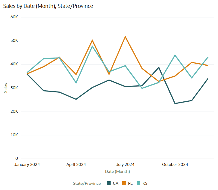
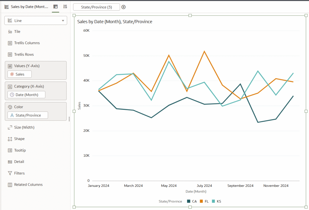
Simple line graph
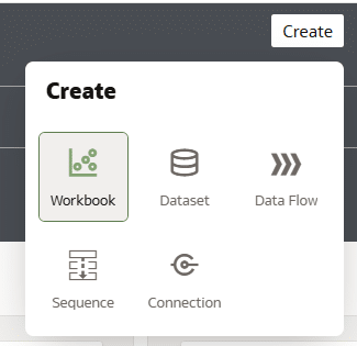
The first line chart variation is a simple line graph with some basic formatting. In the Oracle Analytics Home dashboard, start by creating a new workbook by choosing the button at the top right that says “Create” and select “Workbook”.
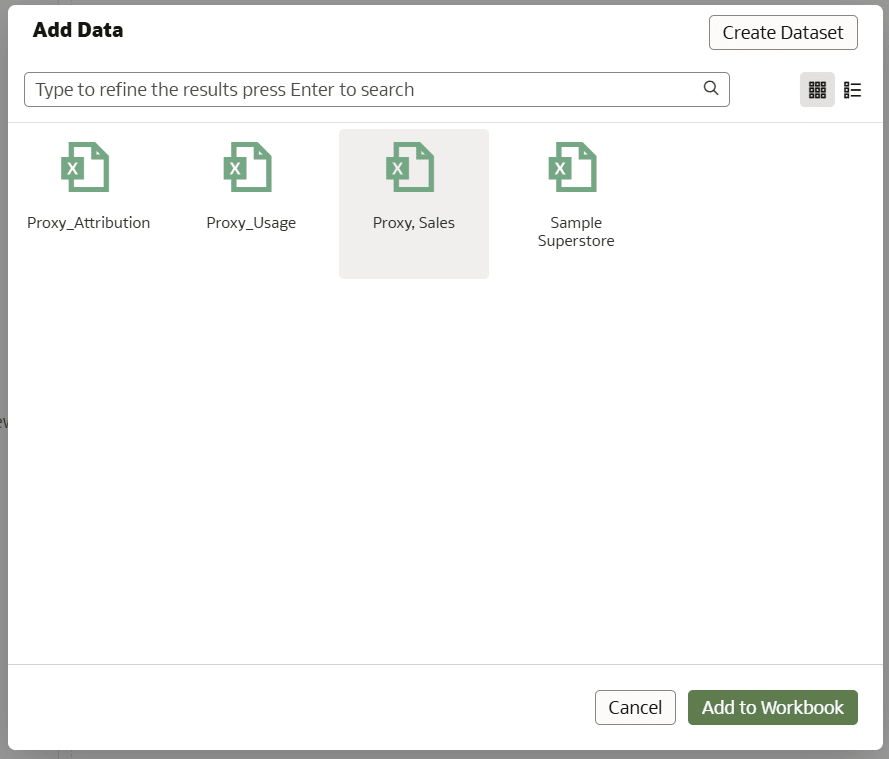
If you want to follow along with the data I’m using, connect to the Sales table from the Proxy dataset by choosing “Proxy, Sales”, then select “Add to Workbook”.
In the Visualizations pane, click, drag, and drop Line into the canvas.
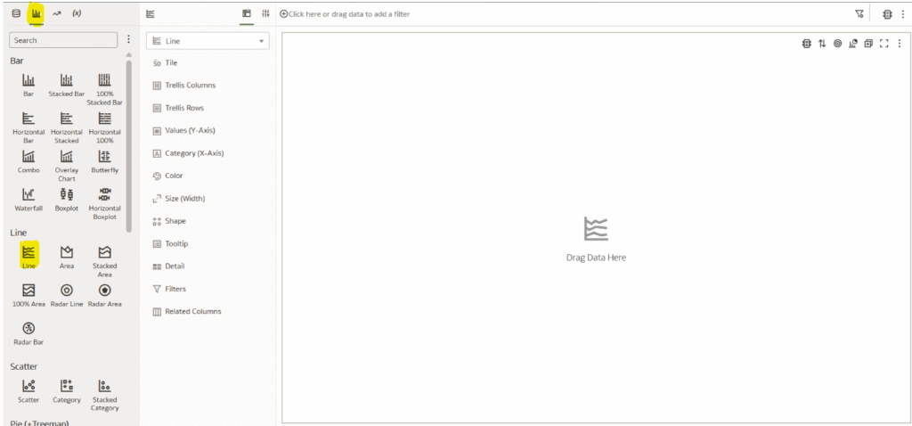
Place Sales on Values, Date (Month) on Category, State/Province onto Color, and lastly, for the simplicity of the tutorial, filter to only three states by placing State/Province onto the Canvas Filters and selecting CA, FL, and KS.
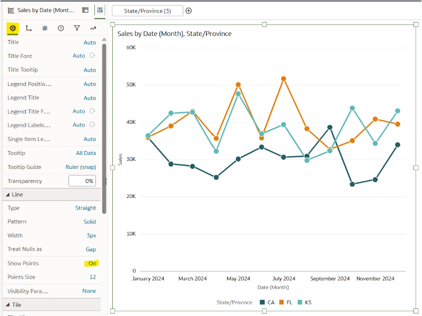
Simple line graph with points
Let’s build off the simple line graph by adding circles, or “Points”, to each data point. Adding points to a line graph not only looks great, but serves a practical purpose of explicitly showing us which points have data. But be careful using this technique if you are working with a “spaghetti line graph”, or a line graph with many lines, because adding points can overcrowd and confuse the view.
In the Properties pane, choose the General tab (gear icon), then next to Show Points, choose On.
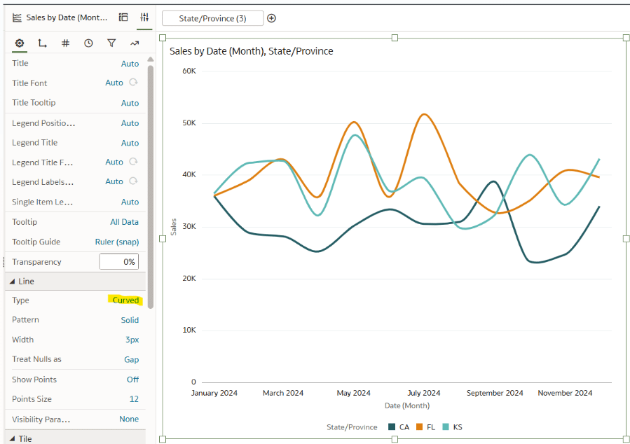
Simple curved line graph
Changing the line graph from a straight line to a curved line has both benefits and drawbacks. Curved lines are very easy to implement in OAC and doing so can increase engagement with your analysis as they look very clean and polished. But the drawback is that it can slightly decrease the accuracy of the graph when glancing at it as opposed to the straight lines which show exactly where each point lands.
To implement the curved lines, choose the General tab from the Properties pane, change Show Points to Off, and change the Line Type to Curved.
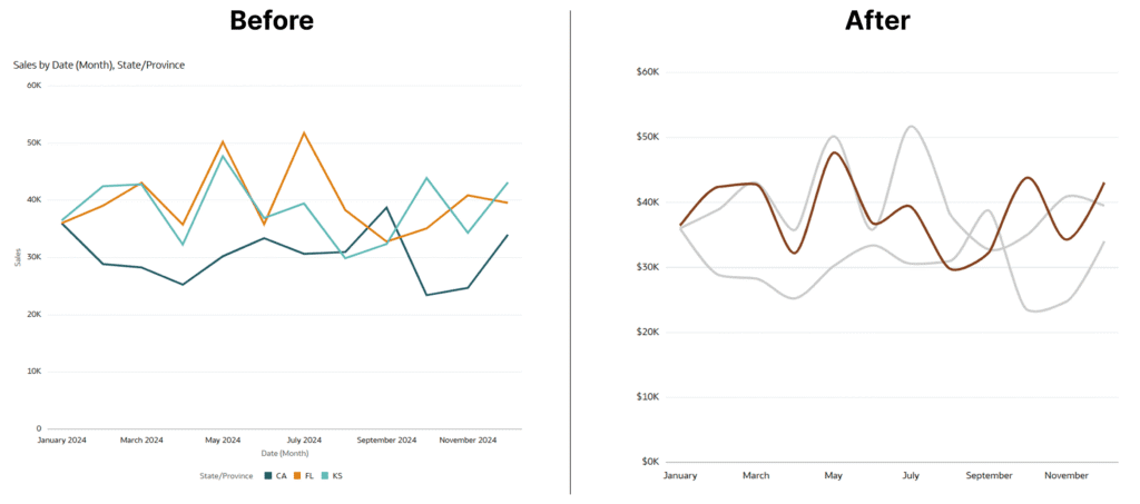
2. Maximize the data-ink ratio
The data-ink ratio is a concept introduced by Edward Tufte, who says you should dedicate as much ‘ink’ (i.e. pixels) on a view to the data as possible. This means getting rid of unnecessary lines, effects, and anything else that detracts from the data itself.
Opportunities to maximize the data-ink ratio in this line chart would include getting rid of unnecessary titles, redundant axis labels, and legends. In addition, maybe the stakeholder of this visualization wants to look at a specific state, or maybe there is a noteworthy insight worth highlighting. An effective way to achieve this would be to emphasize the state’s trend by utilizing the preattentive attribute of color.
Using the above visualization as the starting point, navigate to the Properties pane, then in the General tab, change the Title and Legend Position to None.
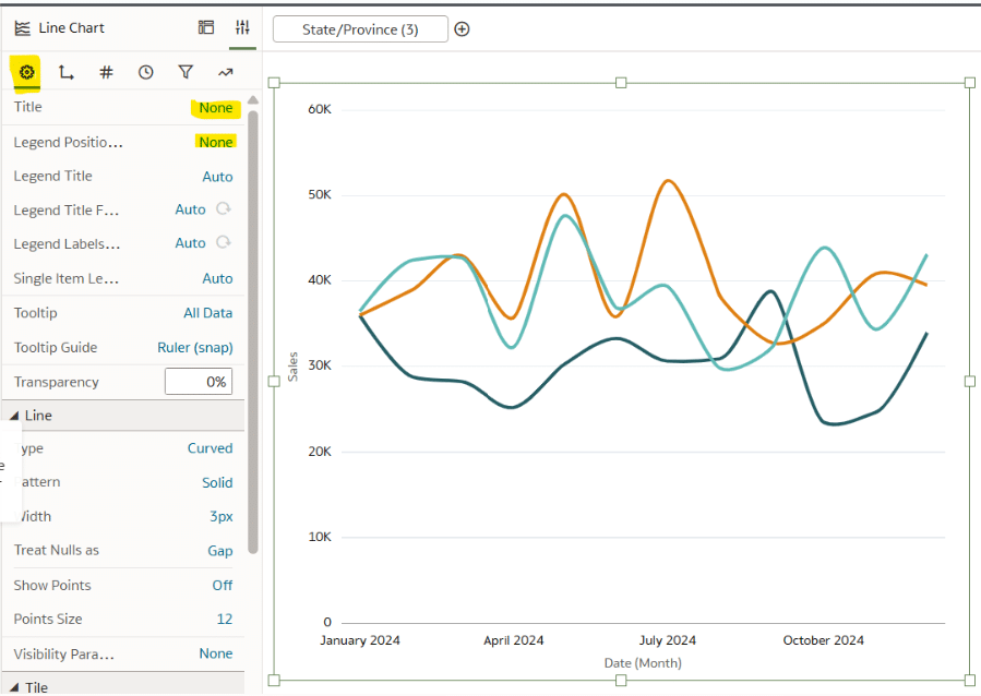
Next, remove the axis titles, the redundant “2024” values on the x-Axis, and add a currency label to the y-Axis. In the Axis tab, change the Title from Auto to None for both the Labels Axis and the Values Axis. Under Values Axis, change the Number Format from Auto to Currency, remove the decimal places, and add a thousand abbreviation (K).
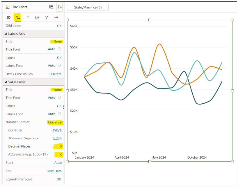
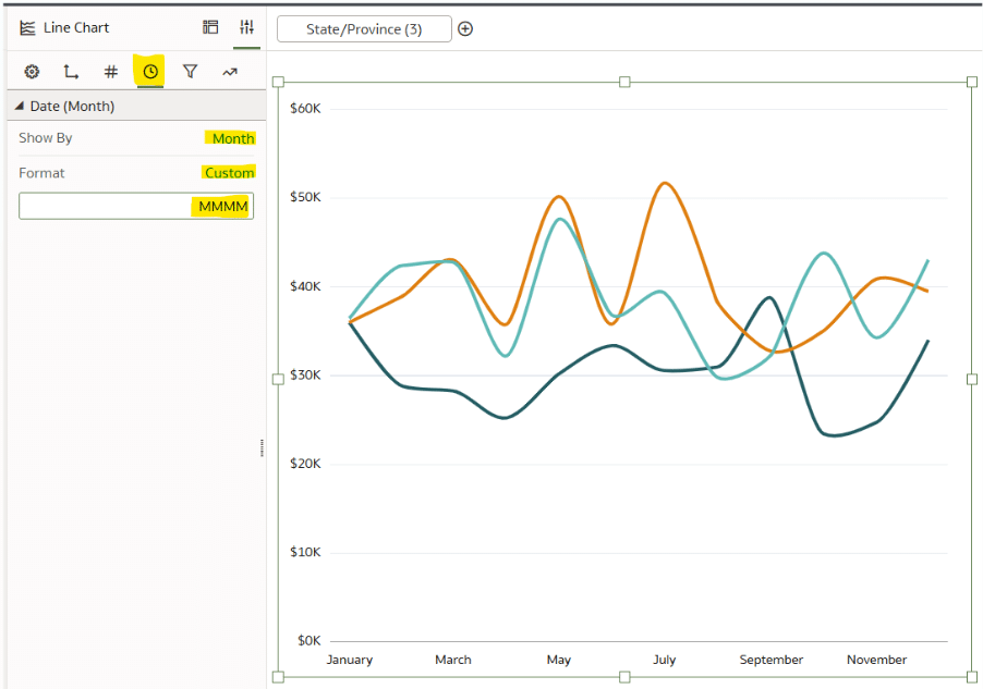
To remove the redundant “2024” from the x-Axis, navigate to Date/Time Format and change the Format to Custom. The custom format will be MMMM.
This is starting to look better, but now I want to highlight KS as the focal point. In the Grammar pane, choose the Color dropdown and select Manage Assignments.
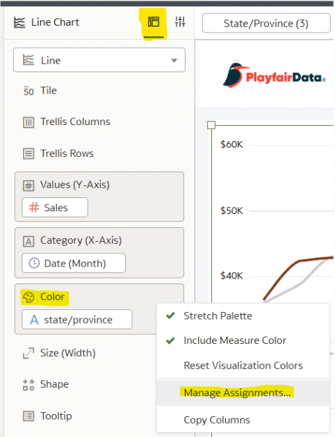
Change CA and FL to a light grey while changing the KS color to a burgundy/red.
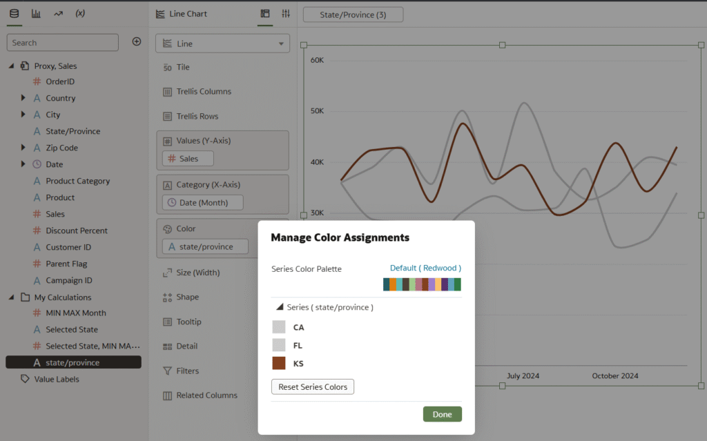
As you can see, the line graph is much cleaner, professional, and easier to read. Compare that to our starting point with the default line graph!
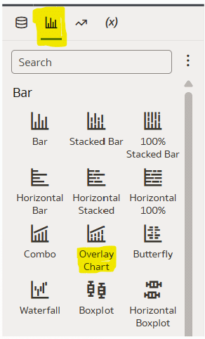
3. Leverage Overlay Charts for Oracle Analytics line graphs
If we’d like to make the highlight of KS even more pronounced, then we can utilize what is called an “Overlay Chart”, which allows you to leverage two chart types in a single visualization.
Continue reading with a free account, or login.
Unlock this tutorial and hundreds of other free visual analytics resources from our expert team.
Already have an account? Sign In
By continuing, you agree to our Terms of Use and Privacy Policy.
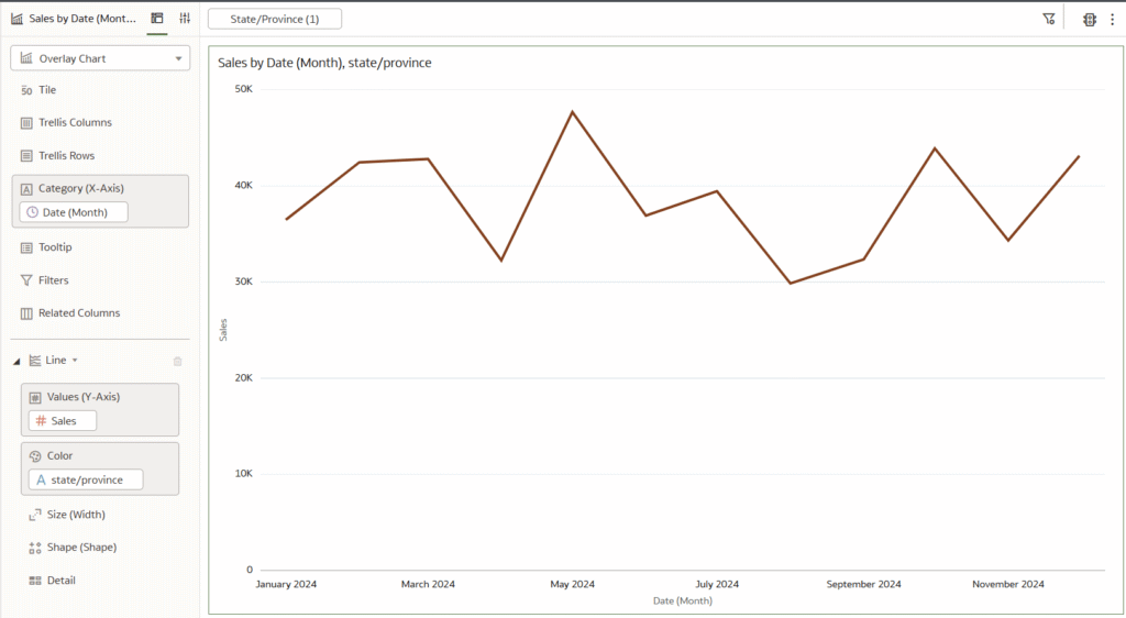
Start by creating a new Canvas. In the Visualizations pane, drag the Overlay Chart into the canvas.
Place Date (Month) on Category, Sales on Values, State/Province on Color, and filter the canvas to only KS.
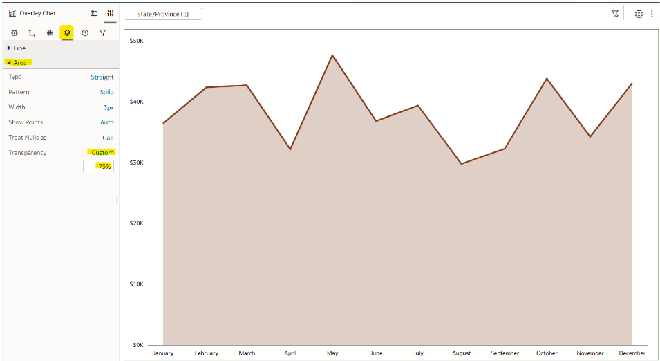
At the bottom of the Grammar pane, select Add Layer, and choose Area.
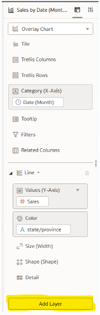
Place Sales on Values and State/Province on Color.
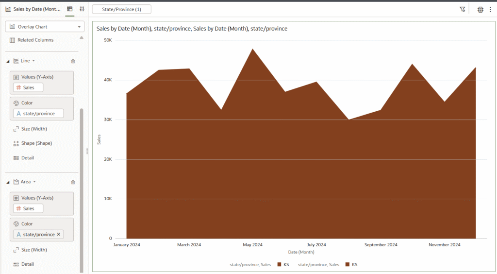
In the Properties pane, choose the Data Layers tab. Under Data Layers, choose the Area dropdown and change Transparency to 75%. Here is how my final view looks.
This method of leveraging Oracle Analytics’ Overlay Chart, also known as a dual-axis combination chart, to combine an area graph with a line graph is a seamless way to elevate the design of a line graph without compromising the simplicity of the chart type.
Thanks for reading,
Dan

Written By
Dan Bunker

Peer Review
Juan Carlos Guzman
Visual Analytics Associate

Technical Review
Ethan Lang
Director, Analytics Engineering
Related Content
3 Ways to Make Beautiful Bar Charts in Oracle Analytics Cloud
When it comes to comparing discrete categorical values, rarely is there a better choice than the bar chart. Invented by…
Winning the Oracle Analytics Cloud Data Visualization Challenge

What better way to start the year than for the Playfair Data team to have won yet another award! Our…
How to Setup Oracle Cloud Infrastructure for Oracle Analytics Cloud
Trying to navigate Oracle Cloud Infrastructure (OCI) for the first time can be an overwhelming experience with all the applications,…