3 Ways to Make Lovely Line Graphs in Power BI

If you read the first installation in this series on how to make Power BI bar charts more engaging, this next entry should be no surprise–line graphs are a fundamental data visualization type and by far the most popular way to visualize trends over time. Line graphs are a workhorse in dashboards and can be incredibly engaging, especially if you take the time to elevate them beyond the default formatting in Power BI. Here are three quick ways to enhance your line graphs, all without using any plug-ins.
FAQs answered in this post:
How can I improve line graph formatting in Power BI without plugins?
Power BI’s native formatting tools offer substantial improvement opportunities for line graphs. Adjust line stroke width to 4-5 pixels for better visibility, use dashed lines to de-emphasize secondary data series, and add markers to highlight critical data points. These simple adjustments using built-in formatting options can transform default visualizations into professional, decision-ready dashboards without requiring custom plugins or extensions.
What is the data-ink ratio and why does it matter for Power BI dashboards?
The data-ink ratio, introduced by Edward Tufte, measures how much visual space is dedicated to actual data versus decorative elements. Maximizing this ratio means removing unnecessary gridlines, excessive axis labels, and redundant titles so stakeholders can focus on insights rather than chart decoration. In enterprise dashboards where executives need quick insights, a high data-ink ratio reduces cognitive load and accelerates decision-making by eliminating visual clutter.
When should I use dual-axis line charts in Power BI?
Dual-axis charts work best when comparing two related metrics with different scales, such as revenue and profit margin, or sales volume and conversion rate. The key is ensuring viewers can clearly distinguish which line corresponds to which axis through color-coding and intentional labeling. When implemented properly, dual-axis charts enable stakeholders to identify correlations and trends between metrics that would otherwise require separate visualizations.
How do I highlight one line over others in a Power BI line graph?
To emphasize a specific data series, use a combination of color contrast and line styling. Keep your priority line in a bold, saturated color with solid styling and 5px stroke width, while changing secondary lines to light gray with dashed styling at 4px. This visual hierarchy immediately directs attention to the most important trend while maintaining context from comparison lines, helping executives quickly identify what matters most.
Can I use DAX to improve Power BI line chart readability?
Yes, DAX calculated columns can significantly enhance chart readability by customizing axis labels. For time-series data, create a calculated column that converts full month names to three-letter abbreviations, reducing horizontal axis clutter while maintaining clarity. This approach is particularly valuable in enterprise dashboards where space efficiency matters and stakeholders need to view multiple time periods simultaneously without overwhelming labels.
How can Playfair Data help optimize our Power BI reporting strategy?
Playfair Data specializes in transforming standard Power BI reports into strategic decision-making tools through visual analytics best practices and engineering fundamentals. Our professional services team applies proven frameworks like the data-ink ratio and Decision Ready Data methodology to ensure your dashboards drive action, not just display data. Schedule a complimentary strategy call to discover how our Power BI expertise can accelerate insights and improve stakeholder engagement across your organization.
Use formatting available in Power BI
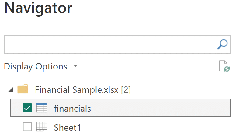
We’re going to use one of the sample datasets available to anyone using Power BI Desktop–when you open a new file, follow the instructions on how to load a sample data set and choose the “financials” sheet from Financial Sample.xlsx.
Our first tip is to use the tools that Power BI gives you right away! It’s a very simple thing to do and it can get your data immediately looking clean and legible. Our example starts by selecting the Line chart visualization and bringing the Order Date (Month) to the X-axis, the Sum of Gross Sales to the Y-axis, and the Discount Band to the Legend. What you get at this point is a clear, readable line graph, but we can definitely do better with some simple formatting.
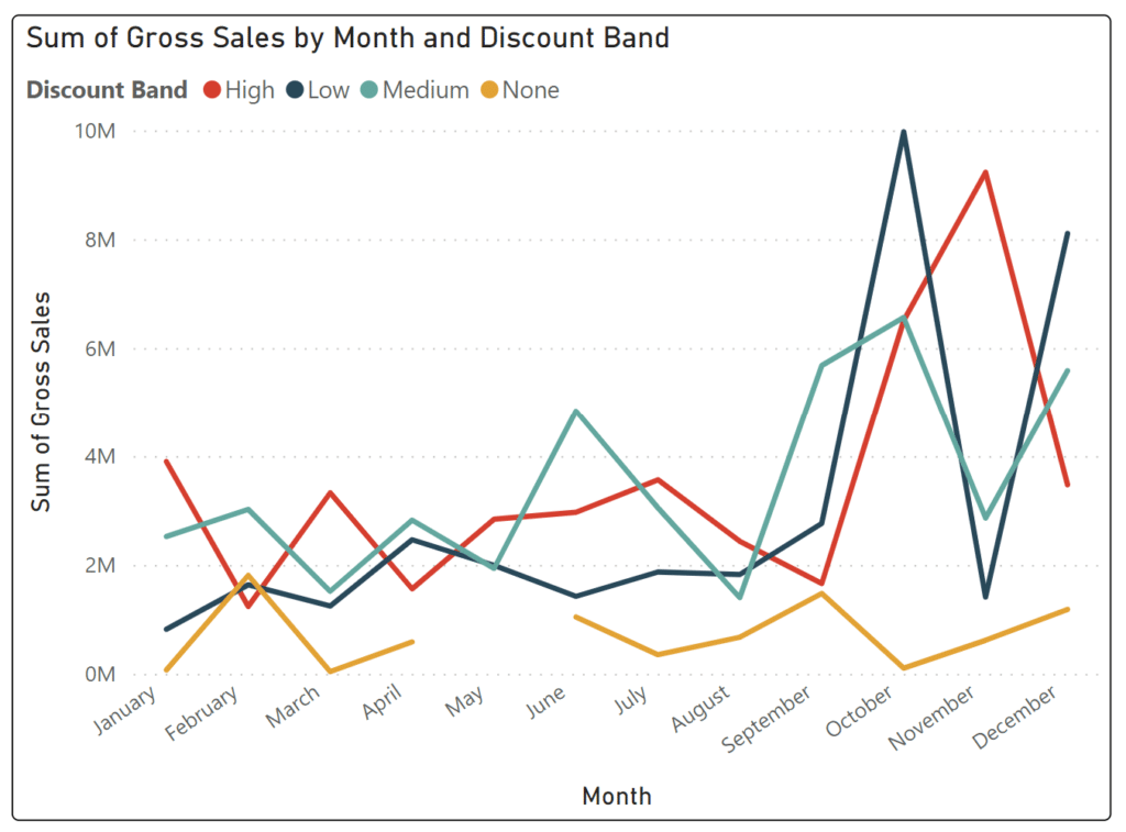
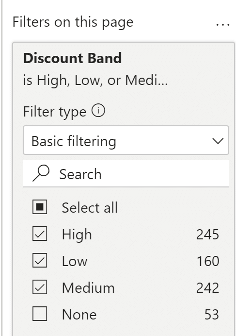
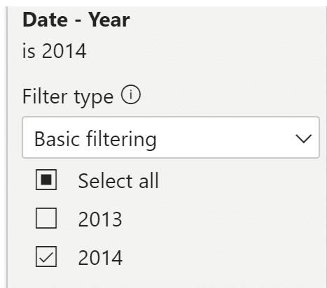
Before we make the visual changes, we’ll make a quick filter addition to remove the “None” Discount values. This will simplify our visual for this tutorial and as you can see from the filter menu, contains the smallest number of records. We’ll also filter this to only 2014 data, as 2013 only contains partial monthly data.
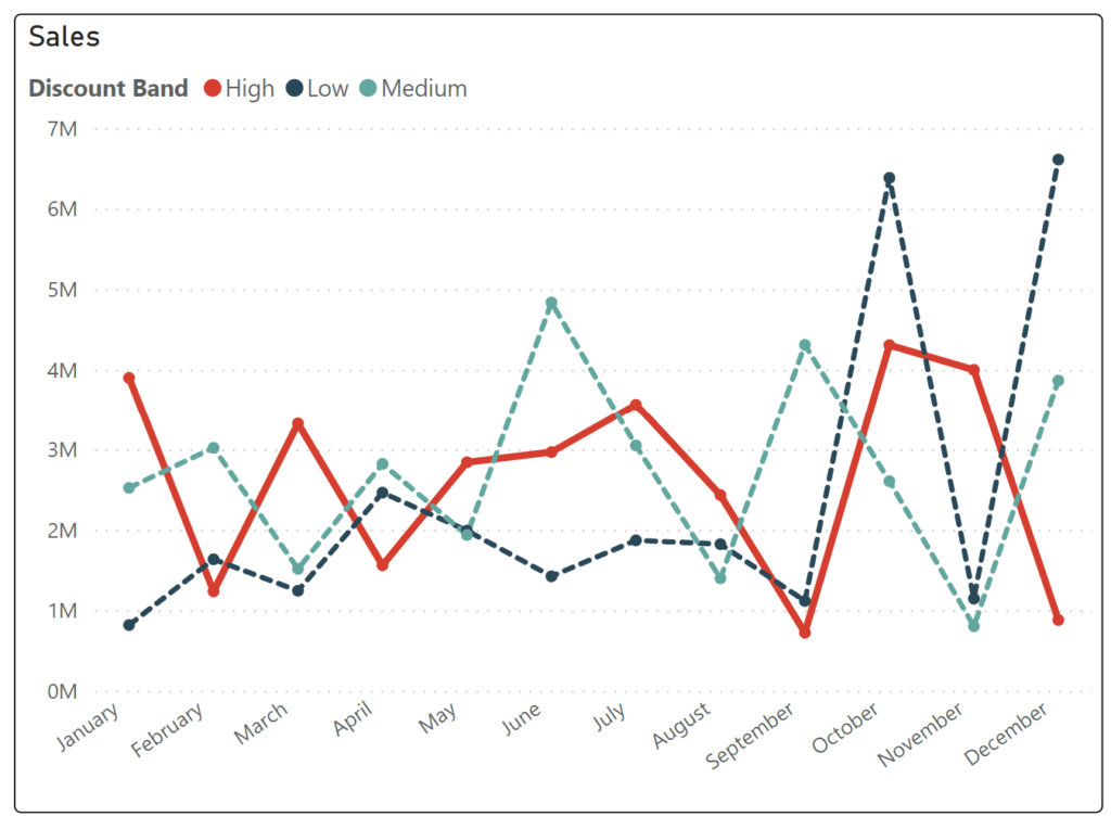
Starting with the overall title, let’s change “Sum of Gross Sales by Month and Discount Band” on the Y-axis to just “Sales.” I think you might agree with me that the default title is unwieldy and long when it doesn’t need to be–we already know this is a “by month” chart because we have an Axis header at the bottom that gives us that information, and a sub-header right below the title shows that each line represents a distinct Discount Band. To make this change you’ll navigate to the Format visual menu and update the main title text from Default to “Sales.” My recommendation is to keep the data-to-ink ratio low but still provide necessary information. Your viewer will no doubt be able to discern that this chart is monthly by the X-axis, and is about Sales by the Y-axis title, so we can turn those axis titles off as well.

Now to address the star of the show–the lines themselves! One easy way to give your viz more “pop” right out of the gate is to play with the formatting under “Lines” in the Format visual menu: I like to make the lines a little heavier, say 4 or 5 px. For this visual, I’m going to keep the Line Type as “Linear” but “Smooth” and “Step” also have their place. If you’re going to combine this visualization with several others on a dashboard, you might want to make the lines lighter than the default 3 px, since space is at a premium in a tighter window.
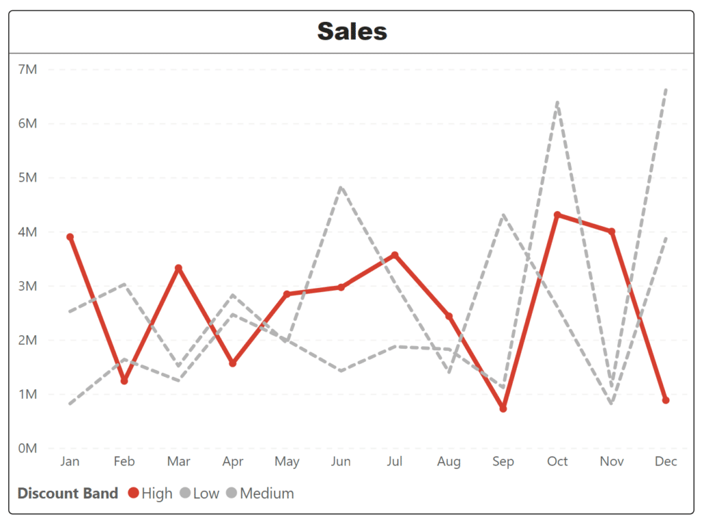
We can make the data points stand out even more by adding Markers to the lines. Markers can be found directly below Lines in the Format menu. Perhaps you want to draw the viewer’s eyes towards one line over the others–there are plenty of ways to do that in Power BI. For our example, we’ll highlight the “High” discount band with some straightforward formatting tricks. To start, we’ll go into the Lines menu and apply the “Dashed” Line style for both Medium and Low lines, leaving the High line as the lone solid option. We can make High stand out even more if we adjust the stroke width for that line as well–see what it looks like when you make High at 5 px while the other lines remain at 4 px.
Maximize the “data-ink ratio”
The next tip is one you should consider implementing for any visualization you create. Maximize that “data-ink ratio”! Edward Tufte introduced this idea and it has stuck around–the idea that you should be dedicating as much “ink” (digital ink, now) on any visualization to the data as possible. Jettison extra lines, axis labels, tick marks, and anything that might detract from the data itself.
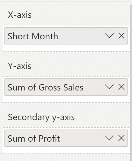
Power BI doesn’t allow you to format your month names by default, but there’s a very easy way to shrink down the size of your x-axis legend: DAX. Add a column to your table with this:

Once this is created, you can replace your existing month field with with new column. If you find that the new column lists your months out of order, you can solve this by sorting the Short Month field by Month Number. Click on the Short Month measure in the Data menu, then “Sort by column” from the top ribbon.
Continue reading with a free account, or login.
Unlock this tutorial and hundreds of other free visual analytics resources from our expert team.
Already have an account? Sign In
By continuing, you agree to our Terms of Use and Privacy Policy.
We can focus our eyes on a single dimension through color and size, allowing us to make the ink we do use stand out. This can be done dynamically by the user, but we’ll discuss that another time. To continue using the High discount band in our example, we’re going to change the color of our Medium and Low lines to a light gray, making them almost appear as background noise to the “featured” High line. Here’s how the visualization looks when we drive our attention to a single line. (Bonus lesson: I put one completely unnecessary line in the visualization. Can you see it? If you’re building your own, see how it looks with this line removed.)
Make use of dual-axis
Now that we’ve isolated the High band as one we’d like to look at, we can do further analysis by taking advantage of Power BI’s integrated dual axis. Edit your current Discount Band filter to only include the High Discount Band, remove Discount Band from your Legend, and then drop the Profit measure onto the Secondary y-axis.
Your visualization should look like this.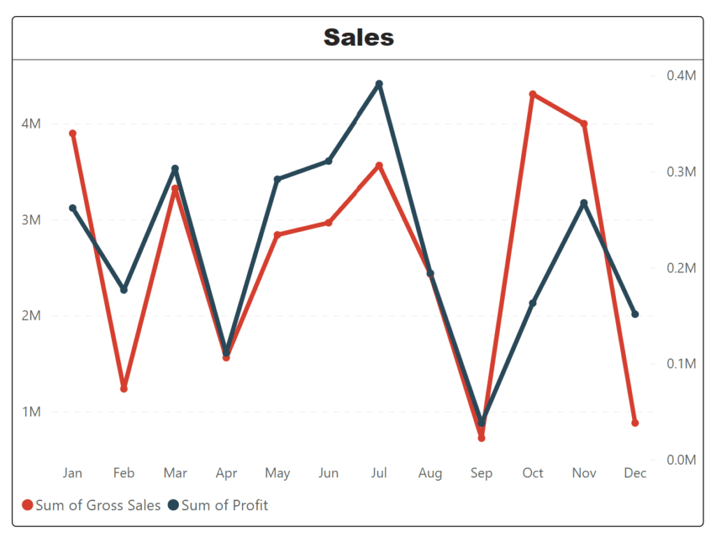
You see the secondary y-axis on the right, and it is a different scale for Profit than it is for Sales. Because of this difference in scale, it’s a good idea to draw the viewer’s visual attention to this fact as much as possible–we need to tie the Sales line to the Sales scale, and the Profit line to the Profit scale.
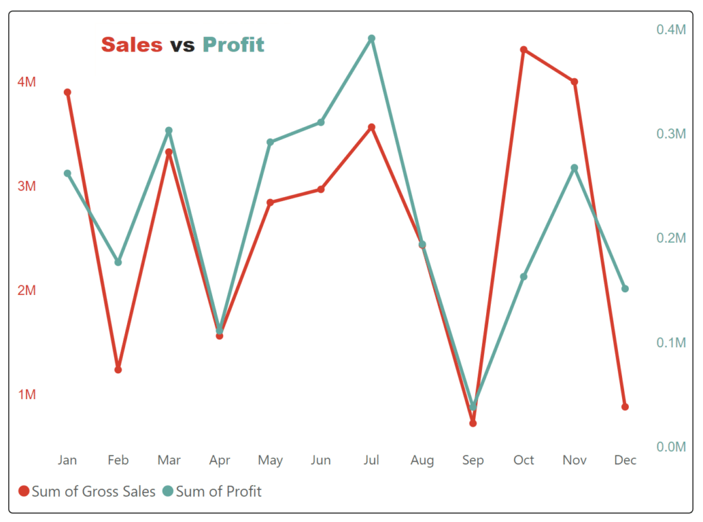
We can do that with color, and also change the title on the chart to accurately (and quickly!) reflect what the user will see. To do this, simply hide the default title in the format menu for the chart, and add a Text Box with your color-matched title above. Your final output should look similar to this:
Hope you enjoyed this basic line chart tutorial.
Thanks for your time!
Matt

Written By
Matt Snively

Peer Review
Juan Carlos Guzman
Visual Analytics Associate
Related Content
3 Ways to Make Lovely Line Graphs in Oracle Analytics Cloud

As far as I’m concerned, boring chart types are always in style. The problem-solving principle of Occam’s Razor states that,…
3 Ways to Make Beautiful Bar Charts in Power BI
Despite many new challengers over the years in the world of data visualization, bar charts have remained one of the…
3 Ways to Make Lovely Line Graphs in Tableau

Due to the popularity of 3 Ways to Make Beautiful Bar Charts in Tableau, I’ve decided to follow it up…