3 Ways to Make Stunning Scatter Plots in Oracle Analytics Cloud

The scatter plot is a chart type that has many uses in visual analytics. They’re used to visualize relationships between two measures, reveal trends, clusters, and outliers in your data. The basic scatter plot requires a measure on the x-Axis, a second measure on the y-Axis, and at least one dimension to add context and points. While the out-of-the-box scatter plot built in Oracle Analytics is a great starting point, we’ll be taking it a bit further with three different tactics to make your scatter plots more engaging and professional.
By the end of this tutorial, you will be able to create a basic out-of-the-box scatter plot, format the points for better user experience (UX), improve the data-ink ratio for more engagement, and create dynamic quadrants for a deeper analysis.
FAQs answered in this post:
When should I use scatter plots in Oracle Analytics Cloud?
Scatter plots work best when you need to visualize relationships between two measures, reveal trends, clusters, and outliers in your data. Adding reference lines for the average of each axis creates natural four-quadrant segmentation, allowing you to identify which dimension members have high or low performance on both measures simultaneously—like states with high sales and high discounts versus those with low sales and low discounts.
How do I create a scatter plot in Oracle Analytics Cloud?
From the Oracle Analytics Home dashboard, create a new workbook by choosing “Create” then “Workbook.” In the Visualizations pane, drag and drop the Scatter chart into the canvas. Add your first measure to Values (Y-Axis), your second measure to Values (X-Axis), and at least one dimension to Category (Points). The dimension adds granularity by creating individual points for each member, while additional dimensions can be added to Color or Size for context.
How do I format scatter plot borders in Oracle Analytics Cloud?
When points overlap, make them semi-transparent and add borders to identify areas with multiple overlapping data points. In the Properties panel, change Transparency to 50% and Outline to Auto. This provides an approximation of data density by showing where points stack on top of each other. You can further enhance the visualization by adding a dimension like Country to Color, using preattentive attributes to immediately reveal patterns in your data.
What is level of detail in Oracle Analytics calculations?
Level of detail determines the grain at which calculations are performed before aggregation. When creating calculated measures like Discount Amount (Sales multiplied by Discount Percent), you must calculate at the correct level to avoid inaccurate results. Use the BY clause to specify the level: calculate at the lowest grain first (BY Customer ID), then aggregate to the visualization level (BY State/Province). Without proper level of detail specification, measures get aggregated before multiplication, producing incorrect results.
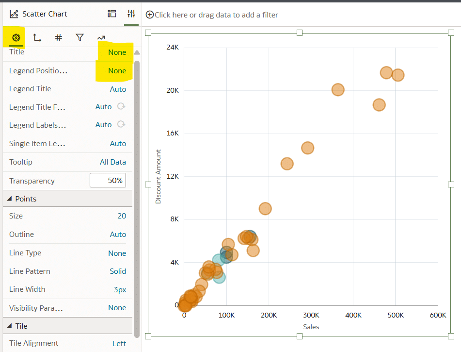
How do I improve the data-ink ratio in Oracle Analytics scatter plots?
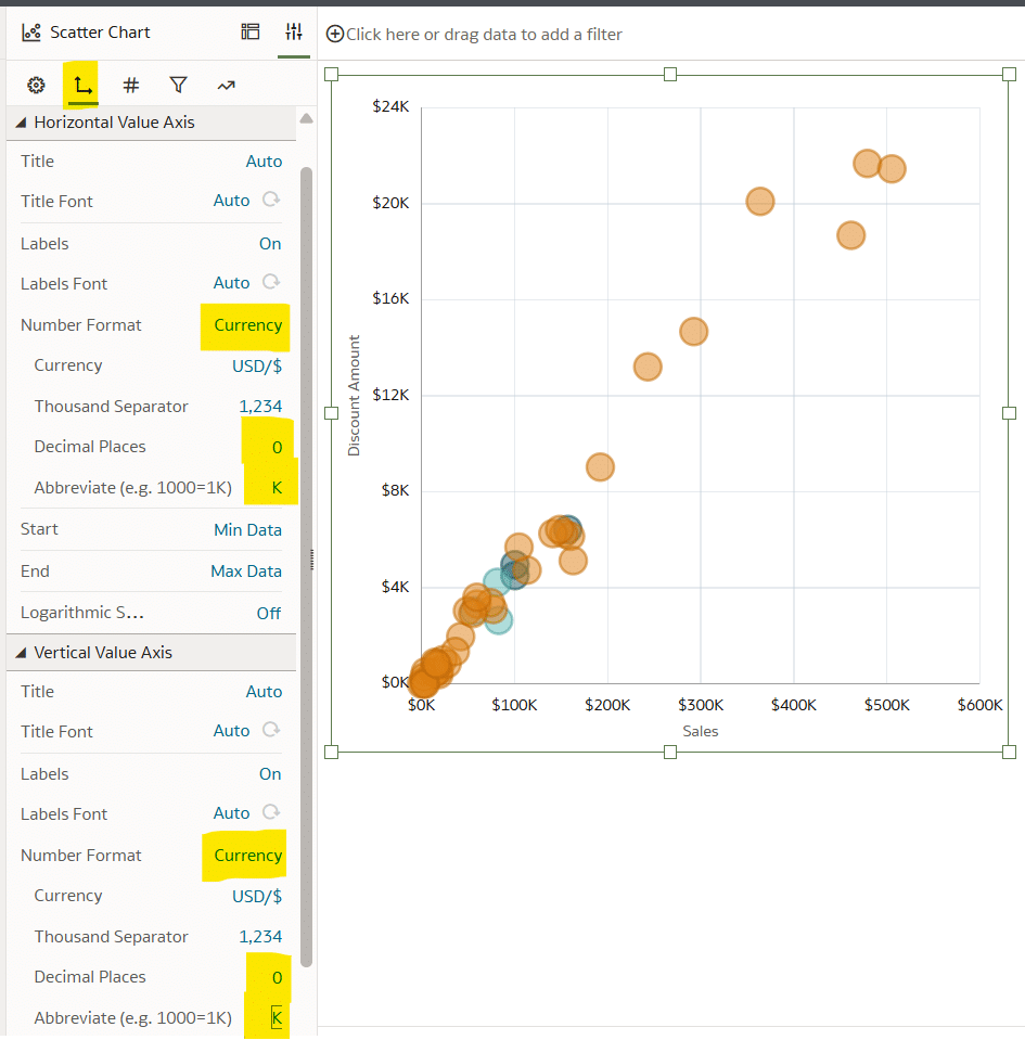
Maximize the proportion of ink dedicated to data by removing unnecessary elements. In the Properties panel General tab, change Title to None and Legend Position to None. Under the Axis tab, format both axes to display Currency with 0 Decimal Places and K abbreviation. Standardize axes font type, size, and color to match your brand guidelines. These changes eliminate visual clutter and focus attention on the data itself, making insights easier to spot. Schedule a complimentary strategy call to learn how Playfair Data implements data-ink ratio principles across enterprise analytics solutions.
How do I create four-quadrant segmentation in Oracle Analytics scatter plots?
Use two methods together for effective segmentation. First, add reference lines by navigating to Properties, choosing the Analytics tab, and adding two Reference Lines—one for each axis with Function set to Average. Second, create a segmentation calculation using a CASE statement with Boolean logic comparing each point to AVG() of both measures. This calculation classifies points into quadrants like “High Discount Amount & High Sales” or “Low Discount Amount & Low Sales.” Place the calculation on Color to visually emphasize the four segments, allowing quick identification of which dimension members require different strategic approaches.
How to make a scatter plot in Oracle Analytics
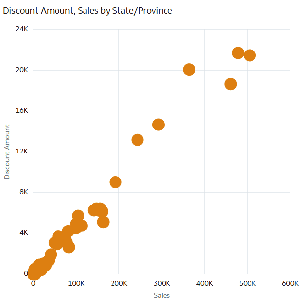
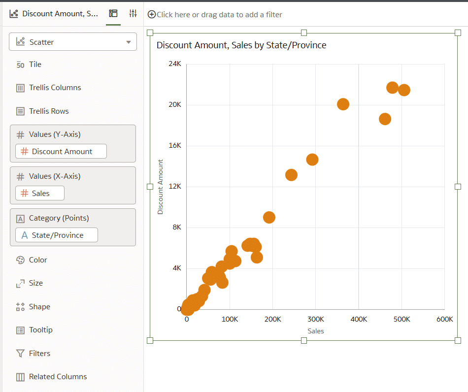
Scatter plots in Oracle Analytics are made with at least two measures and zero or more dimensions. The first two measures are placed on the x-Axis and y-Axis, which draw the coordinates where each point is placed. Then one or more dimensions are added to the chart to introduce granularity (i.e., points) or context through preattentive attributes (i.e., color). For the following three tips, we will start by building a default scatter plot by comparing Discount Amount and Sales by State using the Sales table from the Proxy dataset.
In the Oracle Analytics Home dashboard, start by creating a new workbook by choosing the button at the top right that says “Create”. Then select “Workbook”.
If you’d like to follow along with this tutorial, connect to the Sales table from the Proxy dataset by choosing “Proxy, Sales”, then selecting “Add to Workbook”.
In the Visualizations pane, click, drag, and drop the Scatter chart into the canvas.
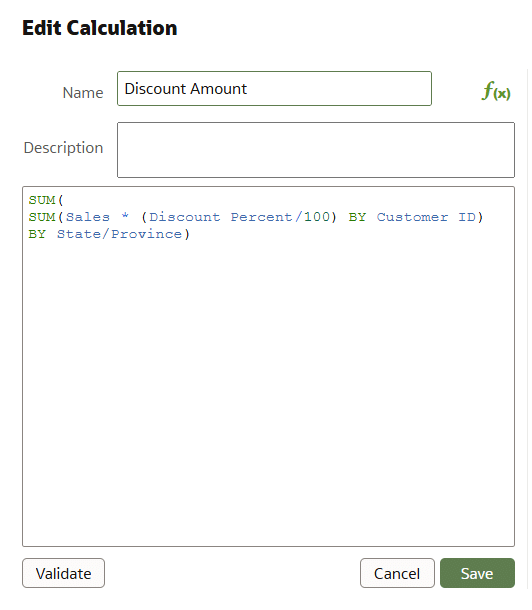
The Sales table already contains one measure, Sales, but scatter plots require two measures, one for each axis. For this tutorial, we’ll compare State/Province by Sales and a custom calculated measure that we’ll call ‘Discount Amount’. Discount Amount is a simple enough calculation to understand, which multiplies ‘Sales’ by ‘Discount Percent’, but there are some intricacies.
Discount Percent, represented in the data by a whole number, must first be transformed into a decimal by dividing it by 100. Then, to accurately calculate the discount amount, we must take into consideration the level of detail that we are working with. Level of detail is an advanced topic, but here is a brief explanation of level of detail and what we are aiming to achieve.
The Sales and Discount Percent values are at the Customer ID level of detail within the data (the lowest level of grain) and each point of the scatter plot will be aggregated to the state level (a higher level of grain). Therefore, we must calculate the Discount Amount (Sales multiplied by Discount Percent) at the Customer ID level before aggregating up to the State level. Otherwise, if we did not take this into account and simply calculated the Sum of Sales times the Sum of Discount Percent, then both Sales and Discount Percent would get aggregated to the State level before getting multiplied.
![]()
For example, if we don’t take the level of detail into consideration, then the sales for Kansas would get aggregated to $100,000, and the Customer ID Discount Percent would get aggregated to 200%, then they’d get multiplied by each other, resulting in an inaccurate discount amount. Instead, we need to multiply each Customer ID’s Sales value by its corresponding Discount Percent value at the Customer ID level, then sum the Customer ID Discount Amounts up to the State level (Kansas).
In the Data pane, click ‘+’ → Create Calculation. Name this calculation ‘Discount Amount’ and the syntax is as follows:
SUM(
SUM(Sales * (Discount Percent/100) BY Customer ID)
BY State/Province)
With all our measures ready to go, we can start building the chart. Add Discount Amount to Values (Y-Axis), Sales to Values (X-Axis), and State/Province to Category (Points). And that’s all it takes to build a simple out-of-the-box scatter plot in Oracle Analytics, but keep reading for three tips on how to elevate this chart to the next level.
Formatting a scatter plot for better point borders
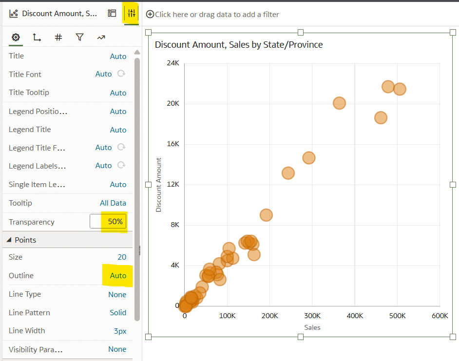
Scatter plots are a great chart for visualizing many data points, but sometimes the points overlap, making it difficult to know if there are multiple points hidden behind each other. To solve this problem, we can make the points semi-transparent and enclose the points with a border. This will allow us to identify areas with overlapping data points, providing an approximation of the density.
Choose the Properties panel, then in the pane, change Transparency to 50% and Outline to Auto.
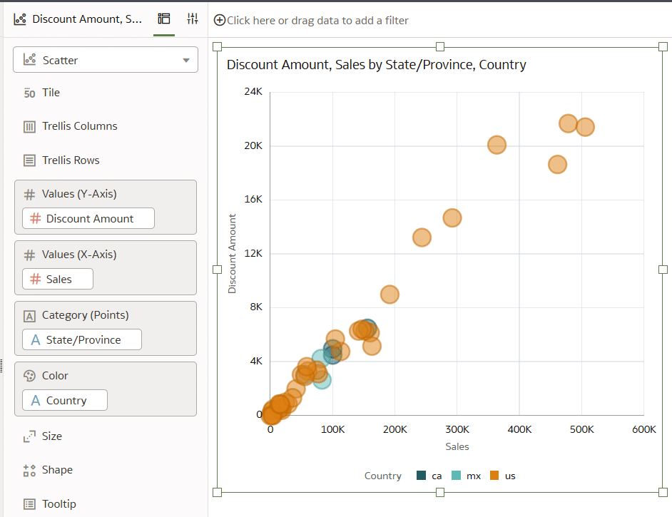
The last thing I would like to see is the division of states by country. I will achieve this by using the preattentive attribute of color. Navigate back to the Grammar pane and place Country onto Color. By adding Country to Color, we can immediately and easily see that the US accounts for most of the data points.
Maximize the data-ink ratio for scatter plots in Oracle Analytics
The data-ink ratio is a concept introduced by Edward Tufte, who says you should dedicate as much ‘ink’ on a view to the data as possible. This means getting rid of unnecessary lines, effects, and anything else that detracts from the data itself.
Opportunities to improve the data-ink ratio could include removing the color legend, adding currency labels to the axes, standardizing the axes label color for improved branding, and removing the default chart title.
Start by choosing the Properties panel icon, choose the General tab (gear icon), then in the pane, change Title to None and Legend Position to None.
To format the axes labels, navigate to the Axis tab. Under the ‘Horizontal Value Axis’ and ‘Vertical Value Axis’ dropdowns, change Number Format to Currency, Decimal Places to 0, and Abbreviate to K.
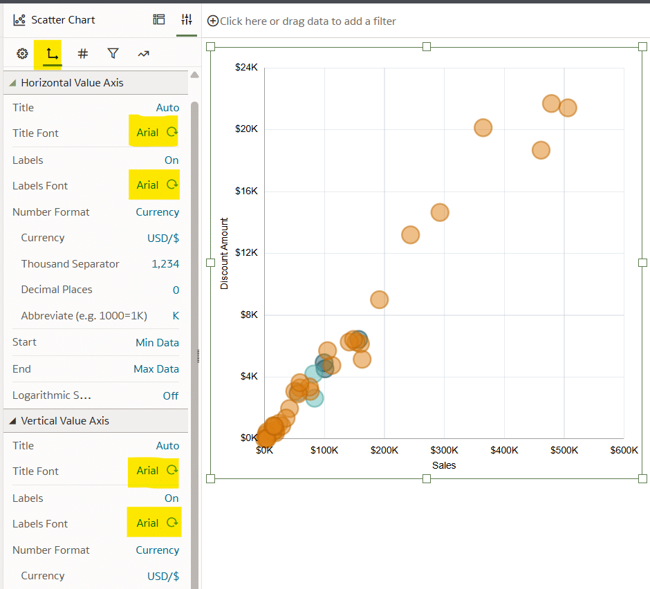
The last data-ink ratio improvement will be to standardize the axes font. By default, Oracle Analytics will apply font type, size, and color to the axes titles and labels, but you can easily adjust these to fit your organization’s brand guidelines. For the sake of this tutorial, I will change the formatting of this scatter plot to a font type of Arial, the font size to 11 pt, and the font color to black.
The axes labels and titles are controlled in the Axis tab of the Properties pane. Under both the ‘Horizontal Value Axis’ and ‘Vertical Value Axis’ dropdowns, change the Titles Font and Labels Font to meet your organization’s brand guidelines.
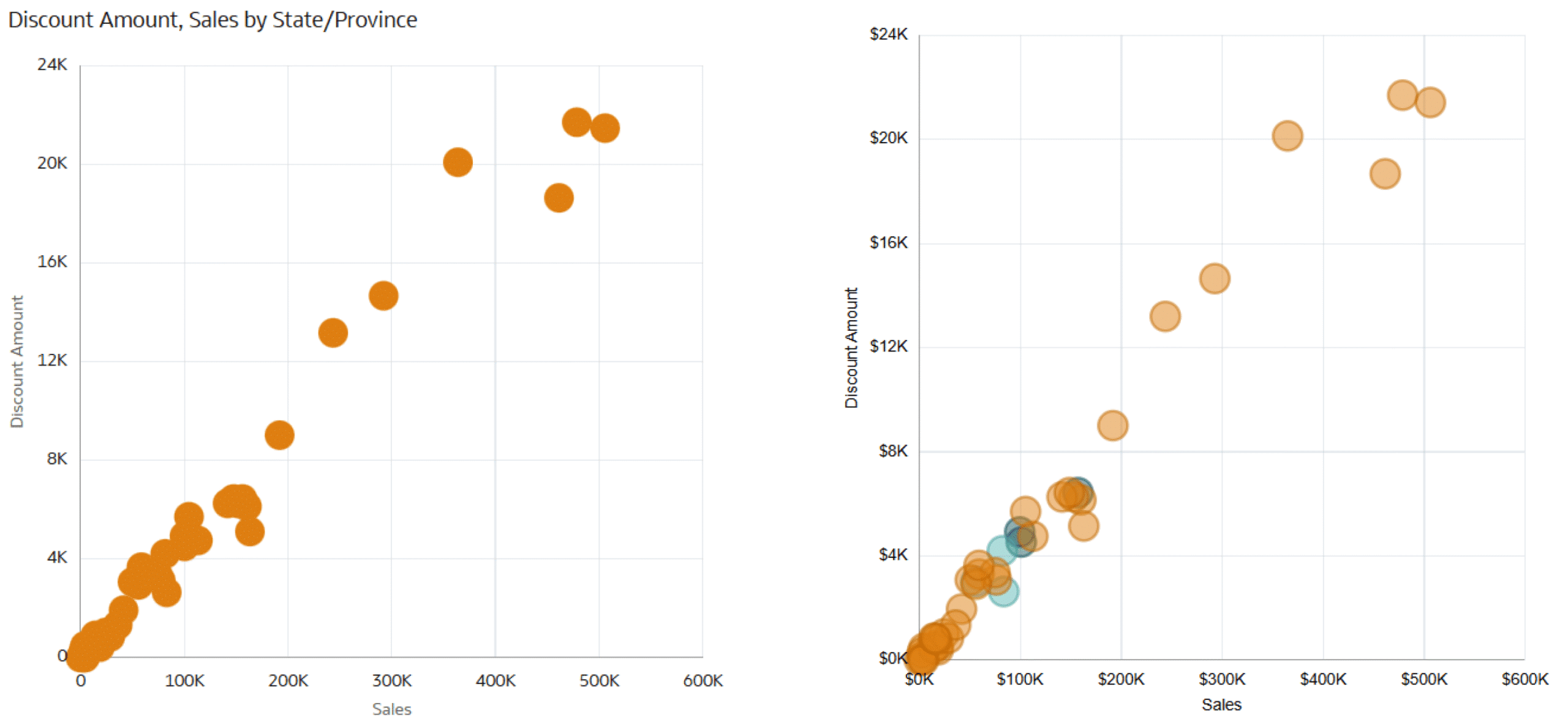
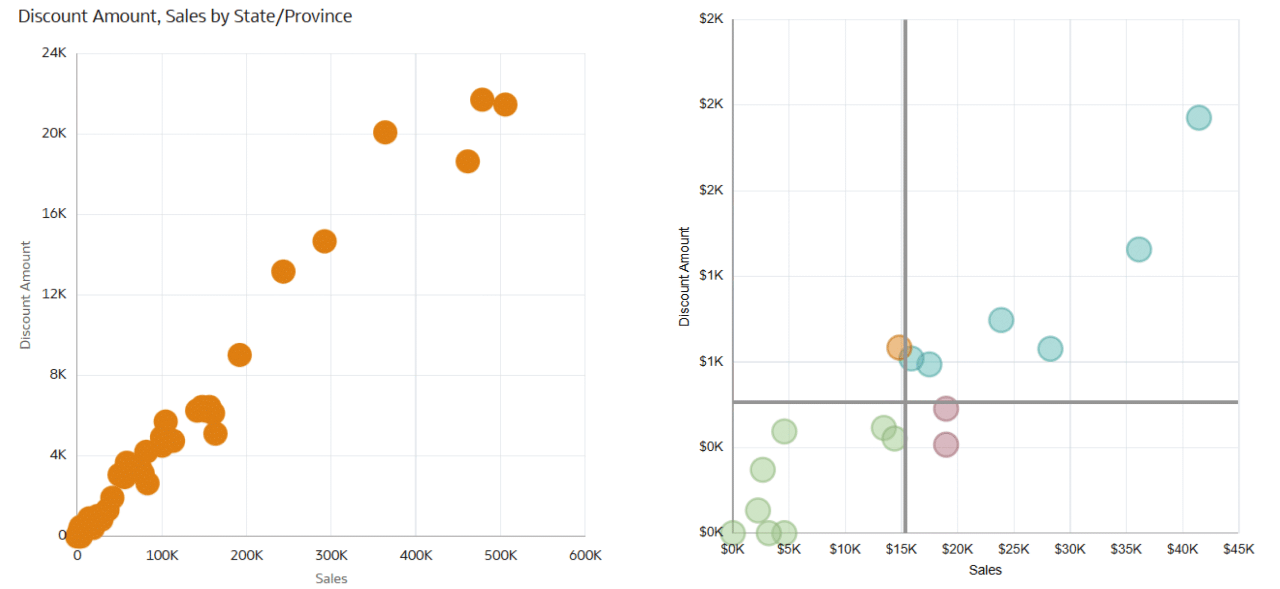
This is how my final view looks compared to the default scatter plot that we started with!
Make the scatter plot functional with segmentation
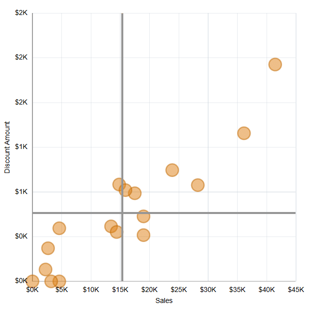
Segmenting the scatter plot into four quadrants can elevate the analysis by visually grouping the data points based on each State’s actual value compared to the average. These visual quadrants will allow the user to quickly identify which states have high sales and high discounts, high sales and low discounts, low sales and high discounts, and low sales and low discounts. This can be a valuable visual aid because it tells a different story about the states in each of the four quadrants.
Applying Gestalt Principles to Dashboard Design
There are two basic methods that can be used to segment the scatter plot into four quadrants, which can be used either separately or in conjunction with each other. The first method draws the quadrants using two reference lines, one for each axis, based on the average of the data in the view. The second method uses a calculation to match the four-quadrant segmentation based on the averages of the measures on each axis. This calculation is then placed onto Color, and each point in the scatter plot is colored based on the quadrant it lands in.
Continue reading with a free account, or login.
Unlock this tutorial and hundreds of other free visual analytics resources from our expert team.
Already have an account? Sign In
By continuing, you agree to our Terms of Use and Privacy Policy.
Building off the scatter plot built in the last section, start by removing Country from Color in the Grammar pane. For the purpose of demonstrating the segmentation in this tutorial, we are going to filter the scatter plot to a more dense area of the chart by selecting the points in the bottom left of the scatter plot by clicking and dragging your cursor around the points highlighted in the image below. Right-click one of the selected points and, from the menu that appears, choose ‘Keep Selected’.
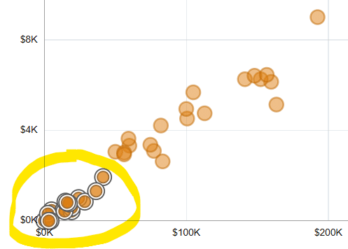
The result should be 17 states left in the view.
Segmentation with reference lines
To create the segmentation quadrants with reference lines, navigate to the Properties pane, choose the Analytics tab, select the Plus icon next to Add Statistics, and choose Reference Line.
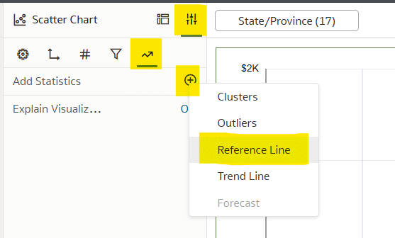
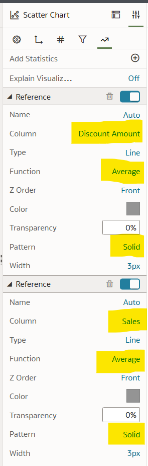
Repeat the above steps to create two reference lines, one for the x-Axis and the second for the y-Axis. Format the first reference line to make the Column ‘Discount Amount’, Function as ‘Average’, and Pattern as ‘Solid’. Format the second reference line to make the Column ‘Sales’, Function as ‘Average’, and Pattern as ‘Solid’.
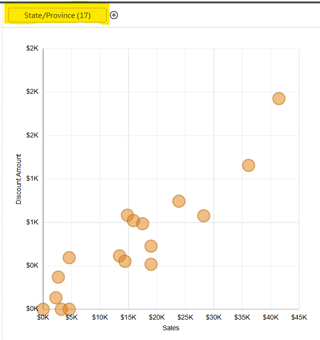
This is how the final view looks after adding and formatting the reference lines quadrants.
Segmentation with a calculation
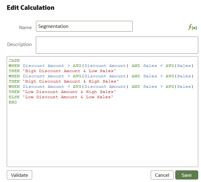
To take this one step further, we can create a calculation that will classify each point on the scatter plot by the quadrant it falls into. These quadrants include high sales and high discounts, high sales and low discounts, low sales and high discounts, and low sales and low discounts. We will then be able to place the calculation onto Color, emphasizing the segmentation already seen by the reference lines built in the previous section.
![]()
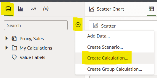
Navigate to the Data pane and choose the Plus icon next to the search bar and choose Create Calculation.
This calculation will compare each point in the view to the average using Boolean logic, then based on the outcome, it will classify it in one of the four quadrants of the scatter plot.
Name the calculation ‘Segmentation’ and the syntax is as follows:
CASE
WHEN Discount Amount > AVG(Discount Amount) AND Sales < AVG(Sales)
THEN ‘High Discount Amount & Low Sales’
WHEN Discount Amount > AVG(Discount Amount) AND Sales > AVG(Sales)
THEN ‘High Discount Amount & High Sales’
WHEN Discount Amount < AVG(Discount Amount) AND Sales > AVG(Sales)
THEN ‘Low Discount Amount & High Sales’
ELSE ‘Low Discount Amount & Low Sales’
END
Place this calculation onto Color in the Grammar pane and adjust the colors as you see fit. Here is how my final view looks compared to the default scatter plot!
Thanks for reading!
Dan

Written By
Dan Bunker

Peer Review
Juan Carlos Guzman
Visual Analytics Associate

Technical Review
Ethan Lang
Director, Analytics Engineering
Related Content
3 Ways to Make Beautiful Bar Charts in Oracle Analytics Cloud
When it comes to comparing discrete categorical values, rarely is there a better choice than the bar chart. Invented by…
3 Ways to Make Lovely Line Graphs in Oracle Analytics Cloud
As far as I’m concerned, boring chart types are always in style. The problem-solving principle of Occam’s Razor states that,…
Winning the Oracle Analytics Cloud Data Visualization Challenge

What better way to start the year than for the Playfair Data team to have won yet another award! Our…