Applying Gestalt Principles to Dashboard Design

Have you ever heard the Gestalt Principles referenced when people are talking about data visualization or design? The Gestalt Principles (pronounced guh-SHTAHLT) are part of the larger Gestalt theory of psychology, which was developed in the 1920s by German psychologists to provide rules for human perception, particularly how humans recognize patterns and simplify complex images.
When discussing this theory, I particularly like how Alberto Cairo defines it in his book, The Functional Art: An introduction to information graphics and visualization: “The main principle behind Gestalt theory is that brains don’t see patches of color and shapes as individual entities, but as aggregates. In fact, the word gestalt means pattern.” (p. 114). Understanding how the brain processes visuals is vital when creating good data visualizations and dashboards. In this post, we’ll walk through some of the common principles, what they mean, and how to apply them to your dashboard design.
While the Gestalt principles have become an ever-evolving list over the years, this post focuses on those we deem most essential to data visualization. It’s also important to note that these principles are interrelated and often can be applied in tandem to the same visual element or dashboard.
What are the Gestalt principles?
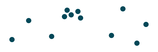
Proximity – Things that are close to each other will be perceived as the same group.
Similarity – Identical things will be perceived as the same group. This may include color, shape, or size.

Continue reading with a free account, or login.
Unlock this tutorial and hundreds of other free visual analytics resources from our expert team.
Already have an account? Sign In
By continuing, you agree to our Terms of Use and Privacy Policy.
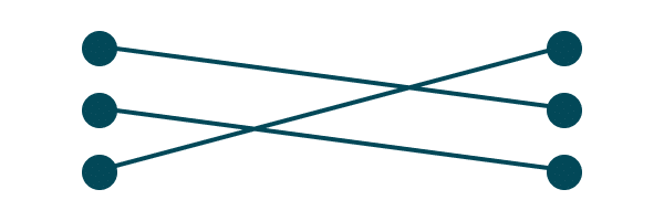
Connectedness – Objects linked by a graphic element will be perceived as a group.
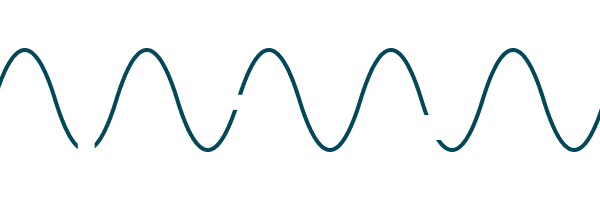
Continuity – We’ll associate elements that follow a similar path, even if that path is broken.
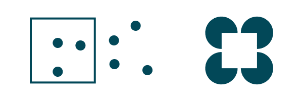
Closure – Things inside a clear boundary (such as a container on a dashboard) will be perceived as the same group. Also that the brain will fill in missing parts of an image to see a whole.
Common Fate – Elements that are moving in the same direction appear to be part of the same group.
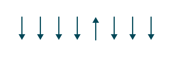
Figure-ground – The tendency to perceive one aspect of an event as the figure or foreground and the other as the ground or background.

Pragnanz – Pragnanz (pronounced PREG-nahnz) is a German word that means salience, conciseness, and orderliness. The human mind prefers experiences that are simple and orderly and will naturally simplify complexity to find meaning.

Past Experience – The rule that our past experiences and beliefs influence our visual perception. Meaning, we tend to group or interpret elements in ways that are familiar to us.
Playfair Data Presents: Preattentive Attributes
How to apply the principles for dashboard design
Now that we’ve defined the principles we’ll discuss, let’s talk through applying the principles to data visualization and dashboard design. This is where it gets exciting, because we’ll see how user experience and aesthetics come together.
![]()
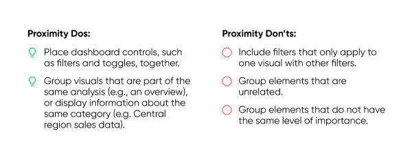
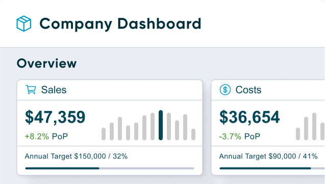
Let’s start with proximity. Since we know humans tend to group things together that are close, we can use this to our advantage when considering the UX of our dashboard. When you are sketching your design, group global filters and navigation elements together. If a filter only applies to a single view, put it close to that view so the user understands that the two are related. Follow a hierarchy, so that elements with the same importance are grouped together.
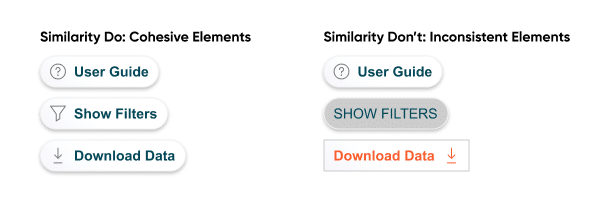
The use of color is an excellent use case of the principle of similarity to your advantage in data visualization. When you color data by a category, keep that color consistent throughout the dashboard. Apply the same principle when it comes to buttons, font, and navigation buttons. If your first button contains a white background with a blue stroke, maintain that style across all your buttons so the user recognizes that they have a similar function. If your container titles use Arial bold font size 20 pt, continue that same styling on every container title.
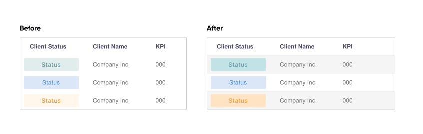
When we think about connectedness, one of the first examples that comes to mind is the lines that connect the points on a line graph. We assume that each point is connected, and often that what we see represents a trend over time. This is why we don’t recommend visualizing categorical data as a line graph, because the viewer may draw conclusions that are incorrect because they are using the principle of connectedness to understand the graph. One way to use connectedness correctly is to apply row banding to a table. This helps the user group together all of the data in a single row since the shading connects that data for the brain.
When it comes to continuity, I want to highlight something that might seem unexpected: typography. Continuity applies to the order in which we read text. In the case of English-speaking countries, we read text from left to right, so we expect all of the text we see will follow the same order. When considering the text on your dashboard, ensure that it follows the standards that your readers would expect.
How to Design a Typographic Hierarchy in Tableau
Check that alignment and spacing is such that users won’t group text that does not actually belong together. In the example below, you’ll see an attempt to group words together using color (Similarity, I see you!), but in this case, the continuity of the words overrides the color so that the “before” version reads “End Season of Sale.”

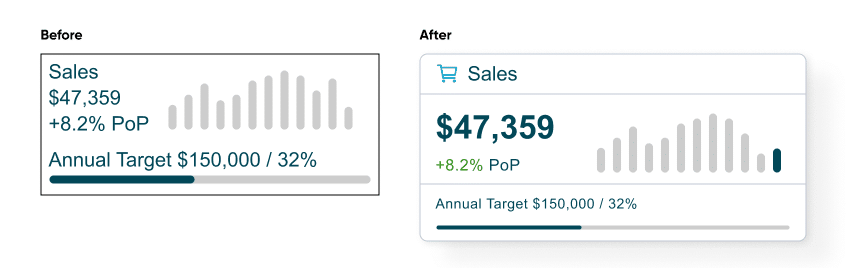
Next let’s talk about closure and figure-ground together. Often containers in dashboards act as closure elements to signal that certain visuals should be grouped together. In some cases, you may want to put a container around every element. In others, you may want to put containers around only some of the elements, resulting in the grouping of the elements that are left out.
![]()
Containers, and the elements within them, can also communicate what is foreground and what is background. Charts and graphs employ figure-ground principles to highlight key data points and relationships. In UX, interface elements are designed to stand out against the background for clarity and usability.
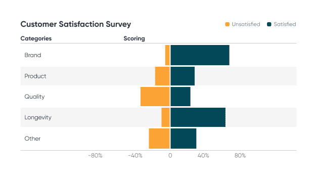
The common fate principle is ideal when you need to visualize metrics or categories that are opposites or that diverge. This could include survey data, profit/loss data, orders and returns, or births and deaths. Additionally, common fate explains why we are particularly adept at highlighting outliers. This is useful when you want to make something stand out, whether it includes an actual outlier or not.
For example, we commonly expect to see bar charts that read from the bottom up. By flipping this on its head, we create an outlier, or something the brain notices. The graphic “Iraq’s bloody toll” by Simon Scarr is an excellent example. Here’s one more example of a horizontal diverging bar chart.
The principle of Pragnanz can be summarized with the following phrase: “Keep it simple!” Our brains prefer when things are simple and orderly, so our dashboards should be too if we want users to enjoy using them. This principle pairs nicely with Edward Tufte’s concept of chart junk, which is anything that is not necessary for a user to understand a visualization. This also includes removing elements that could be considered distractions, such as bold background textures or excessive icons. Whether you’re calling it keeping it simple or eliminating chart junk, you’re following the principle of Pragnanz.
Lastly, we’ll touch on the principle of past experience. I did not provide a visual example of this above, because this is entirely dependent on your end-user. Each person will bring their own perspective and experience when they interpret a dashboard, and it’s up to us as designers to consider these experiences in design. A noteworthy example of this is the save button icon that’s used almost everywhere – the image of a floppy disk. Despite the fact that floppy disks are now considered outdated technology, the image has become so ubiquitous that even a user who has never seen a physical floppy disk will recognize that the icon indicates the action of “saving” a file on an electronic device. Because of this, it doesn’t make sense to use another icon in place of the floppy disk. Sometimes the tried and true are there for a reason.
I hope that as we’ve explored each of these Gestalt principles that you’ve come to see the intersection of aesthetics, user experience, and data visualization best practices. Even if you don’t consider yourself to be a designer, you’ve likely subconsciously been using many, if not all of these principles in your own data visualization practice.
Happy vizzing,
Alyssa

Written By
Alyssa Huff

Peer Review
Jason Penrod
Director, Information Design
Related Content
3 More Ways to Make Charming Crosstabs in Tableau
One of the most challenging aspects of data visualization can be getting stakeholders to buy into using something other than…
3 More Ways to Make Lovely Line Graphs in Tableau
Tableau line graphs are one of the most widely used visualizations on dashboards today – it’s hard to beat a…
Playfair Data Presents: Preattentive Attributes

In the post and video, Why do you visualize data?, I share my exercise for educating stakeholders on the value…