Building Blocks of Dashboards: A Beginner’s Guide to Visual Elements

Lines, shapes, colors, and space are all around us, including in the tools we use every day. On their own they may seem simple, but together they create meaning. In dashboards these simple design elements help organize information, make data clearer, and turn complex details into an easy-to-understand story.
Design elements and design principles aren’t the same thing. Elements—like lines, shapes, colors, and space—are the building blocks, the “what.” Principles, like balance, contrast, and alignment, are the “how”—the rules for using those elements effectively.
Today, we’re focusing on the “what”—the key design elements every dashboard creator should know. If you don’t have a design background, making dashboards that look good and function well can feel challenging. But design is really about solving problems in a clear, simple way. Once you understand these basics, you’ll create dashboards that are both visually appealing and easier to use.
Before we dive in, keep in mind that these design elements often overlap. Many of them work together, and combining them can create a more balanced, effective dashboard. Using multiple elements thoughtfully can improve clarity, enhance user experience, and bring harmony to your design.
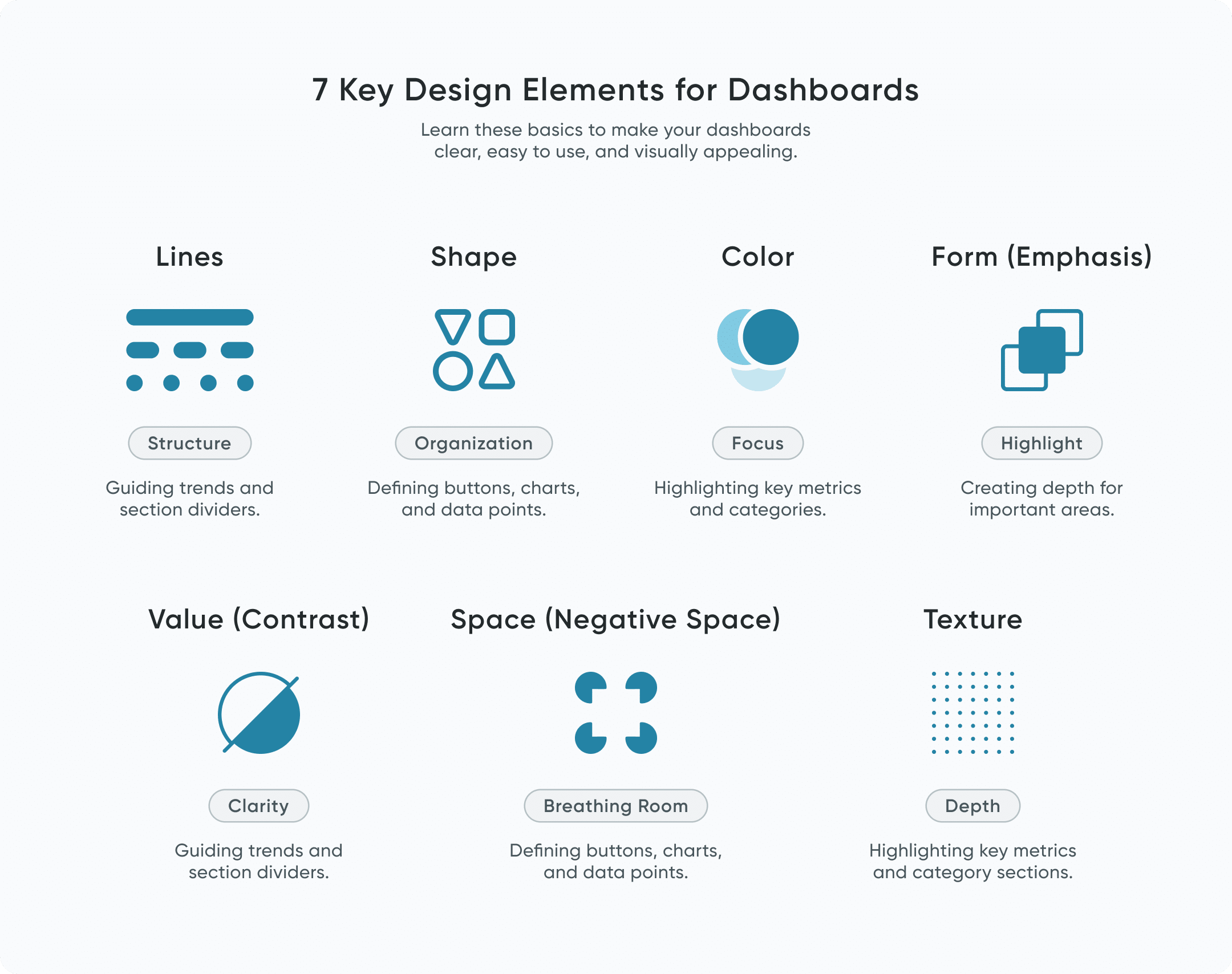
The 7 key elements of design
Lines
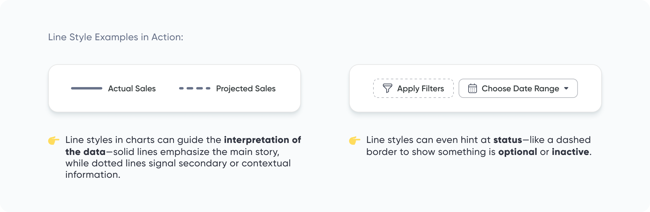
A line is just a connection between two points, but how you use it can say a lot. Our brains love patterns—even when lines aren’t actually there, like when we look up and see constellations in the stars.
Continue reading with a free account, or login.
Unlock this tutorial and hundreds of other free visual analytics resources from our expert team.
Already have an account? Sign In
By continuing, you agree to our Terms of Use and Privacy Policy.
On dashboards, lines aren’t just for line charts (though those matter too!). They show up in lots of ways:
- Dividers that separate different sections
- Gridlines in charts to make data easier to read
- Borders that show where you can click or interact
Even dotted or dashed lines can mean something different—like a softer connection or a hint that something is optional. Used well, lines bring structure to your dashboard and help guide your user’s eyes.
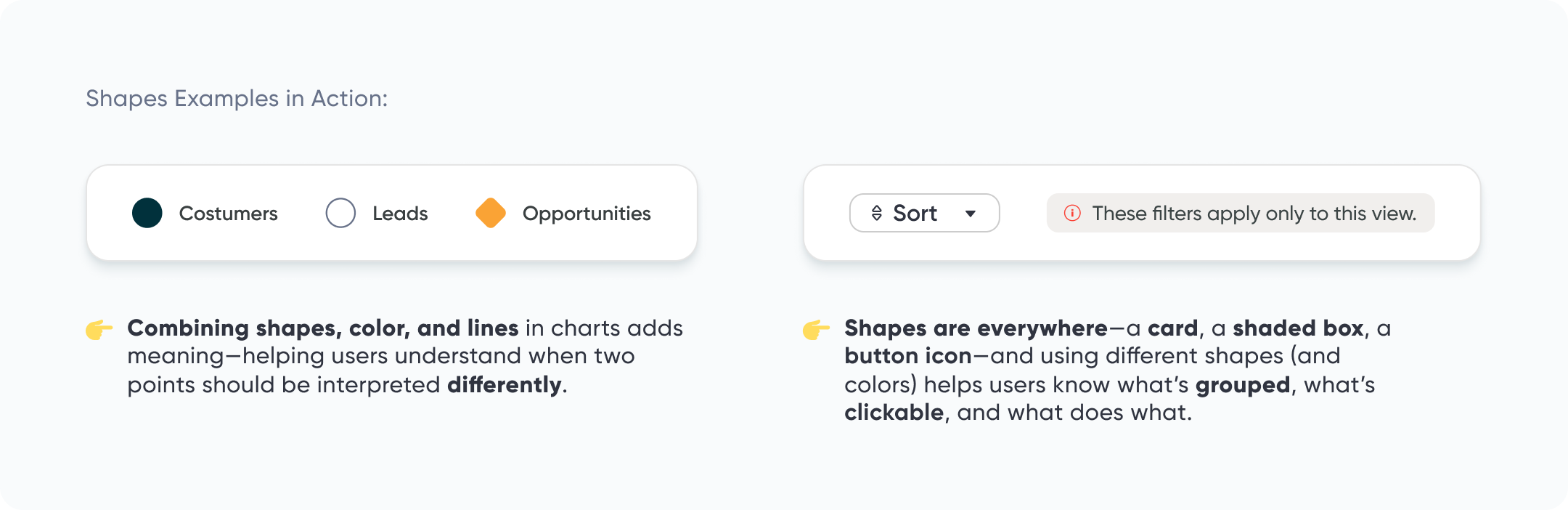
Shape
A shape is any space that has a clear outline—made by lines, color, or contrast. Shapes are all over your dashboard: cards, buttons, icons, and chart points are all shapes.
They help organize things and guide people through your design. For example:
- Cards group related content, like filters or controls
- Icons hint at what you can click
- Different shapes in a chart can show different categories of data
The way we shape our shapes—through size, color, spacing, and style—can tell users:
-
“This is clickable.”
-
“This belongs with that.”
-
“This number needs your attention.”
Our brains are wired to pick up on visual cues, so even small design choices can speak volumes. When shapes are used with care, your dashboard becomes easier to use without needing extra instructions. It just makes sense.
So don’t just drop shapes onto the screen—use them to guide, group, and give meaning. They’re not just there for decoration.
Space (a.k.a White Space or Negative Space)
Space is the area between your content. It’s what gives your dashboard room to breathe. Without it, things can feel crammed, crowded, and confusing.
There are two kinds of space:
- Positive space is the stuff you put on the screen—charts, text, buttons, etc.
- Negative space is the empty area around it
Negative space isn’t necessarily wasted space. It helps users focus on what matters, makes things easier to read, and gives your design a clean, calm feeling.
Here’s a few quick tips:
- Leave space around charts and cards—try at least 16–24 pixels of padding
- Use more space between big sections to help users know when something new starts
- Resist the urge to fill every inch—blank space can be your friend
Color
Color is a great way to guide people’s attention and add personality to your dashboard—but too much of it can be distracting.
I like to start with the idea of “less is more.” I stick to mostly neutral colors (like grays and soft blues), and then add one or two brighter colors for highlights or important details.
Here are a few helpful tips:
-
Use the same color for the same thing across all charts—like green or blue always means an improvement or positive change
-
Pick a consistent color for interactive elements like buttons or filters, so people learn what they can click
-
Keep your color choices simple—save bold colors for what really matters as those will stand out more and catch your user’s attention
Color should support the story, not compete with it.
3 Storytelling with Color Tips to Improve Your Data Visualization
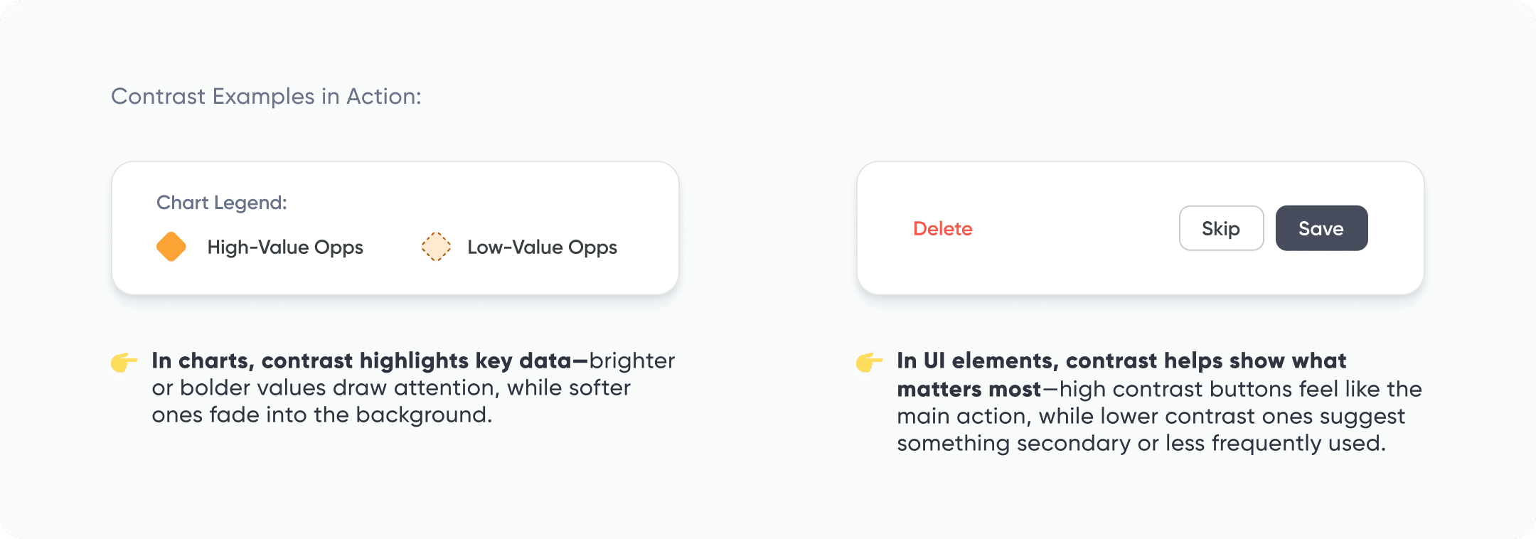
Value (a.k.a. Contrast)
Value is just a fancy word for how light or dark something is. You can think of it like a dimmer switch—turn it up, things get brighter and pop out; turn it down, they fade into the background.
On dashboards, value helps show users what’s important. For example:
-
A bold, dark number can highlight a key metric
-
A lighter shade can make supporting info feel secondary
-
Using a brighter background on one card can make it stand out from the others
This kind of contrast helps create a clear visual path for your users. It tells their eyes where to look first—and what they can skip for now.
There’s also a fun bit of psychology here: the Von Restorff Effect. It says that people are more likely to notice and remember something when it looks different from the things around it. So if everything has the same brightness or tone? Nothing stands out.
Used well, contrast brings clarity. It helps your dashboard feel more organized, easier to scan, and more memorable.
When adjusting contrast, keep accessibility in mind. If you need help with this, check out our guide on Fundamentals of Accessibility Design: Making Your Dashboards a Friendlier Place.
Form (a.k.a. Emphasis or Depth)
Form is what gives your design a little depth—it helps some things pop out, while others stay in the background.
You can do this with small touches like:
-
Shadows under cards or buttons
-
Lighter backgrounds to make a section stand out
-
Contrast between elements so users know what to focus on
For example, a card with a shadow might look more clickable. A key number with a bold background might grab attention first.
Just be careful—too much depth (lots of shadows or pop-outs) can make things feel messy. Keep it subtle and consistent.
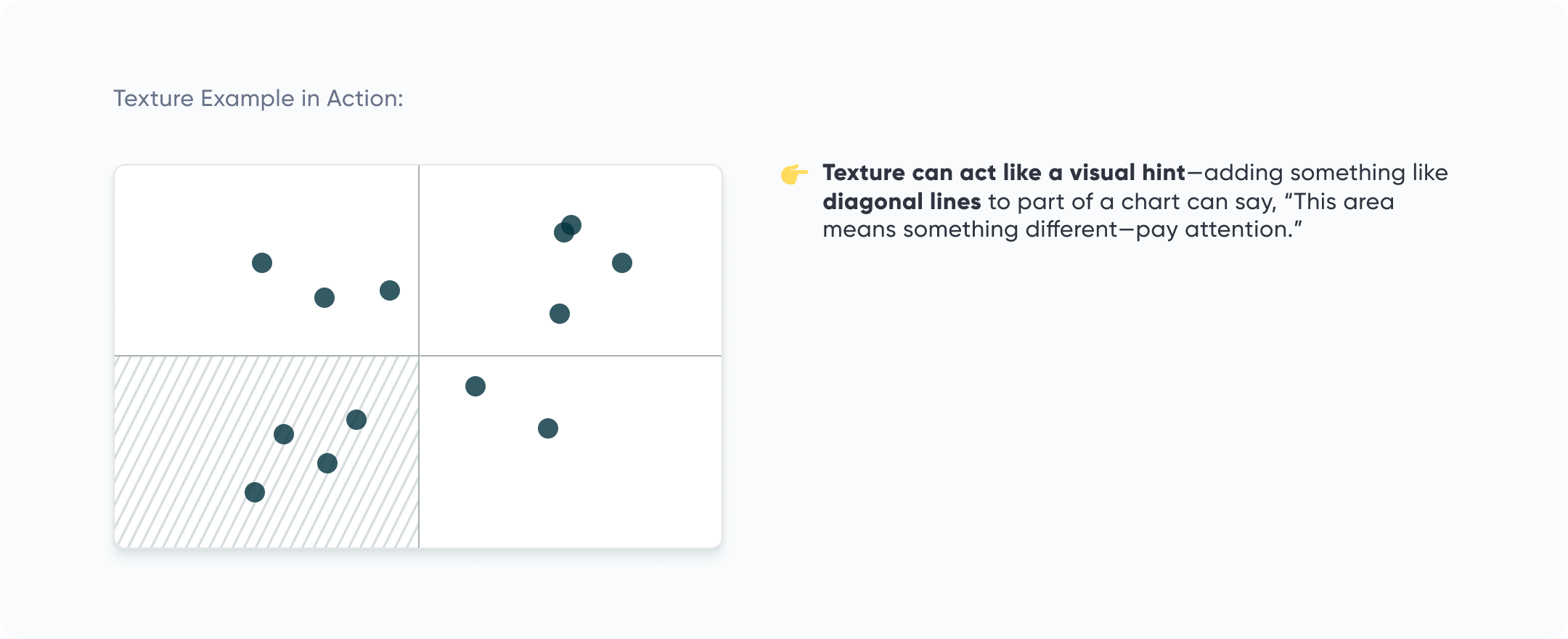
Texture
Texture adds a little feel to your design—even though dashboards live on a screen, texture can still suggest touch. A soft texture might feel calm and welcoming, while a rough one can add energy or edge.
I like to use texture lightly—just enough to bring some interest without making things feel busy. It’s a great way to add personality or tie in your brand’s style without relying on more color or clutter.
Texture can also help guide attention. For example:
- A textured background behind a key number can help it stand out
- A subtle pattern in a chart area can make that section feel more important or distinct
The key is to keep it subtle and intentional. If users notice the texture, it should be because it helped them—not because it distracted them.
Want to learn how to use these design elements so your users actually notice them? Check out our tutorial, Applying Gestalt Principles to Dashboard Design.
Avoiding the middle child syndrome in design
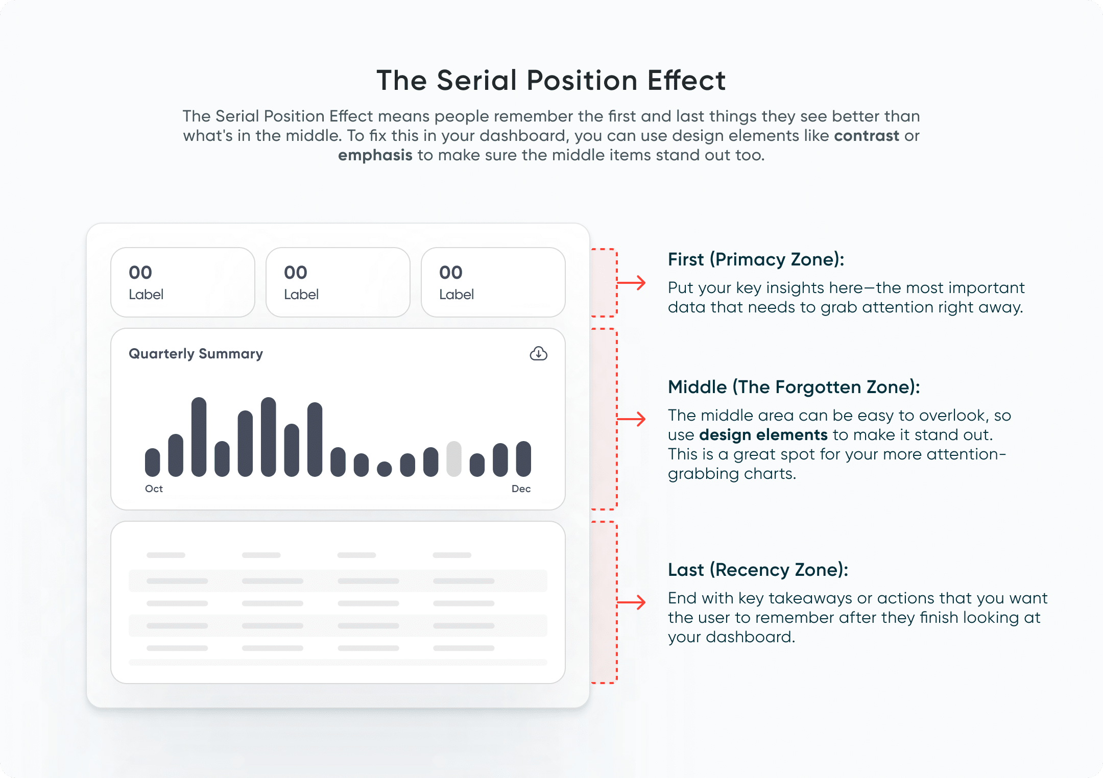
Let’s talk about how these design elements can help you avoid something called the Serial Position Effect. This idea is simple: people tend to remember the first and last things they see better than the stuff in the middle.
This is where design comes in. By using elements like contrast and depth, you can make sure the middle sections don’t get overlooked. For example, adding some contrast or shadow can help the middle parts stand out more, making sure they get noticed. Think of how bolding or highlighting key points makes them easier to spot—this is the same principle you can apply to your dashboard design to keep everything equally visible and engaging.
Design isn’t just about making things look nice—it’s about making them work better. By applying these elements with intention, you can level up your dashboards and make them clearer, more user-friendly, and way more effective. No art degree is needed – just a little attention to detail can make all the difference. So, go ahead, start experimenting with these elements, and watch how much they improve your dashboards!
Go forth and create!
Rafa Simancas

Written By
Rafael Simancas

Peer Review
Alyssa Huff
Assoc. Director, Information Design
Related Content
5 Lessons Learned from Designing Executive Dashboards: the Financial Analysis Swift

Creating a great executive dashboard for finance takes careful attention to design principles and a solid understanding of user needs.…

Ryan Sleeper
Leverage color to improve your designs and help communicate insights Color tips include reducing the saturation of marks, keeping color…
Avoiding Common Pitfalls in Chart Design
Choosing and designing charts is a deceptively challenging aspect of data visualization. It can seem obvious when someone else made…