Dashboards aren’t dead. They’re just explanatory.

The problem isn’t that companies don’t have enough data. There’s never been a time in history when businesses have had more data, and data continues to grow exponentially. The problem is most companies can’t harness data into a clear picture that aligns stakeholders, creates a shared understanding, and directly leads to positive outcomes.
That’s why we’ve collectively spent decades explaining that analytics and data visualization are objectively stronger than data alone. While we’ve made progress, I estimate 80% of people who rely on data to make better, faster decisions are still stuck creating tables in Excel.
But there’s a new battle emerging, even for the 20% who have bought into the world-changing power of visual analytics. I keep coming across the phrase dashboards are dead, and my theory is that of the 20% of companies attempting visual analytics, 80% are stuck creating explanatory dashboards.
This post explains why that is problematic and offers a few ideas on bringing your dashboards back to life.
What are explanatory analytics?
Explanatory analytics are called that because they seek to explain something that happened historically in a business. We have demonstrated on our what is visual analytics page and through our count the 9’s tool that any form of analytics and data visualization is superior to raw data alone, but explanatory analytics come with major pitfalls.
Most notably, because they help explain historical performance without regard for why something happened or what to do about it, insights become stale very quickly and the associated dashboard inevitably ‘dies’. This is the moment that the dashboard dies, the phrase ‘can I download the data in Excel’ is born, and your data fails to deliver a positive return on investment.

Don’t get me wrong, explanatory analytics are a key milestone in business analytics, but they are not the destination in successful programs. At Playfair, we are asked to do this type of analytics and happily do so, typically for an executive snapshot, other forms of disposable analytics (i.e., use them once and purposely don’t look at them again), or non-business cases (e.g., entertainment or marketing infographics).
As one example, here’s an excerpt from our sports infographic, Playoff Mahomes, a project within our PRISM experimental data visualization space.
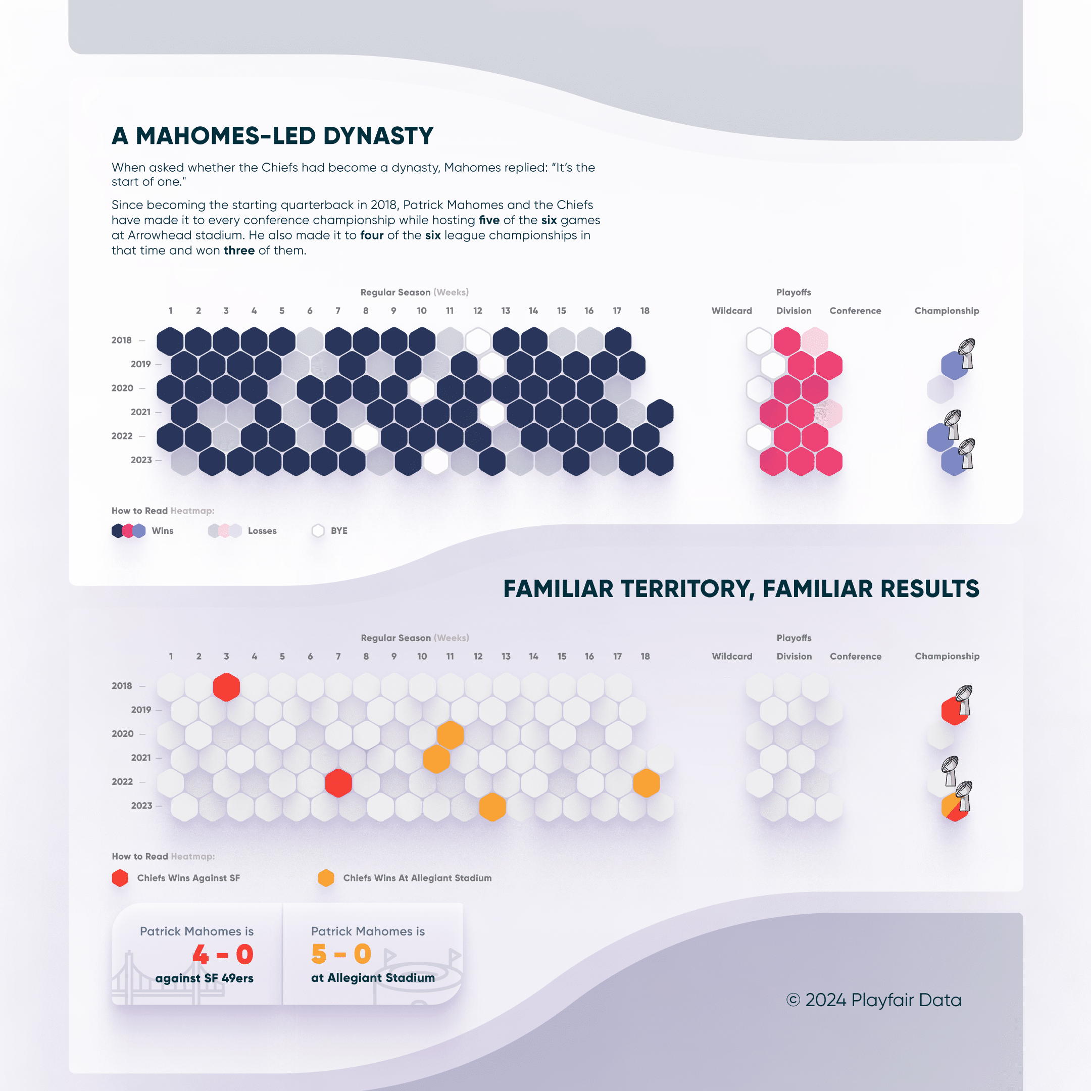
This image was circulated widely leading up to Super Bowl XVII in 2024 and garnered more than one million views within days. There’s no doubt that this fulfilled our aspiration to create analytics people use, but it is a classic case of explanatory analytics for a few reasons:
- It focuses on Patrick Mahomes’ historical performance.
- There are no actions users are prompted to take.
- Viewers likely will not revisit this exact view as new data comes in (e.g., future seasons).
I don’t believe simply sharing a table of this same data would earn more than a million views, so the project was more effective than raw data alone. But what if we wanted to drive future adoption and further scale the impact of these insights by making them actionable? What follows are some tips for doing just that for your business dashboards.
Monitor usage and conduct follow up discovery meetings
If you are publishing interactive dashboards to a server using business intelligence tools like Tableau, Power BI, and Oracle Analytics Cloud, it is likely you can find some usage data that gives you information like which dashboards are the most popular, who is using them, and how often. If you are a Tableau user and Lifetime / Premium member of Playfair+, you can also use this Tableau Cloud Usage Swift:
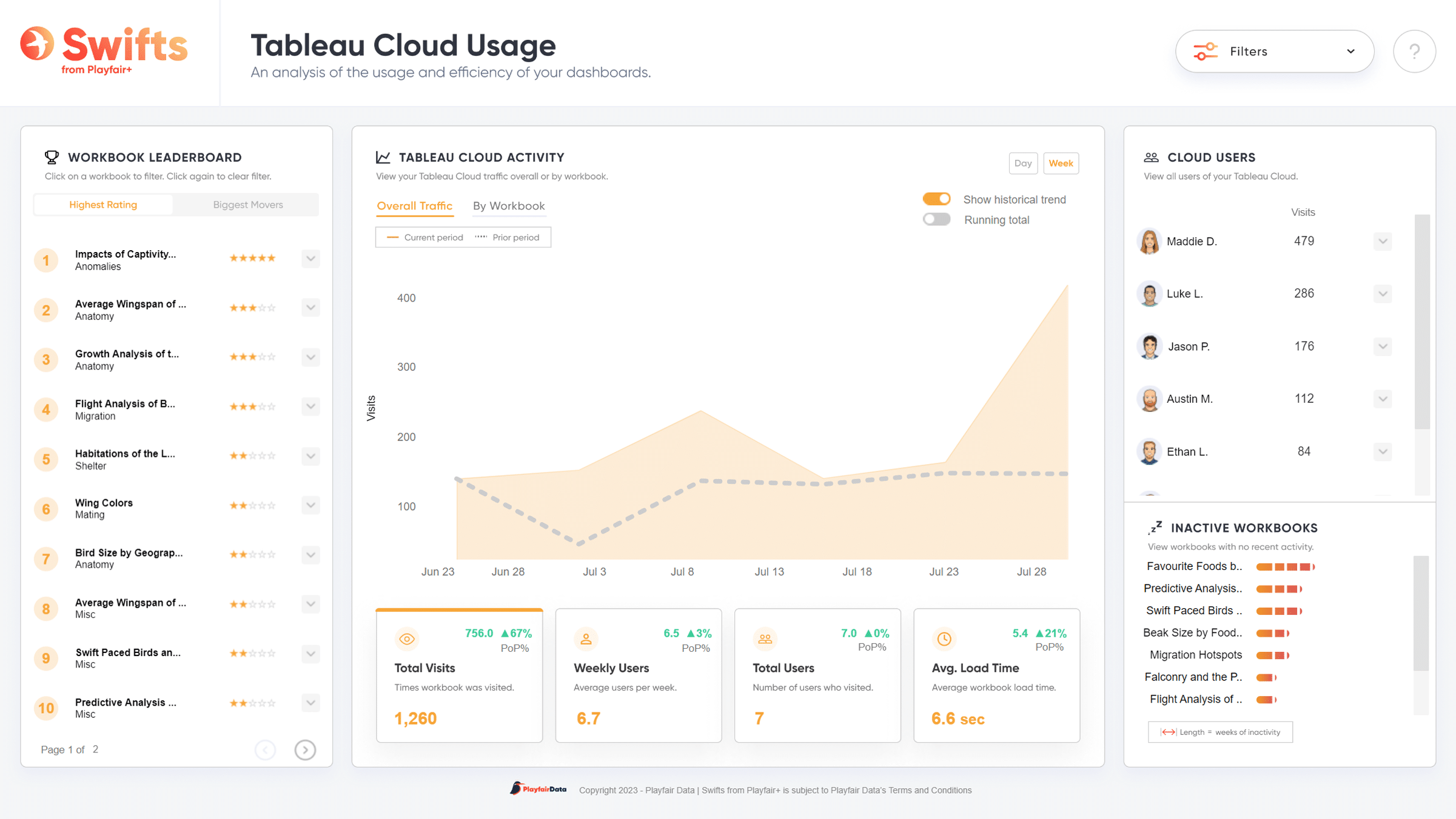
Here are some of the data points I find most actionable and how I use them:
Dashboard popularity. It’s likely that your portfolio of dashboard tools follows the Pareto Principle, meaning that 80% of your total views will come from the top 20% of dashboards. Evaluate why the top 20% are delivering such strong performance. I suspect you’ll find the overindexed performance is a result of views that are 1. better tied to company objectives, 2. improving engagement and authority through thoughtful design and user experience, and/or 3. generating tangible actions. From here you can either replicate the positive features of the top 20% across the rest of your portfolio or decide the longer tail views can be sunset or consolidated into your top quantile.
Continue reading with a free account, or login.
Unlock this tutorial and hundreds of other free visual analytics resources from our expert team.

Already have an account? Sign In
By continuing, you agree to our Terms of Use and Privacy Policy.
User names. Not all dashboard views are created equal. One engagement from the CEO who takes the insight and immediately does something positive for the organization is worth more than the views by an analyst who may need several layers of approval before the insight reaches that same CEO. Understanding who is using the dashboards will help you tailor them to their unique requirements, in turn improving the likelihood they are adopted and acted upon.
User frequency. In addition to the nominal view count, it is even more important to know how frequently the same user is returning to a dashboard. This will help you spot patterns that indicate whether the dashboard is dead or its adoption is driving real business decisions. A few consistent views over days, weeks, or months when the tool is refreshed, followed by a sudden drop to zero repeat visits, is a telltale sign you are using explanatory analytics, and insights have become stale or inactionable.
Aim for actionable analytics
Actionable analytics explain why something happened in a business, naturally creating decision points and resulting actions. In our post, 3 Reasons the Analytics Maturity Framework Is Broken (and What’s Better!), I explain that actionable analytics are the sweet spot between explanatory analytics and (while valuable) more advanced analytics and data science that may be confusing to stakeholders and counterproductive to creating action. If you’re inclined, give that article a read and see a dashboard that evolves from explanatory to actionable.
In the meantime, let’s take a closer look at the Tableau Cloud Usage template referenced above. This dashboard includes explanatory data like historical views, but it also provides tangible opportunities to take action to improve the portfolio. For example, there is an “Inactive workbooks” section in the bottom-right corner that could prompt an admin to determine whether something is wrong with those files, work with stakeholders to improve them, or discover they can save resources by removing those files from the system altogether.
Further, clicking on a low-rated dashboard will not only explain why it was rated poorly across five criteria, but the dashboard itself will also provide specific recommendations to improve performance. Say a dashboard in the report takes longer than average to load on Tableau Cloud, the user will be fed a dynamic link with a resource explaining how to optimize load times.
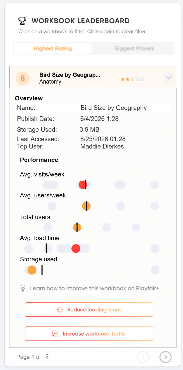
Examples like these are about as clear as you can outline potential actions. If you are implementing strategies like this and the organization still isn’t acting on your data, you may have a larger cultural challenge. That’s a topic for a different post, but if you’re feeling like your dashboards are dead, start your path to culture change by aiming for actionable analytics.
Incorporate both push and pull analytics
Explanatory dashboards are a form of push analytics, proactively pushing insights onto the viewer that they may not have known to ask about. Again, this is a huge improvement over raw data alone and is headed in the right direction, but the problem is the pushed insights stop short of explaining why something happened or what to do about it.
In our post, 3 Ways to Navigate AI’s Push vs. Pull Trade-Off, I recommend adding push analytics along with the pull analytics that have become ubiquitous with the advent of AI chatbots. For explanatory dashboards, I recommend the other way, adding pull analytics to the explanatory, pushed insights. This may seem contradictory, but the key is balancing both, giving the user the flexibility to arrive at better, faster decisions.
Incorporating a chatbot directly on the dashboard is one way to add some pull analytics, but there are several others. Options can include allowing users to 1. experiment with their own scenarios and see projected outcomes, 2. drill up and down through a hierarchy to see insights at various levels of detail, or 3. simply use filters to make the dashboards more relevant to them personally.
The common thread between these techniques for incorporating pull analytics and the larger tips outlined in this post is that they prevent insights from getting stale, drive adoption of your dashboards, and ultimately lead to a better return on investment from your data.
Thanks for reading,
– Ryan
P.S. Playfair recently built a data product for a top five global manufacturer that realized an ROI of over 400 to 1. That means for every $1 the client gave us, they earned over $400. If you would like us to help you find similar opportunities, schedule a complimentary strategy call.

Written By
Ryan Sleeper
Related Content
3 Ways to Navigate AI’s Push vs. Pull Trade-Off
Here’s what nobody is talking about… The maligned AI catchphrase that is a telltale sign that AI slop is forthcoming.…
3 Reasons the Analytics Maturity Framework Is Broken (and What’s Better!)
During our Decision-Ready Data strategy workshops, one focus area is ensuring practitioners and stakeholders align on the type of analytics…
3 Ways to Avoid Data Visualization Desire Paths
Desire paths are unplanned trails that form when users circumvent the carefully constructed paths before them in favor of routes…