3 Ways to Navigate AI’s Push vs. Pull Trade-Off

Here’s what nobody is talking about…
The maligned AI catchphrase that is a telltale sign that AI slop is forthcoming.
But seriously, I wrote this, and here’s what nobody is talking about: AI integrations are mostly a type of pull, requiring the user to initiate an interaction, instead of push, proactively delivering value on the user’s behalf. This post discusses the AI push vs. pull trade-off, why it’s a challenge within the analytics and data visualization space, and offers three solutions for improving your analytics’ AI integrations.
If you are looking for experts to incorporate AI into your analytics projects with proven solutions and measurable ROI, schedule a complimentary strategy call with our team.
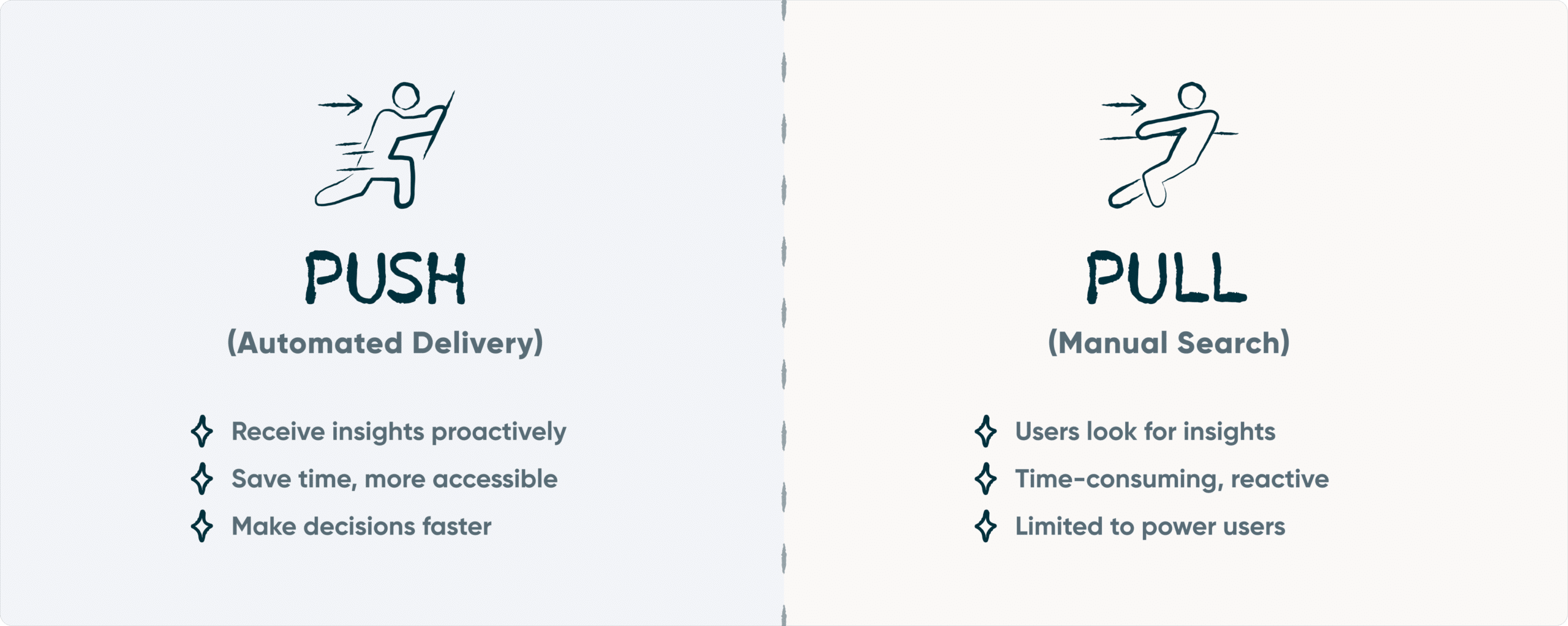
What is the artificial intelligence push vs. pull trade-off?
The most common type of analytics AI integration I’ve seen, and we receive requests for, are interactive agents / chatbots that can find, consolidate, and analyze data. In this scenario, the user may ask something like, “Which five regions generated the most profit last quarter?” The problem with this type of analytics is multifold:
- To result in a positive impact, the individual user has to know which key metrics are tied to business outcomes and how they connect holistically. In other words, they have to know the strategic question to ask, not to mention be in a position to activate the insight in a meaningful way.
- By default, the answer is only seen by the person asking the question. The challenge with data has never been that your company doesn’t have enough of it. It’s that they likely don’t have a shared view to drive understanding and reduce time to insight.
- If the user, much less any human, wasn’t in the loop, the user is often trusting a result without due diligence. As models are constantly improving and studies about their efficacy are constantly being updated, I won’t link to individual studies. However (and I encourage you to do this search yourself), a quick search of “how accurate are the best AI models today” at the time of this writing reveals that the best AI models are correct 53 – 70% of the time. This drops to 10 – 50% when it comes to logic and math problems.
So how do we strike the right balance between push and pull insights?
Complement agentic AI and chatbot functionality with data visualization
I’ve always believed that data visualization is data’s Rosetta Stone, the key that translates exponentially growing and complex data into something useful. Data visualization works so well because it taps into the same traits that have helped humans survive from the beginning (preattentive attributes), can transform an infinite number of records into a readable format, and has the ability to align large and broad audiences with a holistic understanding. I still believe data visualization is a more powerful translator than AI alone because the user can see and make sense of the data themselves without having to rely on models that are (currently) 10 – 70% correct.

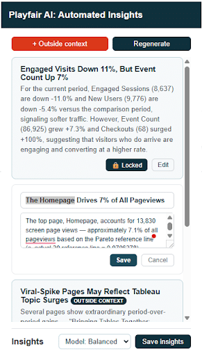
So why not use both data visualization and AI together? In one of our custom analytics and data visualization solutions for our clients, we integrate the best of what AI has to offer with the best of what data visualization has to offer. In this scenario, our team has strategically curated the data visualizations that will align stakeholders with a shared understanding of the data and create the best chance of creating analytics people can act upon (i.e. push analytics). The automatically generated AI insights also push a starting point onto the viewer, but they can then regenerate and/or ask additional questions to pull out additional insights that are relevant to them.
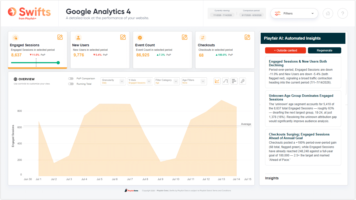
At a minimum, I recommend using data visualization along with AI as a form of checks and balances, or quality assurance, on the AI. It is objective that data visualization reduces the time to insight and increases the accuracy of insights, so just like we should leverage the benefits of data visualization when dealing with raw data, we should leverage data visualization when dealing with AI.
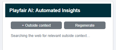
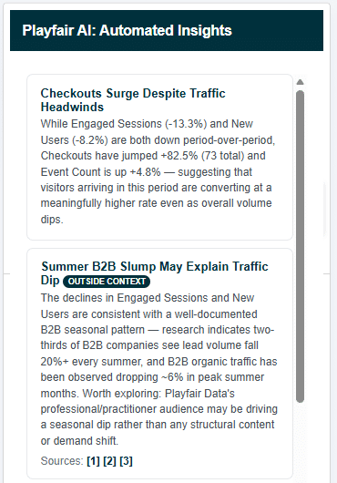
Unlock this tutorial and hundreds of other free visual analytics resources from our expert team. Already have an account? Sign In By continuing, you agree to our Terms of Use and Privacy Policy. AI is too much of a black box to replace data visualization as data’s de facto translator. But what AI is remarkably efficient and effective at is surfacing causes that are affecting your company’s performance. What makes this ability even more remarkable is that, because AI is not necessarily confined to your environment, the causes it finds can even exist outside of the data you are working with. Due to this, another solution Playfair builds for its clients is an option to add “outside context” to the visual analytics tool at hand. You don’t know what you don’t know. Since the user would typically have no idea to ask about a seasonal slump impacting two-thirds of B2B companies and pull the insight into the view, the AI is set up to scour the web for potential context and push it onto the user. Of course, the outside insights may or may not be relevant to the analysis, so we will wrap up by providing some user experience tips to optimize the balance between push and pull analytics. We’ve previously shared How Nielsen’s Usability Heuristics Apply to Visual Analytics, and because AI integrations should also consider user experience / user interface design, several usability heuristics also apply here.
My hope is these tips lead to a dream team of data visualization and AI, where the whole of potential impact is greater than its parts. You should now be closer to harnessing the value of this emerging technology while gaining value from both push and pull analytics. If you are still looking for an expert team to get you up and running, let us know how we can help. Thanks for reading,Continue reading with a free account, or login.
Intuitively push outside context into the data visualization
Leverage usability heuristics to keep humans in the loop
– Ryan


Written By
Ryan Sleeper
Related Content
Visualizing Novel Use Cases with Claude Sonnet 4.6
Like so many others, I have been intrigued by the capabilities of advancements in AI and its potential to make…
How to Enable Tableau Pulse and Ensure a Successful Launch

Tableau Pulse has created a lot of buzz within the Tableau community. Tableau developers around the world are celebrating because…
Data democratization is dead. Long live data democratization.
This year, I had the opportunity to attend my first Gartner Data & Analytics Summit, one of the leading community…