Exploring the History of Data Visualization

If you’re reading this post, it’s highly likely that you either have some familiarity with or are interested in data visualization. Today we’ll explore some of the fascinating history of data visualization. But before we get to that, let’s define what we mean by data visualization. Sometimes referred to as information visualization, data visualization is the practice of designing and/or creating visual representations of data, including quantitative and qualitative data. The end goal is to make complex data, relationships, and/or concepts faster to understand and easier to communicate.
Data visualization’s foundations
When we think about the data visualization’s history, I think it’s important to to consider the following:
- Data visualization has a very long history, which goes beyond the modern applications that primarily utilize digital mediums for dissemination.
- Data visualization has roots in several areas including, but not limited to, mathematics, computer science, design, and psychology. Throughout this post, I’ll touch briefly on each.
Continue reading with a free account, or login.
Unlock this tutorial and hundreds of other free visual analytics resources from our expert team.
Already have an account? Sign In
By continuing, you agree to our Terms of Use and Privacy Policy.
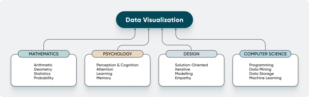
Mathematics
Data visualization is not possible without simple arithmetic. If you have a table with one million rows of data, it’s not practical to display every single row of data for your audience to interpret. We use aggregations such as sum, average, median, count, or range, to summarize data and make it both easier to understand and easier to visualize. We can use ever-more complex arithmetic to create calculations and further derive meaning from data.
![]()
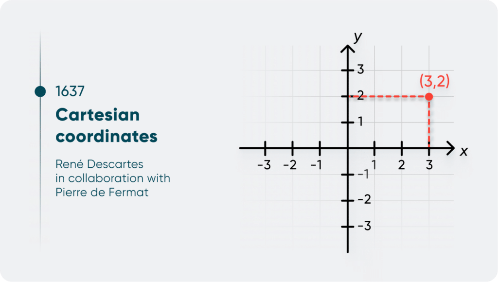
Additionally, common data visualizations we see today, such as scatter plots, line graphs, or geographic maps would not be possible without innovations in the fields of statistics and geometry. The Alexandrian mathematician Ptolemy created the map projection of Earth into latitude and longitude coordinates between 85 B.C. and 165 B.C. Around the mid-17th century, René Descartes, in collaboration with Pierre de Fermat, conceived of Cartesian coordinates (the concept of x- and y-axes), and the concept of using x to represent an unknown number.
Psychology
Data visualization best practices rely on a comprehensive understanding of human visual processing. This includes understanding how attention, memory, and learning all play a role in how a viewer perceives and interprets a data visualization. The Gestalt theory of psychology was introduced in 1890, and it underpins the Gestalt principles, which seek to explain how humans perceive patterns and understand complex images or visuals. Psychology helps explain why data visualization is important, as studies have shown that people use about 20% less cognitive resources and were 4.5% better able to recall details with data visualization than with text. (source)
Applying Gestalt Principles to Dashboard Design
Design
I will admit that “design” is an extremely broad term. For the purposes of this post, we’ll focus on design defined as the intentional creation of something; in our case, we’re talking about the creation of a data visualization. Design thinking, or the ways in which designers think about the process of designing and solving problems, first emerged in the 1950s and 1960s. Design thinking incorporates solution-focused thinking, inspiration through observations, modeling or prototyping, and empathy for end users. We often use design thinking in the creation of data visualizations, whether we realize it or not. As an information designer at Playfair, I am constantly asking questions that are user-focused. What questions is the user trying to answer with this tool? What are some pain points in their current tool that we can alleviate through design? Based on the user’s feedback, what changes can I make to a data visualization design so that it best fits their needs?
Computer science
Computers and computer science propelled data analysis and visualization forward, since the limits of human computing power and storage capacity were eliminated. With data mining and machine learning, statisticians, scientists, and mathematicians could quickly find patterns, generate statistical analyses, or visualize data using computers and computer software. The first software generated for data analysis was centered around statistical analysis, such as SAS, which was released in 1972. Later, both software and programming languages were developed for use outside of strictly statistical analysis. Microsoft Excel was first released in 1985, followed by R and Python in 1991 and 1993, respectively. Tableau Software was founded in 2003, while Power BI was first introduced as part of Office 365 in 2013.
Key Events: A timeline of the history of data visualization
While this isn’t a comprehensive overview of the history of data visualization, I pulled together some of the key events throughout history. You’ll notice that the first human use of data visualization is extremely old, and that many advancements in several of the foundational fields occurred in the 17th, 18th, and 19th centuries.
Distant Past
- 17,000 – 12,000 years ago – Lascaux Cave Paintings in France include depictions of animals, human figures, and symbols
- 5500 B.C. – Mesopotamian clay tokens, which were likely the earliest method of record-keeping
- 2700 B.C. – Incan quipus are used for record-keeping by tying knots into varying lengths of string

- 1160 B.C. – Turin Papyrus Map accurately displays the geographic distribution of resources
- c. 85 – c. 165 B.C. – Ptolomy creates a map projection of a spherical Earth into latitude and longitude
17th Century
- 1637 – Cartesian coordinates (concept of x- and y-axes), René Descartes’s La Géométrie in collaboration with with Pierre de Fermat
- 1654 – invention of probability theory, Blaise Pascal and Pierre de Fermat
- 1662 – invention of demography/first use of descriptive statistics, John Graunt, Natural and Political Observations Made upon the Bills of Mortality
18th Century
- 1765 – Priestley timeline, Joseph Priestley
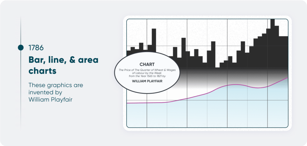
- 1786 – Bar charts, area charts, and line charts are invented and appear in William Playfair’s The Commercial and Political Atlas
- Playfair was directly inspired by Priestley’s timeline to create bar charts
19th Century
- 1801 – Pie charts are invented and appear in William Playfair’s Statistical Breviary
- 1858 – Nightingale Rose chart is invented and appeared in Florence Nightingale’s Notes on Matters Affecting the Health, Efficiency, and Hospital Administration of the British Army
- “According to the historian Hugh Small, ‘she may have been the first to use [pie charts] for persuading people of the need for change.’” (source).
![]()
- 1869 – Charles Joseph Minard publishes a graphic of Napoleon’s invasion of Russia
- 1890 – Christian von Ehrenfels introduces the concept of Gestalt psychology, the foundation upon which Gestalt principles are built
20th Century – Present
- 1950s – 1960s – emergence of design thinking
- 1970s – Dieter Rams introduces his “Ten Principles of Good design”, which has had significant influence on product and UX/UI design

- 1972 – SAS (Statistical Analysis System), a software for advanced analytics and statistical analysis is first released
- 1983 – The Visual Display of Quantitative Information by Edward Tufte is published and helps redefine data visualization as more than just for statisticians
- 1985 – First version of Microsoft Excel is released
- 1991 – Python programming language, used for data analysis, data mining, and machine learning, is released
- 1993 – R programming language, used for statistical analysis and the creation of data visualizations, is released
- 1997 – Alteryx founded, a company that creates computer software used for advanced data science and analytics
- 2003 – Tableau Software is founded
- 2013 – Power BI for Office 365 becomes publicly available
- 2021 – Open AI releases DALL-E, which is capable of producing accurate captions for images
I hope you enjoyed this overview of the history of data visualization.
Happy vizzing,
Alyssa
Sources:
The History of Data Visualizations – From Cave Drawings to Tableau
The Cave Painters
Untangling an Accounting Tool and an Ancient Incan Mystery
Milestones in the History of Thematic Cartography, Statistical Graphics, and Data Visualization
Interaction Design Foundation – Dieter Rams

Written By
Alyssa Huff

Peer Review
Jason Penrod
Director, Information Design
Related Content
Applying Gestalt Principles to Dashboard Design
Have you ever heard the Gestalt Principles referenced when people are talking about data visualization or design? The Gestalt Principles…

Ryan Sleeper
Undeniable links between graphs and old-school storytelling This video discusses the three elements found within every story and how those…
Why Dashboard UX is Important

Dashboards are valuable tools that allow us to visualize and analyze the most important data at a glance. The effectiveness…