Find Hidden Insights in Tableau Line Graphs by Adding a Slope Graph Toggle
I just returned from a week-long visit to London for Tableau Conference Europe and, as usual following a TC, have come away re-energized by the Tableau community and the company’s dedication to making the best data visualization software possible. I attended several valuable sessions including Andy Cotgreave’s, New Ways to Visualize Time. I was looking forward to hearing his perspective on why line graphs can hide insights, and he did not disappoint. One of the alternatives discussed was slope graphs, and Andy shared a formula to dynamically keep only the earliest and latest dates on the chart. The talk inspired me to add a twist made possible by Tableau’s flexibility. This post will show you how to make slope graphs in Tableau, how to allow the slope graphs to update when a new date range is selected, and how to add a toggle that allows your end users to choose between a line graph or a dynamic slope graph.
Two Ways to Make Dynamic Slope Graphs in Tableau
How to make slope graphs in Tableau
First, I’ll explain what a slope graph is and show you a manual way to create them. A slope graph is a line graph that connects dimension members across just two points. To illustrate, consider the following line graph looking at profit ratio by region in the Sample – Superstore dataset (filtered to 2018).
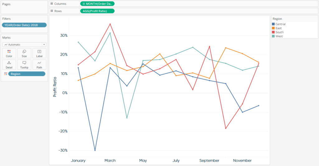
While line graphs are my second favorite chart (after bar chart) because of their strengths in analyzing trends over time, there are certain insights that are challenging to determine with this chart alone. For example, we’ve got some ‘spaghetti-ing’ going on from about May to September, making it hard to analyze the trends of individual dimension members during that period. It’s also tricky to analyze the overall growth or decline of each dimension member at a glance, especially with the South region which appears to finish the year in the same place it started.
Continue reading with a free account, or login.
Unlock this tutorial and hundreds of other free visual analytics resources from our expert team.
Already have an account? Sign In
By continuing, you agree to our Terms of Use and Privacy Policy.
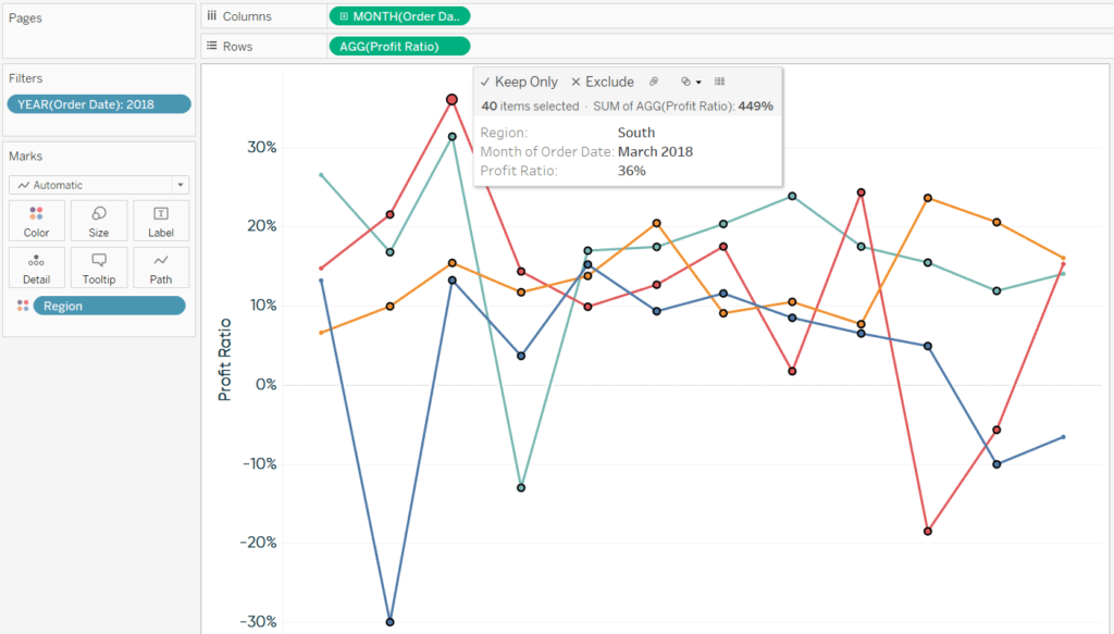
For the latter insight, slope graphs would reduce the time to insight and increase the accuracy of insight by focusing the analysis on just the first and last data points. To create a slope graph manually, simply draw a box around the points between the start and end of the date range, hover over the marks, and click “Exclude”.
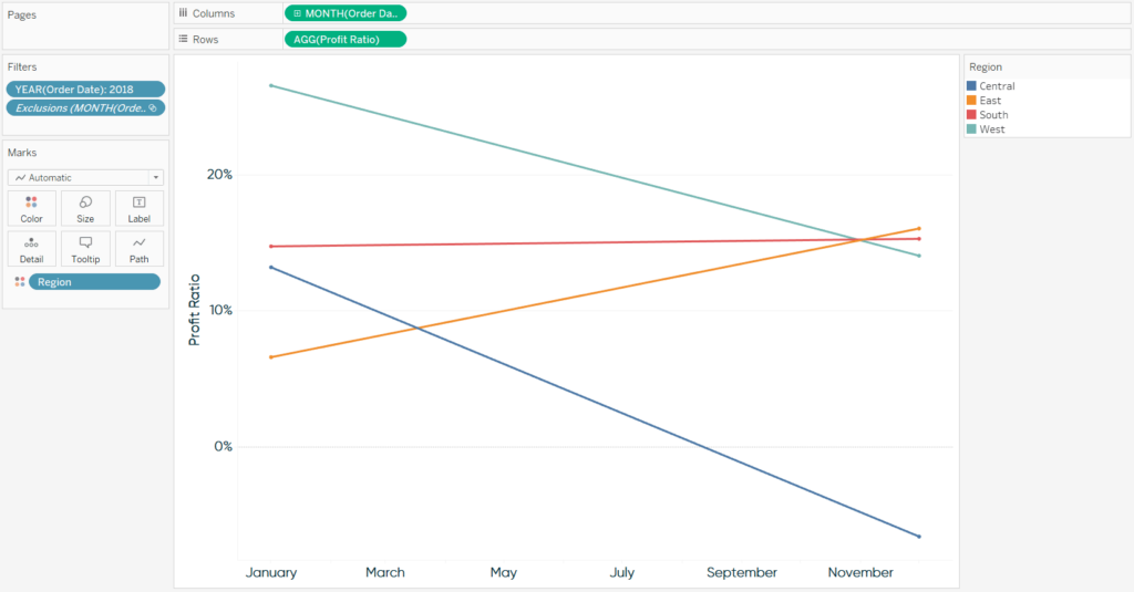
After filtering out the marks between the start and end of the range, we are left with a slope graph showing how profit ratio has changed from January to December.
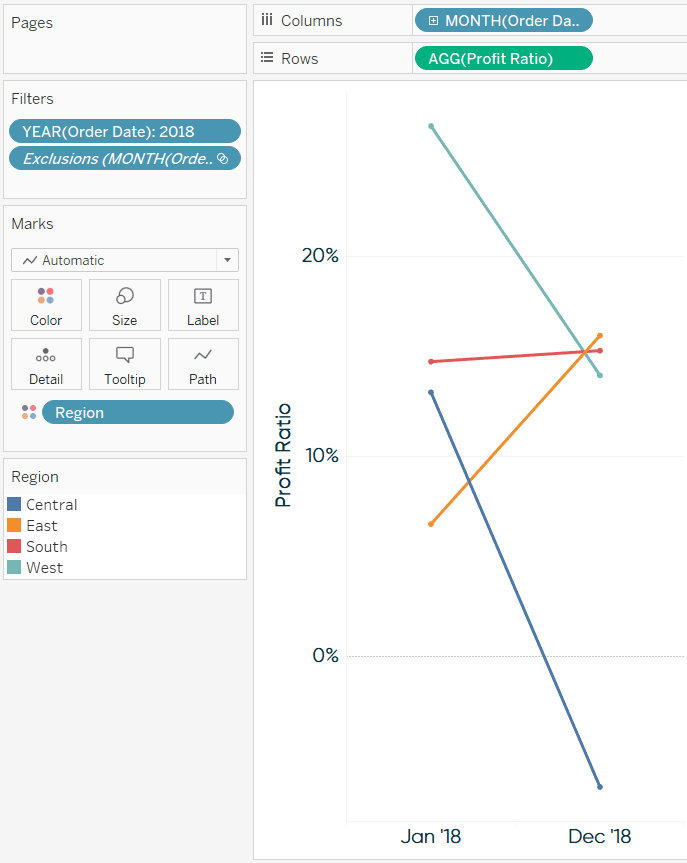
I prefer to create line graphs with continuous date fields, but with slope graphs, this leaves too many labels on the continuous axis. Here’s how my final slope graph looks if I change the MONTH(Order Date) field to discrete.
How to make slope graphs dynamic based on a date range filter
Slope graphs work great for showing how a dimension member has changed between two points in time, but they would be even better if they were tied to a date range filter. In other words, I would like for the first point and last point to automatically update based on the selection in a date range filter. This is the trick that I picked up during Andy’s talk at TCE. To illustrate, I’m going to take a step back and clear the filters I applied in the first section of this post.
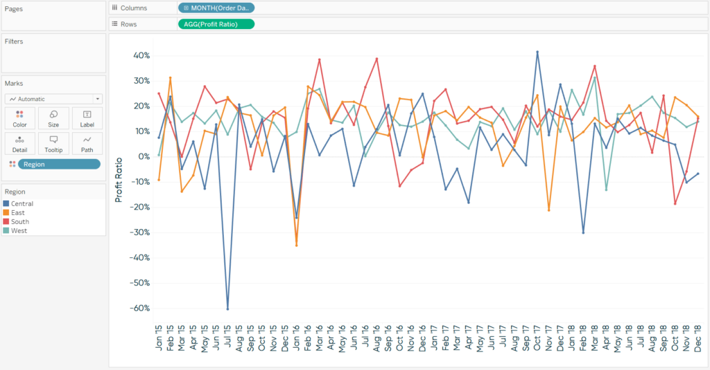
As you can see, now this is really a spaghetti graph because I removed the date filter and am now showing all 48 months in the dataset. To convert this to a slope graph this time, I’m going to set up this simple Boolean calculated field that keeps just the first and last points on the line graph:
FIRST() = 0 OR LAST() = 0
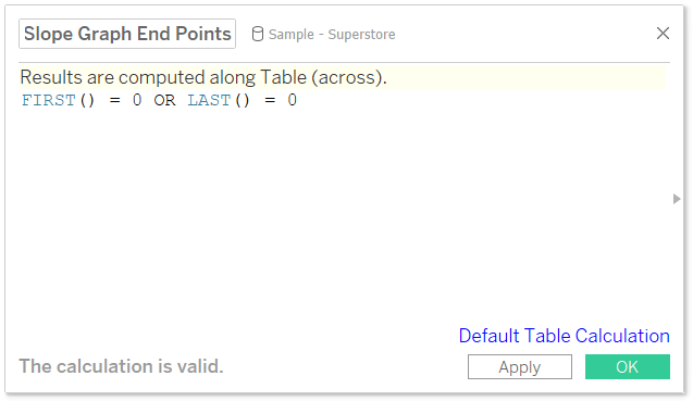
Because FIRST() and LAST() compute the difference between the current row and first or last row, respectively, a difference of zero means the row is either first or last. FIRST() and LAST() are table calculations, so by default, they are computed left to right. After adding this new calculated field to the Filters Shelf, I am back to a slope graph, this time comparing the first month in the entire dataset to the last month in the entire dataset.
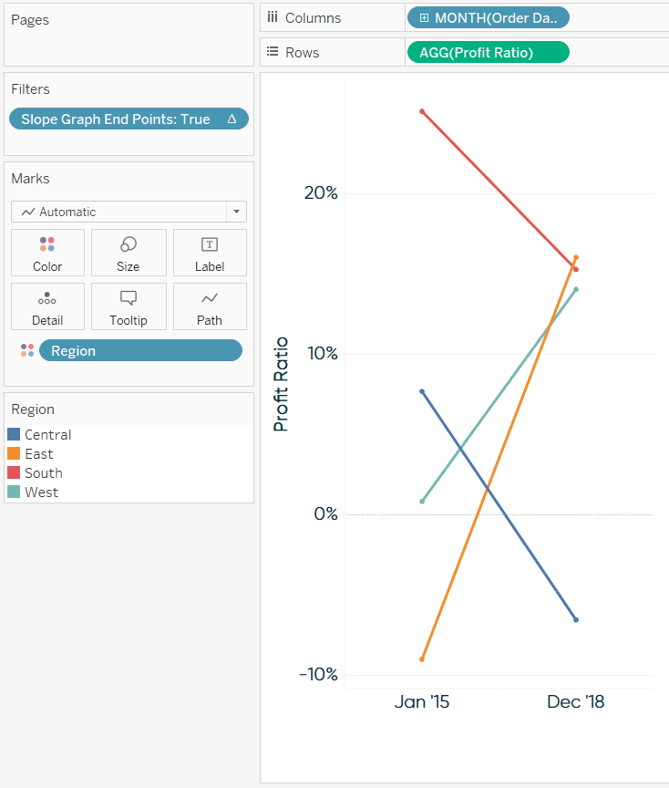
What’s best about this approach is that it keeps the first month and last month, even when there is a custom date range selected in a filter. Here’s how the view looks after adding a continuous date filter and choosing 4/1/2016 to 6/30/2018.
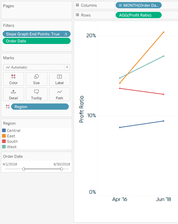
The user now has direct access to comparing the growth or decline during any date range!
How to add a toggle to a line graph in Tableau
There are times when a line graph is better for visualizing an entire trend, and others when a slope graph would be preferred to just see the overall change. Why not provide access to both options? To toggle between a line graph and a slope graph, start by setting up a parameter with a data type of String. The allowable values will be ‘Line Graph’ and ‘Slope Graph’.
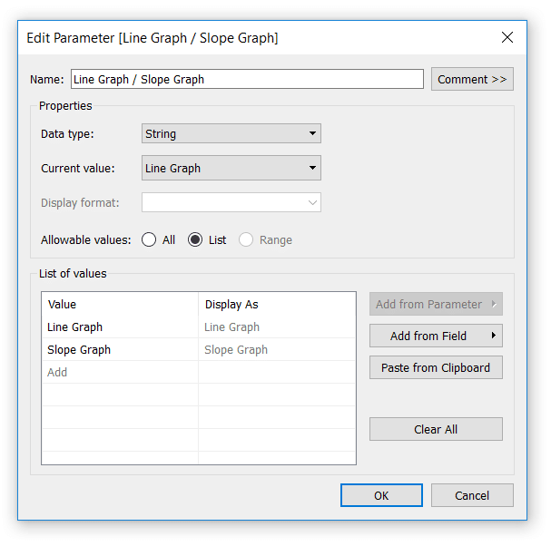
Next, set up a calculated field that gives Tableau instructions for what to do when each of the allowable values is selected. There are a few ways to write this formula, but here’s one approach:
CASE [Line Graph / Slope Graph]
WHEN “Line Graph” THEN NOT ISNULL([Number of Records])
WHEN “Slope Graph” THEN FIRST() = 0 OR LAST() = 0
END
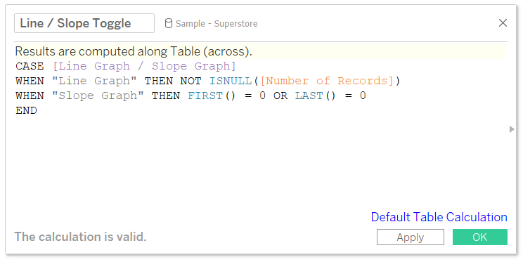
This is another Boolean formula, so we need the result to be ‘True’ for the values we want to remain on the view. When “Line Graph” is selected, we’re saying keep the value on the view if the record is not null (i.e. everything; so all of the marks on the line graph). When “Slope Graph” is selected, we are keeping only the first and last data points as described in the second section of this post.
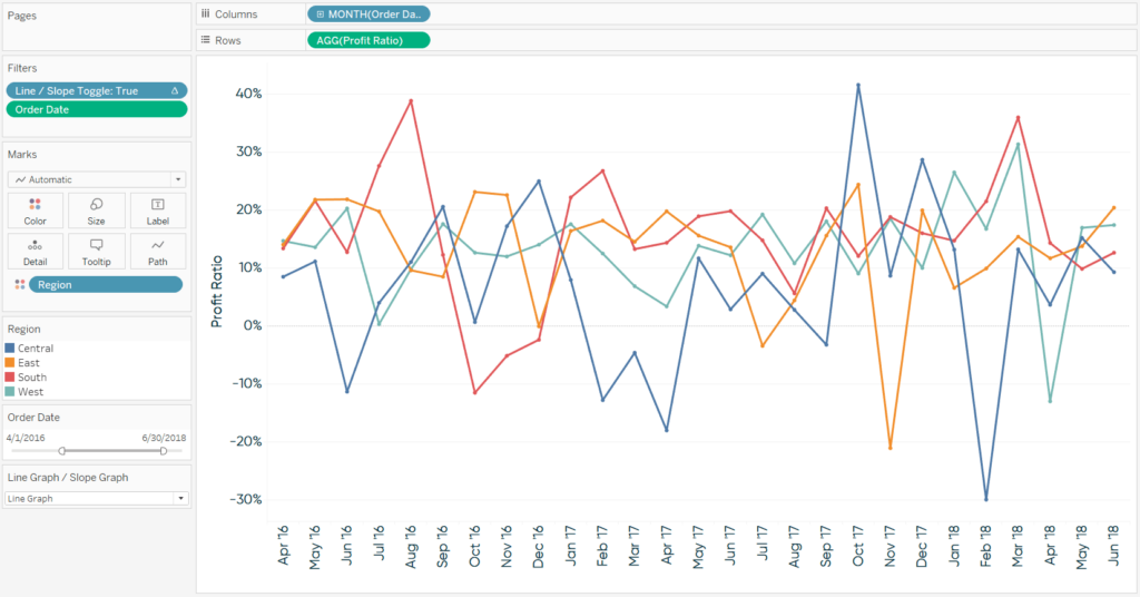
For this last example, I will now replace the “Slope Graph End Points” filter with the newly created calculated field. I also need to show the parameter control by right-clicking on the “Line Graph / Slope Graph” parameter and choosing “Show Parameter Control”. Now when “Line Graph” is selected, we see profit ratio by region by month as a line graph:
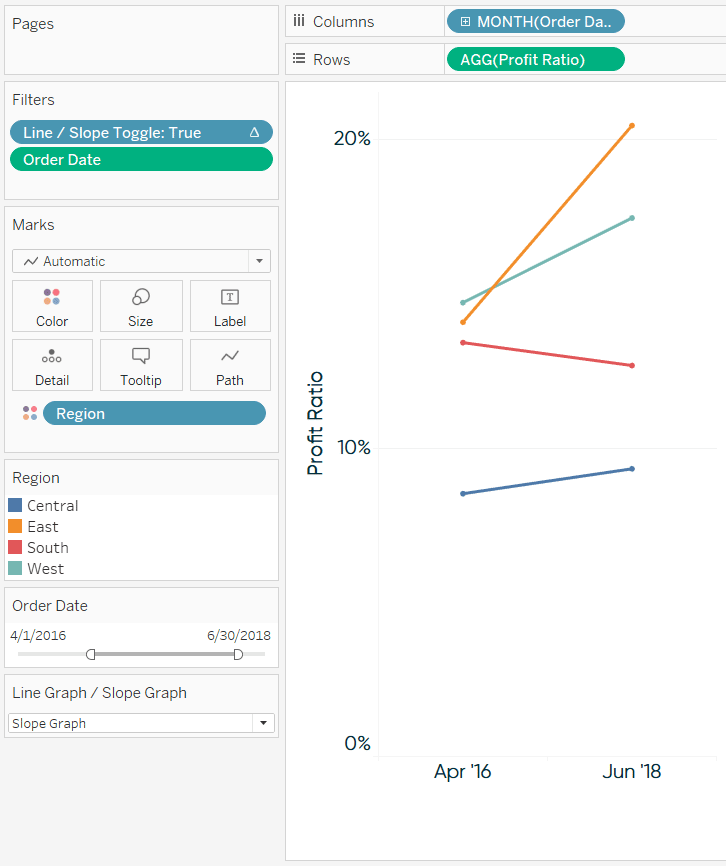
When “Slope Graph” is selected, we see profit ratio by region as a period over period slope graph:
Thanks for reading,
– Ryan
Related Content
Ryan Sleeper
Reveal hidden insights in line graphs by using slope graphs Learn the benefit of slope graphs, a simple formula for…
3 Ways to Make Splendid Slope Graphs in Tableau
I always say that one specific chart type per analytics scenario will help you capture roughly half the insight. Comparing…
Ryan Sleeper
Improve the design of slope graphs by connecting marks Slope graphs are an engaging and effective alternative for visualizing time.…
