3 Ways to Make Splendid Slope Graphs in Tableau
I always say that one specific chart type per analytics scenario will help you capture roughly half the insight. Comparing categorical data? I always start with a bar chart. Want to analyze many data points at the same time and look for correlations? Scatter plot is your best bet. Trending something over time? A line graph will certainly help. This is not to say that you should only ever use these three charts. Alternatives often help add context to your analysis and reveal new insights. Slope graphs, which keep only the first and last marks on a line graph, are one of my favorite alternatives for visualizing time. This post will show you how to make slope graphs in Tableau and provide three tricks to improve their formatting and user experience.
Two Ways to Make Dynamic Slope Graphs in Tableau
How to make slope graphs in Tableau
First, I’ll explain what a slope graph is and show you a manual way to create them. A slope graph is a line graph that connects dimension members across just two points. To illustrate, consider the following line graph looking at Profit Ratio by Region in the Sample – Superstore dataset (filtered to 2018).
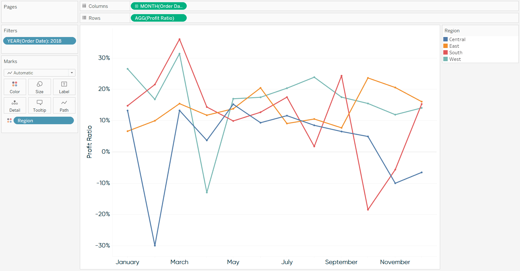
While line graphs are my second favorite chart (after bar chart) because of their strengths in analyzing trends over time, there are certain insights that are challenging to determine with this chart alone. For example, we’ve got some ‘spaghetti-ing’ going on from about May to September, making it hard to analyze the trends of individual dimension members during that period. It’s also tricky to analyze the overall growth or decline of each dimension member at a glance, especially with the South region which appears to finish the year in the same place it started.
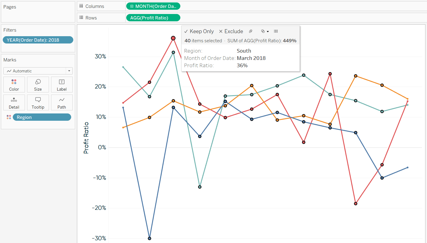
For the latter insight, slope graphs would reduce the time to insight and increase the accuracy of insight by focusing the analysis on just the first and last data points. To create a slope graph manually, simply draw a box around the points between the start and end of the date range, hover over the marks, and click “Exclude”.
Continue reading with a free account, or login.
Unlock this tutorial and hundreds of other free visual analytics resources from our expert team.
Already have an account? Sign In
By continuing, you agree to our Terms of Use and Privacy Policy.
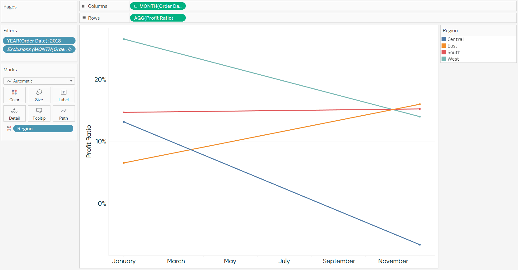
After filtering out the marks between the start and end of the range, we are left with a slope graph showing how Profit Ratio has changed from January to December.
I prefer to create line graphs with continuous date fields, but with slope graphs, this leaves too many labels on the continuous axis. There are two formatting options to reduce the amount of redundant data ink the extra months are creating. You could fix the tick marks, which we will talk about in tip 3 below, or you can change the Month of Order Date dimension from continuous to discrete. Here’s how my slope graph looks if I change the MONTH(Order Date) field to discrete.

How to make slope graphs dynamic based on a date range filter
Slope graphs work great for showing how a dimension member has changed between two points in time, but they would be even better if they were tied to a date range filter. In other words, I would like for the first point and last point to automatically update based on the selection in a date range filter. I picked this trick up from a talk by Andy Cotgreave about visualizing time at Tableau Conference Europe. To illustrate, I’m going to take a step back and clear the filters I applied in the first section of this post.
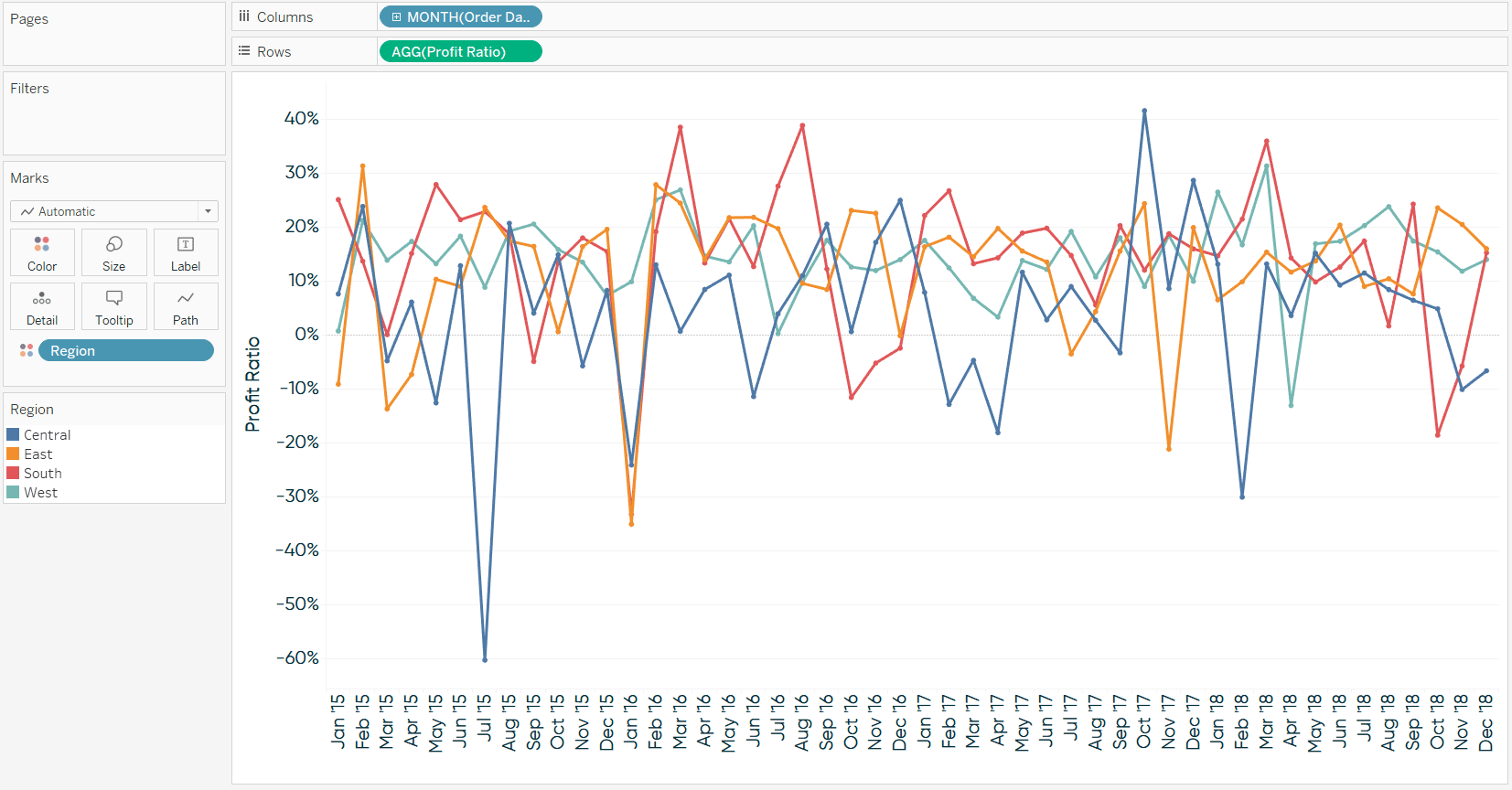
As you can see, now this is really a spaghetti graph because I removed the date filter and am now showing all 48 months in the dataset. To convert this to a slope graph this time, I’m going to set up this simple Boolean calculated field that keeps just the first and last points on the line graph:
FIRST() = 0 OR LAST() = 0
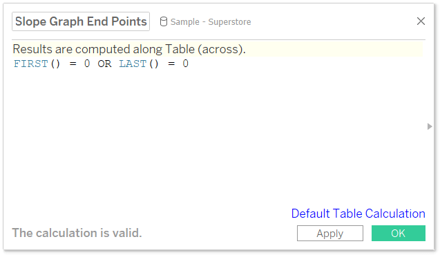
Because FIRST() and LAST() compute the difference between the current row and first or last row, respectively, a difference of zero means the row is either first or last. FIRST() and LAST() are table calculations, so by default, they are computed left to right. After adding this new calculated field to the Filters Shelf, I am back to a slope graph, this time comparing the first month in the entire dataset to the last month in the entire dataset.
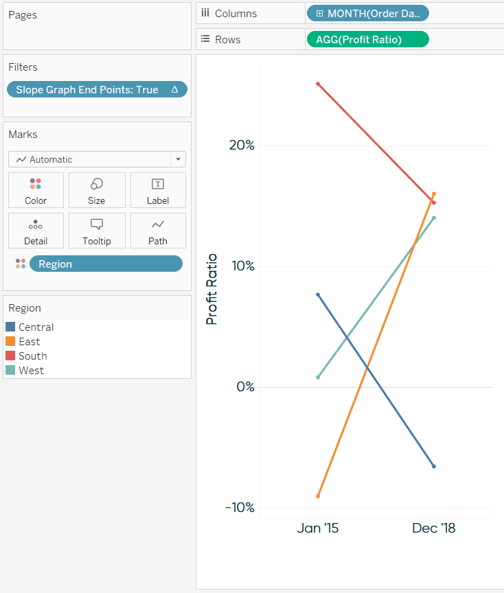
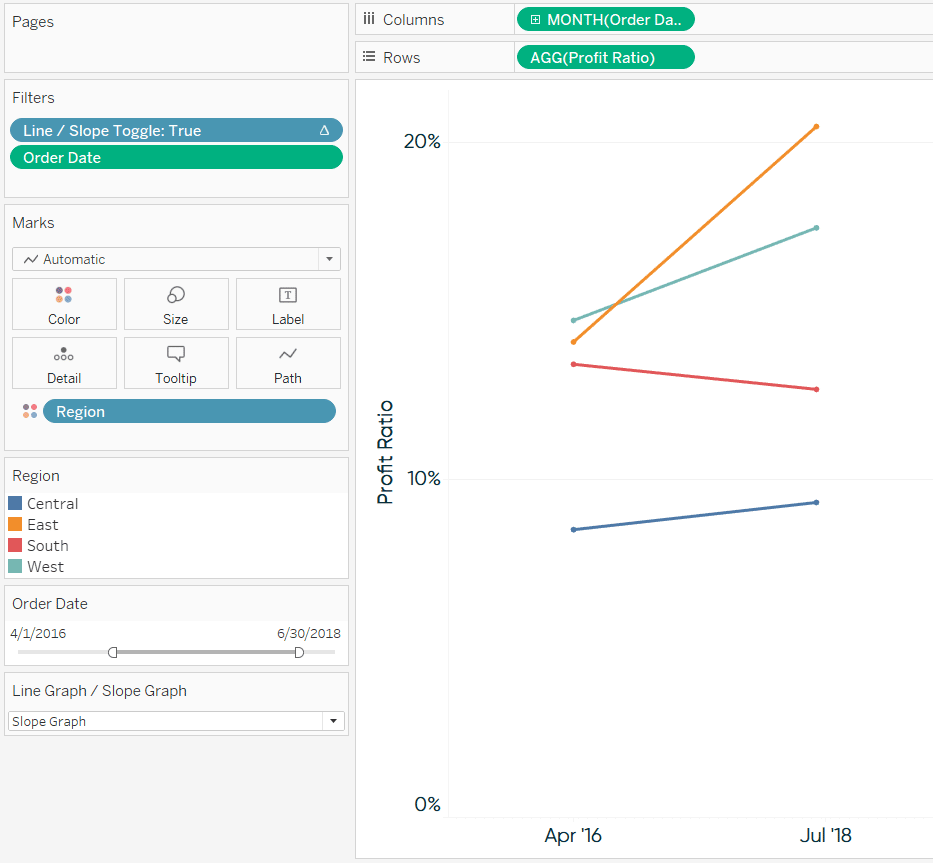
What’s best about this approach is that it keeps the first month and last month, even when there is a custom date range selected in a filter. Here’s how the view looks after adding a continuous date filter and choosing 4/1/2016 to 6/30/2018.
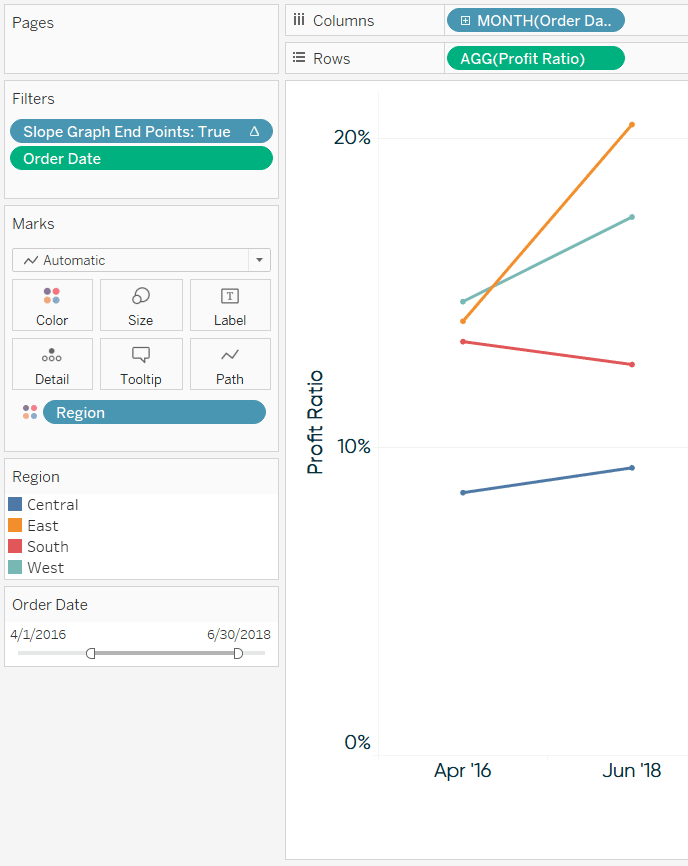
The user now has direct access to comparing the growth or decline during any date range!
How to add a slope graph toggle to a line graph in Tableau
There are times when a line graph is better for visualizing an entire trend, and others when a slope graph would be preferred to just see the overall change. Why not provide access to both options? To toggle between a line graph and a slope graph, start by setting up a parameter with a data type of String. The allowable values will be ‘Line Graph’ and ‘Slope Graph’.
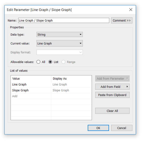
Next, set up a calculated field that gives Tableau instructions for what to do when each of the allowable values is selected. There are a few ways to write this formula, but here’s one approach:
CASE [Line Graph / Slope Graph]
WHEN “Line Graph” THEN NOT ISNULL([Number of Records])
WHEN “Slope Graph” THEN FIRST() = 0 OR LAST() = 0
END
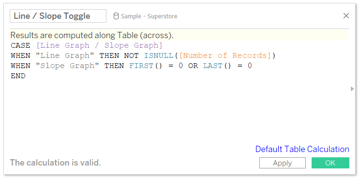
This is another Boolean formula, so we need the result to be ‘True’ for the values we want to remain on the view. When “Line Graph” is selected, we’re saying keep the value on the view if the record is not null (i.e. everything; so all of the marks on the line graph). When “Slope Graph” is selected, we are keeping only the first and last data points as described in the first tip.
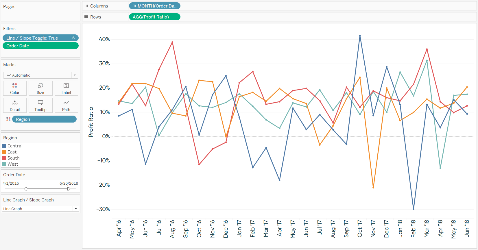
I will now replace the “Slope Graph End Points” filter with the newly created calculated field. I also need to show the parameter control by right-clicking on the “Line Graph / Slope Graph” parameter and choosing “Show Parameter Control”. Now when “Line Graph” is selected, we see Profit Ratio by Region by Month as a line graph:
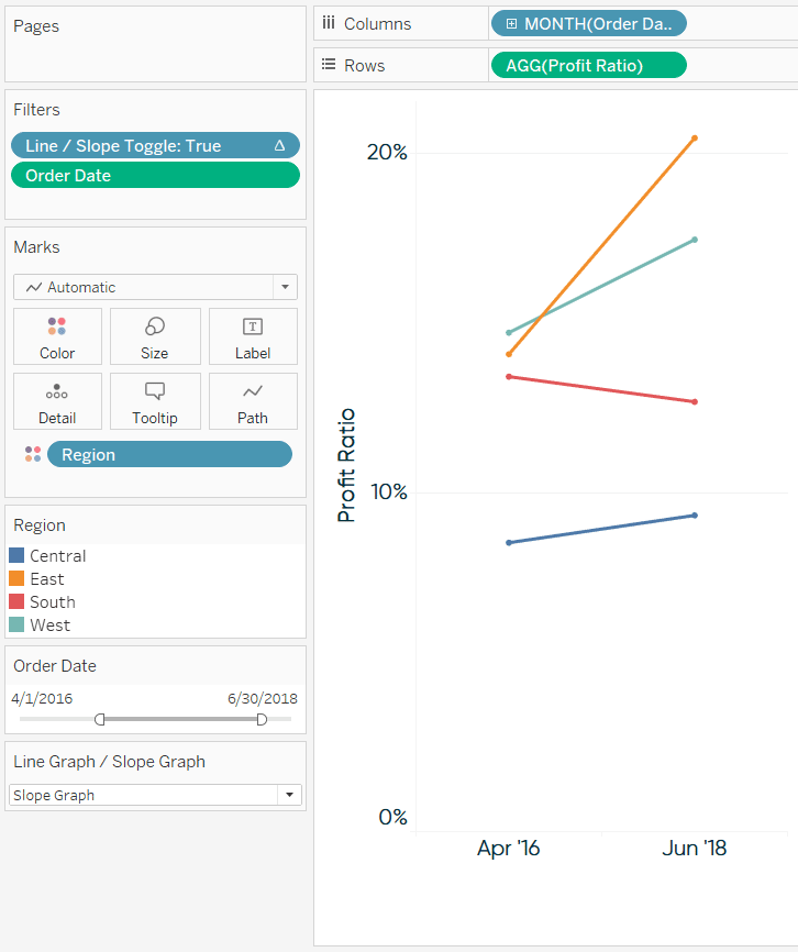
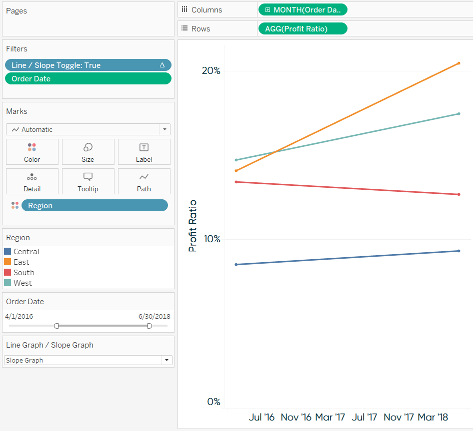
When “Slope Graph” is selected, we see Profit Ratio by Region as a period over period slope graph!
How to add vertical lines to connect Tableau slope graphs
Lastly, I’ll share a couple of formatting hacks that allow you to draw vertical lines on the x-axis of a slope graph view. The approach is different depending on whether your x-axis is being drawn with a discrete or continuous date field, so for the first example, we’ll keep building onto the slope graphs seen throughout this post. Note that the Month of Order Date dimension in the last image is blue, indicating it is drawing discrete headers as columns for each month on the view.
To create vertical lines, start by double-clicking on the Rows Shelf and typing MIN(1).
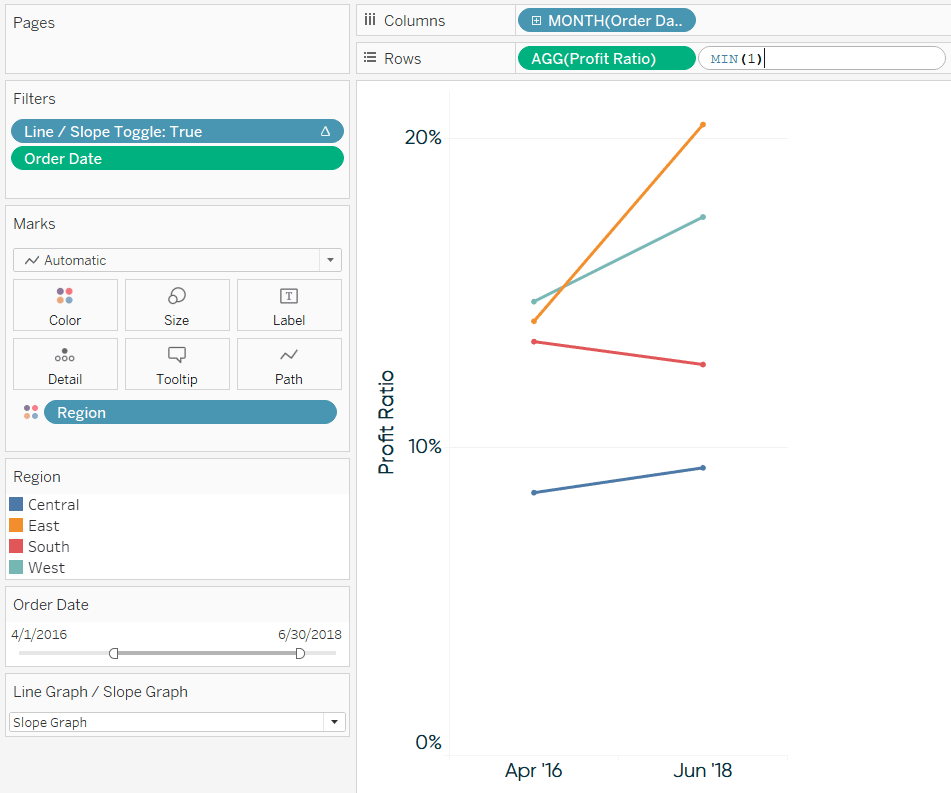
Next, remove all fields from the new row’s Marks Cards, change the mark type of the second row to Bar, and convert the two rows into a dual-axis combination chart.
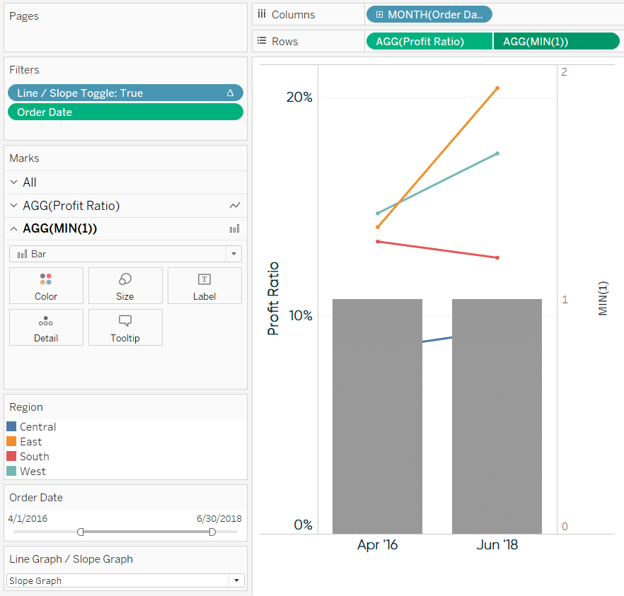
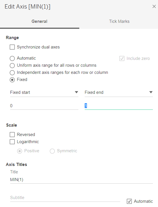
Now fix the axis range on the right by right-clicking on it, choosing “Edit Axis…”, and update the range so it only goes from 0 to 1.
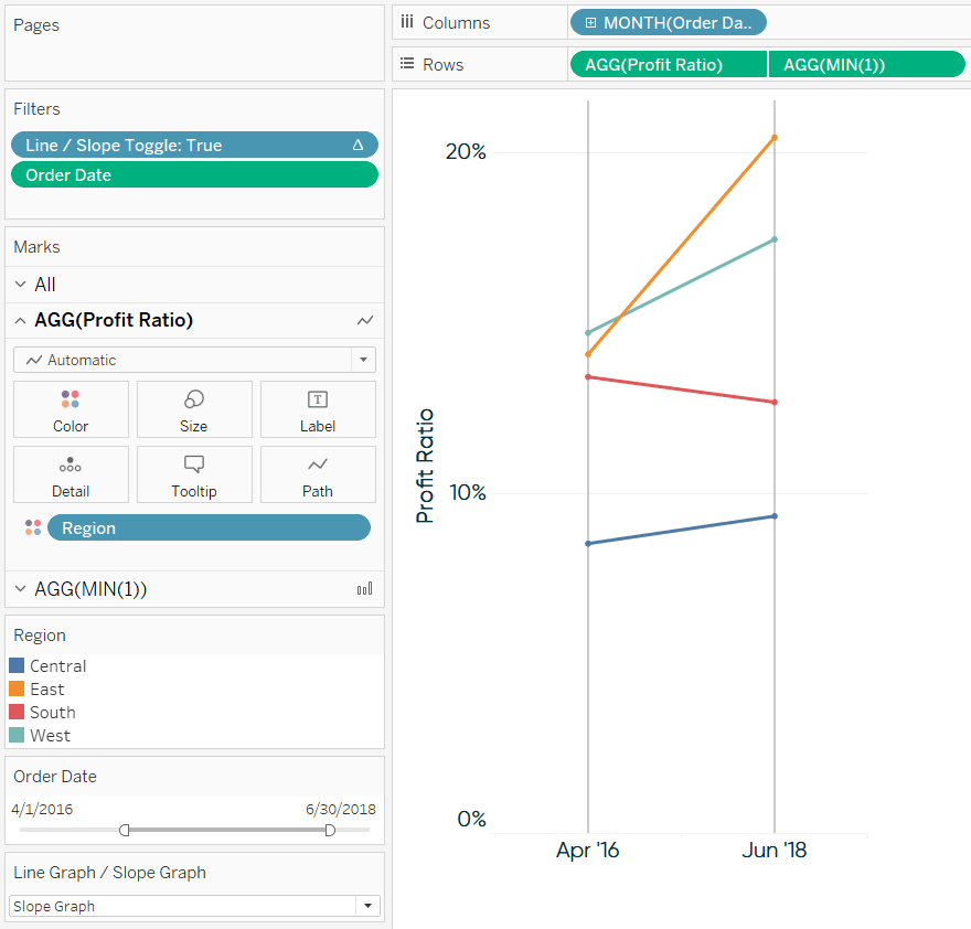
The bars are now your vertical lines! Format them to your liking by clicking on the Size Marks Card and/or changing their color on the Color Marks Card. If you would prefer the connecting lines be behind the slope graphs on the view, right-click on right axis and choose “Move marks to back”. You should also hide the right axis by right-clicking on it and deselecting “Show Header”. Here’s my view after formatting:
Note that these lines will show up on every month. This is ideal when formatting slope graphs with only two months pictured, but if you are using the line graph / slope graph toggle shared in the last tip, you will see excessive vertical lines when Line Graph is selected. For best results, you can also parameterize the vertical lines so they don’t show up when Line Graph is selected in the toggle.
To do so, instead of hard-coding “MIN(1)” on the Rows Shelf, create a calculated field that results in “MIN(1)” when Slope Graph is selected in the toggle, but “MIN(0)” when Line Graph is selected. The code would be something like:
CASE [Line Graph / Slope Graph]
WHEN “Line Graph” THEN MIN(0)
WHEN “Slope Graph” THEN MIN(1)
END
This field would then be used to create the bars on the second axis.
But what if I’m using a continuous field to create my slope graphs?
I mentioned earlier that discrete dates work slightly better than continuous dates with slope graphs. The reason is that discrete dates will draw just one header for the first date and one header for the second date. With continuous axes, you will see the first date, second date, and everything in between until you change the defaults.
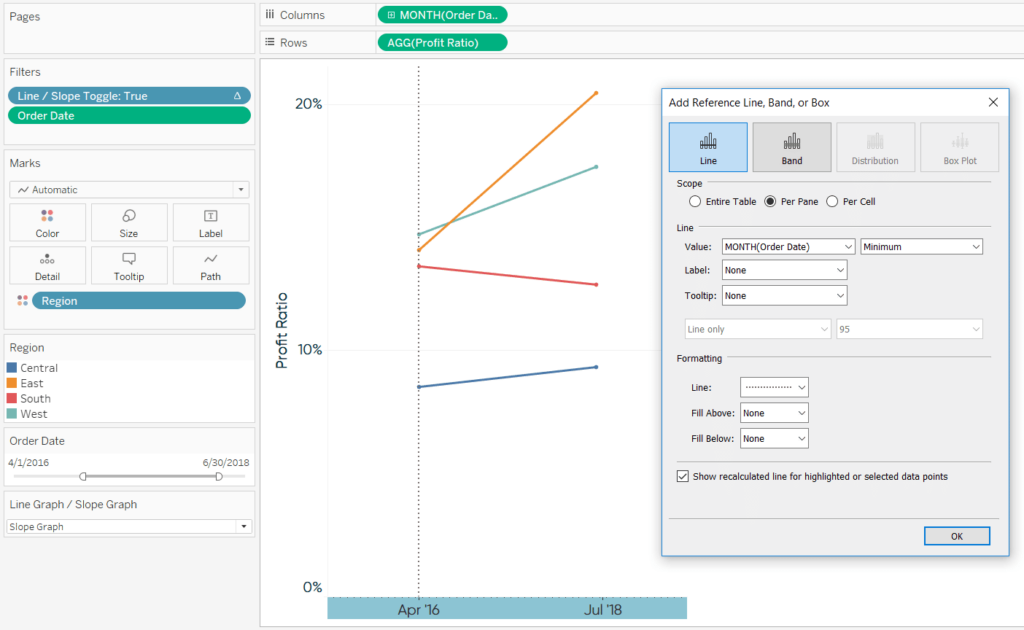
On the plus side, continuous axes allow for more flexible formatting because you can add reference lines. To illustrate, here’s how the slope graph from this post looks after changing the date on the Columns Shelf from discrete to continuous.
To alleviate some of the excessive tick marks and provide better padding on the sides of the chart, I will edit the axis and fix the axis range. This approach works well for creating slope graphs when the date range is consistent. However, note that if you are using this formatting trick with a date range filter that allows the user to select date ranges with varying months, you would have to edit the axis each time to get the tick marks to line up with the line ends of the slope graphs. Another option would be to hide the x-axis all together, but you would probably want to provide some visual indication of what date range has been selected.
From here, to add the vertical lines that connect the slope graphs, all you need to do is add reference lines which you can do by right-clicking on the x-axis and choosing “Add Reference Line”. The trick is to make the reference lines equal the minimum month and maximum month. These are dynamic aggregations that will update every time the date range changes. Here’s how it looks adding a reference line for the minimum date:
Next, add a second reference line for the maximum date:
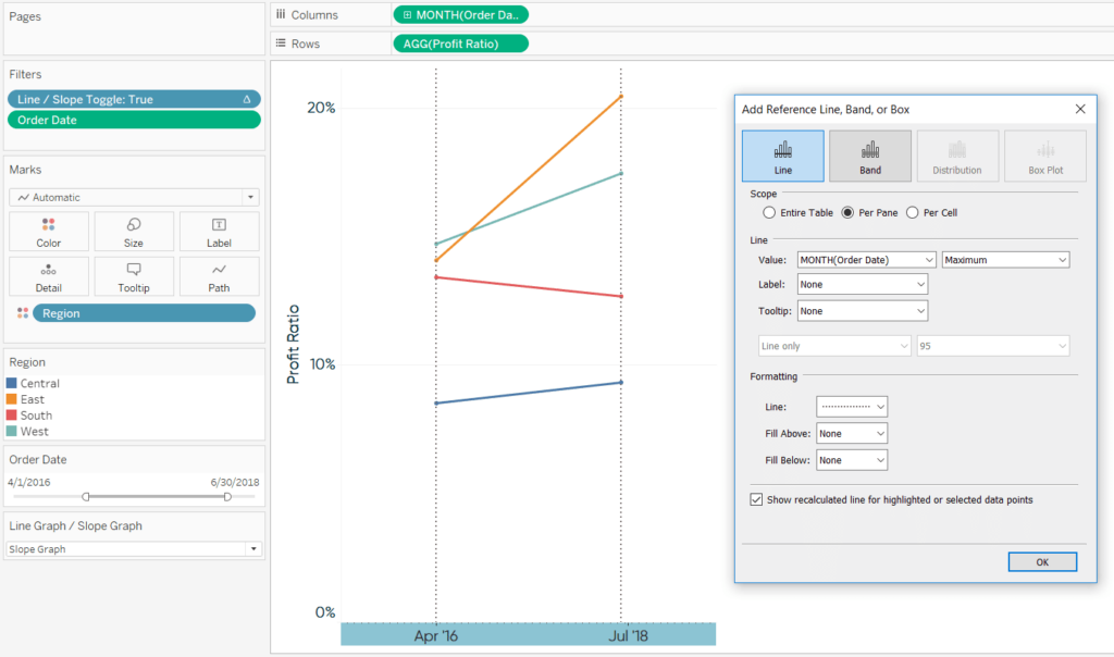
Not only will these vertical lines automatically update based on the date range selected, but reference lines provide more formatting flexibility compared to our approach with discrete months.
Thanks for reading,
– Ryan


Written By
Ryan Sleeper
Related Content
Find Hidden Insights in Tableau Line Graphs by Adding a Slope Graph Toggle
I just returned from a week-long visit to London for Tableau Conference Europe and, as usual following a TC, have…
Innovative Tableau: How to Add Vertical Lines to Connect Slope Graphs
In the last tip of this chapter series, I’ll share a couple of formatting hacks that allow you to draw…

Ryan Sleeper
Improve the design of slope graphs by connecting marks Slope graphs are an engaging and effective alternative for visualizing time.…