Innovative Tableau: How to Add Vertical Lines to Connect Slope Graphs
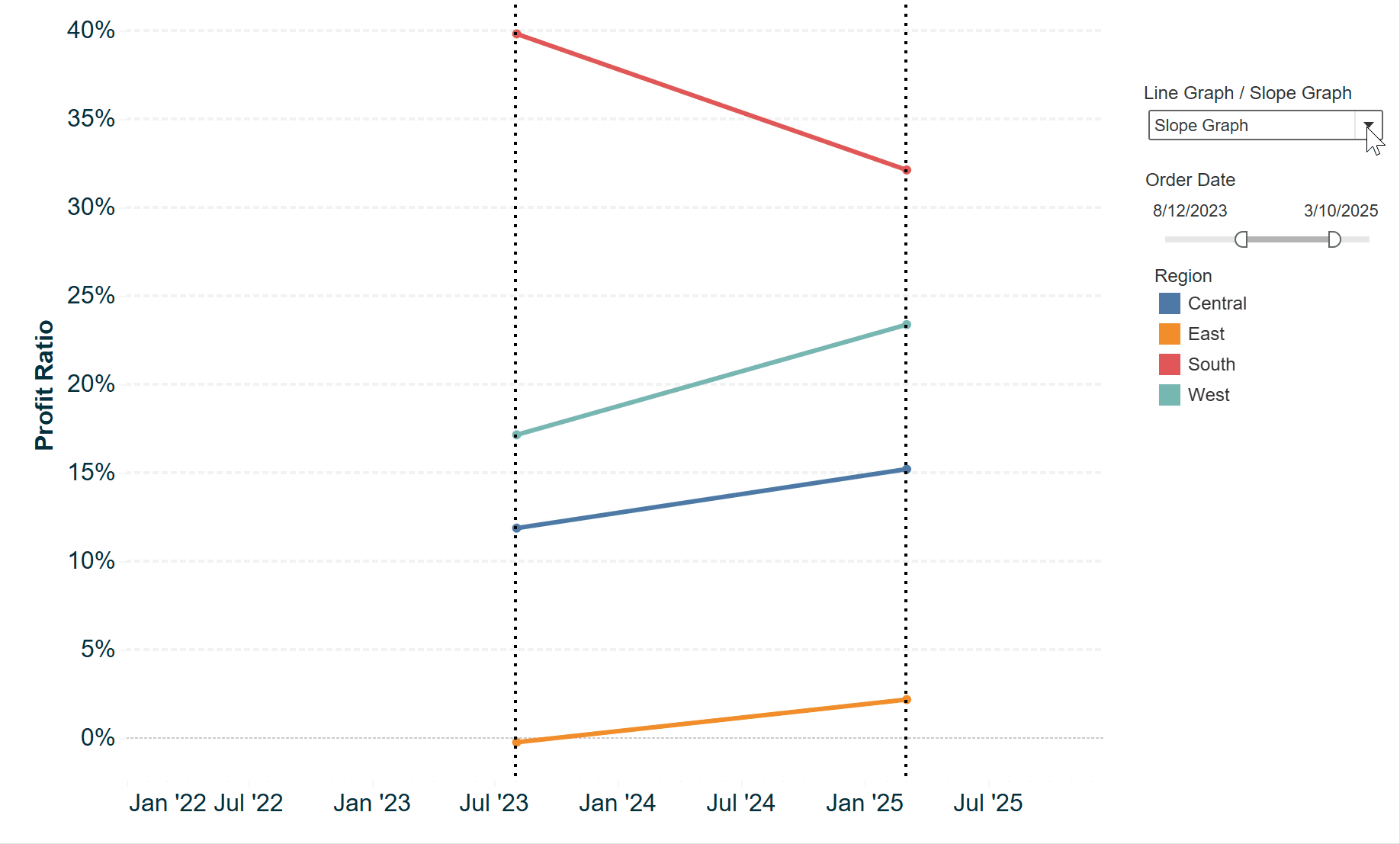
In the last tip of this chapter series, I’ll share a couple of formatting hacks that allow you to draw vertical lines on the x-axis of a slope graph view. The approach is different depending on whether your x-axis is being drawn with a discrete or continuous field, so for the first example, we’ll keep building onto the slope graphs used in the previous two chapters. Note that the Month of Order Date dimension in the last image is blue, indicating it is drawing discrete headers as columns for each month on the view.
This content is excerpted from my book, Innovative Tableau: 100 More Tips, Tutorials, and Strategies, published by O’Reilly Media Inc., 2020, ISBN: 978-1492075653. Get the book at Amazon.
How to Add Vertical Connecting Lines to Tableau Slope Graphs
Approach 1: Dual-axis combination charts
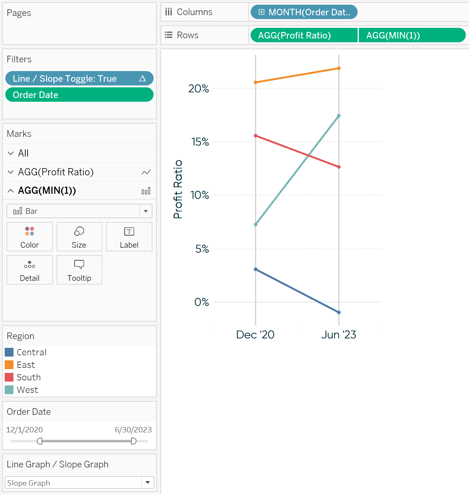
To create vertical lines, start by double-clicking on the Rows Shelf and typing MIN(1).
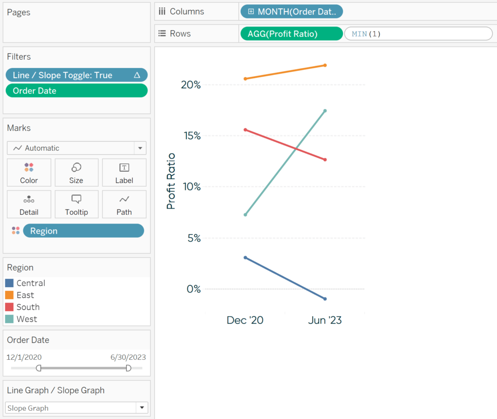
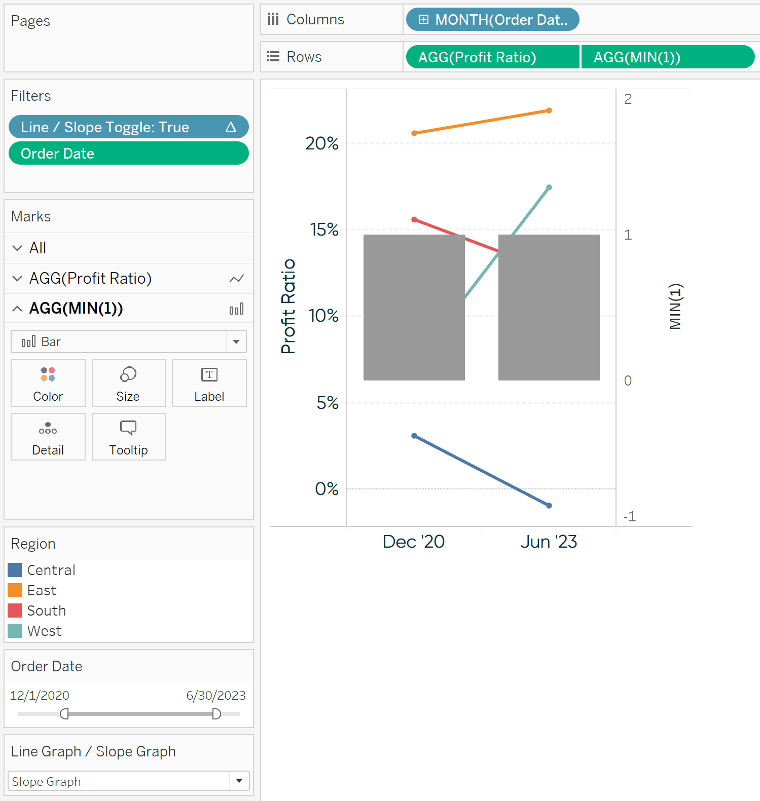
Next, remove all fields from the new row’s Marks Cards, change the mark type of the second row to Bar, and convert the two rows into a dual-axis combination chart.
Continue reading with a free account, or login.
Unlock this tutorial and hundreds of other free visual analytics resources from our expert team.
Already have an account? Sign In
By continuing, you agree to our Terms of Use and Privacy Policy.
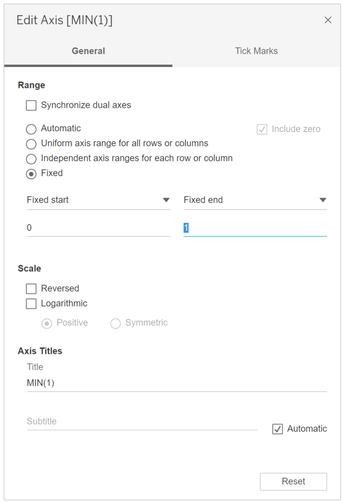
Now fix the axis range on the right by right-clicking on it, choosing “Edit Axis…”, and update the range so it only goes from 0 to 1.
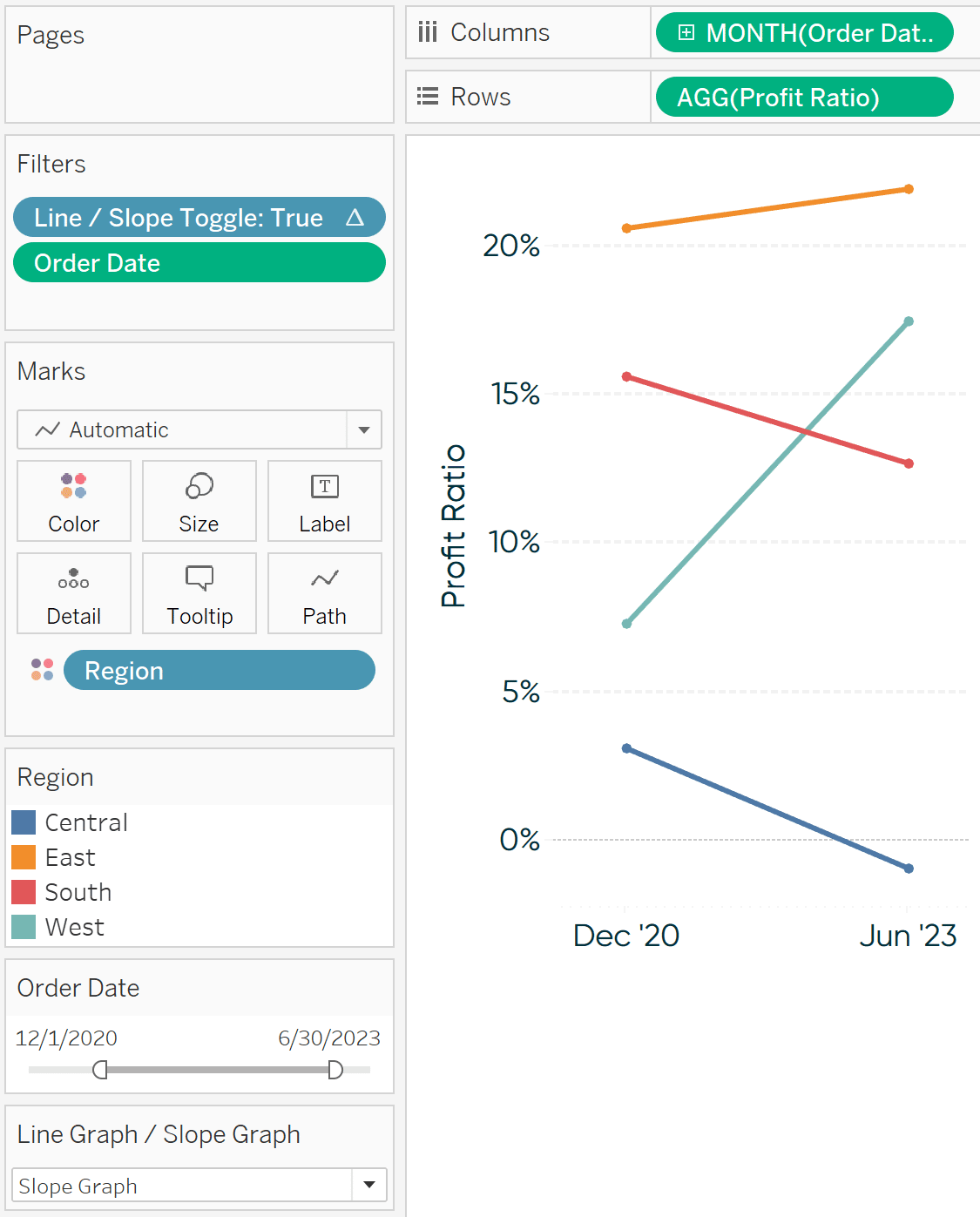
The bars are now your vertical lines! Format them to your liking by navigating to the Marks Shelf for MIN(1) and clicking on the Size Marks Card and/or changing their color on the Color Marks Card. If you would prefer the connecting lines be behind the slope graphs on the view, right-click on right axis and choose “Move marks to back”.
![]()
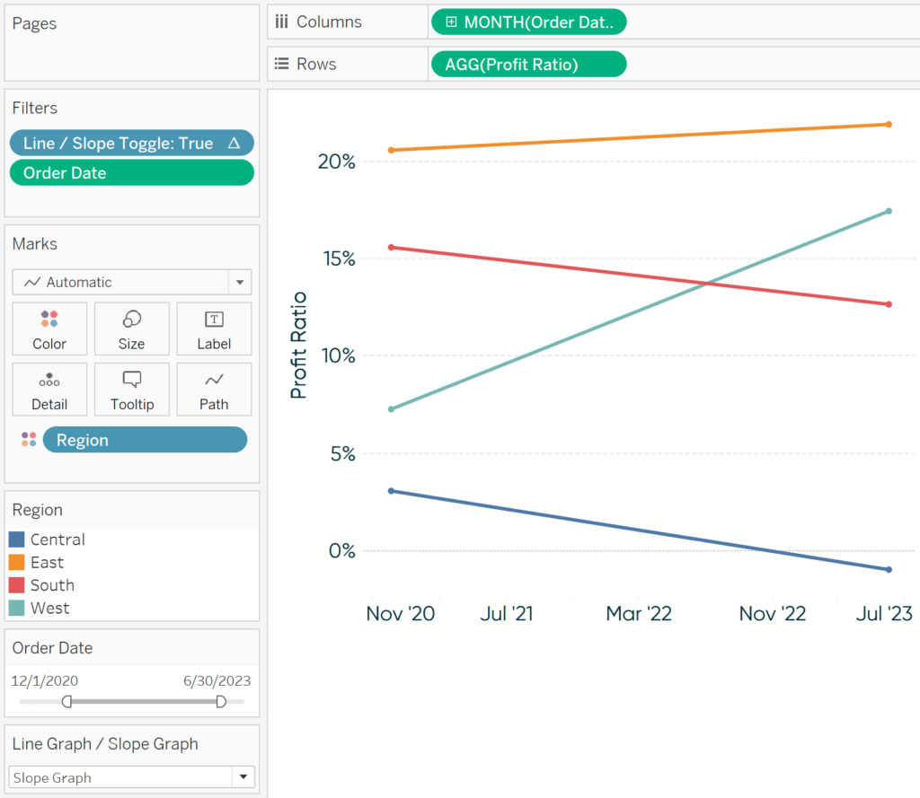
You should also hide the right axis by right-clicking on it and deselecting “Show Header”. Here’s my view after formatting:
Note that these lines will show up on every month. This is ideal when formatting slope graphs with only two months pictured, but if you are using the line graph/slope graph toggle shared in the last chapter, you will see excessive vertical lines when Line Graph is selected. For best results, you can also parameterize the vertical lines so they don’t show up when Line Graph is selected in the toggle.
To do so, instead of hard-coding “MIN(1)” on the Rows Shelf, create a calculated field that results in “MIN(1)” when Slope Graph is selected in the toggle, but “MIN(0)” when Line Graph is selected. The code would be something like:
CASE [Line Graph / Slope Graph]
WHEN “Line Graph” THEN MIN(0)
WHEN “Slope Graph” THEN MIN(1)
END
This field would then be used to create the bars on the second axis.
Approach 2: Reference lines
But what if I’m using a continuous field to create my slope graphs?
I mentioned earlier that discrete dates work slightly better than continuous dates with slope graphs. The reason is that discrete dates will draw just one header for the first date and one header for the second date. With continuous axes, you will see the first date, second date, and everything in between until you change the defaults.
On the plus side, continuous axes allow for more flexible formatting because you can add reference lines. To illustrate, here’s how the slope graph from this chapter looks after changing the date on the Columns Shelf from discrete to continuous.
To alleviate some of the excessive tick marks and provide better padding on the sides of the chart, I will edit the axis and fix the axis range. This approach works well for creating slope graphs when the date range is consistent. However, note that if you are using this formatting trick with a date range filter that allows the user to select date ranges with varying months, you would have to edit the axis each time to get the tick marks to line up with the line ends of the slope graphs. Another option would be to hide the x-axis all together, but you would probably want to provide some visual indication of what date range has been selected.
From here, to add the vertical lines that connect the slope graphs, all you need to do is add reference lines which you can do by right-clicking on the x-axis and choosing “Add Reference Line”. The trick is to make the reference lines equal the minimum month and maximum month. These are dynamic aggregations that will update every time the date range changes.
![]()
Here’s how it looks adding a reference line for the minimum date:
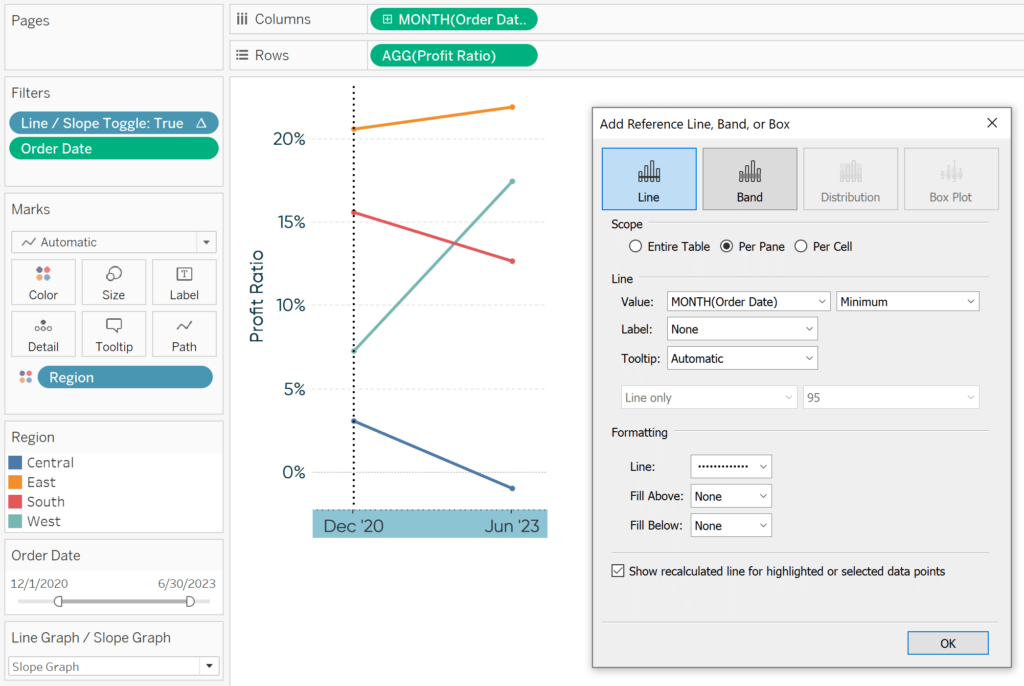
Next, add a second reference line for the maximum date:
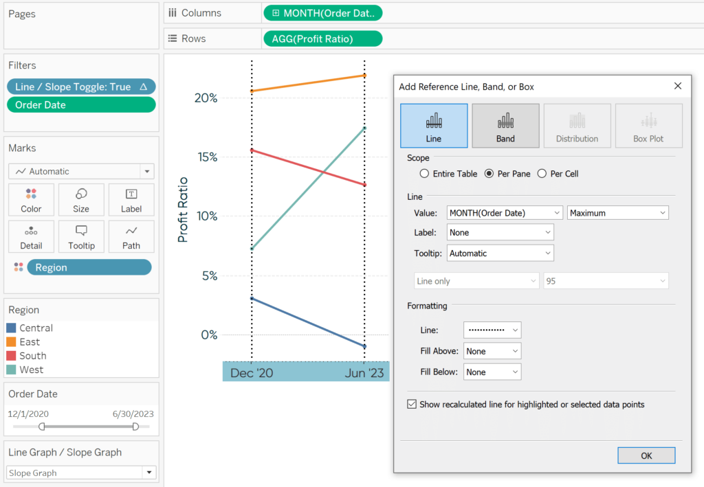
Not only will these vertical lines automatically update based on the date range selected, but reference lines provide more formatting flexibility compared to our approach with discrete months.
Slope graphs are one of my favorite alternatives for visualizing time, and these two techniques for providing a nice aesthetic only make them better!
Thanks for reading,
– Ryan


Written By
Ryan Sleeper
Related Content

Ryan Sleeper
Reveal hidden insights in line graphs by using slope graphs Learn the benefit of slope graphs, a simple formula for…
3 Ways to Make Splendid Slope Graphs in Tableau
I always say that one specific chart type per analytics scenario will help you capture roughly half the insight. Comparing…
Find Hidden Insights in Tableau Line Graphs by Adding a Slope Graph Toggle
I just returned from a week-long visit to London for Tableau Conference Europe and, as usual following a TC, have…