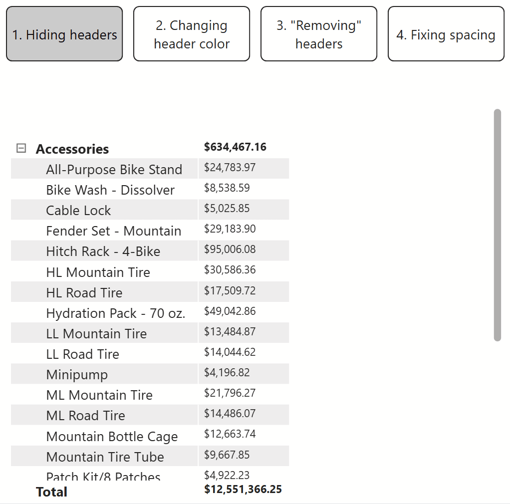
Formatting Tips for Power BI Matrix Visuals
If you’ve ever used Power BI in any capacity, I am confident you’ve come across a report with at least one matrix visual. Matrix visuals are one of the most commonly used chart types in Power BI. Due to their similarity to spreadsheets and Power BI’s built-in formatting options, they are extremely beginner-friendly. However, having so many built-in formatting options at your fingertips can sometimes cause confusion when trying to implement simple formatting techniques.
Why would you ever need to custom-format your matrix when there are so many native options already available to you? Take our latest product, the Financial Analysis Swift in Power BI, as an example. The specific matrix design in the Financial Analysis Swift in Power BI is not possible with Power BI’s native matrix formatting options. In this tutorial, I’ll show you three easy ways to deal with column headers and how to fix the space between columns in matrix visuals – two key techniques used in engineering the Financial Analysis Swift in Power BI.
Connecting to data
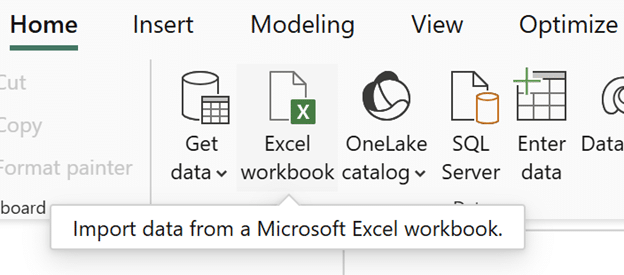
First, download Microsoft’s AdventureWorks dataset. Open a new report in Power BI Desktop, click Excel Workbook, find the data in your files, and click Open.
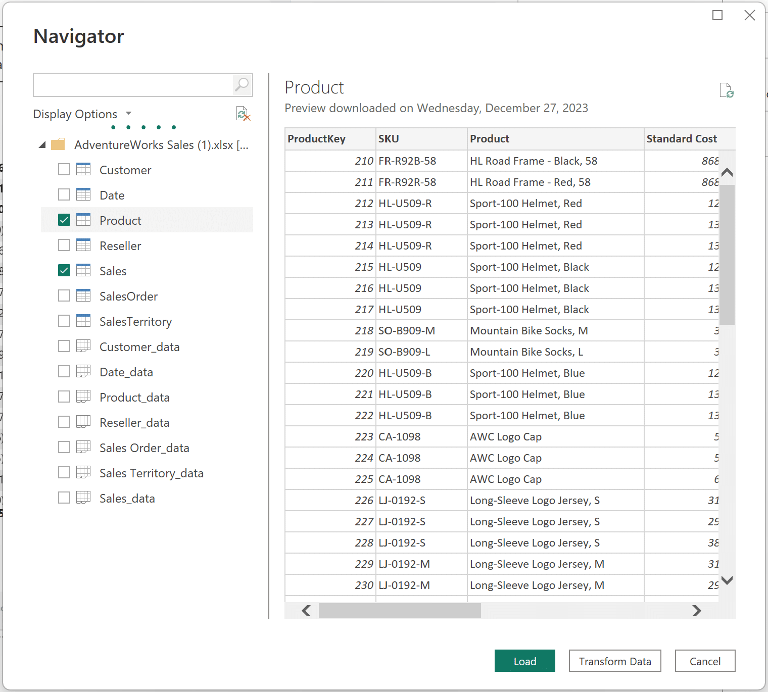
In the Navigator window, click on the Sales and Product tables.
Continue reading with a free account, or login.
Unlock this tutorial and hundreds of other free visual analytics resources from our expert team.
Already have an account? Sign In
By continuing, you agree to our Terms of Use and Privacy Policy.
Creating a profit column
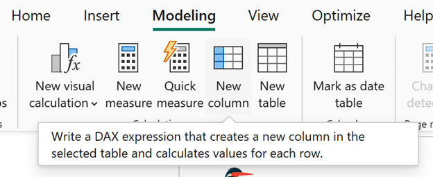
To start, create a ‘Profit’ column. Click on the Sales table in the Data pane on the right-hand side of your screen. When the ‘Table tools’ menu appears at the top, click on ‘New column’ to create a new column in the Sales table.
Beginner’s Guide to DAX: Creating Calculated Columns and Measures in Power BI

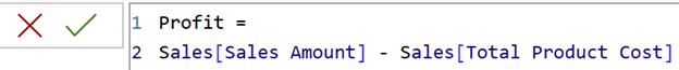
In the DAX window that appears, enter the following formula and click the green checkmark to confirm the new column.
Profit =
Sales[Sales Amount] – Sales[Total Product Cost]
Now that the data is set up, we can begin the custom formatting.

Hiding headers in your Power BI matrix visuals
For simple matrix visuals comparing categories across one metric, like Sales or Profit, leaving the column headers visible isn’t always helpful, especially when the matrix has a title. In cases where you are fitting multiple visuals on the same page, headers can take up valuable space on your report page.
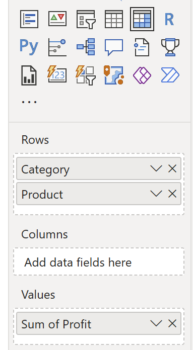
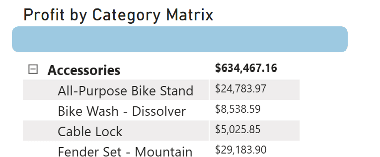
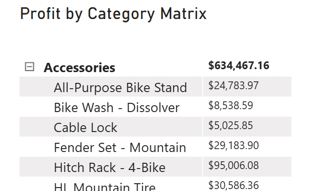
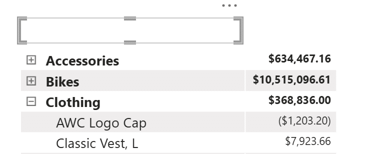
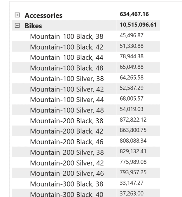
There are three quick ways to remove your matrix headers. First, create a matrix with ‘Category’ and ‘Product’ from the Product table on Rows, and the newly created ‘Profit’ column from the Sales table in the Values section of the matrix visual.
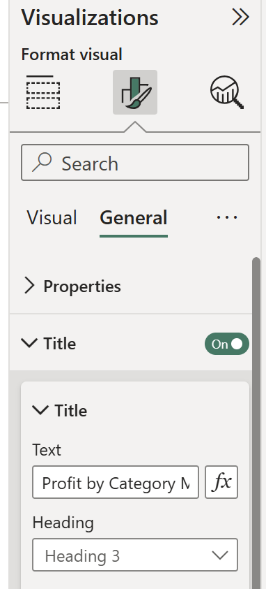
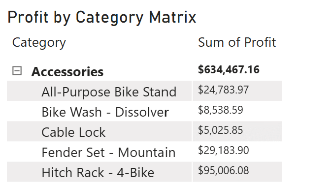
In Format visual → General → Title, I’ve given this matrix the title “Profit by Category Matrix” to help illustrate the use case for this example.
1. Hiding headers with a blank object
The first technique to hide headers is to simply use a blank object to float it above the matrix visual’s header. This is a very quick and effective solution when you’re in a pinch. To begin, select a shape from Insert → Shapes at the top of your screen.
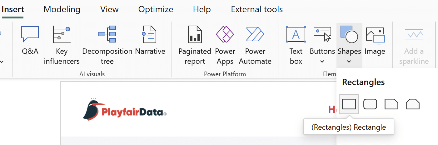
Fit your shape directly over the matrix visual’s header.
Under ‘Format shape’, change the shape’s color to match your sheet’s background. That’s it!
2. Changing header text color
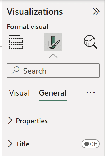
A second way to hide headers from your Power BI matrix visuals is to change the color of your headers in the Formatting pane. Before doing so, remove the matrix title by turning off the ‘Title’ toggle under Format visual → General → Title.
Beginner’s Guide to DAX in Power BI: Creating a Date Table
Under Format visual → Specific column → Apply settings to, select the desired column. Change the ‘Apply settings to’ section to only apply the following change to the header.
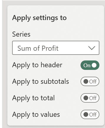
In the ‘Values’ dropdown, change the ‘Text color’ to match your report background.
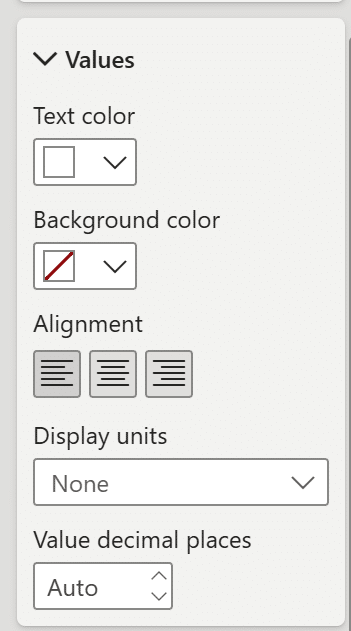
An important note is that this will only work for the field that is placed in the ‘Values’ field well. In this case, that’s the ‘Profit’ column. This change will not work for the fields placed in the ‘Rows’ field well. If you do not want the rows to have a header, use the blank object from the first tip to cover the ‘Category’ header. Since the ‘Profit’ text color now matches the background, shorten the header to only cover the ‘Category header.
While this works, it is rather limiting because you will only be able to change the font color and background color for the header. You won’t be able to apply any changes to the subtotals, totals, or values. The next tip provides a more flexible solution.
3. “Removing” headers
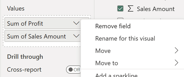
This matrix visual formatting tip is more flexible as it doesn’t require an additional object on your report page and you are not limited to only applying changes to the headers. In the Visualizations pane, click on the dropdown arrow for any column or measure and select ‘Rename for this visual’.
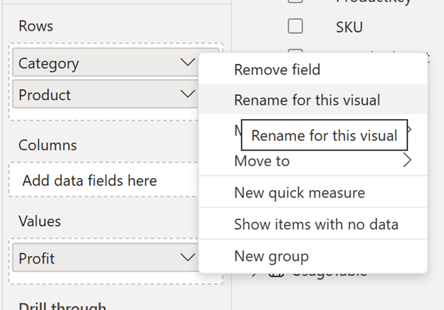
Replace the current name of the column or measure with a single space, “ ”. This is as close as you can get to having no headers in your Power BI matrix visual.
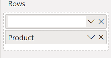
Repeat this for all of the columns or measures in the matrix visual. Now the matrix visual no longer has visible headers.
Those are the three quick ways to deal with your matrix headers. Next is a tip on fixing spacing between columns in your Power BI matrix visuals.
Preserving space between columns in Power BI matrix visuals
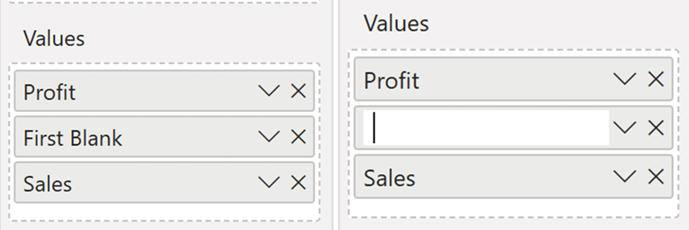
Similar to the three previous tips in this tutorial, this is a pretty straightforward technique. First, add the ‘Sales Amount’ column to the ‘Values’ well of your matrix visual, next to ‘Profit’.
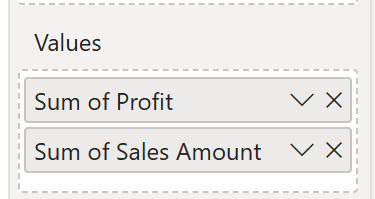
Since I have two columns in the Values well of this matrix, I’ll also rename them both for this visual from the single space, “ ”, to ‘Profit’ and ‘Sales’. Click on the dropdown for each column and select ‘Rename for this visual’.
The renamed columns will immediately be shown in your matrix visual.
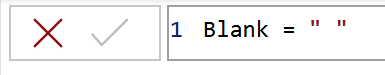
Now, create a new column in the Sales table. While in the Sales table, click on Modeling → New column.
In the DAX window that appears, type the following:
Blank = ” “
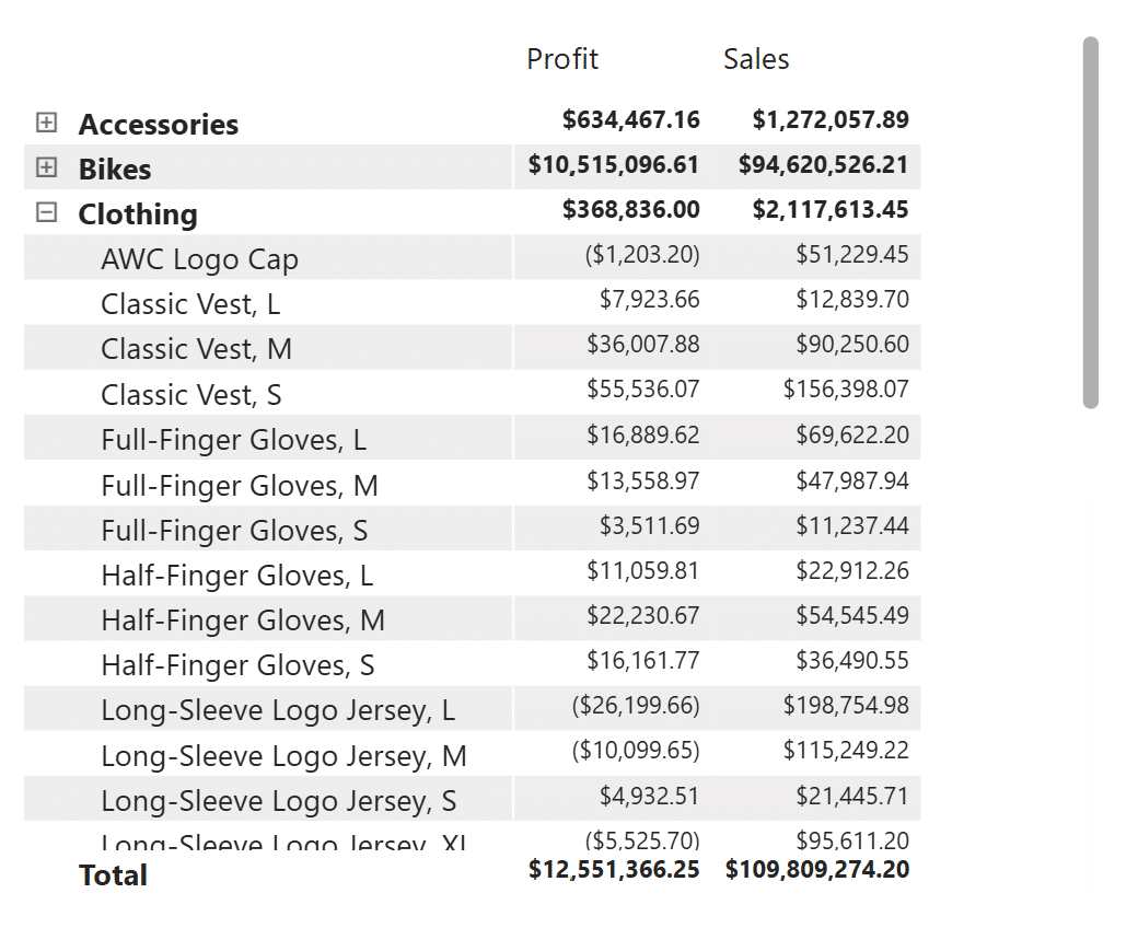
This blank column will be used to preserve spacing between columns in your Power BI matrix visuals. Insert this ‘Blank’ column between the newly renamed ‘Profit’ and ‘Sales’ columns. Like the above tip, rename the ‘Blank’ column to a single space, “ ”, by clicking on the dropdown arrow and selecting ‘Rename for this visual’.
Now there should be exactly one space between the ‘Profit’ and ‘Sales’ columns. You can increase the width between columns manually by clicking and dragging the headers, or you can add the ‘Blank’ column a second time to the same matrix. This way, you can fix the distance between columns as much as you want. At a minimum, there will always be a single space between your two columns. Fixing the spacing between columns reduces the time you spend having to manually increase or decrease the width between columns in your Power BI matrix visuals.
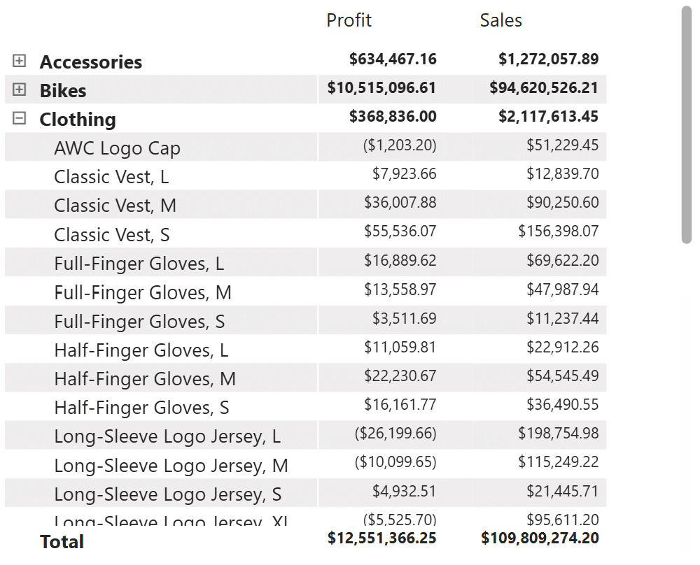
My final matrix visual is a combination of the above techniques: I’ve renamed the ‘Category’, ‘Product’, and ‘Blank’ columns as “ ”, and I’ve fixed the spacing between the ‘Profit’ and ‘Sales’ columns. These techniques are very simple, but implementing them together allows you to create elegant matrix visuals in Power BI.
Thanks for reading,
Juan Carlos Guzman

Written By
Juan Carlos Guzman
Related Content
3 Ways to Make Beautiful Bar Charts in Power BI

Despite many new challengers over the years in the world of data visualization, bar charts have remained one of the…

Juan Carlos Guzman
Connect to Three Common Data Sources in Power BI Desktop Learn how to connect to three of the most common…
An Introduction to Parameters in Power BI
Parameters are user-generated values that define how a system can operate. We can use parameters in Power BI to grant…