Fundamentals of Accessibility Design: Making Your Dashboards a Friendlier Place

“What are your accessibility design standards?” It’s a question that can catch us off guard during project discussions. But when was the last time we really took the time to ensure our analytic reports are inclusive? Accessibility boils down to making sure our end product can be used by everyone, or at least by as many users as possible in different scenarios. The good news is, there are guidelines that can help us design with inclusivity in mind. By considering these accessibility laws when creating a dashboard, not only do we make it more user-friendly and appealing, but we also open it up to a broader audience, potentially increasing its adoption.
Let’s dive into the world of accessible design, tackling the key concepts, challenges to overcome, and exploring the application of guidelines and requirements. We’ll also delve into specific areas like accessible fonts, colors, and icons to give you practical insights and tips.
What does ‘accessibility’ mean?
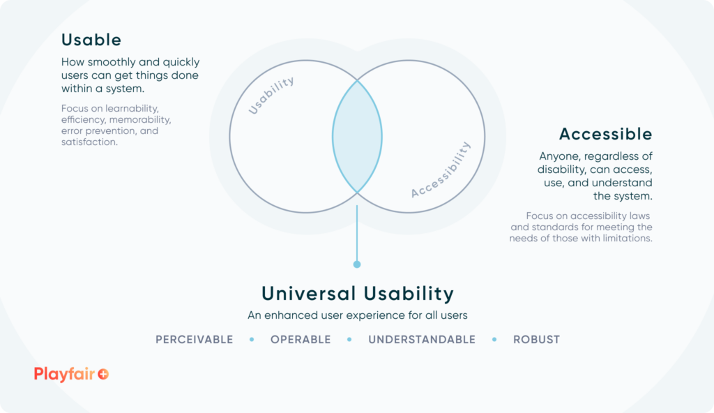
In simple words, a product is accessible when it’s usable by everyone. Accessible design helps people with different abilities to better understand your dashboards. According to the World Health Organization (WHO), approximately 16% of the global population lives with some form of disability. This means that one in six people that come into contact with your dashboard might encounter some difficulties.
When we talk about UX best practices, there’s often a mix-up between usability and accessibility. Usability focuses on making products easy to use, while accessibility ensures designs are easy to use for individuals in specific situations, removing barriers for equal access. If a product isn’t usable, it won’t be accessible. Therefore, accessibility is often seen as a subset of usability, where we ensure all users can have an equal experience no matter how they interact with the product.
Continue reading with a free account, or login.
Unlock this tutorial and hundreds of other free visual analytics resources from our expert team.
Already have an account? Sign In
By continuing, you agree to our Terms of Use and Privacy Policy.
Understanding the types of accessibility design issues of our users
Accessibility issues create barriers for people with disabilities, putting them at a disadvantage compared to those without. This is where resources such as the WCAG guidelines (discussed below) and validation tools can help us make informed design decisions while still being inclusive.
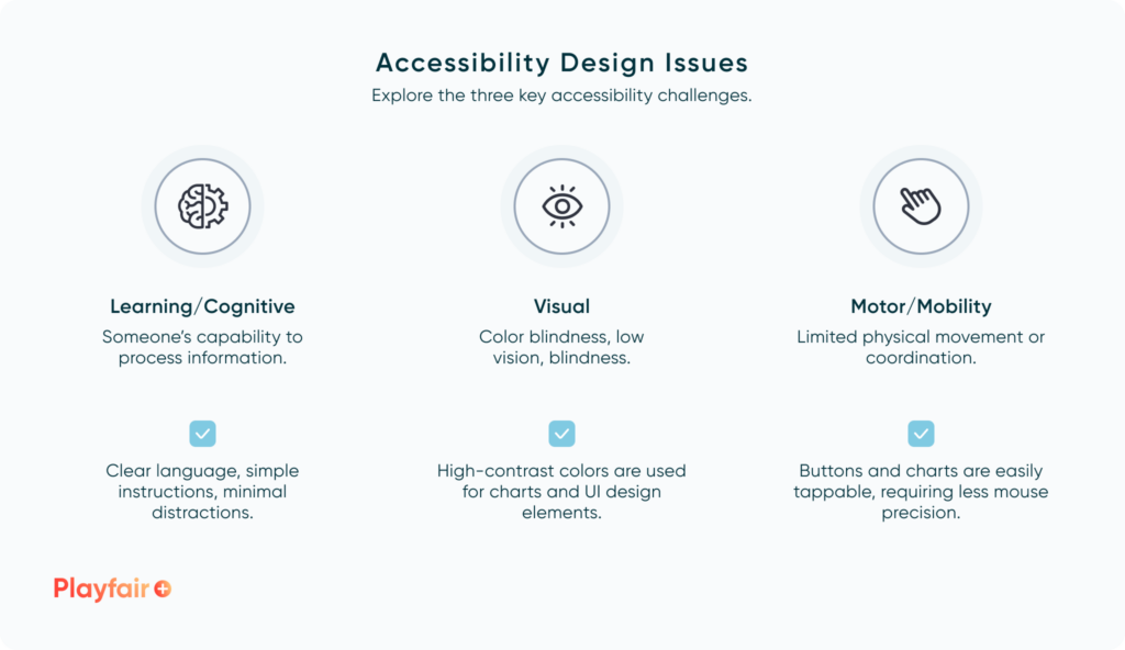
There are various disabilities to consider, but the ones I particularly watch out for user interfaces are Learning/Cognitive (like Dyslexia), Visual (such as Color Blindness), and Motor/Mobility (such as Parkinson’s Disease or Arthritis). One or all of these can make it tough for users to interact and gain insights from your dashboards.
In this post, I’ll attempt to give tips for designing around each of these barriers. But before we jump into practical tips for making designs accessible, there are a few more concepts we need to define.
Guidelines for evaluating the accessibility design of dashboards
The Web Content Accessibility Guidelines (WCAG) are like our compass, guiding us to create interfaces that work for everyone, especially considering people with disabilities. These guidelines are built around four key principles:
- Perceivable: Everything needs to be presented in a way that people can understand.
- Operable: People need to be able to use the interface.
- Understandable: Users should get what’s going on and how to interact with it.
- Robust: The interface should keep working as technology evolves.
If we miss the mark on any of these, those with disabilities might not be able to use what we’ve created. Within the WCAG documentation, each principle gets guidelines with requirements to make sure our designs are inclusive. These are broken down into three levels: A, AA, and AAA.
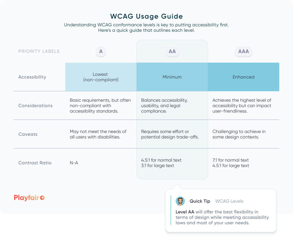
A great example of how these ratings come into play is when we talk about color contrast ratios in accessibility design. Simply put, when there’s enough contrast between two elements, like text over its background or lines on a graph, content becomes readable for everyone, especially those with visual impairments or colorblindness.
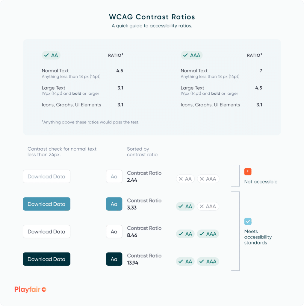
So, what do color contrast ratios measure? They gauge the difference in luminance between two objects, where luminance refers to the actual light emitted by a color.
For example, a contrast ratio between a text and its background is written as 4.5:1 – two numbers separated by a colon. The first number represents the relative lightness of the lighter color, while the second number represents the relative lightness of the darker color. Ratios range from 1 (lowest) to 21 (highest), with 1:1 indicating identical colors and 21:1 representing maximum contrast when they’re at opposite ends of the lightness scale (like black and white). So, a contrast ratio of 4.5:1 tells us that the text is 4.5 times more luminous than the background.
If we’re aiming for Level AA compliance, our contrast ratio needs to be at least 4.5 or 3, depending on the size of the text. Level AAA, which is even stricter, requires a ratio of 7, at times limiting our design options. That’s why Level AA is often the sweet spot – it meets the standard while still offering flexibility in design.
I’ll keep referring back to these concepts as we go along. Now, let’s put them into practice.
Practical implementation of accessible design laws
By now, accessibility can seem like a big topic to tackle. To keep it simple, we can break it down into three main parts for our dashboards: fonts, colors, and icons. By focusing on one element at a time, we can make sure each part of our design is accessible for everyone.
Tip 01: Achieving accessible fonts
I’ll begin with fonts since they can be addressed early in the design process, even during low-fidelity wireframing for initial testing. Here are some key points to consider:
- Font Size: Make sure the text is big enough for everyone to read comfortably. Aim for at least 12-14 points (16-19 pixels). If you’re a designer, you might be more familiar with pixels, but tools like Tableau and Power BI use points. Just a quick note: 1 point is roughly equal to 1.33 pixels, so a 12-point font would be about 16 pixels. For your convenience, you can use this Pt to PX Converter for quick conversions.
- Font Choice: Stick to simple and easy-to-read fonts. The British Dyslexia Association suggests sans serif fonts, such as Arial, as letters can appear less crowded. Fonts like Arial, Verdana, and Trebuchet are not only recommended by this organization but are also web-safe for Tableau use.
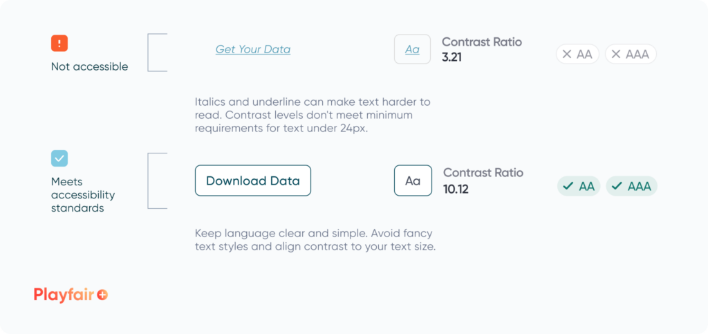
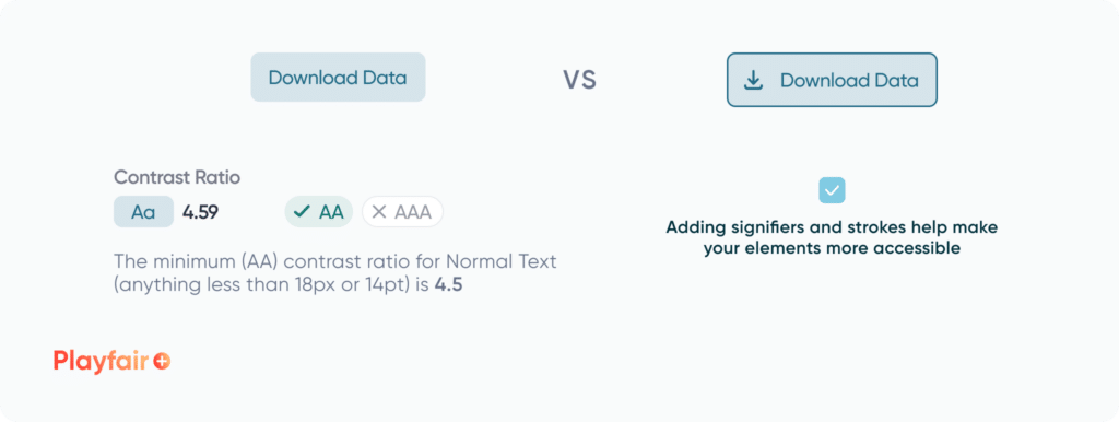
- Contrast: Keep a good balance between text and background colors so it’s easy on the eyes. Think about a contrast ratio of 4.5:1 for regular text and 3:1 for larger text—this helps meet the Level AA standard under WCAG. Any higher ratios will make reading easier.
- Font Style: Avoid underlining and italics as this can make the text blend together and cause crowding. Instead, stick to using bold for emphasis.
If you’re interested in diving deeper into font essentials, our Sr. Manager of Information Design, Alyssa Huff, has a post on “Simple Fonts: Mastering Font Essentials in Figma” that might be worth checking out!
Simple Fonts: Mastering Font Essentials in Figma
Tip 02: Achieving accessible colors
Next, let’s dig deeper into color contrasts. Color is essential for visualizing data, so finding the right balance is crucial. Here are some handy tips for selecting colors for your charts or UI elements:
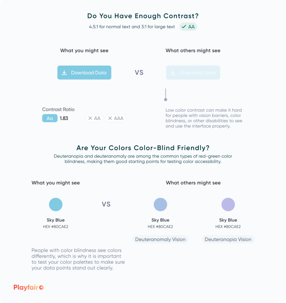
- Use Color Blind-Friendly Palettes: Choose colors that are distinguishable for users with color vision deficiencies. A good tip for creating color-blind-friendly palettes is to use online tools, such as David Nichols’ Coloring for Colorblindness, that simulate various types of color vision deficiencies. These tools allow you to see how your color combinations appear to users with different types of color blindness.
- Avoiding Red-Green Combinations: Many people have trouble telling red and green apart. There are three types that fall under this: Deuteranomaly (Makes green look more red), Protanomaly (Makes red look more green and less bright), Protanopia and Deuteranopia (where you are unable to tell the difference between red and green). In Figma, there are a variety of free plugins that designers can use to quickly test the different color blindness types. Alternatively, you could use blue and yellow, which are typically easier to differentiate.
- Color Contrast: Once again, ensure there’s enough contrast between text and background colors for readability. Aim for a contrast ratio of at least 4.5:1 for regular text and 3:1 for large text. Remember, higher ratios makes reading easier. Adobe Color is a great online resource to do your own tests.
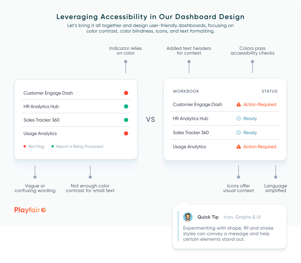
- Don’t Rely Solely on Color: Not everyone sees colors the same way, so include alternative indicators like text labels or symbols/icons to ensure everyone understands the system.
Visual Analytics Architect, Zoya Zafar, offers her thoughts on “Creating Custom Color Palettes for Visual Analytics.” It’s a great resource for selecting the ideal colors for your product.
Tips for Creating Custom Color Palettes for Visual Analytics
Tip 03: Achieving accessible icons and custom shapes
Now that readability is established, we can direct our attention to icons for visual communication and navigation. Icons aren’t just there to make things pretty—they can play a crucial role in effective communication. That’s why we need to think about them when we’re talking about accessibility design:
- Icon Size: Much like buttons, make sure your icons are big enough to tap or click easily, especially for those who might have trouble with motor skills.
- Icon Clarity: icons that are clear and easy to understand work best, even when they’re small. Stay away from ones that are too detailed or abstract, these can confuse users, especially those with cognitive disabilities.
- Pair Icons with Text and Color: as we’ve seen so far, relying solely on color can lead to poor results. Pairing icons with text and color can help elevate your design intention and break accessibility barriers.
- Testing and Feedback: It’s always a good idea to try out your icons with those who have different abilities and get their feedback. That way, you can spot any issues or things that might make your design hard to use, and then tweak things to make them better.
If you’re interested in diving deeper into best practices for icons in dashboards, I have also written a post on “Streamlining Dashboards: Minimizing Chartjunk with Icon Design” that you might find helpful.
Streamlining Dashboards: Minimizing Chartjunk with Icon Design
Bringing it all together
Every user is unique. Making dashboards accessible and inclusive isn’t just the right thing to do; it’s also smart for your business. Planning your design with this mindset will boost your brand image, ensure legal compliance, and prove cost-effective and time-efficient for future product scalability.
Designing with accessibility in mind welcomes more users and can lead to better usability design. Now, let’s make every user feel at home.
Thanks for reading,
Rafael Simancas

Written By
Rafael Simancas

Peer Review
Jason Penrod
Director, Information Design
Related Content
Streamlining Dashboards: Minimizing Chartjunk with Icon Design
Whether you use icons within or around your data visualizations, it’s crucial to be mindful of the value they add…

Ryan Sleeper
Leverage color to improve your designs and help communicate insights Color tips include reducing the saturation of marks, keeping color…
3 Simple Ways to Improve the UX of Your Dashboards

At Playfair Data, we pride ourselves in improving the UX of dashboards to transform raw data into powerful insights. To…