Streamlining Dashboards: Minimizing Chartjunk with Icon Design

Whether you use icons within or around your data visualizations, it’s crucial to be mindful of the value they add or subtract to the dashboard. The term “chartjunk”, coined by data visualization expert Edward Tufte, is used to refer to elements that do not add value to the data being presented, but rather serve only to distract or confuse the viewer. While icons can elevate data storytelling, interface aesthetics, and user engagement, the excessive or poor application of iconography can confuse, overwhelm and hurt the user experience.
What are icons? These are symbols representing objects, actions, or ideas. Their primary function is to communicate a concept quickly, and it does this through the use of metaphors as visual elements to enhance user comprehension when using an interface.
Icons play a crucial role in simplifying complexity and capturing the attention of your audience. Choosing the right icon becomes the first step in taking your visual storytelling to the next level, as they need to seamlessly align with the style and tone of any dashboards.
In this post, we will delve into the essence of great iconography: why you should start using them in your reports, their core design principles, and how to apply icons for your dashboards.
Why use icons?
Why bother integrating icons into your dashboards? Well, the benefits are plentiful.
Continue reading with a free account, or login.
Unlock this tutorial and hundreds of other free visual analytics resources from our expert team.
Already have an account? Sign In
By continuing, you agree to our Terms of Use and Privacy Policy.
- Icons efficiently save space and reduce chartjunk by replacing words and preventing dashboards from looking cluttered, especially when having to design within relatively small spaces or sections.
- They’re easily recognized, leveraging familiarity to convey actions or messages quicker than words, especially for universal symbols like play or pause.
- Icons transcend language barriers, enhancing accessibility for a diverse audience.
- Lastly, they add aesthetic appeal, bringing visual interest to interfaces especially when these tools are expected to be used often and by different groups of people.
In summary, incorporating icons enhances user experiences by sparking interest, maximizing usability, and facilitating faster tool comprehension and adoption.
Much of this philosophy is rooted in best practices for UX design. You can explore further insights on the importance of dashboard UX by visiting Why Dashboard UX is Important.
The core principles of icon design
Icons are a small yet crucial part of any user interface. To master the art of iconography, we first need to understand three key principles.
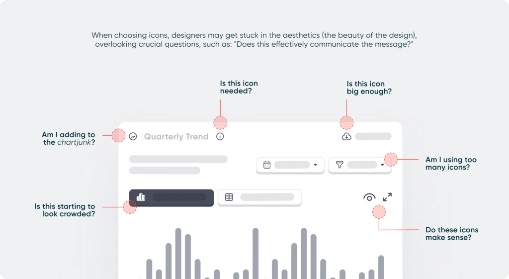
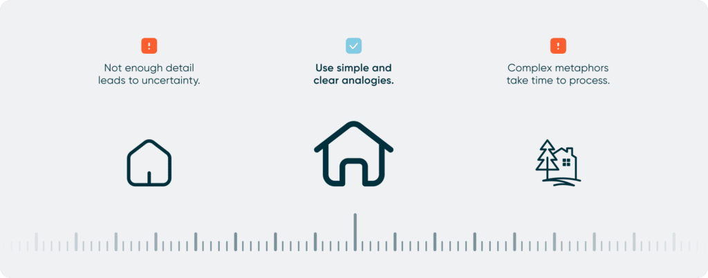
1. Simplicity and clarity. Keep icons simple and clear for great user experiences. It’s crucial that users understand the meaning of each icon at a glance, without any confusion, particularly when space is tight. Users should grasp an icon’s meaning almost instantly, without getting lost in the details. Elements that are not necessary to effectively understand and use the dashboard are ultimately chartjunk.
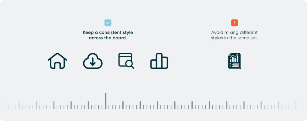
2. Consistency in style. Get icons to align with your audience’s expectations and company language, following style guides for brand identity. Maintaining consistent icon design across the board is crucial for reinforcing brand recognition and personality, and a smooth user experience.
3. Universality and recognition. No need to reinvent the wheel; stick with what users are familiar with to avoid confusion. Nevertheless, run tests to ensure universal understanding. You can collaborate with diverse perspectives, such as subject matter experts and designers, to create icons that score high for user comprehension.
Choosing icons and avoiding chartjunk in the process
Now that we grasp the essence of icons, their functionality, and characteristics, let’s delve into the dos and don’ts when creating or selecting the right icon for your dashboard visualizations.
- Context: Align your icons with your audience’s expectations and the established language within your company. If you have access to a style guide, ensure the icons align with brand identity and meet industry standards.
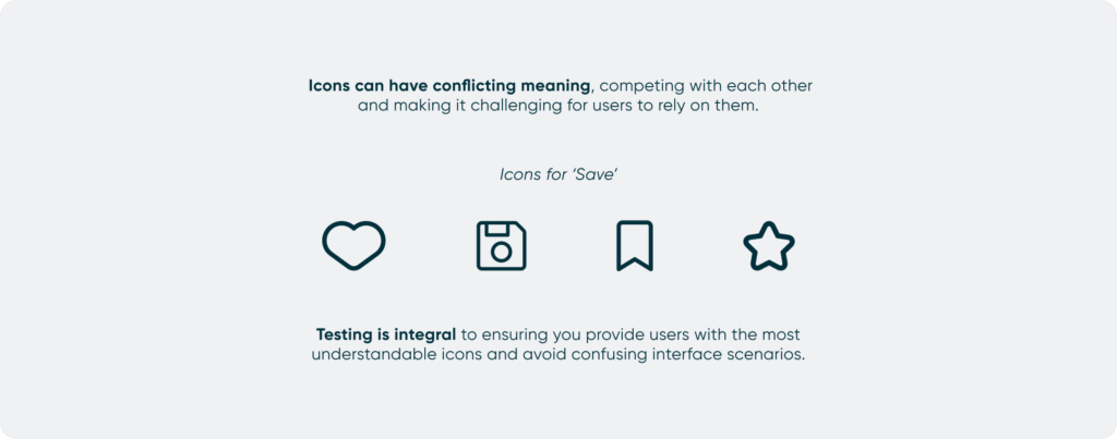
- User Feedback: Test for effective iconography. Ensure icons are universally understood, not just clear to you. In particular, there are two key attributes you’re testing for: Recognizability and Memorability.
- To assess recognizability, ask users what they believe the icons represent. If the icons cause confusion, consider adding labels or using text instead. Remember, most users won’t put much effort into deciphering ambiguous icons or if cultural differences come into play.
- Ensure that the icons are memorable; if they are difficult to remember, they won’t be effective.
- Collaborate: Engage with various perspectives, including subject matter experts, designers, and non-designers. Their feedback enhances the creation of icons with a high level of user comprehension.
“A lot of times when designers create symbols, they get trapped by the aesthetics. They want to make them very beautiful, but it might not necessarily communicate the message most effectively.” Edward Boatman, the designer and co-founder of The Noun Project.
Through collaboration, you can ensure that your design decisions are well-informed, and that every icon serves a purpose without crossing the line into chartjunk territory.
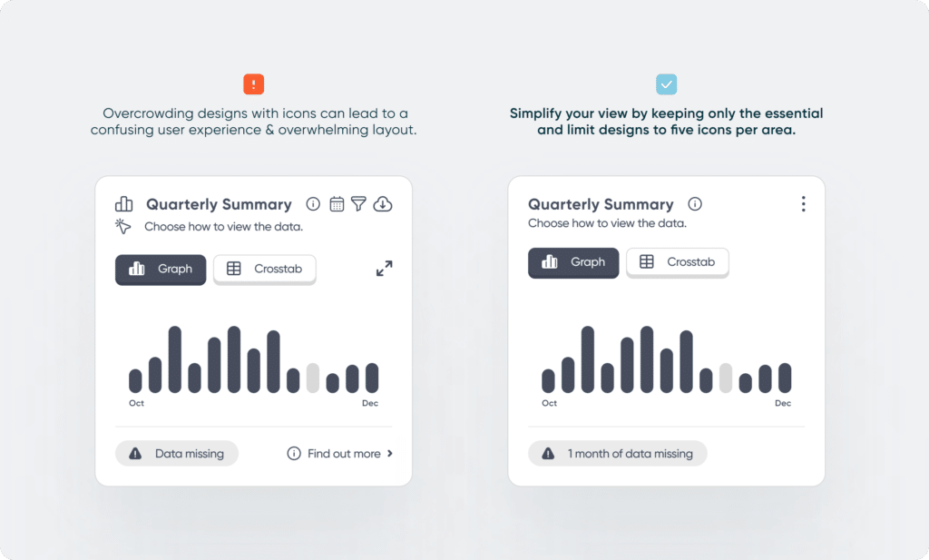
- Quality over quantity: resist the urge to rely on icons in every scenario. Instead, use them strategically to highlight crucial points or actions. Icons can greatly enhance a data visualization by reducing the need for excessive text and decluttering the display. But, be careful not to overwhelm your audience by using icons excessively, hence actively promoting chartjunk in your dashboards.
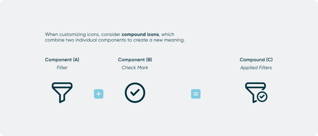
- Personalize your icons: Custom icons offer a unique opportunity to express your personality, identity, or message in a more creative and impactful manner. They can visually represent data points, provide additional context or details, or even create visual metaphors and analogies.
ASL, or American Sign Language, employs what are called compound signs—merging multiple signs to convey new meanings greater than the sum of their parts. This idea can influence icon design, creating new and unique shapes to elevate the user experience.
Creating your own icons requires analyzing your data and considering how your dashboard users will interact with it. For example, you can utilize shapes, colors, and visual cues to create a set of icons that can communicate a data hierarchy or the state of the data being filtered (example shown below).
Online resources like, The Noun Project, Flaticon, and Iconfinder provide a vast selection of icons tailored to your needs. Alternatively, you can create your own icons, similar to analysts customizing reports to convey specific insights using tools such as Adobe or Figma.
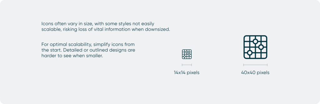
- Sizing: The final size of your icon should prioritize readability and detail in the design. You might choose a different icon depending on whether it’s going to be displayed at 14×14 pixels or 40×40 pixels. As icons decrease in size, it becomes increasingly challenging to distinguish details due to limited space.
For readability, we recommend keeping icons close to the font size being used, preferably no smaller than 14 pixels (equivalent to an 11-point font size). Anything smaller can be difficult for the average user to make out.
- Style: filled vs outlined. While there’s no definitive answer, the effectiveness of an icon hinges on how swiftly a user can recognize it and grasp its meaning. When choosing a style, there are numerous elements to explore, such as dynamics, color, space, shape, and texture. With solid icons, you have the freedom to experiment with all these elements, whereas outline icons will limit you to shape and space, challenging you to create something that resonates with users.
Be mindful that outlined icons are harder to distinguish the smaller they get.
Last thoughts: when in doubt…
Even after choosing the right icon, application and placement can help or hurt an interface.
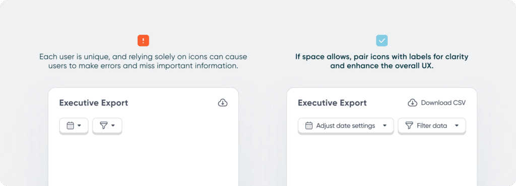
- When in doubt… accompany icons with labels for clarity. Every user is different, and their experiences shape the way they interpret symbols. Overcoming these differences can be challenging, so icons that might leave users questioning their meaning can benefit from having a label.
- When in doubt… less is more. Chartjunk icons, unnecessary elements in data visualizations, can make views overly complex. Great iconography prioritizes clarity and relevance, avoiding confusion and effectively conveying information. Apply principles of minimalism and simplicity to avoid clutter and ensure all icons serve their intended purpose without unnecessary distractions.
Data-Ink Ratio Animation and How to Apply it in Tableau
- When in doubt… place icons to the left of the label. This is a common practice because it follows the natural reading pattern for many languages, where readers typically start from the left and move to the right. This arrangement allows users to quickly identify the associated icon before reading the label, aiding in faster recognition and understanding.
While icons undoubtedly enhance the visual appeal of data visualization dashboards, it’s important not to prioritize aesthetics over functionality. Icons should be utilized sparingly, wherever they can enhance comprehension and reduce cognitive load for users. By ensuring that icons serve a clear purpose, we can use them effectively to communicate information, elevate the user experience, and avoid instances of chartjunk in the process.

Written By
Rafael Simancas

Peer Review
Alyssa Huff
Assoc. Director, Information Design
Related Content
Why Dashboard UX is Important

Dashboards are valuable tools that allow us to visualize and analyze the most important data at a glance. The effectiveness…
How to Create Better Dashboard Layout Designs with Figma

Being able to apply some basics of dashboard layout design to your visual analytics projects in Figma can bring a…
Applying Gestalt Principles to Dashboard Design
Have you ever heard the Gestalt Principles referenced when people are talking about data visualization or design? The Gestalt Principles…