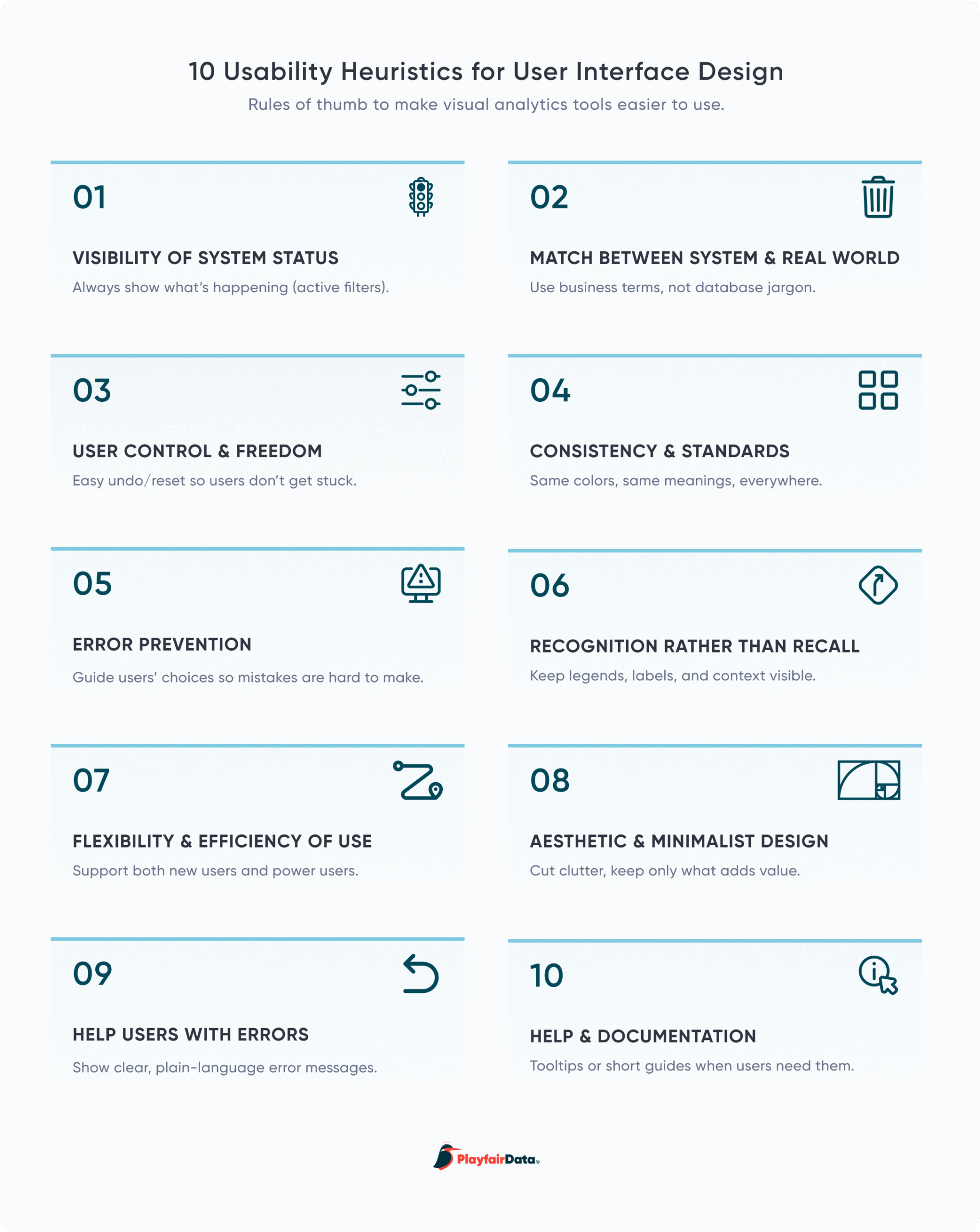
How Nielsen’s Usability Heuristics Apply to Visual Analytics

Understanding human perception, cognition, and psychology is indispensable when it comes to creating successful visual analytics tools. A psychological element we often unknowingly use, called a heuristic, is a rule-of-thumb or mental shortcut that we can use to make a decision or solve a problem. Humans have heuristics for many things, but they can be especially useful for dashboard interface design. In this post, I’ll walk you through Nielsen’s 10 Usability Heuristics, how they relate to visual analytics, and why you should understand them.
FAQs answered in this post:
What are Nielsen’s 10 Usability Heuristics and why do they matter for dashboards?
Nielsen’s 10 Usability Heuristics were created by Dr. Jakob Nielsen and finalized in 1994. His factor analysis of how 101 usability principles explained 249 usability problems distilled this complex space down to 10 factors that explained most of the problems. While not specifically created to apply to dashboard interface design, applying these principles will go a long way towards improving the usability of analytics tools. A heuristic is a rule-of-thumb or mental shortcut that we can use to make a decision or solve a problem, and these can be especially useful for dashboard interface design.
How does visibility of system status apply to visual analytics tools?
System status can be applied in several ways. One is showing the date or timestamp of the data’s last refresh, which can be incorporated as informational text or in the dashboard title itself (e.g., “Last Data Refresh 10/23/2026 4:48 pm CST”). Another application is displaying the filters that are applied to a view. Without this, it can be easy for viewers to assume no filters have been applied, resulting in misinterpretation of the data. Giving users immediate feedback about the results of their actions helps build trust in the tool.
What is the difference between external and internal consistency in dashboard design?
External consistency refers to maintaining industry standards or conventions. For example, if you are creating a dashboard about weather patterns for an audience in the United States, you would use degrees Fahrenheit rather than degrees Celsius. Internal consistency refers to maintaining standards within an individual tool or suite of tools. For example, if all interactive elements on a visual analytics tool use the same stroke and drop shadow, users quickly recognize this as a visual indicator that they can take an action. Without consistency, users’ cognitive load increases as they spend more time learning how a UI works.
Why is recognition better than recall in dashboard interfaces?
Recognition is the ability to identify something as familiar, such as seeing a list of options and selecting the one you need. Recall is the ability to retrieve information from memory without any cues, like remembering a specific ID you need to pinpoint in the data regularly. Since humans have limited short-term memory, we should aim to make tool interaction, menus, instructions, and contextual information visible or easy to find. Ideally, the most frequently used filters should be visible on the view at all times, or included within an easy-to-find show/hide container.
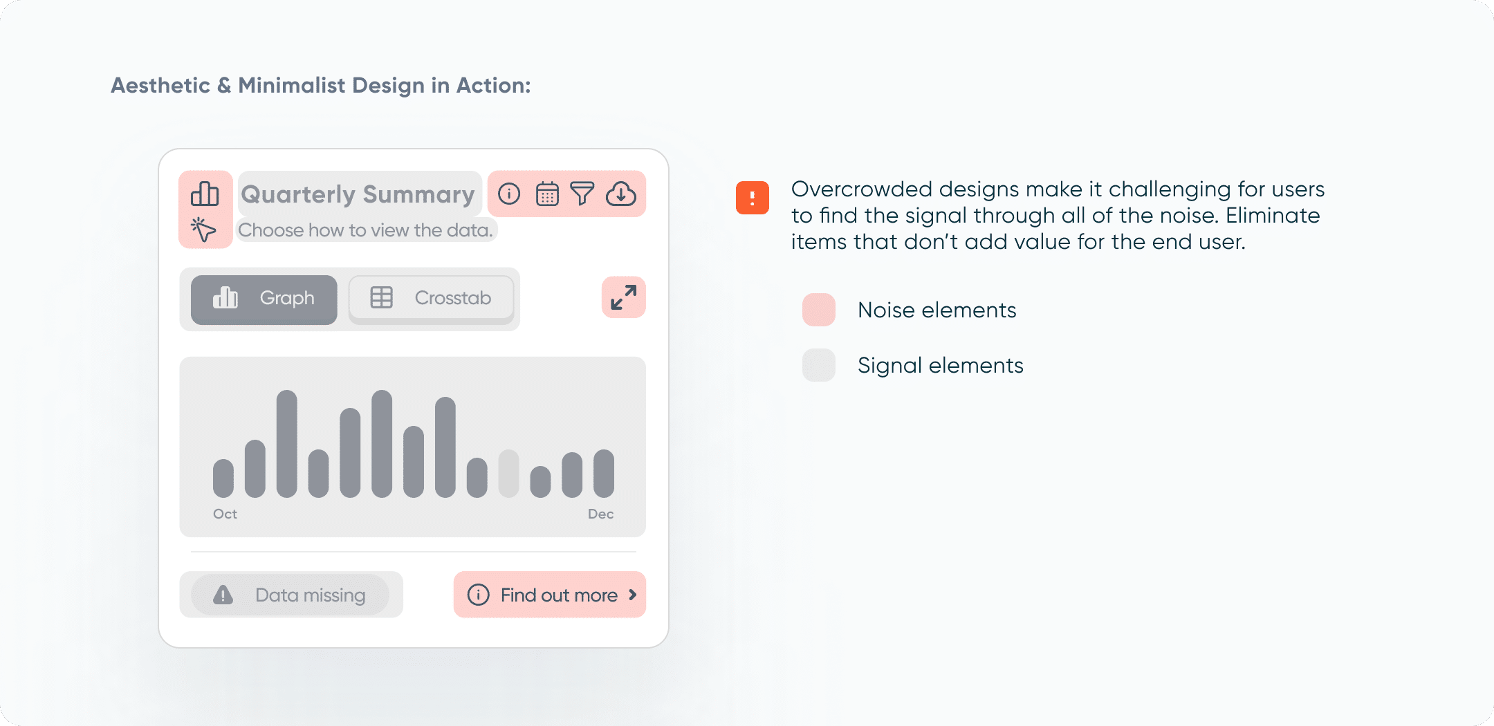
What does aesthetic and minimalist design mean for dashboards?
Aesthetic and minimalist design does not have to mean boring (and it’s also not about making a dashboard “pretty”). We are aiming to keep the most relevant and often used elements on a dashboard. Since every piece of information requires cognitive load, any extraneous information takes users’ attention away from valuable information. One litmus test is to ask, “What value does this add for the end user? Does it help them understand data, interactivity, or provide instruction on how to use the tool?” If the answer is no or maybe, remove the element. Consider what you want to signal to the user and what noise may be interfering with that signal.
Should I use usability heuristics as a checklist for every dashboard I build?
These heuristics are meant to be guidelines rather than an exhaustive checklist that you should follow each time you create a new tool. Designing better dashboards is a process, and that process won’t follow the exact same steps every time. Each tool, audience, and usability problems will be a unique challenge. Conduct heuristic evaluations early in the design process, before user testing or implementing in a BI tool, to catch fundamental usability issues when they’re easier to fix. Not all usability issues are equal—prioritize based on importance to focus on the most critical problems first. Book a complimentary strategy call to learn how Playfair Data can help you implement usability best practices in your visual analytics tools.
How the 10 Usability Heuristics came about
The 10 Usability Heuristics were created by Dr. Jakob Nielsen, cofounder of the Nielsen Norman Group, and finalized in 1994. Dr. Nielsen took a systematic approach to narrow down the list, as he describes here: “My factor analysis of how 101 usability principles explained 249 usability problems distilled this complex space down to 10 factors that explained most of the problems, though by no means all. The result was the 10 usability heuristics we know and love today.” While not specifically created to apply to dashboard interface design, applying these principles will go a long way towards improving the usability of analytics tools. Let’s dive in and talk about how each heuristic can be applied to visual analytics.
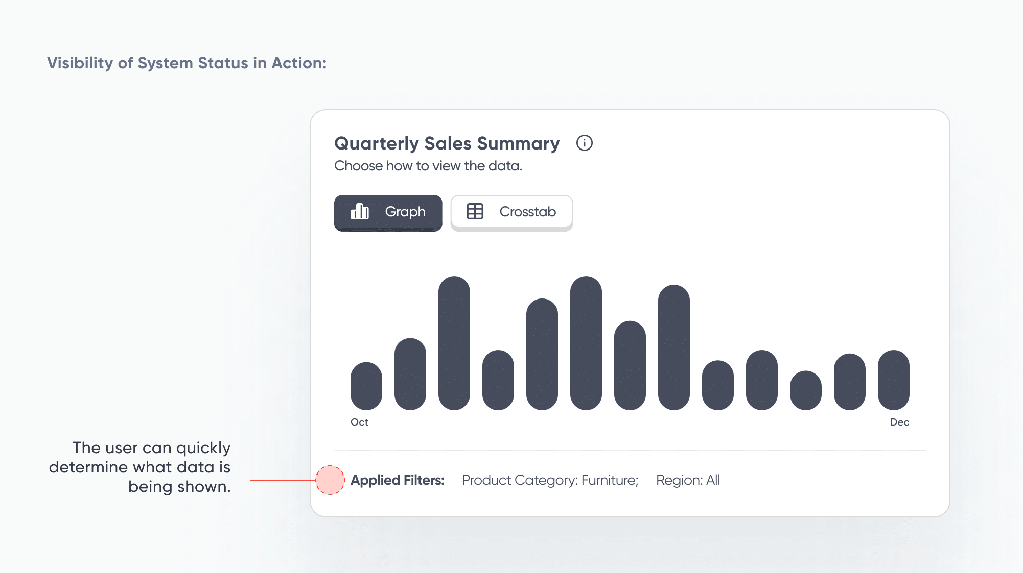
Visibility of System Status
In the case of visual analytics tools, a system status can be applied in several ways. One is showing the date or timestamp of the data’s last refresh. Users want to know that they are looking at the latest data, or at least the data relevant to their analysis. This can be incorporated into a tool as informational text or included in the dashboard title itself (e.g., “Company Sales Report: Q2 2026” or “Last Data Refresh 10/23/2026 4:48 pm CST”).
Another application is displaying the filters that are applied to a view. Without this, it can be easy for viewers to assume that no filters have been applied, resulting in misinterpretation of the data. Making it clear which filters are active helps users understand both the functionality of the tool and make correct interpretations of the data displayed. Additionally, giving users immediate feedback about the results of their actions helps build trust in the tool. This can be incorporated into the tool by adding a container that displays the filter information, indicator dots next to the filter, and/or by adding informational text to containers or cards.
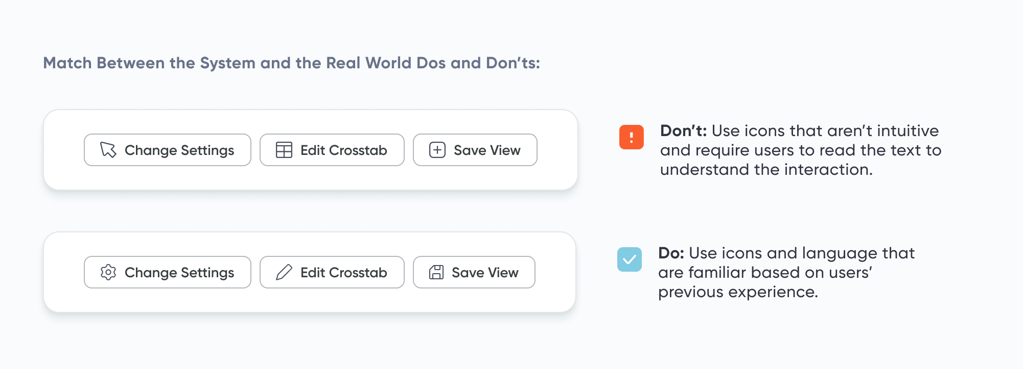
Match Between the System and the Real World
Many users are familiar with software like Microsoft Word or internet browsers like Google Chrome. Due to users’ experiences with these tools, there is no need to reinvent the wheel when designing a dashboard user interface (UI). Reusing icons like the floppy disc for “Save”, the gear for “Settings”, or the pencil for “Edit” means the user does not have to learn new icons or become confused when familiar icons are missing from the interface. Furthermore, this heuristic goes beyond experience with other tools, but also considers the culture of our audience and their day-to-day experiences. We use a trash can icon for “Trash” or “Delete” because it is a commonly understood symbol – even users who are not tech savvy or have used many tools before will understand its meaning.
Building Blocks of Dashboards: A Beginner’s Guide to Visual Elements
If there are certain icons, colors, or language that your target audience commonly uses, employing those aspects will speed up your users’ ability to understand the tool. They won’t have to spend time learning new icons, new jargon, or new color associations. Don’t assume that your understanding of icons, words, or phrases matches that of your users. During discovery, take the time to uncover the terms and language your users are familiar with.
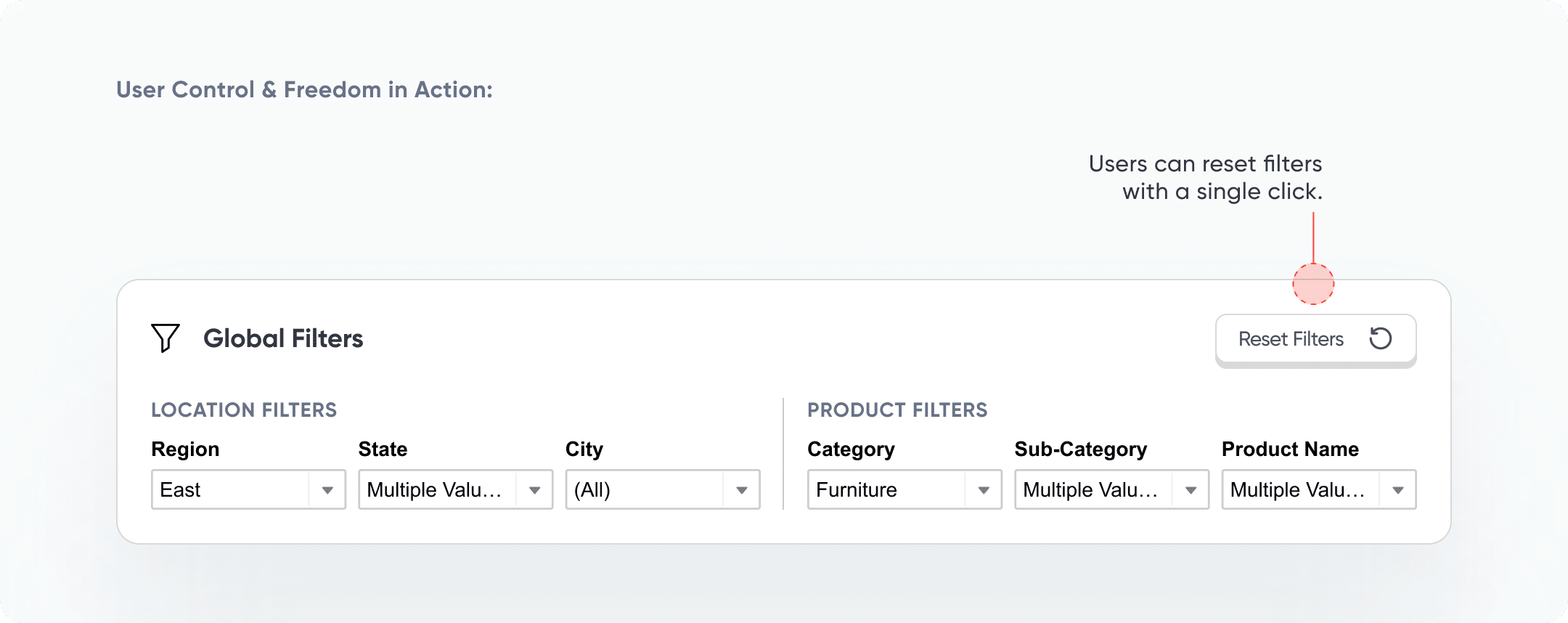
User Control and Freedom
If the “Undo” button was suddenly eliminated from all software, can you imagine how frustrated everyone would be? People often make mistakes when interacting with digital tools, and dashboards are no exception. Including “Apply,” “Cancel,” and “Reset Filters” buttons in a visual analytics tool gives users the confidence to know that they can back out of or even reset filters. Unintentional clicks or uninformative filter results are easily remedied with a flexible UI.
![]()
Furthermore, these kinds of buttons have additional benefits. One, they can reduce the number of clicks it takes for a user to complete an action. It’s much easier to click “Reset Filters” than to check and uncheck boxes or radio buttons to return to a previous state. Two, they can prevent a loading screen from interrupting the flow of work. This comes into play when “Apply” buttons are included – users can check and uncheck filters uninterrupted, then click “Apply” to load all of their changes at once.
Consistency and Standards
Without consistency, users’ cognitive load is increased as they spend more time learning how a UI works. It’s important to maintain both external and internal consistency. External consistency refers to maintaining industry standards or conventions. For example, if you are creating a dashboard about weather patterns for an audience in the United States, you would use degrees Fahrenheit rather than degrees Celsius to convey temperature. Internal consistency refers to maintaining standards within an individual tool or suite of tools. Design systems, even basic ones, can provide significant benefits in terms of consistency and standards. For example, if all of the interactive elements on a visual analytics tool use the same stroke and drop shadow, users quickly recognize that this is a visual indicator that they can take an action.
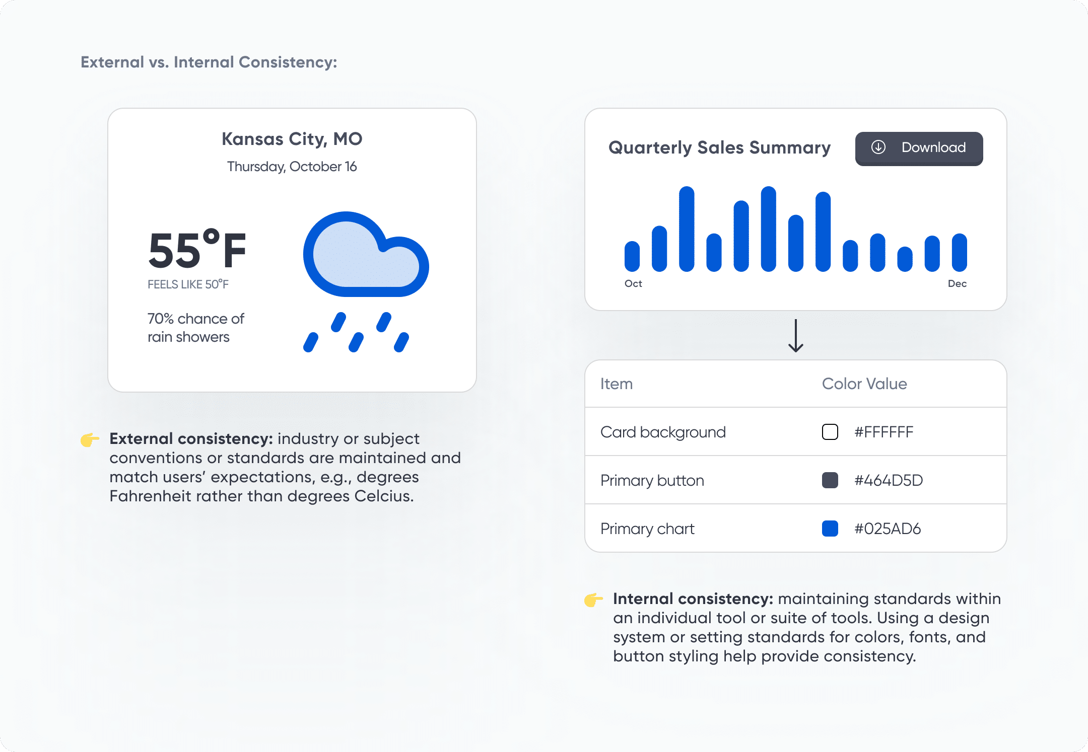
Playfair Data offers brand guidlelines for visual anlaytics to support maintaining internal consistency. If your company could use a resource like this, let us know how we can help.
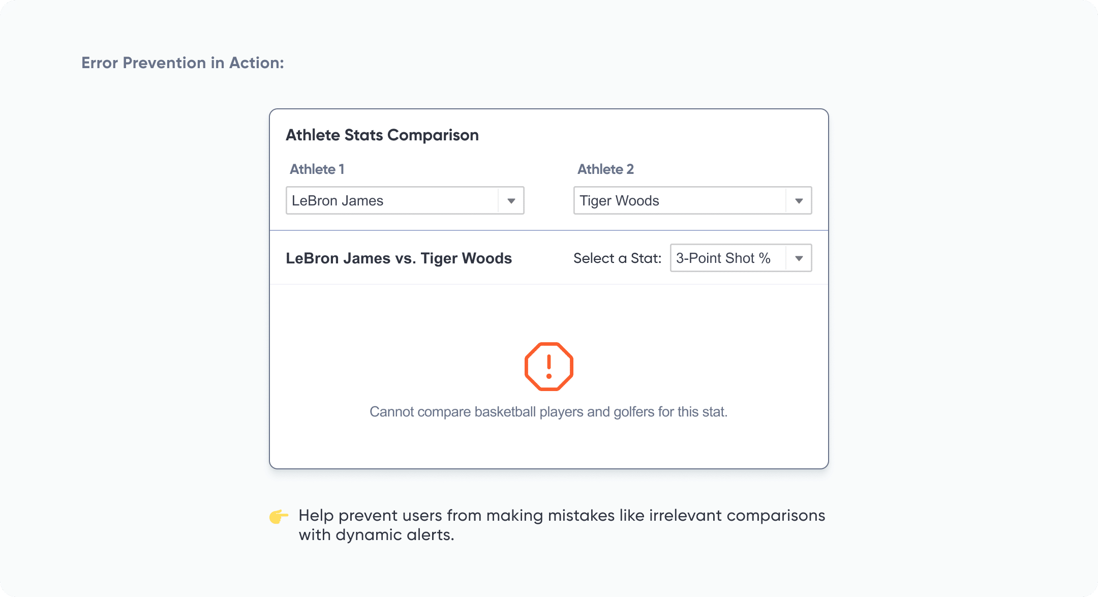
Error Prevention
Nielsen describes two types of errors to watch out for: slips and mistakes. Slips are not conscious errors, but rather caused by inattention. Slips can be prevented by starting with good defaults and including helpful constraints. In the case of visual analytics tools, we can help prevent slips by setting filter defaults to the most common use case or limiting filter or toggle options to only the relevant values.
Mistakes, on the other hand, are conscious errors caused by a discrepancy between the design and what the user expects. Preventing mistakes might require a bit more thoughtfulness. One possible mistake that users can make in a visual analytics tool is creating comparisons that aren’t apples-to-apples comparisons. Options to prevent this can include limiting filter or toggle options, displaying only relevant values based on initial criteria set by the user, or overlaying the visual with an alert to let the user know that their comparison is not useful.
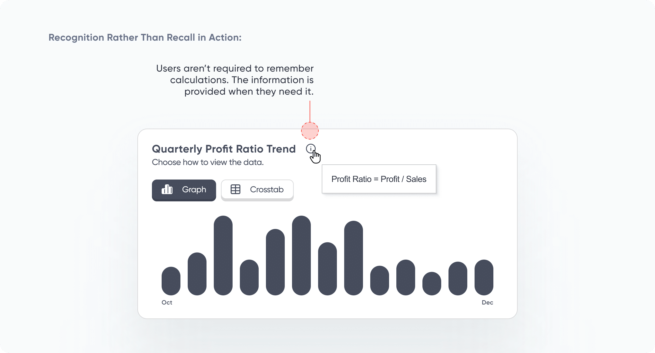
Recognition Rather than Recall
First, let’s define recognition and recall. Recognition is the ability to identify something as familiar, such as seeing a list of options and selecting the one you need. Recall is the ability to retrieve information from memory without any cues, like remembering a specific ID you need to pinpoint in the data regularly. Since humans have limited short-term memory, we should aim to make tool interaction, menus, instructions, and contextual information visible or easy to find. While it might not be possible to show all the filters on the dashboard at once, for example, ideally, the most frequently used filters should be visible on the view at all times, or included within an easy-to-find show/hide container. To include additional contextual information, such as calculation details or category definitions, without adding too much text to the dashboard, I recommend using an information icon that the user can hover over to see more information.
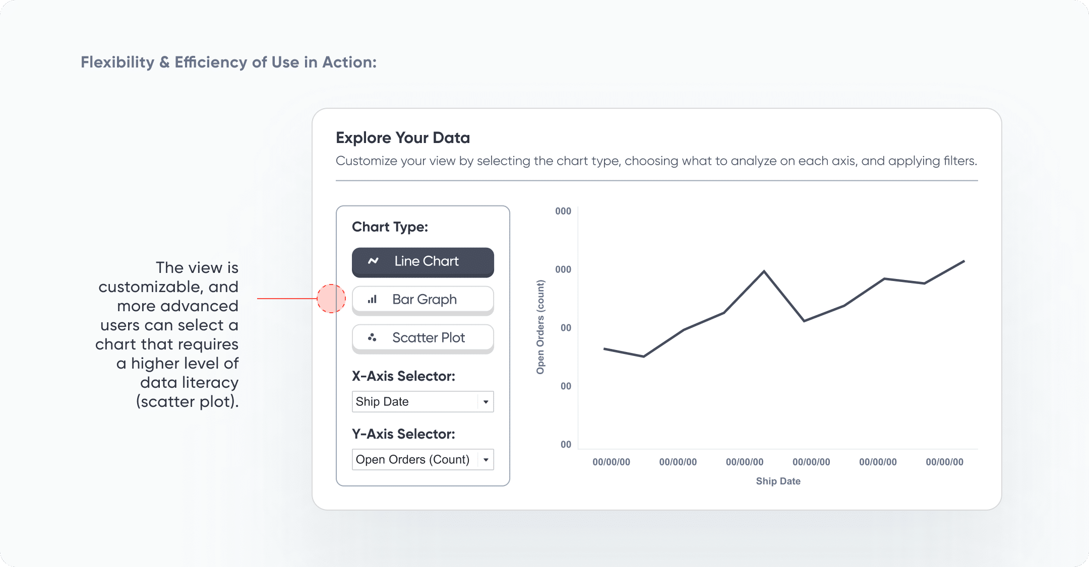
Flexibility and Efficiency of Use
It is important to incorporate flexibility and efficiency into a tool in such a way that novice users aren’t confused and experienced users can take shortcuts or customize interactions. It’s very common to find that stakeholders find different metrics important based on their role or department in a business. It may not be practical or feasible to create a view for each use case. In this situation, a customizable dashboard that allows users to select the dimensions, measures, and even chart types would provide the most flexibility and meet the most needs. Alternatively, software like Tableau allows for the creation of row-level security, enabling us to limit or expand the dimensions or measures available in the dashboard.
Aesthetic and Minimalist Design
Aesthetic and minimalist design does not have to mean boring (and it’s also not about making a dashboard “pretty”)! This heuristic aligns with Edward Tufte’s concept of chartjunk and can be one of the trickiest aspects of dashboard design to master. In a nutshell, we are aiming to keep the most relevant and often used elements on a dashboard. Since every piece of information requires cognitive load, any extraneous information takes users’ attention away from valuable information.
Streamlining Dashboards: Minimizing Chartjunk with Icon Design
One litmus test for questionable elements on a dashboard UI is to ask, “What value does this add for the end user? Does it help them understand data, interactivity, or provide instruction on how to use the tool?” If the answer is no or maybe, remove the element from the dashboard. Another way to think about this is through the concept of signal and noise. We aim to amplify the signal, or what we want the user to pay attention to, such as a KPI, a spike in a trend, or a relationship between two variables.
Continue reading with a free account, or login.
Unlock this tutorial and hundreds of other free visual analytics resources from our expert team.
Already have an account? Sign In
By continuing, you agree to our Terms of Use and Privacy Policy.
Simultaneously, we aim to dampen the noise, or what could distract our user from the signal, such as too many colors, overwhelming text, or confusing charts. Consider what you want to signal to the user and what noise may be interfering with that signal.
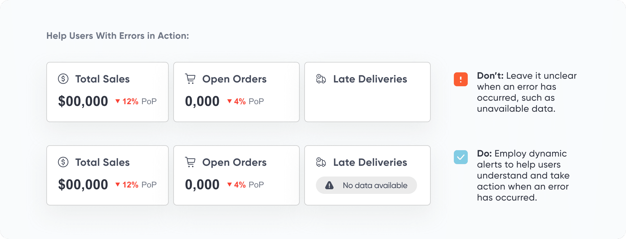
Help Users Recognize, Diagnose, and Recover from Errors
Error messages should be obvious, use simple language (no error codes), and provide a solution for the user. One issue that users may encounter when interacting with visual analytics tools is applying filters in a way that results in no remaining data points that match the filter criteria. In this situation, a pop-up alert and a reset button can be incorporated into the tool. This lets users know that the tool is not broken, and that they need to reset their filters or adjust them to visualize the data.
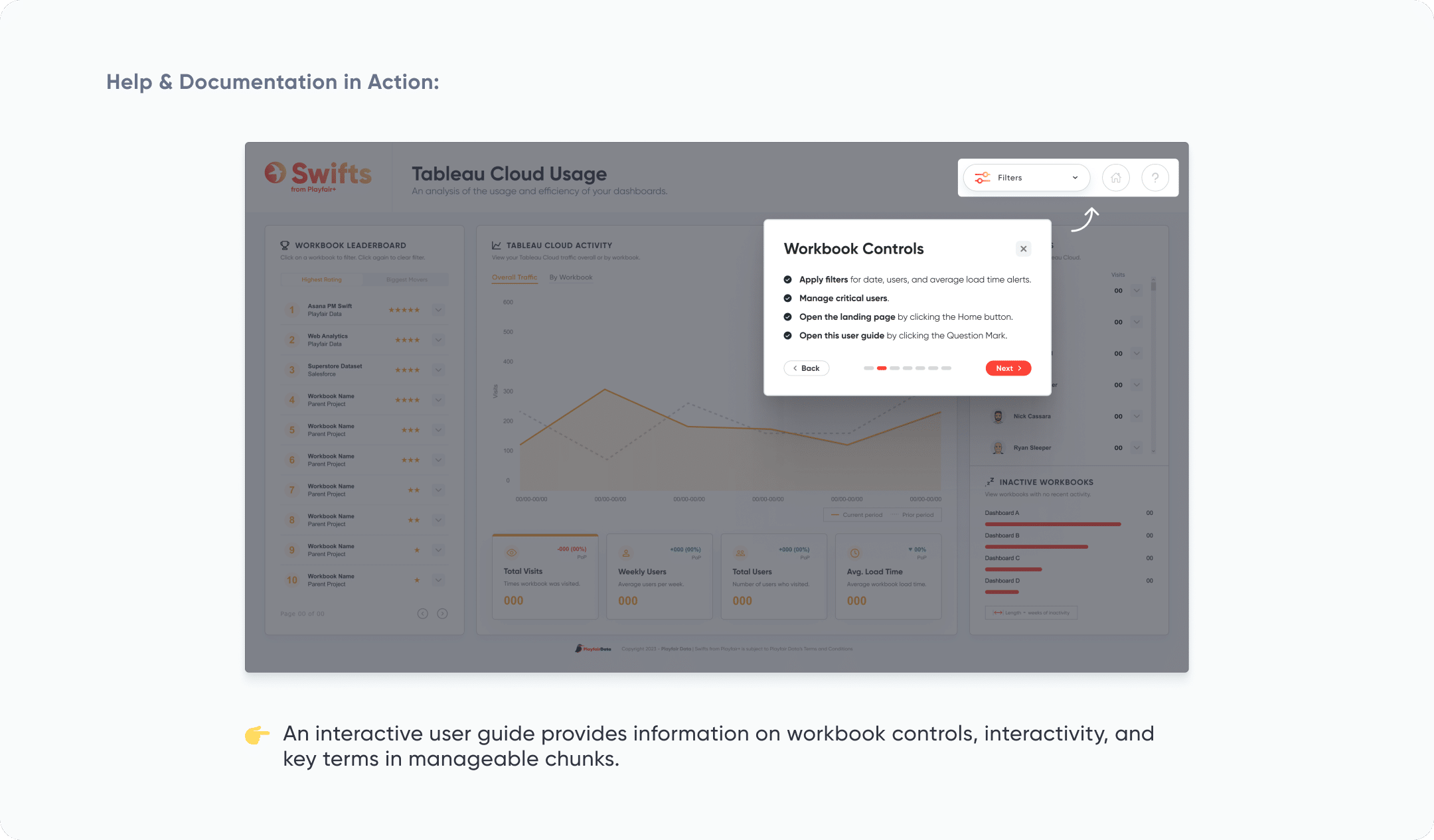
Help and Documentation
Help guides or documentation should be easy to find and use. Ideally, help information should be included in context when the user needs it. Adding an info icon that provides information on hover, a user guide overlay, or an interactive user guide are three simple ways to ensure that users understand interactivity, important terms, key metric calculations, and the data sources behind a visual analytics tool. The user guide overlay or interactive user guide should be easily accessible via a button included in the menu or navigation pane.
Enhancing UX with Interactive User Guides in Tableau
Implementing Usability Heuristics
If this is your first time reading about Nielsen’s usability heuristics, you may be overwhelmed by the factors you should consider while creating visual analytics tools. Keep in mind that these heuristics are meant to be guidelines rather than an exhaustive checklist that you should follow each time you create a new tool. Here are some tips for implementing usability heuristics into your own workflow:
- When to conduct a heuristic evaluation: Do this early in the design process, before user testing or implementing in a BI tool, to catch fundamental usability issues when they’re easier to fix. Repeat evaluations iteratively: after design changes, just before launch, or whenever users report issues.
- Heuristics don’t replace user testing: Real user testing is still essential. Heuristic evaluations are a great complement to user testing, helping you catch common usability issues faster.
- Great for building user experience (UX) instincts: If you’re new to UX, heuristic evaluations are a useful way to train yourself to spot usability problems. The more you practice, the fewer mistakes you will make.
- Success goes beyond usability: Even a perfectly usable dashboard can fail if it lacks business strategy, marketing, or a good data foundation. Usability matters, but it’s just one piece of the puzzle.
- Prioritize based on importance: Not all usability issues are equal. Some are minor annoyances, while others can block users entirely. Use importance ratings to focus on the most critical problems first.
Conclusion
While the 10 Usability Heuristics weren’t created specifically for visual analytics tools, I hope these examples show that they are very valuable in creating tools that are both easy and pleasant to use. Remember that you don’t need to mark off each of these heuristics like a checklist before a tool can be considered usable. Designing better dashboards is a process, and that process won’t follow the exact same steps every time. Each tool, audience, and usability problems will be a unique challenge. I’ll end with this quote from Dr. Nielsen: “Skilled designers absolutely introduce usability problems in their initial designs: nobody can create a perfect UI on their first try. This is why we conduct user testing, and this is also why it’s useful to have usability heuristics for further analysis and refinement of the initial designs.”
Happy creating,
Alyssa

Written By
Alyssa Huff

Peer Review
Rafael Simancas
Sr. Manager, Brand Strategy

Peer Review
Juan Carlos Guzman
Visual Analytics Associate
Related Content
Understanding Design Thinking for Visual Analytics
Have you ever faced a messy dashboard problem and thought, “Where do I even start?” That’s where design thinking comes…
Fundamentals of Accessibility Design: Making Your Dashboards a Friendlier Place
“What are your accessibility design standards?” It’s a question that can catch us off guard during project discussions. But when…
3 Ways Psychological Schemas Can Improve Your Data Visualization

Whether you are aware of it or not, you are constantly recognizing and processing patterns in your everyday life. Think…