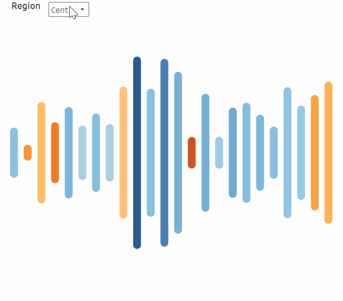
How to Create Engaging Soundwave Charts in Tableau

A soundwave chart, which gets its name for its resemblance to a soundwave (shocking, I know), is excellent for measuring volume across time, dimensions, or other discrete bins. To better understand what a soundwave chart is, let’s first think about music. Throughout the runtime of a song, the volume of the song will get louder and quieter. To visualize the song’s volume, we could create a soundwave chart where the bars get larger or smaller depending on the measure of volume across time (the length of the song).
In other words, there is a bar for each second of the song, and each bar gets larger when the song’s volume increases then; conversely, the bars get smaller when the song’s volume decreases, creating a wave effect. We can recreate this soundwave effect in Tableau, but instead of measuring a song’s volume, we can use our own measures to compare how volume has increased or decreased over time, across dimensions, or across other discrete bins.
Two Ways to Make a Diverging Bar Chart in Tableau
The soundwave chart is a cousin of the bar chart in that it is best used for comparisons, but the soundwave is specifically advantageous because it grabs the attention of the user by exaggerating differences between values which can create a good starting point for analysis. In this example, we will be creating a soundwave chart using the Sample-Superstore data to analyze how many sales have occurred over time by region.
Calculations needed for a soundwave chart
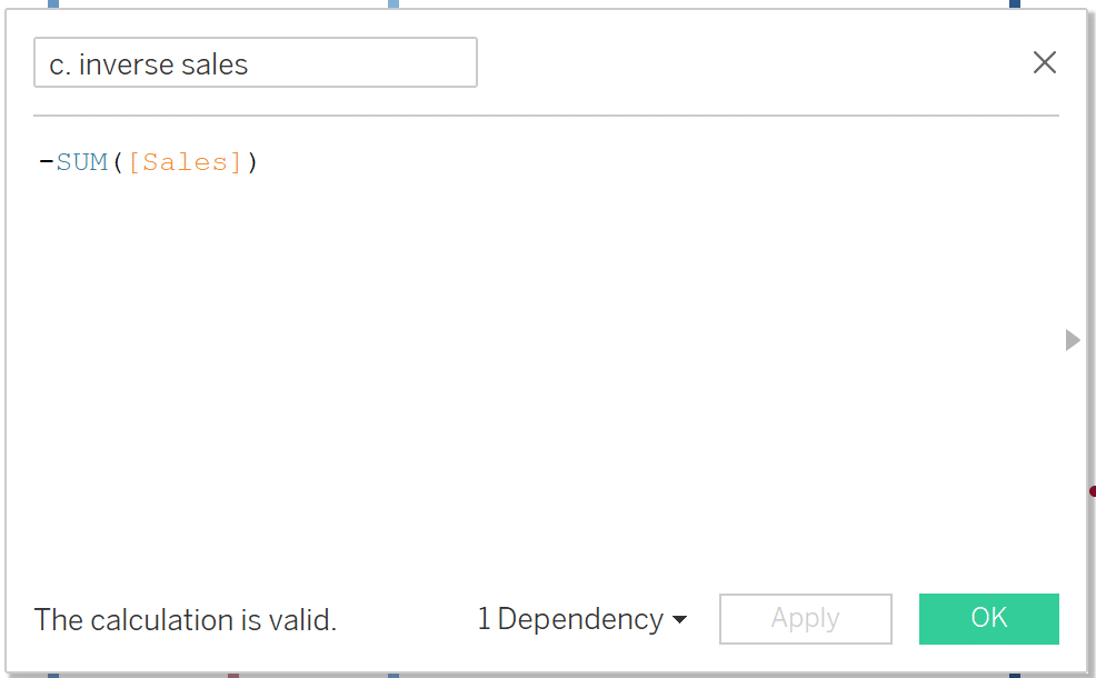
A soundwave chart has a discrete x-Axis and a continuous y-Axis. Because we want to know how many sales occurred over time, we’ll need a discrete date field for month/year. We’ll also need to create an inverse measure calculation to exaggerate the differences in sales, creating the classic ‘soundwave’ effect, and ultimately drawing more attention to the differences in sales over time.
![]()
Let’s start building our visualization by first creating the inverse calculation that will create the soundwave. The inverse calculation will calculate the negative value (or opposite) of whatever continuous measure is used on our y-Axis (what the lines on our soundwave chart will be sized by). In our case, Sales will be the y-Axis, so the inverse calculation will calculate a negative sales value. In the Data pane, select ‘Create Calculated Field…’, name the calculation ‘c. inverse sales’ and write the logic as ‘-SUM([Sales])’. Select OK.
Continue reading with a free account, or login.
Unlock this tutorial and hundreds of other free visual analytics resources from our expert team.
Already have an account? Sign In
By continuing, you agree to our Terms of Use and Privacy Policy.
Assembling the soundwave chart
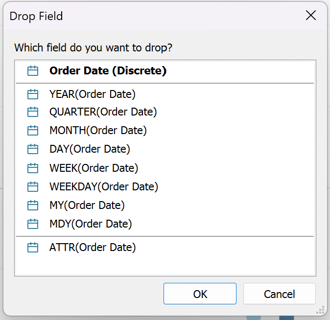
Now that we have our sales inverse calculation created, let’s begin assembling the view. Start by right-clicking and dragging the Orders Date field to the Columns shelf. When you release the date field onto the Columns shelf, select ‘MY(Order Date)’ and make sure the pill is blue, which represents a discrete field.
Add Measure Values to the Rows shelf. Remove everything from the Measure Values card except SUM([Sales]) and AGG(Inverse Sales).
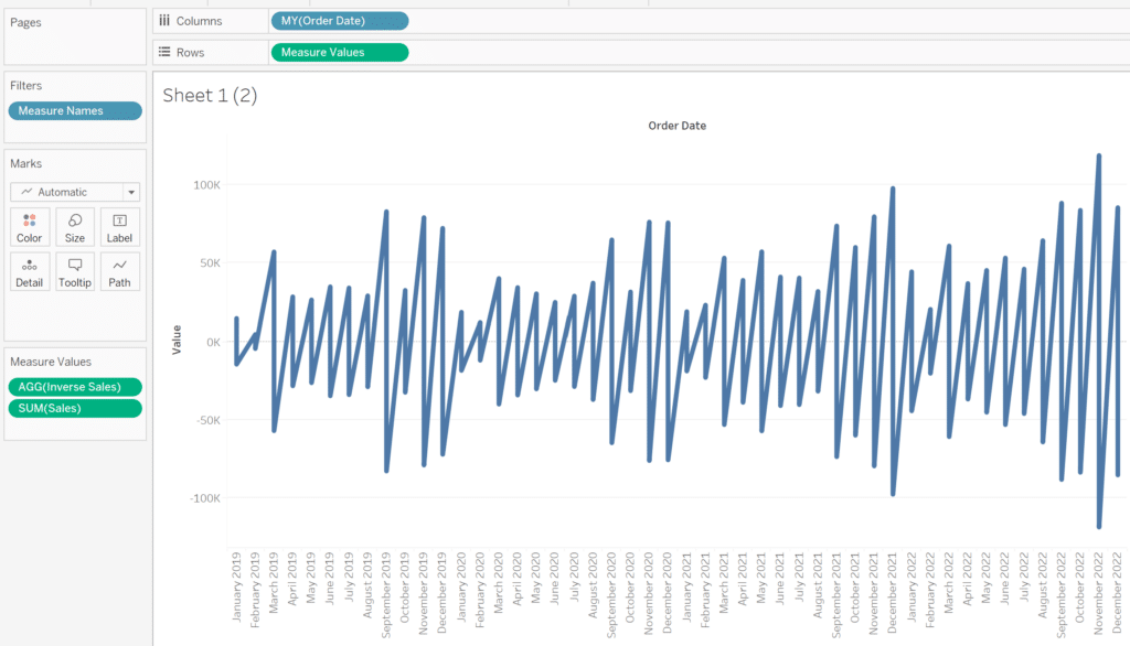
Add Measure Names to the Path property of the Marks card to properly align the bars based on the Measure Values.
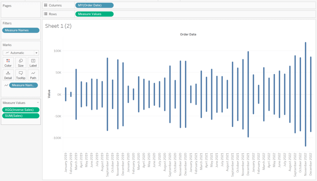
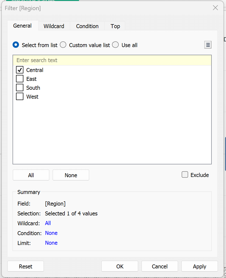
To narrow down the focus of the analysis, let’s add some filters. Drag Region to the Filters shelf and select Central. Select OK.
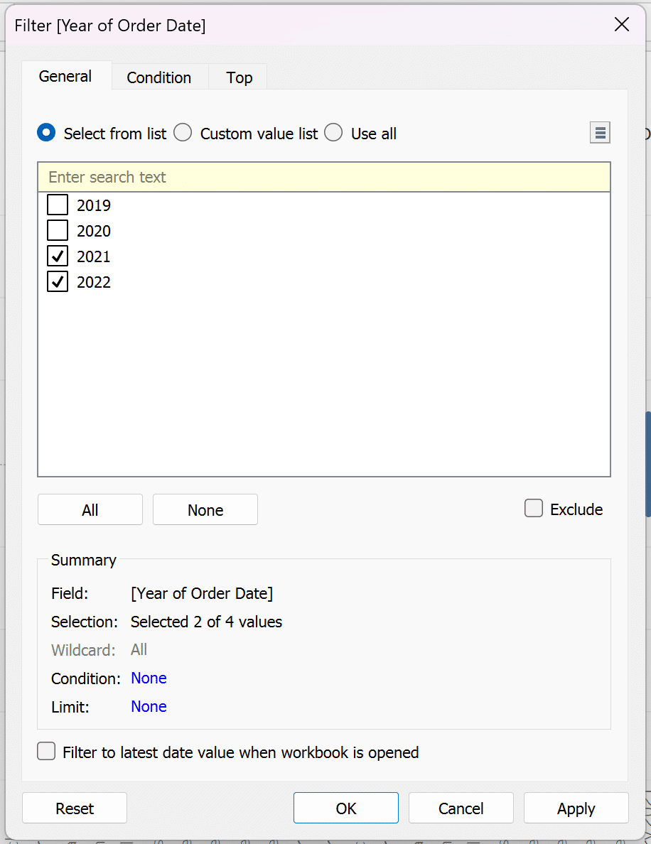
Drag Order Date to the Filters shelf and select ‘2021’ and ‘2022’. Select OK.
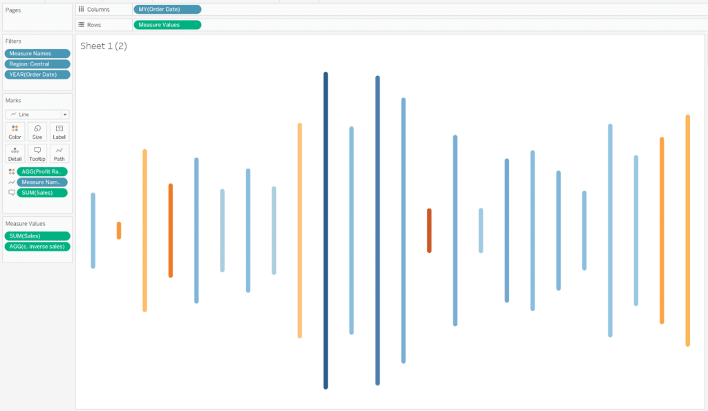
Add Profit Ratio to the Color property of the Marks card to visualize which months are most profitable, whether or not they have the most sales. Adding this one feature adds invaluable information to the visualization as it could potentially spark an important starting point of discussion or further analysis about why some months have high sales volume but a lower-than-average profit ratio or vice versa. Adjust the size of your bars to your liking using the Size property of the Marks card and change the view from Standard to Entire View.
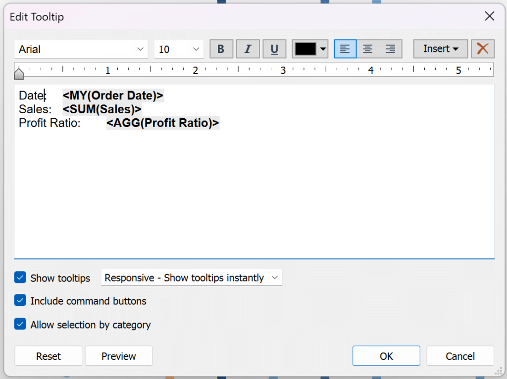
Next, we’ll format our Tooltips to show the user vital stats about each date. Let’s include the date, sales, and profit ratio.
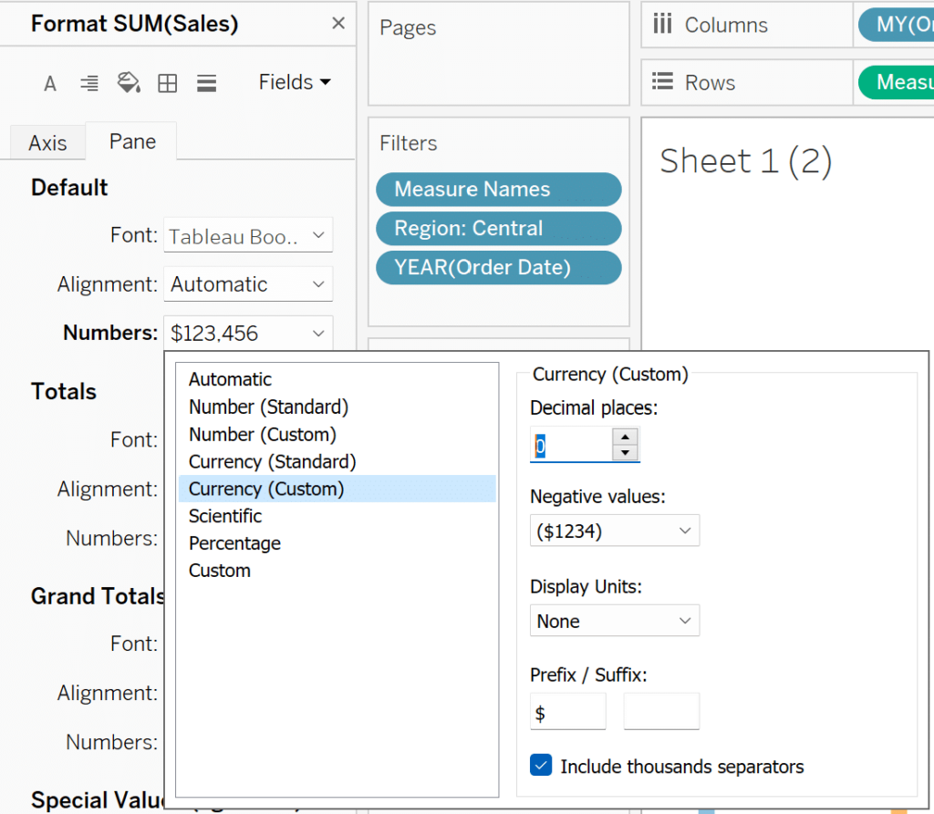
To improve the UX of our visualization, lets make sure our sales numbers displays as currency and profit ratio displays as a percentage. Right-click the view and select ‘Format’. In the Format pane, select ‘Fields’ at the top and select ‘SUM(Sales)”.
![]()
Select the Pane tab and under the ‘Default’ section, select ‘Numbers’, select ‘Currency (Custom)’, change your decimal places to 0 and the Prefix/Suffix to a dollar sign ($).
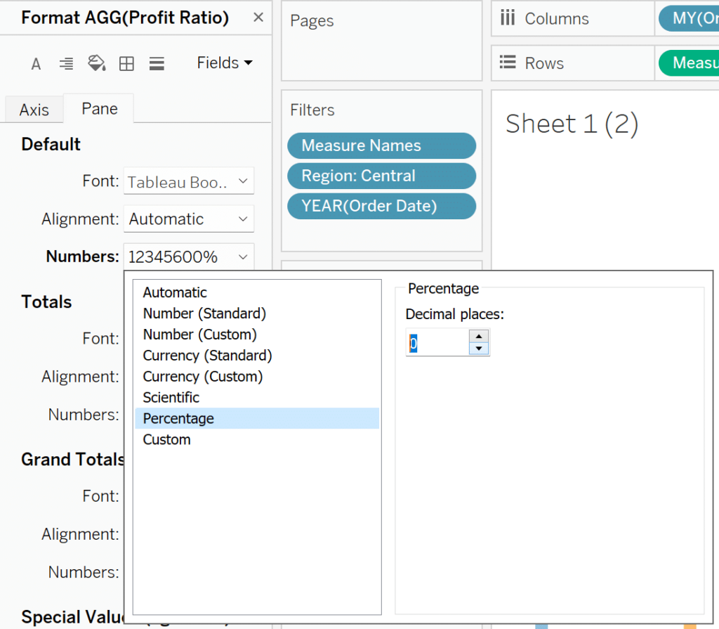
Repeat the process for Profit Ratio, but instead of selecting ‘Currency (Custom)’, select Percentage and change the decimal places to 0.
Lastly, right-click your Region filter and select Show Filter, then edit the settings to display a single value drop-down to allow your user to change the Region. And that’s it! You now have a fully functioning soundwave chart!
These principles can be applied to almost any scenario to quickly and effectively display a comparison over time. One specific advantage to soundwave charts is their approachability to those who may be less familiar with data visualization and their ability to attract attention to differences in measures. With the advent of music-data reporting from streaming services and more, this chart type will be familiar to most users and can be easily stylized for an aesthetic and easily navigated user experience.
Happy vizzing,
Dan


Written By
Dan Bunker

Peer Review
Ethan Lang
Director, Analytics Engineering
Related Content
3 Ways to Make Spectacular Sparklines in Tableau
Minimalist chart types like Tableau sparklines are a great addition to most dashboards because they can add value without overcrowding…
How and Why to Use Diverging Unit Charts in Tableau
A diverging unit chart acts in the same fashion as a normal unit chart but adds another layer of insight…
How to Make Unit Charts with Continuous Measures in Tableau

Unit charts – or stacked bar charts made up of equal-sized marks – take the benefits of the bar chart…