How to Create Light Mode and Dark Mode Dashboards in Tableau


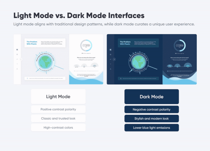
Over the years, Playfair Data has been honored to receive and be nominated for several design awards for our products. A highlight of 2022 was our nomination for the Information is Beautiful Award for a workbook titled The Problem with Plastic. Within this dashboard, we created an immersive and customizable user experience by allowing the user to switch between light mode and dark mode.
In this blog post, we will discuss the elements of light mode and dark mode, the benefits of allowing users to choose their viewing mode, design considerations to keep in mind, and how you can incorporate this feature into your own tools and products.
What is dark mode/light mode?
Dark mode and light mode interface designs are also known as positive contrast polarity and negative contrast polarity. Positive or light mode refers to dark-font text on a light background. The negative or dark mode is the combination of light text on a dark background but emits less light than its counterpart.
3 Ways to Wow Stakeholders with Figma
The UI/UX feature has garnered popularity in recent years due to its widespread implementation in various apps, mobile interfaces, and websites – and more and more operating systems are starting to support it. The dark mode is almost a requirement for any new interface looking to break into the market.

Dark mode interfaces are not only beautiful, they are also functional. There are several surprising benefits to providing users with a dark mode option in addition to a light mode.
Continue reading with a free account, or login.
Unlock this tutorial and hundreds of other free visual analytics resources from our expert team.
Already have an account? Sign In
By continuing, you agree to our Terms of Use and Privacy Policy.
Benefits of dark mode/light mode options
- Accessibility
One of the greatest benefits of providing users with a dark mode option is making your dashboards more accessible to all people. Dark mode interfaces provide a more comfortable experience for individuals who have difficulty focusing, trouble reading or experience eye strain or headaches when looking at bright screens.
Many users will benefit from decreasing blue light consumption by using dark mode. Bright screens with solid white backgrounds emit blue light, which can dry eyes and cause damage to users’ retinas if in contact for extended periods. The darker interface emits less blue light, providing a more comfortable viewing experience, especially for individuals with light sensitivity issues. Eye comfort during long sessions is pivotal, particularly regarding data visualization dashboards, as many analysts and executives will spend time interacting with the tool to make critical decisions.
But, if not implemented correctly, a dark mode can make site navigation difficult for some individuals. When designing for dark mode, you need a new color palette because of the contrast difference. Using light text on dark backgrounds can affect readability if the contrast is too high, giving the appearance of blurry text (also known as the Halation Effect). This issue can particularly affect individuals who suffer from astigmatism.
Providing the option to use light or dark mode expands accessibility to fit a user’s specific needs or preference for a more holistic experience.

- Modern Style
Prioritizing design and modernity in your data visualization dashboards has numerous benefits. Society’s demand for interfaces in dark mode is only getting stronger. Some may like its visual appeal, while others find it practical for solving eye-straining and battery-saving measures. Regardless, the desire for dark mode is becoming an expectation from all technology interfaces. Considering cultural trends and user demands can ensure your dashboards are up-to-date with the latest design tendencies and, in turn, help promote product adoption.
Design considerations
- Typography
-
- Designing both dark and light mode user interfaces requires more planning in advance. Some typefaces perform well in light mode but are not well suited for dark mode, stylistically or functionally.
- Light-colored text on a dark background can appear bolder than dark text on a light background, so you may want to use a lighter font weight for dark mode.
- Serif fonts, such as Times New Roman, tend to look fuzzy on dark backgrounds, especially when using a smaller text size. In this case, sans-serif fonts, such as Arial or Helvetica, are typically a safer choice for dark mode.
- Typeface considerations early in the process alleviate the revisions of rescaling layout and typography hierarchy from your dashboards.
How to Design a Typographic Hierarchy in Tableau
- Increase contrast in some instances
When designing light and dark mode user interfaces, make sure to pay attention to color contrast ratios. Adjusting contrast in certain areas is crucial for both aesthetic and accessibility purposes. In dark mode, increasing contrast alleviates eyestrain and improves legibility, but avoid using a pure black background with pure white text as it creates a harsh contrast that will have the opposite effect. Over-saturated colors on dark backgrounds can also decrease readability, so try using less-saturated tints or hues if you need to stick to a specific color palette. Similarly, enhancing contrast in light mode guarantees that content remains clear and distinguishable. Using darker, more saturated colors over a light background creates a bright and attractive interface that is enjoyable to view. By strategically adjusting contrast in different interface elements, such as text, icons, and buttons, designers can create visually pleasing and accessible experiences for users in both modes.
- Accessibility
When designing light and dark mode interfaces, it is important to adhere to ADA (Americans with Disabilities Act) accessibility standards to provide inclusivity and equal access for all users. Meeting the required contrast ratios between text and background elements in both modes guarantees readability and reduces the risk of eye strain. Prioritizing accessibility in the design process is specifically important when creating dark mode interfaces, as it is easy to focus too heavily on eye comfort or aesthetics while neglecting proper contrast. Following ADA guidelines confirms the interfaces will be usable by individuals with visual impairments, color blindness, or other disabilities.
- Default to what is familiar
When designing data analytics tools, we at Playfair Data prioritize making the tools intuitive and easy to use for users of all skill levels. To put this into practice, we recommend defaulting dashboards to light mode, because it is what most users will be familiar and comfortable with. In this way, users who prefer light mode will not face any friction in viewing their preferred way, and they may switch to dark mode at any time.
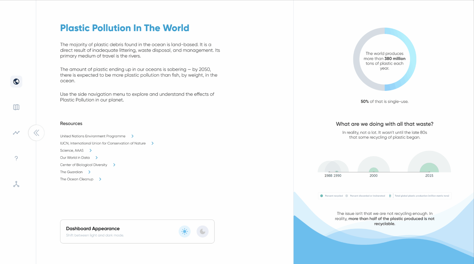
Tableau implementation
- Getting started
Once you have successfully planned and designed all of the elements for your dashboard, implementing light and dark modes in Tableau is actually very simple. Essentially you will create two copies of the dashboard, one with your light mode elements and one with your dark mode elements, and a navigation button to switch between the two dashboards. When designing The Problem with Plastic, we created a pop-out menu to house a “Dashboard Appearance” section where the user could switch between light and dark modes. The menu itself is an image with a show/hide button, but the interactivity of the menu and light/dark mode toggle mimics setting panels you often encounter when using applications and web interfaces, with one image being static and the other being a navigation button.
- Technical considerations
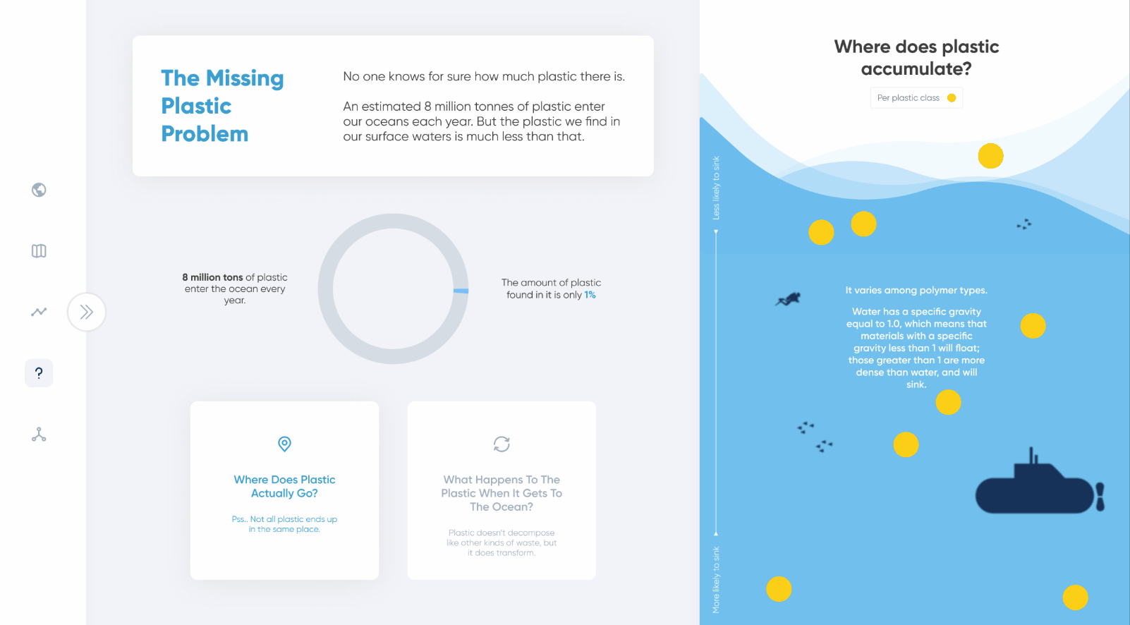
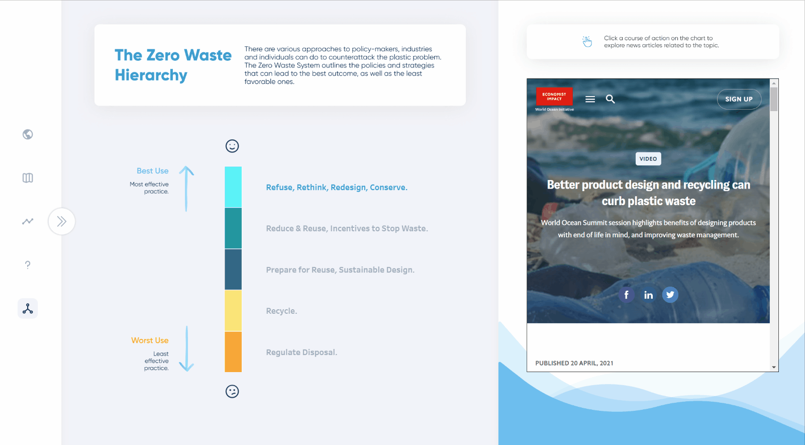
There are a few things to keep in mind when duplicating your dashboard to create the second viewing mode. First, you will need to create two versions of each sheet on the dashboard, unless your visualization uses colors that work on both light and dark backgrounds. Out of all the elements featured in The Problem With Plastic, only two used the same colors for both light and dark modes: the yellow jitter plot visualizing “Where does plastic accumulate?” and the stacked bar chart for “The Zero Waste Hierarchy.”
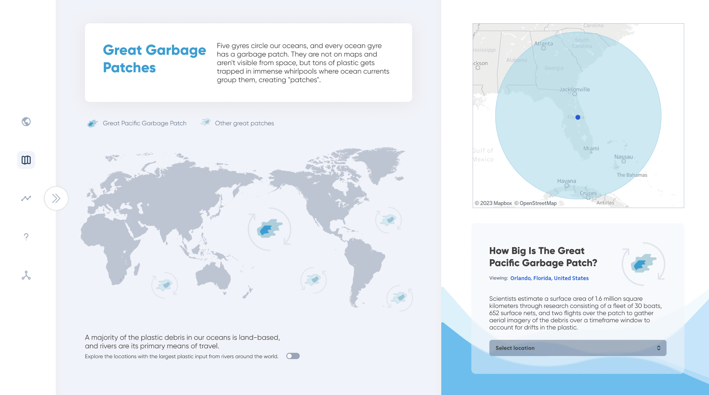
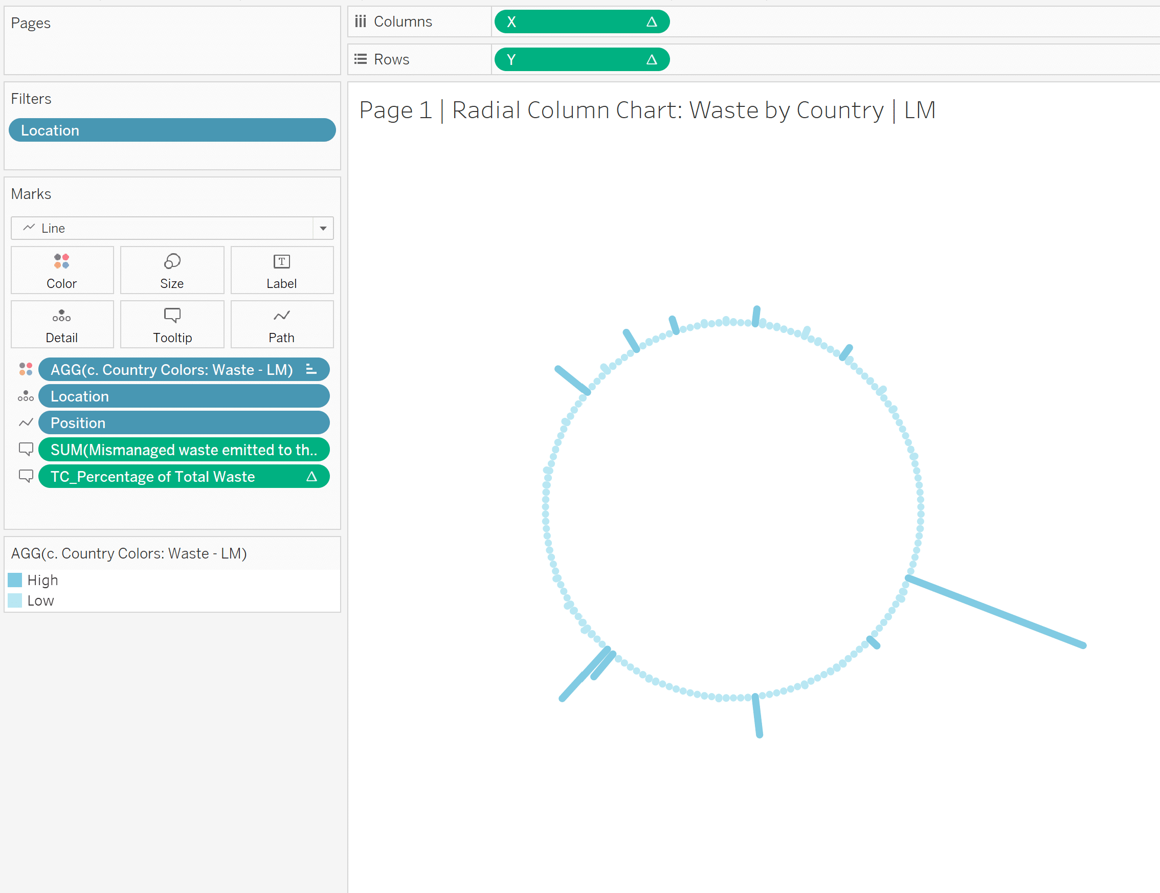
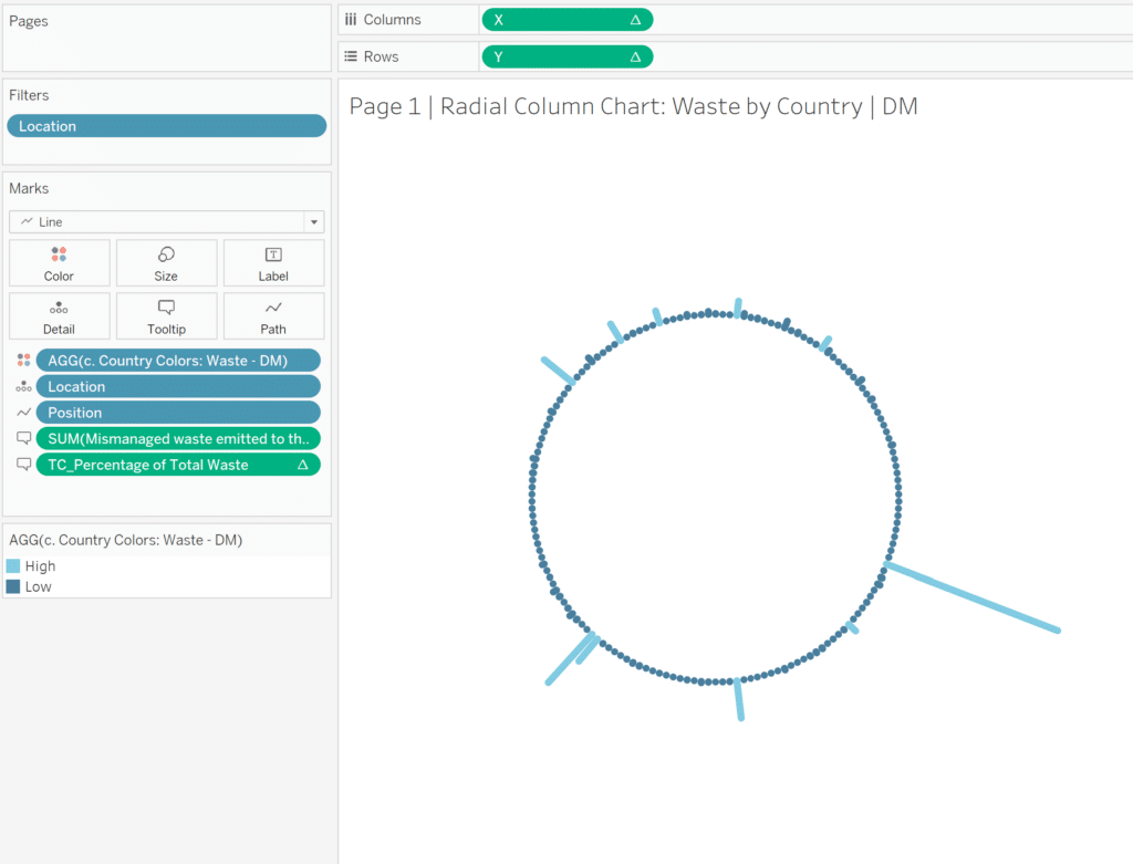
If your visualizations are colored by a dimension, like the radial bar chart or timeline on the first view in The Problem with Plastic, you will also need to duplicate the field used to color your marks. This way, you can assign different colors to the same values.
- Creating the second viewing mode
If possible, I recommend completing all of the elements for one viewing mode (light or dark) before building anything for the second. This means engineering all of your visualizations, adding all of the sheets, text boxes, and images you need to the dashboard, and creating any dashboard actions or navigation buttons you need for interactivity. Don’t forget to take note of the position and size of any sheets on the dashboard – this will come in handy when switching out your visualizations. Now when you duplicate your completed dashboard to create the second viewing mode, everything will be in place, and you can start switching out images, changing text color, and replacing sheets. A tip for replacing sheets so that they stay at the same exact spot on a dashboard: click on the sheet you want to replace, hover over the unused sheet you want to replace it with on the Sheet List, and click the curved arrow to swap out the sheet.
You will also need to update the source and target for any dashboard actions, but fortunately, when you duplicate your dashboard, the dashboard actions will be duplicated with it. And if your sheets use the same measures and dimensions for both light and dark modes, parameter actions will carry over between light and dark modes, and the two views will mirror each other. One exception is URL Actions, which do not carry over between dashboards. I covered this example in a previous tutorial on Dynamic URL Actions if you are interested in learning more.
How to Use Dynamic URL Actions in Tableau
The Problem with Plastic also features a navigation bar on the left side of each background, where the navigation buttons on a light mode view-only link to other light mode views. If you implement a similar feature, don’t forget to update the destinations of your navigation buttons after duplicating a dashboard. This way, users can only switch between light mode and dark mode through the “Dashboard Appearance” section in the pop-out menu, and the viewing experience will remain consistent while interacting with the dashboards.
Conclusion
By offering both dark mode and light mode, we can empower users with enhanced accessibility, reduced eye strain, and personalized experiences. We encourage all designers and analysts to prioritize careful planning, strategic contrast adjustments, transparent expectation setting, and a steadfast commitment to accessibility standards. At Playfair Data, we are committed to pushing the envelope of innovation and creating bespoke solutions that provide immense value. We invite you to do the same and experiment with providing light and dark mode solutions!
Happy Vizzing,
Luke Lewis & Megan Spengler


Written By
Luke Lewis

Written By
Megan Spengler

Peer Review
Rafael Simancas
Sr. Manager, Brand Strategy

Peer Review
Felicia Styer
Assoc. Director, Analytics Solutions
Related Content
3 Innovative Ways to Use Figma in Your Visual Analytics Projects

What does design software have to do with visual analytics software like Tableau? At Playfair Data, we approach our visual…

Ryan Sleeper
Dynamically Change Background and Marks with a Single Click Color is an essential asset to branding, engagement, and storytelling. In…
Ryan Sleeper
Toggle On the Fun with 3 Techniques and 3 Practical Applications In this exclusive Playfair+ webinar, Ryan shares techniques for…