How to do Reverse Normalization in Tableau

Recently, I was presented with the challenge of visualizing goal achievement at a product level. This appeared to be an easy task, but the challenge was that every single product had its own goal. To complicate things even more, none of the set goals ever totaled to 100%. So, I developed a method that reverses the normalization of data. For example, normalizing data is when you want to have your data for analysis start at the same point on an axis, e.g. 0. For reverse normalization, I took that logic and applied it to the goals so that each individual goal for my dimension member would equal 100% achievement.
Asking yourself how I did that? Let’s dive into it! In this blog, I will walk you through every step of the way including the parameters needed to set the goals, how to create the reverse normalization and how to track progression to those goals.
How to Turn Normalization On and Off in Tableau
Setting the goals
This might be something you have in your dataset either way if this was something that your data source included by default. If not you can always add the goals in your dataset at a later stage during your data engineering process or like I did in the use case for this blog, create parameters to have dynamic goal-setting capabilities.
![]()
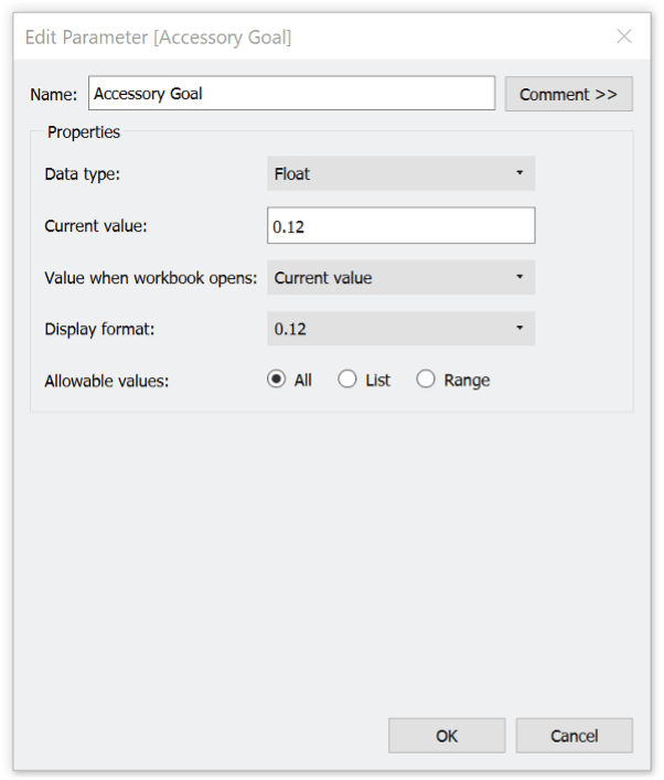
If you choose to do it within Tableau, you will need to create as many goal parameters as members in your dimension that you are looking at for the achievement. This meant for me that I needed 17 parameters for each sub-category in the Sample Superstore dataset.
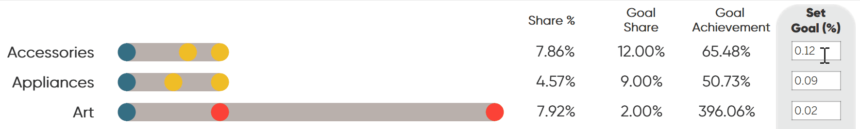
Each of those 17 will target a different sub-category. For example, I created the “Accessory Goal” parameter with a data type of float and a value of 0.12, representing 12%
Continue reading with a free account, or login.
Unlock this tutorial and hundreds of other free visual analytics resources from our expert team.
Already have an account? Sign In
By continuing, you agree to our Terms of Use and Privacy Policy.
Overall, I choose to take Mix % as my KPI trying to improve the mix across the sub-category to improve the profitability of the business. What that means is, that I looked at each individual sub-category’s profitability per unit and increased or decreased its Mix % and set that as a goal. In the end, all my sub-category goals should be adding back up to 100% to keep the quantity available steady.
The calculation for Mix % is the following:

If a sub-category had a high profitability per unit, I tried to increase the mix % where applicable, and vice versa, when the profitability per unit was low I tried to decrease the sales mix.
Side Note: I calculated the profitability by unit based on SUM([Profit]) / SUM([Quantity]) and dragged it on a simple crosstab to evaluate.
Reverse normalization calculations
Once we have all our goals set, we can start creating the calculations needed to be able to see if we have overachieved those goals or underachieved. For that we will need a calculation that is mapping my goal parameters with the individual sub-category dimension member as my goals are not part of the original dataset.
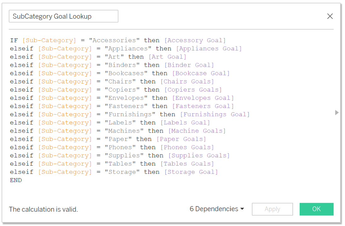
The calculation itself is a simple IF – ELSE statement that will look like the following:
SubCategory Goal Lookup
IF [Sub-Category] = “Accessories” then [Accessory Goal]
elseif [Sub-Category] = “Appliances” then [Appliances Goal]
elseif [Sub-Category] = “Art” then [Art Goal]
elseif [Sub-Category] = “Binders” then [Binder Goal]
elseif [Sub-Category] = “Bookcases” then [Bookcase Goal]
elseif [Sub-Category] = “Chairs” then [Chairs Goals]
elseif [Sub-Category] = “Copiers” then [Copiers Goals]
elseif [Sub-Category] = “Envelopes” then [Envelopes Goal]
elseif [Sub-Category] = “Fasteners” then [Fasteners Goal]
elseif [Sub-Category] = “Furnishings” then [Furnishings Goal]
elseif [Sub-Category] = “Labels” then [Labels Goal]
elseif [Sub-Category] = “Machines” then [Machine Goals]
elseif [Sub-Category] = “Paper” then [Paper Goals]
elseif [Sub-Category] = “Phones” then [Phones Goals]
elseif [Sub-Category] = “Supplies” then [Supplies Goals]
elseif [Sub-Category] = “Tables” then [Tables Goals]
elseif [Sub-Category] = “Storage” then [Storage Goal]
END
Side Note: When you add this calculation to a view, make sure to choose the aggregation MIN.
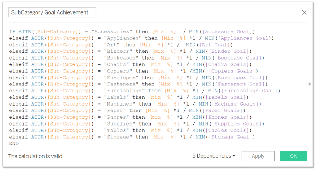
Once we have this calculation ready, we need to come up with logic that will show us how much % achievement we currently have between our actual mix % of sales and the set goal.
In order to do that, we are reversing the normalization logic telling tableau that my goals set for each sub-category represent the value 100 %.
The logic that I came up for that is looking like this:
SubCategory Goal Achievement
IF ATTR([Sub-Category]) = “Accessories” then [Mix %] / MIN([Accessory Goal])
elseif ATTR([Sub-Category]) = “Appliances” then [Mix %] *1 / MIN([Appliances Goal])
elseif ATTR([Sub-Category]) = “Art” then [Mix %] *1 / MIN([Art Goal])
elseif ATTR([Sub-Category]) = “Binders” then [Mix %] *1 / MIN([Binder Goal])
elseif ATTR([Sub-Category]) = “Bookcases” then [Mix %] *1 / MIN([Bookcase Goal])
elseif ATTR([Sub-Category]) = “Chairs” then [Mix %] *1 / MIN([Chairs Goals])
elseif ATTR([Sub-Category]) = “Copiers” then [Mix %] *1 /MIN( [Copiers Goals])
elseif ATTR([Sub-Category]) = “Envelopes” then [Mix %] *1 / MIN([Envelopes Goal])
elseif ATTR([Sub-Category]) = “Fasteners” then [Mix %] *1 / MIN([Fasteners Goal])
elseif ATTR([Sub-Category]) = “Furnishings” then [Mix %] *1 / MIN([Furnishings Goal])
elseif ATTR([Sub-Category]) = “Labels” then [Mix %] *1 / MIN([Labels Goal])
elseif ATTR([Sub-Category]) = “Machines” then [Mix %] *1 / MIN([Machine Goals])
elseif ATTR([Sub-Category]) = “Paper” then [Mix %] *1 / MIN([Paper Goals])
elseif ATTR([Sub-Category]) = “Phones” then [Mix %] *1 / MIN([Phones Goals])
elseif ATTR([Sub-Category]) = “Supplies” then [Mix %] *1 / MIN([Supplies Goals])
elseif ATTR([Sub-Category]) = “Tables” then [Mix %] *1 / MIN([Tables Goals])
elseif ATTR([Sub-Category]) = “Storage” then [Mix %] *1 / MIN([Storage Goal])
END
To better understand what this calculation is doing in terms of normalization, I usually use a basic math example that I remember from middle school. For example:
Parameter.Accessory Goal ….. 100%
Mix % of Accessory …………….X
Now all you have to do is reverse the calculation to solve for x, giving you the % achievement of the 100% Goal.
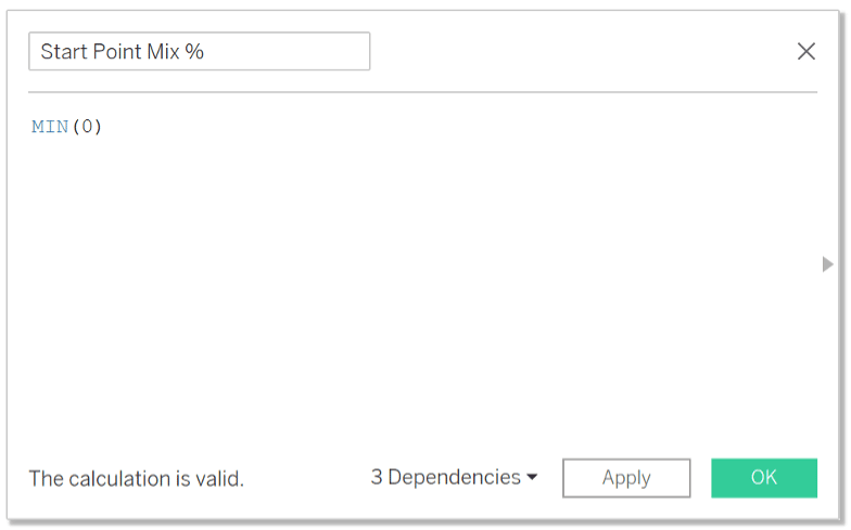
An additional calculation that we are going to need to create a bar chart is a basic placeholder for the value 0. By adding this calculation to the measure values option, we can create a bar chart that goes from 0 to the respective mix % of each of my sub-categories. For this use case, I called my placeholder calculation “Start Point Mix %” and used a simple MIN(0) as the formula.
Lastly, to finish the functionality of our chart, we need to create a calculation that creates our 100% goal baseline, that is visible in case the goal is under-achieved. For that, we are going to reference the previously created formula called SubCategory Goal Lookup and tell Tableau that if the value in my sub-categories is bigger than 0 to draw a line that equals 100%.
Normalized Rate
IF MIN(SubCategory Goal Lookup) > 0 THEN 1 END
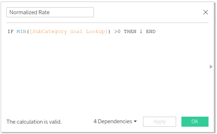
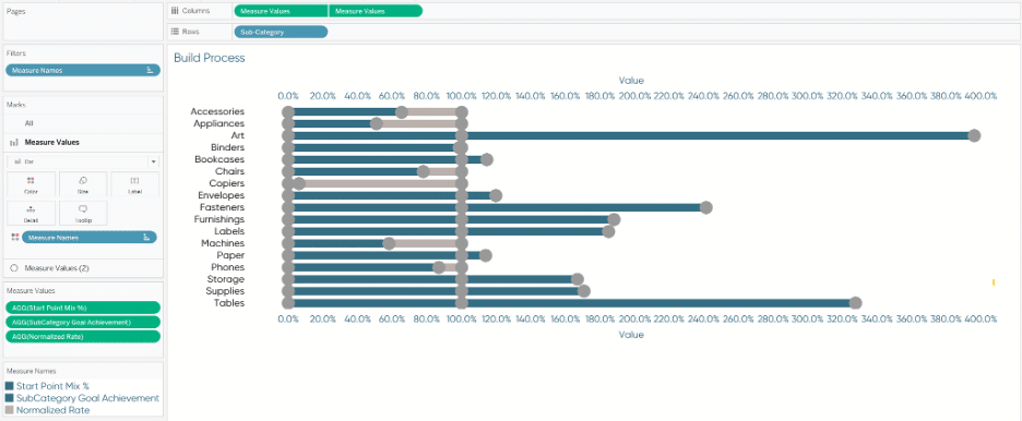
Chart build process for reverse normalization
Now that we have all our calculations, let’s get started building out our chart!
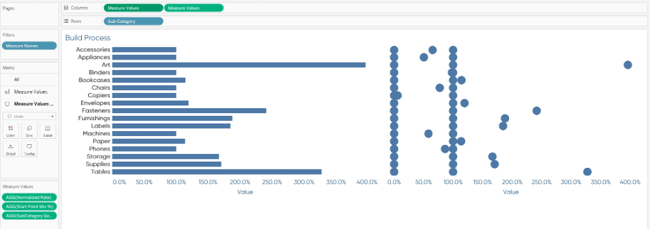
We are going to start out with a dual-axis chart. To do that, I am dragging Measure Names first in the Filters Pane and only select the 3 calculations needed for my viz. Those are the Normalized Rate calculated field, the Start Point Mix % as well as the SubCategory Goal Achievement calculated field.
Once that is done, I feel more comfortable dragging the continuous Measure Values pill onto the columns pane without seeing every single measure pop up from my dataset. Once one is on my columns pane, I hold the control key, click into my just placed Measure Values pill and drag it right next to each other in order to duplicate it. By duplicating the pill, I now have 2 marks cards that I can individually manipulate. For my first marks card, I will choose a bar chart for its preferred visualization, and for the second marks card, I am going to change it to the Circle visualization.
In addition, I place the dimension “Sub-Category” onto the rows shelf to highlight what I am wanting to focus my analysis on. After these steps, you are going to end up with a view that looks somewhat like this:
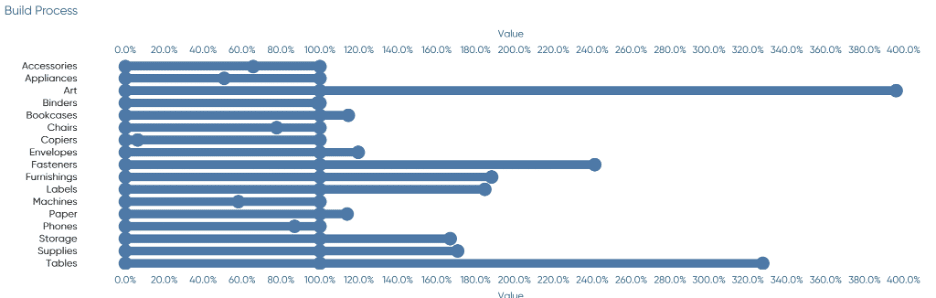
After that is complete, we are going to right-click on the second pill within the columns pane and select “Dual Axis” as well as synchronizing the axis by clicking on either one of the x-axis and select “synchronize”.
This will get you a chart looking like the one on the bottom, now all we need is some color to make it easily understandable and readable!
Coloring logic
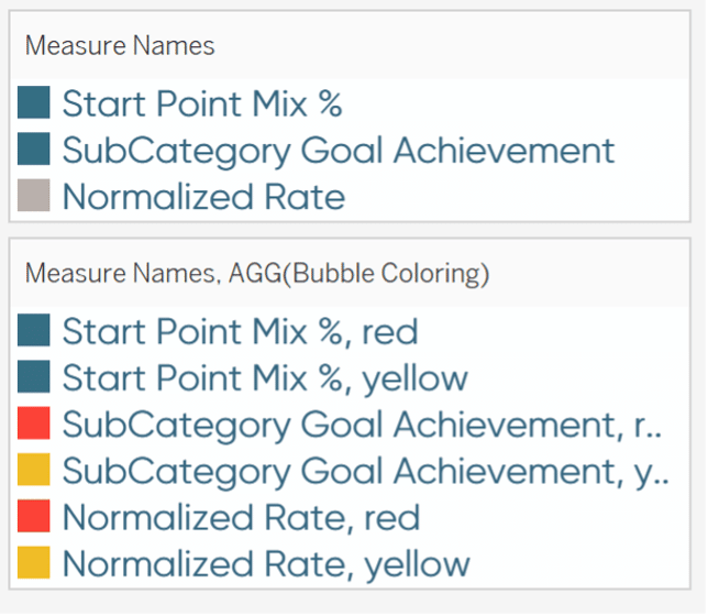
For the bar chart, the coloring is very simple and I will re-use our Measure Names pill and drag it onto the color marks card. The one special thing about this is that the Start Point Mix %, as well as my Goal achievement bar, are going to have the same color (in my case dark blue), and the normalized Rate calculated field needs not only be a different color but also be the last in the list in the color pop-up card for it to be placed in the background. If it shows up as the first item in the color pop-up card it will simply hide the other bars behind it, hiding a lot of our analysis points. Therefore to move it to the back, you can simply click on it and drop it to the bottom of the list.
For the circle marks cards, logic is going to be a little different and will actually require us to use Measure Names on the color marks card as well as a manually calculated field using some if logic:
Bubble Coloring
IF [SubCategory Goal Achievement] > 1 then “red”
elseif [SubCategory Goal Achievement] > 0 and [SubCategory Goal Achievement] < 1 THEN “yellow”
end
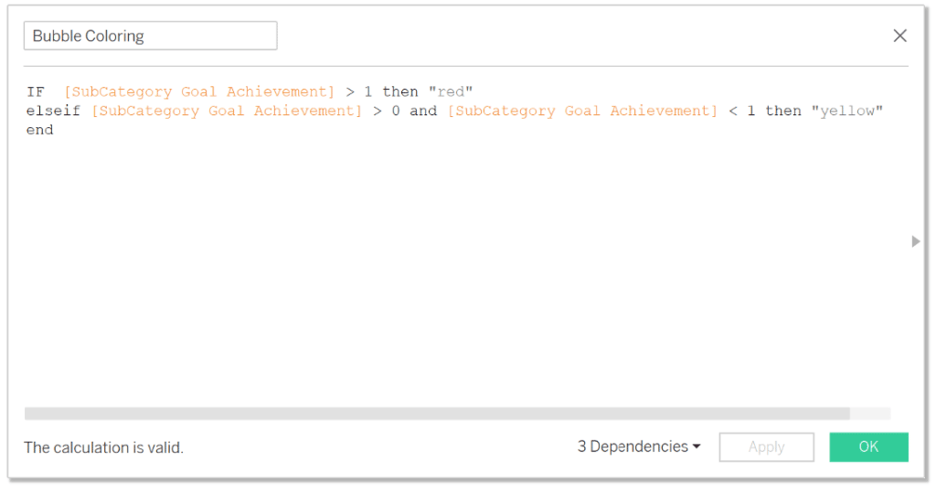
I classified anything over my targeted goal mix as red as it would identify that my company is selling too much mix % of an item that is less profitable than others. On the other hand, my yellow classification is indicating that I haven’t sold enough of an item that is profitable and has the potential to increase my revenue and profit by trying to sell more of that mix % in comparison to lower profit items.
(Assuming that I couldn’t just sell more of everything)
One thing I would like to call out, in addition, is that the sequence matters which dimension we first add on the color marks card. Also if you are having trouble putting two dimensions in the color marks section. Add the first one by dragging it right onto the color marks section and then add the second dimension as a detail marks card first. From there right-click into the three dots next to the blue pill and change it to color there.
![]()
An additional thing to call out is that the logic created automatically also applies to the Start Point measure, yet I want that one to stay “just” blue so we have to ignore the red and yellow categorization for this particular item.
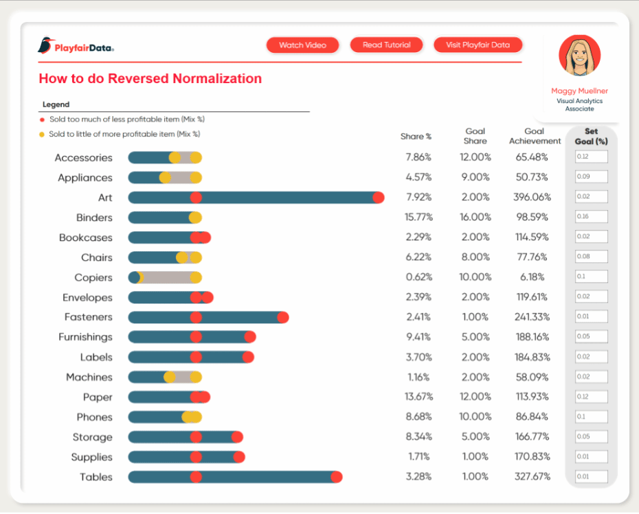
To finalize my visualization, I added a table showing the actual Mix % of each Sub-category at the moment to its target goal and the Goal Achievement rate. I then added a section with my parameters that allow the users to make goal adjustments at any time as well as a Legend at the top to allow users to easily understand the dashboard at a first glance.
Hope you like it and let me know if you have any questions!
Stay hungry,
Maggy


Written By
Maggy Muellner

Peer Review
Ethan Lang
Director, Analytics Engineering

Graphic Design
Dan Bunker
Manager, Decision Engineering
Related Content
3 Ways to Normalize Data in Tableau

While performing data analysis, you might find yourself needing to transform your data to further unlock some insight. One way…
How to Normalize Current and Prior Dates on the Same Axis in Tableau

Dates can be tricky to work with in Tableau. It’s no wonder there are six different chapters in Practical Tableau…
Statistical Tableau: Using MAD to Detect Outliers in Non-Normalized Data
I recently wrote a tutorial on 3 ways to visualize outliers in Tableau. This tutorial assumes a normal distribution of…