How to Insert Custom Images in Power BI Matrix Visuals
Matrix visuals are extremely popular and easy-to-use charts in Power BI. Their familiarity to spreadsheets makes them easy to adopt, especially for beginners. While the built-in formatting options can seem limiting, matrix visuals are a lot more flexible than what initially meets the eye. Did you know you can flexibly add custom images directly in your matrix visuals? These images can serve as additional context, performance indicators, you name it. In this tutorial, I’ll show you three different ways to insert custom images in your matrix visuals.
Connecting to data
To follow this tutorial, download the AdventureWorks dataset. Open a new report in Power BI Desktop, click Excel Workbook, find the data in your files, and click Open.
In the Navigator window, click on the Sales and Product tables.
Continue reading with a free account, or login.
Unlock this tutorial and hundreds of other free visual analytics resources from our expert team.
Already have an account? Sign In
By continuing, you agree to our Terms of Use and Privacy Policy.
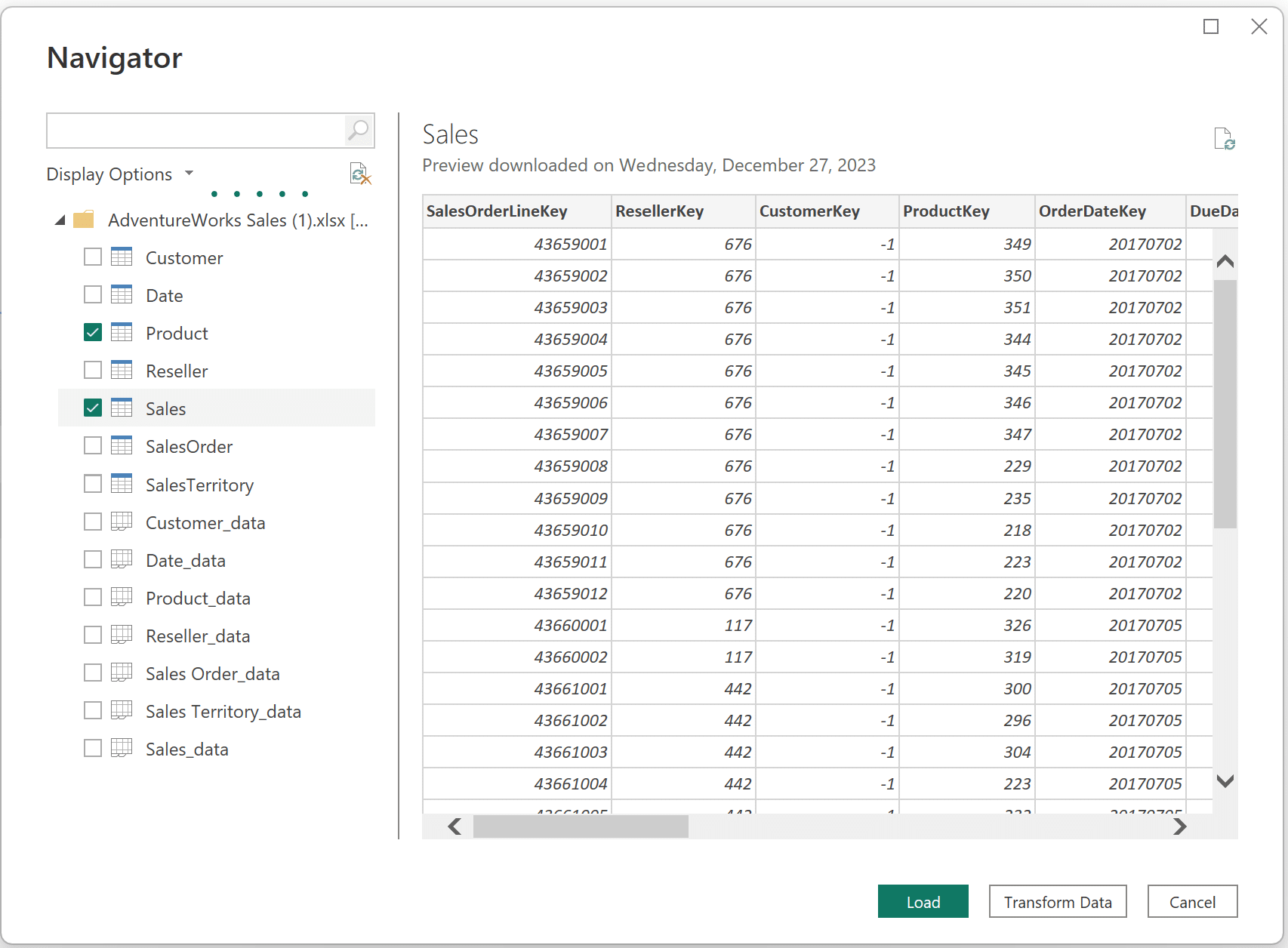
Click Load to add these tables to Power BI Desktop.
Creating/finding custom images
If you’re feeling creative, use Figma to create smooth and original designs to use in your Power BI reports. Alternatively, The Noun Project is a great free resource for stock icons. You will need a URL for each visual you add to your Power BI report. There are plenty of resources to create URLs online. I have uploaded the four visuals I will use to our site. If you want to follow along, copy the URLs for each image below.
| Airpump | Jersey | Bike | Gear |
 |
 |
 |
 |
Creating the matrix visual
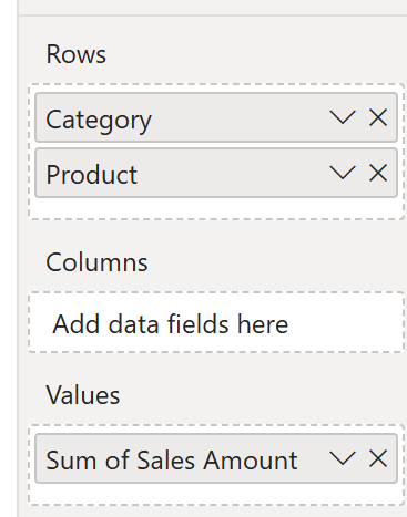
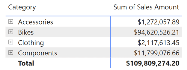
In a new Power BI Desktop report, add a matrix visual to your report page. Add the ‘Category’ and ‘Product’ columns from the Product table into the Rows field well, and the ‘Sales Amount’ column from the Sales table to the Values field well.
Next, I’ll discuss three ways to elevate your matrix visuals by adding custom images directly to them.
Inserting URLs into your Power BI matrix visuals
1. Using URLS within a measure
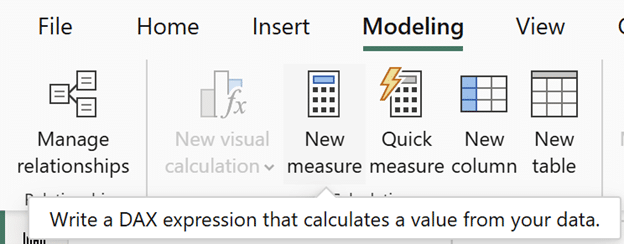
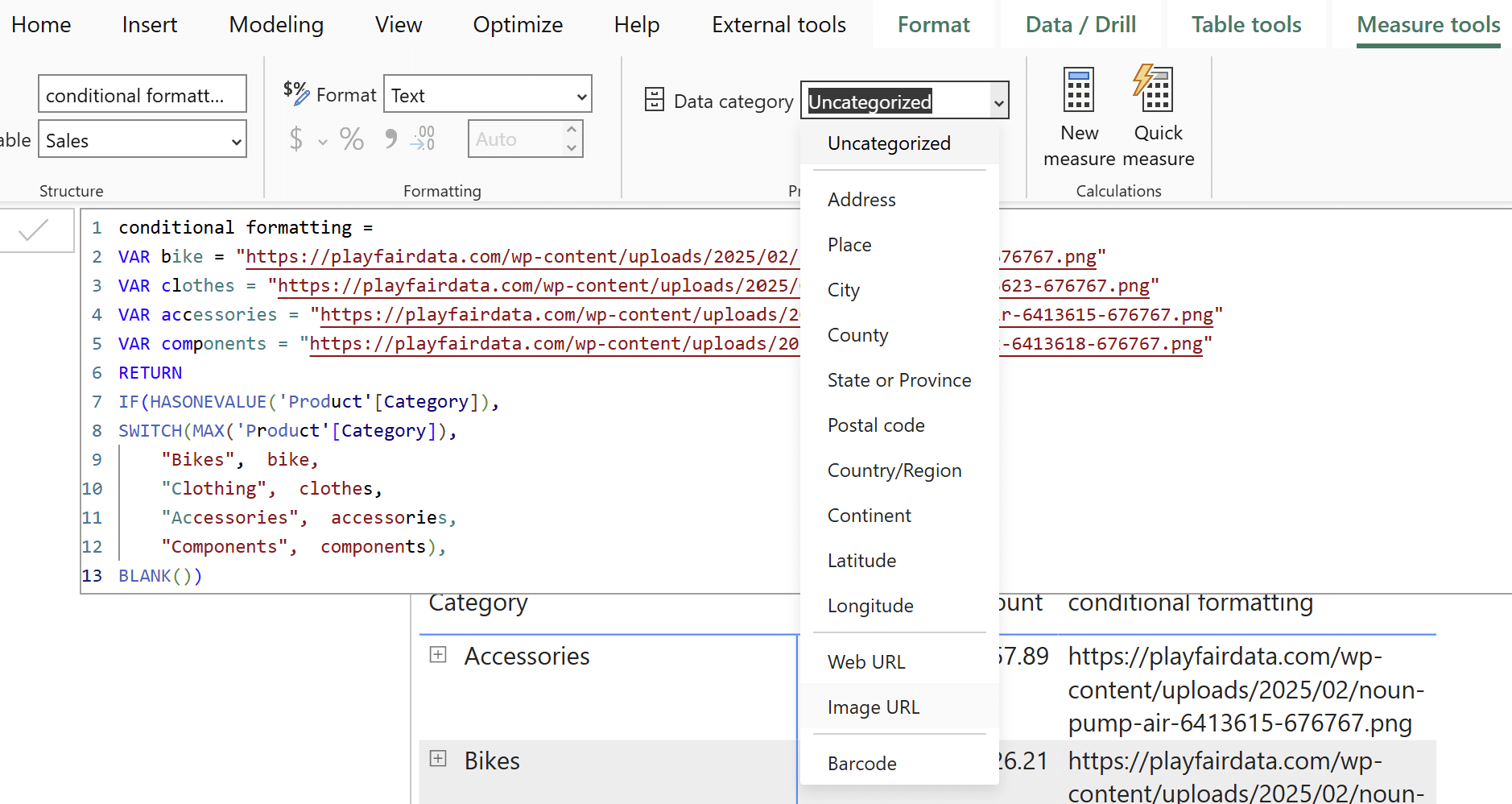
This measure will be linked to the ‘Category’ column in the Product table using DAX. Create a new measure by clicking on Modeling → New measure. Call this measure ‘conditional formatting’.
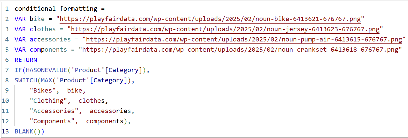
Using a separate VAR statement for each image URL, copy and paste them into the DAX window. The SWITCH() function allows Power BI to assign a URL to each of the individual product categories. Wrapping the DAX in IF() and evaluating the condition HASONEVALUE() removes the custom image from the totals row, because the context for the total row includes all of the above values. So HASONEVALUE() is false for the total row, and true for the individual rows. The syntax is as follows:

conditional formatting =
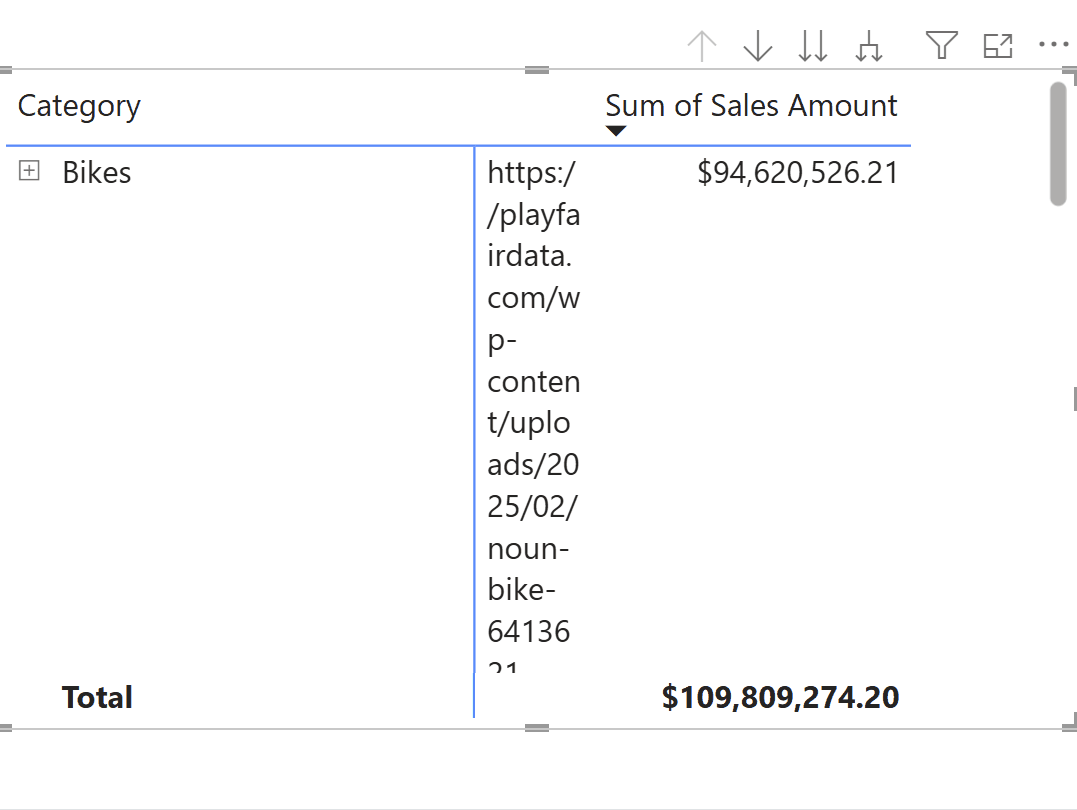
VAR bike = “https://playfairdata.com/wp-content/uploads/2025/02/noun-bike-6413621-676767.png”
VAR clothes = “https://playfairdata.com/wp-content/uploads/2025/02/noun-jersey-6413623-676767.png”
VAR accessories = “https://playfairdata.com/wp-content/uploads/2025/02/noun-pump-air-6413615-676767.png”
VAR components = “https://playfairdata.com/wp-content/uploads/2025/02/noun-crankset-6413618-676767.png”
RETURN
IF(HASONEVALUE(‘Product'[Category]),
SWITCH(MAX(‘Product'[Category]),
“Bikes”, bike,
“Clothing”, clothes,
“Accessories”, accessories,
“Components”, components),
BLANK())
Beginner’s Guide to DAX: Creating Calculated Columns and Measures in Power BI
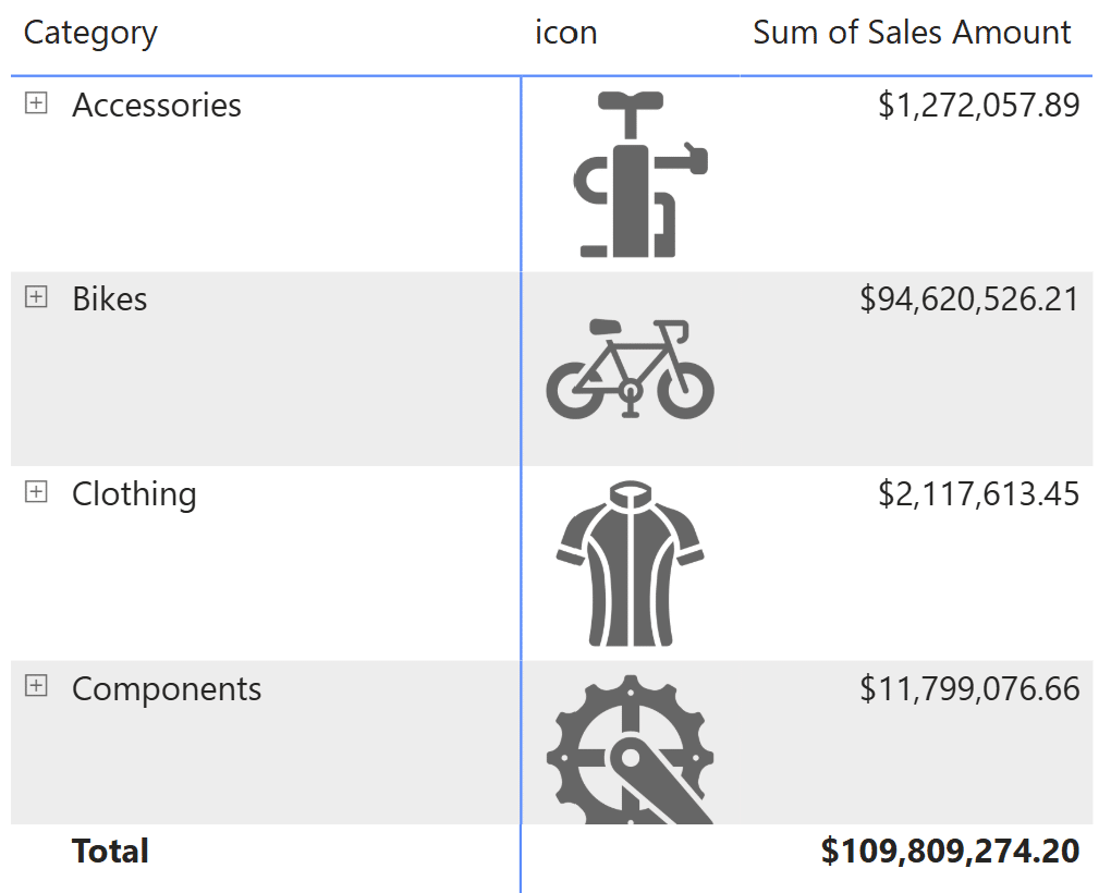
Add the new measure to the matrix visual.
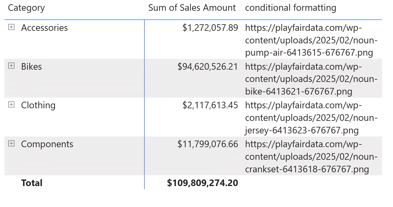
Change the measure’s Data category from ‘Uncategorized’ to ‘Image URL’ to display the actual images within the matrix visual instead of the URL. This data category switch will ensure that whenever you use this measure in a matrix or table visual, the measure will always display the image, rather than the URL text.
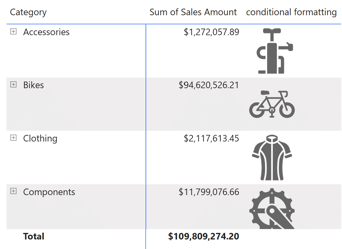
Swap the position of the ‘conditional formatting’ and ‘Sales Amount’ fields to place the custom images on the left. Change the name of the ‘conditional formatting’ measure to ‘Icon’ by clicking on the dropdown and clicking ‘Rename for this visual’.
I am changing the name to reduce the amount of space that the header takes up because I want to reduce the whitespace between the image measure and the ‘Sales Amount’ column. I can manually click and drag to reduce the space with the measure’s original name, but Power BI will increase the vertical size of the header to compensate for the horizontal shrinking, to fit the entire name. Thus, a shorter name for the measure is used.
Before:
After:
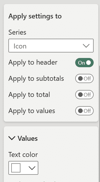
Now that the whitespace is reduced, I can ‘remove’ the header by formatting it. Under Format visual → Specific column → Apply settings to, select the ‘icon’ field and toggle the options to only apply to the header. Under Values → Text color, change the text color to match your report page background.
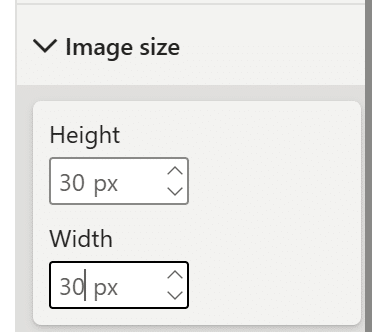
Lastly, in the ‘Image size’ section of the Formatting pane, change the height and width under ‘Image size’ from the default 75 px to 30 px to better fit the matrix visual.
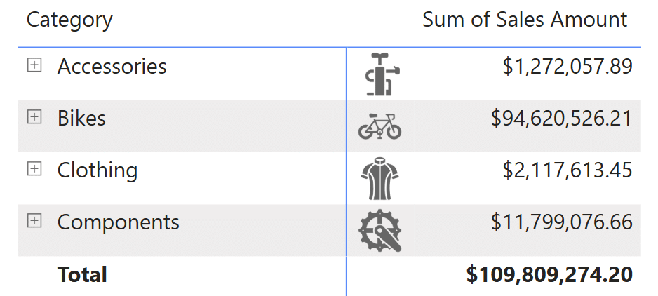
Here’s the final, formatted matrix visual with custom images from the ‘conditional formatting’ measure.
2. Adding a conditional column in Power Query Editor
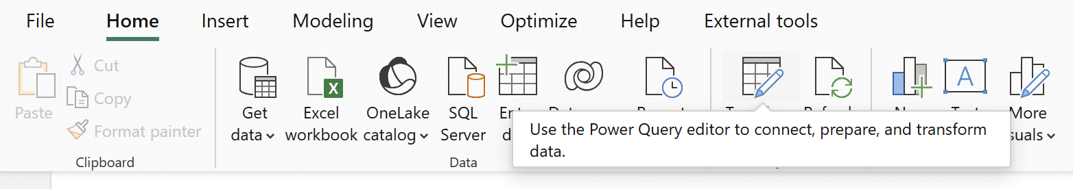
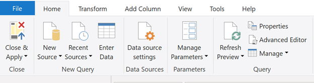
The logic for this way to add custom images via URL to your matrix visuals is similar to the first technique. Here, you’ll learn to add a conditional column directly to the Product table in the AdventureWorks dataset. To begin, click on Home → Transform data to open up the Power Query Editor.
An Introduction to the Power BI Power Query Editor
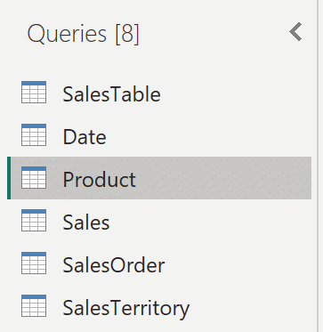
In the Queries pane, click on the Product table.
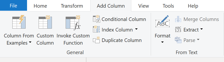
Click on the ‘Add Column’ tab at the top of your screen. When the tab opens, click on ‘Conditional Column’.
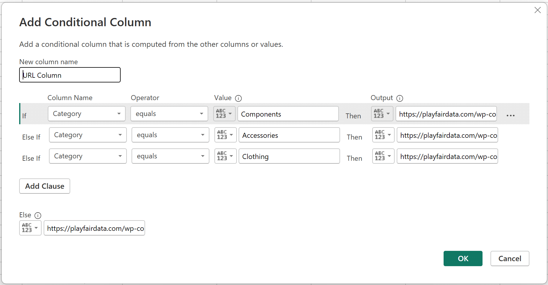
In this window, the logic you’ll apply is extremely similar to the ‘conditional formatting’ measure created above. Name this column ‘URL Column’. In the ‘Column Name’ dropdown, select the ‘Category’ column in the Product table. Ensure ‘equals’ is selected in the ‘Operator’ dropdown, enter one of the four categories in the ‘Value’ section, and enter the corresponding URL from above in the ‘Output’ section. To add a new clause, click on ‘Add Clause’.
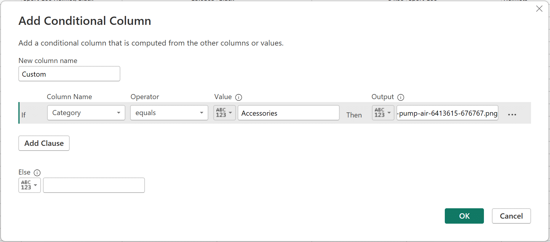
You only need to add three clauses. The ‘Else’ condition will use the fourth URL that you did not use in the three clauses. When you’re finished, the menu should look like the image below.
Click ‘OK’ to confirm this new conditional column in the Product table, and then click Home → Close & Apply to apply the changes you made in PQE, in Power BI Desktop.
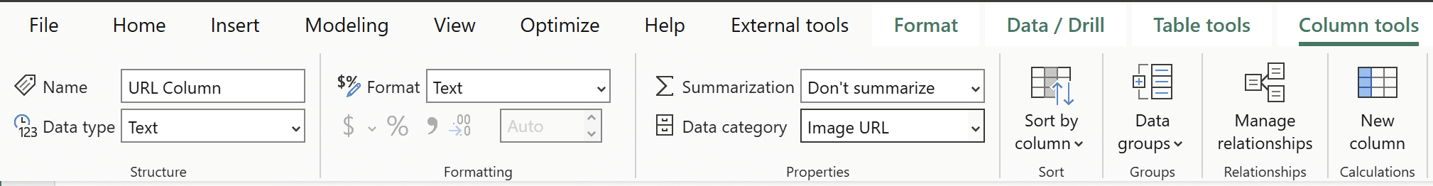
You can now use this new column in a matrix visual. Make sure to change the data category from ‘Uncategorized’ to ‘Image URL’, just like before.
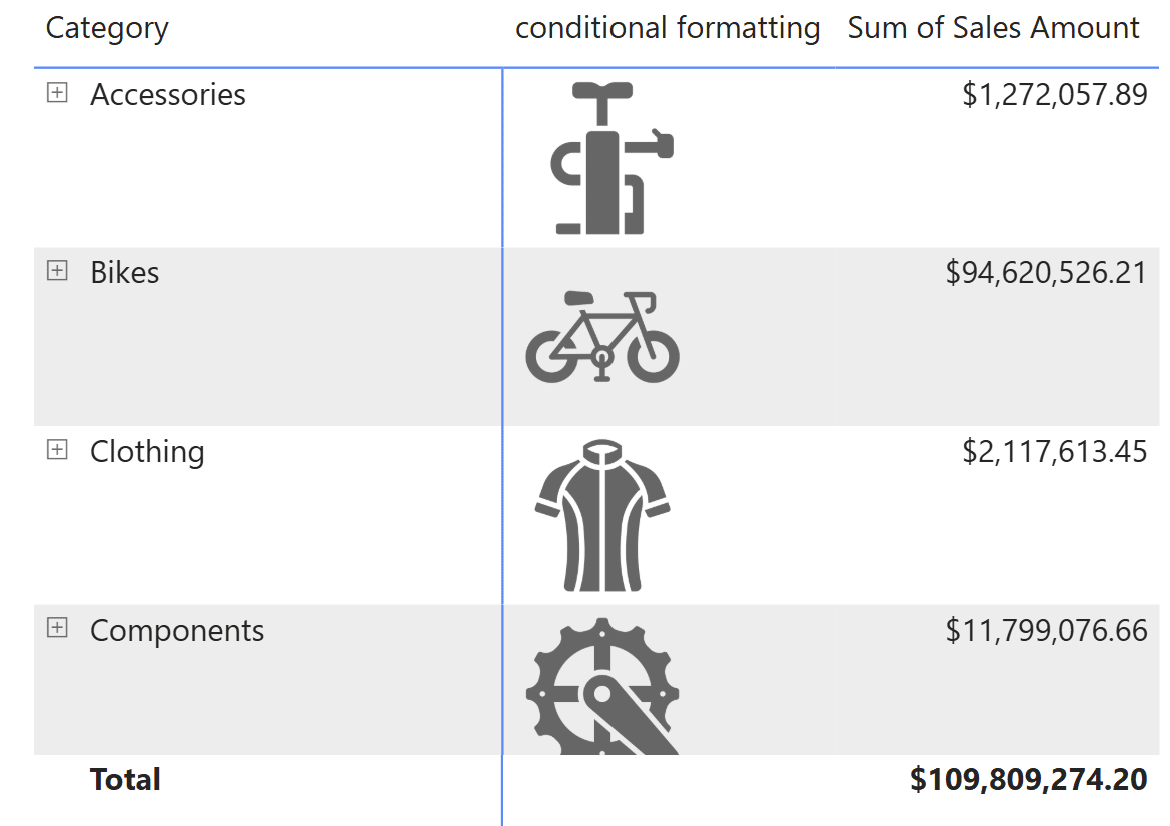
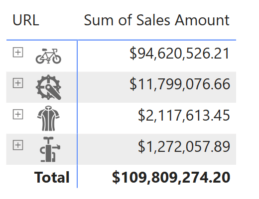
Here I’ve added it to the ‘Rows’ field well, replacing the original ‘Category’ column.
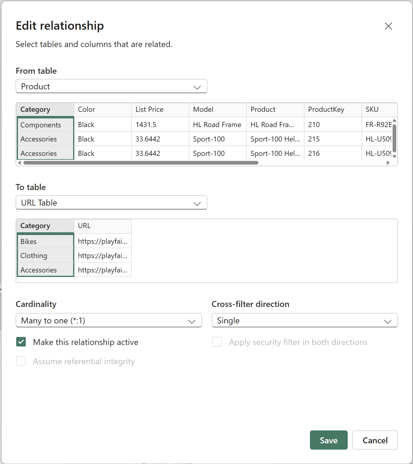
3. Creating a new table to hold the URLs
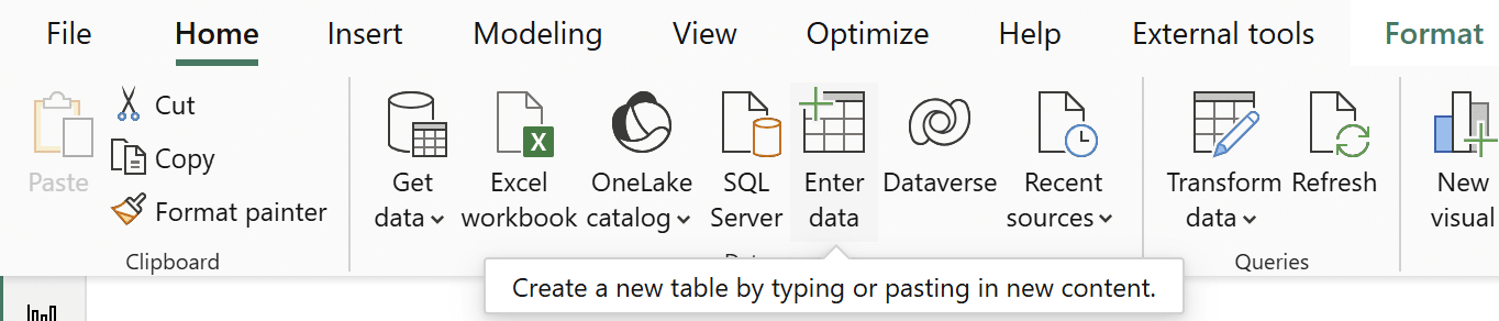
In this variation, I’ll create a brand new table to hold the URLs. If necessary, I’ll also create a relationship between the brand new table and the ‘Product’ table. Start by clicking on Home → Enter data.
Name the new table ‘URL Table’ in the window that appears. Rename the first column to ‘Category’ and enter four categories as values in the new column. Create a second column by clicking on the column plus sign and name it ‘URL’. Insert the corresponding URLs for each category.
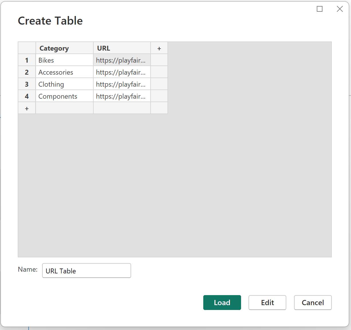
Click Load. Navigate to the model view using the menu on the left-hand side of your screen.
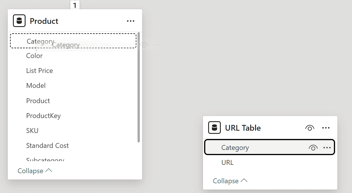
If you don’t see a relationship already created between the ‘Category’ columns in the Product and URL tables, drag the ‘Category’ column from the URL table onto the ‘Category’ column in the Product table.
The ‘New relationship’ window should look like this:
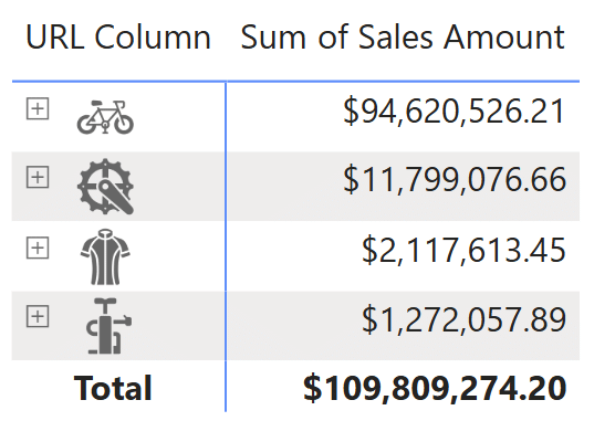
The final step should come as no surprise. Change the data category for the ‘URL’ column from ‘Uncategorized’ to ‘Image URL’ to use the new URL column in any matrix visual you want. Below is the exact same matrix visual as the second technique, using the ‘URL’ column from the new table.
Conclusion
In this tutorial, you’ve learned three different ways to elevate your Power BI matrix visuals by inserting custom images using URLs. While the above examples are simple, getting creative can yield very impactful and impressive matrix visuals. For a great example, I recommend checking out the Financial Analysis Swift in Power BI.
Thanks for reading,
Juan Carlos Guzman

Written By
Juan Carlos Guzman

Peer Review
Felicia Styer
Assoc. Director, Analytics Solutions

Peer Review
Matt Snively
Sr. Manager, Analytics Engineering
Related Content
How to Create Balance Scale Charts in Power BI
The Balance Scale chart is a Playfair Data innovation that was originally created for our Financial Analysis Swift in Tableau.…

Juan Carlos Guzman
Connect to Three Common Data Sources in Power BI Desktop Learn how to connect to three of the most common…
An Introduction to Parameters in Power BI
Parameters are user-generated values that define how a system can operate. We can use parameters in Power BI to grant…