How to Make 80/20 Pareto Charts in Power BI

Pareto charts are powerful visualizations that help determine your business’ best performers. In this tutorial, I’ll create a Pareto chart in Power BI to analyze business performance by applying the Pareto Principle, or 80/20 Rule. It states that roughly 80% of results come from 20% of causes. How closely does our sales data follow this rule? Do approximately 80% of sales come from 20% of products? By the end of this tutorial, you’ll learn how to create a traditional Pareto chart, how to visualize the 80/20 Rule in Power BI, and how to create a custom Pareto chart, the 80/20 Pareto, which more effectively analyzes business performance while being more visually appealing and able to account for more variables than the traditional Pareto.
The 80/20 Pareto chart is a big advancement over the traditional Pareto chart because it uses a scatter chart instead of a dual-axis line and column chart. When applying the 80/20 Rule to a large dimension, like product Category, Subcategory, or Product ID, the traditional line and column Pareto can have a large scroll bar. In a report that already has plenty of interactive components, adding an additional interactive component, with the traditional Pareto chart’s scroll bar, has the potential to overwhelm your users with controls. Since the 80/20 Pareto chart is built using a scatter chart, all of the information included in the Pareto is visible immediately without a scroll bar. The 80/20 Pareto is a clean and insightful addition to any report.
Connecting to data
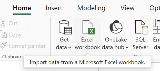
If you would like to follow along, open Power BI Desktop, click on the ‘Excel workbook’ button, and connect to the AdventureWorks dataset from your files.
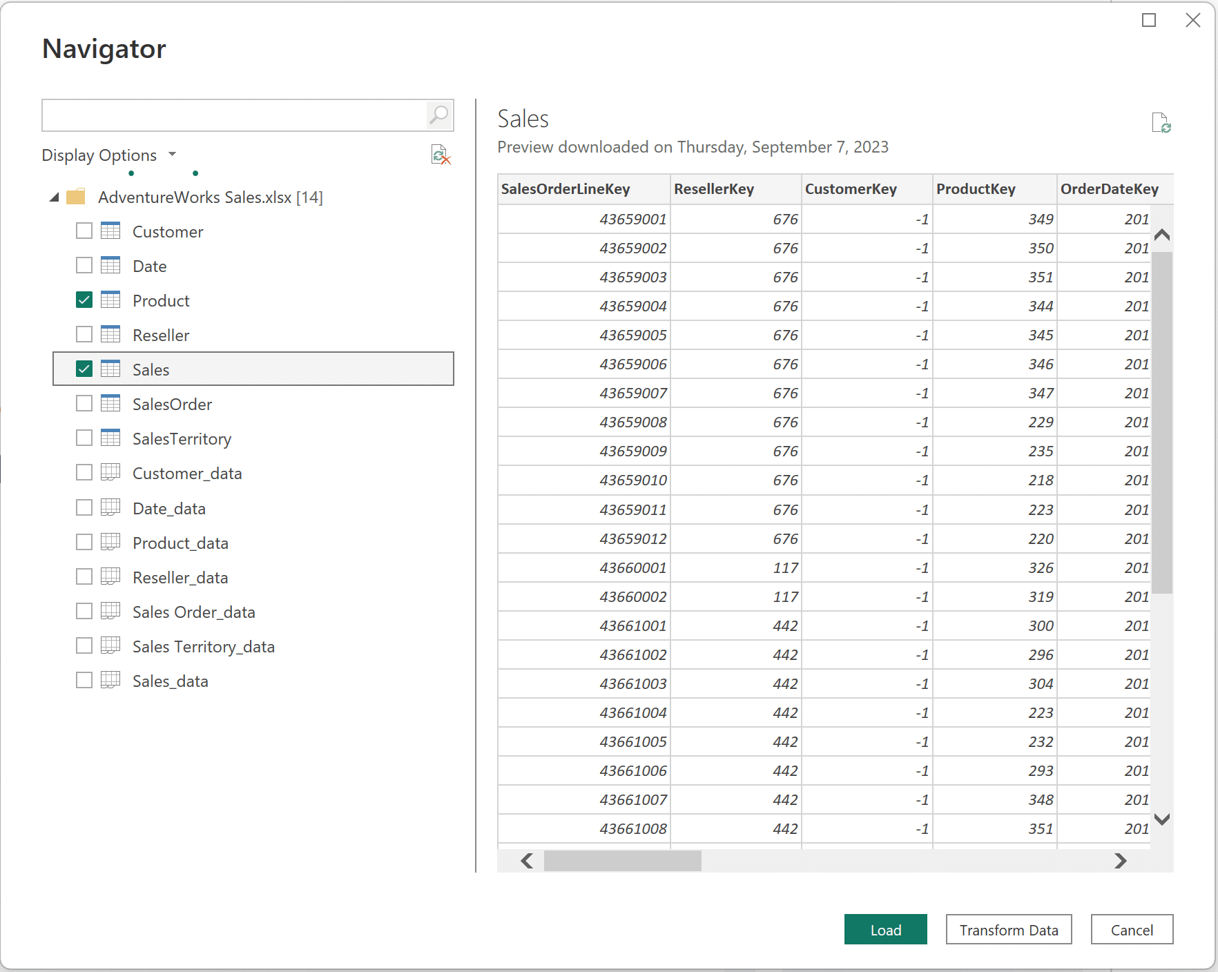
In the popup window that appears, click the check next to the Product and Sales tables, and then click Load.
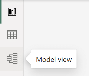
Once your data is loaded, open the Model view.
Continue reading with a free account, or login.
Unlock this tutorial and hundreds of other free visual analytics resources from our expert team.
Already have an account? Sign In
By continuing, you agree to our Terms of Use and Privacy Policy.
Confirm that there is a relationship between the ProductKey field in the Product table and the ProductKey field in the Sales table. The relationship is represented by the line connecting the tables, with the cross-filter direction being indicated by the arrow on the relationship line. If there is no line, there is no relationship. If there is an active relationship, you can skip this section and continue to the next section, “Creating a measures table.” If not, continue reading.
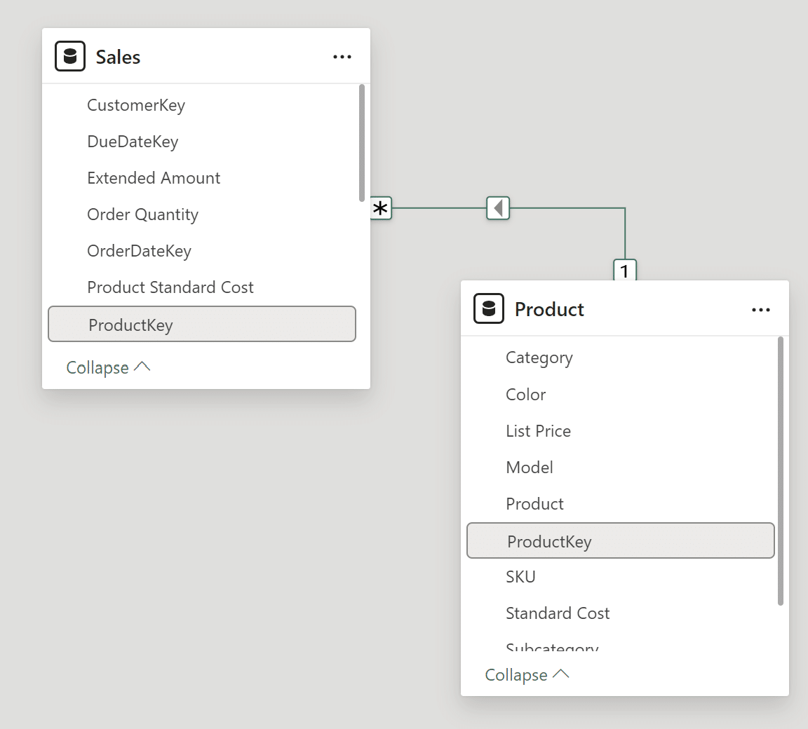
If your model view does not look like the above image with a relationship between the two ProductKey fields, click and drag the ProductKey field from the Product table to the ProductKey field in the Sales table. Once you do so, this popup window will appear.
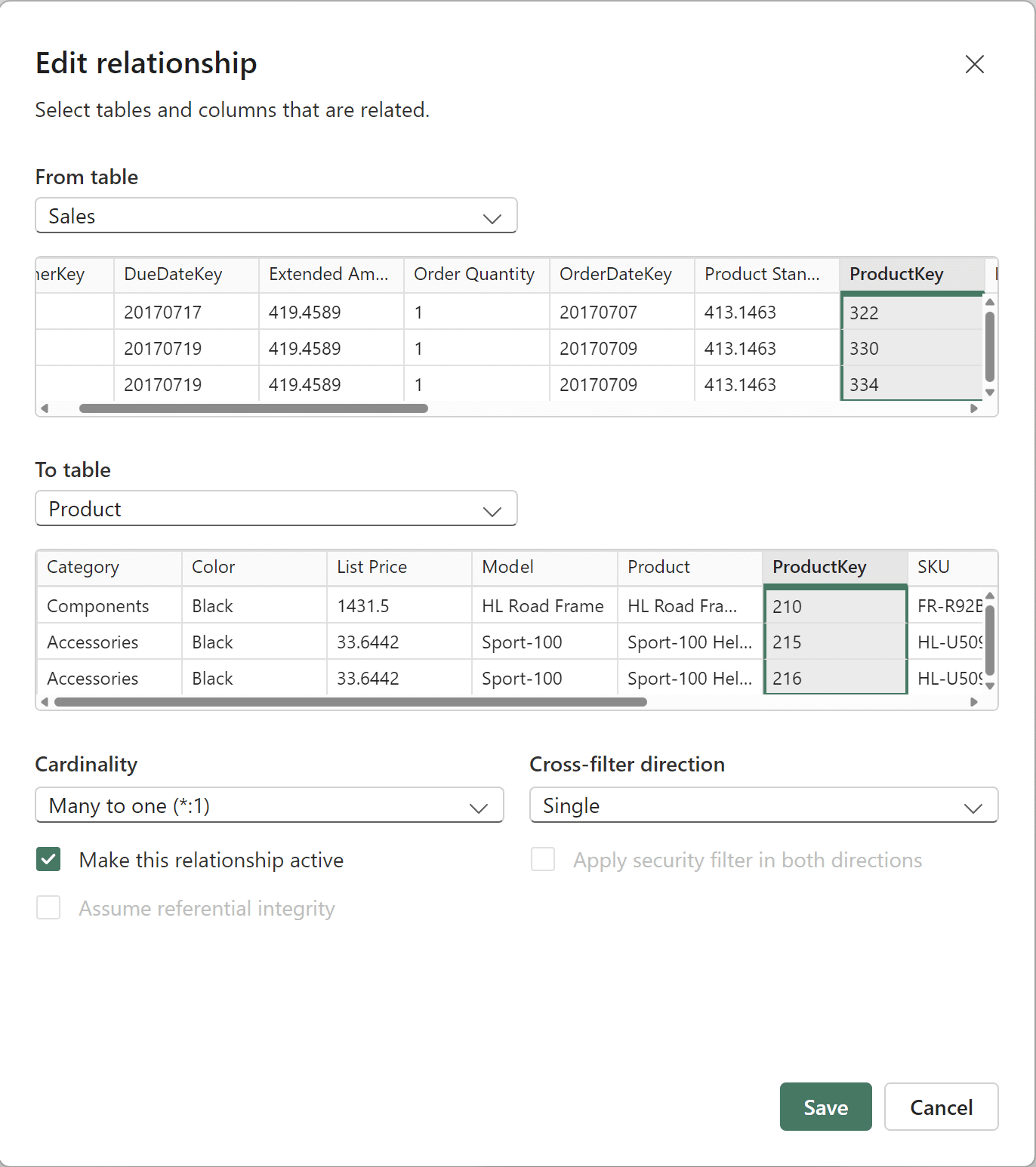
Confirm the popup window is exactly like the above image and hit Save. Now you can begin the Pareto chart setup.
Creating a measures table
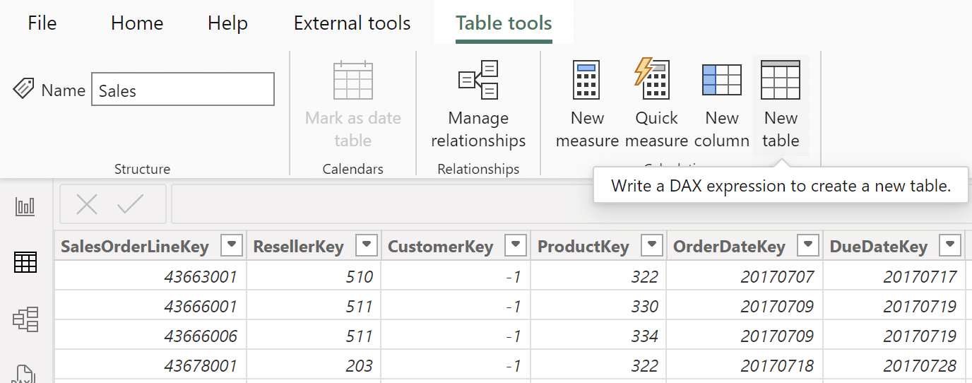
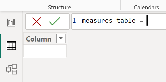
This technique requires many DAX measures, so before I begin, I’ll create a table to store all of the necessary DAX measures to stay organized. First, navigate from the Model view to the Table view by clicking on the table icon to the left of the Authoring interface. Now, click ‘New table’ from the options in the main navigation at the top. In the popup window, name it “measures table” by replacing the “Table” on the left side of the equal sign with “measures table.” Once your DAX window reads “measures table =”, ensuring you leave the equal sign, click the checkmark to confirm the new table.
The first measure will be a measure of total sales. To create the new measure, click on ‘New measure’ and type the following formula in the DAX window that appears:
total sales measure = SUM(Sales[Sales Amount])
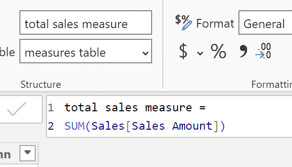
Click the checkmark to create this measure. This total sales measure will be used in virtually every other measure and calculated column that will be created. Don’t worry if you don’t see the measure in the Table view. Only columns are shown in the Table view. Measures are visible in the Report view’s Data pane and the Model view. Now that the measures table and the first measure are created, I will move on to creating the calculations and measures required for a traditional Pareto chart.
Creating a traditional Pareto chart in Power BI
If you are already familiar with creating a traditional Pareto chart in Power BI, feel free to skip to the section, “Calculations for the 80/20 Pareto chart in Power BI.”

A traditional Pareto chart is created with a column and line chart visual, and it displays a percentage of running total of a metric. I am going to create a traditional Pareto to examine total sales by product subcategory. The first step is creating a calculated column in the Product table to rank product subcategories by total sales. Next, I will create two measures: a percentage of sales, and a running total of that percentage of sales.
Beginner’s Guide to DAX: Creating Calculated Columns and Measures in Power BI
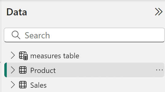
Click on the Product table in the Data pane to ensure that the column you create is stored in this table.
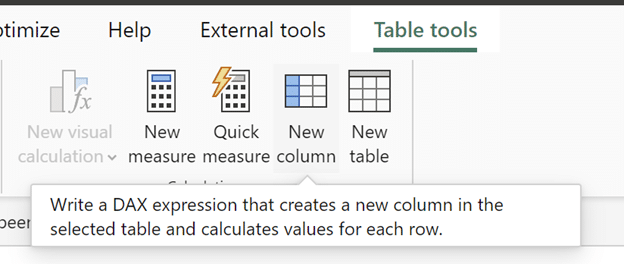
When the Table tools tab appears in the main navigation next to External tools, click on ‘New column’ to create a new column.
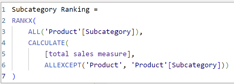
This calculated column, which I’ll call “Subcategory Ranking,” ranks all the subcategories by total sales amount. ALLEXCEPT() retains the filters on the Subcategory column since it is being called within ALLEXCEPT(), in the CALCULATE() function. This is necessary because the Subcategory field will be used in the visual. In the DAX window that appears, type the below DAX:
Subcategory Ranking =
RANKX(
ALL(‘Product'[Subcategory]),
CALCULATE(
[total sales measure],
ALLEXCEPT(‘Product’, ‘Product'[Subcategory]))
)
Now click back on the measures table, and create a new measure by clicking on ‘New measure’ in Table tools. The next measure is called “Sales percentage_subcat,” which calculates the percentage of sales by product subcategory. Before I create a running total of sales, I need to find the percentage of sales for each subcategory. This is the first step in finding out which product subcategories are responsible for the most sales. The syntax is as follows:
Sales percentage_subcat=
VAR numerator =
CALCULATE([total sales measure],
FILTER(‘Product’,
‘Product'[Subcategory] <= MAX(‘Product'[Subcategory])))
VAR denominator =
CALCULATE([total sales measure], ALL(‘Product’))
RETURN
DIVIDE(numerator,denominator)

I am using VAR here to limit the number of measures that I need to create. VAR allows you to give an expression, which would otherwise be a separate measure, a name. This allows you to use the named expression within the current measure. Once I finish creating variables, I close the variables with RETURN to return to normal DAX syntax. Using ALL() in the denominator is critical to the success of this measure because it produces the same value, the total sales amount, for every row. By definition, ALL() returns all the rows in a table, or all the values in a column, ignoring any filters applied. In other words, it ignores filter context. Using ALL() in the denominator is necessary to be able to properly calculate a percentage of total.
Create another measure in the measures table. This measure is called “Sales percentage running total subcat.” This measure is ordered by the ranking column I just created, and it adds up the percentages, in order, to create a running total. The syntax is as follows:
Sales percentage running total subcat =
CALCULATE(
[Sales percentage_subcat],
FILTER(
ALL(‘Product’),
‘Product'[Subcategory Ranking] <= MAX(‘Product'[Subcategory Ranking])))
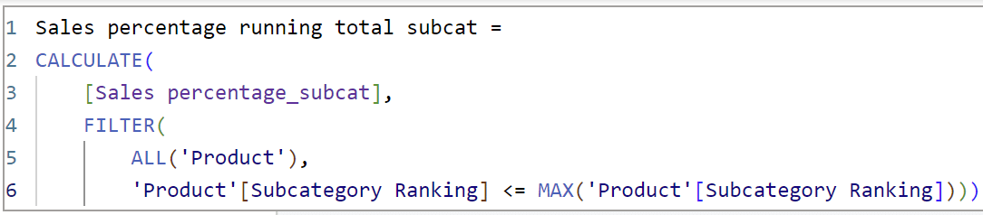
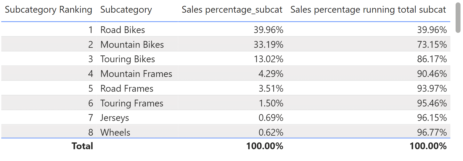
Here’s a table visual showing what this measure does. It adds up the percentage of sales that each subcategory is responsible for.
Add a line and clustered column chart visual to a report page. Add the Subcategory field from the Product table to the x-Axis, the total sales measure to the column y-Axis, and the Sales percentage running total subcat measure to the line y-Axis field well. This is how to create a traditional Pareto chart in Power BI.
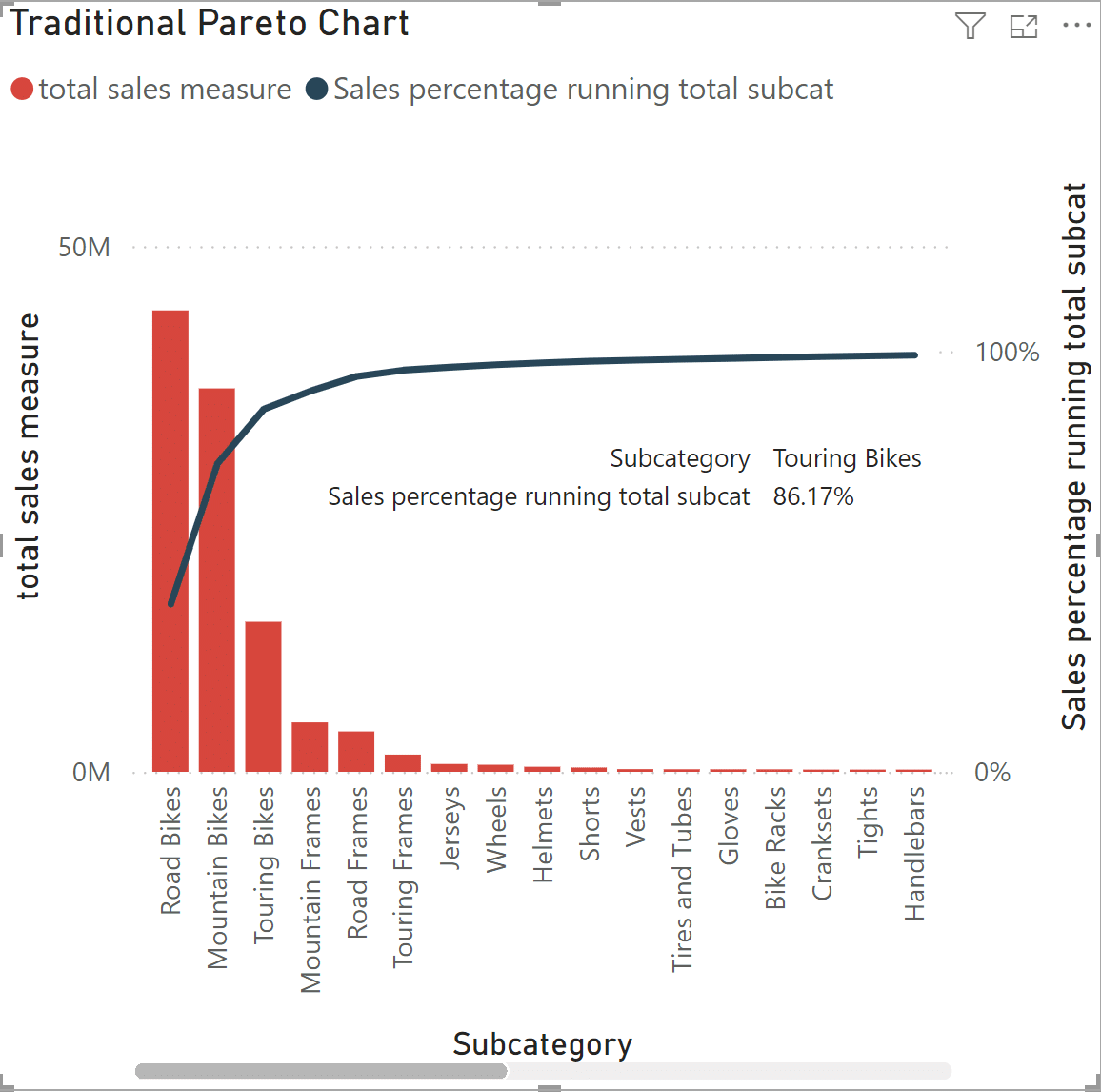
From here, you can quickly see that the top three product subcategories are Road Bikes, Mountain Bikes, and Touring Bikes. Hovering on the line over the Touring Bikes subcategory tells you that the top three subcategories are responsible for 86% of sales. To see all of the subcategories along the x-Axis, you need to use the scroll bar. To see the exact products within these subcategories, you can create an associated matrix or table. This is very helpful information, but a customized Pareto chart that focuses on visualizing the 80/20 Rule will be more effective.
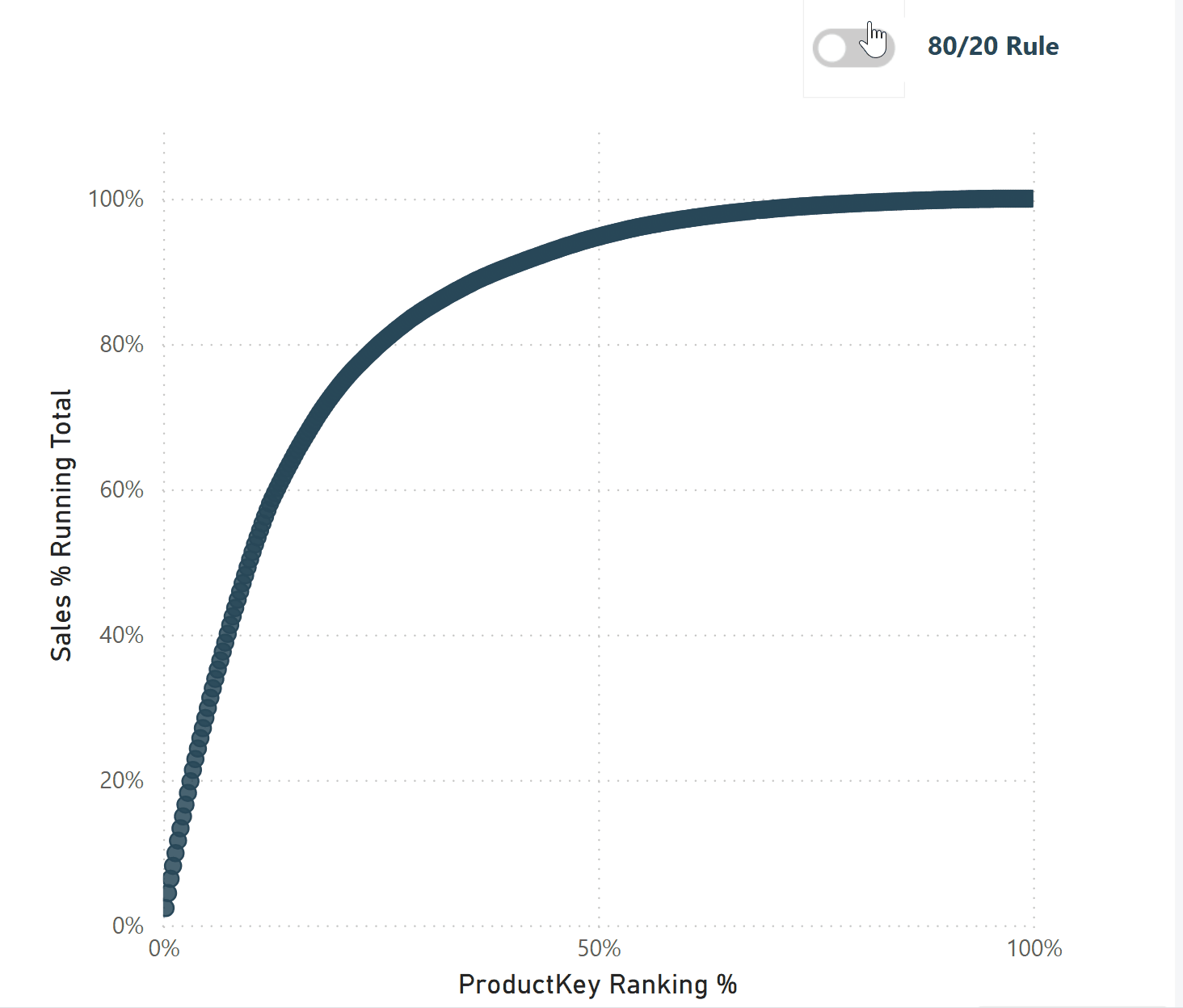
The 80/20 Pareto chart does not require columns or a scroll bar, it allows you to solely focus on the Pareto curve. While always helpful, an associated table or matrix is not needed here as you’ll be able to see exact products in the 80/20 Pareto. This custom 80/20 Pareto chart will analyze total sales by product key instead of subcategory, to find the exact products and percentage of products that account for 80% of total sales. By the end of this tutorial, this is what you will learn to create:
Calculations for the 80/20 Pareto chart in Power BI
Click on the Sales table in the Data pane. In the Sales table, I am going to create two calculated columns. The first calculated column will rank products by total sales, and the second calculated column will turn the rank calculation into a percentage. Since this custom Pareto chart focuses on visualizing the 80/20 Rule, I need numeric X and Y axes. To accomplish this, the 80/20 Pareto chart in Power BI will be built using a scatter chart – a visual that uses numeric X and Y axes.
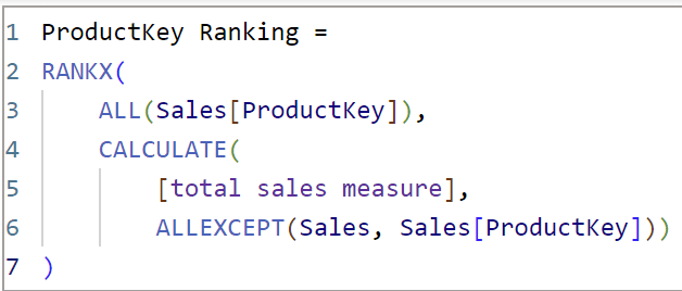
In the Sales table, click on ‘New column’ to create a new column. This column, called “ProductKey Ranking,” will use the total sales measure along with product key to rank the products by total sales. This is identical to the Subcategory Ranking field used above.
ProductKey Ranking =
RANKX(
ALL(Sales[ProductKey]),
CALCULATE(
[total sales measure],
ALLEXCEPT(Sales, Sales[ProductKey])))
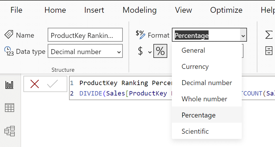
Now I’ll create the second calculated column, “ProductKey Ranking Percent,” which is a percent of total of the ProductKey Ranking column above.
ProductKey Ranking Percent =
DIVIDE(Sales[ProductKey Ranking], (DISTINCTCOUNT(Sales[ProductKey])))

Change the format from General to Percentage.
The ProductKey Ranking Percent column will be the x-Axis of the 80/20 Pareto chart. For the y-Axis, I need to create a sales percentage measure, and then create a running total of the sales percentage measure, similar to the measures in the traditional Pareto chart. If you’d like, you can recycle the Sales percentage_subcat and Sales percentage running total subcat measures by replacing references to the Subcategory column with the ProductKey column. For clarity, I will create two new measures. Navigate back to the measures table and click on ‘New measure’ from the Table tools tab in the main navigation to begin.
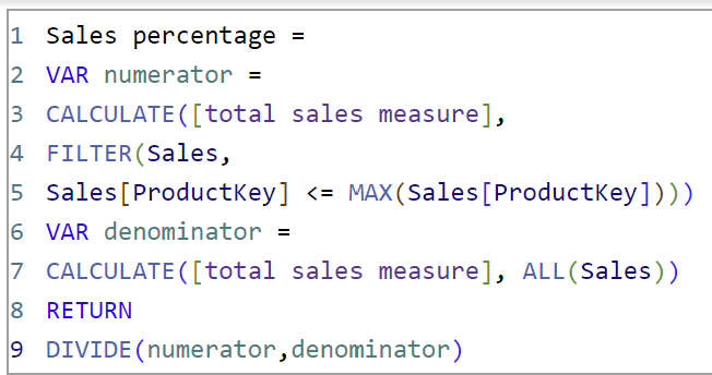
The first measure is called “Sales percentage.” In this measure the numerator sorts the ProductKey column by total sales and the denominator produces the total sales value for every row, utilizing ALL() to ignore filter context like before. Once this measure is created, change the formatting from General to Percentage to show the percentage of sales for every product key.
Sales percentage =
VAR numerator =
CALCULATE([total sales measure],
FILTER(Sales,
Sales[ProductKey] <= MAX(Sales[ProductKey])))
VAR denominator =
CALCULATE([total sales measure], ALL(Sales))
RETURN
DIVIDE(numerator,denominator)
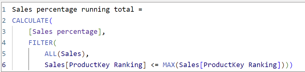
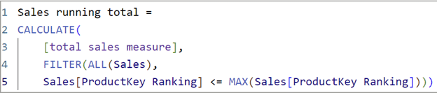
The next measure is called “Sales percentage running total.” It creates a running total of the “Sales percentage” measure that was just created. Like the previous running total measure, the FILTER() expression forces the sales percentage to be calculated from the top-selling product to the least-selling product and adds up the percentages to create a running total. Using the ProductKey Ranking column here instead of the ProductKey column is essential for the running total to be calculated correctly. Like the previous measure, change the formatting from General to Percentage.
Sales percentage running total =
CALCULATE(
[Sales percentage],
FILTER(
ALL(Sales),
Sales[ProductKey Ranking] <= MAX(Sales[ProductKey Ranking])))
You can double-check this by creating a table and sorting by ProductKey Ranking, or by creating a running sum visual calculation of the Sales percentage measure and changing the data format to percentage in the Format visual pane, like below.
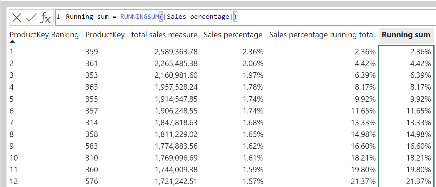
These are the base calculations needed for the 80/20 Pareto chart in Power BI.
Building the 80/20 Pareto chart in Power BI
While the traditional Pareto chart in Power BI is built with a dual-axis line and column chart visual, this 80/20 Pareto chart is built with a scatter chart to focus on the Pareto curve. Select a scatter chart visual and place the ProductKey Ranking Percent column on the x-Axis.
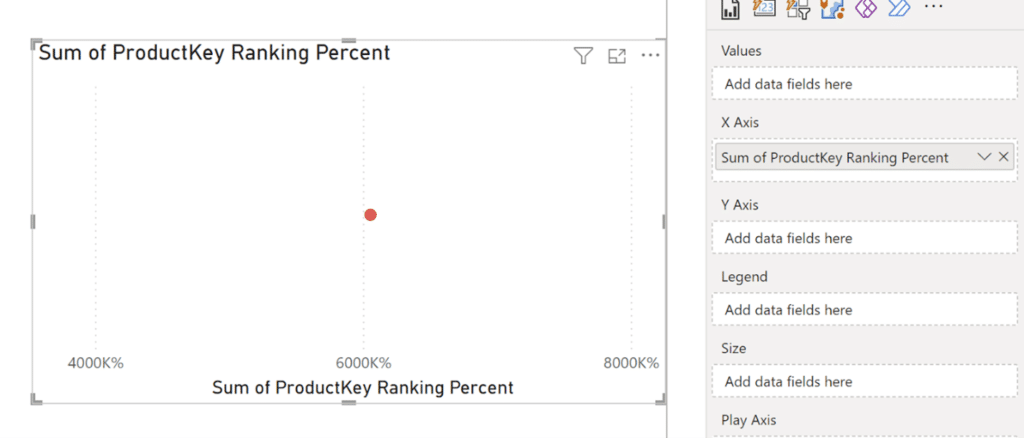
Since the ProductKey Ranking Percent field is aggregated, it produces a single point on the scatter chart representing the sum of the ProductKey Ranking Percent column, which doesn’t provide any useful information. You need to remove the aggregation on the ProductKey Ranking Percent column. In the dropdown, select “Don’t summarize”.
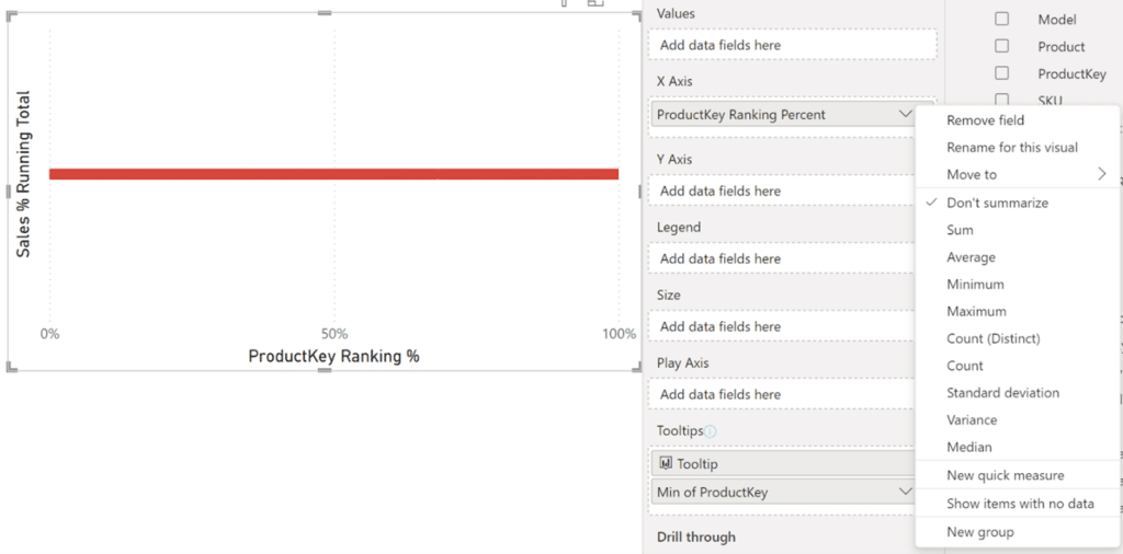
Once the aggregation is removed from the ProductKey Ranking Percent column, the product key rankings populate in a straight line. Now add the Sales percentage running total measure to the y-Axis.
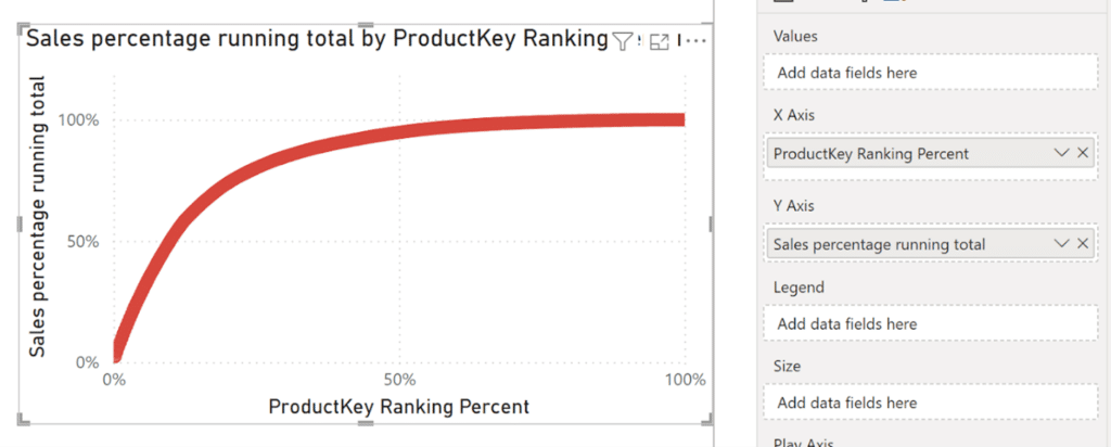
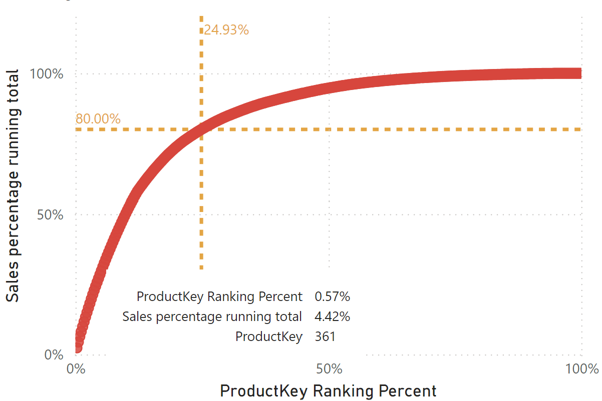
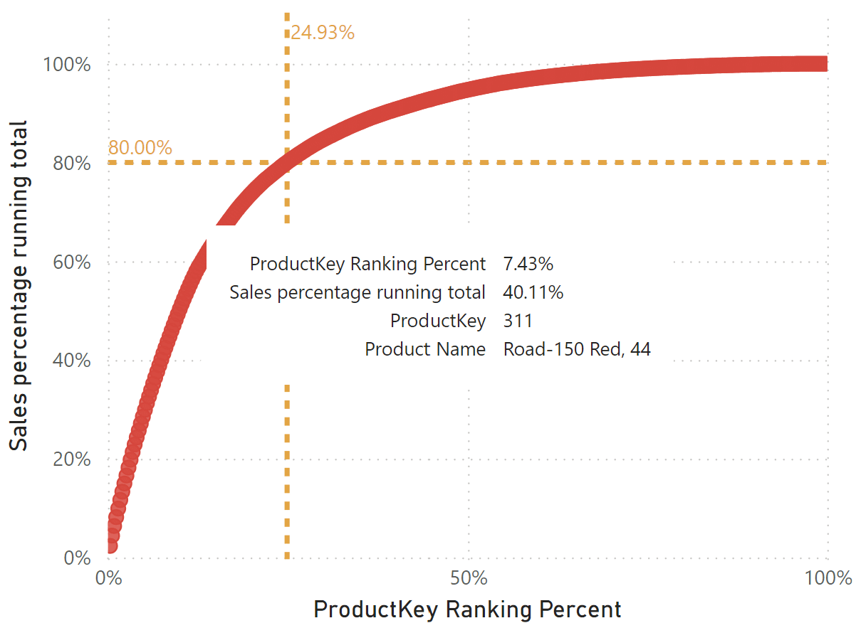
Once the Sales percentage running total measure is placed, the Pareto curve takes shape. Now that I have the Pareto built with percentages of totals on both axes, I can visually apply the 80/20 Pareto principle by adding constant lines.
Note: I’ve also slightly reduced the size of the individual markers in the scatter chart in formatting.
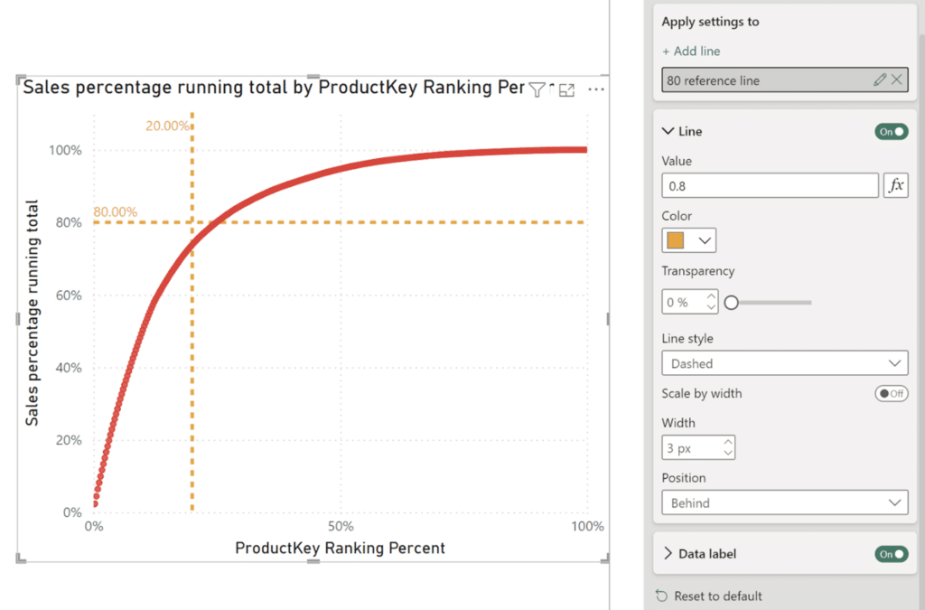
Though the data doesn’t exactly follow the 80/20 Rule, I can find out exactly how close I am.
Accurately visualizing the 80/20 Rule
The first step here is to create a running total of the total sales measure in the measures table. The syntax is similar to the Sales percentage running total measure from above, except I’ll be using the total sales measure in place of the sales percentage.
Sales running total =
CALCULATE(
[total sales measure],
FILTER(ALL(Sales),
Sales[ProductKey Ranking] <= MAX(Sales[ProductKey Ranking])))
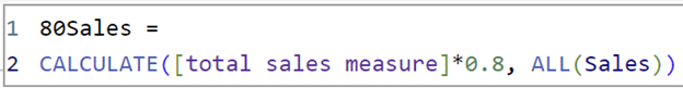
This next measure, “80Sales,” gives the value of 80% of total sales. I want to know how many products are at or below 80% of total sales.
80Sales =
CALCULATE([total sales measure]*0.8, ALL(Sales))
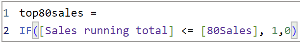
Now create a new Boolean measure, called “top80sales,” in the measures table with Sales running total and 80Sales to determine the products, by product key, that are less than or equal to 80% of total sales.
top80sales =
IF([Sales running total] <= [80Sales], 1,0)
I can place this measure in a table with ProductKey, ProductKey Ranking, Sales running total, and our 80Sales measure to check values. Sort this table by ProductKey Ranking.
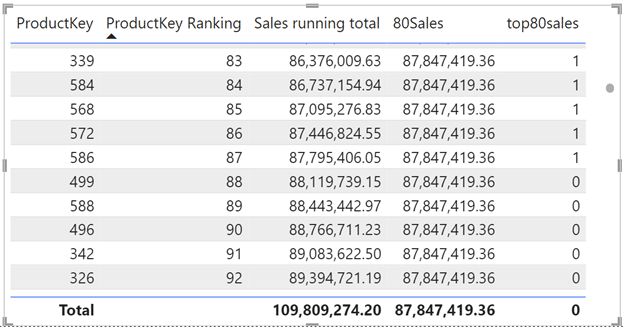
I can see where the Sales running total measure starts to be greater than 80% of the total sales.
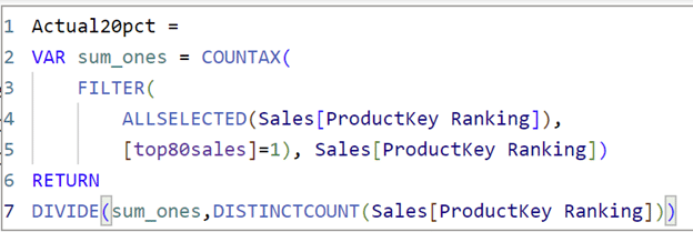
To determine the actual percentage of products that are responsible for 80% of sales, I need to create a calculation that adds up all of the ones/true values and divides that by a distinct count of the ProductKey Ranking. The function COUNTAX is used to count all of the true values in top80sales.
Actual20pct =
VAR sum_ones = COUNTAX(
FILTER(
ALLSELECTED(Sales[ProductKey Ranking]),
[top80sales]=1), Sales[ProductKey Ranking])
RETURN
DIVIDE(sum_ones,DISTINCTCOUNT(Sales[ProductKey Ranking]))
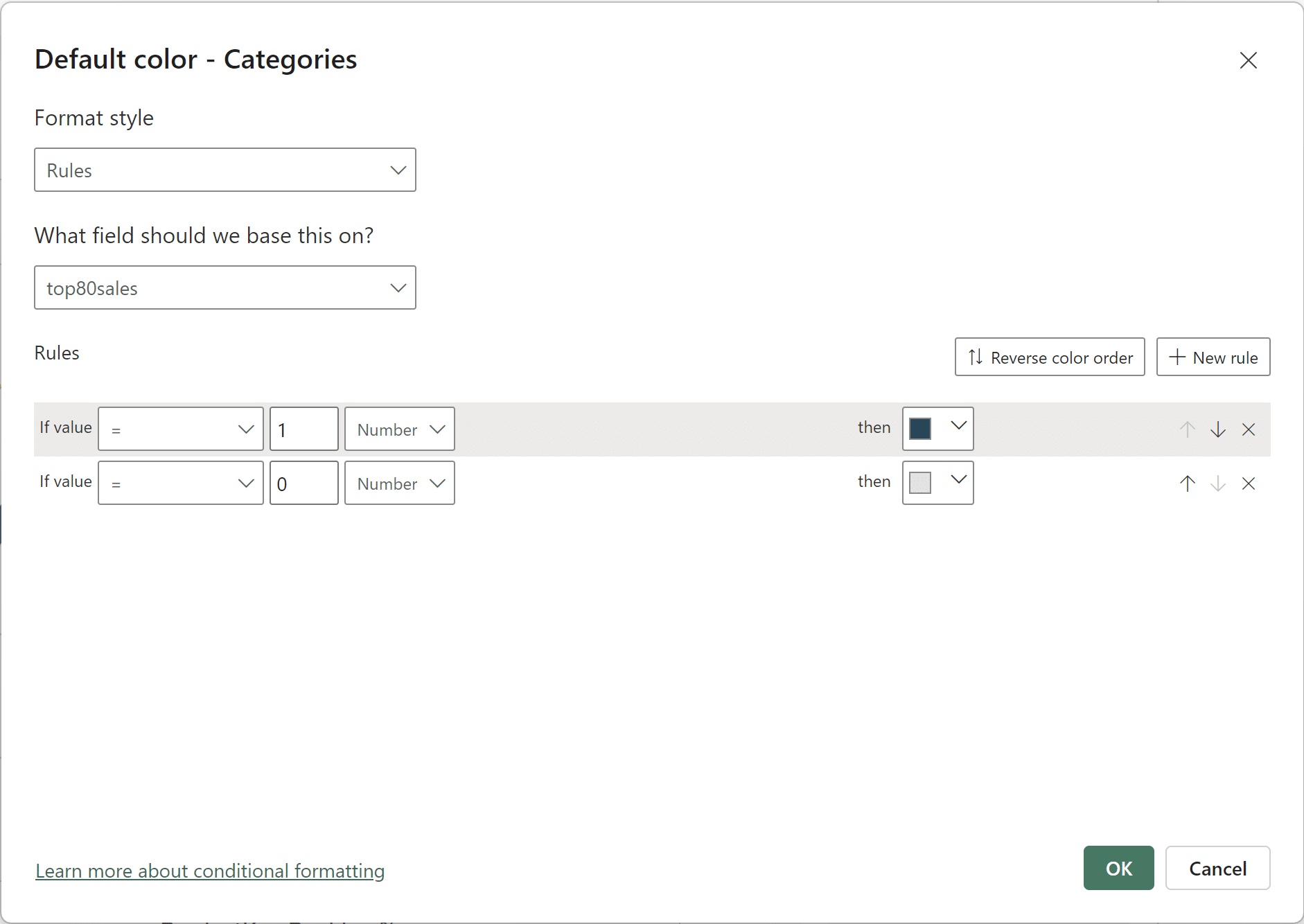
This measure will replace the constant line placed on the x-Axis. Add conditional formatting to the line value to use the new measure.
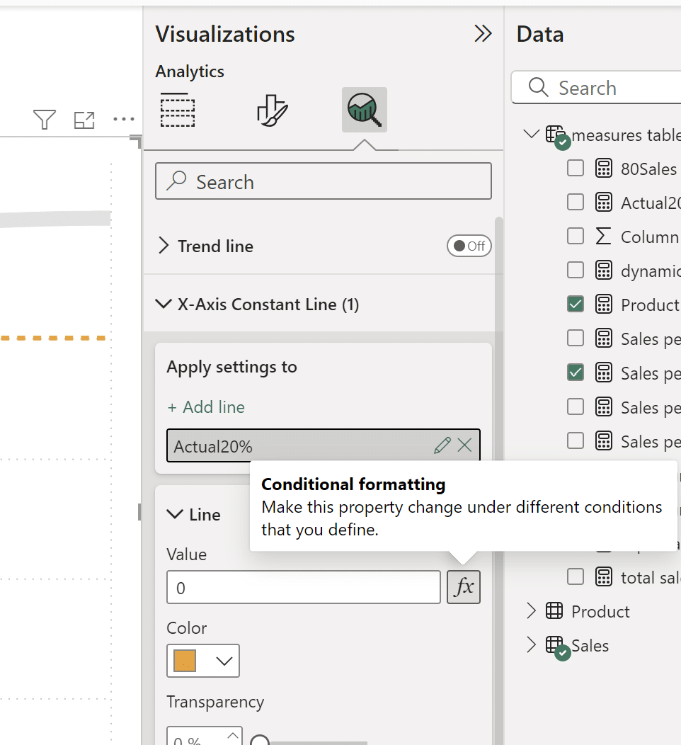
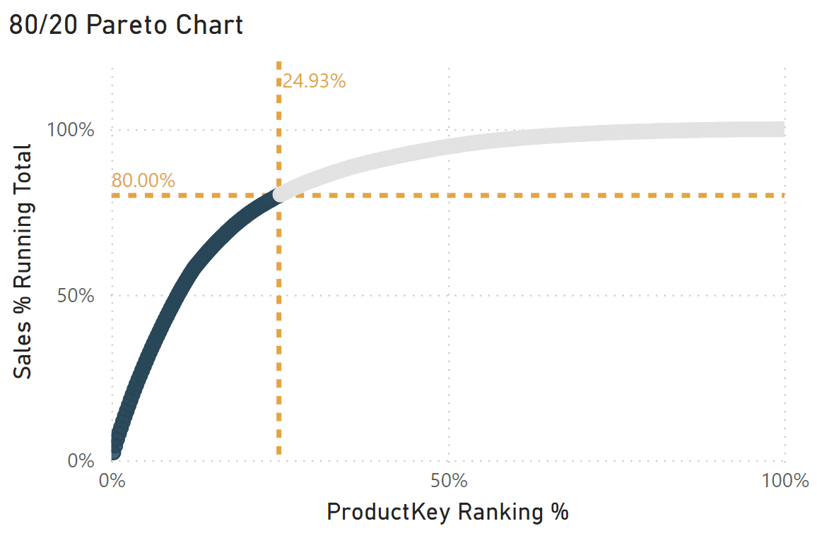
With this new constant line, I have found that the data follows closer to 80/25, where 25% of products are responsible for 80% of sales.
Creating useful tooltips and emphasizing the 80/20 Rule
Add useful fields in the tooltips like ProductKey to examine the individual products. Change the automatic aggregation from Count to Minimum or Maximum when you place the ProductKey field in the tooltips. I’ve also renamed the “Min of ProductKey” field in the tooltip to just “ProductKey” by right-clicking on the field and selecting “Rename for this visual.” Matching the exact product name to the ProductKey within the scatter chart visual is difficult but not impossible. It isn’t as straightforward as adding the individual ProductKey field because the ProductKey field is not directly used in the scatter chart. If this were a normal scatter chart, I would have kept the aggregation in the x-Axis and used the ProductKey field directly in the Values well. Since this technique can’t have a field in the Values well, this next measure is an alternative.
To match the product name to the ProductKey field in the tooltip, I’m going to create a new measure and use a little bit of DAX. This measure allows Power BI to change the filtering direction. If you look back at the relationship line between the Product and Sales tables in the Model view, you’ll see the arrow on the line representing the filtering direction. The original filtering direction in the Model view is from the Product table to the Sales table. Think of this measure as changing that arrow to point in both directions. Within this measure, the Sales table can also filter the Product table, which holds the ProductKey field that I need.
Product Name =
CALCULATE(
SELECTEDVALUE(‘Product'[Product]),
CROSSFILTER(Sales[ProductKey], ‘Product'[ProductKey], Both))
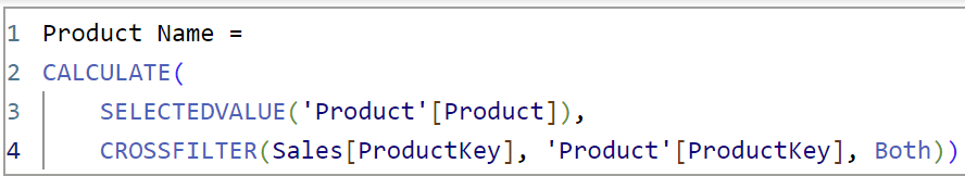
You can also create a similar field to display the correct category and subcategory for each Product with the same DAX. Just change the SELECTEDVALUE() selection from ‘Product’[Product] to ‘Product’[Category] or ‘Product’[Subcategory].
Now I have a tooltip telling me the specific product, not just the product key.
To further emphasize the products included in the 80/25 Rule, I’ve added rule-based conditional formatting using the top80sales Boolean measure on the scatter chart markers under Format visual → Markers → Color.
Here is my final 80/20 Pareto chart in Power BI that precisely visualizes the 80/20 Rule, or in this case, the 80/25 Rule.
This 80/20 Pareto chart in Power BI provides precise insight into how closely this sales data follows the 80/20 Rule, where roughly 20% of causes make up 80% of results. With this 80/20 Pareto chart, you can easily visualize the Pareto Principle, and see the top 25% of products that are responsible for 80% of total sales, as well as identify the specific products that make up that top 25%.
Thanks for reading,
Juan Carlos Guzman

Written By
Juan Carlos Guzman

Peer Review
Matt Snively
Sr. Manager, Analytics Engineering

Peer Review
Felicia Styer
Assoc. Director, Analytics Solutions
Related Content
Beginner’s Guide to DAX in Power BI: Creating a Date Table
In the same way that you can’t bake a cake without flour, you can’t use Power BI Desktop without Data…
3 Ways to Make Powerful Pareto Charts in Tableau

Pareto charts in Tableau – named for the Pareto principle inspired by Italian economist, Vilfredo Pareto – help visualize the…
3 Ways to Make Beautiful Bar Charts in Power BI
Despite many new challengers over the years in the world of data visualization, bar charts have remained one of the…