How to Make a Biggest Movers Chart in Power BI
Biggest movers charts in Power BI are powerful charts that show the performance of dimension members with the largest absolute period-over-period change. Typically, report developers create two visuals to show the top and bottom moving dimension members separately. With this biggest movers chart, you’ll be able to quickly compare both the top and bottom movers in the same visual.
In this tutorial, I’ll show you how to build a biggest movers chart in Power BI. As an added bonus, I’ll also show you how to conditionally format the chart to provide even more value to your stakeholders.
Connecting to data
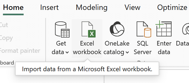
To follow this tutorial, download the Sales table from Proxy, Playfair Data’s real-world mock data source, available to all Playfair+ members. Open a new report in Power BI Desktop, click Excel Workbook, find the data in your files, and click Open.
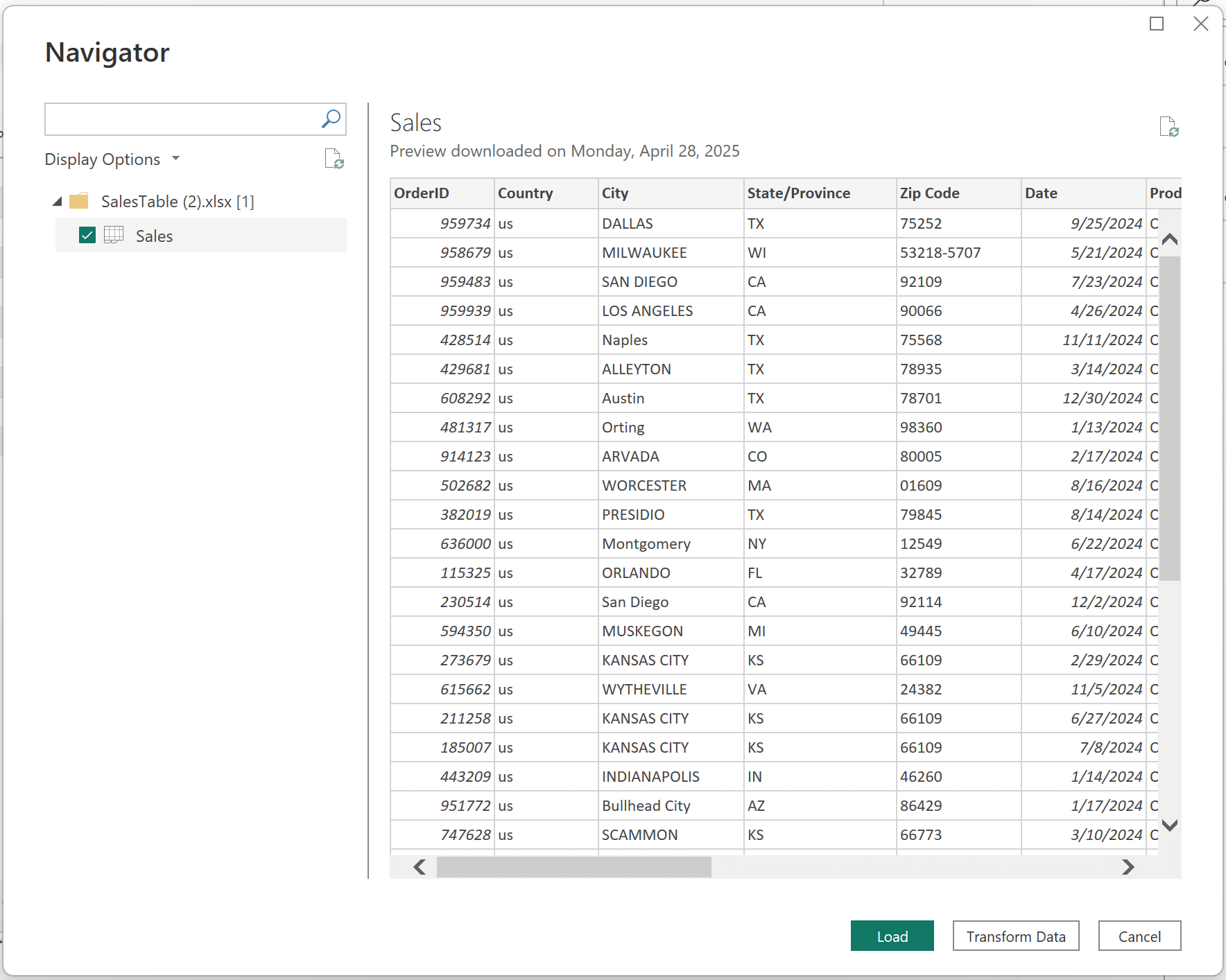
In the Navigator window, click on the Sales table and then click ‘Load’.
Continue reading with a free account, or login.
Unlock this tutorial and hundreds of other free visual analytics resources from our expert team.
Already have an account? Sign In
By continuing, you agree to our Terms of Use and Privacy Policy.
Create a date table
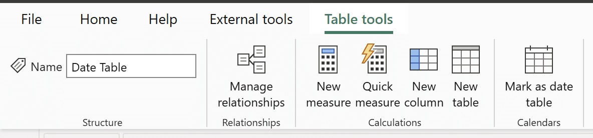
Since the biggest movers chart in Power BI is built using period-over-period calculations, the first step is to create a date table. Navigate to the Table view to begin.
Click on ‘New table’ to create a new table. In the DAX window that appears, copy the following syntax:
Date Table =
var dates = CALENDAR(MIN(Sales[Date]), MAX(Sales[Date]))
RETURN
ADDCOLUMNS(dates,
“Year”, YEAR([Date]),
“Quarter”, QUARTER([Date]),
“Month”, MONTH([Date]))
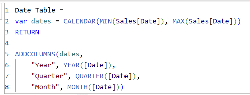
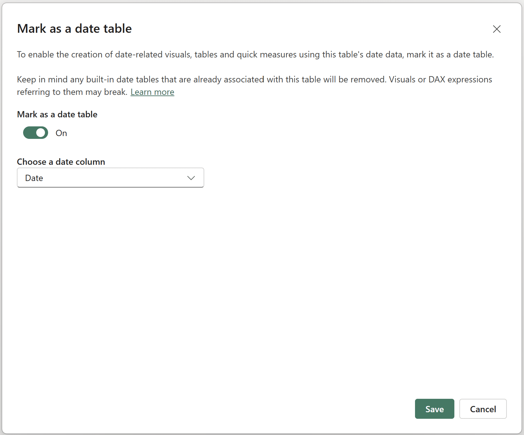
Click on the green checkmark to confirm this new date table. Once you’ve created the table, click on ‘Mark as date table’.
Beginner’s Guide to DAX in Power BI: Creating a Date Table
In the window that appears, toggle the ‘Mark as date table’ button to ‘On’, and select the ‘Date’ column in the ‘Choose a date column’ dropdown. Click ‘Save’ to confirm the choices.

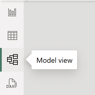
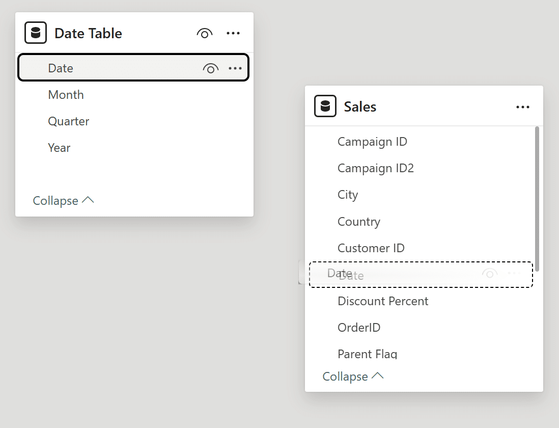
Now that the date table has been created, use the left-hand navigation to access the Model view.
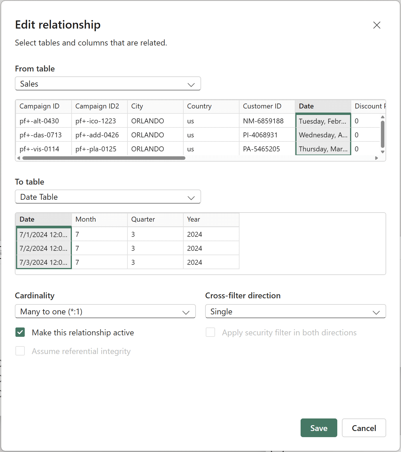
Click on the ‘Date’ column in the Date table and drag it to the ‘Date’ column in Sales to create a relationship between the two tables.
Confirm that the New relationship popup window looks like the below image, and click ‘Save’.
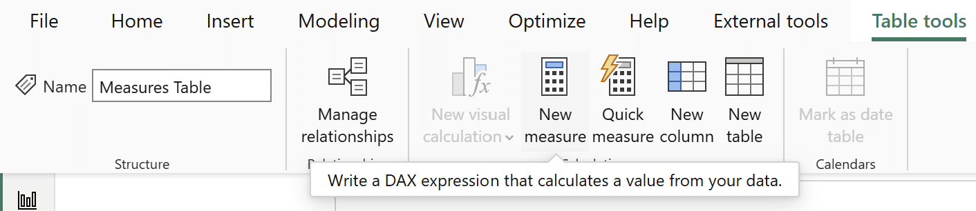
Create a measures table
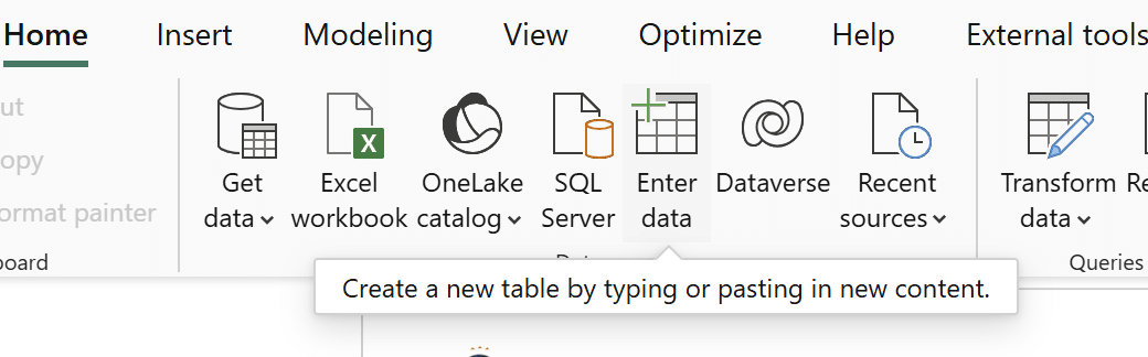
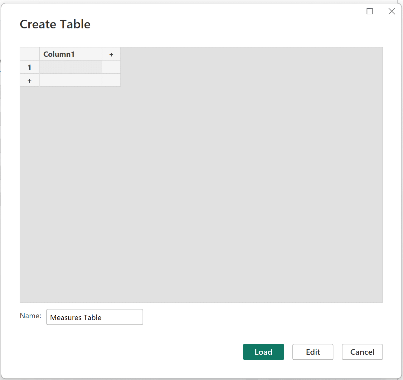
The biggest movers chart requires a few different measures, so I’ll create a table to hold them all. Navigate back to Table view and click on ‘Enter data’.
Change the table’s name to ‘Measures Table’ and click ‘Load’ to create it.
Creating period-over-period measures
Click on ‘New measure’ to create the first measure.
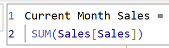
The first measure is simply an explicit measure of total sales. I will use a slicer visual to control the current month in view, so I’ll call this first measure, ‘Current Month Sales’. The syntax is below:
Current Month Sales =
SUM(Sales[Sales])
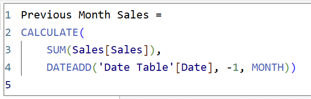
Create a new measure and call it ‘Previous Month Sales’. It uses DATEADD() to calculate sales for the previous month. The syntax is as follows:
Previous Month Sales =
CALCULATE(
SUM(Sales[Sales]),
DATEADD(‘Date Table'[Date], –1, MONTH))
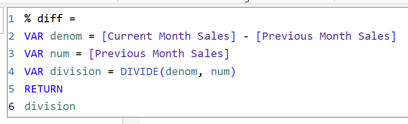
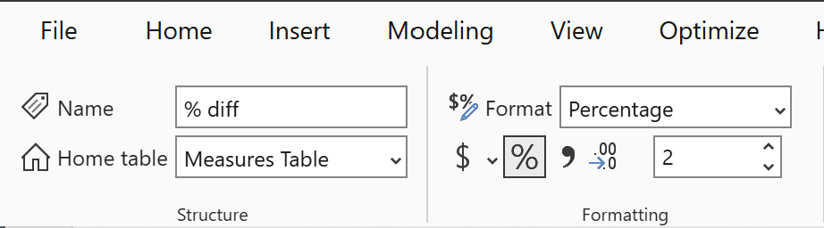
The next measure, ‘% diff’, will calculate the percent difference of sales between the current and previous months. The syntax is as follows:
% diff =
VAR denom = [Current Month Sales] – [Previous Month Sales]
VAR num = [Previous Month Sales]
VAR division = DIVIDE(denom, num)
RETURN
division
Format the ‘% diff’ measure as a percentage.
Note: If you want to limit the number of measures created, you can combine the three measures into one single measure using VAR statements, but I broke them out into individual measures for the purposes of demonstration.
One more measure is required to create the biggest movers chart in Power BI. To be able to sort the biggest movers chart properly, regardless of whether the percent change is positive or negative, you need to create a measure that calculates the absolute percent difference between the current and previous period sales. The DAX function that makes this possible is ABS(), which returns the absolute value of a number.
Using the left-hand navigation, move to the Report view, create a new measure, and type the following in the DAX window:
abs diff =
ABS([% diff])
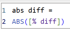
This measure simply wraps the ‘% diff’ measure in ABS() to compute the absolute value. Like the ‘% diff’ measure, format this measure as a percentage.
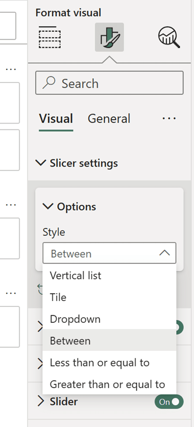
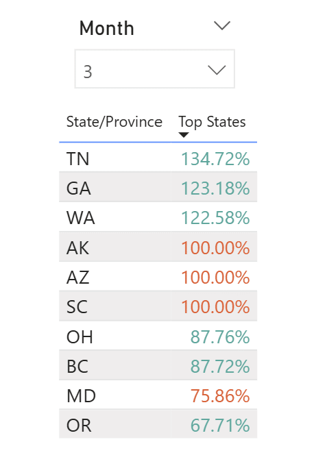
Add a slicer to your report page with the ‘Month’ column from the date table.
Power BI’s default style for date range slicers is ‘Between’, which lets you click and drag to select a beginning and end. In Format visual → Slicer settings → Options, change the style from ‘Between’ to ‘Dropdown’.
Below the slicer visual, add a table visual with the ‘State/Province’ column and the ‘abs diff’ measure. Click on the ellipses on the top right of the table visual to sort it by the ‘abs diff’ measure in descending order.
Note: I’ve used the Filters pane to exclude January from the month slicer because the Sales table has one year’s worth of data.
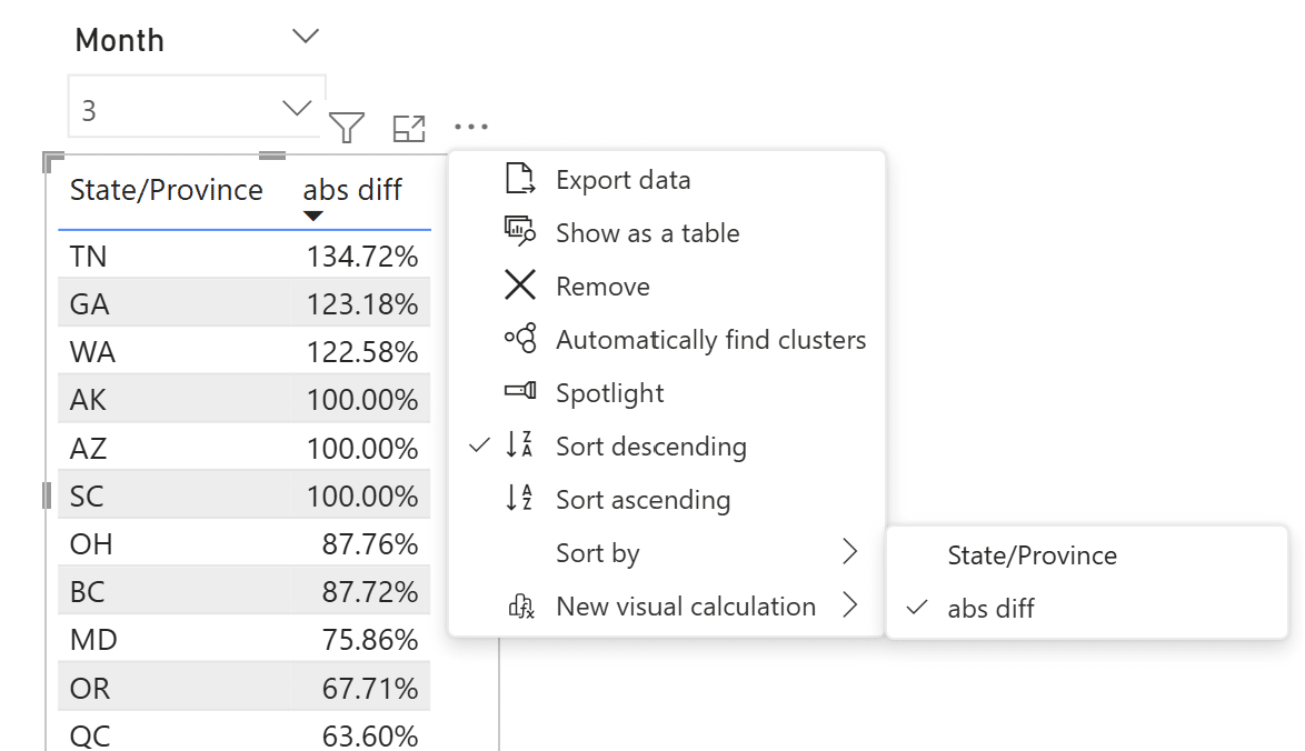
The states are now sorted correctly by the absolute value of the percent change of month-over-month (MOM) sales. In its current state, you are unable to tell which state had a positive or negative MOM change in sales. To bring this chart to life, you need to add some conditional formatting.
Conditional formatting with additional visual indicators
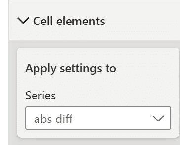
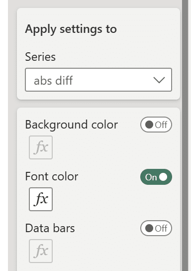
In the Visualizations pane, click on ‘Format visual’ and open up the ‘Cell elements’ dropdown. Select the ‘abs diff’ measure in the ‘Series’ dropdown.
The first change I’ll make is to conditionally format the font color. Click on the ‘Fx’ under ‘Font color’ to open up the conditional formatting window.
In the Conditional Formatting window, I will set rules to change the font color based on the ‘% diff’ measure. Be careful here to select the ‘% diff’ measure in the ‘What field should we base this on?’ dropdown, not the ‘abs diff’ measure. This detail is key for the biggest movers chart to work correctly.
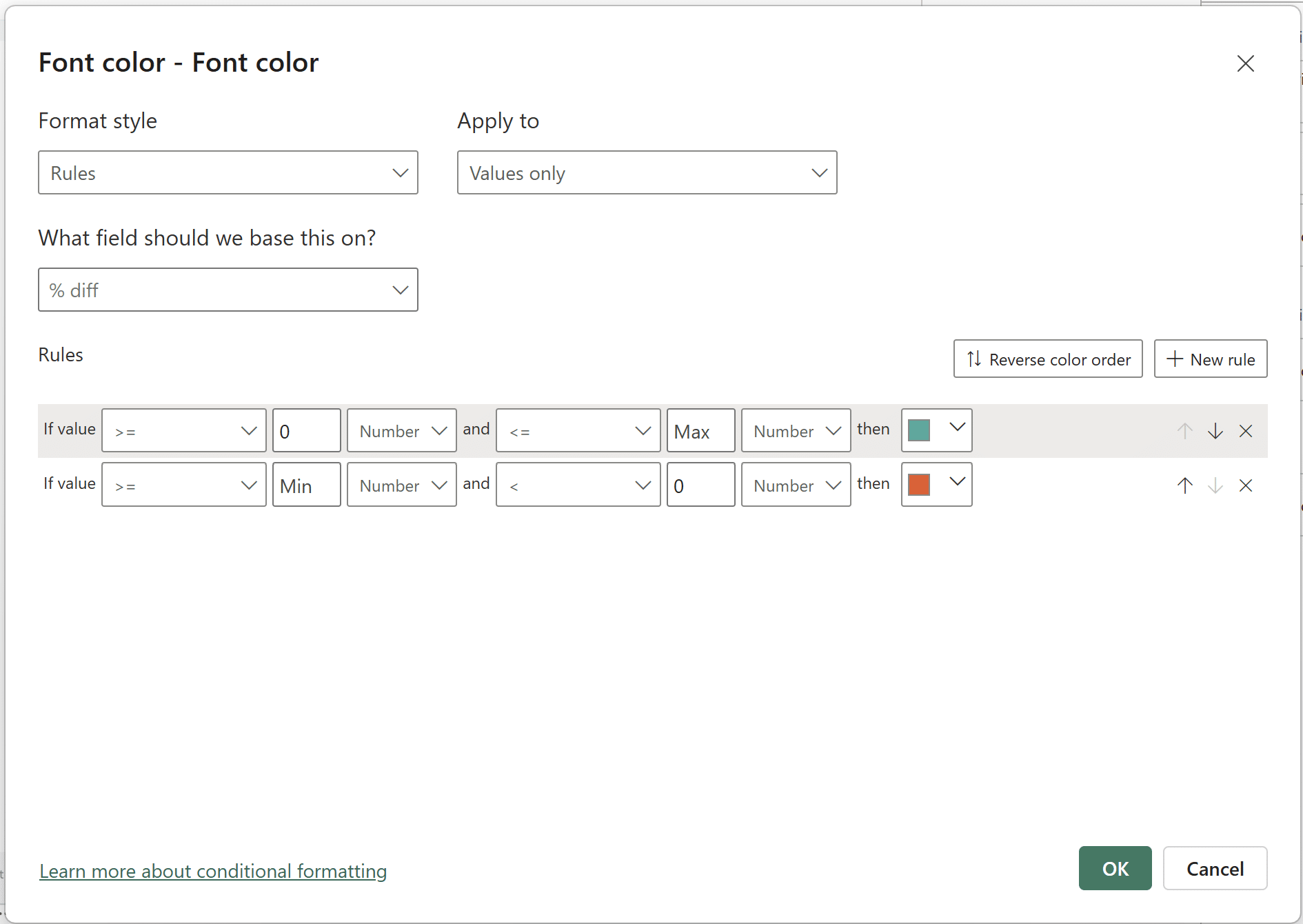
Once your conditional formatting window for the font color looks like the above image, click ‘OK’ to confirm.
Your biggest movers chart in Power BI should look like this:
To make the month-over-month percent difference clearer, I’m going to add an additional visual indicator in the form of icons. Like before, in ‘Cell elements’, toggle the ‘Icons’ button to ‘On’ and click on the corresponding ‘Fx’ to open up the Conditional Formatting window. Just like the font color conditional formatting, make sure that the ‘% diff’ measure is selected in the ‘What field should we base this on’ dropdown. Select the icons you’d like to use; I am using the default arrow icons.
Once your window looks like the above image, click ‘OK’. That’s it! Your biggest movers chart in Power BI is complete.
Extra credit
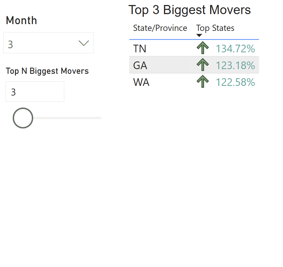
To parameterize the biggest movers chart, create a numeric field parameter and call it ‘Top N’. Click on Modeling → New Parameter → Numeric range.
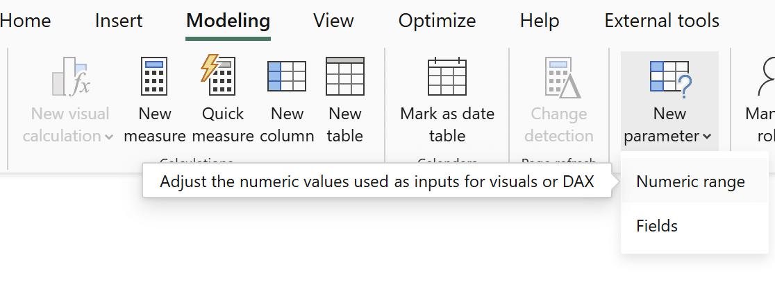
Name this numeric range parameter ‘Top N’ and set your desired minimum and maximum values. Keep the increment at 1.
An Introduction to Parameters in Power BI
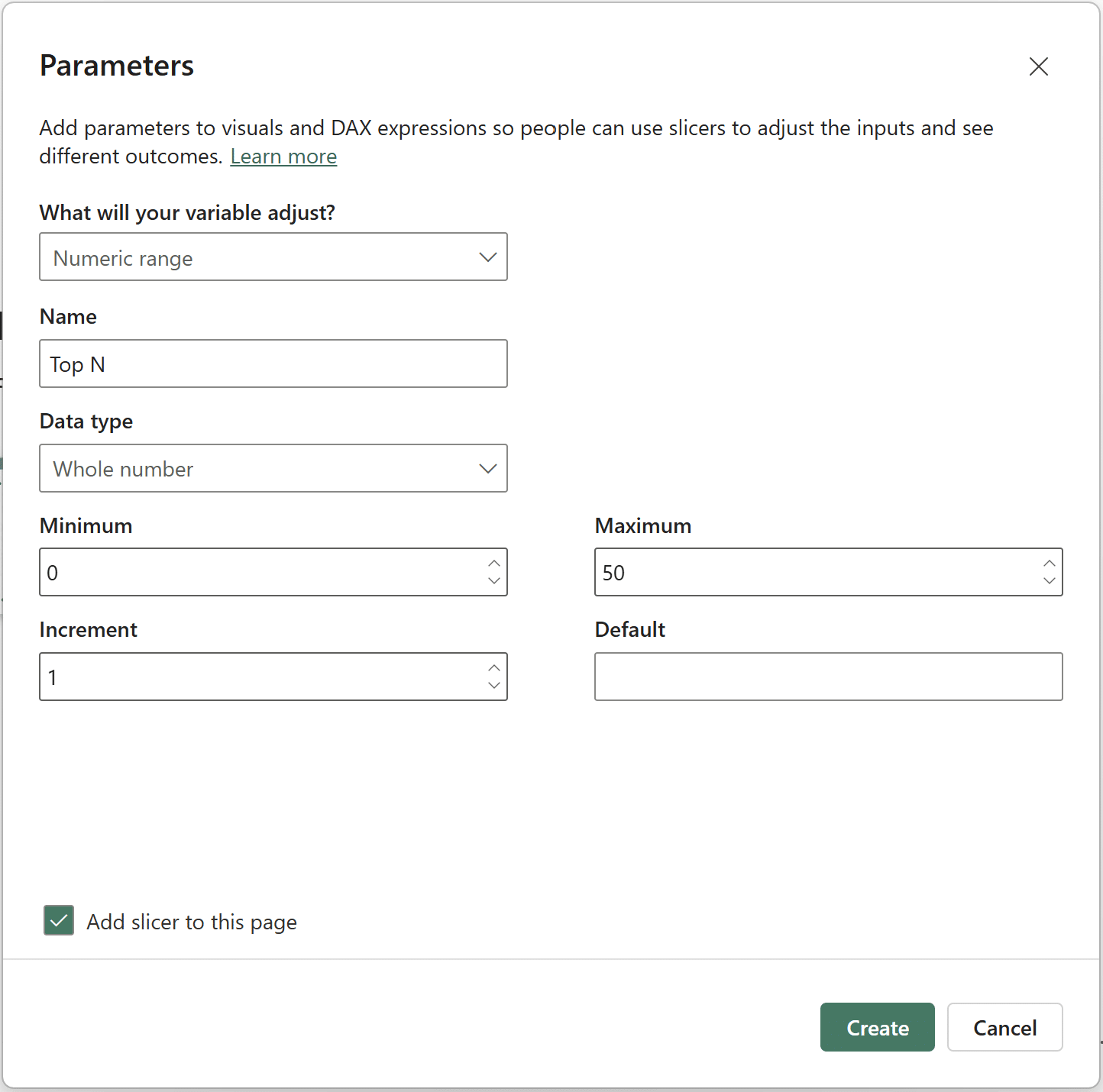
Click ‘Create’.
Create a new measure in the measures table called ‘Top States’. The syntax is as follows:
Top States =
VAR dynamicTopN = SELECTEDVALUE(‘Top N'[Top N])
RETURN
SWITCH(
TRUE(),
dynamicTopN = 0, [abs diff],
RANKX(ALLSELECTED(Sales[State/Province]), [abs diff]) <= dynamicTopN, [abs diff])
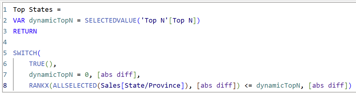
RANKX() sorts the states by the ‘abs diff’ measure, while SELECTEDVALUE() and ALLSELECTED() ensure that the number of states shown depends on the value in the Top N slicer.
Now replace the ‘abs diff’ measure with the new ‘Top States’ measure in the original table visual. Apply the same conditional formatting to the font color and icons to the new ‘Top States’ measure. Just like above, ensure that the ‘What field should we base this on?’ dropdown is set to the original ‘% diff’ measure.
Create a new measure in the measures table called ‘Dynamic Title’. The syntax is as follows:
Dynamic Title =
“Top “ &
SELECTEDVALUE(‘Top N'[Top N]) &
” Biggest Movers”
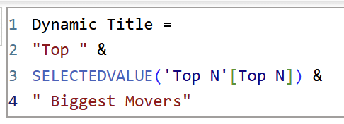
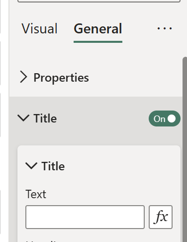
This measure will be used as the table visual’s title. Under Format visual → General → Title, click the ‘Fx’ to set this measure as the new title.

Click ‘OK’ to set the title.
After applying the conditional formatting and a few additional formatting techniques, here’s my final biggest movers chart in Power BI:
Thanks for reading,
Juan Carlos Guzman

Written By
Juan Carlos Guzman

Peer Review
Matt Snively
Sr. Manager, Analytics Engineering
Related Content
How to Create Balance Scale Charts in Power BI
The Balance Scale chart is a Playfair Data innovation that was originally created for our Financial Analysis Swift in Tableau.…

Juan Carlos Guzman
Connect to Three Common Data Sources in Power BI Desktop Learn how to connect to three of the most common…
Icon-Based Navigation in Power BI
Icon-based navigation in Power BI is one of the most effective ways to improve the user experience of your reports.…