Icon-Based Navigation in Power BI

Icon-based navigation in Power BI is one of the most effective ways to improve the user experience of your reports. Using an icon as a navigation button, instead of a page or bookmark navigation button, reduces the space needed on a report page for button controls and is more visually appealing than a text-based button. Another equally important benefit of using icons as report controls is that they can convey the same information as an instructional text box or a text-based button when they are used appropriately.
Instructing your users with relevant icons rather than text-based buttons allows users to spend more time digesting the report and less time digesting instructions. Everyone digests information differently, so why not reduce the possible interpretations of a text-based button with a relevant icon? Instead of a navigation button that says “Click here to toggle the report visual”, why not have a small set of icon controls that communicates that message to the user? With icons, you’ve reduced the visual load that the text box has on the report page while communicating the same information.
In this tutorial, I’ll show you how to use icon-based navigation to improve your Power BI reports.
Getting started with icon-based navigation in Power BI
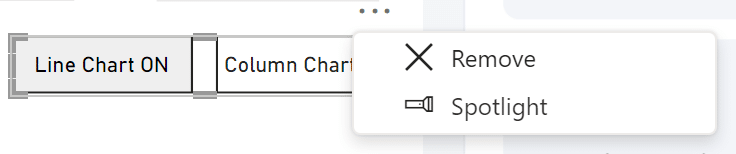
Since this tutorial builds off of Toggle Visuals with Bookmarks in Power BI, I encourage you to download the .pbix file to follow along. After downloading the .pbix file, the first step is to remove the bookmark navigator button. Click on the three dots above the bookmark navigator button and click ‘Remove’.
Continue reading with a free account, or login.
Unlock this tutorial and hundreds of other free visual analytics resources from our expert team.
Already have an account? Sign In
By continuing, you agree to our Terms of Use and Privacy Policy.
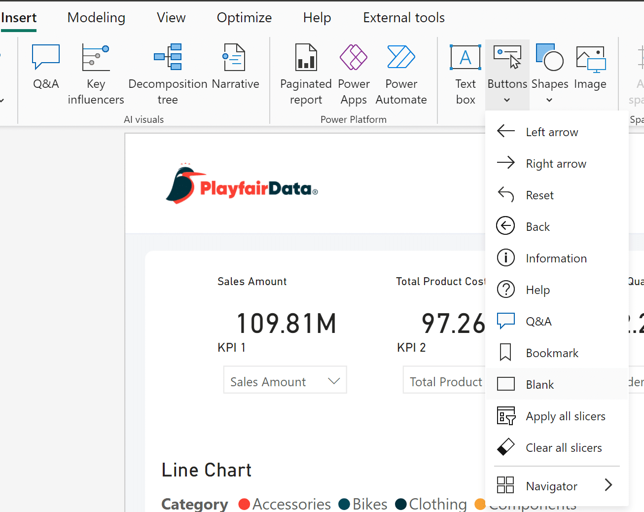
Importing images and creating blank buttons in Power BI Desktop
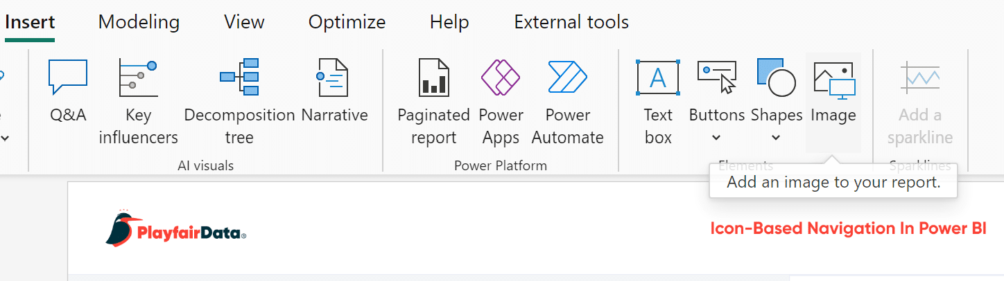
Next, download two images/icons to represent the two visuals you want to toggle. I will be using the images named “Bar highlight” and “Line highlight” from this folder. From the Insert tab, click on the ‘Image’ button and select the first image from your downloads. Click ‘Open’ to add the image to the report. You can only select one image at a time, so you’ll have to do this again to insert the second image.
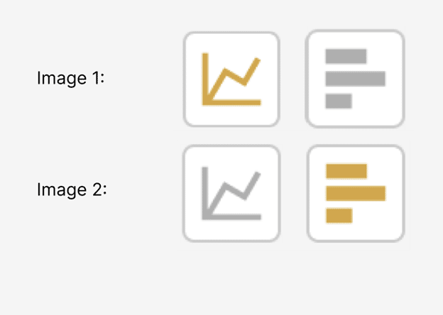
When selecting icons for icon-based navigation in Power BI, it’s best to select icons that have clear “Off” and “On” states. These two images have a distinct “On” state in orange, and an “Off” state in grey. Image 1 represents the line chart being “On” while the bar chart is “Off”. Image 2 represents the opposite. Make sure that your icons flow nicely within your report page by selecting colors and shapes within your report’s branding.
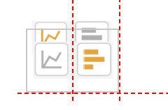
Once both images are in your report, reposition and resize them using the Format visual pane under General → Properties. Next, layer them one on top of the other. Drag the first image to its desired position on the report page. The second image will be placed right on top of the first.
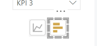
Now that I have my two images in position, I will add two blank buttons from the Insert window.
I will resize and place one blank button on top of the line icon and the other on top of the bar icon.
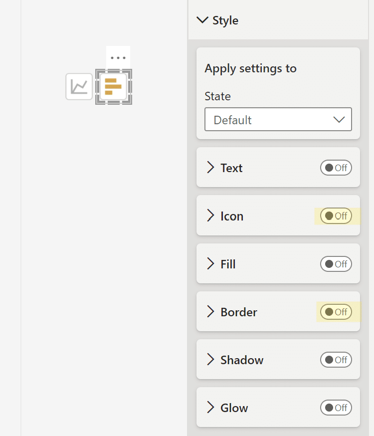
Next, I will change each button’s settings. Currently, the blank button’s default setting has both the Icon and Border options toggled when it is pressed. In the Format pane, select the button State as “On press” and deselect the Icon and Border options. The goal here is for the button to be invisible, so it looks like the user is pressing directly on the line and bar icons to change the report page. This is essential for seamless icon-based navigation in Power BI. You can see my changes highlighted below.
Editing bookmarks
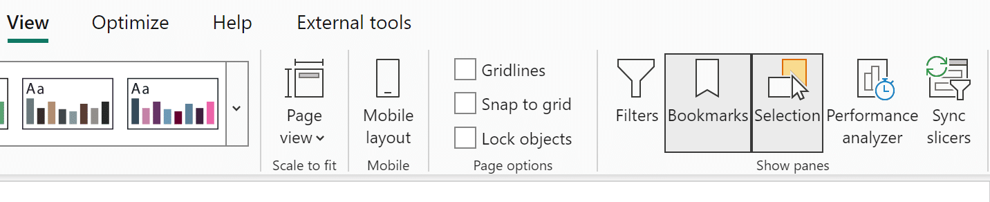
Now I will open up the Bookmarks and Selection panes from the View tab.
Once the Selection pane is open, I’ll rename the blank buttons from “Button” to “Line button” and “Bar button”, respectively. Next, I will rename the images I brought in earlier by double-clicking on “Image” in the Selection pane.
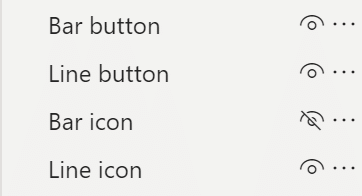
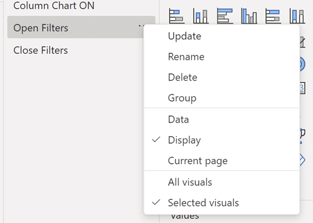
Next, I will need to update the bookmarks created in Toggle Visuals with Bookmarks in Power BI. When updating bookmarks, you need to Ctrl+Click each item that you want to include in the bookmark. In the Selection Pane, I will Ctrl+Click the Bar icon, Line icon, Column Chart, and Line Chart. After Ctrl+Clicking these four elements, click the three dots on the right of the bookmark and click ‘Update’.
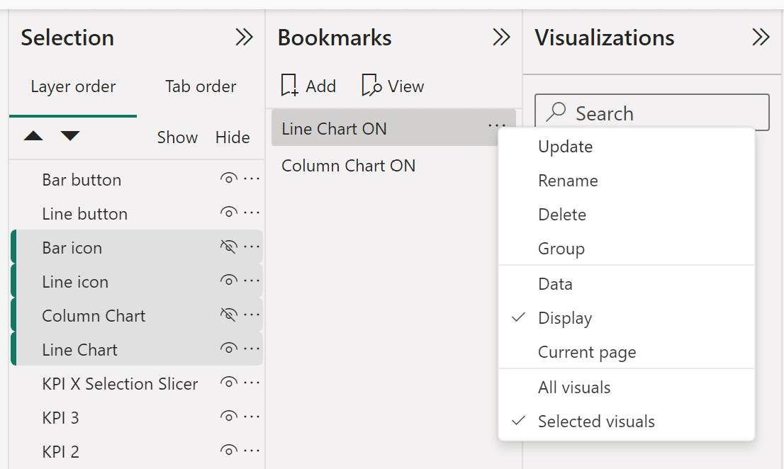
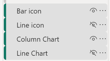
Both the “Line Chart ON” and “Column Chart ON” bookmarks have the same four elements. The only difference between the two bookmarks is the elements that are hidden or shown. To hide an element, click on the eye in the Selection pane. When the “Line Chart ON” bookmark is active, the bar icon and column chart will be hidden. The line icon and line chart will be hidden when the “Column Chart ON” bookmark is active.

Once you’ve updated the “Line Chart ON” bookmark, toggle the visibility of the four highlighted elements in the Selection pane to match the desired settings for the “Column Chart ON” bookmark by showing the bar icon and column chart and hiding the line icon and line chart. Then click ‘Update’.
When you hide an element in Selection pane, it will automatically deselect. You need to Ctrl+Click the element again after hiding it.
Applying actions to the blank buttons in Power BI Desktop
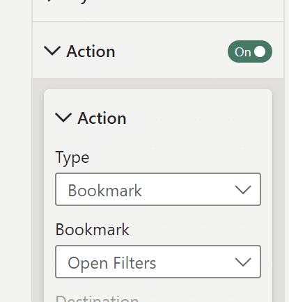
The last step in applying icon-based navigation in Power BI is to assign actions to the blank buttons on the report page. First, click on the blank button on top of the line icon to open up the Format button pane. Next, open the Action dropdown. Then from the Type dropdown, select the Bookmark type. Lastly, select the “Line Chart ON” bookmark from the Bookmark dropdown. Repeat these steps for the blank button floating over the bar icon. Now you can successfully toggle the visuals on your report page by Ctrl+Clicking on the line and bar icons.
Bonus: Take icon-based navigation in Power BI one level further
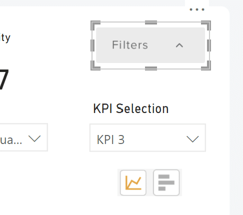
Since the icon buttons play a supporting role, they don’t always need to be visible to the user. When you aren’t actively using icons to toggle visuals, they are taking up valuable space on the report page. The same goes for other controls such as slicers. To preserve page real estate, I’ll use a second set of buttons to hide all of the controls on this page, not just the icon buttons.
Starting with the “Importing images and creating blank buttons in Power BI Desktop” section of this tutorial, I will first import a set of images. Download them here if you’d like to follow along. The images I will use are “Button_Filter_Closed” and “Button_Filter_Open”. Next, I will add a blank button for each, and then I will create new bookmarks. Lastly, I will assign bookmark actions to the blank buttons.
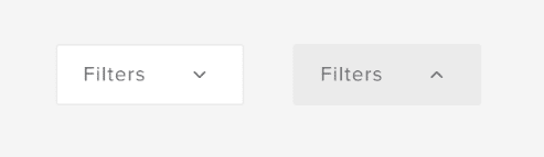
Like before, I will use two images that have a distinct “On” or “Open” state and an “Off” or “Closed” state. Next, I will layer these two images on top of each other.
Next, I will add two blank buttons to the report page. These blank buttons will also be layered on top of the two images.
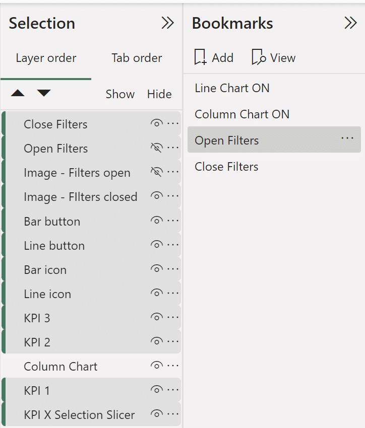
On the top right of the screen, there are four components layered on top of each other – two images and two blank buttons. Now, open the Bookmarks and Selection panes to name each component appropriately. Next, create two new bookmarks and make sure the settings for each new bookmark match the settings for the “Line Chart ON” bookmark – the Display and Selected visuals settings are the only settings selected.
For these two new bookmarks, Ctrl+Click every visual that you want to include in each bookmark – including the visuals that are going to be hidden. Just like before, these two new bookmarks share the same elements. The only difference between them is the elements that are shown or hidden. I will name the first bookmark “Open Filters”, and the second bookmark will be “Close Filters”.
Once you select all of the elements for the “Open Filters” bookmark, click the three dots on the right of the bookmark, and then click ‘Update’ to save it.
When creating the second bookmark, confirm that the correct visuals are hidden or shown.
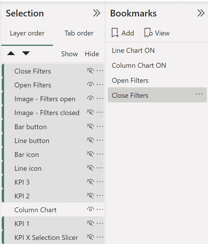
Then, click ‘Update’ to save your bookmark settings. Just like before, the last step is to add bookmark actions to the buttons.
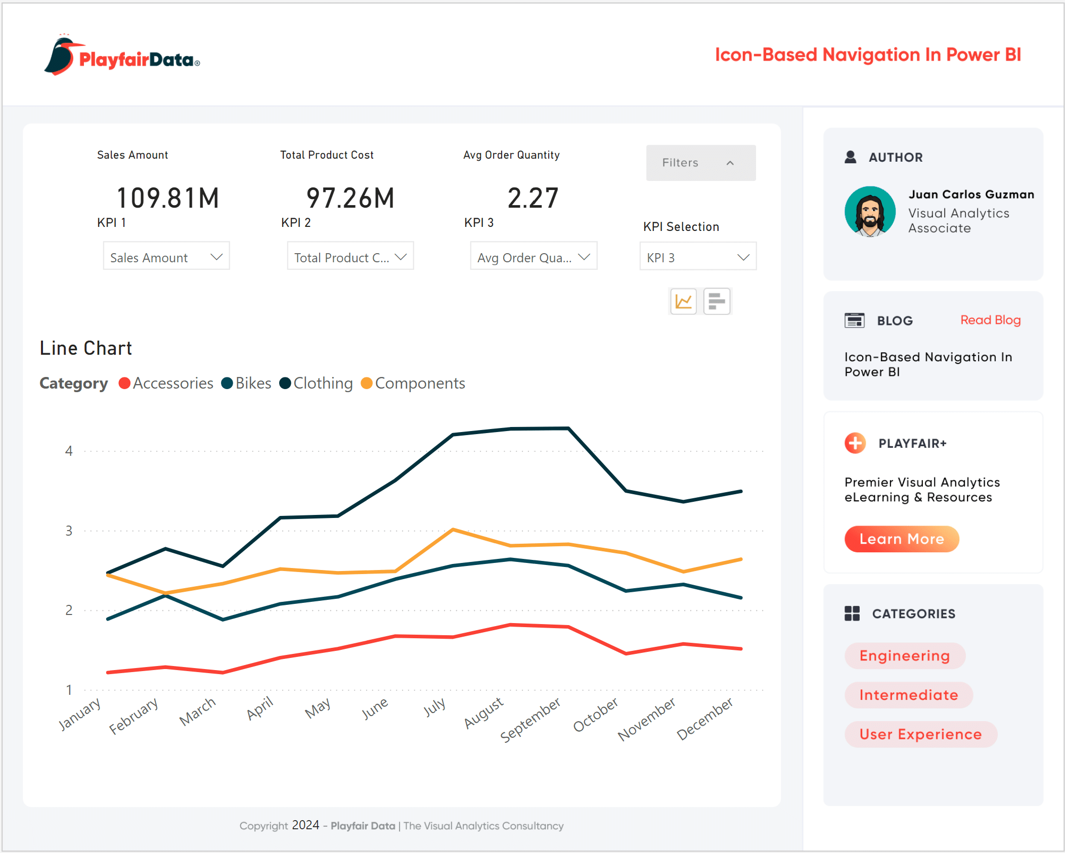
After some formatting, here’s my final report.
In this post you’ve learned why icon-based navigation is useful in Power BI reports and how to successfully utilize icon-based navigation in Power BI to create button toggles for chart visuals. You’ve also preserved valuable page real estate by adding a second set of toggles to hide the icon menu. As this tutorial wraps up, I’ll leave you with some final thoughts and considerations when using icon-based navigation in your Power BI reports.
Final thoughts:
- Use relevant icons. You don’t want to confuse your users.
- Ensure that replacing a text button with an icon button doesn’t take away from the message that the text button communicates.
- If you like using icons but aren’t sure that the message is being communicated in the way you want it to, use tooltips to supplement the icons.
- Your report’s visuals and analysis are the stars. Icon-based navigation buttons play a supporting role. You don’t want flashy, distracting instructions that can increase the cognitive load on your users.
- Stick to simple, effective icons that follow your report’s theme, colors, and branding. For more ideas, check out the Data-Ink Ratio and how to apply it.
- If you want to improve your Power BI report’s navigation, structure, or complete layout but aren’t sure where to start, get connected with us at [email protected].
Thanks for reading,
Juan Carlos Guzman

Written By
Juan Carlos Guzman

Peer Review
Matt Snively
Sr. Manager, Analytics Engineering
Related Content
An Introduction to Parameters in Power BI
Parameters are user-generated values that define how a system can operate. We can use parameters in Power BI to grant…
Streamlining Dashboards: Minimizing Chartjunk with Icon Design

Whether you use icons within or around your data visualizations, it’s crucial to be mindful of the value they add…
So You’ve Decided to Use a Visual Analytics Tool–What Now?
Why do we use visual analytics tools? Everyone may have different goals with their visualizations, but I think the overall…