So You’ve Decided to Use a Visual Analytics Tool–What Now?


Why do we use visual analytics tools? Everyone may have different goals with their visualizations, but I think the overall idea is the same: we all want to better understand and explain our data. Visualizing data is an efficient and effective way to create meaningful insights into your data. Depending on your audience’s data literacy, you might be used to using spreadsheets to show your data, but spreadsheets can quickly become complex, making them near inscrutable to those without a high level of familiarity with the data itself.
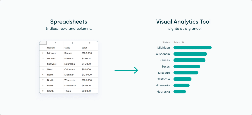
With a simple bar or line chart, we can open up our data to an audience with a much wider range of data literacy–this leads to a clearer understanding of important takeaways, faster insights, and ultimately better decision making.
![]()
But which type of visual analytics tool should you use with your data? Are you looking to build a report, a full dashboard, or an even more complex suite of tools? There are many great options out there, so we’ll walk you through some of them and why you could use them in different situations.
A Spreadsheet is Not a Data Visualization
Step 1: Identify your audience
It should go without saying, but not all audiences are the same. While the data literacy level–the ability to understand and use the data at hand–of our audience can be a good baseline for how you visualize your data, it’s also important to consider other important factors such as their familiarity with the data, time available to look for an insight, and what decisions might be made by using the visualization.
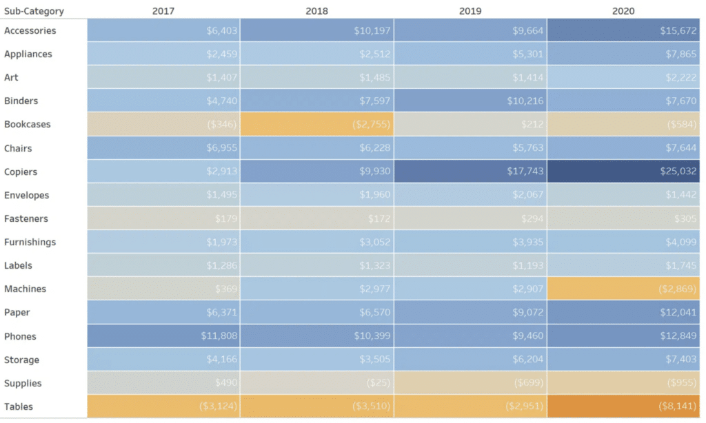
For general audiences with possibly low data literacy or existing insight into your data, make sure you’re choosing a visual analytics tool that can provide enough context to make sure your data is understandable and leverage a preattentive attribute like color to make key insights quickly apparent. For example, this would be a good opportunity to create a highlight table that shows a table that colors measures to draw the user’s eye, and then a single chart featuring that same measure highlighted again in context. Highlight tables are a great way to emphasize trends and outliers in an otherwise plain Excel spreadsheet.
Continue reading with a free account, or login.
Unlock this tutorial and hundreds of other free visual analytics resources from our expert team.
Already have an account? Sign In
By continuing, you agree to our Terms of Use and Privacy Policy.
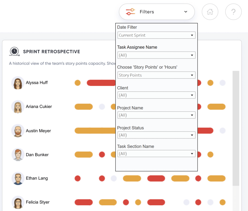
For audiences more familiar with the data, perhaps an analyst looking to make some business recommendations, you could make use of a series of charts with filters for them to dynamically adjust the displayed data. Think comparative measures, slicing data by different periods of time, or focusing on specific metrics. For these visualizations, a dedicated data visualization platform like Tableau or Power BI is recommended–they are designed to allow users to make these dynamic changes themselves.
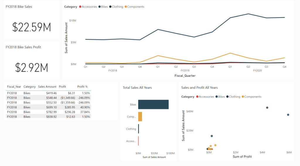
For high-level audiences like CEOs or Finance Directors who have a detailed understanding of the underlying data, a focused key performance indicator dashboard is a great way to showcase the data in a way that allows for quick business decisions to be made. Think about building a few chart tiles to show the context of the data, then make the KPIs a centerpiece for executives who need to know the “top-level” information quickly and clearly. Power BI Dashboards (available on service only) are an excellent choice here.
Vital Question 1: Who is the Audience?
Step 2: Choose your visual analytics tool
Now that you know your audience, how do you move from raw tables to visualizations? There’s no correct first step as everyone’s process is different, but the best starting advice is to jump right in! To start, it is important to match the type of visualization with the type of data available–line charts suit continuous data (think date and time data) best whilst bar charts work best with discrete data (think slicing key performance indicators by categorial data like product type).
Of course, you could do all this work by hand, or even with the ever-ubiquitous software Microsoft Excel… however, there are dedicated platforms for data visualization that can do some of the heavy lifting for you, allowing you to generate your end results faster and more clearly. Industry-leading tools such as Tableau, Microsoft Power BI, and Amazon QuickSight all provide a way for you to enter your raw data and generate a powerful visualization for your users. We’re not going to push one specific path in this post–the best tool is the one you become most comfortable with through learning and experimenting.
Create visualizations with your end goals in mind
We mentioned preattentive attributes above when discussing audiences. These are visual properties that viewers process without conscious thought–think about how you naturally view a highlighted color separately from the rest of a set, or easily group items by shape. Color, form (shape), movement (direction), and position are all powerful attributes to encode in your data to guide your audience to actionable insights.
Step 3: Guide your audience
Now that you have your audience and visualization(s) chosen, you can maximize the impact of your data with additional guidance. No matter the level of data literacy for your audience, visual cues are an effective way to direct your audience to the most important information on the screen.
![]()
Visual cues draw the user’s attention to the information on the page. Visual cues can be direct components of your visualizations, or they can play a supporting role while giving your visualizations the center stage. This can be done by adding a background to the page(s) that display your visualizations.
Apart from making your reports visually appealing, a huge aspect of visual cues and visual flair is brand identity. Your report/content backgrounds can include your logo and company colors. Consistency in visual cues and flair throughout different content your company puts out becomes your brand identity and a second way for users to recognize your brand, apart from the quality of your work.
Streamlining Dashboards: Minimizing Chartjunk with Icon Design
Using visual analytics tools can evolve your data requirements and goals from a spreadsheet to a simple visualization, and from a simple visualization to more advanced visualizations with complex filtering and interactions. Ultimately, the best tool is the one you are comfortable with and accomplishes the specific goal at hand. Just remember to keep your end user in mind!
Thanks for reading,
Juan Carlos Guzman and Matt Snively

Written By
Matt Snively

Written By
Juan Carlos Guzman

Peer Review
Dan Bunker
Manager, Decision Engineering
Related Content
Tableau vs. Power BI: A Quick Start Guide Comparison
As someone who is relatively new to both Tableau and Power BI, having to navigate either platform can feel overwhelming…
Power BI Reports vs Dashboards
If you recently made the transition from Tableau to Power BI, you may find yourself looking for similarities between the…

Ryan Sleeper
Connect with your audience to improve the chance of action It doesn’t matter how good your data visualization is, how…