Power BI Reports vs Dashboards

If you recently made the transition from Tableau to Power BI, you may find yourself looking for similarities between the two platforms. When I first opened Power BI Desktop, one of my first questions was, “If reports in Power BI are similar to sheets in Tableau, then where are the dashboards?” While reports in Power BI and sheets in Tableau function similarly, dashboards in each platform are an entirely different story. This post explains the difference between Power BI reports vs dashboards.
If you’re using Power BI Desktop, you only have access to reports. To create dashboards, you need to use the Power BI service. We’ll get to dashboards later, but let’s start with the basics of reports.
Reports in Power BI Desktop (and Power BI service)
Reports are fully customizable in Power BI Desktop. They can be one or more pages of the different visualizations available to you. You can add as many report pages as needed with all sorts of visualizations, custom formatting, and filtering options. To create a report without errors, all of your visuals must come from a single semantic model. This is all of the data that you connected to/imported into Power BI Desktop. Once you’ve connected to your data, creating a report can be as simple as adding visuals to a report page. Click on a visualization type and then select the fields to populate it from the Data pane. You can filter individual visuals, pages, or entire reports from the Filters pane, or use visualizations like a Slicer to filter your data. Along with the Slicer, there are many other ways to filter and highlight data, such as using the Filters pane or editing visual and page interactions.
Continue reading with a free account, or login.
Unlock this tutorial and hundreds of other free visual analytics resources from our expert team.
Already have an account? Sign In
By continuing, you agree to our Terms of Use and Privacy Policy.
How to Connect to Data in Power BI Desktop
You can also make reports in the Power BI service! The main difference between creating reports in the Power BI service is that your data needs to come from a data source/semantic model that’s already published to the Power BI service. You can create a report once the semantic model is published.
Creating a report from a published semantic model in the Power BI service
To publish a report to the Power BI service, click on the Publish tile on the far right of the home ribbon in Power BI Desktop. Once you hit publish, you will be prompted to select a workspace where you want to publish your .pbix report to. Once you hit publish, that’s it! Open up the Power BI service.
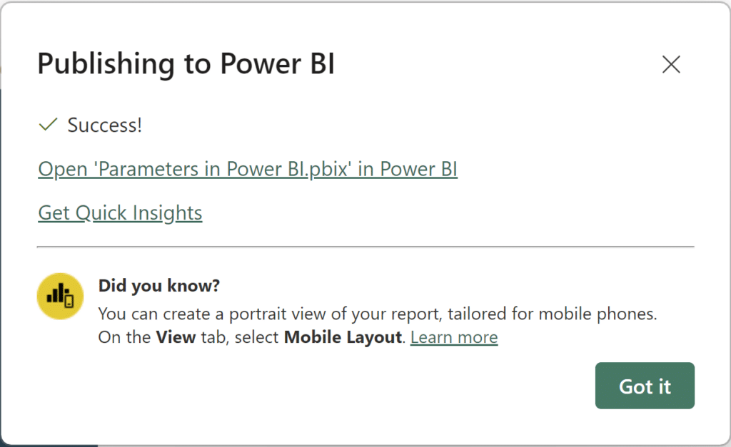
You can sign into the Power BI service or click the link to open your workspace where the .pbix file is located.

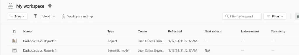
Once you’re logged in, you should see two different files with the same name as your workbook. Once you publish a report from Power BI Desktop, the report is saved and the underlying semantic model is also available.
To create a report from our Semantic model, click on the semantic model in your workspace.
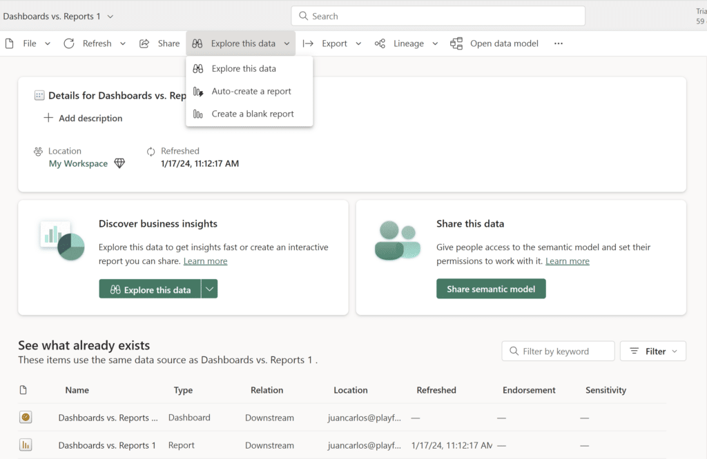
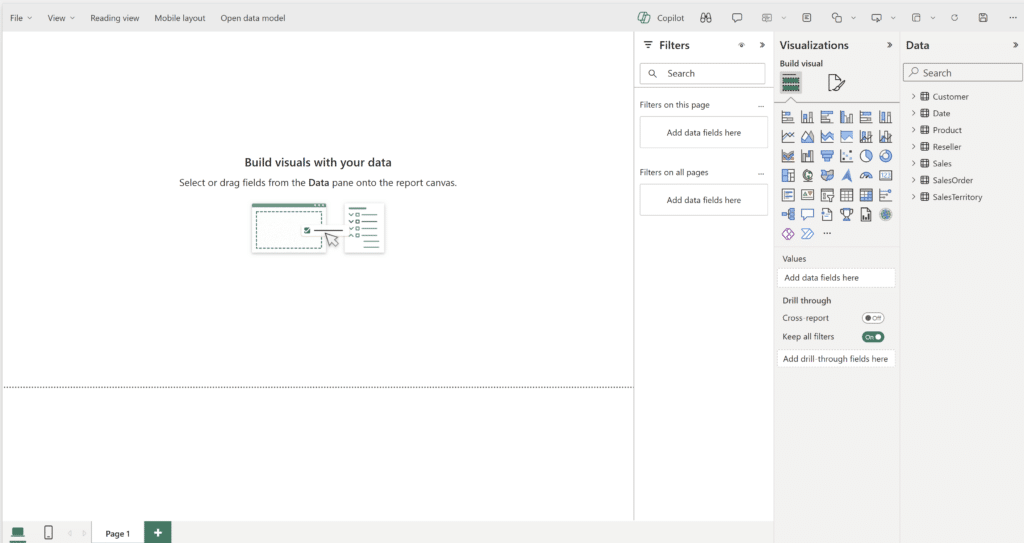
Now click on the ‘Explore this data’ dropdown and hit ‘Create a blank report’. And that’s it! You should see an identical view to a blank report in Power BI Desktop:
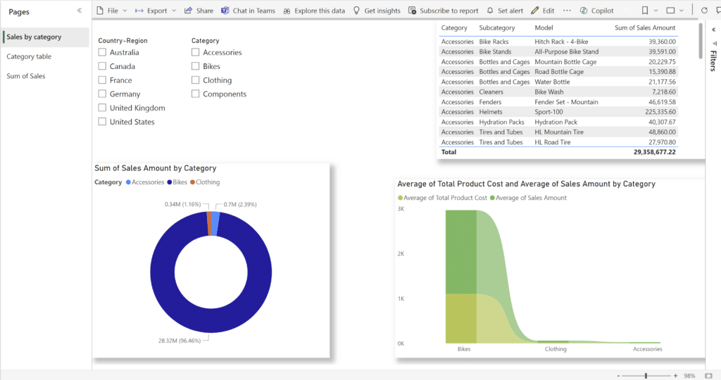
Interacting with reports in Power BI Desktop and the Power BI service
There are two ways to interact with reports in Power BI Desktop and the Power BI service including the Reading view and the Editing view. Reading view is typically used when you open a report that was shared with you, either through a common workspace or an app. If you have permission to edit the report, you can access it in the Editing view.
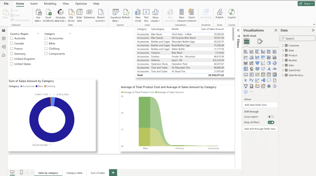
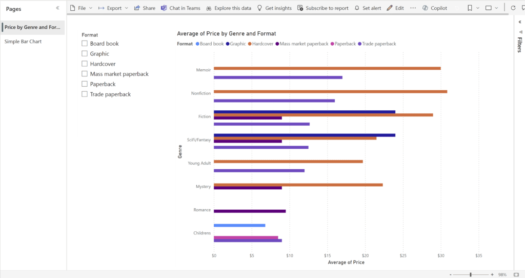
Here’s how a sample report looks in Power BI Desktop:
And here’s how the same report looks once it’s published in the Power BI service:
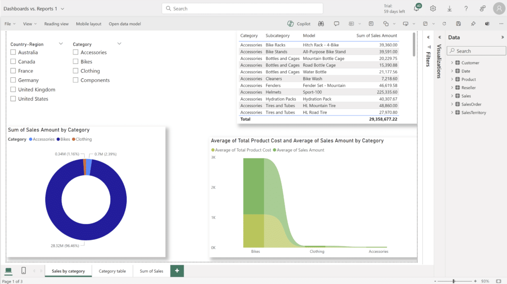
Apart from slight interface differences, a very important thing to note is that you cannot create measures in the Power BI service. You are able to interact with measures created in Power BI Desktop and you are able to build visuals, but you are unable to create new measures or calculated columns in the Power BI service. Any new measure or column you wish to create has to be done in Power BI Desktop before publishing your report to the service.
Dashboards in the Power BI service
Unlike reports, dashboards are an exclusive feature of the Power BI service. One of the main differences between Power BI reports vs dashboards is that dashboards are one single page. This limits how much you can put on the dashboard, making it challenging to include all key information while also maintaining readability. To maximize readability, learn more about maximizing the Data-Ink Ratio. While this post focuses on readability within Tableau, the concept of the data-ink ratio is tool agnostic.
Since dashboards have more limitations than reports, a good way to think about dashboards is that they represent the best aspects of all of the reports included in them. Different from a report in Power BI Desktop, dashboards can include visualizations from multiple reports and semantic models, as long as they’re all located in the same workspace. Dashboards are made up of visualizations called tiles that are individually pinned to a dashboard. Tiles are a really useful aspect of dashboards because they are interactive. Clicking on one takes you to the report and model that it represents.
There are also different types of tiles you can pin onto a dashboard. You can pin Excel tiles to connect directly to relevant Excel workbooks (as long as they’re uploaded to the same workspace), you can pin relevant tiles from another dashboard, and/or entire report page tiles, just to name a few. A great feature of pinning entire report tiles is that if you pin an entire report, that tile becomes live. This means that any change in the report will be shown in the pinned tile on your dashboard!
![]()
To summarize, a good way to think of dashboards is that they function like the table of contents of a good book. The table of contents tells you the chapter title and the page that the chapter begins. Useful dashboards can present important information from multiple reports. Clicking on report tiles will bring you to the report, much like flipping to the chapter you’re looking for.
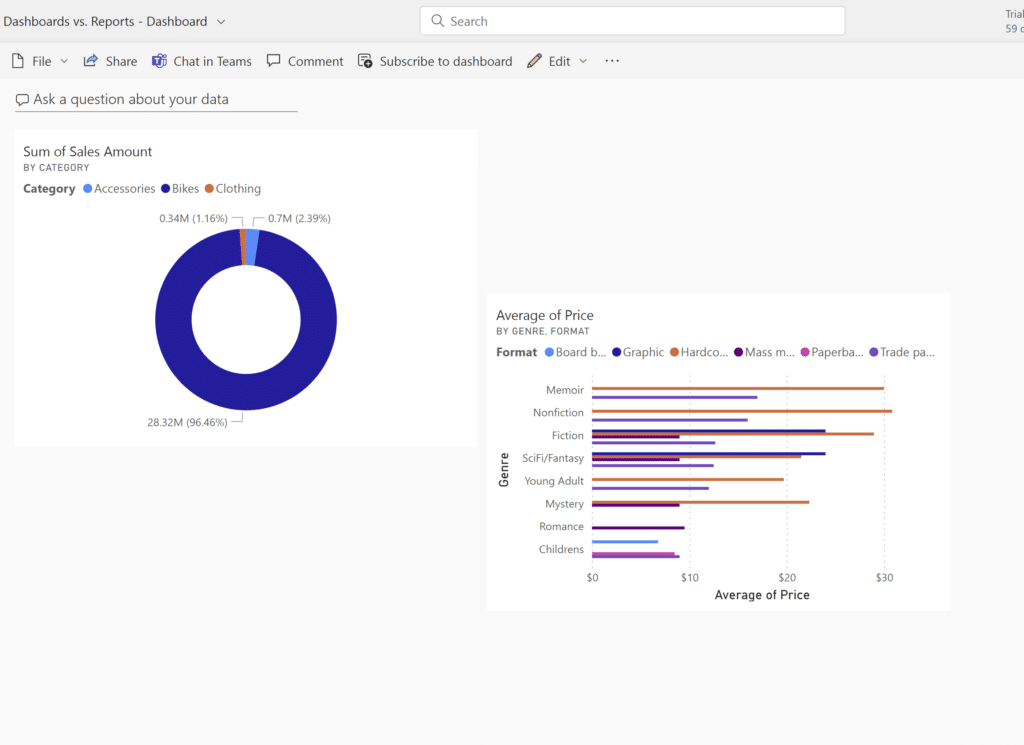
Clicking on either tile will bring me to the respective report.
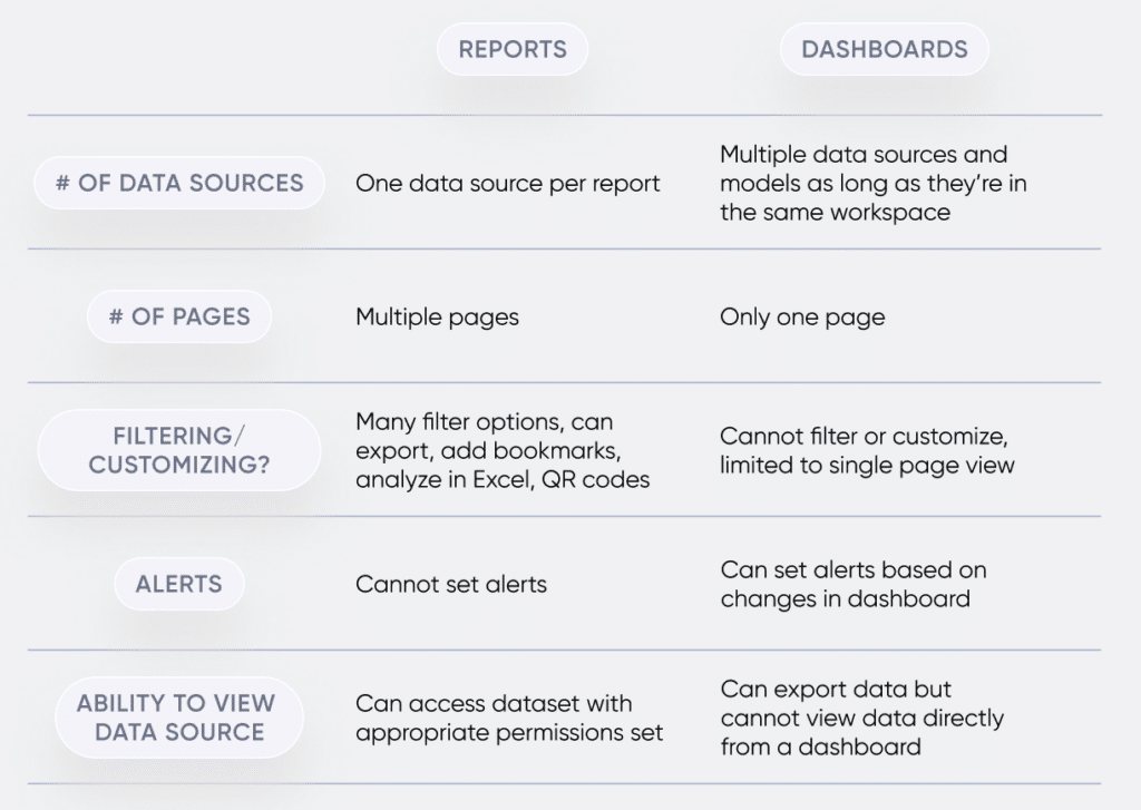
The main differences between reports and dashboards
Reports and dashboards, which one do I use?
To get a better understanding of Power BI reports vs dashboards, let’s talk through an example of how you could use each.
Imagine you’re an analyst tasked with finding reasons for unusual sales activity for three types of laptops. You have one dataset that stores information on these three laptops. You determine that it would be best to use the same metrics to compare each laptop. You and your group of analysts are the only viewers/users of this information. Your best course of action would probably be a multi-page report, with a report page dedicated to each laptop, since you’re getting into the details and trying to understand specific differences. When compared to a report, a dashboard that presents high-level insights may not be as helpful.
Once you’ve created this report, your manager requests that you perform a similar analysis on two different products to present to the higher-ups. These two different products each have their own dataset. Since dashboards provide a high-level view and can include highlights from multiple different reports/semantic models, a dashboard with tiles from each respective report could be your best bet.
Thanks for reading,
Juan Carlos Guzman

Written By
Juan Carlos Guzman

Peer Review
Maddie Dierkes
Manager, Decision Science
Related Content
Tableau vs. Power BI: A Quick Start Guide Comparison
As someone who is relatively new to both Tableau and Power BI, having to navigate either platform can feel overwhelming…
3 Ways to Make Beautiful Bar Charts in Power BI

Despite many new challengers over the years in the world of data visualization, bar charts have remained one of the…
How to Connect to Data in Power BI Desktop
Microsoft’s Power BI is one of the top data visualization platforms on the market. The Power BI platform has products…