Tableau vs. Power BI: A Quick Start Guide Comparison

As someone who is relatively new to both Tableau and Power BI, having to navigate either platform can feel overwhelming at first. If you have found yourself asking, which platform is better than the other? Then this post is for you… well, kind of. The Tableau vs. Power BI race will never have a clear winner because the ranking will always be subjective. Each visual analytics practitioner has their own requirements that sway them in favor of one platform over the other. A better question to ask is, which tool best suits my needs? This post aims to list the best aspects of each platform so you can make that decision for yourself.
Given that both Tableau and Power BI are visual analytics platforms, they are similar in nature but differ in specifics. Both are low to no-code platforms that exhibit a smooth click-and-drag functionality. Both have many different options to connect to data and many different tools and tricks for creating insightful data visualizations. In an effort to compare the two, let’s create the same visual from start to finish in each platform. After that, we’ll discuss the key differences between the two platforms.
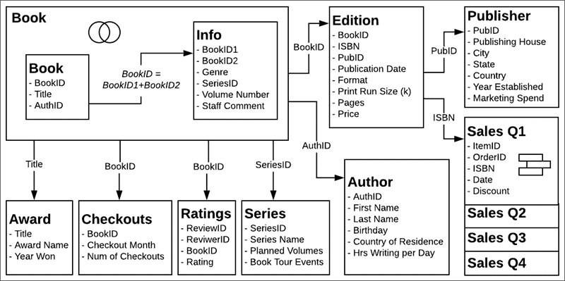
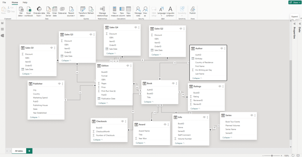
For this tutorial, we’ll use the Bookshop data set that Tableau provides. We’ll be using this image that Tableau provides to combine the many tables in the Bookshop data set:
Let’s start with our first competitor in the Tableau vs. Power BI race: Tableau!
Creating visuals in Tableau vs. Power BI
Creating a visual in Tableau
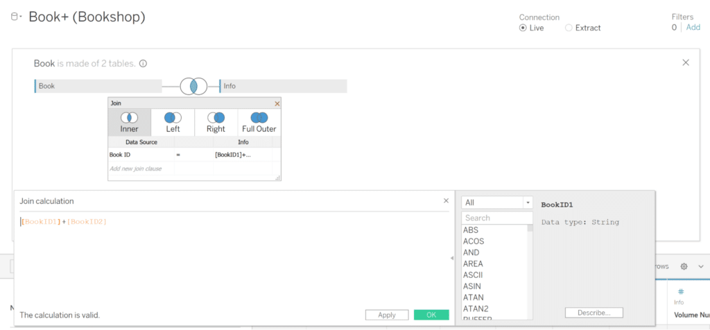
Open Tableau Desktop and click Connect to Data, then click Microsoft Excel. Now select the Bookshops.xlsx file. The data window will open. Now we can create our table connections. For a complete resource on the Tableau physical layer, check out this amazing tutorial from Felicia Styer on Bringing Tables Together: Tableau’s Physical Layer. Start by dragging the Book table onto the view. To create a join between the Book and Info tables, double click on the Book table to access the physical layer. In the physical layer, drag the Info table next to the Book table. A Join window should appear. We want to use an Inner Join on the BookID field. Since Info has BookID1 and BookID2, we want to click on Create Join Calculation. When the Join calculation window appears, type “[BookID1] + [BookID2]” to successfully join the two tables.
Continue reading with a free account, or login.
Unlock this tutorial and hundreds of other free visual analytics resources from our expert team.
Already have an account? Sign In
By continuing, you agree to our Terms of Use and Privacy Policy.
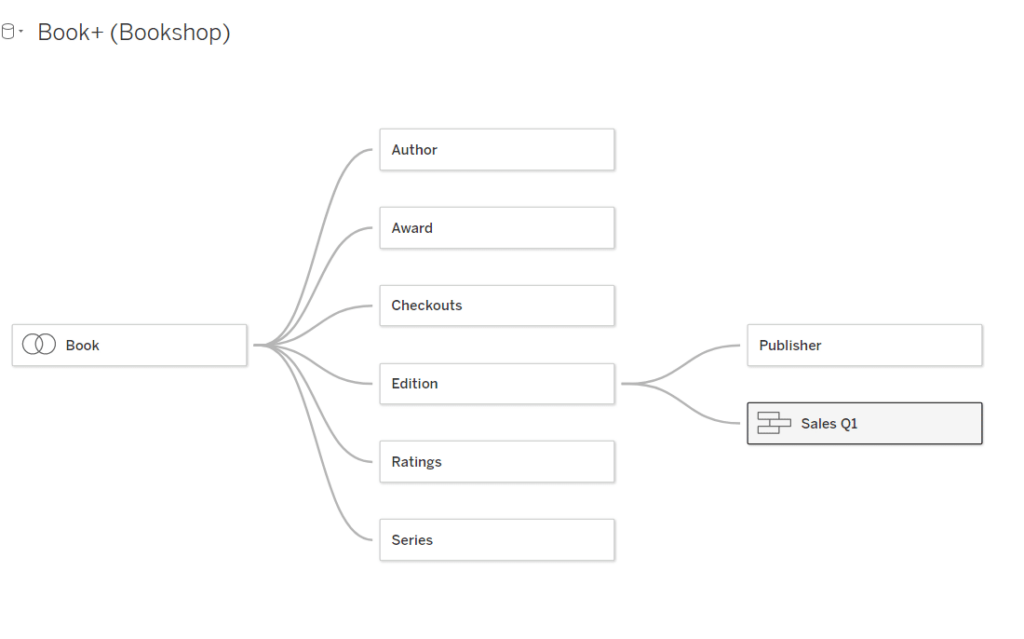
Now that we have our Book and Info tables joined, we can create the relationships between the rest of the tables. Exit the physical layer by clicking the “X” on the right-hand side of the page. Now drag the tables to form connections to the Book table according to the Bookshops Schema. As you drag tables, you should see a string connecting the tables to the Book table.

Drag the Sales Q1 table to create a relationship with the Edition table. To create a union between the Sales Quarterly tables, then drag the Sales Q2 table directly under the Sales Q1 table. The Union pane will appear for you to drop the Sales Q2 table. Repeat the process with the rest of the Quarterly Sales table. When you finish, you should have a structure like this one:
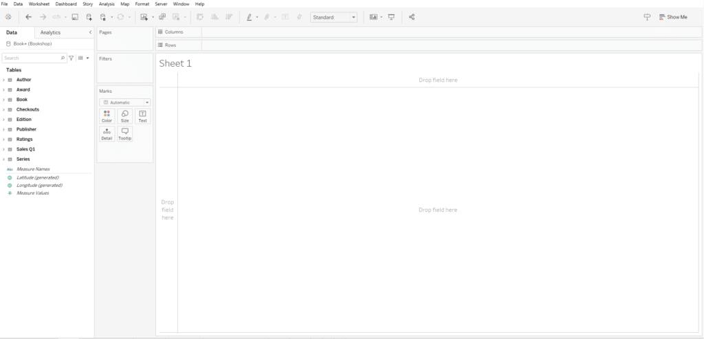
Now that our table connections have been established, click on the blank Sheet 1 to begin creating a visualization!
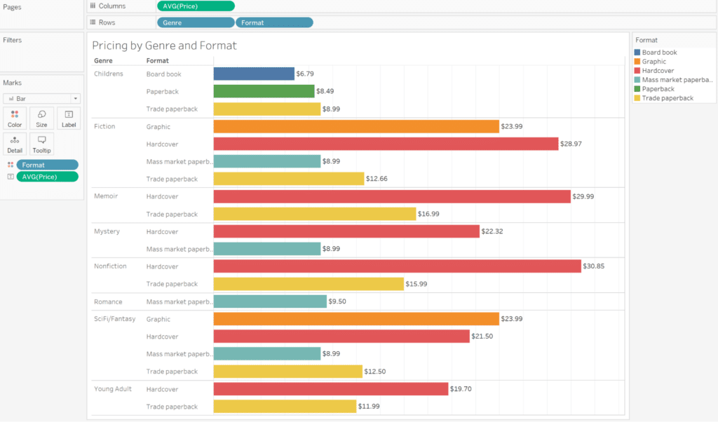
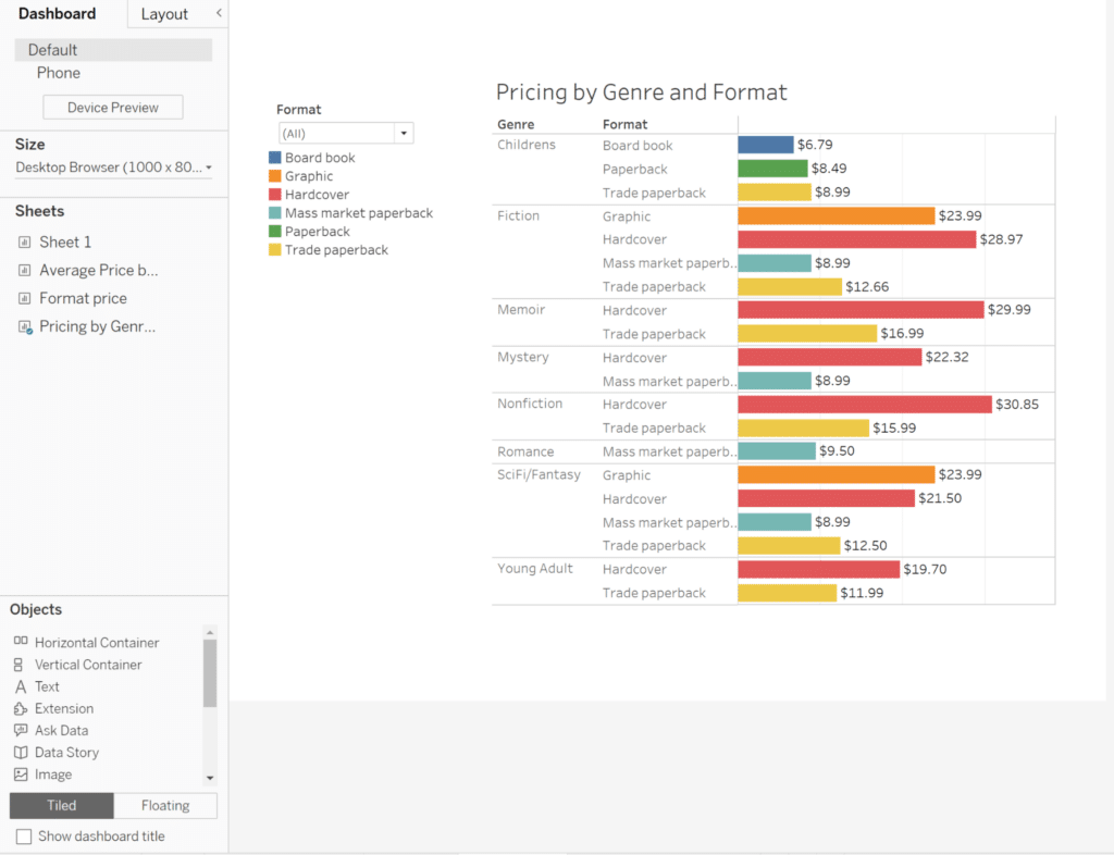
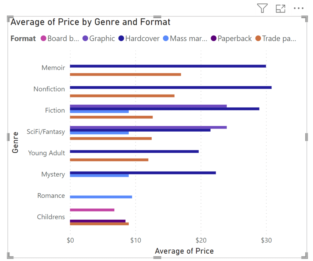
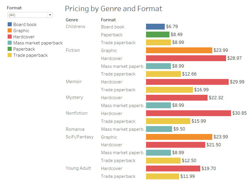
Let’s say we want to look at a book’s average price by genre and format. Let’s create a bar chart! Place Price in the Columns Shelf and let’s put Genre and Format in the Rows Shelf. Your view should automatically create a Bar chart.
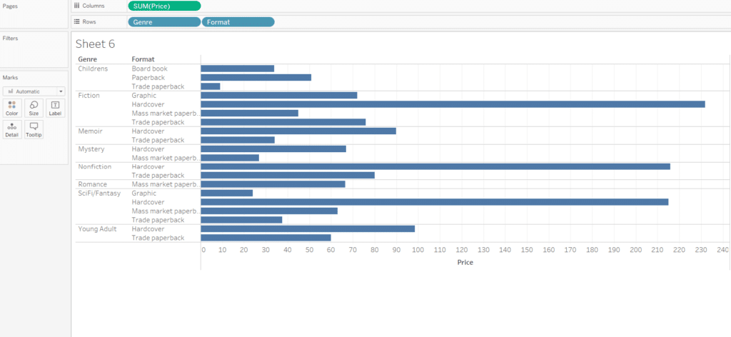
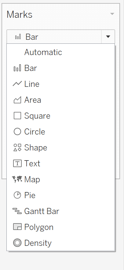
In the mark type dropdown on the Marks card, you are able to change your visual using the main dropdown.
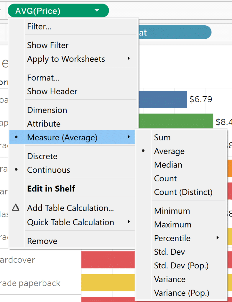
While here, let’s put Format on Color and Price on Label. Since SUM(Price) isn’t the most helpful, let’s change the aggregation from SUM to AVG. Use the dropdown arrow to change the measure from Sum to Average.
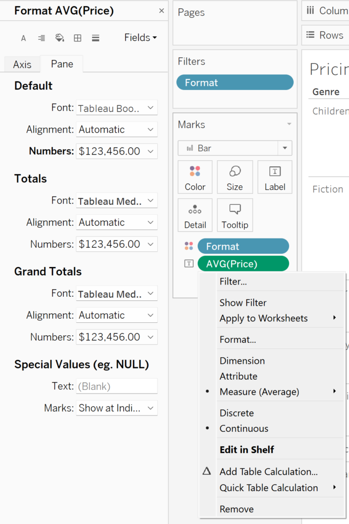
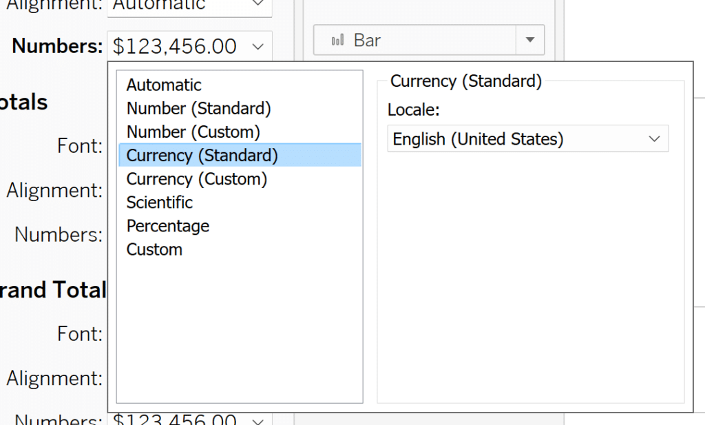
To change the formatting of Price, click on the AVG(Price) pill in the Label property of the Marks card and select Format. Once the Format AVG(Price) window appears, click on the Pane tab, and change the default Numbers setting from Automatic to Currency (Standard).
Now change the view type from Standard to Entire View to have our viz fill the screen.
Your sheet should look something like this:
Data-Ink Ratio Animation and How to Apply it in Tableau
Now let’s say we want to add a filter to the page to filter by Format. From the Data pane on the left, grab Format from the Edition table and drag it onto the Filters shelf. In the Filter window that appears, click OK. We’ve just created a dimension filter. Now right-click on the Format pill in the Filters shelf and click on Show Filter. You should see a checked list appear above the Format color legend. To change the filter from a checkbox list to a dropdown list, click on the dropdown arrow on the current Format list and select Multiple Values (dropdown). Now you have an interactive filter on your sheet!
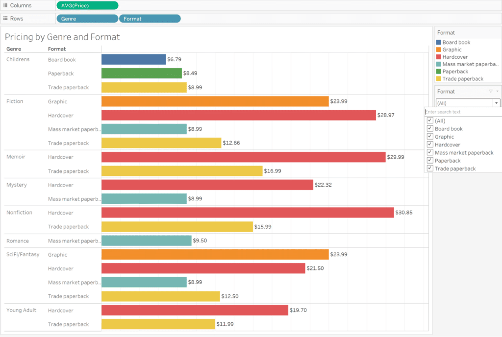
Tableau Filters and Order of Operations
If you wanted to add this sheet to a dashboard, you’d have to first create a dashboard by clicking on the dashboard icon (second option) next to your sheet you’ve created at the bottom of the workbook.
In the Dashboard pane you should see your available sheets to click and drag onto the Dashboard. Before you do, click on the Floating button at the bottom of the Dashboard pane. This will allow you to drag your sheet wherever you want to on the dashboard. This is great for a dashboard that with multiple different sheets, you’re able to position your sheets wherever you’d like. The default Tiled button automatically fills the dashboard space with the sheet you drag in.
Once you click and drag your sheet into the dashboard, that sheet’s filter and color legend should automatically appear.
Making Your First Tableau Dashboard (Part 1)
Creating a visual in Power BI
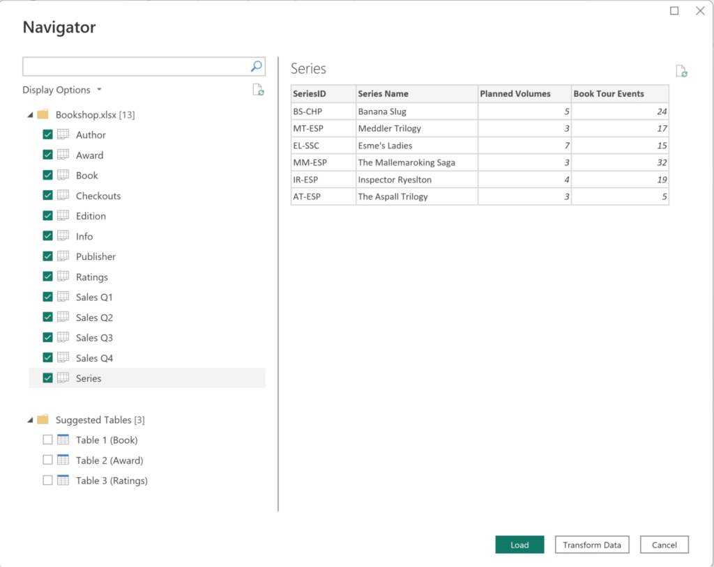
Our second competitor in the Tableau vs. Power BI race is, you guessed it: Power BI. Open up the Power BI Desktop app and start a new project. After selecting Get data in the Home Ribbon and clicking on the Booksops.xlsx file, the Navigator Window pops up and you see the 13 tables available to you. Click on all of them and then hit Transform Data to open up the Power Query Editor.
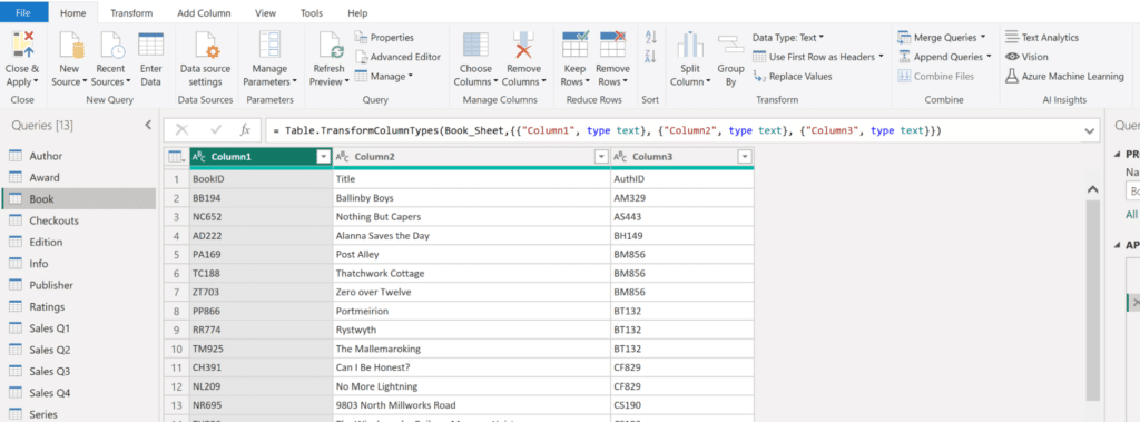
What’s the first thing you noticed when you clicked on the Book Query? If your answer is that the Column headers aren’t being read correctly, you’d be right! To fix this, click on the Use First Row as Headers button in the Transform group on the Home Ribbon. It’s a good idea to do a quick visual check for this on all of your connected tables. If one table didn’t read column headers correctly, it’s possible that other tables have the same issue.
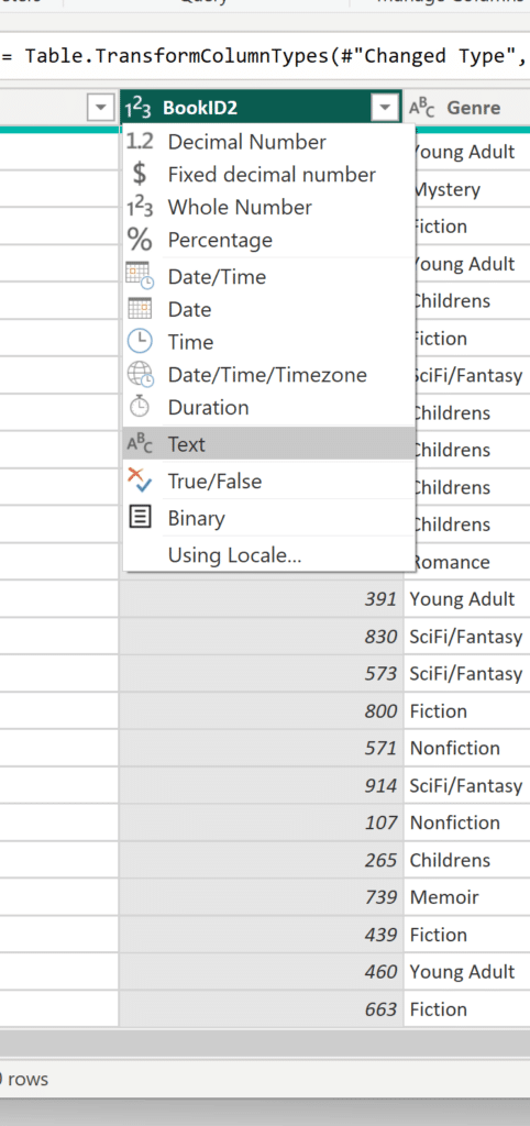
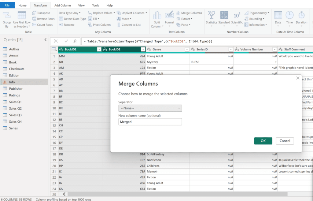
Now, following the instructions in the Bookshop Schema image, we first need to combine the Book and Info queries using BookID = BookID1 + BookID2. Click on the Info Query. To combine the two queries, we first need to combine the BookID1 and BookID2 columns in the Info query. Before we combine them, take a look at the data types of each column. To avoid any errors or unexpected situations, we want to have the same column type before we combine both columns. To change the type of BookID2, click on the number icon next to the column title and select Text. Now we can combine our two columns.
Now Ctrl+Click the BookID1 and BookID2 columns. For this step to work, we need to have both columns selected. Now navigate to the Transform Ribbon and click on the Merge Columns button in the Text Column group. To match the formatting from the Book query, we want to leave the Separator dropdown as –None–. I’m going to name the new column BookID. Click Okay to confirm your choice.
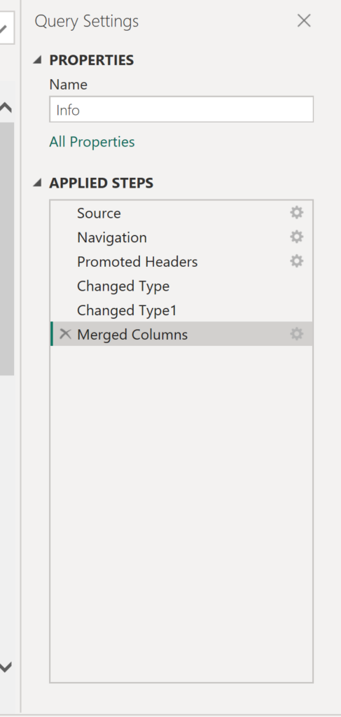
Before we continue, take a look at the Applied Steps on the right-hand side of your screen. You may have noticed it updates every time you modify one of your queries. Applied Steps helps you keep track of all the view changes you’ve made. If you’ve made a mistake or want to undo a change, simply click on the X of the current step. To view the step’s settings, click on the gear icon.
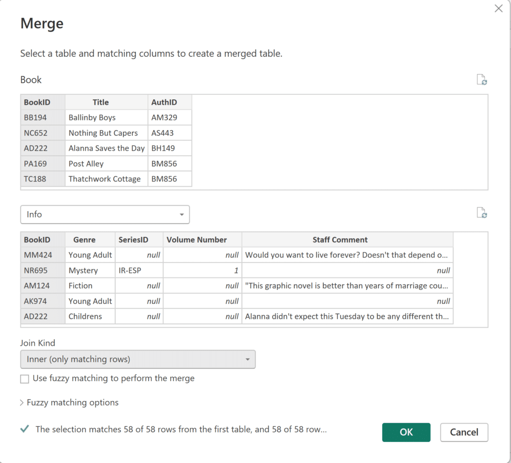
Alright! Now that we’ve got our BookID column in both the Book and Info queries, we’re ready to combine our two queries. On the Home Ribbon, click on Merge Queries to begin. Select the two BookID columns, and select Inner Join. Since we see that all of our rows match, we’re ready to click Ok.
You should now see an Info column at the end of the Book query. To continue combining the table relationships according to Tableau’s Bookshop schema, let’s hit Close & Apply and then explore Power BI’s Model view. Click on the Model view icon on the left-hand side of your screen.
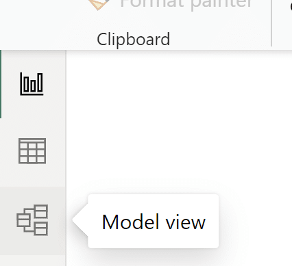
Now that we’re in Model view, you should see all of the different tables connected! Since all of the tables have related fields, our connections were automatically created. We’ll do a quick visual check to make sure the automatic connections match the Bookshop Schema by looking at the direction of the arrows in the Model view. The arrows represent the filter direction. Only the relationship between Book and Info should have an arrow in both directions.
How to Connect to Data in Power BI Desktop
Since we have quite a few tables, our Model view may look a little messy but all of our tables are connected!
All of our table connections look good. Seems that at this point, the work to connect our tables according to the Bookshop Schema is done! Now we can start building.
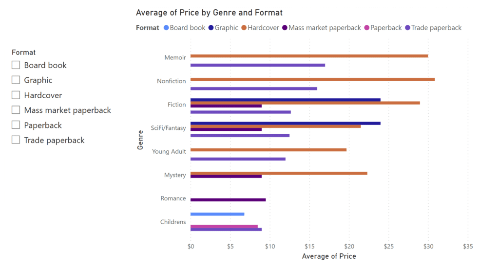
Change your view from Model view to Report view to start building. Let’s build the same chart as we built in Tableau. From the Visualizations pane click on the third icon, the clustered bar chart.
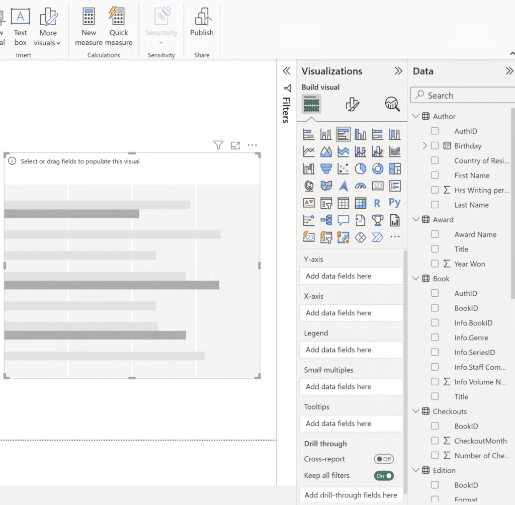
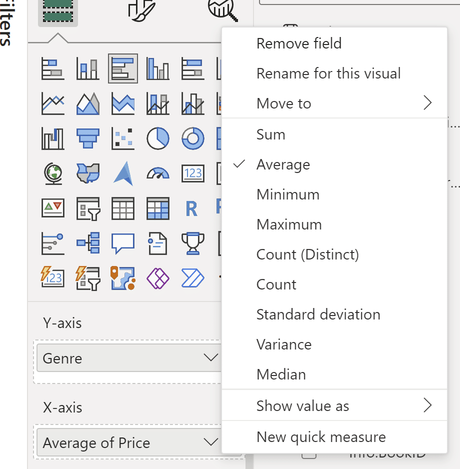
From the Data pane, drag Genre to the Y-axis, and drag Price to the X-axis. Like in Tableau, change the aggregation from Sum to Average by clicking on the down arrow.
Here’s what your visual should look like at this step:
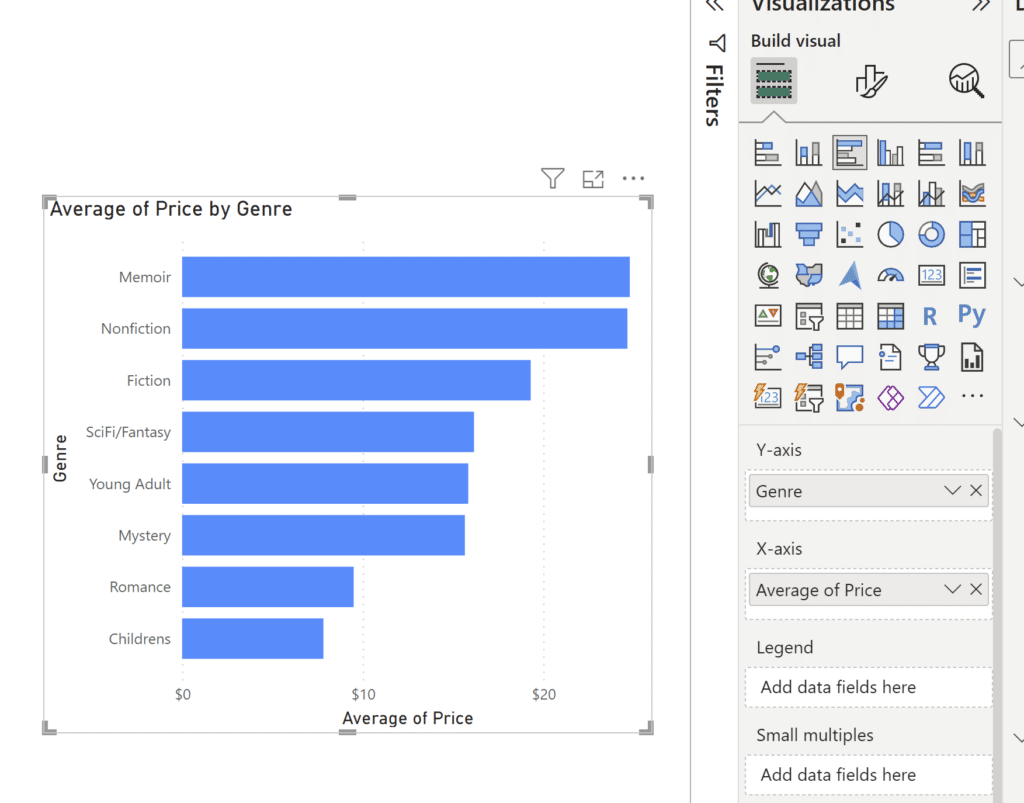
Now drag Format to Legend. We should see a very similar visual to the one we made earlier.
3 Ways to Make Beautiful Bar Charts in Power BI
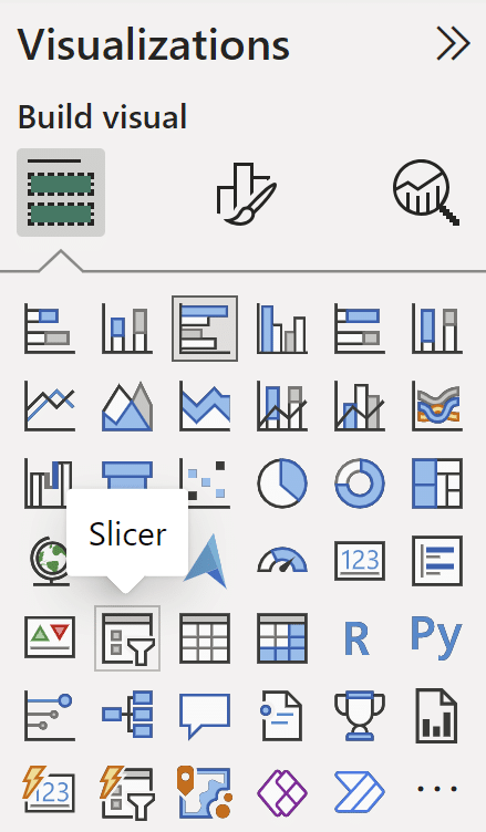
Like Tableau, there are many different ways to filter data and many different types of filters in Power BI. We could use the Filters pane to add a filter to our report (and set its level), but for the scope of this post, we’ll make use of a cool, easy-access visual that Power BI has to offer: the Slicer. From the Visualizations pane, select the Slicer icon to add it to your Report. Drag the Format field to the Field section of your Slicer in the Visualizations pane. Click on any Format you’d like in the Slicer to filter your bar chart. To multi-select, Ctrl+Click the Format.
Formatting and customizing aside, creating a page-level filter with a Slicer is as easy as that. As long as you add visuals to the same report page your slicer is on, it will filter those visuals according to your Slicer selections.
Publishing in Tableau vs. Power BI
Publishing in Tableau
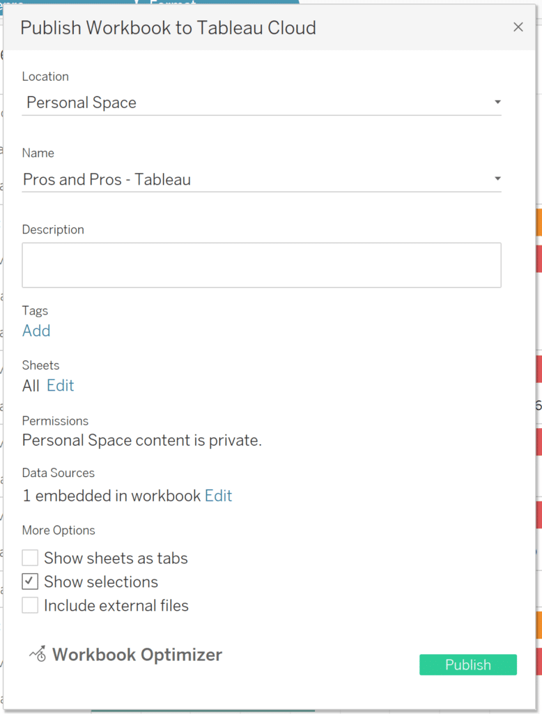
To publish our dashboard, click on Server and then Publish Workbook. After signing into Tableau Cloud or Tableau Server, the Publish Workbook window will open, allowing you to add tags, restrict sheets, permissions, and customize your workbook options before publishing.
After hitting Publish, that’s that! You’re able to view and access your workbook on Tableau Cloud or Server.
Publishing in Power BI
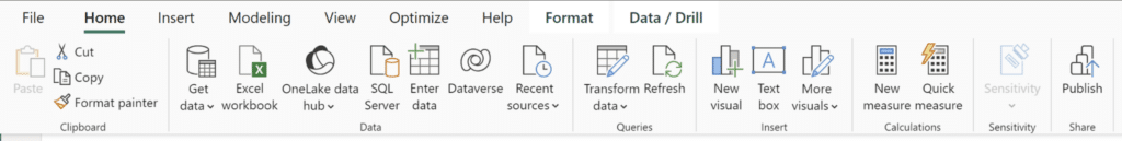
After a bit of formatting and saving our changes, we’re ready to publish our report! Click on the Publish button on the Home ribbon.
Like Tableau Cloud or Tableau Server, you publish your report to an available workspace in the Power BI service.
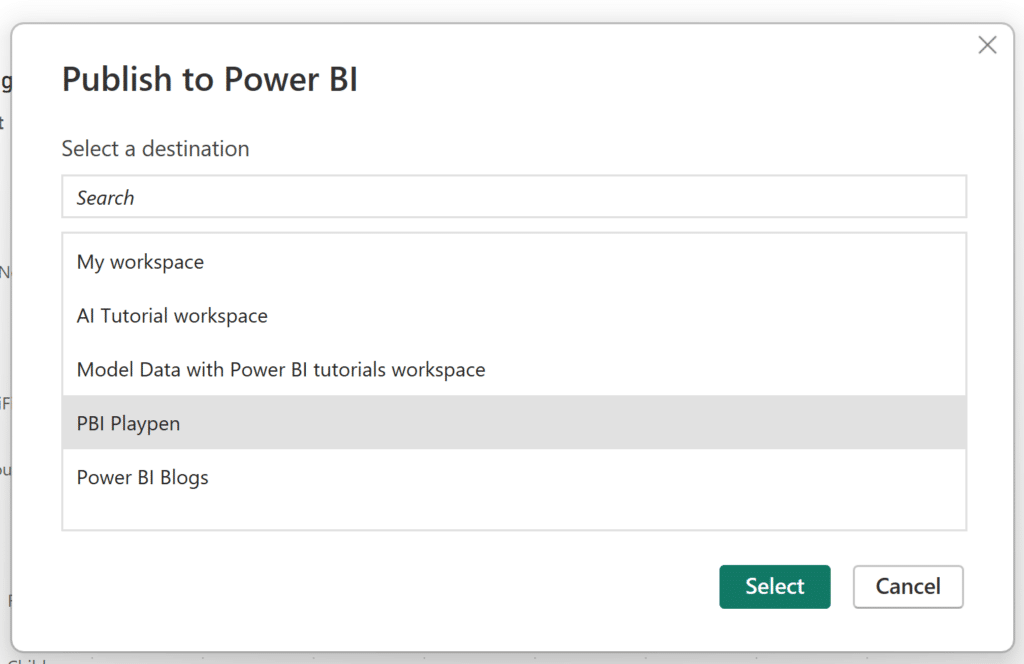
Workspaces are incredibly useful areas meant for team collaboration. Your Power BI license determines how and to whom workspaces can be shared, as well as your capabilities in the Power BI service. Workspace user roles determine the level of interaction that users have within your workspace. Once you select your workspace to publish your report, just click Select. Whoever has access to your workspace can view your report and interact with it according to their role.
![]()
Here’s what our Tableau dashboard and Power BI report look like:
Additional differences between Tableau and Power BI
Desktop Capabilities
Apart from the many terminology differences in Tableau vs. Power BI, one of the most important distinctions is the sheet/dashboard combination in Tableau Desktop versus the Report view in Power BI Desktop. In Tableau, the dashboards you create are populated by sheets. Interactivity between multiple sheets on dashboards involves dashboard actions. In Power BI terms, you create interactive reports in Power BI Desktop, you don’t technically create dashboards. To create dashboards you have to use the Power BI service.
Publishing
The second major difference in Tableau vs. Power BI is the ability to share your work publicly.
Tableau has Tableau Public, a platform where users are able to create and share visualizations with anyone. From Tableau Public, users can interact with and download local copies of published workbooks.
The closest thing Power BI has to compare to Tableau Public is Publish to web. Publish to web creates embed codes that let you place your Power BI content on public websites, blogs, social media posts, and emails. Once embedded, your Power BI content is fully interactive. While Publish to web is great for sharing it does have limitations regarding row level security and different data source connection methods.
Conclusion
In both platforms, the limit to your creativity is your imagination. Power BI has more standard visualization options which makes it very easy for beginners to create visualizations.
Tableau having less standard visualization options isn’t a bad thing, as it opens a space to be inventive and combine chart types to create new ones.
For example, Power BI has a Waterfall Chart as a standard viz option. Tableau doesn’t, but that doesn’t mean you can’t create one!
3 Ways to Make Wonderful Waterfall Charts in Tableau
Both platforms have expansive community forums with excited members that are committed to sharing techniques and answering your questions.
All in all, Tableau and Power BI are at the forefront of visual analytics. While they have clear differences, both are great places to utilize your data visualization skills to the fullest. I see no clear winner, but the choice is up to you. Which platform suits you best?
Thanks for reading,
Juan Carlos Guzman

Written By
Juan Carlos Guzman

Peer Review
Felicia Styer
Assoc. Director, Analytics Solutions
Related Content
How to Connect to Data in Power BI Desktop
Microsoft’s Power BI is one of the top data visualization platforms on the market. The Power BI platform has products…

Ryan Sleeper
An introduction to Tableau terminology In many ways, Tableau is its own language. This video will help orient you with…
3 Ways to Make Beautiful Bar Charts in Power BI

Despite many new challengers over the years in the world of data visualization, bar charts have remained one of the…