How to Make a Biggest Movers Chart in Tableau
A biggest movers chart shows performance for the dimension members with the largest period over period changes, whether those changes are positive or negative. I have been gravitating towards this chart a lot lately because it provides familiar text for those used to looking at their data that way, has a visual element to assist with understanding, and provides several descriptive insights that can be used as a starting point for deeper analysis.
This post will show you how to display the biggest N (i.e. 5, 10, etc.) period over period changes, whether good or bad, on the same chart in Tableau. You will also learn a trick for displaying a colored up or down triangle along with each dimension member to indicate if the changes are positive or negative.
How to Make a Biggest Movers Chart in Tableau
Computing the period over period difference
By the end of this post, you will be able to create a biggest movers chart showing the most critical period over period changes to your business.
First, you need a calculated field that computes the period over period difference so you can determine which dimension members had the largest ‘moves’. This formula can compute an absolute difference, a percentage difference, or a rank difference if that’s a field in your underlying data.
![]()
Continue reading with a free account, or login.
Unlock this tutorial and hundreds of other free visual analytics resources from our expert team.
Already have an account? Sign In
By continuing, you agree to our Terms of Use and Privacy Policy.
For this illustration, I’ll focus on a month over month percent change in Sales from the Sample – Superstore dataset (and I’m pretending there’s only one year’s worth of data). I’ve also parameterized the months in this calculated field so I can quickly change the months in the comparison. The formula is:
SUM(IF MONTH([Order Date]) = [Current Month] THEN [Sales] END)
/
SUM(IF MONTH([Order Date]) = [Comparison Month] THEN [Sales] END)
-1
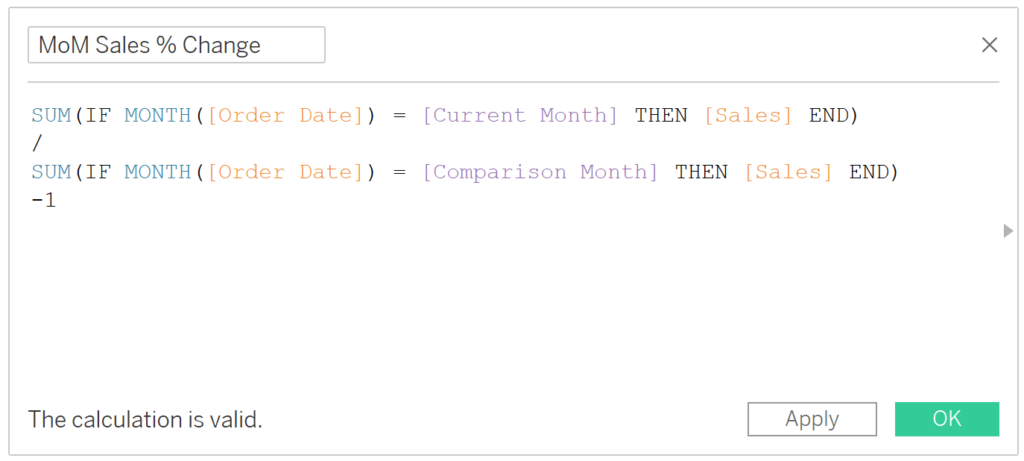
If you’re making a similar calculated field to compute a month over month percent change, I recommend changing the calculated field’s default formatting to percentage by right-clicking on the new measure in the Measures area of the Data pane, hovering over “Default Properties”, and clicking “Number Format…”.
Creating the absolute biggest movers
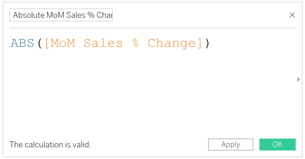
The trick to displaying both positive and negative changes on the same chart is to create a second version of the first calculated field that computes the absolute period over period difference. The formula is the original calculated field wrapped in the function ABS:
ABS([Period over Period Change])
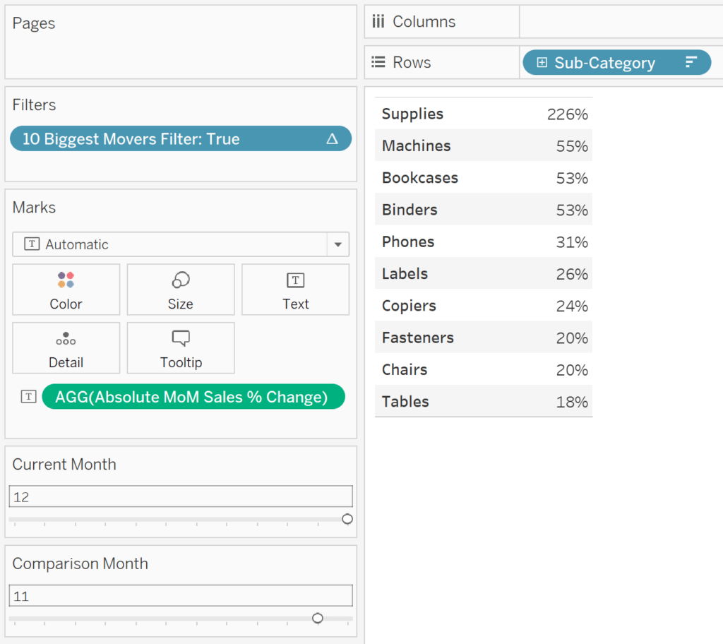
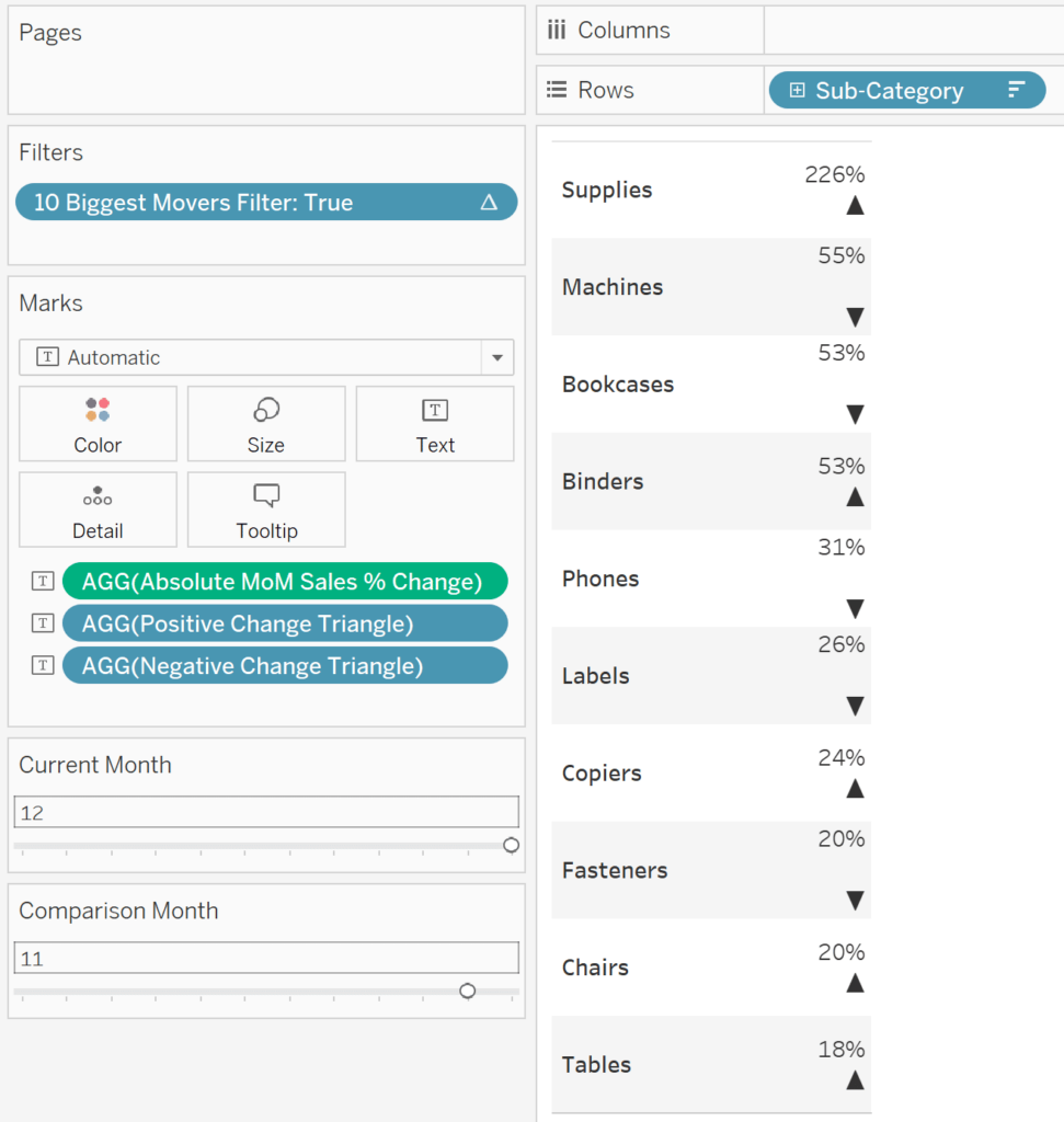
Now for the chart. Again, you can create the period over period change calculated fields with whichever measures you want. You can also look at those period over period changes by whichever dimensions you want. For the purposes of this illustration, I’ll look at month over month percent change in sales by the Sub-Category dimension.
To lay the foundation of the biggest movers chart, create a text table out of the dimension and the absolute version of the period over period change measure. Then sort the chart in descending order by the absolute period over period change measure. To show this is working, I’ve added the original period over period change calculated field as a second column.
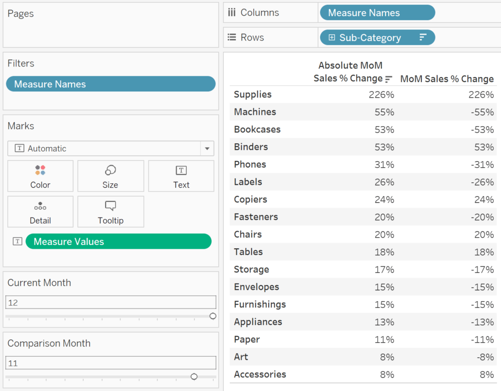
As you can see in the second column, we have a mix of positive and negative changes when I’m comparing month 12 (December) to month 11 (November). By using the absolute version of the period over period change, I can sort the chart in descending order to see the rank order of the “biggest movers”, regardless of if the change was positive or negative.
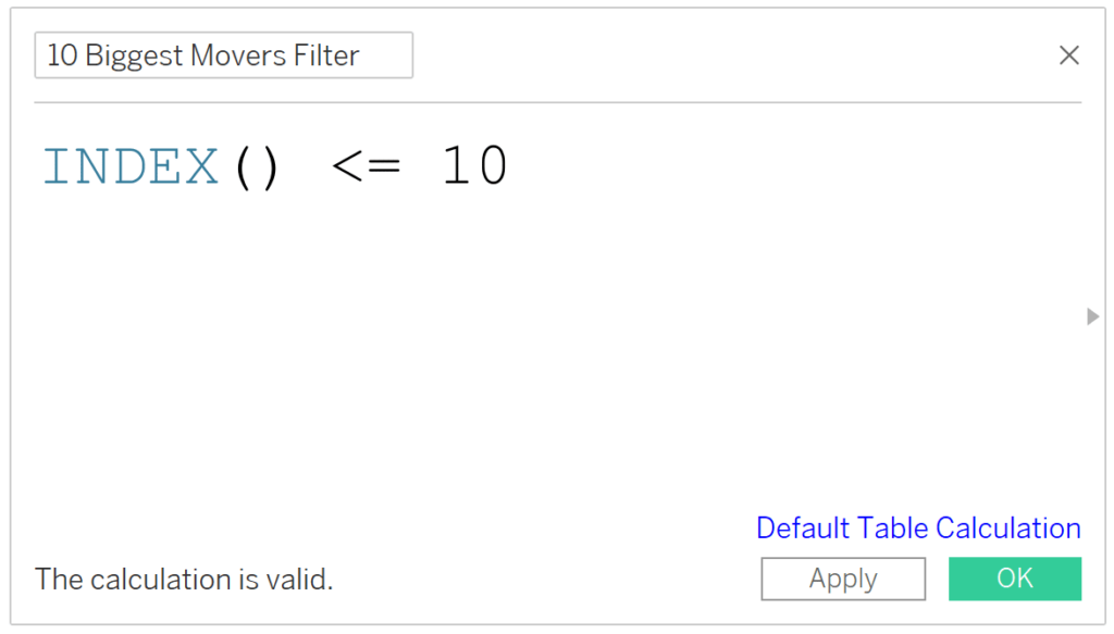
Filtering the biggest movers chart
The next thing I would likely do in a real-world scenario is filter the biggest movers to the Top N by using an INDEX() filter. If filtering to the 10 largest movers, the formula would be:
INDEX() <= 10
Here’s how the Authoring interface looks after adding this filter to the Filters Shelf and removing the second column, leaving me with only the absolute period over period change.
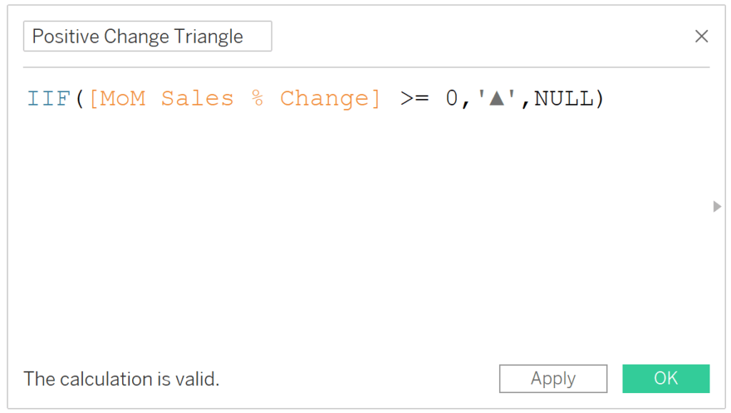
To get a blue, up triangle to appear for the positive changes and a red, down triangle to appear for negative changes, there are two more calculated fields required.
Creating the dynamic arrows
The first will show an up triangle when the change is positive and be NULL when the change is negative.
IIF([MoM Sales % Change] >= 0,’▲’,NULL)
The second calculated field will show a down triangle when the change is negative and be NULL when the change is positive.
IIF([MoM Sales % Change] <= 0,’▼’,NULL)
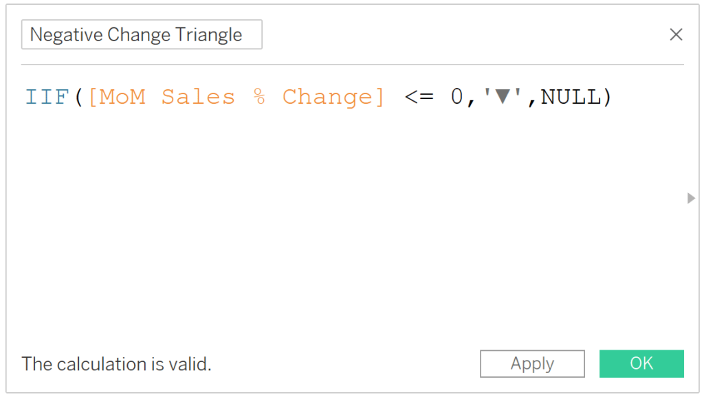
Note in both cases, I purposely used the original (i.e. non-absolute) version of the period over period change. Afterall, if I used the absolute version, all values would be positive and we would never see a down triangle!
Creating the view
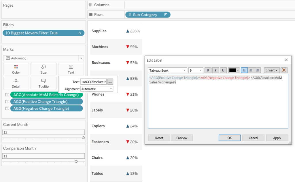
Next, place both calculated fields on the Text Marks Card. You will see an up triangle when the change is positive and a down triangle when the change is negative.
Now that all three fields are on the Text Marks Card, you can click the Text Marks Card and the ellipsis next to the Text box to edit the format of the fields independently.
![]()
I’ll cut and paste the two triangle calculated fields before the period over period change measure, color the positive version blue, and color the negative version red.
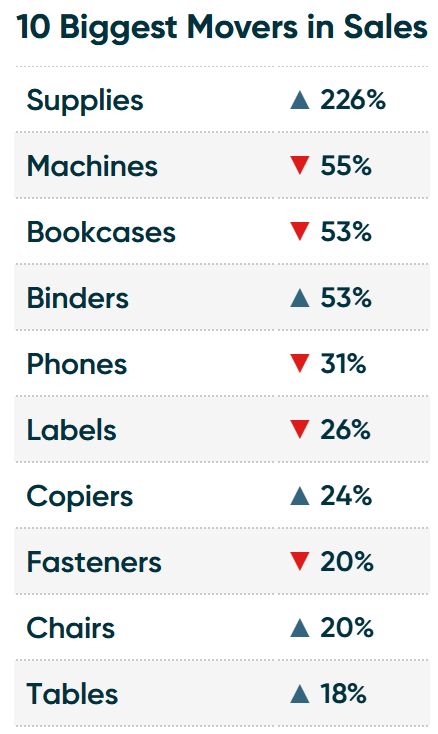
Here’s how my final biggest movers chart looks after formatting.
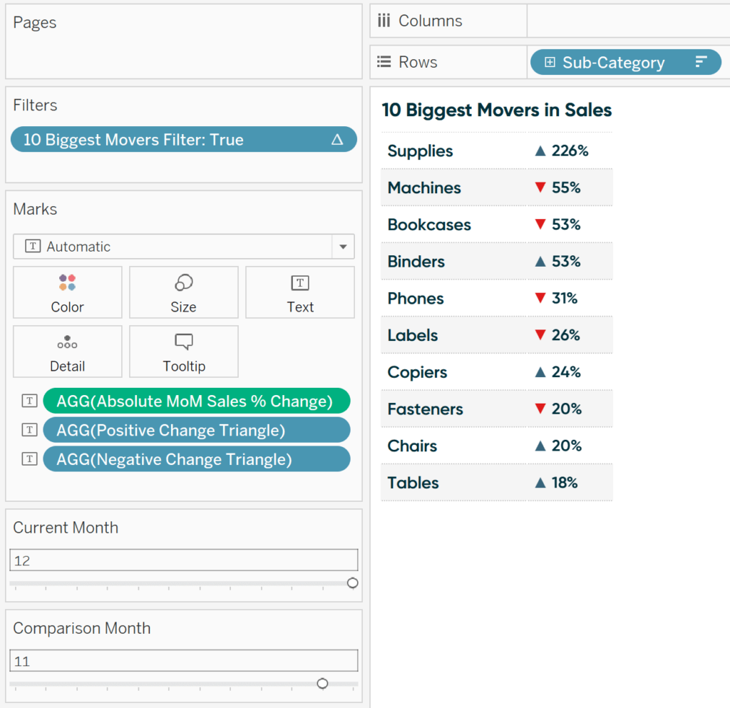
It looks like the Supplies sub-category benefited the most from the Cyber Monday sale on December 2nd. We can also see that three of our top five and five of our top ten biggest movers were negative. These are both valuable descriptive insights that we can use to guide further analysis – made possible with the biggest movers chart!
Thanks for reading,
– Ryan


Written By
Ryan Sleeper
Related Content
Dashboard Element 1: The Current Versus Comparison Index Callout
One of the primary elements you’ll find on almost every high-level corporate dashboard that I ever create is a callout…
3 Creative Ways to Visualize Outliers in Tableau

There are many ways to detect outliers in your data, but flagging them for your end users may present some…

Ryan Sleeper
Make filter results more predictable by basing them on row number Do your filters ever return a result you weren’t…