How to Make a What-If Analysis in Tableau Using Parameters
Parameters are one of the most powerful tools available in Tableau for exploring your data and providing interactivity to your end users. As discussed in An Introduction to Parameters in Tableau, the best way to think of parameters is that they act as wildcards. In the simple formula 2 multiplied by X = 16, the value of X would be the parameter; in this case, equal to 8. The reason parameters are so powerful is that you or your end users can change the value of X from 8 to any number, which will change the results of a view. In this post, we will use this concept to create a what-if analysis in Tableau that will show us what would happen if we improved our sales from 0 – 100%. Parameters come in many different forms, but for this post, we will be creating a parameter from integers, or whole numbers. For this exercise, I am using the Superstore dataset that comes with every download of Tableau if you would like to follow along.
This content is excerpted from my book Practical Tableau: 100 Tips, Tutorials, and Strategies from a Tableau Zen Master published by O’Reilly Media Inc., 2018, ISBN: 978-1491977316. Get the book at Amazon.
How to make a what-if analysis in Tableau using parameters
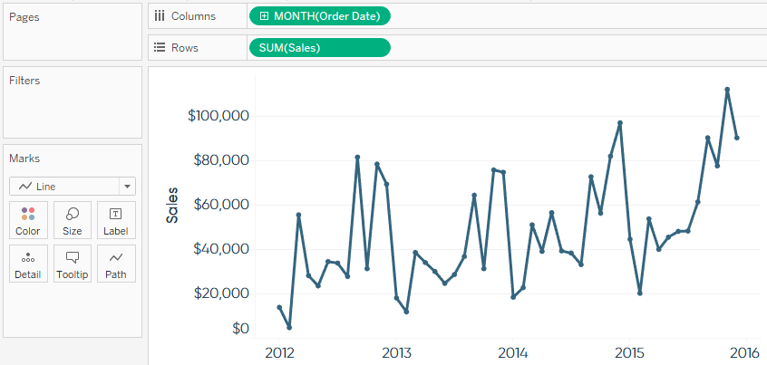
Let’s start by creating a simple line graph showing sales over time:
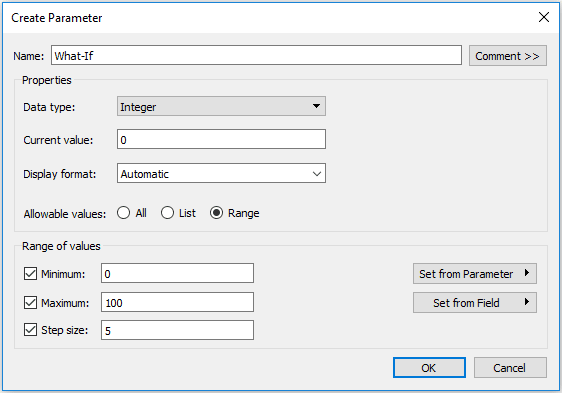
To create a parameter, right-click in the Parameters window in the bottom left corner of the sheet view and select “Create Parameter”. This is where you can choose from six different data types. We only want the ability to select non-fractional numbers, so choose “Integer” as the data type. There are some additional options available including the current value (which will be the default value the first time you use the parameter), allowable values, and within “Range”, minimum value, maximum value, and step size.
Continue reading with a free account, or login.
Unlock this tutorial and hundreds of other free visual analytics resources from our expert team.
Already have an account? Sign In
By continuing, you agree to our Terms of Use and Privacy Policy.
For the purpose of this what-if analysis, we will set the current value to zero, which will end up not changing our view at all the first time we use the parameter. We will also choose Range and set the range from zero to 100 with a step size of five. This means that the end user can select any number between zero and 100 in increments of five.
Parameters do little on their own because they are independent values that are not generated from the data, but controlled by the end user. To make the parameter useful, we will integrate the parameter’s value in a calculated field that multiplies its value by something else. We are interested in creating a what-if analysis that shows how our sales would change if they improved by 0 – 100 percent. There are a couple of ways to write this calculation; here is one:
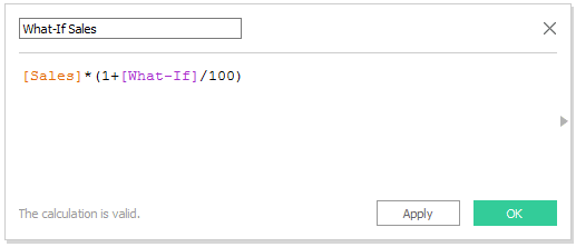
Notice that parameters are colored purple and can be used in a formula just like any other field in your calculation.
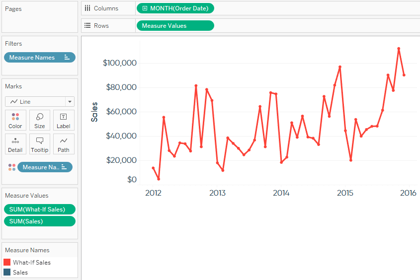
Now that we have our parameter in a calculated field, we can use it in a view. To create two lines on the same axis, one for actual sales and one for what-if sales, we will drag our newly created calculated field onto the existing axis for sales. For this view, I have changed the colors of the measure names and placed the line for What-If Sales on top of actual sales by dragging What-If up in the Measure Names legend. At this point, your view should look like this:
There is one last step needed in order to utilize your parameter. Right-click on the What-If parameter and select “Show Parameter Control”. that we set up when we first created the parameter; a range of zero – 100 in increments of five.
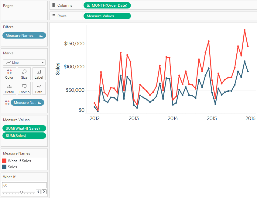
Here’s how the final view looks if sales were to improve by 60%.
Thanks for reading,
– Ryan
Related Content
How to Do Better What-If Scenario Planning with Tableau Set Controls
A long time ago, in a Tableau galaxy far away (aka 2014), I shared how to make a what-if analysis…
Ryan Sleeper
Multiple What-If Outcomes on a Single Tableau Worksheet Ryan shows you how to use the Tableau set control that was…
3 Creative Ways to Use Tableau Parameter Actions
I have always described Tableau parameters as a Swiss Army knife due to their infinite applications. In case you are…
