How to Make Sensational Spider Charts in Tableau

Spider charts, also known as radar charts, are an engaging and perhaps underutilized chart for visual analytics. While this advanced chart may not be best suited for stakeholders who are new to data analysis, it can be a great way to draw comparisons and add user engagement. This tutorial, inspired from the Financial Analysis Swift, innovates on the standard spider chart by allowing the user to select which measures they’d like included in the chart.
Connecting to the data
If you would like to follow along, start by connecting to the Sample Superstore dataset in Tableau Desktop and drag the Orders table into the blank canvas. Next, as a secondary data source, add “Playfair+, Spider Web Chart” by downloading it from the shared Google Drive folder and/or by downloading the workbook from our Tableau Public.
Continue reading with a free account, or login.
Unlock this tutorial and hundreds of other free visual analytics resources from our expert team.
Already have an account? Sign In
By continuing, you agree to our Terms of Use and Privacy Policy.
Drag the Radar Points table into the blank canvas and create a Relationship between the primary table called Orders, and the secondary table called Radar Points. Use the field called Join in the Radar Points table and then create a Relationship Calculation from the Orders table with syntax as follows: ‘Join’.
How to Create Tableau Relationships with the Logical Layer
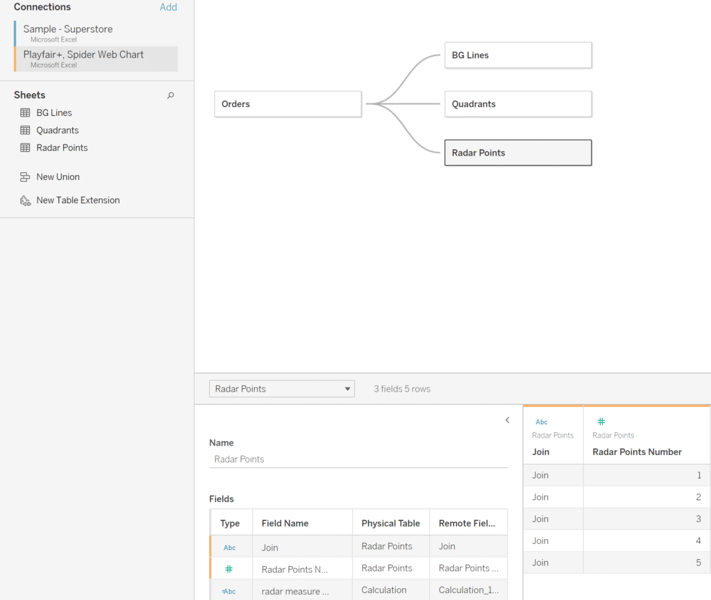
Repeat the same join relationship process for the other two tables called BG Lines and Quadrants from the “Playfair+, Spider Web Chart” data source.
How to Create a Dynamic Spider Web Background for Radar Charts
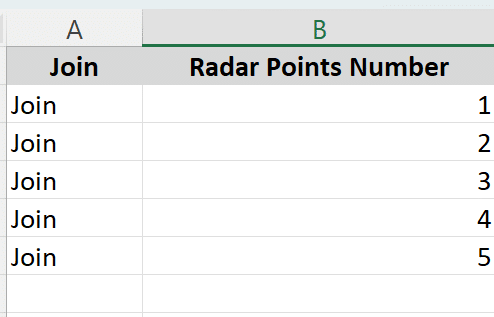
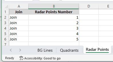
The Radar Points table only contains two columns and five rows. The column called Radar Point Number has a row that represents each point in the radar, so if there are five rows then the maximum number of points in the radar is 5. To add more points to the radar, simply continue adding rows to this table.
Create the custom menu
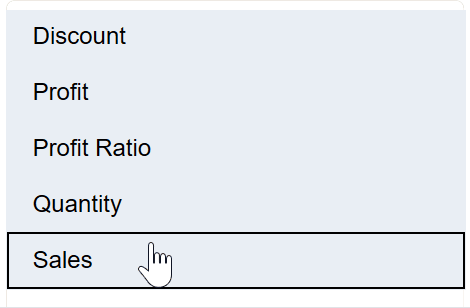
As seen in the GIF below, the points of the polygon are represented by measures selected from the drop-down menu. Therefore, our first step is to build the drop-down menu that includes all the measures that we want available for the spider chart.
The names of each measure needed in the menu are not represented by any dimensions within the data. While it’s possible to build a measure names menu using Tableau’s native Measure Names field, it will not work for our use case because we’ll need to use the measure names within a calculated field, and the Tableau native dimension Measure Names does not offer that capability.
![]()
Therefore, we are going to create a measure names calculation that renames the aliases of some of our existing data.
How to Use Measure Names in Tableau Calculated Fields
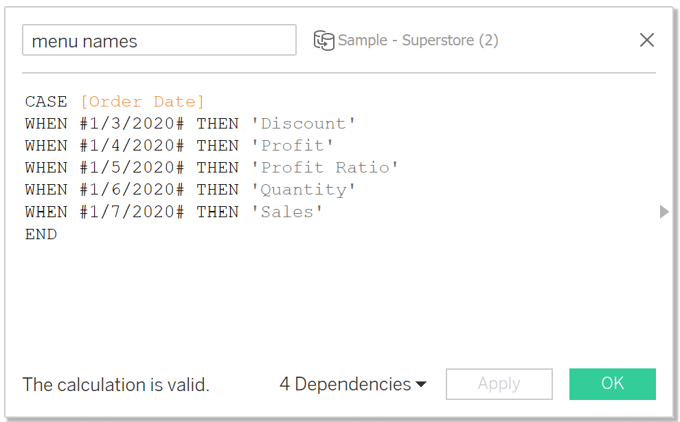
Start by opening a new calculation and name it “menu names”. The measure names we want to include are: Discount, Profit, Profit Ratio, Quantity, and Sales. The syntax for the calculation is as follows:
CASE [Order Date]
WHEN #1/3/2020# THEN ‘Discount’
WHEN #1/4/2020# THEN ‘Profit’
WHEN #1/5/2020# THEN ‘Profit Ratio’
WHEN #1/6/2020# THEN ‘Quantity’
WHEN #1/7/2020# THEN ‘Sales’
END
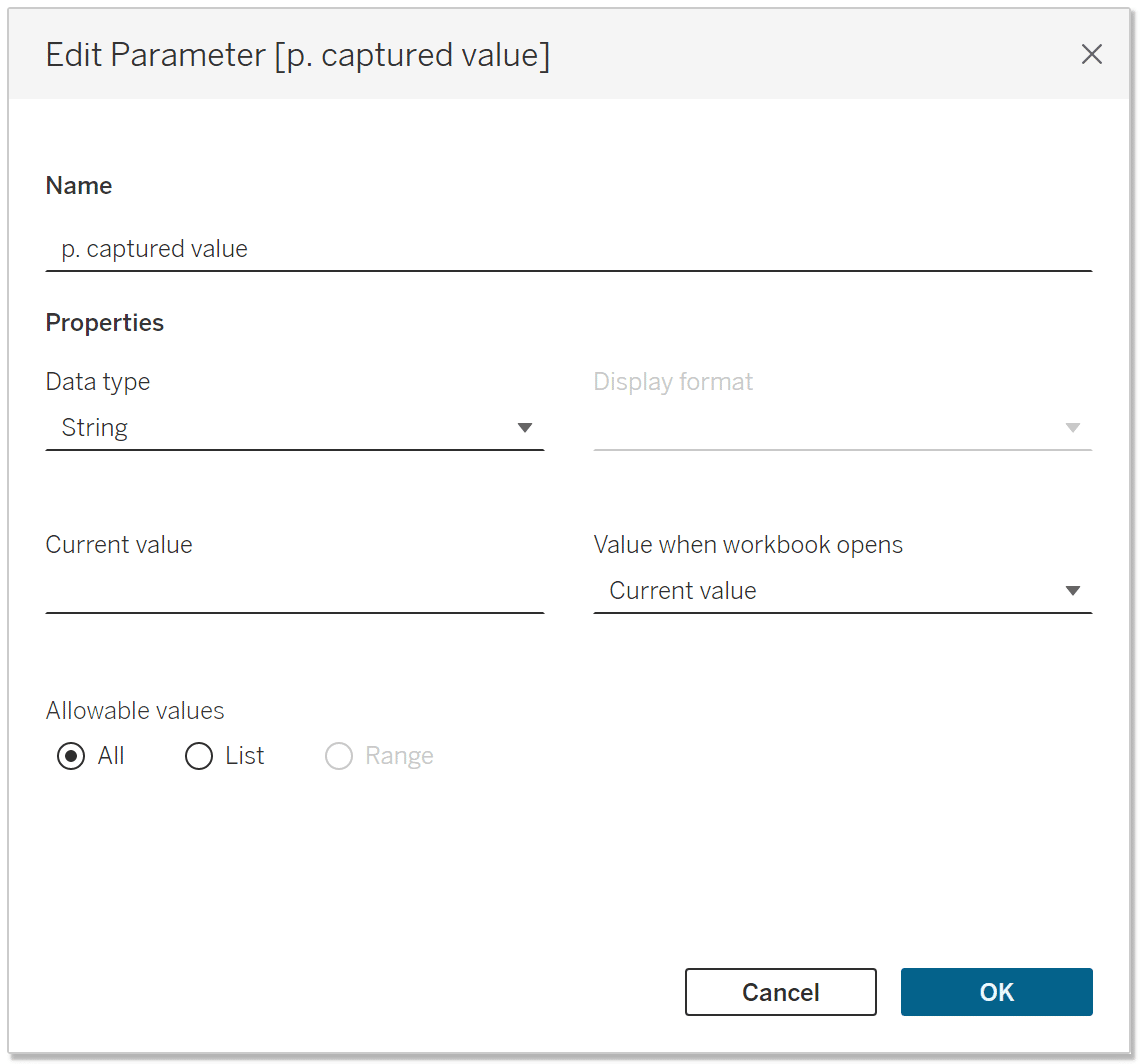
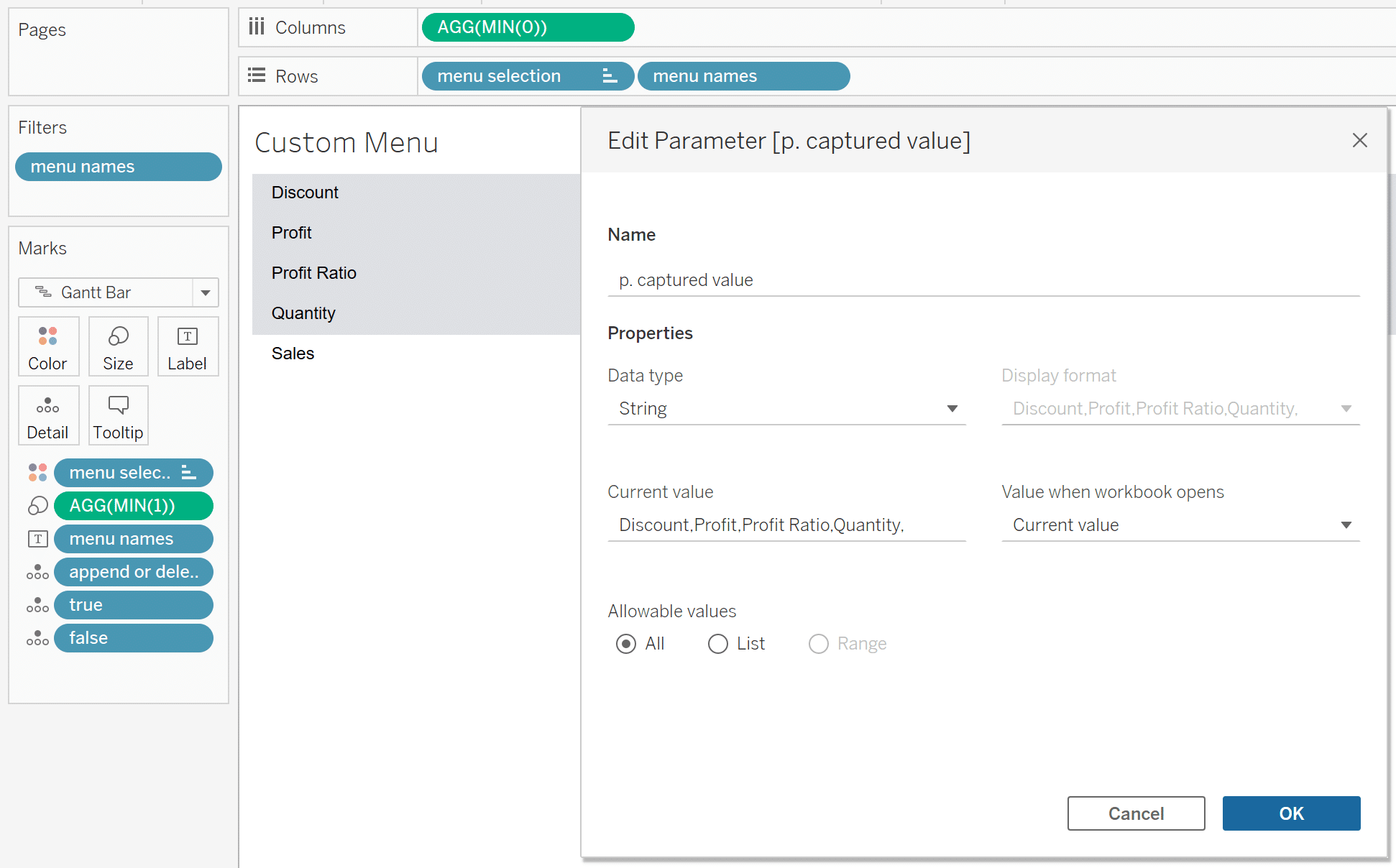
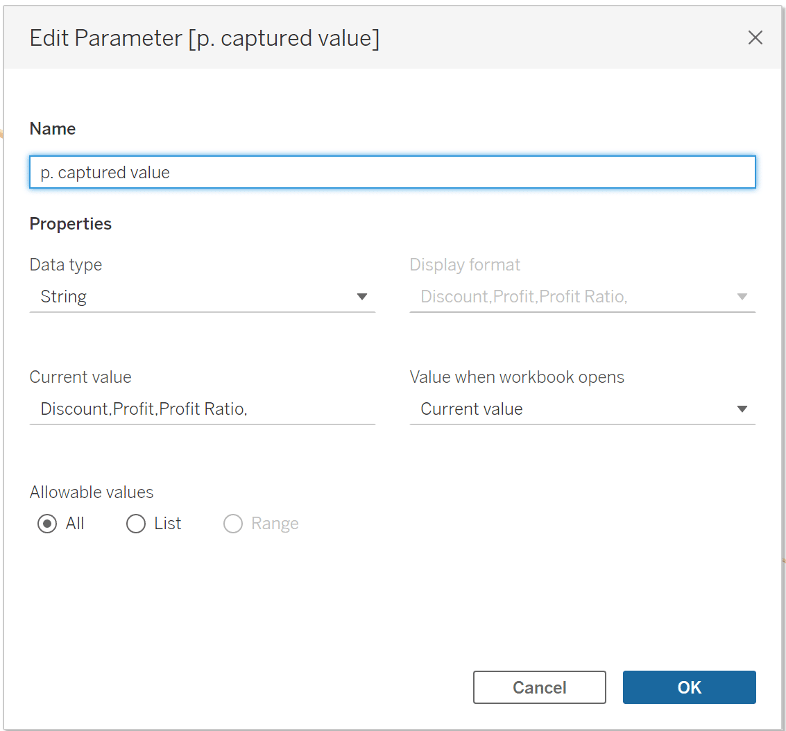
Next, create a new String parameter that will store the selections from the menu sheet. Name the parameter ‘p. captured value’, set the Data type to ‘String’, select ‘All’ for Allowable values, and delete the current value to make it blank.
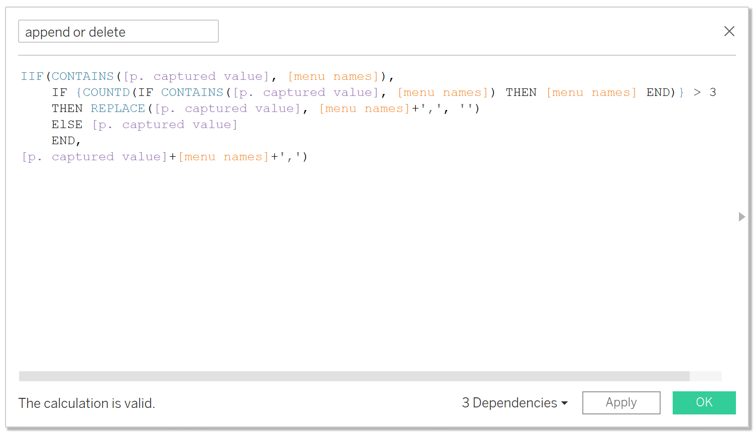
The menu will need a way to append or delete menu selections to and from the ‘p. captured value’ parameter, so we will need a calculation that parses the p. captured value parameter for the measure name from the menu selection. If the selected value does not exist in the parameter then it will append it with a delimiter, but if it already exists and there are more than three measure names in the parameter then it will delete the value from the parameter. Otherwise the parameter will remain the same.
💡Tip: We are restricting the user from selecting less than three measures within the logic because a polygon needs a minimum of three points, otherwise it will break. **
Open a new calculation, name it append or delete and the syntax is as follows:
IIF(CONTAINS([p. captured value], [menu names]),
IF {COUNTD(IF CONTAINS([p. captured value], [menu names]) THEN [menu names] END)} > 3
THEN REPLACE([p. captured value], [menu names]+’,’, ”)
ELSE [p. captured value]
END,
[p. captured value]+[menu names]+’,’)
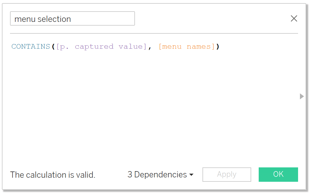
The final piece of the custom menu is a calculation that identifies which menu names have been selected. We’ll call this calculation “menu selection” and the syntax is as follows:
CONTAINS([p. captured value], [menu names])
Now that all the pieces have been built, let’s start assembling the custom menu. Double-click into the Columns shelf and type MIN(0) and click Enter. Add the menu selection and menu names calculations to the Rows shelf. Sort menu selection by True. Change the Mark type to Gantt Bar.
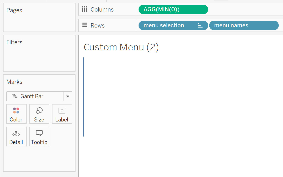
Place the ‘menu names’ calculation on the Text property and place the ‘menu selection’ calculation on the Color property. Next, double-click into the Details shelf, type MIN(1), and drag it to the Size property of the Marks card. Lastly, adjust the Size slider almost all the way to the right to leave some white space between each Gantt mark.
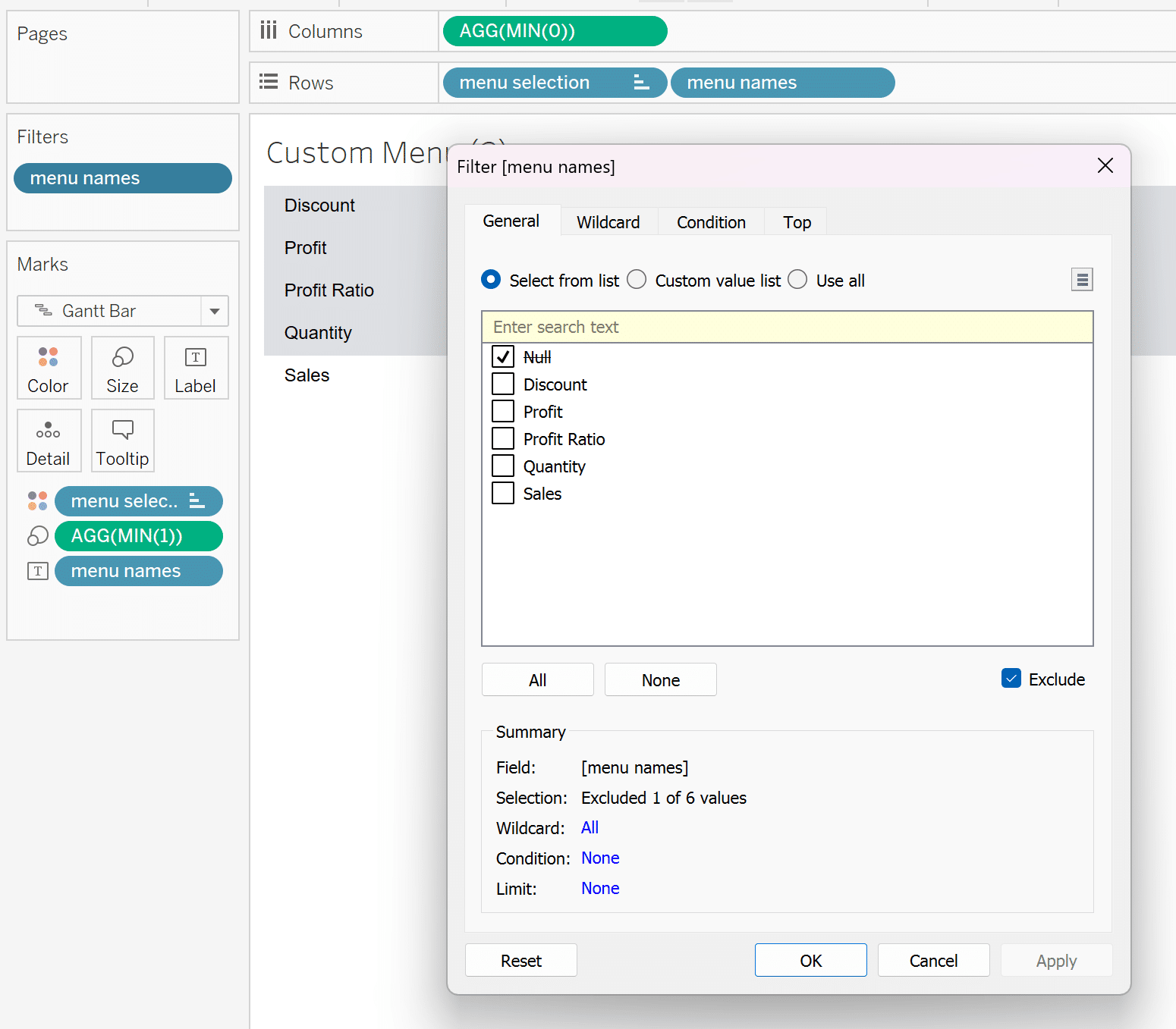
Place ‘menu names’ calculation on the Filters shelf and exclude Null.
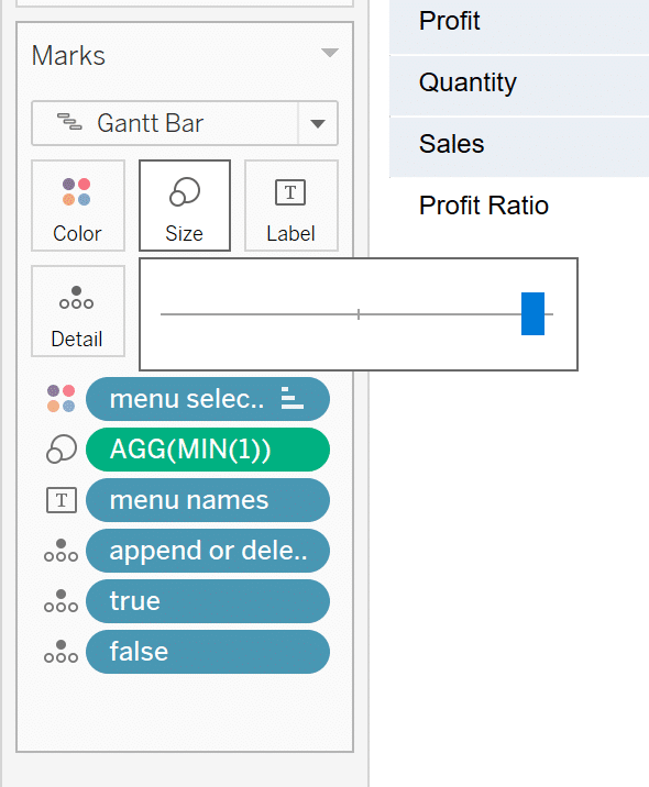
Place the append or delete, true, and false calculations on the Detail property of the Marks card. Change the Fit to Fit Width and format all lines, borders, and colors to your liking.
I realize this step is a bit of a mouthful, so if you would like a more detailed explanation about this approach, see my tutorial on Completely Customizing Multi-Select Filters in Tableau.
Building the spider chart in Tableau
Converting points into dimensions and measures
This spider chart is unique because the points of the polygon are measures that can be dynamically added or removed, thereby changing the overall shape of the polygon with each selection. But to build a polygon with each point representing a different measure, the data has to be pivoted.
There are multiple tactics we could implement to pivot the data to be in the proper structure to build the spider chart, but after extensive research and testing, I have found that the overall best approach is to join in a secondary data source which contains rows whose value represents a point on the spider chart polygon.
How to Use Control Sheets for Better Parameter Actions
For example, if you want the maximum number of polygon points to be five, then you’ll need five rows numbered 1 – 5.
In Tableau Desktop, open up a new calculation and name it ‘radar measure names’ where we will convert each one of these points into a measure name by using the SPLIT() function on the ‘p. captured value’ parameter.
The syntax is as follows:
CASE [Radar Point Number]
WHEN 1 THEN SPLIT([p. captured value], ‘,’, 1)
WHEN 2 THEN SPLIT([p. captured value], ‘,’, 2)
WHEN 3 THEN SPLIT([p. captured value], ‘,’, 3)
WHEN 4 THEN SPLIT([p. captured value], ‘,’, 4)
WHEN 5 THEN SPLIT([p. captured value], ‘,’, 5)
END
Then create a corresponding calculation called ‘radar measure values’. The syntax is as follows:
CASE ATTR([radar measure names])
WHEN ‘Discount’ THEN SUM([Discount])
WHEN ‘Profit’ THEN SUM([Profit])
WHEN ‘Sales’ THEN SUM([Sales])
WHEN ‘Quantity’ THEN SUM([Quantity])
WHEN ‘Profit Ratio’ THEN [Profit Ratio]
END
Spider chart calculations
Next, we need to create the calculations that are necessary to build a radar. For a more in depth explanation on the calculations related to how radar charts are built, see Director of Analytics Solutions, Felicia Styer’s tutorial on How to Make a Radar Chart in Tableau.
Open a new calculation and name it ‘angle spacing’. The syntax is as follows:
360 / { FIXED : COUNTD([radar measure names])}
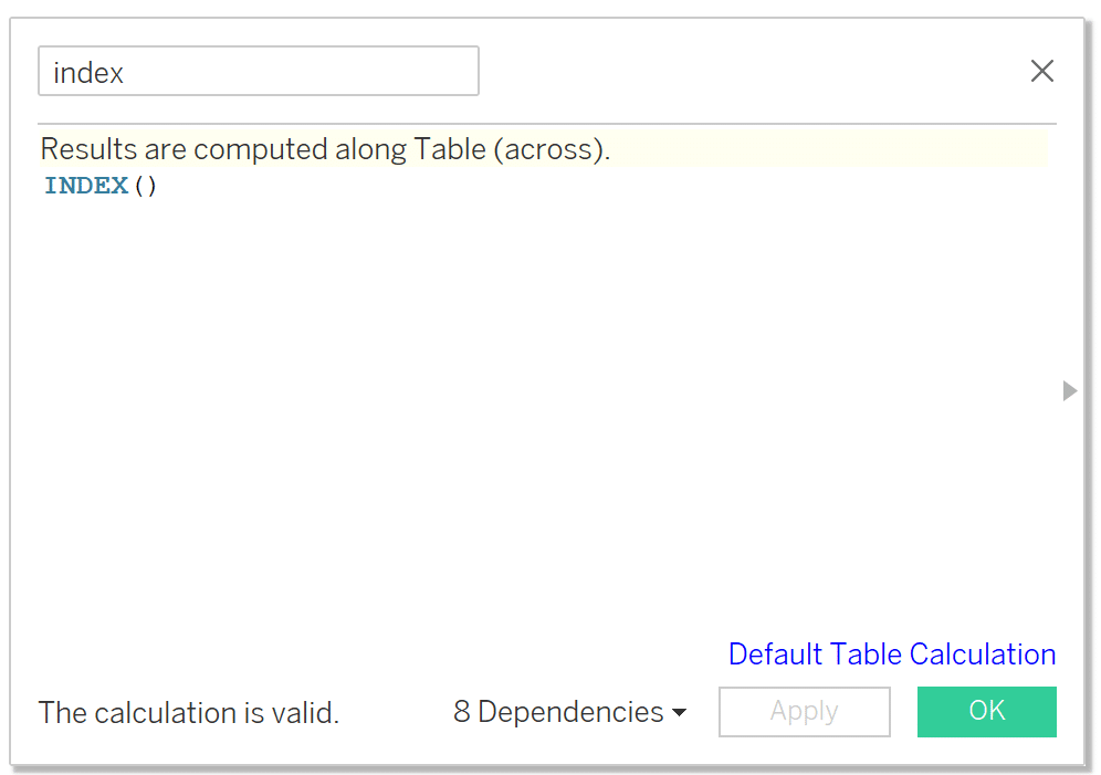
Create a new calculation called ‘index’. The syntax is as follows:
INDEX()
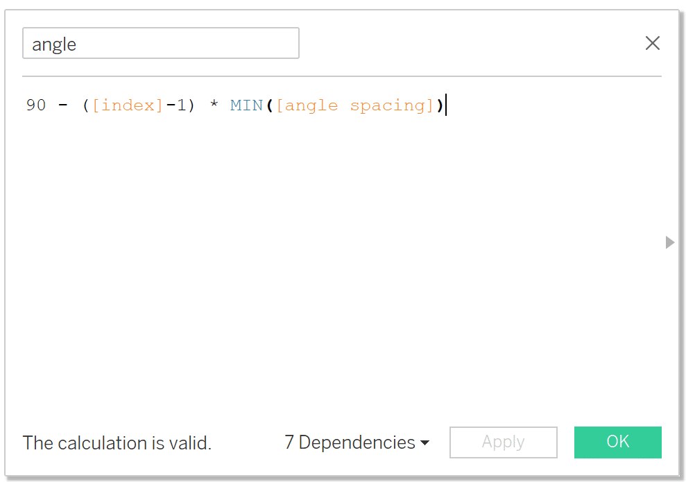
Create a new calculation called ‘angle’. The syntax is as follows:
90 – ([index]-1) * MIN([angle spacing])
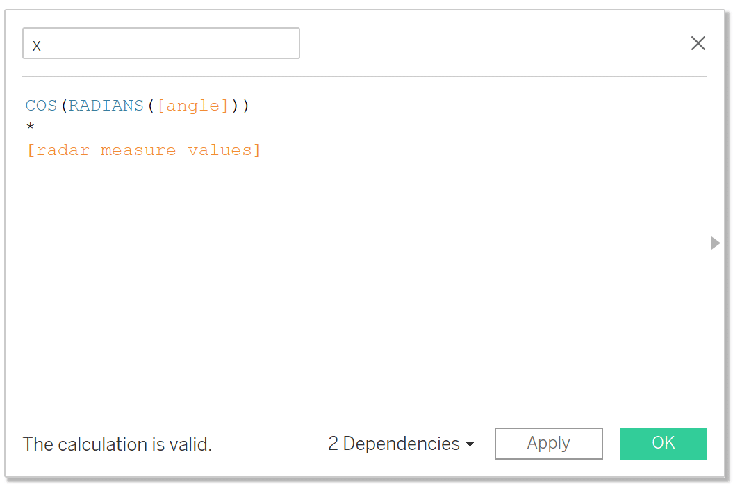
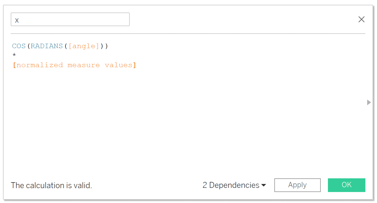
Create a new calculation called ‘x’. The syntax is as follows:
COS(RADIANS([angle]))
*
[radar measure values]
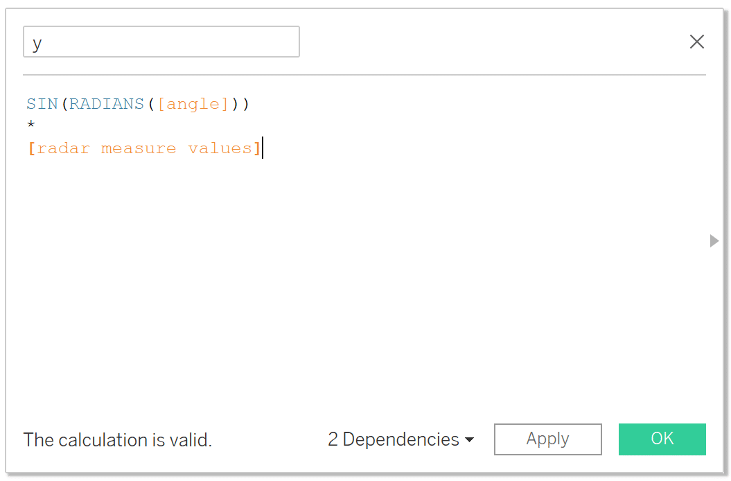
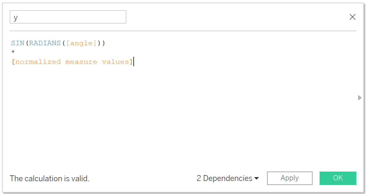
Create a calculation called ‘y’. The syntax is as follows:
SIN(RADIANS([angle]))
*
[radar measure values]
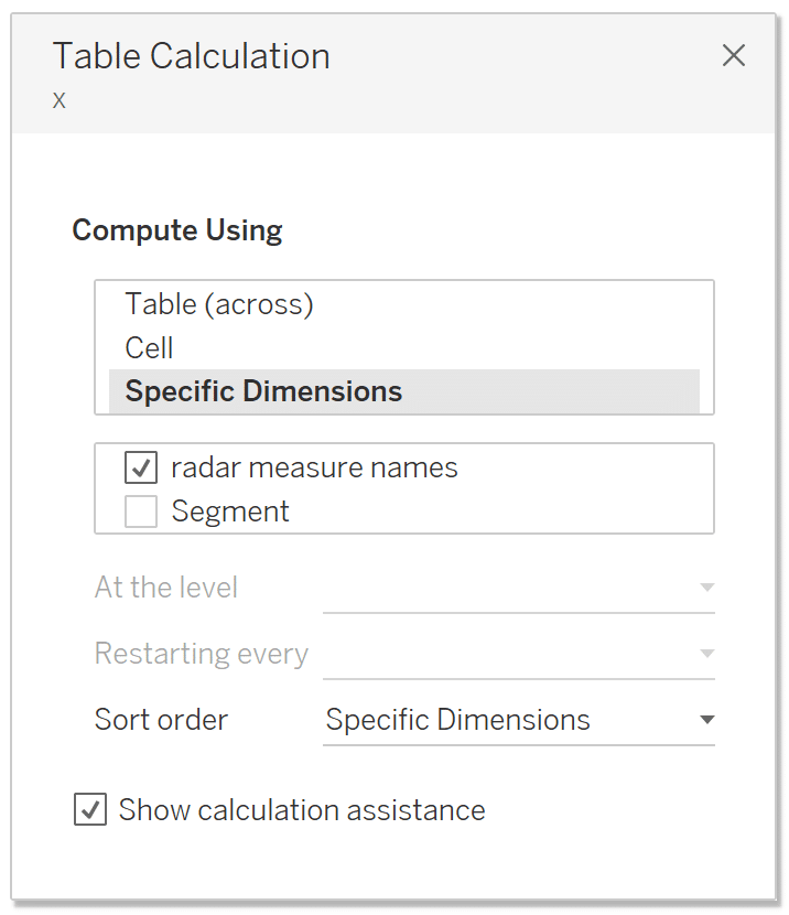
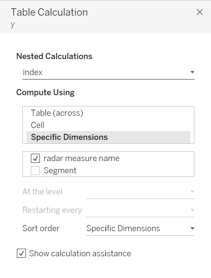
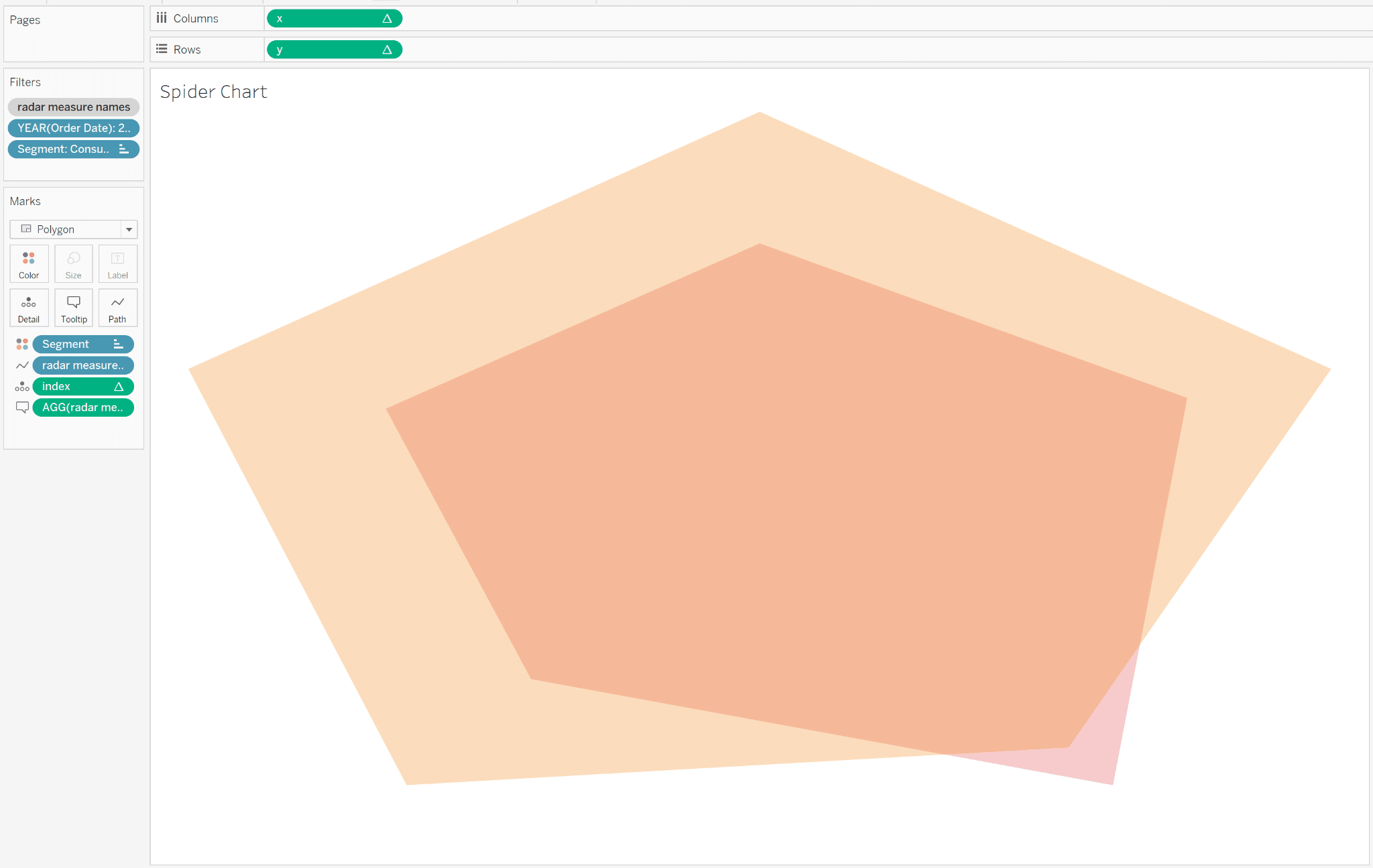
All of the calculations have been built, so let’s start assembling the view. Add a new sheet and set the Mark type to Polygon. Start by placing Segment onto the Color property, then radar measure name on the Path property of the Marks card, and index onto the Detail property of the Marks card. Place x on the Columns shelf and y on the Rows shelf. Adjust the table calculation setting for x, y, and index to the Compute Using: Specific Dimensions and select radar measure names, deselect Segment.
Make sure the ‘p. captured value’ contains the following string value which will result in a polygon with three points:
Discount,Profit,Profit Ratio,
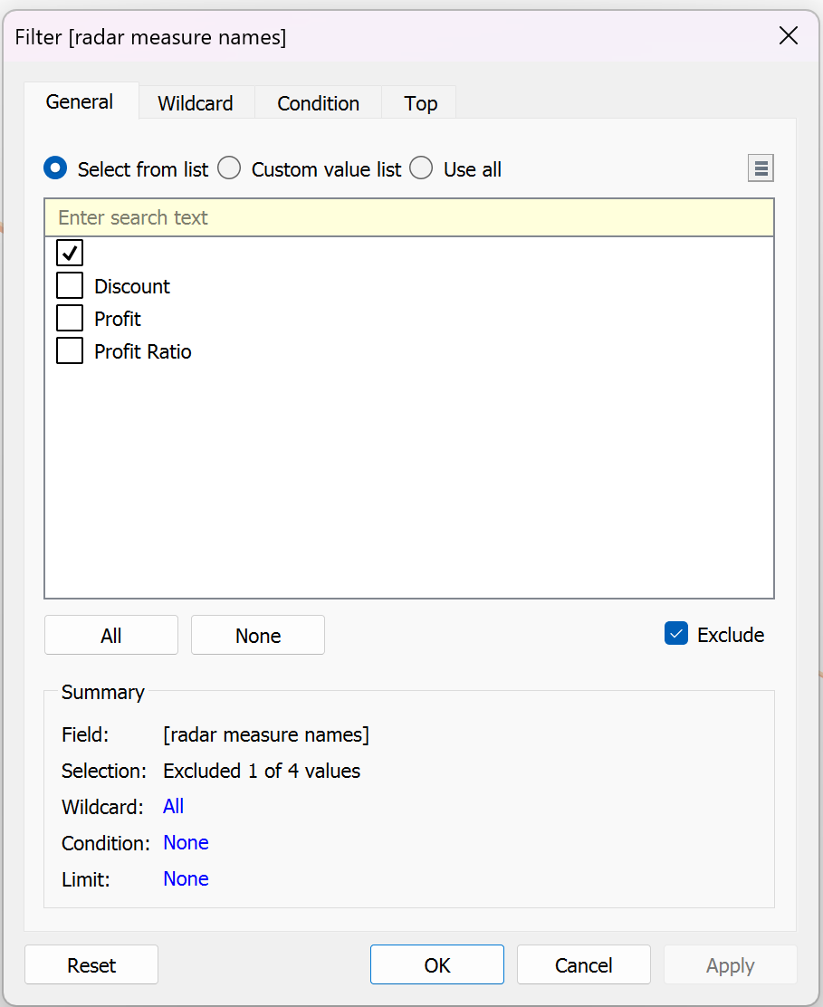
Place ‘radar measure names’ on the Filters shelf and exclude the blank value. Choose OK then add this filter to context by right-clicking it from the Filter shelf and choosing “Add to Context”.
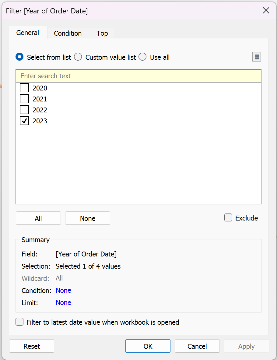
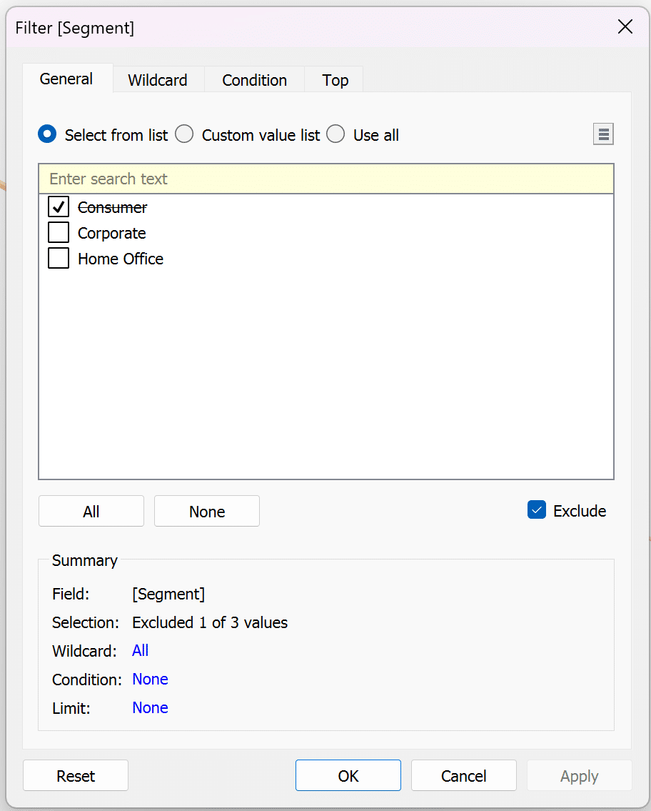
Place YEAR(Order Date) on the Filters shelf and select a single year of your choosing.
Place Segment on the Filters shelf and exclude Consumer.
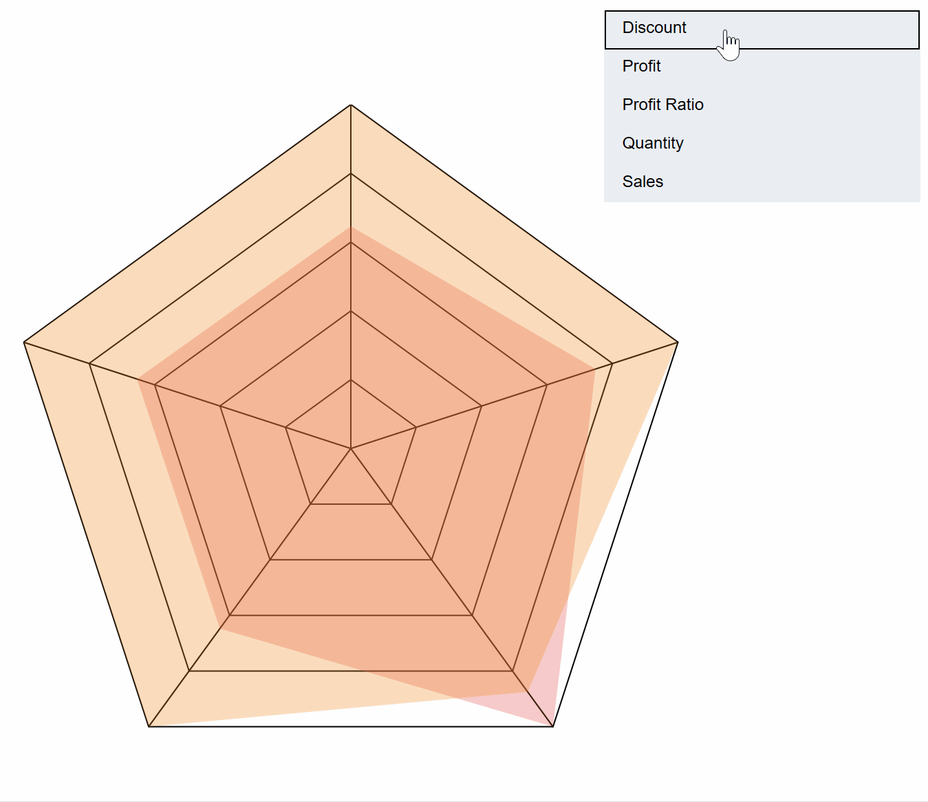
The resulting spider chart should resemble the image below.
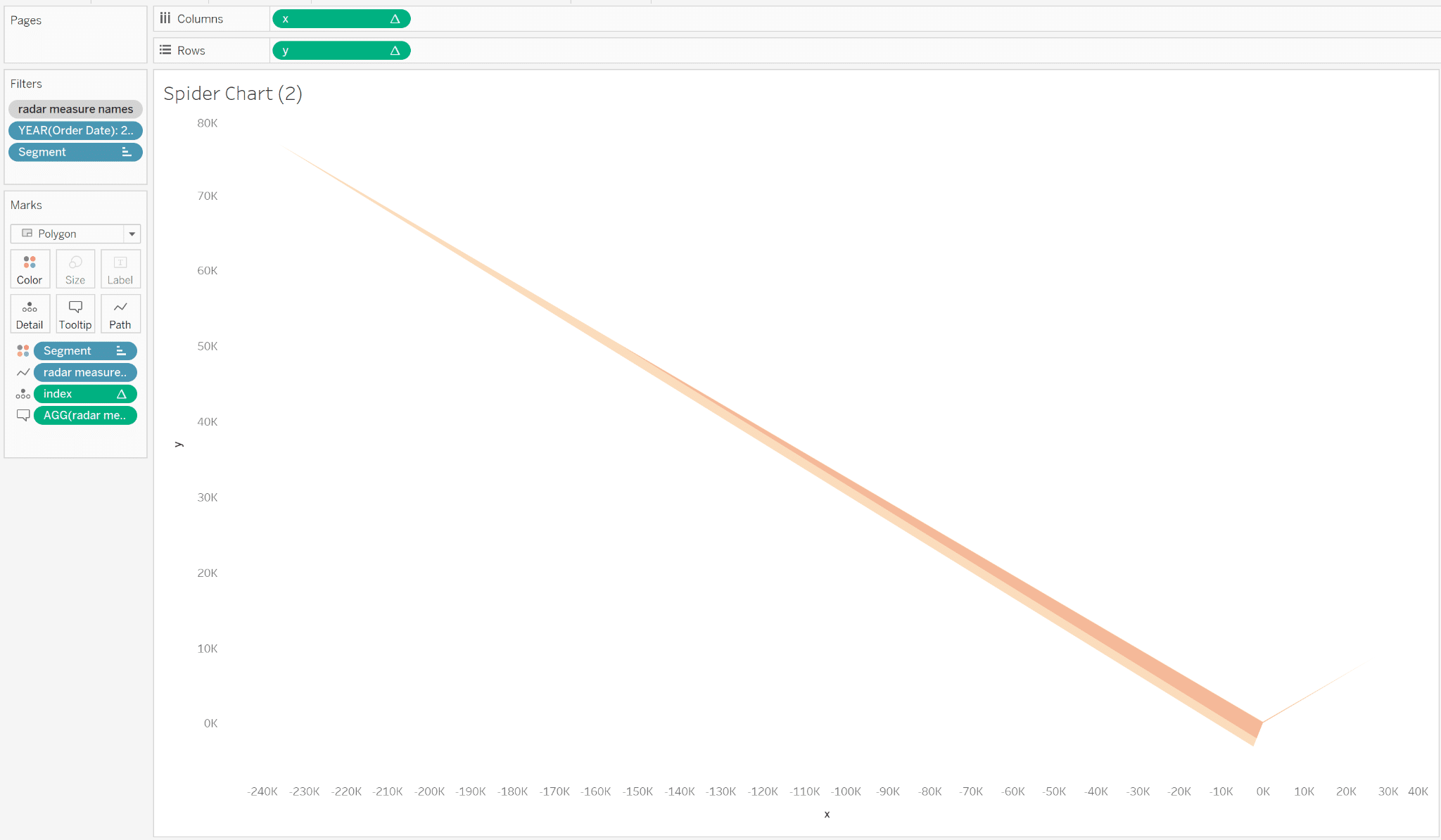
The spider chart is working but the points are very uneven – this is because the points on the chart are different measures with drastically different values. For example, Sales Revenue will always be much larger than Profit Margin because Profit Margin is expressed in decimals whereas Revenue is in dollars. Therefore, we need to fix the shape of our spider chart by normalizing the comparison.
How to normalize a spider chart comparison in Tableau
The purpose of this spider chart is to quickly and easily compare the distance of two points to one another. Therefore, proper scaling is of utmost importance.
We will achieve normalization by indexing our measures from 0 to 1, which is quite simple. The maximum value for each measure will be assigned a value of 1 and the minimum value will be divided by the maximum value, resulting in a normalized value that falls between 0 and 1.
![]()
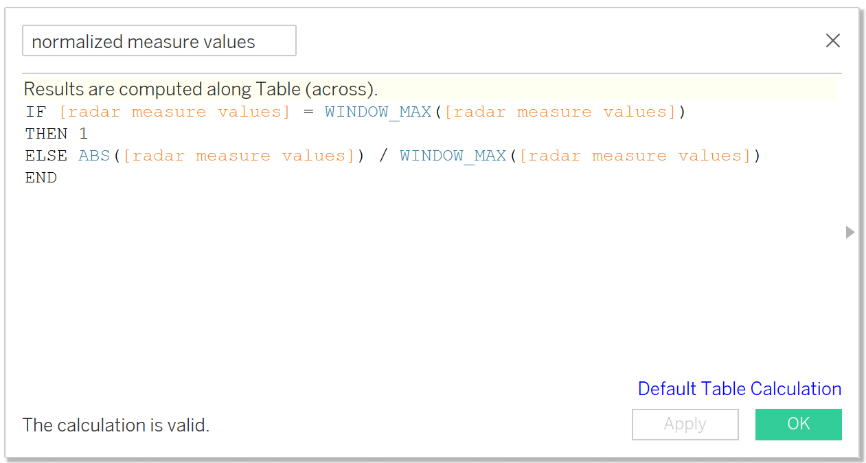
To do so, create a new calculation called ‘normalized measure values’. The syntax is as follows:
IF [radar measure values] = WINDOW_MAX([radar measure values])
THEN 1
ELSE ABS([radar measure values]) / WINDOW_MAX([radar measure values])
END
Next open the ‘x’ and ‘y’ calculations and replace ‘radar measure values’ with the new ‘normalized measure values’ calculation.
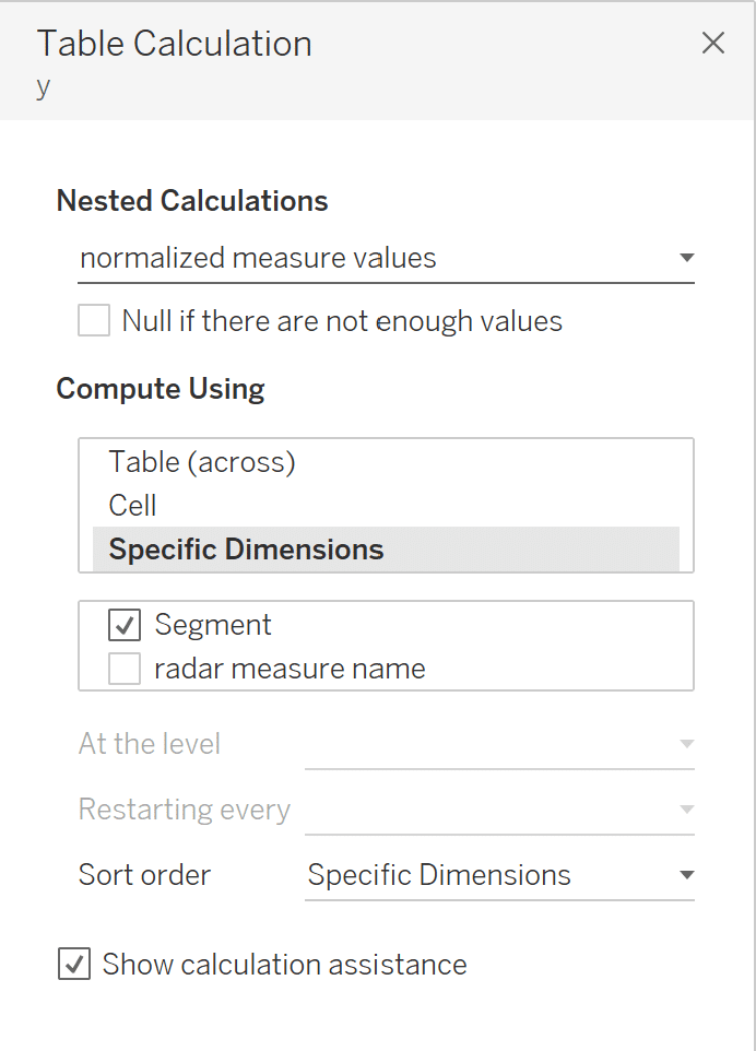
Ensure that the table calculation settings are correctly formatted for x, y, and index by right-clicking each measure, select Compute Using: Specific Dimensions and select radar measure names, deselect Segment. Once the radar measure values is replaced with normalized measure values, there will be nested table calculations. For these, click on the dropdown and select normalized measure values. Set this table calculation to Specific Dimensions → Segment. Do this for both the x and y measures. The index table calculation will stay as before, with Specific Dimensions → radar measure name, with Segment deselected.
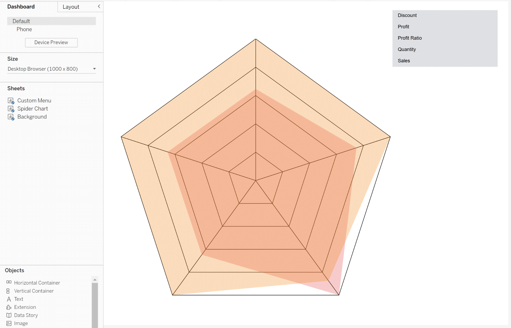
With all five of the measure names in the captured value parameter, the result should be two beautiful pentagons!
Assemble the dashboard
The last step in the process is to assemble the dashboard and bring it to life with dashboard actions. If you followed the tutorial for creating a dynamic spider web background for the spider chart then start by floating the background sheet onto the dashboard and giving it the dimensions of 700 x 700 and the coordinates of x = 26 and y = 93. This can be configured using the Layout pane on the left side of the Dashboarding interface.
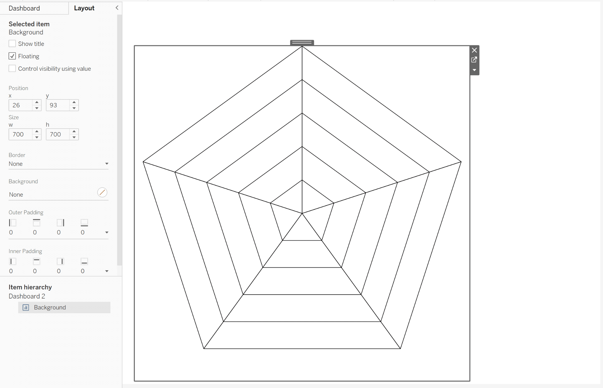
Float the spider chart sheet over the top of the background sheet and give it the exact same dimensions and x/y location. Float the custom menu sheet onto the right side of the dashboard.
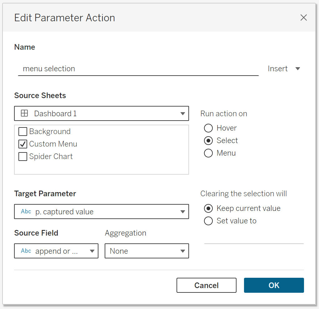
To activate the custom menu, we’ll need to create dashboard actions. Navigate to the top menu of the workbook, choose Dashboard, then select “Actions…” from the drop-down menu. At the bottom of the Actions window, choose Add Action, then select Change Parameter.
Name the parameter action ‘menu selection’, choose Custom Menu as the Source Sheet. Have the action run when it is clicked by checking “Select” under the “Run action on” options. Under Target Parameter, choose ‘p. captured value’ and under Source Field choose append or delete. Choose OK to close the settings.
Now you can make selections from the custom menu and it will add or remove measures from the spider chart!
Thanks for reading,
– Dan

Written By
Dan Bunker

Peer Review
Felicia Styer
Assoc. Director, Analytics Solutions
Related Content
How to Create a Dynamic Spider Web Background for Radar Charts
Radar charts can be a good option to make comparisons with your data, but one of the problems with this…
How to Make a Radar Chart in Tableau
Radar charts are great for catching attention! However, keep in mind that they are difficult to interpret. So combining a…
How to Completely Customize Multi-Select Filters in Tableau
Filters play a crucial role in allowing users the flexibility to manipulate dashboards to their liking. Multi-select filters can be…