How to Use a Border to Highlight Selections in Tableau

This tutorial explores a way to elevate the user experience of your visualizations by adding borders to highlight selections for rounded bar charts in Tableau. Drawing borders around bar selections allows the user flexibility to both convey information through color while also emphasizing key selections. We first used this method to enhance the UX of the Asana PM Swift, one of our Playfair+ products. In the Asana PM project, we found that using borders to highlight selected dates while also color encoding the bars engaged the audience and quickly conveyed useful information. Keep reading to learn this UX trick that will instantly elevate your Tableau project.
Create a rounded Tableau bar chart
We’ll start by creating a basic rounded bar chart by using the following steps:
![]()
Continue reading with a free account, or login.
Unlock this tutorial and hundreds of other free visual analytics resources from our expert team.
Already have an account? Sign In
By continuing, you agree to our Terms of Use and Privacy Policy.
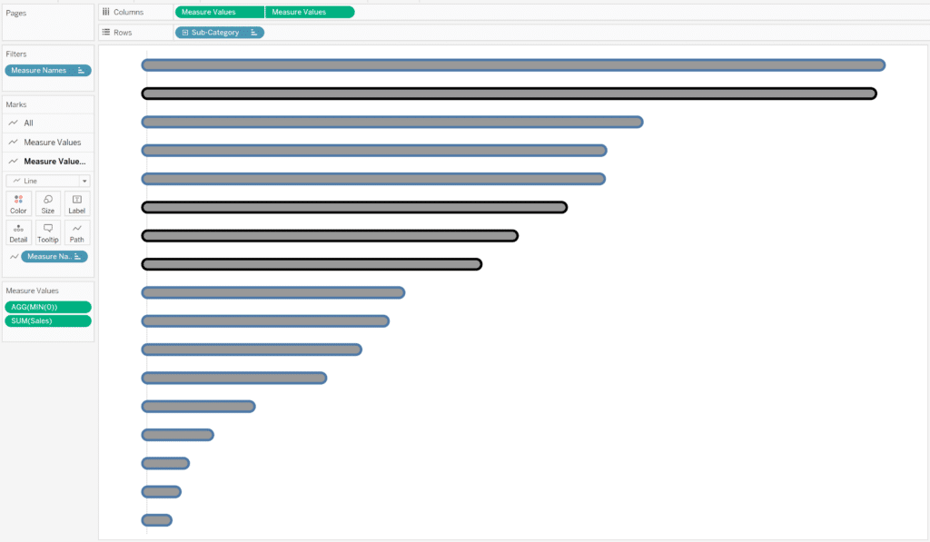
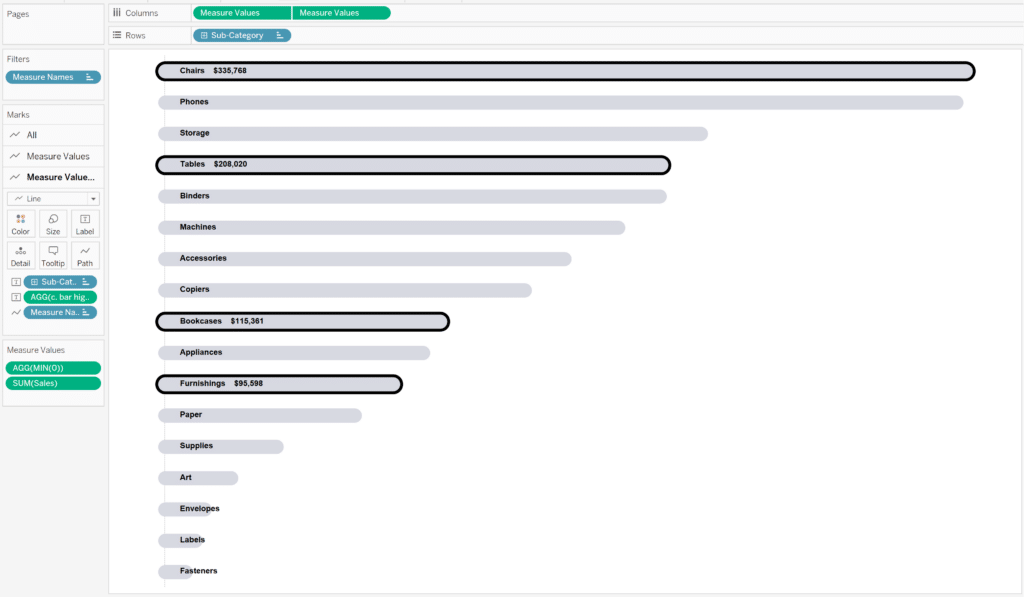
- Place Sub-Category on the Rows shelf.
- Place Measure Values on the Columns shelf.
- Change the Mark type to Line.
- Double click into the Measure Values shelf and type in the calculation MIN(0) and click enter.
- Remove all measures from the Measure Values shelf except for SUM(Sales) and the MIN(0) calculation you created within the flow of the analysis.
- Place Measure Names on the Path property of the Marks card.
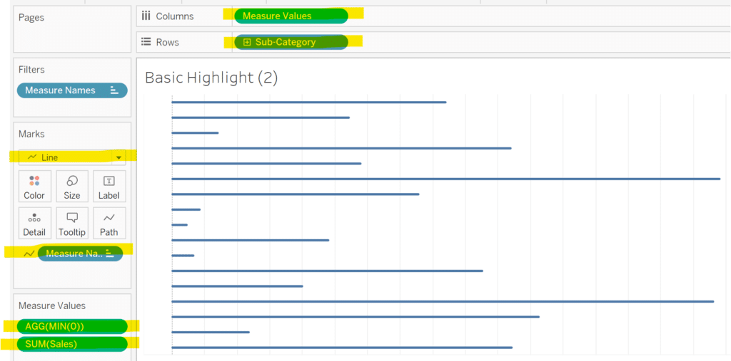
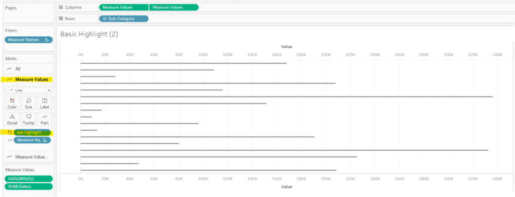
You should now have a basic rounded bar chart that resembles the image above. We’ll next add the highlight effect by creating a dual axis combination chart. Ctrl+click the Measure Values pill on the Columns shelf, then drag and drop it to the right of the existing Measure Values pill on the Columns shelf. This will duplicate the pill to give us two Measure Values pills on the Columns shelf.
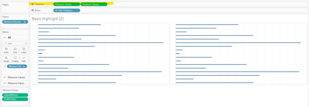
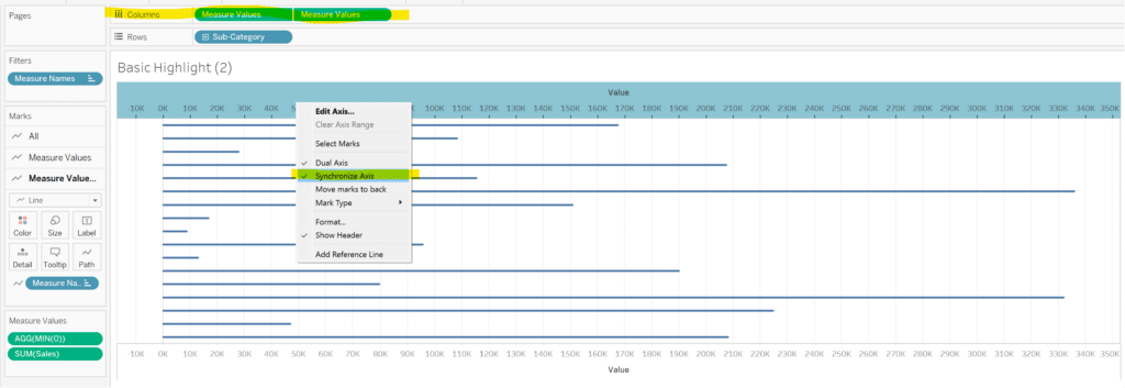
Right-click the second Measure Values pill on the Columns shelf and choose Dual Axis. Then right-click one of the axes in the view and choose Synchronize Axis from the drop down menu which will layer the two rounded bar charts on top of each other.
3 More Ways to Make Beautiful Bar Charts in Tableau
Create the border to highlight selections
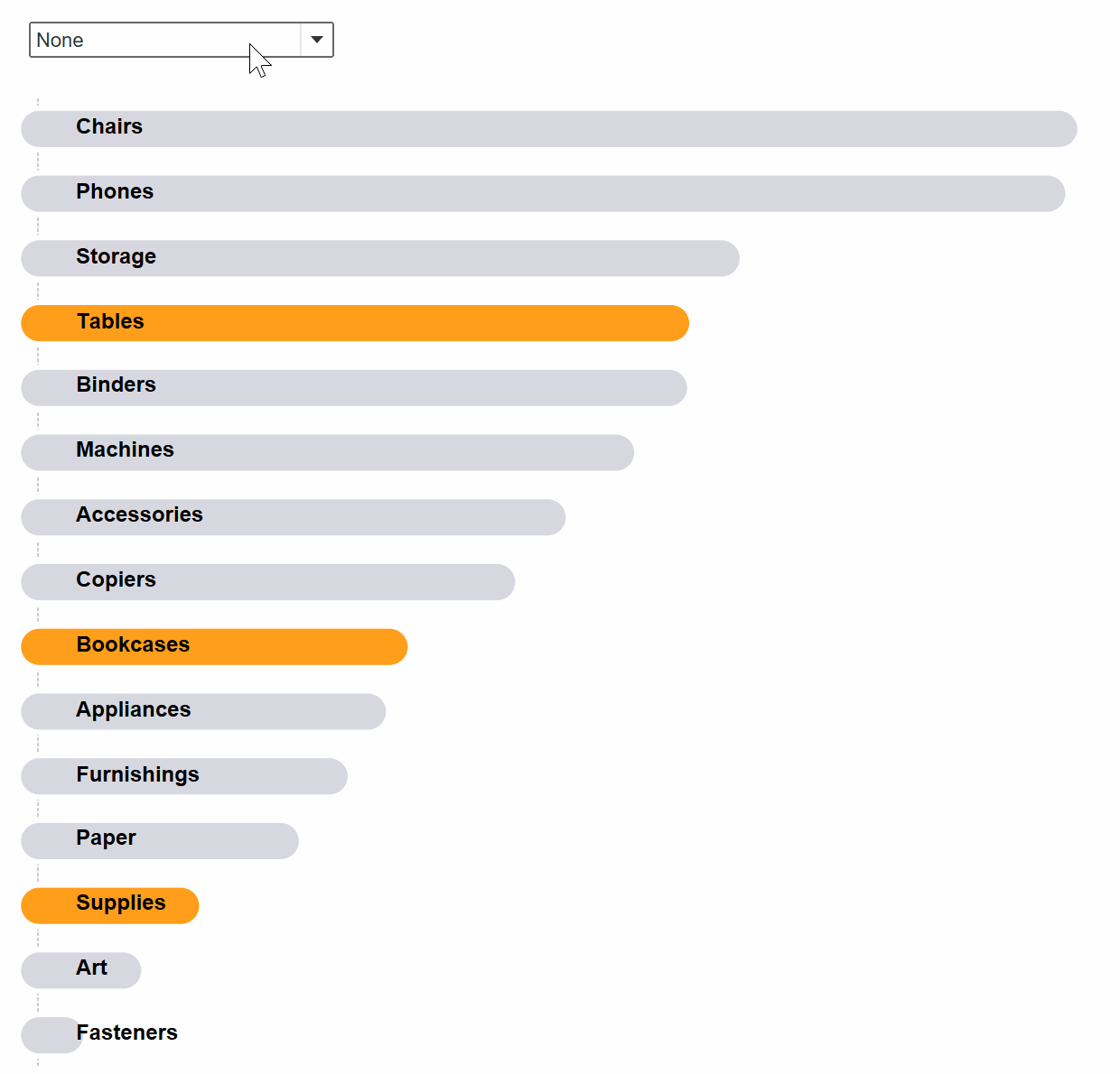
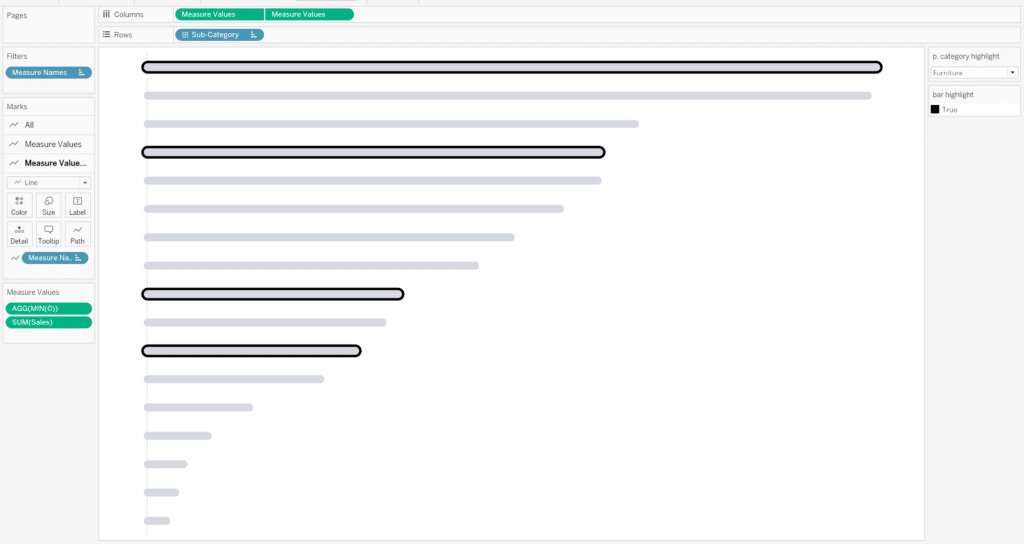
Next, we will encode the second bar chart in the background to be colored black if its Sub-Category falls under the selected Category in a Category parameter that we’ll create.
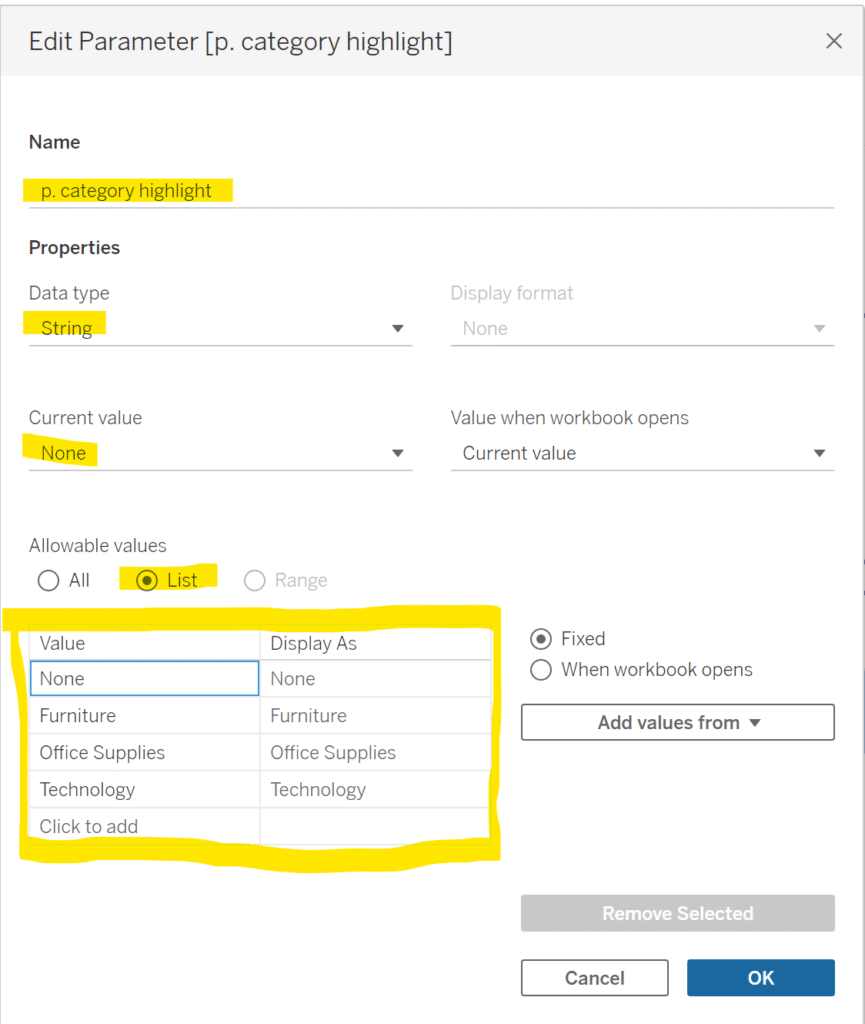
To create the Category parameter:
- Create a new String parameter called p. category highlight.
- Change the data type to String.
- Set the Current value to None.
- Select the List option for Allowable values.
- Either type in the Category dimension members or choose Add values from and select Category from the drop down menu.
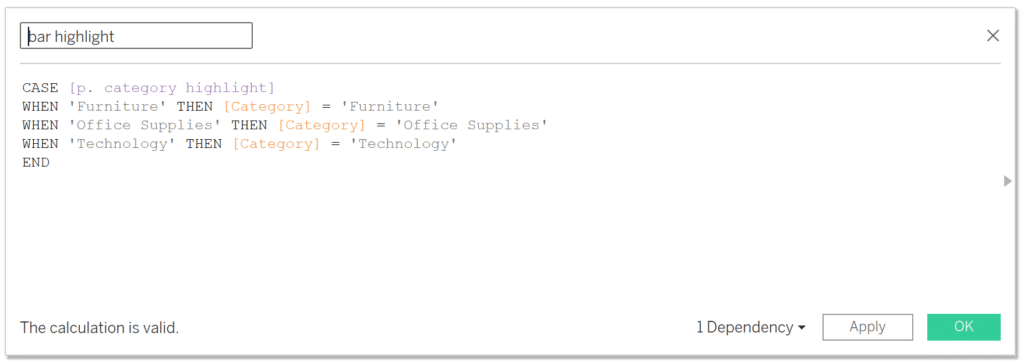
Create a calculation called ‘bar highlight’.
CASE [p. category highlight]
WHEN ‘Furniture’ THEN [Category] = ‘Furniture’
WHEN ‘Office Supplies’ THEN [Category] = ‘Office Supplies’
WHEN ‘Technology’ THEN [Category] = ‘Technology’
END
Select the first Measure Values pill on the Columns shelf and drag the ‘bar highlight’ calculation onto the Color property of the Marks card, which will result in each bar getting colored one color for True and one color for False.
Next, prepare the view to be brought to life by following these steps:
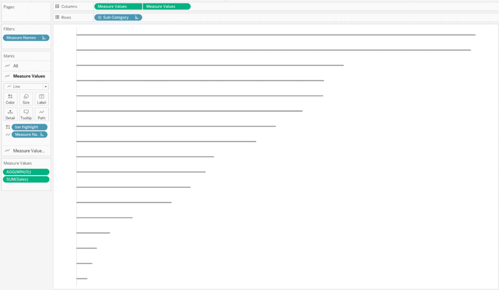
- Right-click the “p. category highlight” parameter and select “Show Parameter”.
- Right-click both axes and deselect “Show Header”.
- Fit Entire View.
- Format the lines and borders to hide everything except the zero line along the Columns.
Now the visualization will really come to life with the next steps. In the first Measure Values Marks card, open the Size property and increase the slider almost all the way to the right. Then in the second Measure Values Marks card, open the Size property and increase the slider of the gray bar until the outer bar appears to border the inner gray bar.
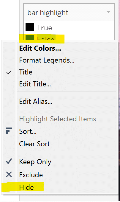
Navigate to the ‘bar highlight’ color legend, right-click False, and select Hide. This will hide, not exclude, the False values from the view.
Update the colors and formatting to your preference and the result should resemble the image below.
We have successfully built the highlight selections function so If this is all you were looking to accomplish, then you can stop here, but continue reading to learn how to create dynamic labels for the selected dimension members.
Elevate the user experience of the bordered bar chart
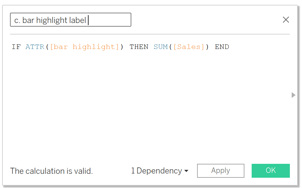
I want to directly label every single bar with its name and then every selected bar with both its name and Sales value. Create a calculation called ‘c. bar highlight label’ which will return the Sales value if the dimension member results in True from the ‘bar highlight’ calculation.
IF ATTR([bar highlight]) THEN SUM([Sales]) END
Next, place Sub-Category and the newly created ‘c. bar highlight label’ calculation on the Text property of the second Measure Value Marks card. Format them so the c. bar highlight label is to the right of the Sub-Category name. Format the alignment so that the label is in the center of each bar and left aligned.
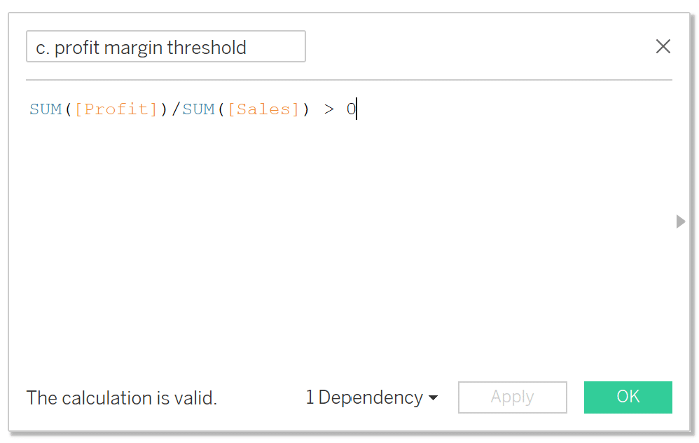
The visualization is looking good but if we want to elevate this further and drive even more insight, we can encode the color of the bars to warn us of any Sub-Categories that have a profit margin below zero. To do so, create a calculation called ‘c. profit margin threshold’, place it on the Color property of the second Measure Values card, and adjust the colors to your liking.
![]()
SUM([Profit])/SUM([Sales]) > 0
Now you can see why the borders for selections are so useful!
The border gives us the ability to draw the stakeholders’ attention to the selected dimension members while also encoding the bar colors to flag for something important, which ultimately drives more insights and action. I hope you have found this tutorial informative, valuable, and entertaining. As always let me know if you have any questions or comments about this tutorial.
Thanks,
Dan
[email protected]


Written By
Dan Bunker

Peer Review
Juan Carlos Guzman
Visual Analytics Associate
Related Content
How to Use Tableau’s Dynamic Zone Visibility to Highlight Selected Measures
Welcome to an exploration of Tableau’s Dynamic Zone Visibility, a powerful feature introduced in Tableau Desktop version 2022.3 that brings…
3 Innovative Ways to Highlight Selections in Tableau

In this tutorial I will demonstrate three ways to use different mark types with transparent sheets to highlight a selection…

Ryan Sleeper
Create a More Polished Analysis with Rounded Bar Charts Ryan demonstrates why creating rounded bar charts will add professional polish,…