How to Use Tableau’s Dynamic Zone Visibility to Highlight Selected Measures
Welcome to an exploration of Tableau’s Dynamic Zone Visibility, a powerful feature introduced in Tableau Desktop version 2022.3 that brings a new level of interactivity and sophistication to your dashboards. In this blog, we’ll delve into an innovative button technique that leverages Dynamic Zone Visibility, combining various elements such as image objects, blank sheets, parameters, and dashboard actions.
Imagine a Tableau dashboard where users have the freedom to select their preferred measure for a visualization by interacting with KPI cards on the dashboard. However, for a seamless and intuitive user experience, we need to provide a visual indication of the selected measure or KPI, and that’s where a button highlight comes into play.
![]()
Throughout this tutorial, we’ll use an example from the Tableau Usage Swift by Playfair+ to demonstrate the implementation of this new technique for highlighting button selections. By the end of this blog, you’ll have gained the expertise to apply Dynamic Zone Visibility in your Tableau projects, enhancing interactivity and making your dashboards stand out. So, let’s dive in and discover how to elevate your visualization game with this innovative feature!
Getting started
Start by opening this shared Playfair+ folder, which contains the components needed for this tutorial as well as the mock data set used to build the Tableau Cloud Usage dashboard by Playfair+. Next, connect Tableau Desktop to the mock data set titled “Playfair+, TS_Events.hyper”.
How to Do Advanced Dynamic Zone Visibility in Tableau
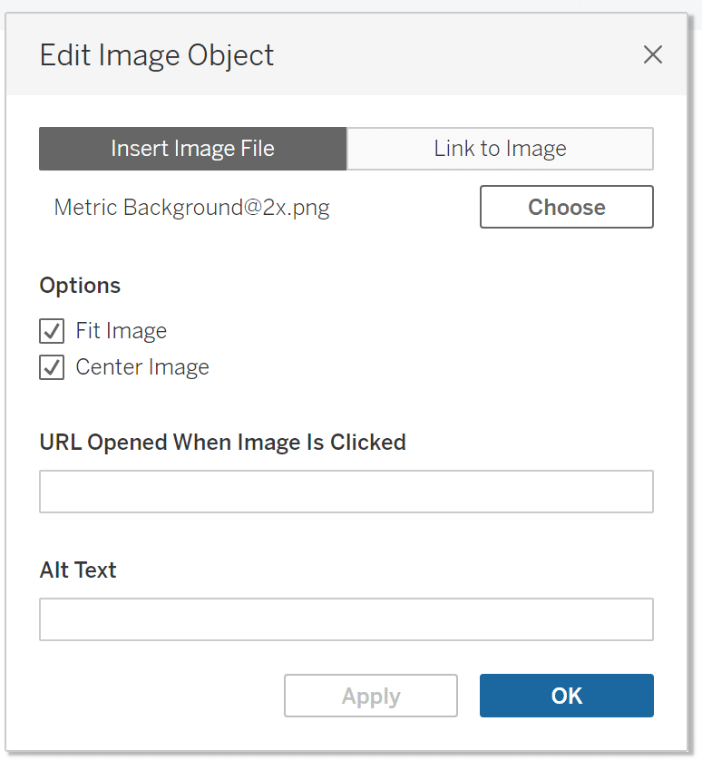
Once connected to the data, create a new dashboard and float an image object into the dashboard and choose the component called ‘Metric Background’ from the shared folder. In the Edit Image Object settings, check mark the boxes Fit Image and Center Image, then select OK.
Continue reading with a free account, or login.
Unlock this tutorial and hundreds of other free visual analytics resources from our expert team.
Already have an account? Sign In
By continuing, you agree to our Terms of Use and Privacy Policy.
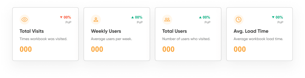
Your dashboard should look very simple, with only the image object in the view.
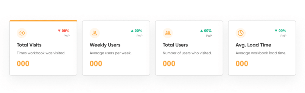
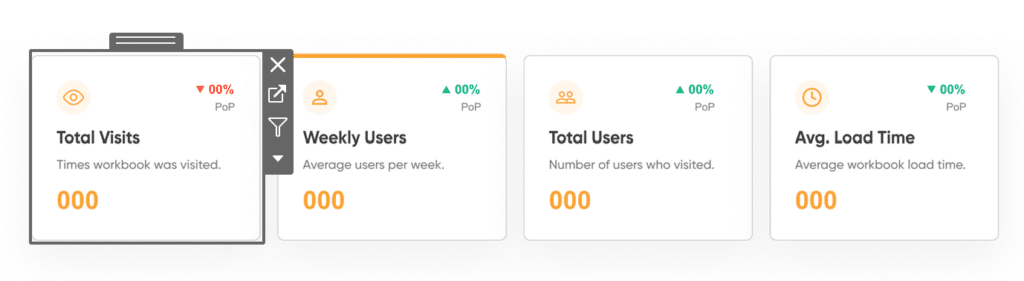
Next, float another image object onto the dashboard. From the Edit Image Object settings, choose the image called ‘Highlight Line’ from the shared folder. Check mark the boxes Fit Image and Center Image. Select OK. Use the Layout pane to position and size the Highlight Line exactly at the top of your KPI box to resemble the image below.
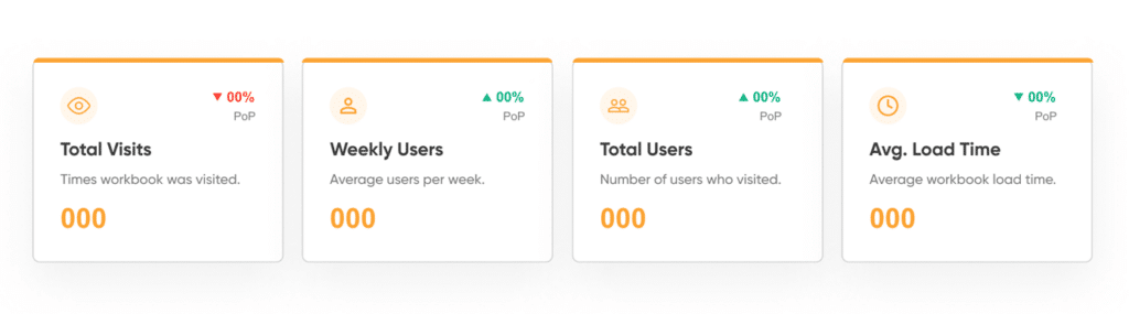
We now need to duplicate this highlight line for all KPI boxes so there will be four highlight lines total by simply clicking the highlight line image object and copy and pasting three times. Reposition the three new highlight lines to be aligned exactly at the top of the three remaining KPI boxes. The result should resemble the image below.
Dynamic zone visibility
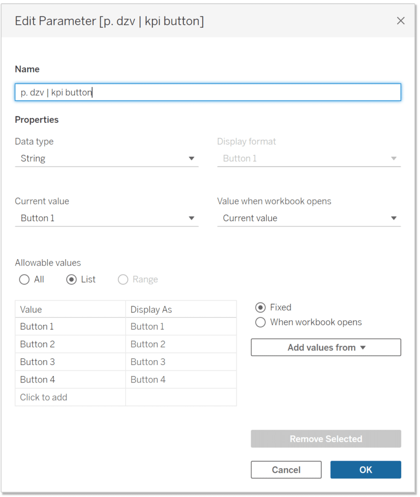
Now we’ll make the magic happen with dynamic zone visibility. Our goal is to hide the highlight bars unless the related KPI is selected. To achieve this, open a new sheet and name it ‘Button 1’. Next, create a new parameter called ‘p. dzv | kpi button’. Data type will be String, Allowable values is List. Next, type in four values, ‘Button 1’, ‘Button 2’, ‘Button 3’, and ‘Button 4’, representing the four KPIs. Select OK.
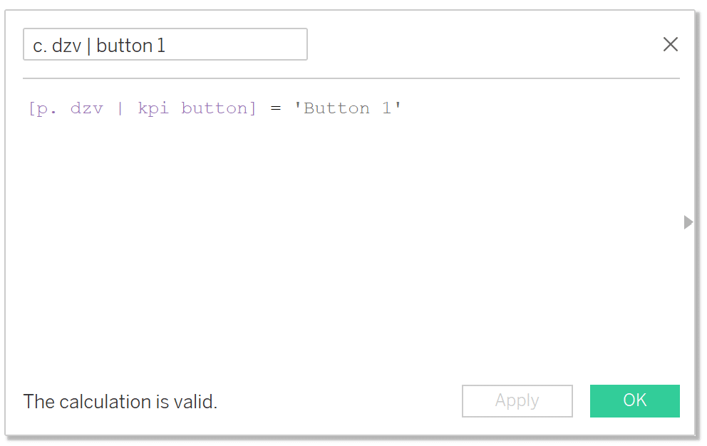
Now we need to pass the parameter through calculations to make the dynamic zone visibility work for each KPI. Create a new calculated field called ‘c. dzv | button 1’ that checks whether the parameter is equal to the string ‘Button 1’. This will control the highlight bar of the first KPI. Duplicate this calculated field three times, one for each button, and rename the calculations ‘c. dzv | button 2’, ‘c. dzv | button 3’, etc. Then change the value within the calculation to ‘Button 2’, ‘Button 3’, etc., respectively.
Navigate back to the dashboard, select the first highlight line, under Layout check the box called ‘Control visibility using value’, then from the dropdown choose ‘c. dzv | button 1’. Repeat the process for all four highlight lines but choose button 2, button 3, etc. respectively.
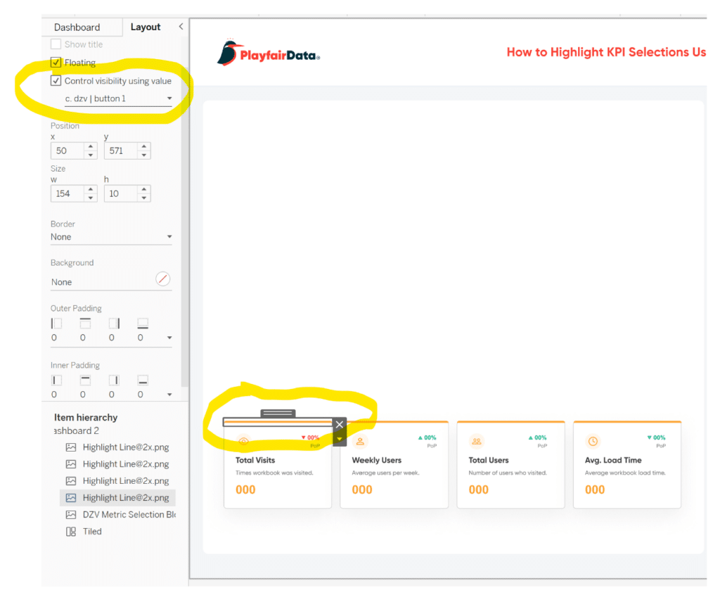
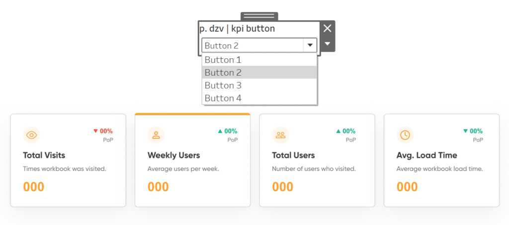
You will see that only one highlight line will remain visible because the result of each button calculation is either true or false based on the parameter selection. If the parameter equals the string value we specified in each calculated field (Button 1, Button 2, etc.), then the calculation will result in True, keeping the highlight line visible. Otherwise, it will result in False, hiding the highlight line. You can test to make sure the dynamic zone visibility is working properly by showing the parameter and changing its value, as shown in the image below.
The button technique with dynamic zone visibility
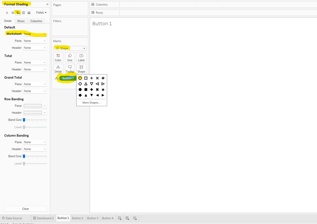
After confirming the dynamic zone visibility is working properly, we’ll transform the normal KPI card into a button that changes the metric selection and the highlight line. Navigate back to the sheet called Button 1, double-click in the blank space in the Marks card, and type ‘Button 1’ (include the quotations). This is a quick and easy way to create a string calculation. We will later use a dashboard action to pass this string calculation to the parameter we created.
How to Do Better Sheet Swapping with Tableau’s Dynamic Zone Visibility
Next, change the Mark type to Shape, choose the unfilled circle, and adjust the Size property slider all the way to the right. Right-click in the view and choose Format. In the Format pane to the left of the view, select the paint bucket, and under Worksheet, choose None for color, which will make the worksheet invisible.
Duplicate this sheet three times for the three remaining buttons and rename each sheet and adjust the string calculation in each sheet to ‘Button 2’, ‘Button 3’, and ‘Button 4’, respectively.
Navigate back to the dashboard and float the Button 1 sheet over the first KPI card, hide the title, and resize it so it perfectly fits over the KPI card. Repeat this process for the other three button sheets.
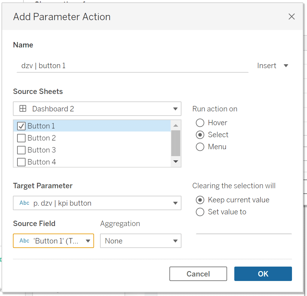
Finally, we’ll bring this UX to life by creating parameter actions. At the top navigation, choose ‘Dashboard’, then choose ‘Actions…’. At the bottom of the Actions settings card, choose ‘Add Action’, then from the dropdown, choose ‘Change Parameter…’. Name the Parameter Action ‘dzv | button 1’, checkmark the Button 1 sheet as the Source Sheet, Run action on Select, choose p. dzv | kpi button as the Target Parameter and choose ‘Button 1’ as the Source Field. Select OK.
Congratulations! By following the step-by-step process outlined in this blog, you have successfully implemented an engaging and dynamic user experience using Tableau’s Dynamic Zone Visibility. Now, with all four buttons expertly set up, your dashboard has come to life with seamless interactivity.
Conclusion
As users interact with the KPI cards, they can effortlessly observe the highlight line adapting to their selections, providing real-time visual feedback and enhancing their understanding of the data. This level of responsiveness and elegance not only elevates the overall user experience but also empowers your audience to gain deeper insights from the visualizations.
![]()
With your newfound knowledge of Dynamic Zone Visibility and the button technique, you have acquired a valuable skill to craft Tableau dashboards that captivate and inform your audience. Feel free to explore further possibilities and experiment with different variations to take your data visualizations to the next level.
Remember, the art of data storytelling is not only about presenting facts and figures but also about creating an immersive and intuitive experience that resonates with your audience. As you continue your Tableau journey, keep seeking innovative ways to blend design, interactivity, and insights, and you’ll undoubtedly leave a lasting impact with your data visualizations.
Thank you for joining us on this exciting exploration of Tableau’s Dynamic Zone Visibility. Now, go forth and unleash your creativity as you craft compelling visual narratives that unveil the hidden stories within your data.
Happy dashboarding!
Dan Bunker


Written By
Dan Bunker

Peer Review
Felicia Styer
Assoc. Director, Analytics Solutions
Related Content

Dan Bunker
Enhance Dashboard UX with Dynamic Zone Visibility In this tutorial, Dan explains Tableau’s dynamic zone visibility feature and how it…
How to Do Advanced Dynamic Zone Visibility in Tableau

Released with version 2022.3, Dynamic Zone Visibility is a relatively new feature in Tableau. In a previous post, Playfair Data…

Ryan Sleeper
Create permanent highlights that work across worksheets using parameters Ryan shows you his favorite approach for highlighting specific marks using…