How to Make Performance Indicator Titles in Tableau
One of my favorite descriptive tactics in Tableau is to conditionally color a dashboard object based on whether the performance improved or declined. This is a descriptive tactic because it only provides a very high-level overview on how something is performing, but it works well for several reasons: (1) it helps avoid the question, “So what?”, by providing at least one comparison point (2) provides an alert that a deeper analysis should take place (3) is almost universally understood by end users.
These indicator titles can be used in two ways. First, they can be used behind a callout number to give a bold visual cue that the KPI featured is performing better or worse. Second, they can be used without numbers, making the title of a chart act as a basic data visualization itself. This post will show you how to create an indicator title as seen in My US Stock Portfolio.
This is the fifth and final post in a series of “you are here” Tableau tutorials. These tips will help improve the user experience of your Tableau dashboards by helping guide your end users. In previous posts, learn to automatically highlight the latest trends, highlight data points in a custom range, add a date period notification, and highlight dimension members on a minimalist dot plot.
How to make performance indicator titles in Tableau
Let’s start by looking at My US Stock Portfolio dashboard. As you can see, each widget features a title with the name of the asset. The titles are colored blue if I’ve made money since purchasing the stock and red if I lost money on the investment.
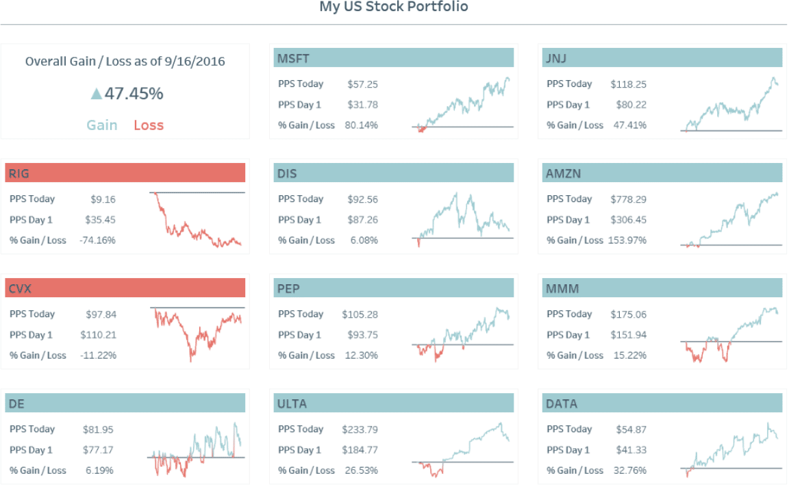
In this case, my comparison formula was the current price of the stock divided by the price I purchased it for. However, this concept can be tailored to fit any comparison point of interest (i.e. previous month, previous year, etc.). To help illustrate, and so everyone can follow along with the same dataset, I’ll create a similar dashboard title using the Sales measure in the Sample – Superstore dataset.
![]()
Create a free account, or login.
Unlock this tutorial and hundreds of other free visual analytics resources from our expert team.
Already have an account? Sign In
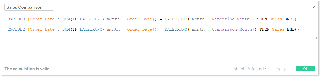
To start with, I’m going to create a comparison. Again, this can be any comparison that is relevant for your business, but I’m going to set up a calculation that compares sales for a reporting month (controlled by a parameter) to sales for a comparison month (controlled by a parameter).
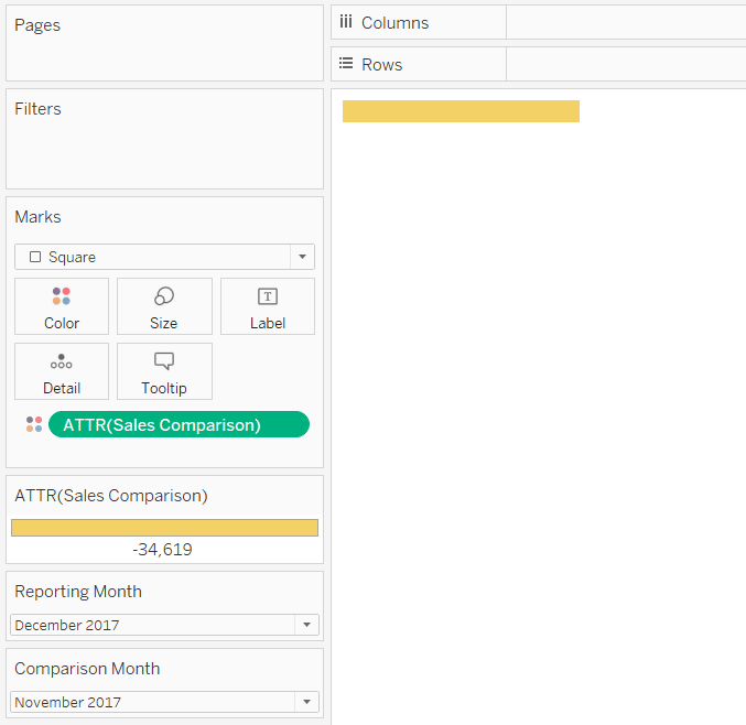
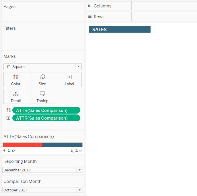
Now that you have the comparison that will eventually control the color of the indicator title, setting it up is easy! On a new worksheet, change the mark type to Square and place the comparison calculation on the Color Marks Card. Note that my current parameter selections are December 2017 as the reporting month and November 2017 as the comparison month.
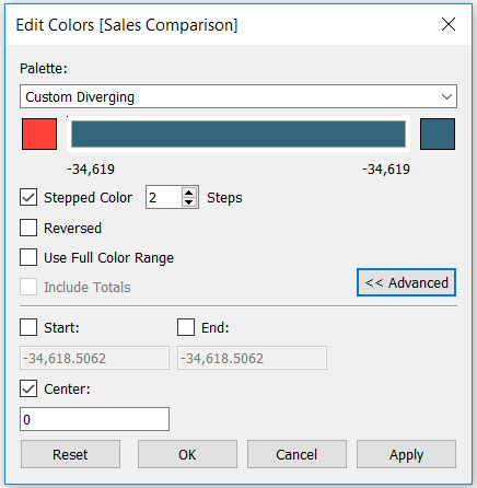
Perhaps the most critical step of this setup is to edit the colors so that they have a diverging color palette, two steps, and a center of 0. This ensures any positive change will be colored differently than any negative change. Colors can be edited in this way by double-clicking on the color legend.
To finalize the indicator title, put the comparison field you are using on the Label Marks Card. Once a field is on the Label Marks Card, you can edit it to show anything you want. In my case, I’m going to customize the label to show only the name of the KPI.
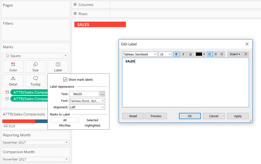
Now when the reporting month underperforms the comparison month, the indicator title turns red. And when the reporting month outperforms the comparison month, the indicator title turns blue!
These indicator titles can be added to another dashboard object such as a trendline or bar chart showing how dimension members ranked for the KPI. In the case of My US Stock Portfolio, I placed an indicator title for each stock in a layout container with a text table and line graph. Of course, you can also make the indicator titles a bigger focus by placing callout numbers, larger text, and / or up and down arrows onto the label.
Thanks for reading,
– Ryan


Written By
Ryan Sleeper
Related Content
How to Add a Date Period Notification to a Tableau Dashboard
When you show a date filter or the parameter controls for a start date and an end date, the end…

Ryan Sleeper
Two ideas for bringing attention to minimum and maximum values Make Tableau answer business questions for you automatically using a…
Ryan Sleeper
Encode Entire Tables Including Headers by Color and Size This video shows you how to highlight entire text table rows…