Practical Tableau: 10 Data Visualization Tips I Learned from Google Analytics
Seven years ago, I was fortunate to be introduced to Tableau, a tool for data visualization that has led to personal opportunities and contributions to my clients’ businesses that I didn’t imagine would be possible in such a short amount of time.
Even before that though, I was introduced to Google Analytics.
It’s no surprise then that some of my inspiration for the design, usability, and analytics of my data visualizations have been drawn from Google Analytics over the years. Sure, the Audience Overview report features an overly large pie chart for New vs. Returning visitors – a measure that is largely useless in an age of multiple devices, cleared cookies, and anonymous users – but Google tends to get a lot of things right.
What follows is a list of 10 Tableau data visualization best practices I use that I either consciously or subconsciously picked up from Google Analytics. In no particular order…
Use a maximum of 12 dashboard objects
One of the first ideas I remember consciously thinking to myself, “Wow – that’s a good idea, Google Analytics; I should use that…,” was the 12 object limit Google Analytics has in place for their custom dashboards. Many data visualization specialists often remind us that “less is more”, and I have encouraged designers in the Data-Driven Storytelling section to Keep It Simple. In Google Analytics, you have no choice but to keep dashboard objects, or widgets in Google’s words, to 12 or fewer. Here is what you see when trying to add a 13th widget in a Google Analytics custom dashboard:
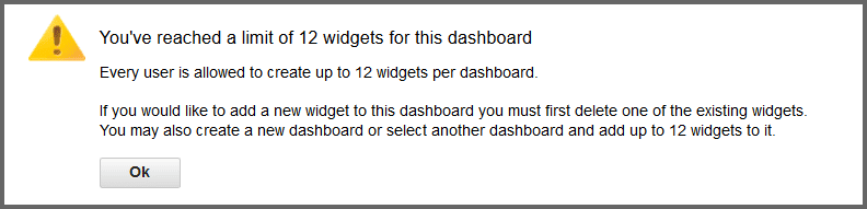
This limit forces designers to prioritize which KPIs and views are truly pertinent to the story.
Improve user experience by leveraging dashboard actions
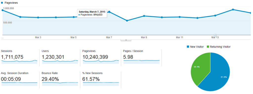
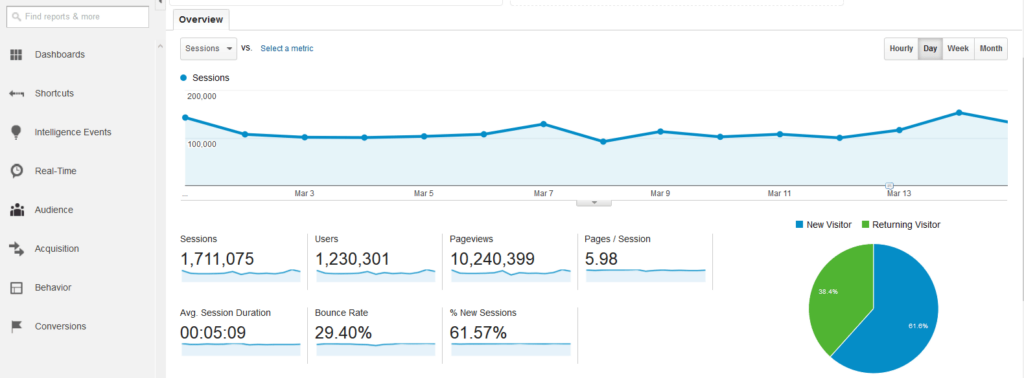
On Google’s Audience Overview report, which is my favorite report to start my analysis on, seven main KPIs are shown along with sparkline trends. By clicking a sparkline, the larger line graph at the top will change to that KPI.
This makes it easier to see trends and find extra detail, which is provided if you hover over data points.
Continue reading with a free account, or login.
Unlock this tutorial and hundreds of other free visual analytics resources from our expert team.
Already have an account? Sign In
By continuing, you agree to our Terms of Use and Privacy Policy.
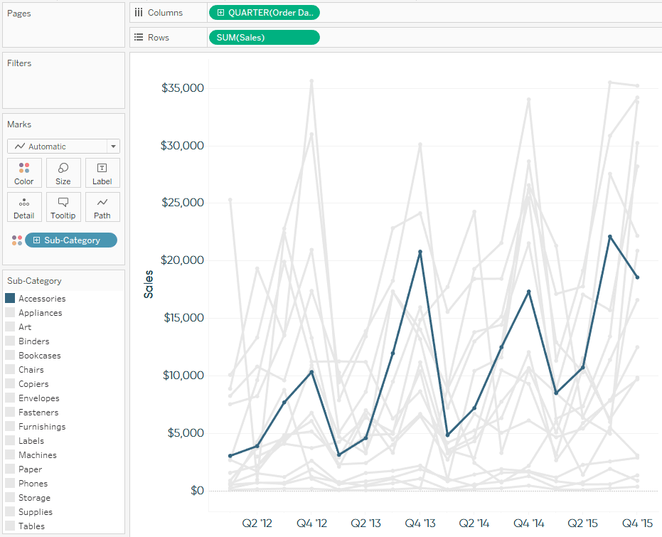
Similar usability can be set up in Tableau through the use of dashboard actions. Here is a simple example using a control sheet for Segment and a sales trend over time. By adding both sheets to a dashboard and choosing to use the sheet containing the three different segments as a filter, clicking on a segment will filter the trend being shown:
To use a sheet as a filter, click on the sheet, click the down arrow that appears in the top right corner, and click “Use as Filter”.
Allow end users to change the date aggregation of line graphs
Another feature I like about the Audience Overview report in Google Analytics is the ability to change the date aggregation of the trend being shown. By default, the trends are aggregated by Day, but users also have the option to change the granularity to Hour, Week, or Month:
![]()
This feature can help find different stories in the data based on the aggregation being displayed. To learn how to replicate this in Tableau, see the chapter, How to Change Date Aggregation Using Parameters.
Keep crosstab widths to a maximum of ten columns
Tableau allows you to make crosstab views with up to 16 columns. If you ask me, this is about 11 too many. Spreadsheets are not data visualizations and they take far too long for analysts to process. Google Analytics is at least closer, never displaying more than 10 columns including the dimension in the first column (nine measures pictured below):
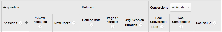
Sometimes it makes sense to use crosstabs in small doses, and I am realistic that some audiences will require more detailed data in a text table. If at all possible, I would stick with this implied limit from Google Analytics of ten or fewer columns.
Use a vertical navigation in the left column
In Tip Five of the Data-Driven Storytelling section, I discussed using the Golden Ratio in data visualization. In addition to considering the dimensions of a dashboard, another aspect of the Golden Ratio is to prioritize content – placing more important dashboard components to the top and left of the view.
![]()
For this reason, I’ve always appreciated the intuitive, left navigation of Google Analytics. For reports that have a lot of changeable components, such as filters, the vertical space on the left side of a dashboard is an ideal place for navigation. Placing controls here serves the dual-purpose of prioritizing what changes can be made to find stories in the data and having a clear place to remind users what filters have been applied.
This is not a must-use tip for every situation, but makes a lot of sense for dashboards that are meant to provide self-serve analytics. If you have certain dashboards that are not meant to be changed very often, deprioritize filters and buttons by moving them to the right navigation.
Choose five or fewer colors for your workbooks
At times, the number of distinct categories within a dimension on a view will dictate how many colors are required in a data visualization. For example, I may have a unique color for each region: North, East, South, and West. When possible, I try to limit the number of colors to five or fewer; an unspoken rule I picked up from Google Analytics’ simple color choices.
Google Analytics does have a set of visuals called “Motion Charts” that contain more than five unique colors, but outside of that, it is challenging to find visuals with more than two different colors. Using five or fewer colors reduces the burden on the end user because they do not have to work as hard to look back and forth to the color legend to determine what the marks on a view represent.
If you are in a situation where more than five categories need distinct colors, consider a two-color palette – making the category of interest a color that stands out, and everything else a more muted color, such as gray. See tip three in the Data-Driven Storytelling section for more on getting the most from color in data visualization.
Stick mostly to lines and bars
With only a few exceptions, Google Analytics’ powerful analytics platform is built almost entirely on what I call the kings of data visualization – lines and bars. Google Analytics has treemaps in their Acquisition reports and highlight tables in their Cohort Analysis. They also use scatter plots in the aforementioned Motion Charts and I’m sad to say, pie charts make several appearances (by the way, Don’t Use Pie Charts).
Even with those other chart types, lines and bars dominate the dozens of available reports in Google Analytics, and for good reason. These simple chart types have been getting the job done for more than 200 years now, and in most cases, continue to be the best starting point for sharing trends and comparisons in data visualization.
Include comparisons such as year over year
When I develop data visualizations, I am constantly trying to avoid the dreaded question, “So What?” If I hear this question, it means I did not do a good enough job communicating the stories in the data. One way to avoid this awkward conversation about why you’ve spent days developing a data visualization that doesn’t tell anybody anything… is to use comparisons.
Some of my favorite approaches for showing comparisons are bar charts, small multiples, and period over period comparisons. The latter of which can be done very easily in Google Analytics by selecting a date range comparison when you set the date range.
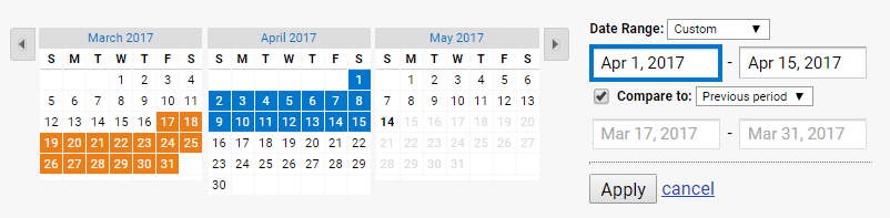
Google Analytics allows you to compare your selected dates to a custom secondary range, the previous period of the same range (i.e. 15 days vs. 15 days) or to that same date range versus the prior year. Similar functionality can be set up in Tableau using parameters.
Bring your data visualization to life using segmentation
Another way I like to provide comparisons in my data visualizations is through the use of segmentation. Segmentation is one of the most powerful tactics for adding value to your analyses; making it easy to quickly identify your weakest and strongest performers. Segmentation allows you to hone in on your weakest performers to figure out what characteristics to avoid, or your strongest performers to determine what you should be doing more of.
![]()
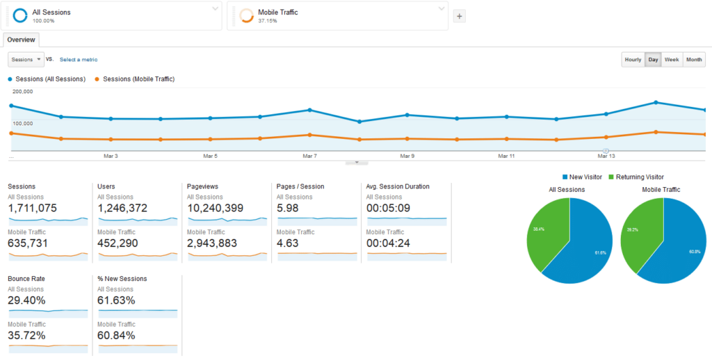
In Google Analytics, several segments including Mobile Traffic, Referral Traffic, and Returning Users (just to name a few), come ready to use ‘out-of-the-box’. You can also set up customized advanced segments to compare users almost any way you can imagine. These standard and custom segments can be used to compare performance to each other, or the site as a whole:
There are a couple of ways to leverage segmentation in Tableau. First, if you are using the Google Analytics connector, you can filter the data coming into Tableau on a specific segment. Note the Segment filter below in the connection setup:
The drawback to this is you can only segment the data to one thing at a time. A much more powerful use of segmentation in Tableau is to create and compare your own segments once the data is already being used in Tableau. For more on customizing your segmentation, see How to Create and Compare Segments in Tableau.
Include alerts of exceptional or poor performance
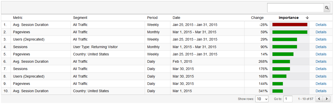
Last but not least, Google Analytics taught me the power of boiling the most important stories in the data to the top. Google Analytics does this in the form of Custom Alerts, which shows any performance on a site for a particular date range that fell outside of its algorithms’ expectations:
Custom Alerts are a great place to start an analysis and I love them for a couple of reasons:
1. They do the heavy-lifting for you; making outliers apparent without making you dig to find them.
2. They are easily understood by analysts and non-analysts alike.
In Tableau, similar alerts can be built into your dashboards to make them more user-friendly and reduce time to insight. See 3 Ways to Add Alerts to Your Tableau Dashboards to get you started.
Google has taught me a lot over the years and these ten data visualization best practices from Google Analytics have served me well. One of the things I like most about Tableau is the software’s flexibility, and I encourage you to take the best ideas from other tools and incorporate – or even build on – them in your own dashboards.
Thanks for reading,
– Ryan
This content is excerpted from my book Practical Tableau: 100 Tips, Tutorials, and Strategies from a Tableau Zen Master published by O’Reilly Media Inc., 2018, ISBN: 978-1491977316. Get the book at Amazon.

Written By
Ryan Sleeper
Related Content
3 Creative Ways to Use Google with Tableau Dashboard Actions
Google has a number of powerful tools that can help with your business analyses. In addition to the native Google…
How to Do Currency Conversion in Tableau with Google Sheets

With many organizations operating in different countries, the topic of currency conversion becomes more important for data visualization specialists. Despite…

Ryan Sleeper
Control any parameter actions scenario with a second data source One drawback to parameter actions is the value you want…