Practical Tableau: 3 Ways to Add Alerts to Your Dashboards

One of the biggest advantages to using a tool like Tableau is that the software can do much of the ‘heavy lifting’ for you. For example, you can build in logic to improve the usability of your dashboards once, and have it work for you or your end users from that point on. One application of this is to add alerts to your dashboards that help communicate notifications or insights. You may want to use alerts to notify users or remind yourself that a certain filter is on. Perhaps you have specific performance thresholds that are tolerable to your business, but want to be alerted somehow if performance is ever higher or lower than expected. Adding alerts to your dashboards helps reduce the time to insight and elicit action that helps your business – the primary goal of analytics. This chapter will cover three different examples of dashboard alerts in Tableau.
How to Add a Filter in Use Alert to a Tableau Dashboard
Alert 1 – Date settings
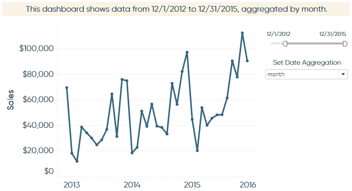
The first type of alert that I frequently use in my own dashboards communicates which dates are being displayed and, if I’m using a line graph, how finely the dates are aggregated (daily, weekly, monthly, etc.). This alert serves two key purposes: (1) it clearly communicates how current the data is, and (2) helps avoid confusion in the case that the data has not updated or a view doesn’t look as expected due to the aggregation. Here is an example using the Sample – Superstore dataset:
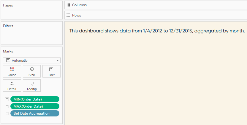
To create this alert, simply start a new worksheet and make a text-based view by adding the information you want included in the alert to the Text Marks Card. In this case, I added MAX(Order Date), MIN(Order Date), and the ‘Date Aggregation’ parameter. To add the two min and max dates, I right-clicked and dragged the ‘Order Date’ dimension onto the Text Marks Card, which allowed me to select the date field I wanted to display.
![]()
Continue reading with a free account, or login.
Unlock this tutorial and hundreds of other free visual analytics resources from our expert team.
Already have an account? Sign In
By continuing, you agree to our Terms of Use and Privacy Policy.
Once you have the information you want on the view, you can click into the Text Marks Card to format the text and written logic as you wish. At this point, your text sheet should look like this:
Finally, ensure the Order Date filter on your line graph is applied to this text sheet. This way, when an end user changes the date range, the MIN and MAX dates will change to match the filter.
How to Change Date Aggregation in Tableau Using Parameters
Alert 2 – Dynamic labels
Wouldn’t it be great if mark labels only showed up when something extra important happened? This is actually straightforward in Tableau. The trick is to build your logic for what’s “extra important” in a calculated field, then use that calculated field as your label. Using the same sales over time example from above, here’s a look at dynamic labels in action:
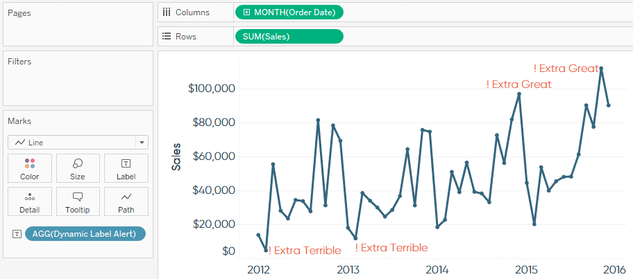
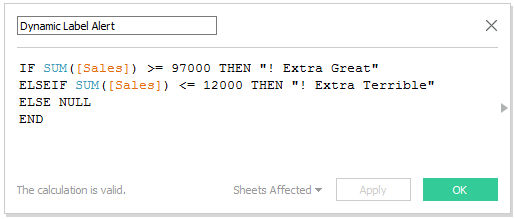
Notice that I have placed a calculated field called ‘Dynamic Label Alert’ on the Label Marks Card. Here is the underlying logic for that calculated field:
This is a simple example, but you can code the logic in the calculated field to alert you when anything important to you occurs. Perhaps you want to know when a goal is met or if any marks are outside of one or two standard deviations from the mean.
Alert 3 – Heat map dashboard with optional Tableau Server email
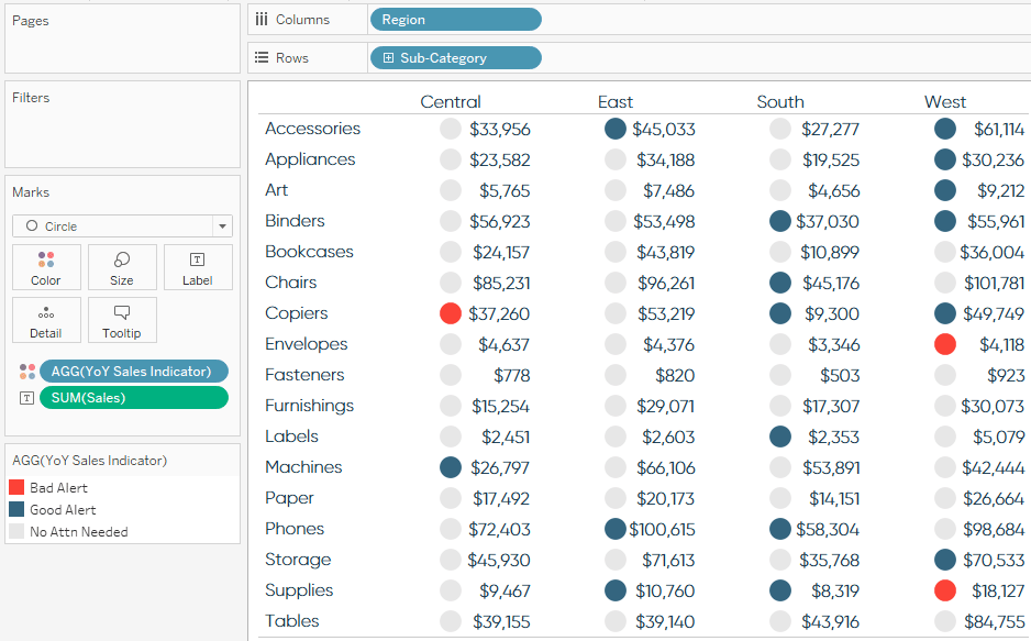
In the third dashboard alert example, we will again leverage calculated fields. Only this time, instead of adding our logic of interest to the Label Marks Card, we will add it to the Color Marks Card – creating a heat map that immediately draws attention to our best and worst performing segments.
![]()
Let’s imagine a C-Level executive has requested a dashboard showing the sales by region and product sub-category. They normally receive this information in a spreadsheet, but Tableau allows us to add value by immediately surfacing the most pertinent information. We decide to add value to the existing crosstab by alerting the executive in-line with the raw numbers whether the sales for a particular segment are at or below 40% of last year’s sales or at or better than 160% of last year’s sales. This logic looks something like this under the hood:
IF [YoY Sales Index] <= 40 THEN “Bad Alert”
ELSEIF [YoY Sales Index] >= 160 THEN “Good Alert”
ELSE “No Attn Needed”
END
Once this calculated field is created, you can add it to the Color Marks Card and change the mark type to Circle, creating a view like this:
A high-level dashboard like this can be subscribed to in Tableau Server or Tableau Online, dropping the most current overview in you or your executive’s inbox every morning or week. From here, they can decide for themselves based on the alerts if they need to click through to a more robust, interactive dashboard on Tableau Server or Tableau Online for further analysis.
Note that this type of alert dashboard can be coded to any comparison you wish, such as performance compared to a goal, competitor, or date range. If you are comparing relative dates year over year (such as “last week”), use Week Number or an equalized date to ensure there is data in both years.
This chapter shared just three ways to add alerts to your dashboards, but the possibilities are almost limitless. Experiment with elements of these three approaches to design the alerts that make the most sense for your business and stakeholders.
Thanks for reading,
– Ryan


Written By
Ryan Sleeper
Related Content
Dashboard Element 3: The Signature Line with Data Status Alert
As discussed in the triple crown framework, the practice of data visualization is very much a psychological exercise. If you…
How to Add a ‘Filter in Use’ Alert to a Tableau Dashboard
As I am constantly touting the benefits of data visualization and Tableau, I regularly have conversations with the objective of…
Tableau UI Tip 2: Alert-Style Splash Page with Cross Dashboard Filters
In the post, 3 Ways to Add Alerts to Your Dashboards, the third idea is to create a “heat map…