Tableau UI Tip 2: Alert-Style Splash Page with Cross Dashboard Filters
In the post, 3 Ways to Add Alerts to Your Dashboards, the third idea is to create a “heat map dashboard” meant to highlight data points of interest to the viewer. An alert-style splash page like this provides the benefit of not making your end users work too hard before deciding if they should dig deeper. If using Tableau Server or Tableau Online to subscribe to the view, they may decide that nothing needs further investigation and not interact with the dashboard at all.
Of course, if you went through the trouble of making a dashboard to monitor the performance of a particular business objective, insights are likely to emerge fairly regularly. At that point, you have a lot of control in designing the dashboard user interface in a way that helps the end user take the next step as efficiently as possible. This post shows you how to make an alert-style splash page, or dashboard introduction, and two ways to link in to deeper analyses.
This is the second in a series of five posts about improving the user interface of your Tableau workbooks. For future Tableau tips, subscribe for weekly updates.
How to make an alert-style splash page with cross dashboard filters in Tableau
To help illustrate the following UI approaches, we will be using this variation of the Super Sample Superstore dashboard.
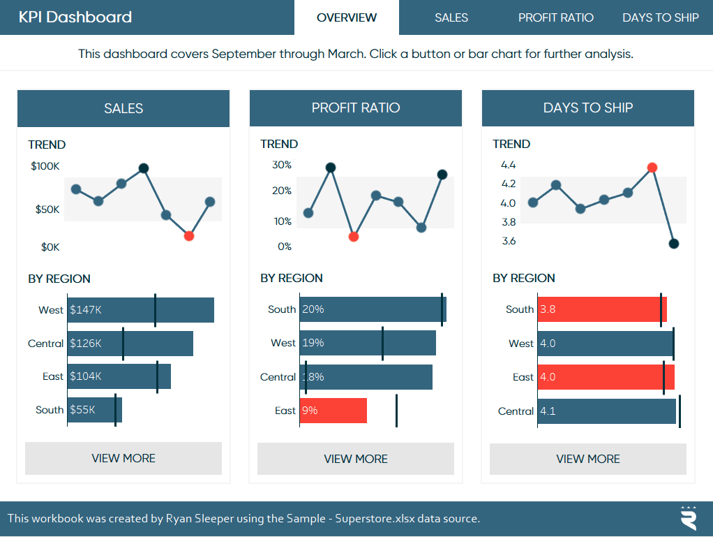
In this version, the end user lands on a ‘splash page’ that shows the performance by region and trend for each of our three KPIs: Sales, Profit Ratio, and Days to Ship. This is a very high-level descriptive view meant primarily to alert the end user when something deserves further investigation. Note that I carried over a similar menu at the top of the dashboard as described in the first UI tip, How to Create a Custom Top Navigation in Tableau.
![]()
Continue reading with a free account, or login.
Unlock this tutorial and hundreds of other free visual analytics resources from our expert team.
Already have an account? Sign In
By continuing, you agree to our Terms of Use and Privacy Policy.
Now in addition the top navigation, there is a button inline with each KPI widget to prompt the user to take further action. This is a slightly better user experience because they don’t even have to think about which button at the top would be most appropriate to find the additional context they are looking for. You, as the dashboard author, determine what happens when a button is clicked. This means you control the flow of the analysis even when you aren’t there to walk the viewer through it. For a refresher on this tactic, see How to Add a Button to a Tableau Dashboard.
But wait – there’s more!
If I were analyzing the dashboard above, a few things would stand out to me. Sales is in good shape period over period across regions. There are a few positive and negative anomalies in all three KPIs. Days to Ship was a bit of a mixed bag across regions, but no dramatic spikes that I should investigate. But there is one thing bugging me…
Profit Ratio in the East region is way down.
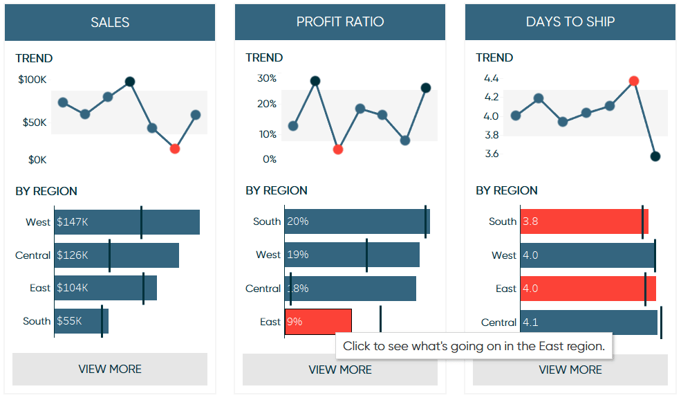
If I were to click the View More button, I would be taken to the Profit Ratio dashboard, but I would have to make a few more clicks to see what’s going on in the East region. Or with Tableau, I can add a dashboard action that both navigates me to the Profit Ratio dashboard and filters it to the East region.
What I typically do when executing this tactic is to add a call to action as the tooltip. Here’s how it may look when hovering over the point of interest:
Next, to deliver on that call to action when the region is clicked, I add a Filter dashboard action that runs on Select. The trick here is to change the target sheet to the destination dashboard. For purely illustration purposes, I’ll set the destination to be the descriptive dashboard in the Super Sample Superstore dashboard.
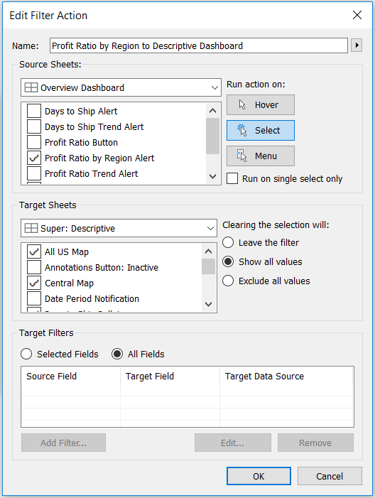
Note this can be refined to filter specific sheets on the destination dashboard as well as specific fields. Now clicking on the East region navigates me to the Descriptive dashboard and filters it to the East region.
I know it’s working because all maps at the top were filtered to the East region and I only see one circle in the dot plots at the bottom. This was just to illustrate the technique, but of course, you can decide where to navigate the end user and if the action should filter or highlight the dimension member on some of the target sheets.
Thanks for reading,
– Ryan

Written By
Ryan Sleeper
Related Content
How to Make a Mobile Splash Page in Tableau


As creators, we can use splash pages to inform dashboard users of something that may affect their journey. In the…
Tableau UI Tip 5: Intro-Style Dashboard with Cross-Dashboard Navigation
I have to admit that I have yet to use Tableau’s story points feature in any of my consulting engagements.…

Ryan Sleeper
Discovery, Descriptive, Prescriptive, and Predictive Analytics Ryan discusses the spectrum of analytics you can do in Tableau, his observations on…