Tableau UI Tip 5: Intro-Style Dashboard with Cross-Dashboard Navigation
I have to admit that I have yet to use Tableau’s story points feature in any of my consulting engagements. The spirit of the feature is great, and when it was released I was excited by the prospect of replacing PowerPoint to share my data stories. But the reason I don’t personally use story points stems from my point of view that getting the point across in the first screen is your best chance at causing an impact. I believe that most users simply will not click through multiple pages to figure out what you’re trying to tell them – rather I recommend cross-dashboard navigation in Tableau.
That being said, I also believe in providing context / set-up for dashboards and – as you’ve seen in the prior posts in this series – strategically breaking up views into their own dashboards and/or workbooks. This post shows you how to make a variation of story points to introduce a dashboard and improve the chances of your end user flipping through interior workbook pages.
This is the fifth and final post in a series about improving the user interface of your Tableau workbooks. For earlier installments, see tutorials on top navigation, alert-style splash page, menus, and passing filters or parameters.
Intro-style dashboard with cross-dashboard navigation in Tableau
For one example of an intro-style dashboard, take a look at the Kansas City Tableau User Group’s, Does Education Really Matter?. This was the winning entry in the 2016 War of TUGs data visualization competition.
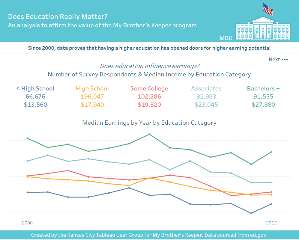
This workbook was meant to reaffirm that the My Brother’s Keeper program is an important program to keep intact. One of several aspects I like about this entry in the contest is that while the workbook contains several pages, they didn’t “bury the lead”.
![]()
Continue reading with a free account, or login.
Unlock this tutorial and hundreds of other free visual analytics resources from our expert team.
Already have an account? Sign In
By continuing, you agree to our Terms of Use and Privacy Policy.
The first dashboard in the workbook asks one clear question at the top, “Does Education Really Matter?”. That question is followed by one clear caption that answers the question, “Since 2000, data proves that having a higher education has opened doors for higher earning potential”. Then the visuals on the dashboard illustrate that there is a clear correlation between education-level and salary.
This introduction works because the main insight is provided right up front which causes it to provide value on its own as a standalone dashboard. Only then, if the end user is compelled to learn more, they have the option to use the “Next •••” button, which takes them to the next ‘page’ of the ‘story’.
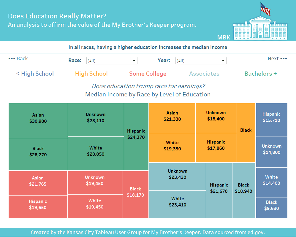
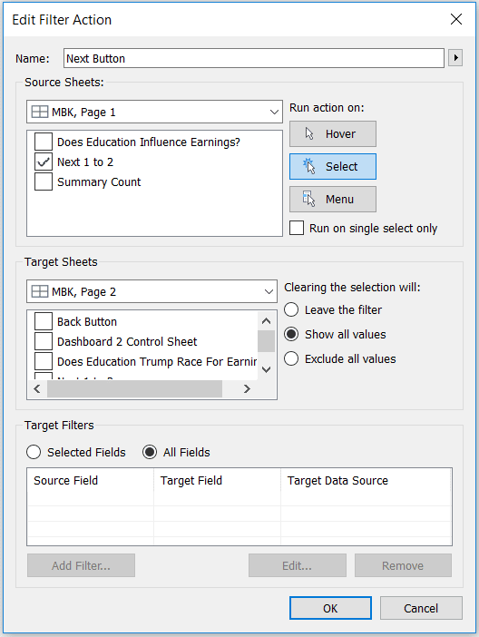
Note that the interior pages contain both “••• Back” and “Next •••” buttons so the end user can flip through the pages in both directions. The bullet characters in the buttons are another example of using alt-code characters to enhance your Tableau dashboards and the buttons can be created with this tutorial about how to add a button to a Tableau dashboard. Only instead of using a URL dashboard action, use a Filter dashboard action that takes the end user to the correct dashboard in the workbook. Here’s how the dashboard action for the first button looks.
Another introduction-style dashboard that can work well is what I call a “welcome mat”. I don’t have any examples from my Tableau Public portfolio, so instead I’ll give a hat tip to the first person I can remember using this technique, Matt Francis. If you’re so inclined, I’m sure my friend would appreciate if we started calling this a “Welcome Matt”.
<pause for laughter>
![]()
Matt has several of these, so I’ll just share one recent example:

The sole purpose of this welcome mat style dashboard is to set up the story and draw the end user in. Also note that Matt has elegantly executed a story points workbook with the navigation at the top.
Some last thoughts on user interface and experience to close the series…
Whether you are using story points or the variation offered in this post, I recommend that your storytelling arc follow the shape of a martini glass. This is when you offer something of value up front, walk the end user through contextual points, and then open up the analysis for self-exploration at the end. Imagine a martini glass laying on its side. The wide mouth of the glass is the main event and draws you in (the opening), the stem is the long, flat interior (the context) that connects to the base, which opens up again to almost the same size as the mouth (the self-exploration).
Thanks for reading,
– Ryan

Written By
Ryan Sleeper
Related Content
3 Simple Ways to Improve the UX of Your Dashboards

At Playfair Data, we pride ourselves in improving the UX of dashboards to transform raw data into powerful insights. To…

Ryan Sleeper
Link Tableau dashboards with a seamless navigation menu This video shows you how to create a user-friendly navigation experience by…
Ryan Sleeper
Filter, Highlight, Go to URL, Go to Sheet, and Change Set Values Bring your Tableau dashboards to life by coding…