Tableau 201: How to Make Dumbbell Charts
Tableau dumbbell charts, also known as DNA charts, are an alternative visualization choice for illustrating the change between two data points. Dumbbell charts get their slang name from their appearance, which look similar to weights, and sometimes strands of DNA, when they are in a horizontal orientation.
I personally love that there is an outside-of-the-box chart type that isn’t named after a delicious food such as donuts or waffles. You may even say that dumbbell charts are a healthy alternative…
Names aside, this is another chart type that I find to be engaging, effective, and relatively easy to create in Tableau. This tutorial will illustrate how to make a dumbbell chart in Tableau in just a few steps.
Tableau dumbbell charts are actually dual-axis combination charts, where one of the axes have a mark type of circle and the other has a mark type of line. If you are unfamiliar with using two axes in Tableau, it may be helpful to read How to Make a Dual-Axis Combination Chart in Tableau before reading further.
Video complement: Two Ways to Make Dumbbell Charts in Tableau
FAQs answered in this post:
What is a dumbbell chart and when should I use it?
A dumbbell chart, also called a DNA chart, visualizes the change between two data points by connecting them with a line, creating an appearance similar to weights or DNA strands. Use dumbbell charts to compare two time periods, highlight year-over-year changes, or show before-and-after scenarios where magnitude and direction of change matter. They’re particularly effective for period-over-period performance comparisons across multiple categories, making trends and outliers immediately visible.
How do I create a dumbbell chart in Tableau?
Create a dot plot by placing your measure on Columns and dimension on Rows, then change the mark type to Circle. Add a second occurrence of your measure to Columns, right-click it and select Dual Axis, then synchronize the axes. Change the second marks card to Line mark type and drag your date dimension to the Path property. This creates the connected circles that form the dumbbell appearance.
What is a dual-axis combination chart in Tableau?
A dual-axis combination chart layers two measures on the same view using different mark types, allowing you to display multiple visualizations simultaneously. Dumbbell charts are dual-axis charts combining circles and lines, while other common combinations include bars with lines or area charts with reference lines. Always synchronize your axes by right-clicking the secondary axis and selecting Synchronize Axis to ensure accurate visual comparisons.
Should I use horizontal or vertical orientation for dumbbell charts?
Horizontal orientation works best for dumbbell charts when comparing many categories, as it accommodates long dimension labels and follows natural left-to-right reading patterns. Vertical orientation can work for fewer categories or when emphasizing magnitude over time progression. To switch orientations, simply swap the fields on your Rows and Columns shelves, though horizontal remains the more common and readable choice.
How can Playfair Data help implement advanced chart types in Tableau?
Playfair Data specializes in advanced Tableau engineering including dual-axis charts, custom visualizations, and creative chart types like dumbbell charts that engage stakeholders and highlight insights effectively. Our experts teach techniques for period-over-period comparisons and combination charts that elevate dashboard quality. Schedule a strategy call to learn how our Flagship Tableau training can help your team master advanced chart types and visual storytelling techniques.
How to make Tableau dumbbell charts
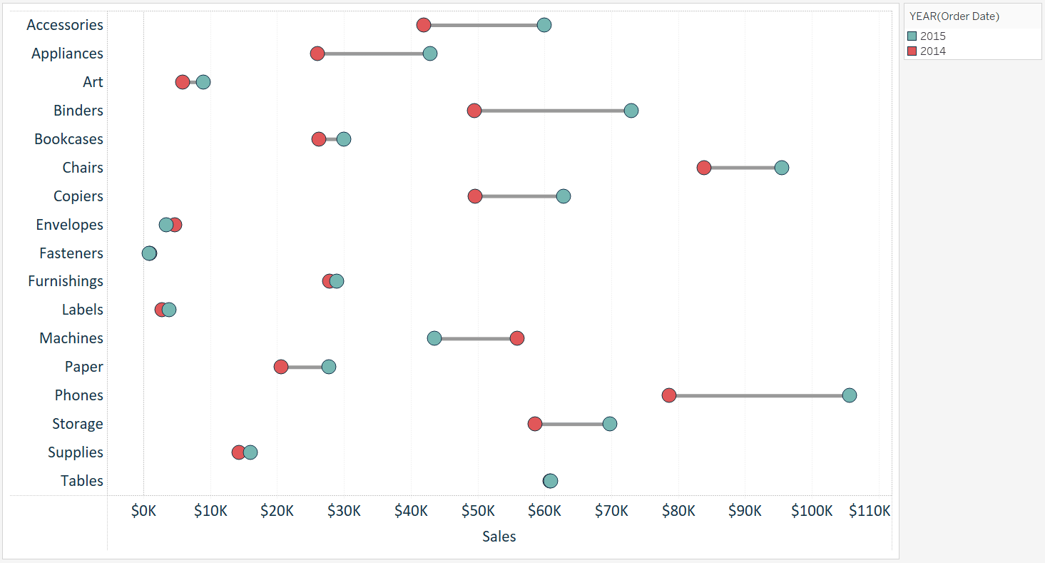
For this tutorial, we will recreate this visualization which compares the year-over-year sales per sub-category in the Sample-Superstore dataset.
The first step to creating a dumbbell chart in Tableau is to create a dot plot with the measure and dimension you want to visualize. In this example, I will place the Sales measure from the Sample – Superstore dataset onto the Columns Shelf and the Sub-Category dimension onto the Rows Shelf. This creates a sales by sub-category bar chart that can easily be converted to a dot plot by changing the mark type from automatic to circle.
![]()
I will also filter the visualization to the last two years in the dataset so that I have only two comparison points per sub-category, and also color the marks by year to distinguish which year is which. At this point, my view looks like this:

Note that this chart type can also be created with a vertical orientation by swapping the location of the fields on the rows and columns shelves, but we will stick with the horizontal orientation for this tutorial.
Continue reading with a free account, or login.
Unlock this tutorial and hundreds of other free visual analytics resources from our expert team.
Already have an account? Sign In
By continuing, you agree to our Terms of Use and Privacy Policy.
The second, and actually final, step is to create a second axis with the Sales measure and change its mark type to line. To turn this dot plot into a dual-axis combination chart, drag the Sales measure near the top of the chart, directly across from the sales axis on the bottom of the chart; when a dashed line appears, drop the measure on the view.
Alternatively, you can place a second occurrence of the Sales measure onto the Columns Shelf, right-click on the second pill, and choose “Dual Axis”. Ensure the axes always line up by right-clicking on the top axis and choosing “Synchronize Axis”.
![]()
At this point, you have two sets of marks cards (one for each occurrence of the Sales measure), and they can be edited independently. Navigate to the second set of marks cards, change the mark type to line, then drag the YEAR(Order Date) dimension on the marks shelf to the Path Marks Card.
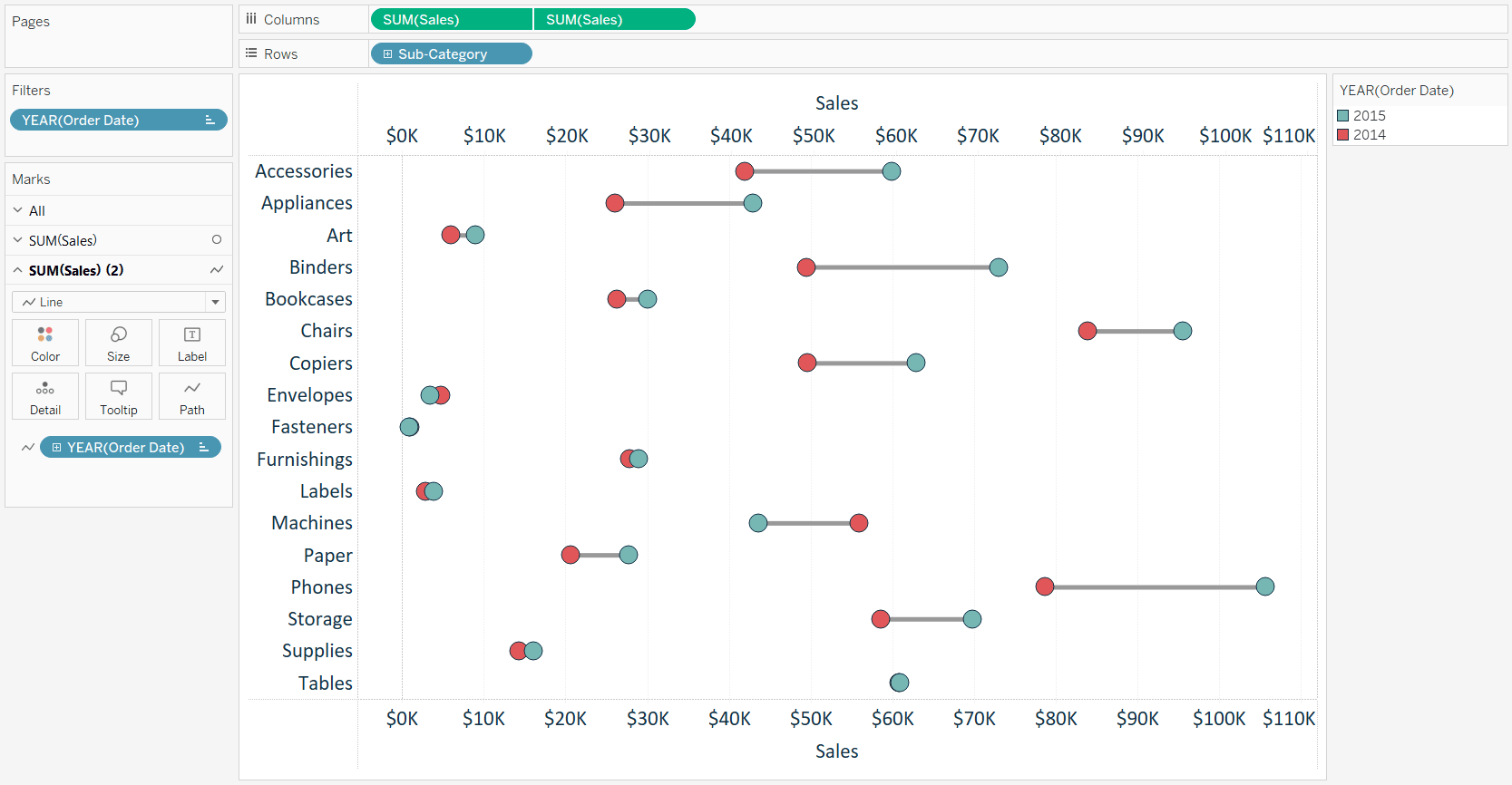
That’s all it takes to get to a nice looking dumbbell chart in Tableau. From here, you can format the size and color of the marks and hide the top axis by right-clicking on it and deselecting “Show Header”.
Thanks for reading,
– Ryan
This content is excerpted from my book Practical Tableau: 100 Tips, Tutorials, and Strategies from a Tableau Zen Master published by O’Reilly Media Inc., 2018, ISBN: 978-1491977316. Get the book at Amazon.


Written By
Ryan Sleeper
Related Content

Ryan Sleeper
Display period over period performance with custom shapes Dumbbell or DNA charts provide an engaging and practical way to display…
3 Ways to Normalize Data in Tableau


While performing data analysis, you might find yourself needing to transform your data to further unlock some insight. One way…
Ryan Sleeper
When we know the outcome vs. making our user part of the story Did you know there are two types…