Tableau Tip: How to Automatically Highlight the Latest Trends
This tutorial will illustrate how to add a highlighter to the most recent data point on a line graph, which will allow you to highlight trends in Tableau. This highlighter can also be dynamically colored to communicate that the latest trend was either positive or negative. This technique provides several benefits including (1) it helps orient your end users (2) communicates positive and negative performance changes at a glance and (3) enhances the dashboard design.
This is the first in a series of five “you are here” Tableau tutorials. These tips will help improve the user experience of your Tableau dashboards by helping guide your end users. Subscribe here to receive new updates.
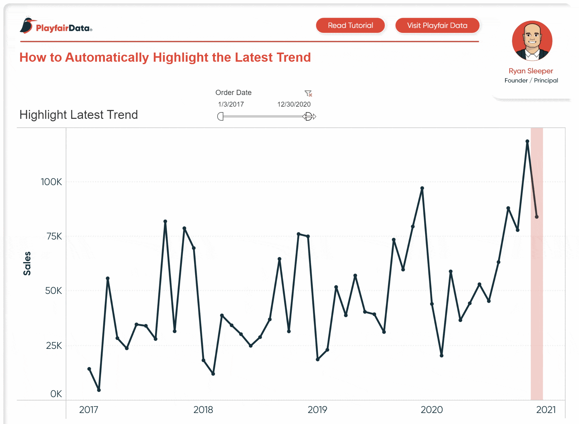
In order to highlight the latest trend, we will use this trick to highlight a dimension member in Tableau. Even though reference lines can be added to dates, we will need to get a little hackier to produce the effect we’re looking for. We will combine this trick with a calculated field to automatically turn the highlighter on for the most recent month in our analysis and color it to communicate a positive or negative change.
![]()
Continue reading with a free account, or login.
Unlock this tutorial and hundreds of other free visual analytics resources from our expert team.
Already have an account? Sign In
By continuing, you agree to our Terms of Use and Privacy Policy.
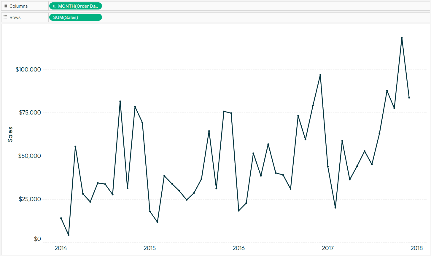
First, I’m going to lay the foundation for the chart by making a sales by continuous month line graph from the Sample – Superstore dataset.
Next, I’m going to create a calculated field which will eventually draw a bar for the most recent month being visualized. The formula is:
IF ATTR(DATETRUNC(‘month’,[Order Date])) = WINDOW_MAX(ATTR(DATETRUNC(‘month’,[Order Date]))) THEN 1 END
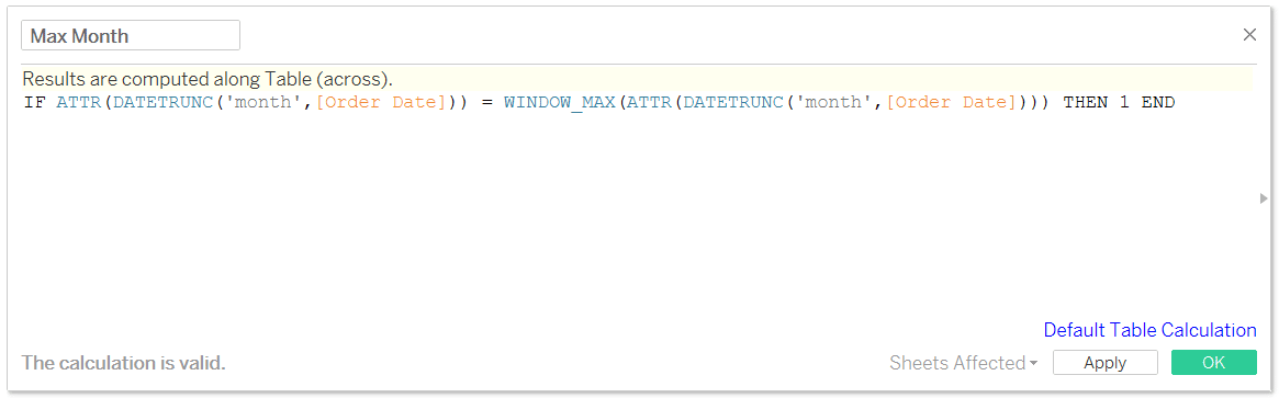
It looks like we’re getting a little complex, but this formula simply causes Tableau to look at each month in the line graph and determine if it matches the latest month. When it matches, it shows the number 1 which will be used in the next step. Since this is a table calculation, I had to use the ATTR function to aggregate the dates.
Next, put the newly created Max Month calculated field on the Rows Shelf.
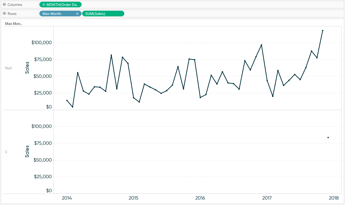
Change Max Month to continuous by clicking on its pill on the Rows Shelf and choosing “Continuous”.
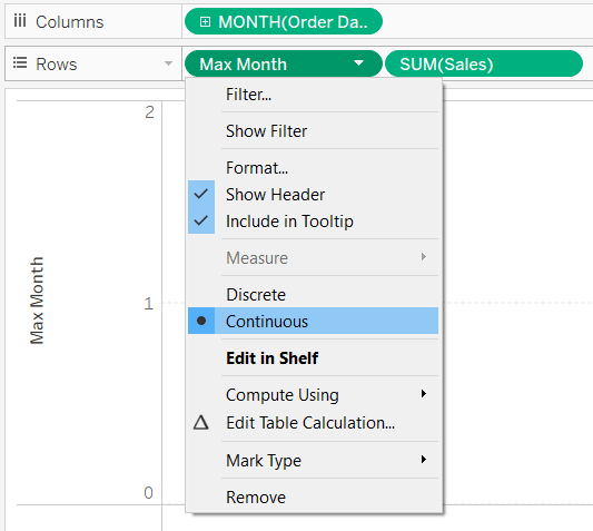
Now that both measures on the Rows Shelf are continuous, they can be combined into a dual-axis combination chart. Yes; this is application #238 or so for this feature. Here are just a few of the ways I use dual-axis combo charts in Tableau.
After converting the view to a dual-axis chart, you can change the mark type of the measures independently of each other. For this example, I’ll change the mark type for Max Month to Bar.
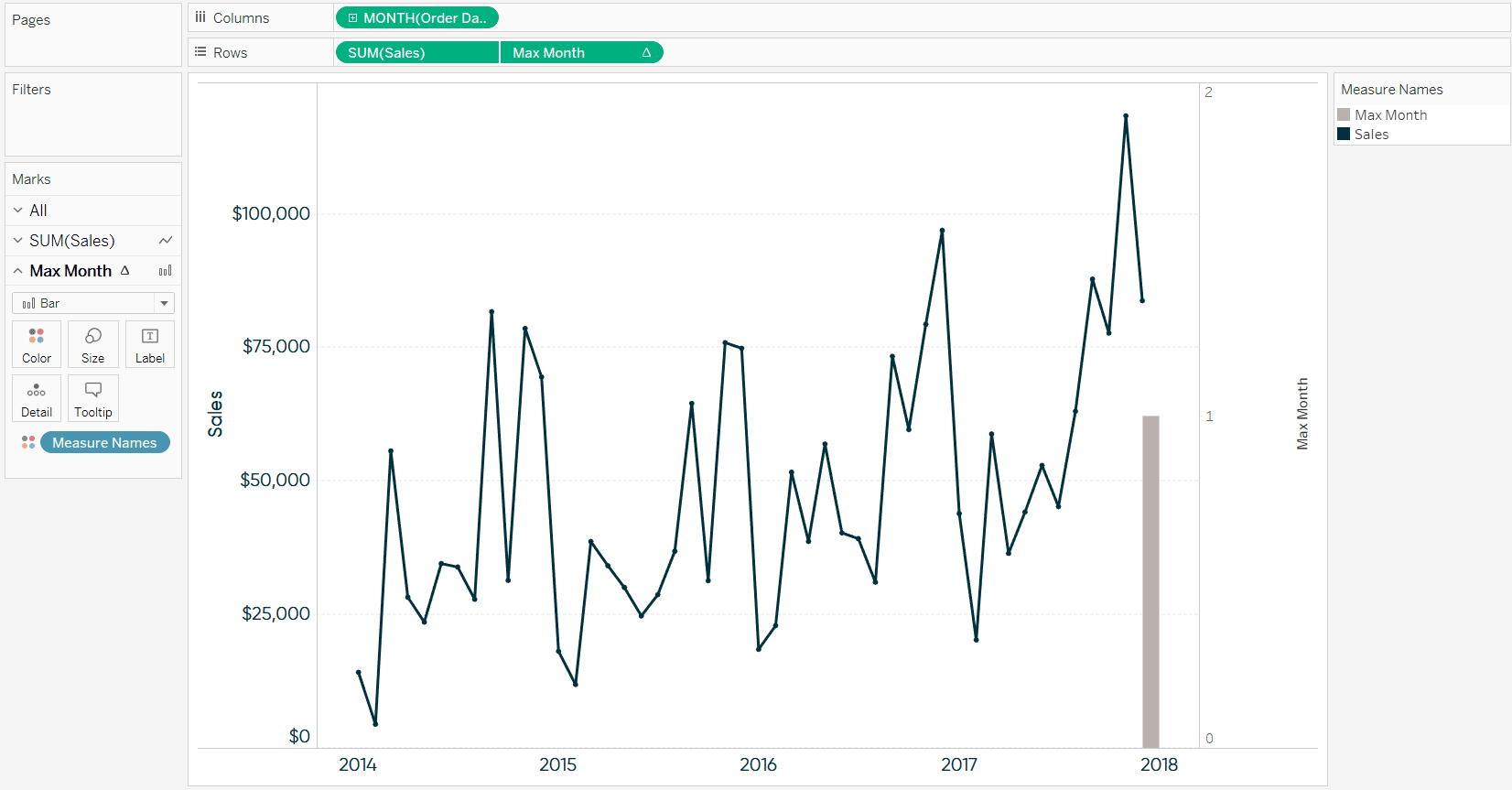
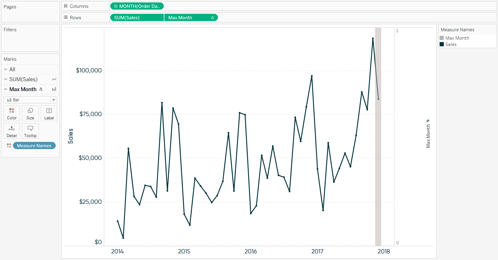
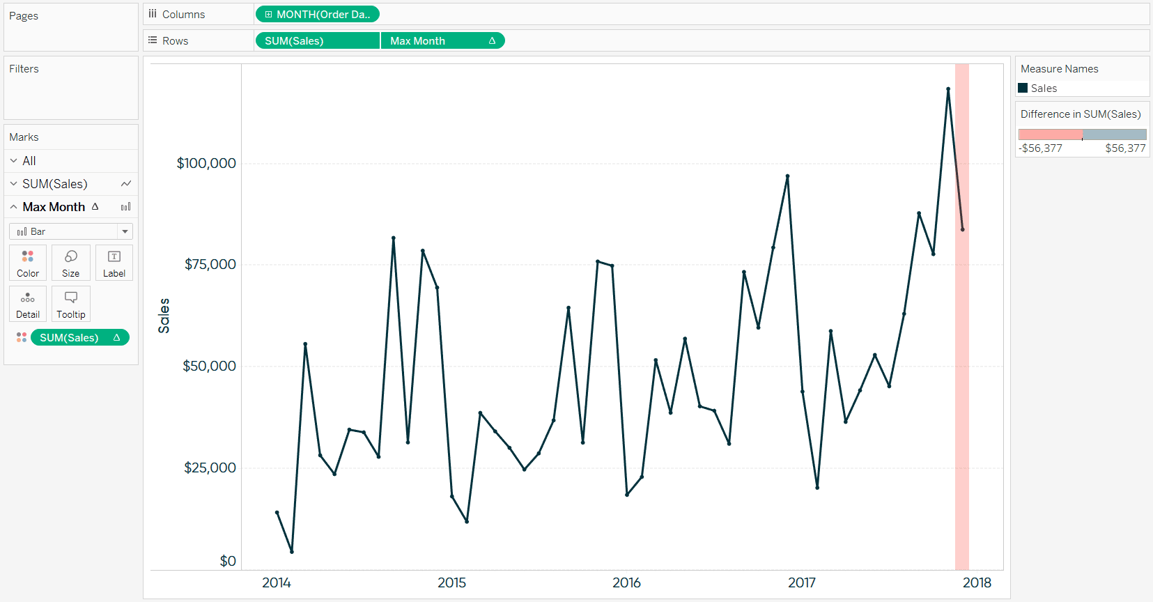
At this point, the bar will always show up on the latest month in the view, even when the dates are filtered or if you’re using a relative date filter to always display data through the latest full month. Before we add color, there are a couple of formatting changes I’d like to do. First, I’ll fix the right axis from 0 to 1 by right-clicking on the axis, clicking “Edit Axis…”, and fixing the start and end. Also, I’ll make the bar evenly distributed around the latest point on the line graph by clicking its Size Marks Card, choosing “Manual”, and increasing the width of the bar. Lastly, I’ll increase the transparency of the bar by clicking the Color Marks Card and sliding the opacity slider to the left.
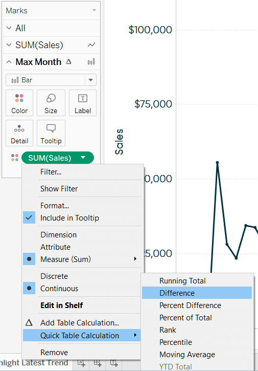
To color the bar, place the measure being evaluated on the Color Marks Card for the bar; in this case Sales. Then add a Quick Table Calculation that computes the month over month difference in sales.
This will work as is, but I usually change the color mapping so that anything positive is one color and anything negative is another color. You can do this by double-clicking the color legend, changing the steps to 2, and forcing the center to be 0 (under the advanced options). The last thing I do is hide the right axis for Max Month by right-clicking on the axis and unchecking “Show Header”.
![]()
Now whenever the most recent month had a negative month over month performance, a red highlighter will show up:
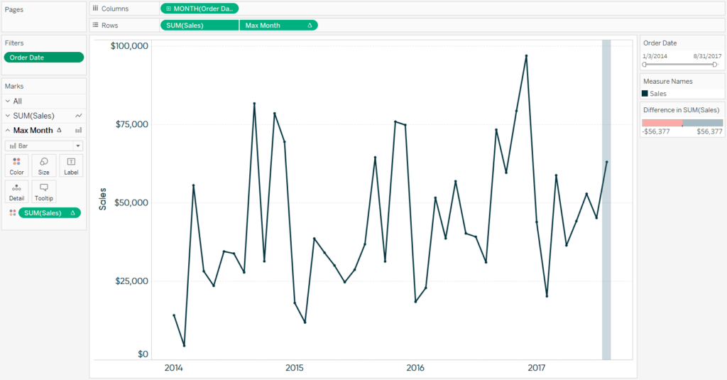
But even if the view is filtered to an older month or our data gets refreshed next month, the highlighter will automatically be displayed on the latest data point and colored based on month over month performance. Here’s an example when I filtered the dataset through August 2017.
Thanks for reading,
– Ryan

Written By
Ryan Sleeper
Related Content

Ryan Sleeper
Encode Entire Trend Charts with a Single Comparison Have you seen stock ticker gauges that show a full trend line…
3 Innovative Ways to Highlight Selections in Tableau

In this tutorial I will demonstrate three ways to use different mark types with transparent sheets to highlight a selection…
How to Highlight the Highest and Lowest Points in Tableau
In my post, Why do you visualize data?, I share my personal exercise for illustrating the benefits of data visualization.…