Tableau Tip: How to Do Better Sheet Swapping
I’ve shared before how to allow your audience to decide which chart type is being shown on a view. This is a well-known tactic known as ‘sheet swapping’ because you use parameters to control which sheet is being ‘swapped’ into the view in Tableau. This approach is still valid and has been made better with the introduction of parameter actions but is relatively tedious to set up.
If you are only wanting to switch between two views, there is now a much more elegant and user-friendly way to provide this experience. For example, you may want to allow your users to flip between visualizations and text tables with the raw data. This post will show you how to use layout containers to do better sheet swapping in Tableau.
This content is excerpted from my book, Innovative Tableau: 100 More Tips, Tutorials, and Strategies, published by O’Reilly Media Inc., 2020, ISBN: 978-1492075653. Get the book at Amazon.
How to do Sheet Swapping with Tableau Layout Containers
Set up the foundational layer for Tableau sheet swapping
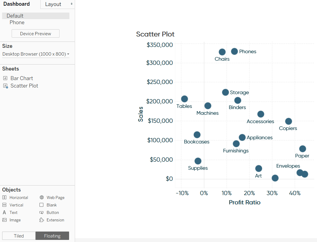
For this tutorial, we will allow a user to toggle between a scatter plot and a bar chart showing the underlying data for each dimension member in the scatter plot. To begin, place the primary sheet on a dashboard. For best results, make the sheet floating so that you can control its exact location and dimensions. Here’s how my scatter plot looks after adding it as a floating sheet with dimensions of 500 by 500 pixels.
Continue reading with a free account, or login.
Unlock this tutorial and hundreds of other free visual analytics resources from our expert team.
Already have an account? Sign In
By continuing, you agree to our Terms of Use and Privacy Policy.
Add a floating container
Next, drag a horizontal or vertical layout container onto the view. This object should be floating and have the exact same dimensions and x / y coordinates as the primary sheet.
These settings can be changed by navigating to the Layout pane on the left-side of the interface.
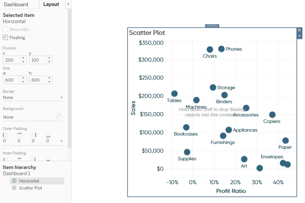
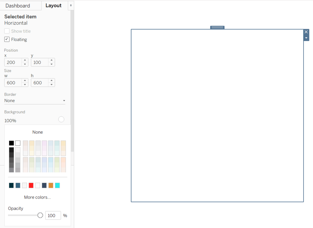
For best results, make the background color of the layout container the same color as the rest of the dashboard. The background color settings are also found on the Layout pane.
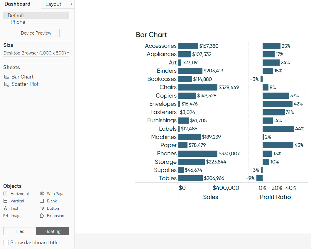
Now, place the secondary sheet that will be toggled on and off inside of the layout container.
Add a Show/Hide button to the container
Your keen intuition is likely telling you that you can no longer see the scatter plot because the bar chart is covering it. Here is where the magic happens. As of Tableau 2019.2, you can toggle layout containers on and off. If we can turn off the container with our bar chart, we would again be able to see the scatter plot. If we can then toggle the container with the bar chart back on, we would be able to navigate our user back to the raw data for the scatter plot.
To toggle containers on and off, select the container, click the down arrow that appears in the top-right corner of the object, and choose “Add Show/Hide Button”.
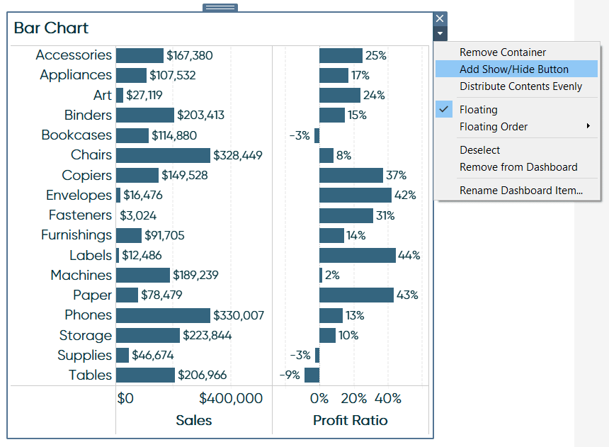
A new object will appear with an image of a “X”. This is now a button that can be used to toggle the container with the bar chart on and off! You can test this experience by going to presentation mode by clicking the projector icon in the top ribbon and clicking on the button. By default, when the container is on, you will see the X to turn off the container; when the container is closed, you will see a hot dog menu to turn the container back on.
What’s better is Tableau allows you to customize the images used for both the toggled on and toggled off states of the container. This allows us to provide a slick user experience by, in this case, displaying a bar chart icon when the container is turned off and a scatter plot icon when the container is turned on. This implies to the user that they can click the icon to swap in the respective chart. To access these options, select the newly added Show/Hide button (outside of presentation mode), click on the down arrow that appears to access more options, and choose “Edit Button…”.
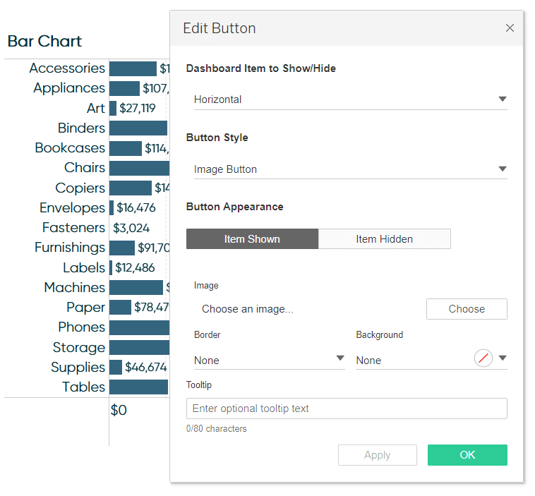
Customize the sheet swapping user experience in Tableau
To select an image for the toggled on state, click the Choose button under the Image settings.
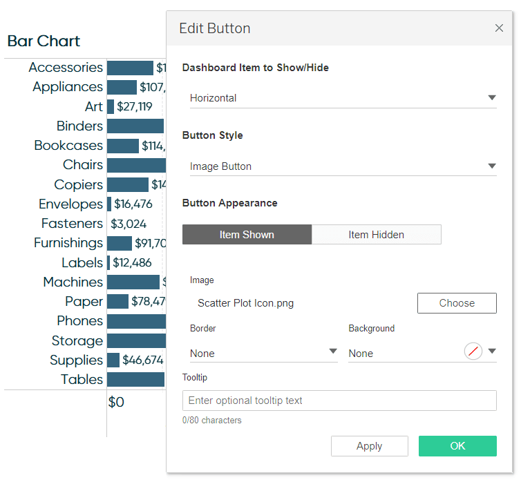
To select an image for the toggled off state, click Item Hidden under Button Appearance, then click the Choose button under the Image settings.
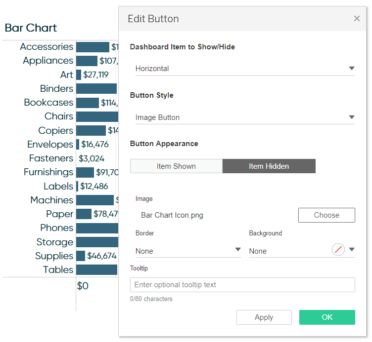
Accept the settings by clicking the green OK button.
This newly added Show/Hide button is its own floating object, so just like the scatter plot sheet and horizontal layout container I’ve added, I can change its precise size and location by modifying the settings on the Layout pane. Here’s how my view looks after resizing the Show/Hide button and moving it more in line with my visualizations.
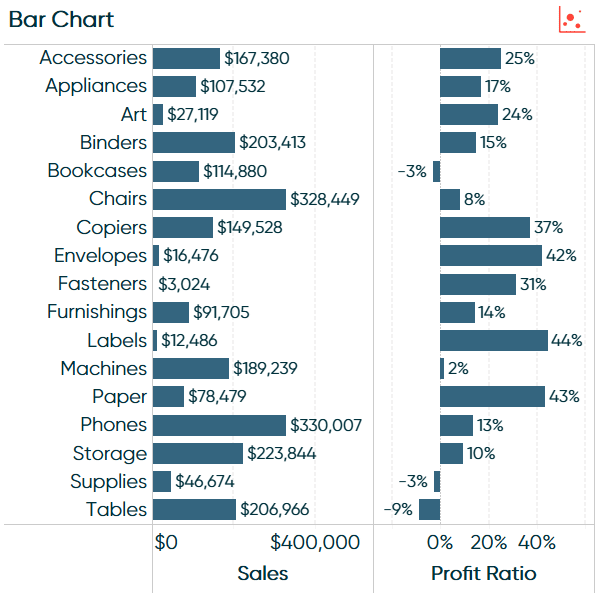
This view has the layout container turned on and the scatter plot icon button will toggle the container off.
After clicking on the scatter plot button within presentation mode (or once this is published to Tableau Server or Tableau Public), the container is turned off, revealing the scatter plot below, and the toggle off button has now turned to the bar chart button to turn the container back on.
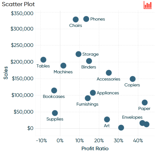
We’ve just used a new approach to sheet swapping that allows the user to go back and forth between a primary scatter plot view and a bar chart illustrating underlying detail!
Thanks for reading,
– Ryan
Related Content
How to Do Better Sheet Swapping with Tableau’s Dynamic Zone Visibility
Tableau’s “Dynamic Zone Visibility” – released with version 2022.3 – promises to be a game changer when it comes to…
Ryan Sleeper
Unlock Better User Experiences by Toggling Elements On and Off Tableau’s Show/Hide button allows you to turn off access to…
Ryan Sleeper
Drill from State to City (and Back!) on One View Learn how to use sheet swapping in Tableau to seamlessly…

