How to Let Users Choose Between Chart Types in Tableau
Data visualization allows you to look at the same data in different ways often leads to new insights (or storylines, if you will) and some end users will have their own preferences for how they want to look at data. Has anyone ever had to convert a data visualization to a crosstab view? I’ve shown before how to let your end users choose the dimensions and measures being displayed on a chart in Tableau. This post shows you how to allow your end users to choose the entire chart type being displayed. Both of these user experiences improve engagement and retention of insights.
3 Ways to Smooth the Excel Transition
How to let users choose between chart types in Tableau
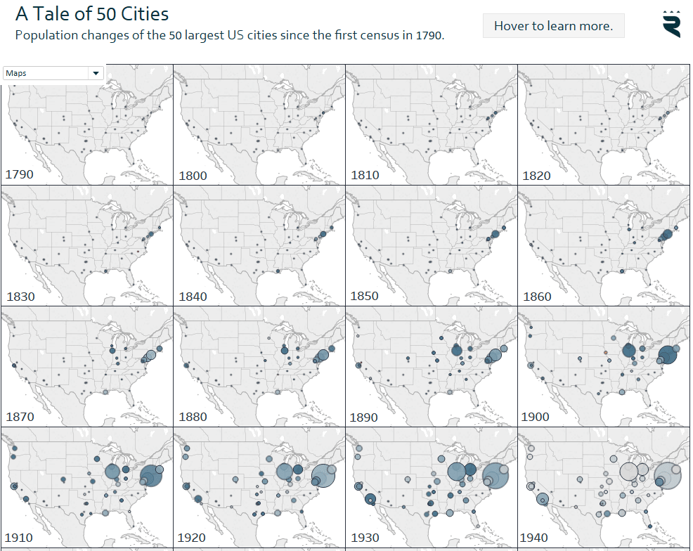
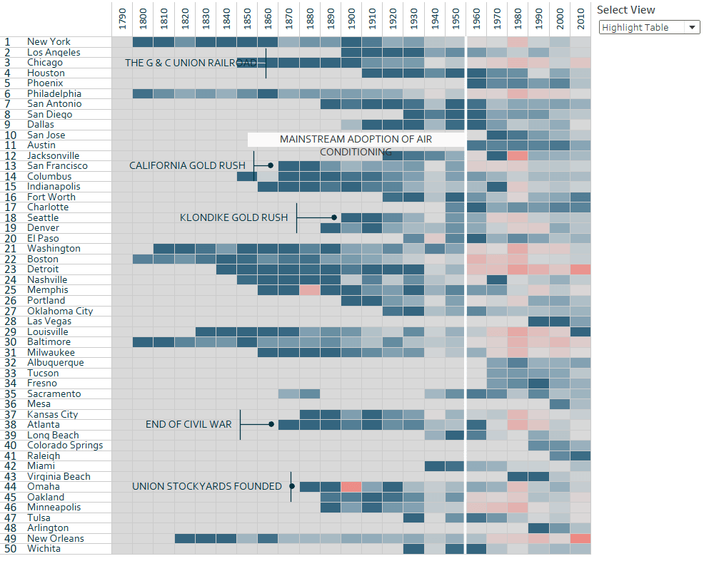
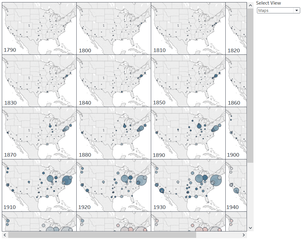
The trick to let your end users choose the chart type they want displayed involves a layout container – and as often the case with my Tableau tutorials – parameters. For the purposes of this tutorial, we will be recreating A Tale of 50 Cities. In the visualization, the end user has the option to toggle between a highlight table and small multiple maps seamlessly in a single view (note the filter in the top left corner of the chart).
[Click image to view interactive version]
First, make your individual views as you normally would. My example has a highlight table and a map view, but you can create more than two options.
![]()
Continue reading with a free account, or login.
Unlock this tutorial and hundreds of other free visual analytics resources from our expert team.
Already have an account? Sign In
By continuing, you agree to our Terms of Use and Privacy Policy.
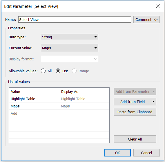
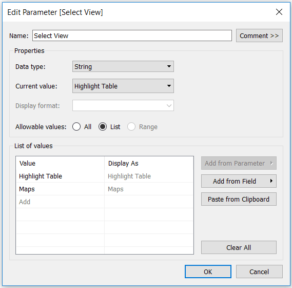
Next, create a string parameter with a list of choices that correspond with the individual views.
An Introduction to Parameters in Tableau
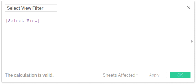
After creating the string parameter, create a calculated field that contains nothing but the newly created parameter. This formula will act as a binary; so the calculated field will either match the parameter selection or it won’t.
An Introduction to Calculated Fields in Tableau
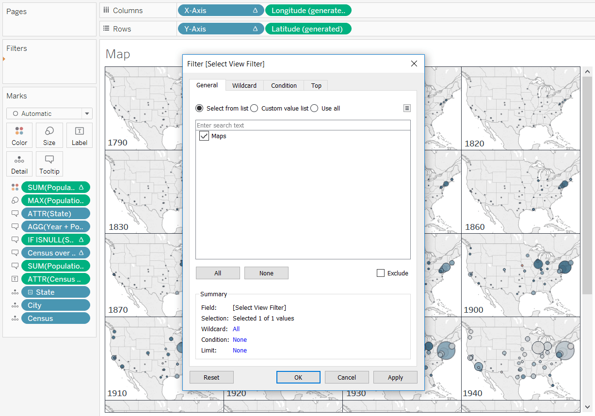
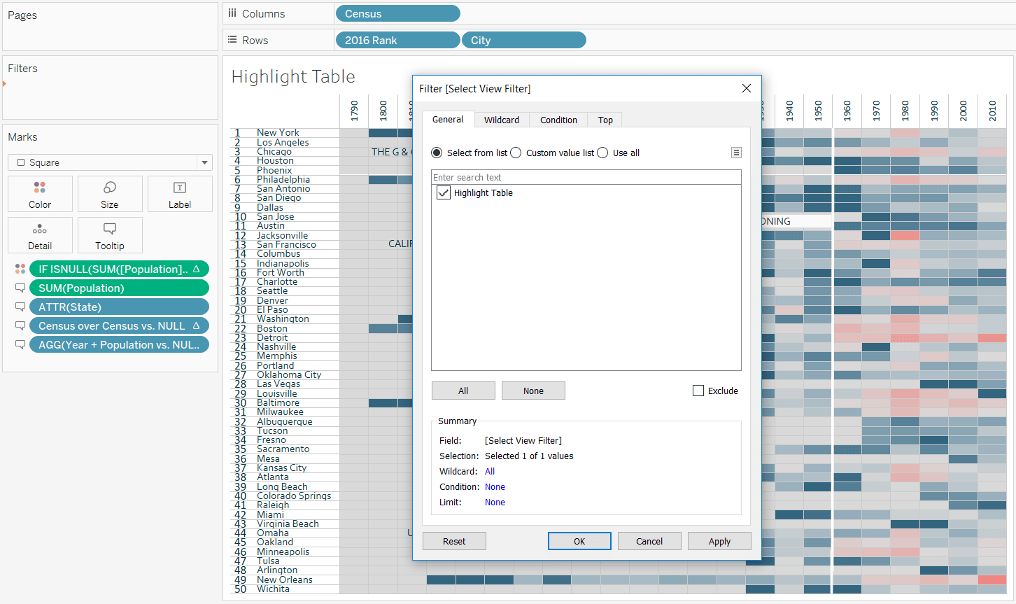
Now we will use this calculated field as a filter. In order to get this to work properly, you will need to change the value of the parameter to match the view you want displayed before adding the filter. As you can see in the image above where we set up the parameter, the current value of the parameter is “Maps”, so we can go ahead and add the Select View Filter calculated field to the filters shelf on the map view and check the box for Maps.
For the highlight table view, we will need to change the value of the parameter before adding the Select View Filter calculated field as a filter. This can be accomplished by right-clicking on the parameter, choosing “Edit…”, and changing the current value.
After changing the current value, you’ll notice the first view disappears. That means so far so good. Remember the filter is a binary, so if the parameter selection doesn’t match the calculated field, the view will be filtered out. Now that we’ve changed the current value to the second chart type, we can add the Select View Filter calculated field to the filters shelf on the second view (which is the highlight table in my case).
Now we have two individual views, one has a filter that will only show the view if “Maps” is the current value in the parameter, and the second has a filter that will only show the view if “Highlight Table” is the current value in the parameter. We’re now ready to set up the view.
This is where the magic happens. Set up a dashboard that contains a vertical layout container (which is where we’ll place the individual sheets).
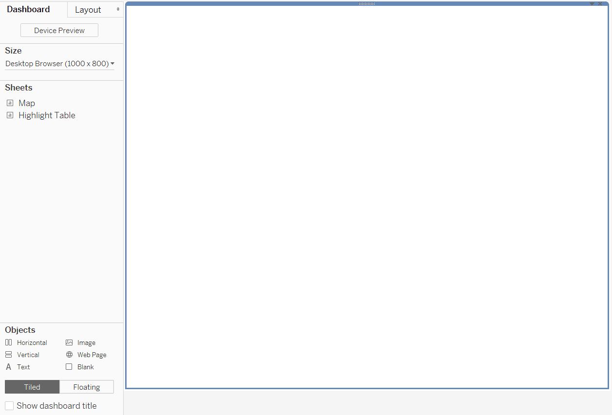
Now place both sheets into the layout container; one on top of the other. For best results, hide the titles by right-clicking on the sheet titles and choosing “Hide Title”.
You will notice that after adding the individual sheets to the layout container, only one view is shown. That’s because we are filtering the views, showing only the view that matches the parameter selection.
![]()
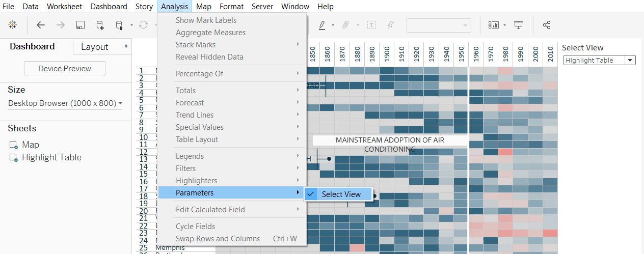
To make the parameter selection (i.e. choice of which chart to show) available to you and your end users, navigate to Analysis > Parameters and choose the parameter.
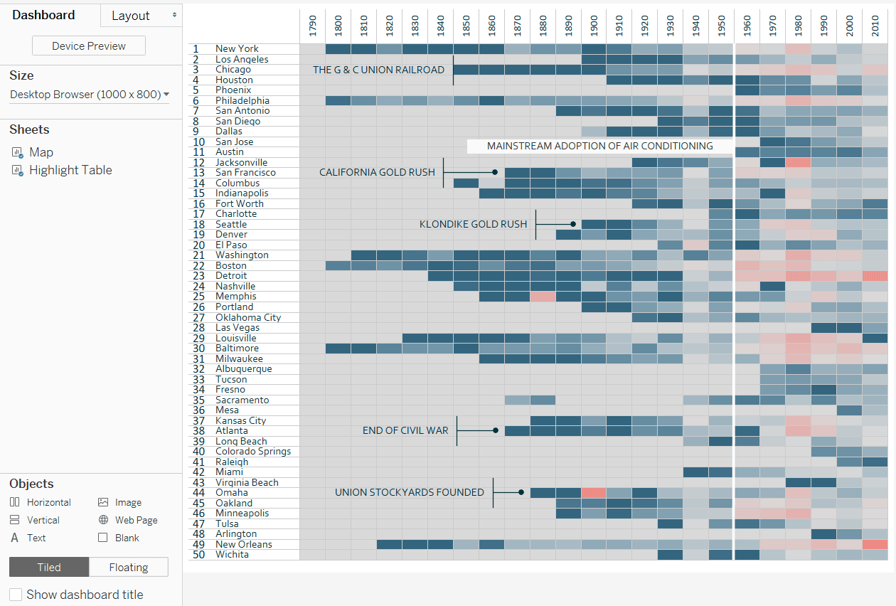
Now when you toggle between the parameter choices, only the appropriate chart will be shown. Here’s the view when “Highlight Table” is selected:
Here is the same view when “Maps” is selected:
I kept the default fits and dashboard dimensions to illustrate this tutorial, but from here, you can format the view, change the dimensions, float the parameter control, etc. to create your desired look and feel. As long as you keep the individual sheets in the layout container, the functionality will work. The only side effect is a small amount of white space added at the bottom of the layout container. With only two chart types, it’s hardly noticeable, but something to consider if you want to try this out with additional views.
Thanks for reading,
– Ryan

Written By
Ryan Sleeper
Related Content
How to Do Better Sheet Swapping with Tableau’s Dynamic Zone Visibility
Tableau’s “Dynamic Zone Visibility” – released with version 2022.3 – promises to be a game changer when it comes to…
How to Zoom Into Scatter Plot Quadrants in Tableau

Scatter plots are a great way to see a lot of individual data points and consider the bigger picture at…

Ryan Sleeper
Drill from State to City (and Back!) on One View Learn how to use sheet swapping in Tableau to seamlessly…