The Benefits of Data Visualization for Data Scientists

At Playfair Data, we have covered dozens of ways to visualize data, and shared our tips, tricks and best practices, but it’s important to note the benefits of data visualization. What’s the point of all this, and how can it help you? As our founder, Ryan Sleeper, puts it in Why Do We Visualize Data?, one of the primary benefits of data visualization is, “to find and communicate actionable insights”.
This post will dive into this idea and explore additional benefits that fall under the umbrella of actionable insights. Specifically, how data visualization can help you uncover hidden trends, patterns or problems, simplify your analysis, and tell a story with your data.
The benefits of data visualization: Categories of visuals
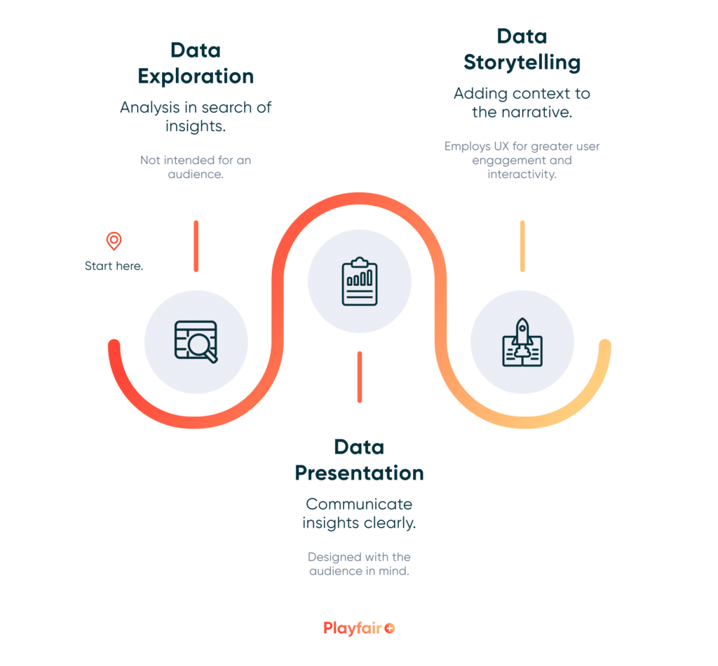
Before diving into the benefits of data visualization, I want to address what I think are the two main categories of visuals created by data scientists, data exploration and data presentation. Data exploration includes the visualizations we use behind the scenes to test ideas and hypotheses, explore data, and fine tune models and products.
Data presentation includes the visualizations we share with stakeholders, clients, or an audience without strong data literacy. These visualizations are the outcome of data exploration, and allow you and your audience to draw conclusions, which are ideally presented in a straightforward, easy to digest format. They clearly highlight trends and insights and do not require a specific skillset or knowledge base to understand. Depending on the end goal, these visualizations can be further categorized as data storytelling, a more dynamic interactive experience, which I will touch on later.
Continue reading with a free account, or login.
Unlock this tutorial and hundreds of other free visual analytics resources from our expert team.
Already have an account? Sign In
By continuing, you agree to our Terms of Use and Privacy Policy.
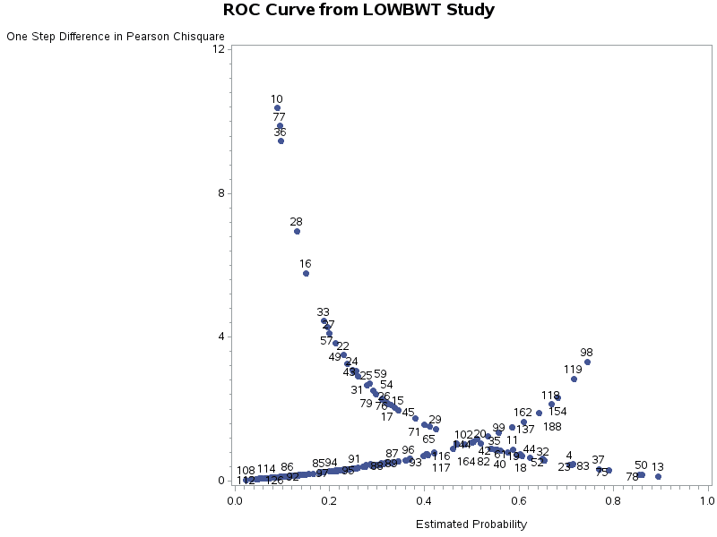
Uncover hidden trends and potential issues
In addition to working as a Visual Analytics Associate at Playfair Data, I am also currently a Masters student studying Statistics and Data Science. So, it’s fair to say data visualization has been a huge component of both my academic and professional journeys. It has been a required skill to learn and use in my courses and an integral tool for study and research.
Data visualization has also proved invaluable when performing model building and cluster analysis in R. When working with a large dataset, it is often helpful to perform cluster analysis during the data exploration phase. The below output from R visualizes the accuracy of different model types using the “BIC” statistic on the y-axis, and the numbers of clusters, or components, on the x-axis.
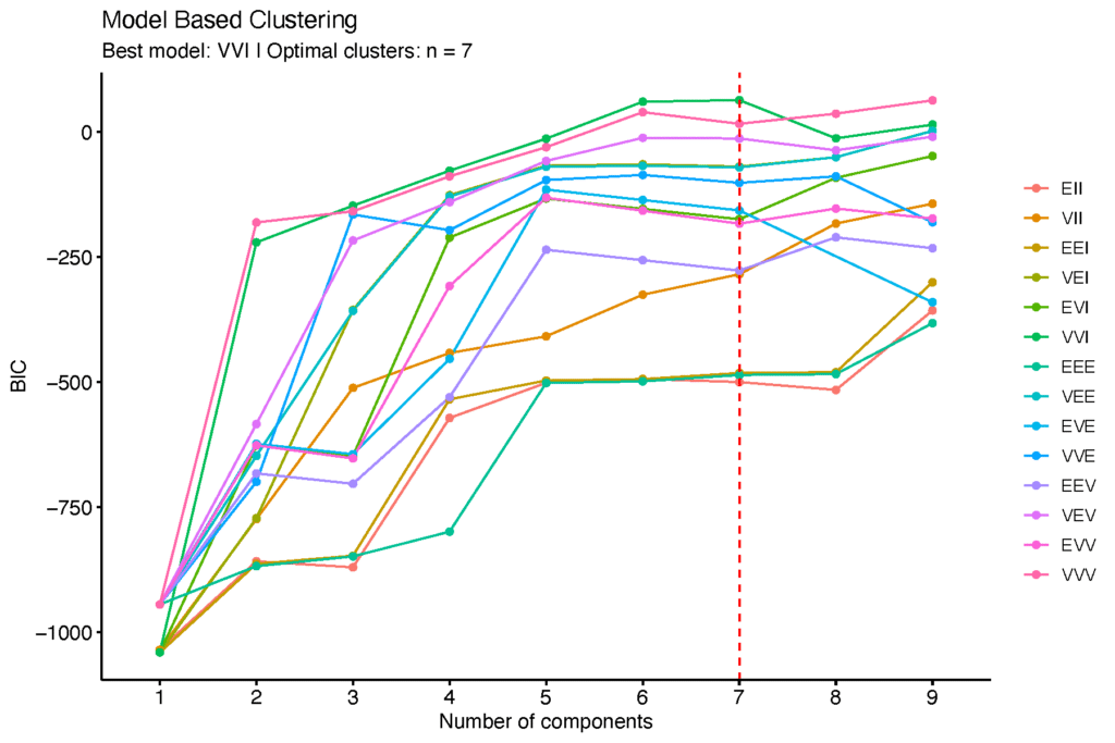
When using this type of visual for model-based clustering, we are looking for the highest peak in a line, not just the highest point. The optimal number of clusters is found at a peak or “bend” in the line, and higher BIC corresponds with higher model accuracy. Analyzing this visual, we can see the model type “VVI” has the highest peak out of all model types when using seven clusters, which is visualized with a dotted line and color legend. Now I have a starting point for building my model instead of using blind trial and error.
How to Do Customer Segmentation with Dynamic Clustering in Tableau
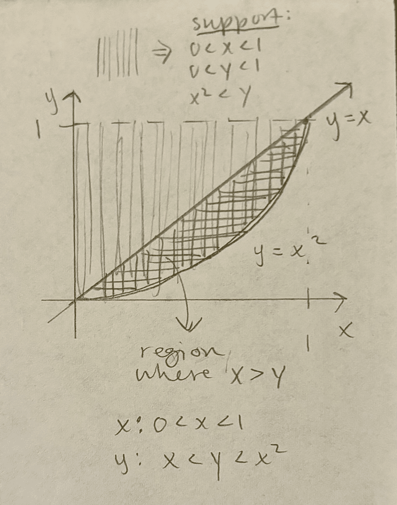
And using data visualization in its simplest form, pencil and paper, I’ve sketched a plot of a mathematical function to visualize an area of interest and define boundaries for a probability model.
In all of these situations, I was able to uncover patterns, discover potential issues and outliers, and highlight important insights with data visualization. Without this step, you open up the possibility of incorrect or less accurate conclusions.
While these are what I consider “behind the scenes” data visualizations, meaning I would not typically share them with a stakeholder or my intended audience, they are part of the data visualization process and help me reach my final product.
Simplified analysis
Another benefit of data visualization is the ability to simplify your data analysis, which in turn can save processing time and increase audience accessibility. If a data analysis is confusing, your audience can lose interest. If someone “isn’t a numbers person” or simply doesn’t have the time to dig deep into data and uncover relevant trends, data visualizations can help them quickly look at a chart or graph, compare and contrast different elements, and reach an important conclusion.
- Save time through simple visuals
- Simple visuals can replace complicated calculations, lengthy text explanations and overwhelming numeric tables
- Increase Accessibility and comprehensibility through effective communication
- Help audiences understand the data without needing to be an expert on the topic, and expand your audience in the process
This means saving time (for you and your audience), and successfully sharing your insights with a larger audience. When performing data analysis, the end goal is to present your content so that your audience does not have to put any effort into understanding what you are visualizing. One of my professors taught that “We think with our eyes. Creating good visualizations is an art and science.” Charts and graphs can be processed faster than plain numbers on a page, and a successful visualization can increase data accessibility.
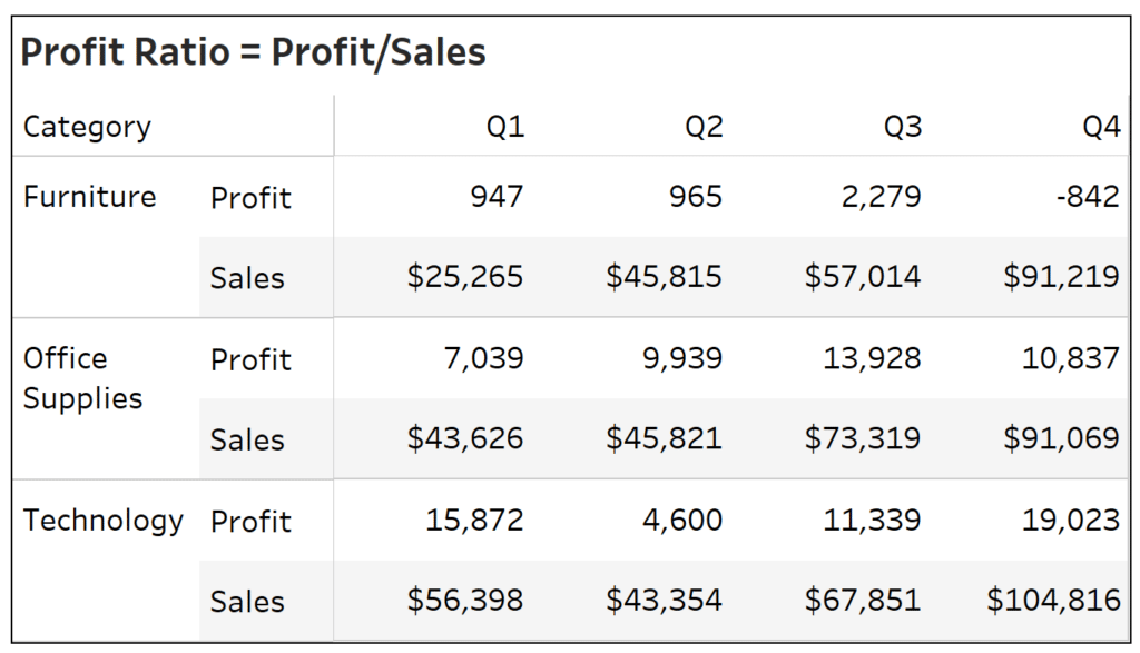
For example, take the below table displaying profit and sales values by quarter, for different categories. We want to know which categories had the highest and lowest profit ratios and when. While profit ratio is not a complicated calculation (profit/sales), in order to answer our question we have to calculate the profit ratio for each combination of category and quarter, and then compare each value. With larger datasets, the computation and comprehension time can both increase drastically.
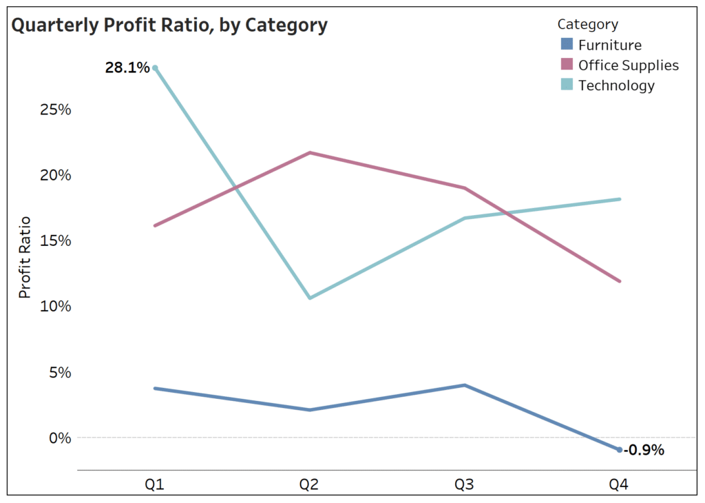
Now look at the below line graph displaying the same data. You can quickly conclude that technology had the highest profit ratio during Q1, and furniture had the lowest profit ratio during Q4. This simple data visualization utilizes color and labeling to instantly share insights.
Storytelling with data
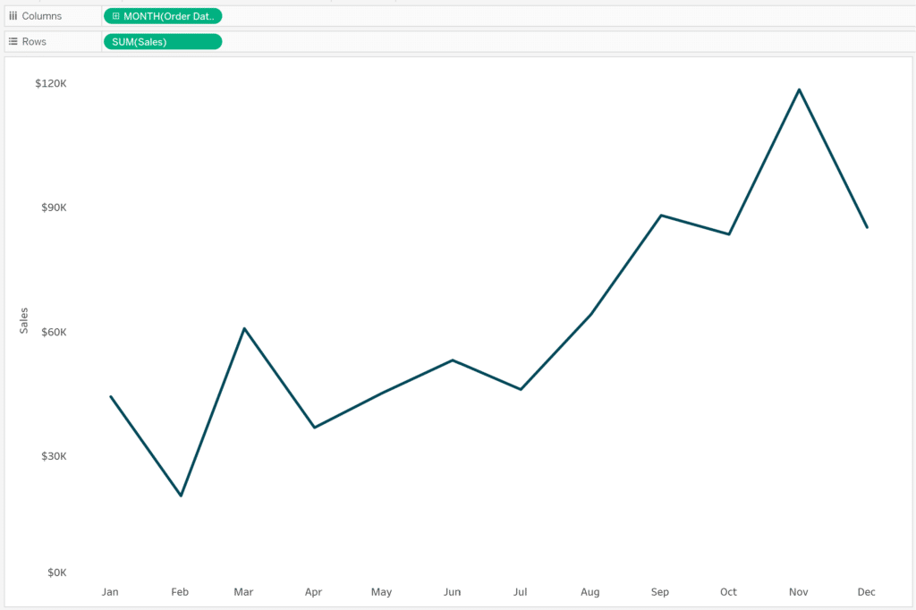
By combining multiple data visualizations or adding UX, you can create a narrative with your data by giving context. A single value, let’s say total number of sales, for example, doesn’t tell you much on its own. When creating a data visualization, you need to consider what story you are trying to tell. If you want to know what month sales are the highest, add a date dimension and create a line graph. In the below image, that single value has turned into a time series analysis of sales over a time period, allowing you to highlight trends and insights. Spotting peaks and troughs on a line chart is much easier than individually comparing a row of numbers to each other.
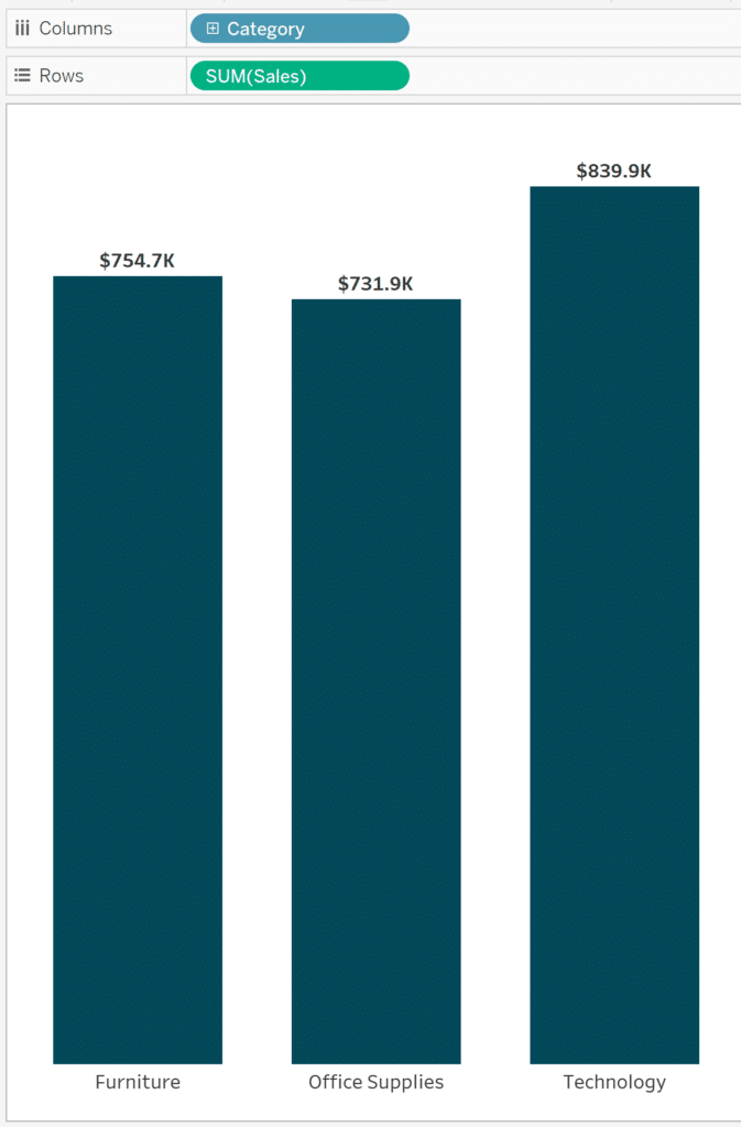
Maybe you don’t care what month has the highest sales, but you want to know what category of products are selling the most. Add a category dimension to create a bar chart, and as in the below image, you can immediately see which type of products are the most successful.
Storytelling through data visualization can also be a creative outlet or engaging way to stay organized. For example, take Manager of Information Design, Alyssa Huff‘s, experience of visualizing her path to ACL recovery. Her project started as a way for her to track her recovery during physical therapy. The data she collected helped keep her spirits up by reminding her of the progress she had made, and also gave her the opportunity to use her artistic skills, experiment with design and create a data visualization telling her personal story.
Why You Should Visualize Your Personal Data
Insights and conclusions aside, creating data visualizations can be a fun, unique way to express your interests and tell a story. I was always told to find data sets that spark my curiosity for class assignments. If you are going to be spending a lot of time working with a data set, find a question you want to answer or a trend you want to explain, look for related data and start exploring.
Conclusion on the benefits of data visualization
I have only touched on a handful of the many benefits of data visualization, and I’m willing to bet you will come across even more as you experiment with different data visualization methods. As you can see, the use case for your data doesn’t have to be strictly professional. I encourage you to indulge your curiosity, have fun with your creativity and discover how else data visualizations can benefit you.

Written By
Megan Spengler

Peer Review
Maddie Dierkes
Manager, Decision Science
Related Content
A Spreadsheet is Not a Data Visualization
Like the movie Groundhog Day, but without its Certified Fresh 96% score on Rotten Tomatoes, there is one conversation I…

Ryan Sleeper
Find and communicate actionable insights See for yourself how preattentive attributes like color help you instantly answer business questions. Ryan…
Playfair Data Presents: Preattentive Attributes
In the post and video, Why do you visualize data?, I share my exercise for educating stakeholders on the value…