Why You Should Visualize Your Personal Data

Sometimes the sheer amount of data available at our fingertips can make it feel impossible to choose a topic for a data visualization. Maybe you saw something on social media, or read something in a book, or heard something in a podcast that made you think, “That would make an amazing data visualization topic.” Whether you have ideas swirling around in your head, you’re coming up empty, or you even have a TBV (to be vizzed) list, how do you decide where to start to visualize personal data?
I think the best visualizations always have something in common: the creator is genuinely interested in the topic. Given this, what better topic to visualize than our own personal data? Who is more interested in you than, well, you? In this post, I’ll talk through why you should incorporate personal data into your data visualization practice if you want to improve your data visualization skills.
My experience visualizing personal data
Let me tell you a story about my own experience visualizing personal data. On a warm summer evening in August 2022, I was playing sand volleyball in a rec league with friends. While running after a ball, I took a wrong step in the sand and immediately went down with immense pain in my left knee. A trip to my doctor and one MRI later, I learned that I had completely torn the anterior cruciate ligament (ACL) in my knee. In order to play volleyball again, I needed to have surgery and complete physical therapy.
![]()
Continue reading with a free account, or login.
Unlock this tutorial and hundreds of other free visual analytics resources from our expert team.
Already have an account? Sign In
By continuing, you agree to our Terms of Use and Privacy Policy.
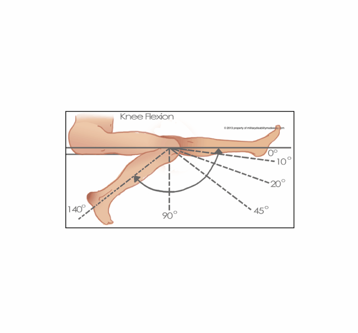
I was upset and overwhelmed by the prospect of surgery and a daunting recovery period of 9-12 months. This was my first major injury, and I was nervous about the recovery from surgery and the pain that would be involved. I decided to keep track of different milestones during my recovery as a way to remind myself that I was making progress. During my first physical therapy session, I learned that knee extension (how much you can straighten your knee) and knee flexion (how much you can bend your knee) are two key progress measurements, so I decided to include those measurements in my data. However, at this point, I hadn’t even considered using the data I collected for a visualization. I was purely tracking it out of a sense of curiosity and as a way to help myself cope.
Below, you’ll see some of the tracking I did on my phone, along with a more formal spreadsheet I kept with more data points.
My recovery happened to coincide with an online course I took from Stefanie Posavec, co-author of Dear Data, called “Analog Data Visualization for Storytelling” (I cannot recommend this course enough!). In it, she walks her students through the steps to tell a story with data via an analog medium, rather than the digital media many of us are so familiar with. I was about three weeks into my recovery, and I decided to use my recovery data to create an analog visual of my own using what I’d learned from Stefanie’s course.
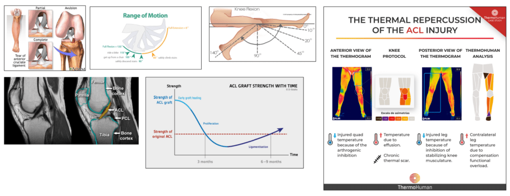
First, I created a mood board with images related to the ACL, its function, and treatment of ACL injuries. I wanted to try to incorporate shapes or movement from these images that I liked into my own design.
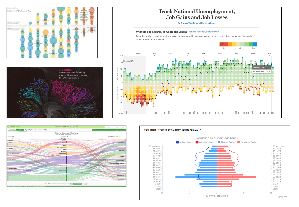
Next, I gathered examples of digital data visualizations that had aspects I found interesting. I was repeatedly drawn to examples with diverging elements, which fit nicely with the extension and flexion data points I had collected.
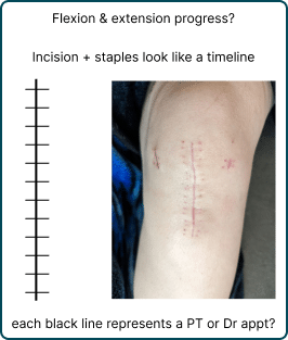
From here, I sketched out some ideas based on the mood board and brainstorming. Ultimately, I was inspired by the scar on my knee, as the combination of the line down the center and the marks from the staples resembled a ladder or a timeline to me (Also, ouch!). This became the backbone of my visualization.
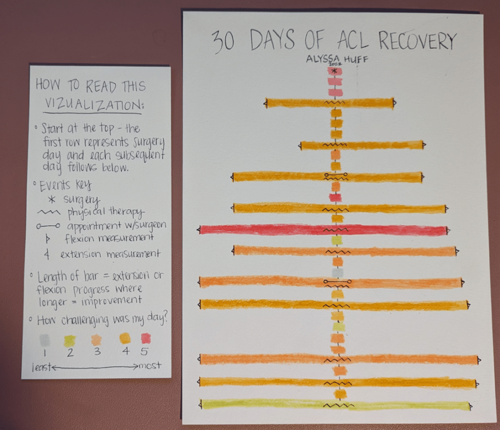
I drew my final visualization using pen and ink and brush pens on watercolor paper. It shows the first 30 days of my ACL recovery journey, starting with surgery. Each row represents one day, and is color-coded on a scale from one to five, with one being the least challenging and five being the most challenging kind of day. I added symbols to represent certain milestones, like physical therapy sessions and appointments with my surgeon. The length of each bar represented my extension and flexion progress, where a longer bar meant more improvement. My flexion and extension were only measured at physical therapy sessions, so not every day has data for those aspects.
The process of gathering my personal data and visualizing it in an analog way accomplished two things. One, it helped show me that progress is not linear, and even when it does not feel like you are making progress or are going backwards, it’s worth it to keep going. I’ve seen this not only in the ACL recovery visualization, but in the subsequent data collection and analogue visualization I’ve done for the past year. Two, it made me better at data visualization, and I think my learnings can help you become better too.
3 Storytelling with Color Tips to Improve Your Data Visualization
Advice for your personal data visualization practice
Based on my experience, three things stood out about visualizing personal data. Here are my guidelines for getting the most out of your personal data visualization practice:
- Collect data out of curiosity, rather than with an end-goal or end-visual in mind. This is often the opposite of what we normally do when creating a data visualization. Pretend you’re a scientist from an alien planet and nothing is familiar to you, so you’re trying to figure it out. Removing any preconceived notions about what the data is or could be opens up a wider array of possibilities, and it can help exercise those creative muscles. Additionally, sometimes it’s fun just to collect data; not everything needs to become a data visualization.
- Experiment with new data visualization tools. If you’re always in Tableau or Power BI, try drawing by hand instead. You don’t need to be good at drawing to do this, I promise. Without the constraints of traditional tools, you can utilize multimedia, layering, shapes, curves, sizes, and colors that you otherwise could not consider using. Use paper, yarn, fabric, wood, or even leaves and flower petals. In addition to what data visualization looks like, consider what it feels like or sounds like. Immersing yourself in new ways of thinking can inspire solutions for a tricky UX problem or act as the impetus for creating a new chart type.
- Have fun! Create visualizations that are only for you, and thus free of the usual pressures of stakeholders, peers, social media, or competitions. It can be easy to get sucked into creating things for an audience rather than ourselves, and sometimes this can create burnout. When you create just for yourself, you can shrug off any ideas that something always has to be top-tier, innovative, or Viz-of-the-Day-worthy, and just have fun with it. Was every one of Michelangelo’s works the Sistine Chapel? Absolutely not.
![]()
With that, I challenge you to get out of your comfort zone and create some analog data visualizations about your personal data. Not only will you have fun, but you’ll improve your digital data visualization skills as well. And if you create something you’re willing to share, send it my way! I’m always happy to talk about data visualization, analogue or otherwise.
Happy vizzing,
Alyssa

Written By
Alyssa Huff

Peer Review
Felicia Styer
Assoc. Director, Analytics Solutions

Graphic Design
Dan Bunker
Manager, Decision Engineering
Related Content
3 Ways to Make Lively Lollipop Charts in Tableau
If you’ve worked in data analytics or data visualization for any length of time, you’ll know that bar charts are…
How and Why to Use Diverging Unit Charts in Tableau
A diverging unit chart acts in the same fashion as a normal unit chart but adds another layer of insight…

Ryan Sleeper
Make Bars Diverge Left Even when Values are Positive You will learn how to make diverging bar / tornado /…