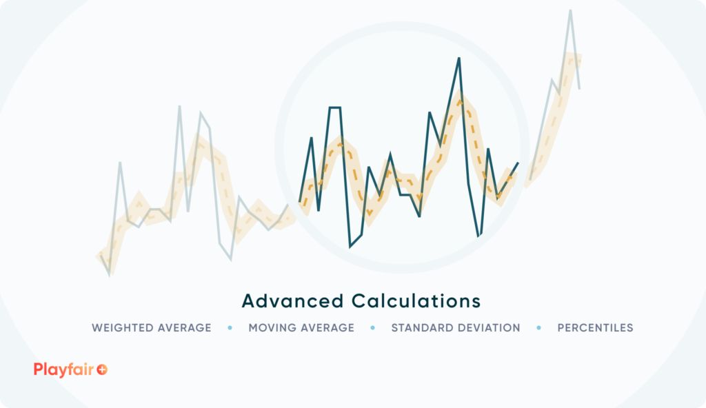
Understanding Advanced Tableau Calculations Like Standard Deviation, Moving Average, and More

Tableau is a useful tool for an analyst to have in their repository, with its drag and drop interface allowing practitioners to easily dive in to explore their data or spend time creating sustainable, decision-centric dashboards. Beyond its user experience and user interface capabilities, Tableau also provides native calculations that have the versatility to integrate more complex calculations into your analyses. In this post, I am going to take you through a few of those, why they are important, and how to execute them in Tableau. We will cover weighted averages, Tableau moving averages, Tableau standard deviations, and Tableau percentiles using the Sample – Superstore dataset.
Weighted averages
A weighted average is simple to build in Tableau. All you are doing is taking the sum of the value you want to average (i.e. Profit), multiplying by the weighting value (i.e. Amount) and then dividing it by the total of the weighting value (Amount, in this case).
![]()
Weighting becomes important as you look at your data at a higher level of grain than the smallest level. If every row in a dataset represented one individual sale, and sales was the weighting amount, then your weighted average would equal the straight average. Instead of working with a dataset where each row is an individual sale, what if your data was already aggregated to the state level with the average profit per order and amount of orders.
Continue reading with a free account, or login.
Unlock this tutorial and hundreds of other free visual analytics resources from our expert team.
Already have an account? Sign In
By continuing, you agree to our Terms of Use and Privacy Policy.
Why It’s Important to Understand the Granularity of Data
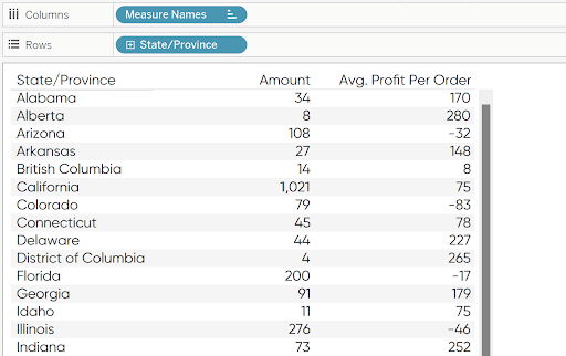
Imagine your task is to show the overall profit per order. Your mind may want to simply average the column to the left, essentially taking an average of the average. You could do that if your data was at an order number level like Sample – Superstore. But if your data came in aggregated at the state level, a weighted average provides a more accurate representation of the data.
To compute the weighted average, multiply the Amount by the Profit Per Order for each state and sum it up. Take that value and divide it by the sum of the Amount:
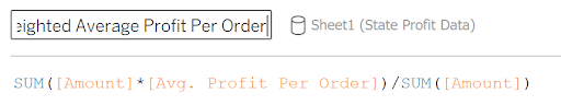
SUM([Amount]*[Avg. Profit Per Order])/SUM([Amount])
You get nearly a $50 difference when comparing this result to a straight average.
Reporting a straight average out to stakeholders would misrepresent the profit and could lead to misinformed decision making. This technique reduces the impact of the states with less sales and allows states with higher sales to have a higher impact in the overall average.
Tableau standard deviation
Standard deviation is a statistical measure of how dispersed the data is and is used in hypothesis testing and outlier detection. There are two equations for standard deviation, Population Standard Deviation and Sample Standard Deviation.
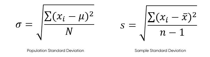
Population should be used when you are conducting a test on an entire population while the sample equation should be used for a subset. The variables for the equations are as follows:
Population
- xi is an individual value in the data
- u is the population mean
- N is the population size
Sample
- xi is an individual value in the data
- x is the sample mean
- n is the sample size
For each calculation, it takes a sum of each individual value in the data, subtracts the mean from it, and then squares it. Then it is divided by either the population size or the sample size minus 1 and the square root is taken of that value.
Standard deviations are already built in Tableau functions. STDEV() for sample and STDEVP() for population are built in calculations that allow you to easily calculate the standard deviation in Tableau for whatever dimensions you have on your view. If I needed to calculate the standard deviation of Profit in Tableau for the entire Superstore data set, I would use STDEVP() which results in $232.45.
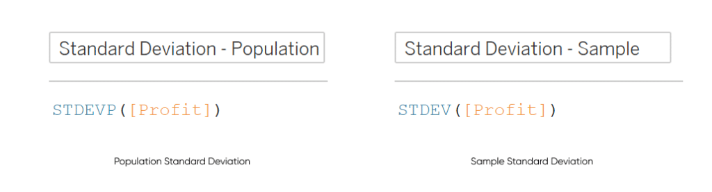
STDEVP([Profit])
STDEV([Profit])
Tableau moving average
A moving average is another reporting technique that smooths out data and reduces the impact of short-term volatility in the data. There are two types of moving averages: simple and exponential. Simple moving averages are calculated by looking back a predetermined distance in the data and taking the average up through the current data point. An exponential moving average gives more weight to more recent values.
A simple moving average can be calculated in Tableau utilizing the WINDOW_AVG table calculation. In this example, we are going to say that we want to create a moving average of the monthly profit looking back 3 months and including the current month in the average. I am going to create a parameter to represent the number of months we want to average.
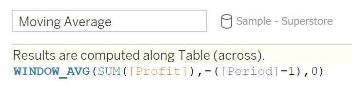
WINDOW_AVG(SUM([Profit]),-([Period]-1),0)
This calculation is averaging the sum of profit for the previous two months and the current month. For UX purposes, I have set the Period parameter to three, so I will need to subtract one from the period so you average the current month with the previous 2 months, creating a 3-month moving average.
The Beginner’s Guide to Tableau Table Calculations
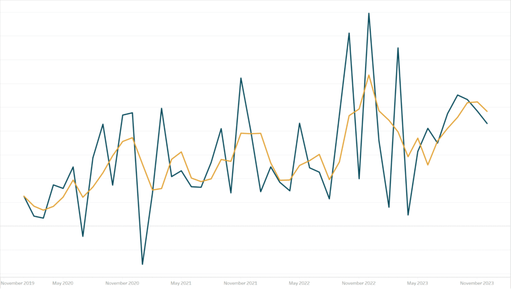
Create a line chart by dragging the Order Date field to the Columns shelf, setting the date format as continuous Month. Drag Profit and Moving Average to the Rows shelf, create a dual axis, and synchronize the axes. Comparing the Tableau moving average of the profit sum to just the profit sum month by month, you get a less volatile look at the trend:
Next, let us take a look at another variation of a moving average, the exponential moving average. Instead of a straight average of the previous months, it gives more weight to more recent months.
The equation for an exponential moving average is:

Current Value is the actual value for the specified time period, Previous EMA is the value for the last data point. The 𝞪 is a calculated value based on the number of periods you want to look backward.
We can repurpose the Period parameter we created for a Tableau simple moving average, so now we need to create the 𝞪 calculation in Tableau. In mathematical notation it looks like:
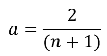
Where n is the number of time periods. In our example we have it set to three. In Tableau it looks like:
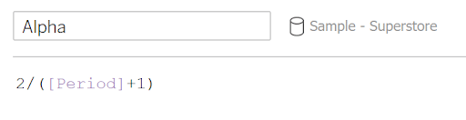
2/([Period]+1)
With our Alpha value, we can now create our EMA function in Tableau:
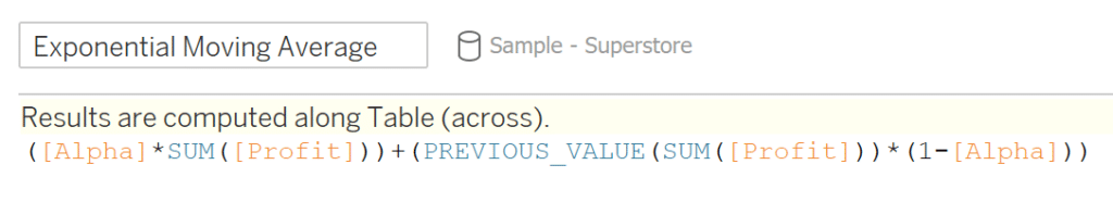
([Alpha]*SUM([Profit]))+(PREVIOUS_VALUE([Moving Average])*(1-[Alpha]))
This equation is taking the Alpha and multiplying by the current period’s value. Then adding that to the previous EMA value multiplied by one minus the alpha value. The PREVIOUS_VALUE function is a helpful table calculation that allows us to avoid a circular reference. It pulls the previous value of the function you are currently creating. If there is no previous value (which would be true for the first month in the view), it will pull the current sum of the profit.
Create a view like we did before, only this time use the exponential moving average instead of the simple moving average:
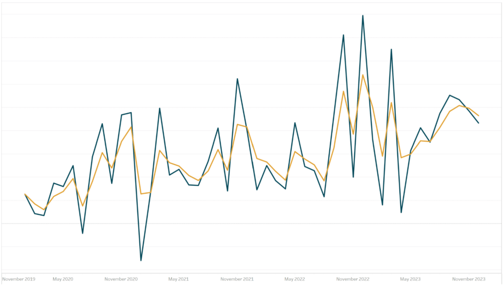
The results are very similar so you may be asking which one to use. That is entirely dependent on your use case, but a good example is stock trading. Short term strategies tend to favor the exponential moving average because it focuses more closely on recent history, while long term strategies may want to use a simple moving average for the opposite reason.
Tableau percentiles
Calculating percentiles gives another layer of context to your data. A percentile is a measure that notes the position of a specific data point relative to the rest of the data. For example, say you got a test score of 70%. The initial reaction of someone who has no insight on the difficulty of the test would assume that is a low score. However, say that you scored in the 95th percentile of students who took the test, meaning you scored higher than 95% of students. Now the initial reaction is that the score was top of the class, and you may assume that the test or class is a very difficult one.
Percentiles are not too difficult to understand conceptually. To calculate the percentile for a data, point the equation is:
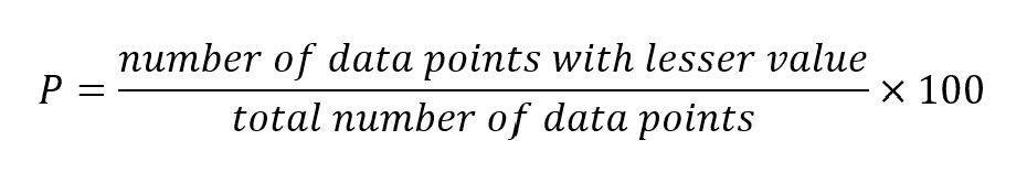
To calculate this, you just need the number of data points with the lesser value. So, say there were 15 students in the class. You scored a 75% on the test and there were 14 students who scored lower than a 75%. The percentile would be calculated at (14/15)*100, so your score would be in the 93.3 percentile or rounding down to the 93rd percentile.
Tableau makes it easy for the user with built in percentile functions. There are four options for Tableau Percentiles
- RANK_PERCENTILE()
- PERCENTILE()
- WINDOW_PERCENTILE()
- MODEL_PERCENTILE()
In this post, we will only be covering RANK_PERCENTILE() and PERCENTILE().
First, let’s look at the RANK_PERCENTILE() function. RANK_PERCENTILE is a table calculation that will return the percentile for each point in the data. I want to calculate the percentile for the total sales by customer. The calculation is as follows:
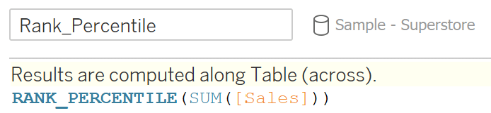
RANK_PERCENTILE(SUM([Sales]))
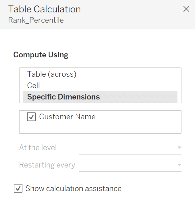
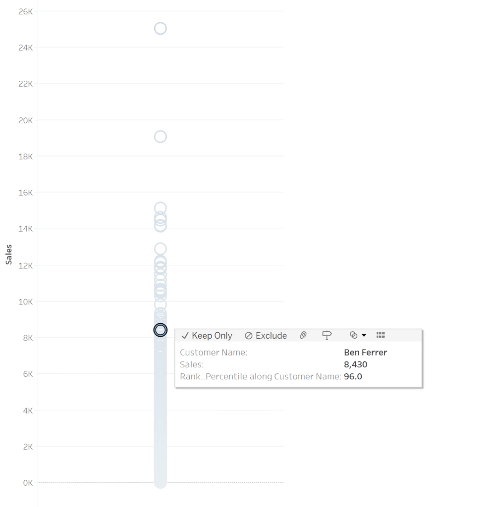
There is also the option to drag the sum of sales into the view and do a Quick Table Calculation, choosing percentile as the table calculation. I am going to create a simple dot plot of all the customers and add Rank_Percentile to the tooltip. Since this is a table calculation, I am going to make sure that the table calculation is set to calculate across Customer Name
Doing an analysis, this dot plot is extremely crowded. If I click on a customer in the middle of the chart, instinct would lead me to believe that the customer falls somewhere close to the 50th percentile in terms of sales. However, Ben Ferrer actually sits in the 96th percentile, having total sales higher than 96% of the other customers even though he sits in the middle of the chart.
The Percentile() function does the opposite, where instead of finding the percentile for each value it finds the value for each percentile. The equation is as follows in Tableau:
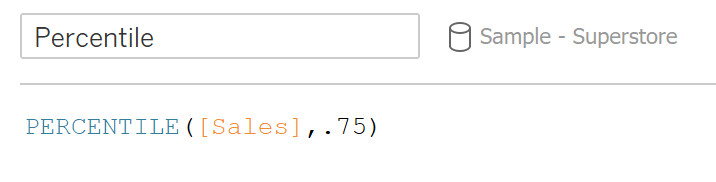
PERCENTILE([Sales]),.75)
This will return the value where 75% of sales fall below at the most granular level in the data. For my analysis, I wanted to add in two level of detail calculations: one to fix the sum of sales to Customer Name and the other to fix the percentile value to be calculated across the entire dataset.
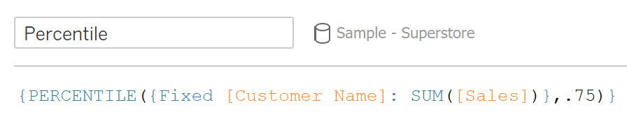
{PERCENTILE({Fixed [Customer Name]: SUM([Sales])},.75)}
I am going to then create a Boolean calculation to determine if a value is greater than the 75th percentile value. Then I will add this as a color to my chart to color all dots whose sales value is less than the 75th percentile.
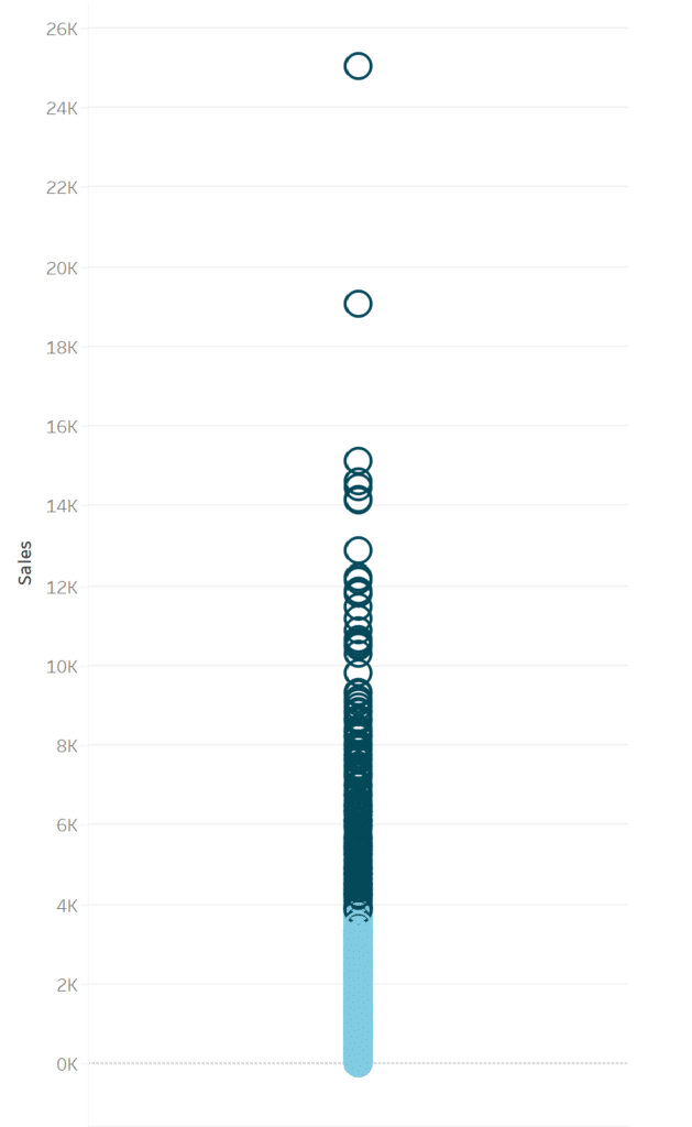
As you can see, the 75th percentile falls visually about ⅓ up the chart and that there is a greater dispersion amongst the top 25% of customers.
![]()
To wrap up, I am going to put together a quick dashboard analyzing sales data in the Sample – Superstore dataset using some of the calculations we touched on.
These calculations allow you to begin answering some of the questions stakeholders might have, taking a dashboard from just a visual to a decision-making tool. Now you should have a good jumping off point to begin incorporating these into your analyses!
Stay after it,
Maddie

Written By
Maddie Dierkes

Peer Review
Ethan Lang
Director, Analytics Engineering
Related Content
Advanced Analytics in Tableau Series: One-Way ANOVA Tests
You may be wondering why we would want to perform an ANOVA test in Tableau, as you can do it…
Ethan Lang
Detecting Outliers in Non-Normalized Data In this tutorial, Ethan will explain how to implement the Median Absolute Deviation equation in…
How to Isolate Linear Regression Equations in Tableau
Tableau has a decent variety of built-in statistical features. One of the easiest to use is the trend line. The…