Why It’s Important to Understand the Granularity of Data

When kicking off a project involving data, one of the first questions will be, “Do we have the right data to complete this project?”. Once you’ve confirmed that you have the fields/columns that you will need, the next step is to ensure that you have the rows that you need. This will involve understanding the level of granularity of data where it is currently at, and what level of grain the data needs to be and/or should ideally be to complete the end product.

Identifying the required data in your end product
Before I dive into my datasets for a project, I like to get a high-level overview of the needs of the project. This can involve discovery and collaboration with the key stakeholders, visual analytics architects (designers), and visual analytics engineers to understand what the most important data elements are within the data product we are building. Doing this exercise helps me keep the overall objective in mind and to ignore any erroneous data that would distract from the overall goal. Once I confirm that I have the columns/fields necessary to complete the project, I collaborate again with the dashboard designers to view the wireframes, or outlines, of the project. The project I will use for an example in this post is the NFL Occupational Mobility Report.
Continue reading with a free account, or login.
Unlock this tutorial and hundreds of other free visual analytics resources from our expert team.
Already have an account? Sign In
By continuing, you agree to our Terms of Use and Privacy Policy.
Playfair Data Launches Interactive Dashboards for NFL’s Occupational Mobility Report
Let’s take a look at one of the charts in this report. Looking through a data engineering lens, we see the following fields of necessary data – team name, year, coach name, win-loss %.
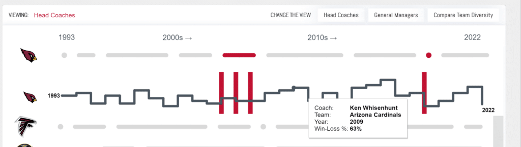
Now we’ll take a look at our hypothetical data and use coach Mike Mularkey as an example. We can see that it has all of the fields we need. However, on closer look, we are unable to provide the data necessary to complete the chart. So even though all of the fields are present, we have an issue with the level of granularity of the data, which I’ll explain in more detail below.

Identifying the level of granularity of data
Per coach in the NFL, we have the years they coached, the teams they coached, and a win-loss percentage. This combination is considered the grain of the data. However, when referring back to our chart, the chart requires a different level of granularity. The chart requires coach, years they coached, what team they coached each year, and a win-loss percentage per year. From the Mike Mularkey data, we are unable to tell which years were attributed to what team, and we only have an overall win-loss percentage for his career as head coach.
![]()
After determining that this dataset will not meet our needs, we receive a new hypothetical dataset that looks as follows. Are we able to use it to complete the chart?
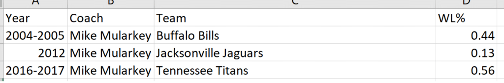
This dataset is closer, but we are still unable to complete the chart as designed. While we could do some data cleansing to break out the rows into a row per year, our WL% for each year/season would not be accurate. Let’s look at another example.
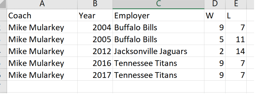
Now this will work now that we have our coach and team per year! While we don’t have a WL%, we can verify the methodology for computing the win-loss percentage and are able to add that calculation into the dataset, providing everything needed to complete the dashboard.
What is the ideal level of grain
As we saw throughout our example, even though we had the fields we needed to complete our desired chart, the way those fields (and consequently, rows) were structured put up some roadblocks. The lowest level of grain, or the level of detail being shown per row of data, changed with each different dataset we looked at.
Our first dataset was by coach, so one row per coach with all of their coaching information squeezed into that row. Our next dataset got a little more granular, giving us a row per coach per team. Our final dataset gave us a row per coach, per year; which also gave us a team and wins and losses for that year. The data could get even more granular from there as we could get a row per game in the year, or rows per player on the team. As the rows could split out into more rows, that would make the dataset more and more granular.
![]()
As mentioned early, we had a specific chart in mind and were trying to make sure we had the relevant data to complete the chart. But what is the ideal level of grain for a dataset? From a data engineering perspective, most of the time we want access to the lowest level of data possible. For this project, if we had a dataset or database that had players, scores by game, what uniform was worn, what the weather was, etcetera, that only increases our ability to provide all necessary data and gives more analytical possibilities to the end product. This could be all in one dataset or could be stored in tables that we are able to join together. Within various data roles, the ideal level of grain of data is the ability to control it.
Shaping the granularity of data
Going back to our line chart example, this chart was just one of many on the overall dashboard. So, when we were engineering the back-end data, we brought in additional fields and had to keep other charts in mind when determining the correct level of grain. I like to provide the lowest level of grain possible to our Tableau / Power BI engineers so they have the most analytical and dynamic options available when developing the dashboards. However, I will begin to reduce granularity of data, or aggregate it up, for two reasons: 1. If the amount of data and/or fields is too cumbersome for the human eye to deal with or 2. If the amount of data is too cumbersome for the end product software to deal with, essentially having negative impacts on performance.
How to Run and Interpret the Tableau Workbook Optimizer
Aggregating data to a higher level of detail is a great way to improve performance both during the data development and dashboarding process. For example, if we received the following dataset for our Mike Mularkey example, I may have decided to aggregate the data to ignore the player rows.
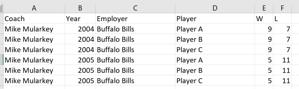
To do this, I would group on Coach, Year, Employer and take the max of W and max of L (knowing that the number was duplicated across the player rows). This would land me back at our ideal level of detail for the specific chart. The aggregation could be done at the beginning of the data process, as early as when extracting it from a database to save processing time and power there. Or, if we needed to build some calculation that was specific to the players, I could keep the players in for part of the data process and then aggregate the data later before the data is passed to the dashboard.
3 Tips for Data Quality Assurance (QA) in Alteryx
Summary
As part of any project that involves data, the level of detail of the data will need to be considered. If the data is not at a low enough level of detail, even though it may contain all of the fields necessary, there may still be gaps or roadblocks to completing the end product. As we saw in our chart with the Mike Mularkey data example, we could not accurately calculate win-loss percentage until we had the data at the level of per coach, per team, and per year. We also covered that the ideal level of grain is having access to the lowest level possible so that we can control the granularity of data as we shape the data for our end product. Lower levels of grain also open up the end product to more analytical possibilities, but with the ability to aggregate, we can balance that capability with performance.
Thanks for reading; you’ve got this!
Ariana

Written By
Ariana Cukier

Peer Review
Ethan Lang
Director, Analytics Engineering
Related Content
How to Remove Duplicates in Tableau Prep

One of the most common data cleaning issues after joining or unioning data is duplicate rows. Without deduplicating rows, you…

Nick Cassara
A guide to using Tableau Prep Builder to explore data This video will cover using basic techniques in Tableau Prep…
The Fundamentals of Data Engineering
The fundamentals of data engineering are centered around, well, data. With data becoming one of the hottest topics in the…