How to Make Trellis / Tile / Small Multiple Maps in Tableau

A chart type with many names… trellis maps, Tableau tile maps, or small multiple maps can help you compare measures across multiple maps in one concise view. No matter what you choose to call them, these maps present an effective way to add context to a view without making your end user do additional work. As discussed in the post, How to Make Small Multiples in Tableau, adding context in this manner is a tactic for avoiding the dreaded question, “So what?”.
This post will provide two techniques to creating trellis / tile / small multiple maps in Tableau. In the first approach, we will use table calculations to automatically generate a grid for the maps. The formulas are provided so you can create these maps in a matter of seconds. In the second approach, we will use IF / THEN logic to manually generate the grid. This approach gives you complete control over the number of rows and columns in the layout, and which “cell”’ you want each map to appear. I will also share a creative hack for how to add a label to each individual map within the view.
This content is excerpted from my book, Innovative Tableau: 100 More Tips, Tutorials, and Strategies, published by O’Reilly Media Inc., 2020, ISBN: 978-1492075653. Get the book at Amazon.
How to make trellis / tile / small multiple maps in Tableau
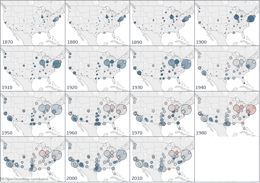
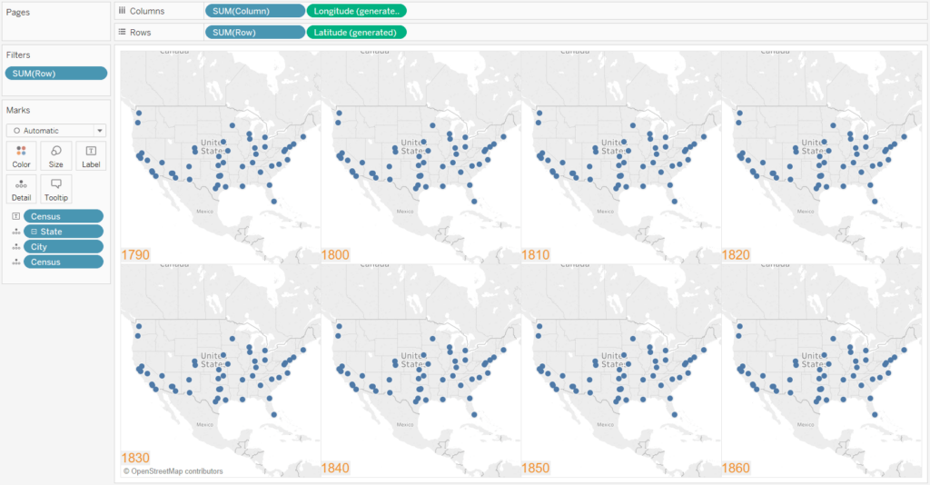
For both approaches to creating small multiple maps in Tableau, we will be recreating the following view from my Tableau Public visualization, A Tale of 50 Cities. In the view, I used a trellis layout to show population changes during each US census dating back to 1790.
[Click image to view interactive version]
For the first approach, and the approach used to create the view above, we will use the INDEX() and SIZE() functions to create a dimension for the columns and a dimension for the rows. To my knowledge, this approach was invented by my friend and data viz hero, Chris Love of The Information Lab. Chris does the explanation better justice, but for efficiency, I’m going to simply share the formulas so you can put them into practice.
![]()
Create a free account, or login.
Unlock this tutorial and hundreds of other free visual analytics resources from our expert team.
Already have an account? Sign In
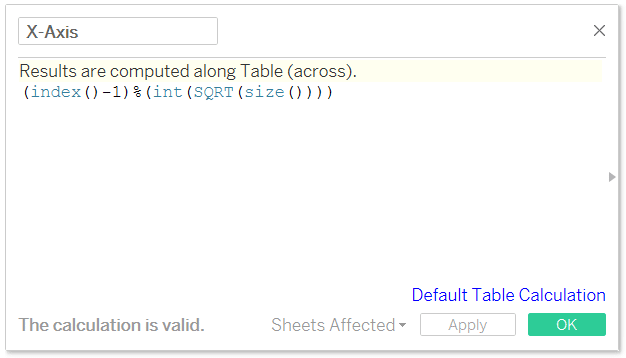
First, create a calculated field for the X-Axis (or columns); the formula is:
(index()-1)%(int(SQRT(size())))
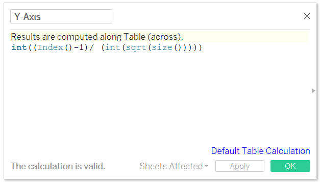
Also create a separate calculated field for the Y-Axis (or rows); the formula is:
int((Index()-1)/ (int(sqrt(size()))))
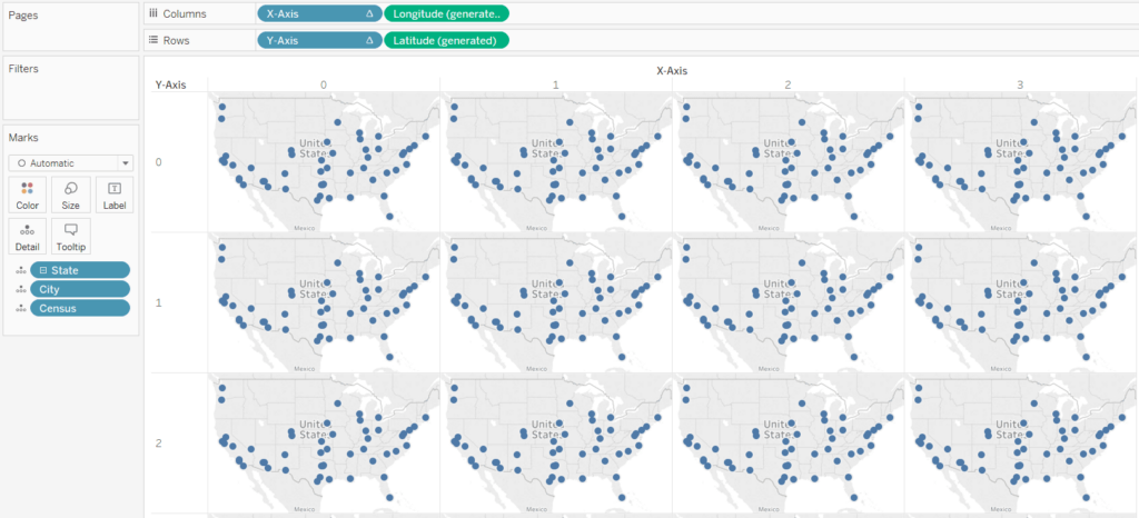
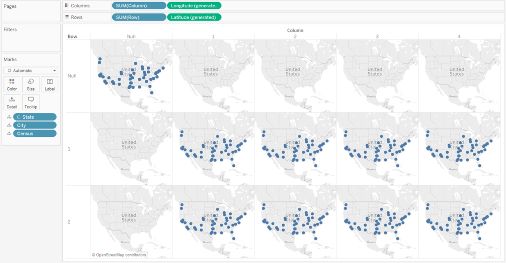
Now I will lay the foundation for my map. Of course there are infinite possibilities of things you can map, so you will need to apply the following steps to your own visualization. To continue with the example in this post, I will just double-click on the State dimension to start the map, and place the Census dimension on the Detail Marks Shelf.
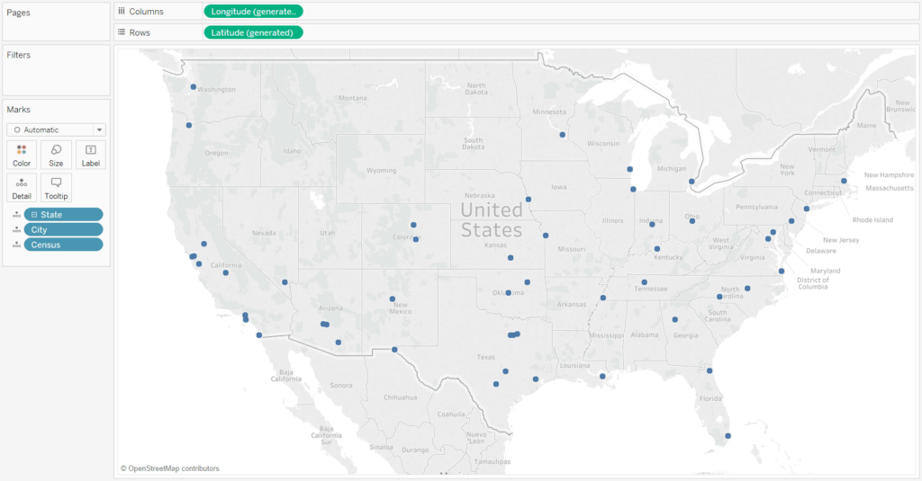
Right now there are 1,150 marks on the view, but we can only see 50 because they are laying on top of each other (i.e. multiple marks for the same state). We will now create a grid using the newly creating X-Axis and Y-Axis calculated fields which will spread the marks out into their own respective cells.
First, place the X-Axis calculated field on the Columns Shelf and the Y-Axis calculated field on the Rows Shelf.
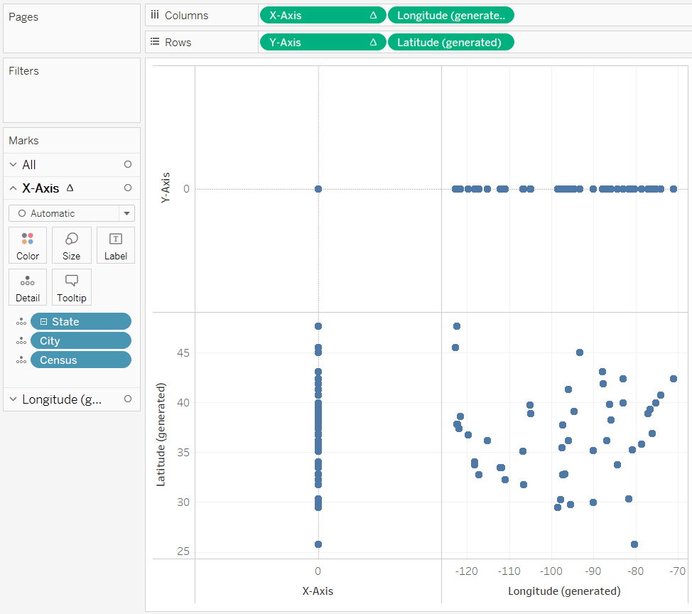
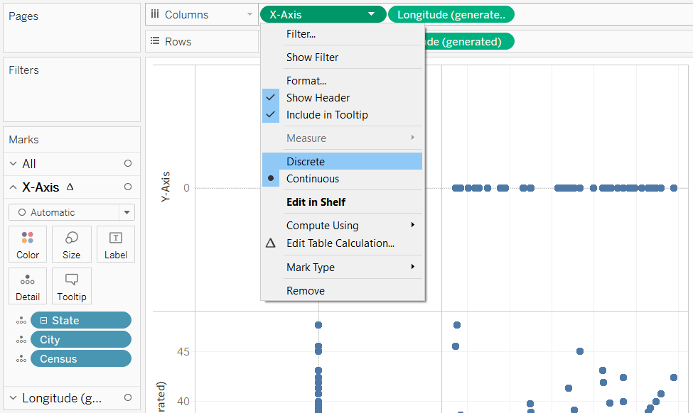
Your keen intuition may be telling you that this doesn’t quite look right. That’s because we need to change the X-Axis and Y-Axis fields to discrete. This can be accomplished by right-clicking on each one (or clicking the triangle that appears when you hover over the pill) and choosing “Discrete”.
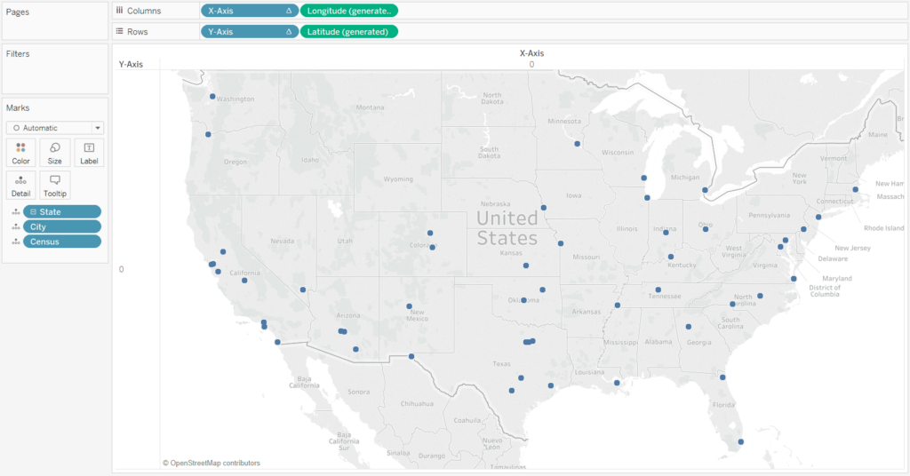
After changing the newly created calculated fields to discrete, we end up with our original map.
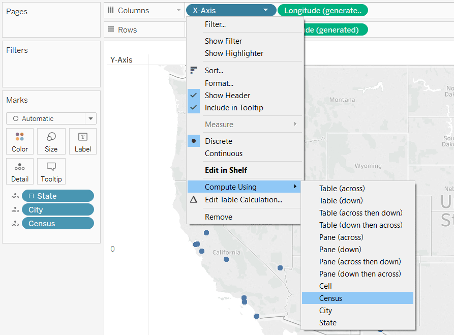
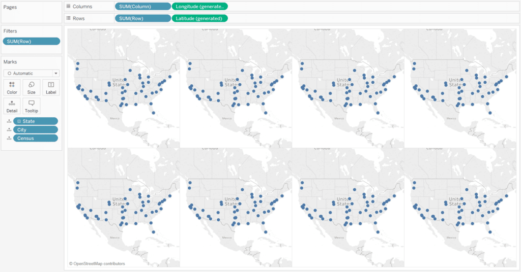
Lastly, we need to change the table calculations on the X-Axis and Y-Axis measures, respectively, so they compute using the field we want in each cell. In this case, I want a unique cell for each census. To edit the table calculation, you can click into each pill again, hover over “Compute Using”, and choose “Census” (or whatever field for which you’re creating unique cells).
After this change, we have a trellis / tile / small multiple set of maps in Tableau!
If you follow these steps, but see more than a single dimension member in a cell – or not enough unique cells for the scenario you are trying to visualize, it is likely that your view includes extra dimensions that must be added to the addressing of both table calculations. This gets trickier, but it’s easiest to work with if you right-click on each table calculation that is generating the trellis effect (x-axis and y-axis, in my case), and click “Edit Table Calculation…”.
If you want more cells to be included based on additional dimensions, choose “Specific Dimensions”, and check the dimensions you want included:
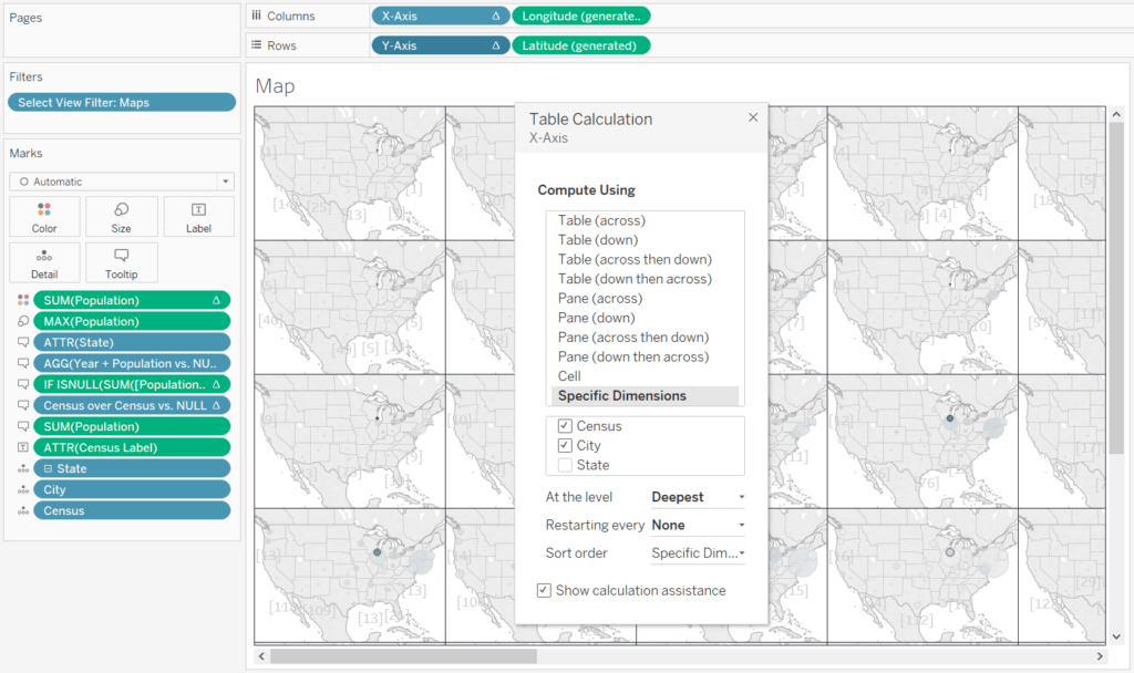
After adding the City dimension to both my x-axis and y-axis fields, my grid now has 15 rows by 13 columns, or 195 cells.
Another scenario you may come across are dimension members that contain a varying number of rows. For example, the earliest census data in my dataset contained only 4 cities: New York, Philadelphia, Boston, and Baltimore. This was problematic because the grid needs to be built to contain the top 50 cities across all 23 census years in my visualization. This mismatching number of Census years and City names throws off the dynamic INDEX() calculation that creates our ideal number of columns and rows.
I handled this issue by padding my underlying data with all top 50 cities, even if they did not have data for a certain census, then used dynamic tooltips to explain when the city didn’t have data. Another way to do data ‘densification’ in this way is to add all relevant dimensions to the addressing, but then change the “At the level” dropdown from “Deepest”, back to the dimension you want unique cells for:
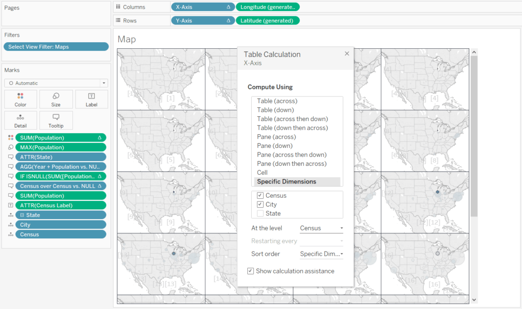
After changing the level of the table calculation to Census, I am back to a grid of 6 rows by 4 columns, or 24 cells, one for each census in my dataset (the last cell is blank because I only have 23 census years).
For more on table calculation addressing and partitioning, see An Introduction to Tableau Table Calculations.
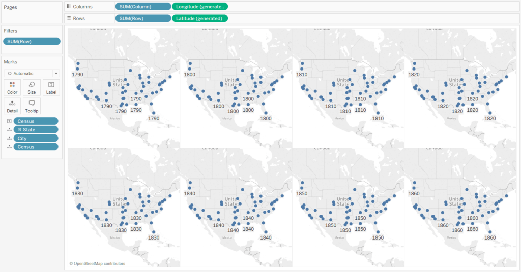
Now that you have your maps in a grid, you can modify them as you wish. In my final example, I’ve added a measure called Population to the Size Marks Card to show the population during each census. I also colored the marks with a table calculation that computed the census over census population change.
Another approach to creating trellis / tile / small multiple maps in Tableau
The second approach to creating grids to place your maps in has been covered by my friend and mentor, Ben Jones at DataRemixed.com. While the approach is more manual, it could be the best choice when you’re making small grids and want to control exactly which cell each map is created in.
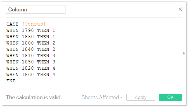
For this technique, as with the first approach, you create a field for the Columns and Rows. The difference is you specify exactly which column or row the dimension member (in my case census year) will appear in. Here are my formulas for the Columns and Rows using a subset of my census years.
Column
Row
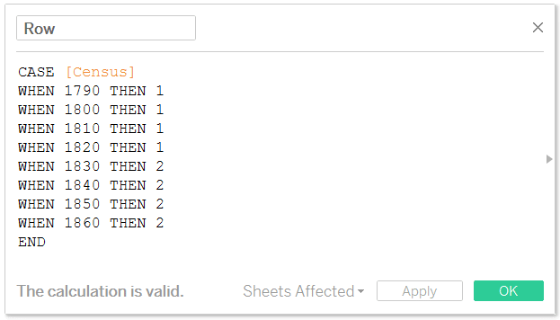
When used together on the same view, the year 1800 for example, will appear in the second column and the first row. When using this approach, you’ll want to make sure there isn’t overlap (where more than one dimension member ends up occupying the same cell). This is the reason this approach is better for smaller grids of 12 or fewer cells.
Once you’ve created the two new calculated fields, as we did before, we will add the newly created calculated fields to our foundational map and change the pills from continuous to discrete.
For illustration purposes, I only mapped out eight cells. Since I have more census dimension members than cells, there is a null category that is being placed in the upper left cell. This cell can easily be filtered out by right-clicking on one of the “Null” headers and clicking “Exclude”. Here’s how my final grid foundation looks after filtering out the nulls and hiding the Column / Row headers by right-clicking on them and deselecting “Show Header”.
A creative hack for adding a label for each cell in a grid of maps
One of the challenges with both of the approaches to small multiple maps outlined in this post is you can’t tell immediately what is represented in each cell. You can also float text boxes or add annotations in Tableau to help your users navigate, but as promised, I’m sharing a slightly more efficient and creative way to label the cells.
First, put the field you want used as the cell labels on the Label Marks Card. In my case, I want each cell to display what census is being evaluated, so I’ll drag the Census dimension to the Label Marks Card.
As you can see, the census for each cell is being shown as many times as possible without overlapping. This is redundant and not what we wanted, so for now, turn all the labels off by clicking into the Label Marks Card again and deselecting “Show mark labels”.
![]()
The trick to getting the cell labels to show up only once per cell, but with consistent formatting, is to force the mark label to show for only one mark in each cell. To do this, right-click on a mark, hover over “Mark Label”, and pick “Always Show”.
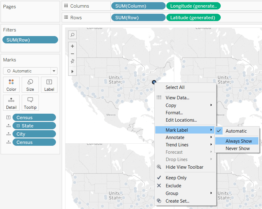
After doing this for each cell, you will have one label per cell. For formatting consistency, I put all of the census years in the bottom left corner by left-clicking and dragging the label in each cell to the bottom left corner of the cell. This one-time step is a bit manual, but the good news is, now if you edit the format of the labels by clicking on the Label Marks Card again, all of the labels will be updated at the same time.
Thanks for reading,
– Ryan

Written By
Ryan Sleeper
Related Content
The Beginner’s Guide to Tableau Table Calculations

Tableau table calculations, while very powerful, can be both tricky and confusing to work with. There are some great benefits…
3 Ways to Make Magnificent Maps in Tableau
Maps are one of the most effective chart types in Tableau and are also among the easiest chart types to…
How to Make Small Multiples in Tableau
Small multiples are a group of charts or graphs that share the same axes and scales, which allows the user…