Tableau Tip: How to Dynamically Display the Top N vs Other

There are times when I like to see every dimension member represented in a data visualization. For example, scatter plots are a great choice whenever you are wanting to view many data points in the same space. I’ll also occasionally create a bar chart or histogram with every dimension member, even if it causes a vertical or horizontal scroll bar to appear.
While the “long-tail” insights these charts can provide have value, I tend to focus on the few dimension members causing the biggest impact on the business I’m analyzing. For this reason, I often show the top N (i.e. usually top 5 or top 10) and group everything else into its own segment. And while I don’t advocate the use of pie charts (here are 3 better options), I do always say that if you must use them, stick to five slices or fewer including “Other”. This is how you do it.
This post will demonstrate how to dynamically display the top N based on the number of dimension members the end user wants to show and how to group everything else into a segment for “Other”.
This content is excerpted from my book, Innovative Tableau: 100 More Tips, Tutorials, and Strategies, published by O’Reilly Media Inc., 2020, ISBN: 978-1492075653. Get the book at Amazon.
Two Ways to Dynamically Display the Top N vs Other in Tableau
How to dynamically display the top N vs other in Tableau
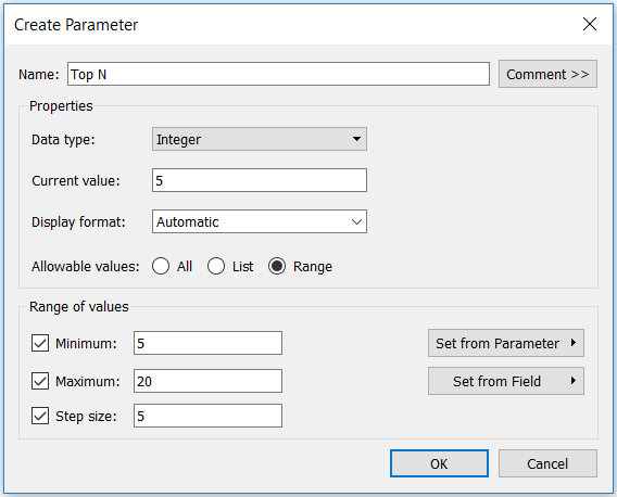
The first step to showing the dimension members of the top N and grouping everything else into one line is to create a parameter for the top N. This will eventually allow the end user to choose how many individual dimension members to show (i.e. top 5, top 6, top 7, and so on). The allowable options are flexible and up to you, but here’s one example when I allow options between 5 and 20 in multiples of 5.
An Introduction to Tableau Parameters
![]()
Create a free account, or login.
Unlock this tutorial and hundreds of other free visual analytics resources from our expert team.
Already have an account? Sign In
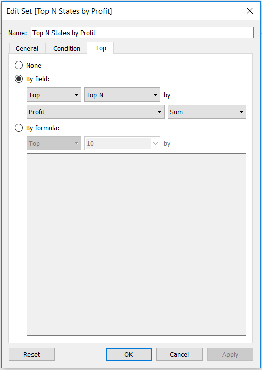
Next, create a set for the dimension you want to segment. For this tutorial, I will create a set out of the State dimension in the Sample – Superstore dataset. The set will be set up to show the top N states by the Profit measure.
To start a set, right-click on the dimension, hover over Create, and click “Set…”. A new dialog will appear where you can set the conditions for which states should be included in the set. Since we are wanting to keep the “top N” based on a specific measure, navigate to the third tab: Top.
Here you can choose a specific number to keep (the default is 10), but you can also click the dropdown located to the right of the hard-coded value and choose our newly created “top N” parameter. Based on our parameter settings, this will keep 5, 10, 15, or 20 states in the set, depending on the current selection.
To finalize the set, we’ll also want to change the measure that the set is based on to Profit. Here’s how my set looks at this point.
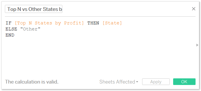
The next step is to create a calculated field that will do the desired grouping. Here is the formula:
Top N vs Other States by Profit = IF [Top N States by Profit] THEN [State] ELSE “Other” END
Now we’re ready to use this calculated dimension in a chart. I’ll place this new calculation on the Rows Shelf, the Profit measure on the Columns Shelf, and sort the bars by profit. Also, be sure to show the parameter control by right-clicking on the top N parameter and choosing “Show Parameter Control”. This will allow you and the end user to choose between the allowable choices of 5, 10, 15, and 20.
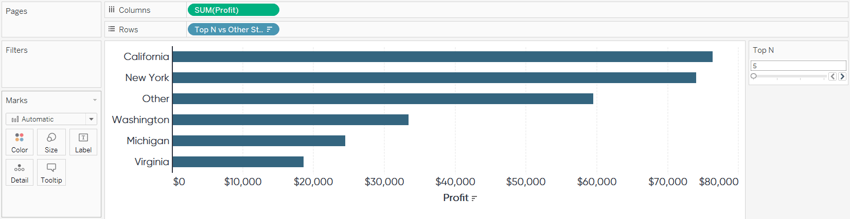
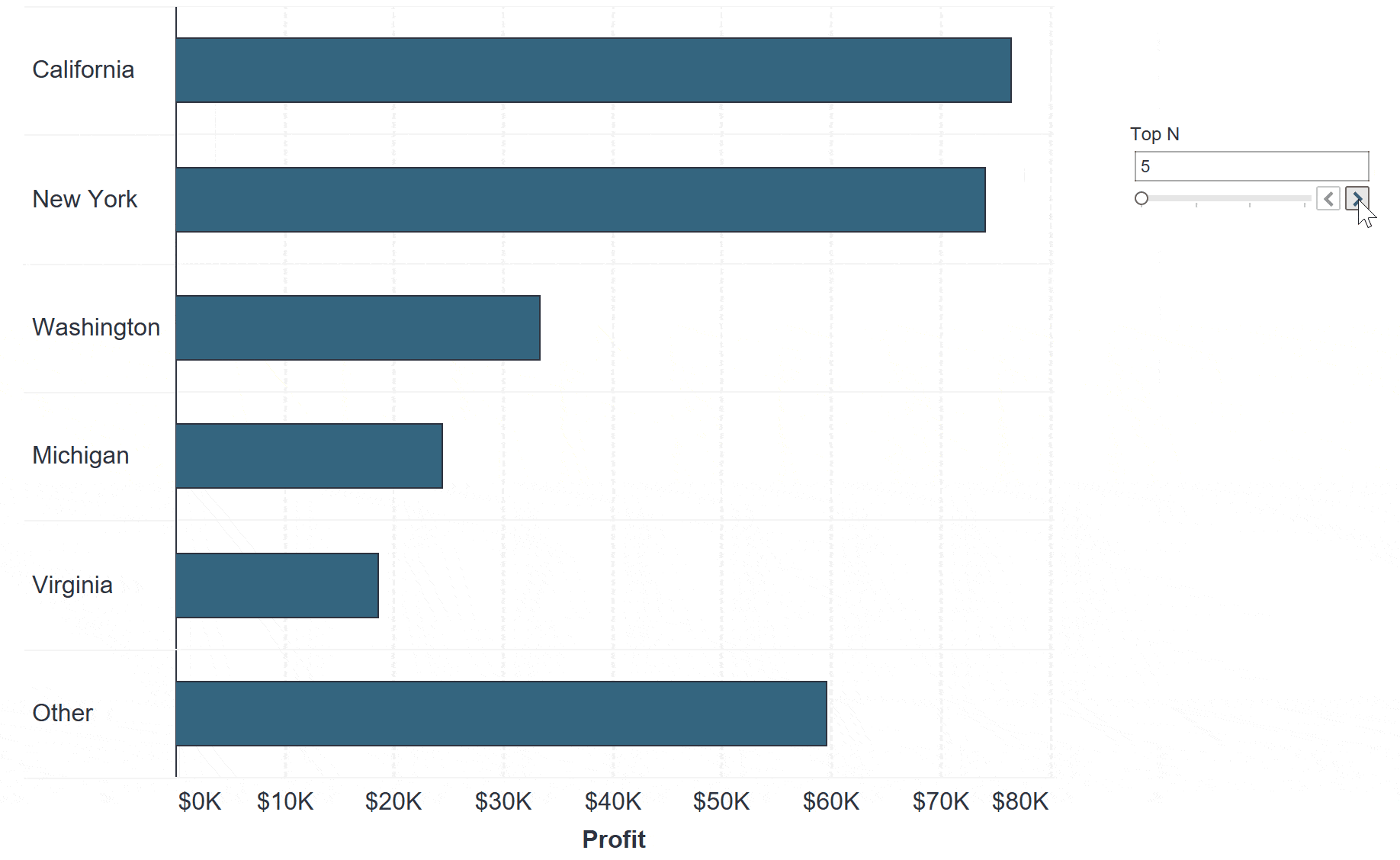
As you can see, when the default parameter value of 5 is selected, there are six bars; one for each of the top 5 states by profit and one for everything else. If you always want the “Other” bar on the bottom, place the “Top N States by Profit” set we created earlier as the first field on the Rows Shelf. This will break up the sets of bars depending on whether or not they’re in the top N.
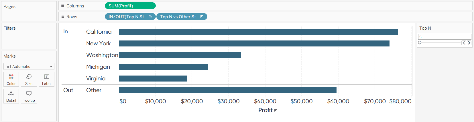
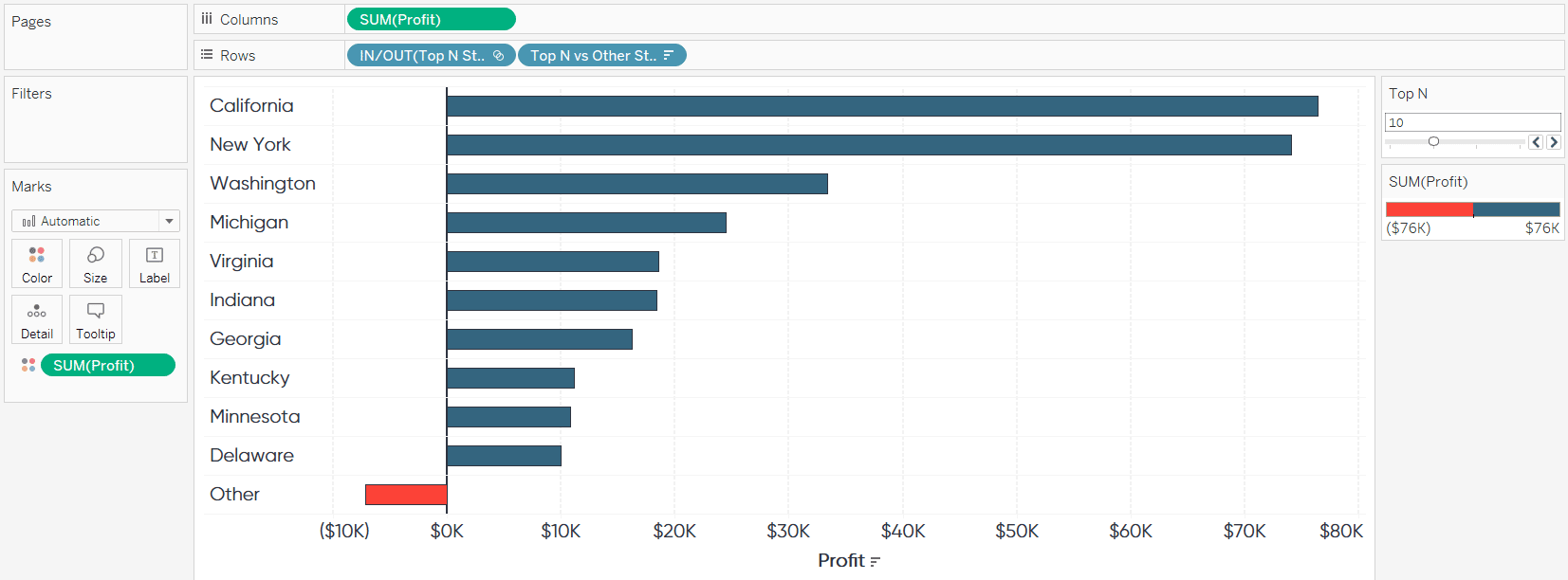
You can always hide the first header for In vs Out by right-clicking on it and deselecting “Show Header”. Now the end user can choose to group the top 5, 10, 15, or 20 and everything else into it’s own segment called “Other”! Here’s how my final view looks after cleaning up the formatting and changing the top N parameter to 10.
Thanks for reading,
– Ryan


Written By
Ryan Sleeper
Related Content
How to Use Tableau Set Actions to Compare the Top N vs Other
Tableau set actions are a new (as of version 2018.3) type of dashboard action that will unlock new user experiences…
The Definitive Guide to Tableau Sets

In this post you will learn how to: (1) create static Tableau sets, (2) create dynamic sets, (3) use sets…
3 Creative Ways to Use Tableau Parameter Actions
I have always described Tableau parameters as a Swiss Army knife due to their infinite applications. In case you are…