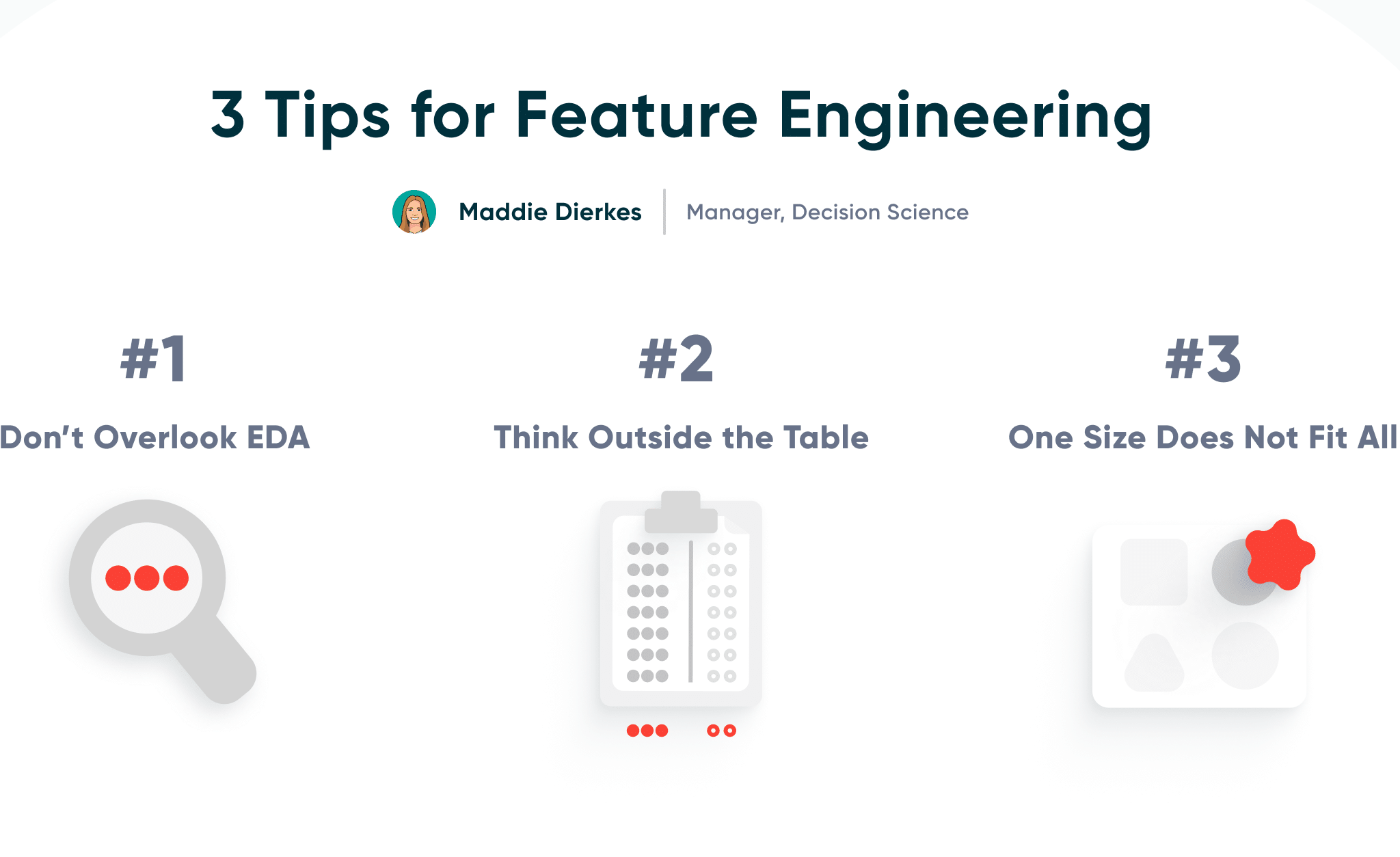
3 Tips for Feature Engineering

Feature Engineering is a critical part of any machine learning project. It is the step of the project where subject matter expertise and statistical knowledge play an integral role in helping the engineer choose the most relevant features for testing and building their models. This tutorial will take you through three feature engineering tips I often utilize when working through a machine learning project.
Assume you are working with a large restaurant chain with a business objective to optimize their staffing at all their locations. They want to ensure they are maximizing revenue by having enough staff to accommodate a busy day while also reducing costs by not overstaffing on slower days. Your goal is to build a machine learning model that predicts the number of customers walking through the door on any day for a specific shift, at a specific restaurant location.
Continue reading with a free account, or login.
Unlock this tutorial and hundreds of other free visual analytics resources from our expert team.
Already have an account? Sign In
By continuing, you agree to our Terms of Use and Privacy Policy.
Don’t overlook EDA

The first step in any data project, before you begin feature engineering, should be exploratory data analysis, or EDA. This step is critical for all data-related projects, not only machine learning. At this point, you probably already know what problem you are trying to solve with machine learning and how the stakeholder defines success. Business analysts or SMEs may have already directed you on what data is relevant for the project, which makes it tempting to save time and skip EDA, but that would be a mistake for a multitude of reasons. Most obviously, EDA is important for the data cleaning process and can also aid in decision-making for feature engineering.
One primary benefit of EDA is understanding the shape of the data. In the EDA portion of the machine learning process, we can understand the scales and formats of all the different variables. This can be achieved by simply looking at the summary statistics and visualizing the distributions. First, I like to isolate the target variable distribution by creating a histogram for numerical variables, or a basic bar chart for categorical variables. This helps you identify if you have an uneven target variable that skews in one direction, and if a transformation or normalization is necessary for a numerical variable. Also, visualizing the possible predictor variables can help you quickly identify which ones may need to go through data cleansing or if there are variables you can exclude altogether, like variables that are all null or only have one value.
The Benefits of Data Visualization for Data Scientists
In this project example, assume you are primarily using point of sale, or POS, data. Through the EDA process, you may be able to see that a majority of the data are ID fields or other irrelevant data fields that can be removed early prior to the feature engineering step.
Using visuals, such as a correlation matrix, can help reveal relationships among the variables in the data. Sometimes this can simply help you identify when two variables are providing the same information to the model. Other times, it helps identify more complex relationships. While there are models that capture predictor interactions automatically, others require the developer to set the interactions, whether they are straight multiplications (Variable A * Variable B), polynomials (Variable A ^2), or others.
![]()
An example of correlation in regards to predicting the number of customers for a restaurant is that as temperature increases to a certain degree, the number of customers could accelerate initially, but as it gets too hot, that rate of acceleration could begin to decrease, especially if that location has an outdoor patio.
Depending on the structure of your data, there are many different tests and statistical measures you can utilize to highlight which predictor variables will be the most informative. The chi-square test of independence and Cramer’s V are great for measuring association between categorical variables, while Spearman’s rank correlation is preferable for numerical or ordinal variables. You can also experiment with regularization, a common machine learning method, which can be used to remove redundant variables if two variables have a high correlation (multicollinearity).
Ultimately, EDA is all about getting more familiar with the data. You may need to continue partnering with the subject matter expert who is closest to the data to fully understand the interactions between variables. This strategic step is one of the most important, but it can take time. Don’t be tempted to take shortcuts on EDA to deliver the product faster. Doing so could prolong the process inadvertently.
Advanced Analytics in Tableau Series: One-Way ANOVA Tests
Think outside the table

Thinking outside the table means looking beyond the base dataset to elevate model performance. This allows you to remove the limits of what features can be incorporated into your models.
For this restaurant chain example, you may use transactional data to predict the number of customers per meal service. However, other departments within an organization may have additional information that impacts the number of customers that come in on any given day. For example, marketing and advertising teams could provide data for marketing campaigns and media spend in certain areas that would add important information to the model.
Another example of thinking outside the table would be incorporating open-source data into the model. There are a lot of different data sources you can utilize, but census and economic data would be relevant predictors for the number of customers. Census data would provide housing and population information for areas surrounding the restaurants. Economic data, such as inflation and unemployment rates, are often indicators of people’s current willingness to spend on eating out. Both of which are impactful data points that a business would not typically have in its internal databases.
One size does not fit all

My last tip is to remember that there is no one-size-fits-all solution for feature engineering. Data scientists fresh out of school or bootcamps are used to projects with predetermined destinations. However, in practice, the problem you are trying to solve is unique. There are best practices and ideas online to help guide your thought process, but it’s important to collaborate with SMEs to understand the data while doing feature engineering.
For this restaurant example, this tip is especially helpful when dealing with date fields. Think about your own eating out habits. Is there a day of the week or time of year when you are eating out more often? I would definitely be able to find a trend in my personal eating out habits. So unsurprisingly, “date” is a very important field in determining restaurant capacity. Date fields typically need to be transformed into numerical variables in order to use them in machine learning models.
How to Analyze A/B Tests in Tableau Using Z-Tests
Thinking through the lens of our example, the easiest approach would be simply converting month and day of week to their numeric counterparts, 1-12 for month and 1-7 for week. However, you may have noticed in your EDA that the number of customers per month and per day of the week doesn’t exhibit the same behavior. Ask yourself questions on why the month is important: what impact does month have on the likelihood of going out to eat? The month itself may not have a large impact, but the characteristics of that month do, such as temperature and daylight hours. When you convert months to numbers 1-12, you are telling the model that December resembles July more than January. Applying our assumptions of the business, that is most likely not true as December is during winter and July is during summer. To address this, you would need to apply a sin/cos transformation to convert the 1-12 to a cyclical scale of 0-1.
While day of week could also have an impact on the number of customers, it would not have the same relationship as month of the year, so the sin/cos transformation wouldn’t be applicable here. You may have discovered during EDA that there are a higher number of customers on the weekend, so simply applying a 1-7 transformation starting with Monday as 1 would more accurately represent the data.
The key takeaway here is that you need to apply your own critical thinking skills to be able to determine these details. Think of the process, place, and people as you would interact with them. Data is great, but putting a human touch to it can make or break your machine learning model.
Bonus tip: Consult others
The one thing I find so inspiring about the data community is their willingness to share. While every situation is unique, break the problem down and explore resources online to help move you along in your project. Jump online, explore, and ask others for help!
Stay after it,
Maddie

Written By
Maddie Dierkes

Peer Review
Megan Spengler
Sr. Visual Analytics Associate
Related Content
Quick Start Guide to TabPy
TabPy is a Tableau feature that allows you to utilize Python scripts as calculated fields for your visualizations. It is…

Ethan Lang
Detecting Outliers in Non-Normalized Data In this tutorial, Ethan will explain how to implement the Median Absolute Deviation equation in…
The Benefits of Data Visualization for Data Scientists
At Playfair Data, we have covered dozens of ways to visualize data, and shared our tips, tricks and best practices,…