3 Totals Hacks to Transform Your Tableau Bar Charts
I’ve recently had a fantastic run of totals-based discoveries. I’ll admit – I’ve overlooked the humble Totals feature. At the Tableau Conference, a friend showed me how the space and marks created by adding totals can enable new spacing and labeling configurations. Not long after, I had the opportunity to apply the technique in a new creative way.
This tutorial will guide you through three tricks that have been successfully implemented in real projects. These examples build on existing Playfair methods, including charts from our Beautiful Bar Charts and Brilliant Bullet Graphs posts.
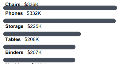
Subtotals make space for top-aligned labels
Adding subtotals to these rounded bars creates space for the top-aligned labels.
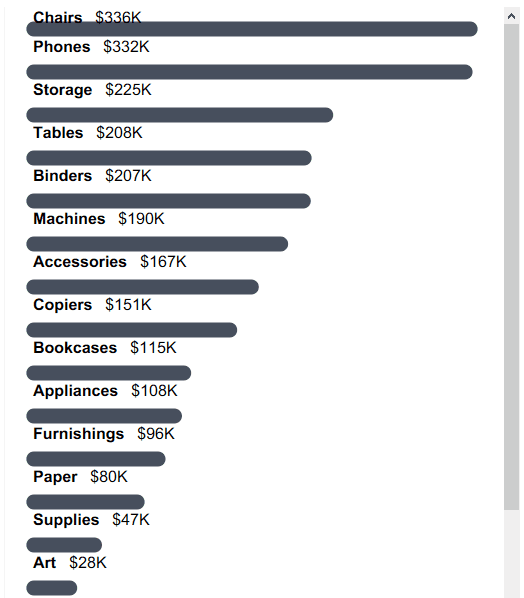
Rounded bars are one of Playfair Data’s signature charts. Labels above each bar allow the chart to fit into narrower spaces than traditional left-side headers. However, the topmost label can be cut off by the top of the worksheet.
Subtotals can create space for each label, including the top bar. If you would like to follow along, set up your initial view by creating a rounded bar chart with the labels aligned to the top left. If you need help with the set up, I recommend reviewing 3 More Ways to Make Beautiful Bar Charts in Tableau.
Next, add a second copy of your row dimension to the Rows shelf. One easy way to do this is to hold the Ctrl key while you left-click and drag the duplicated pill next to itself.
Now we’ll turn on subtotals which you can do by navigating to Analysis > Totals > Add All Subtotals.
Then move the subtotals to the top of each row. This setting is under the same Totals menu, listed as Column Totals to Top.
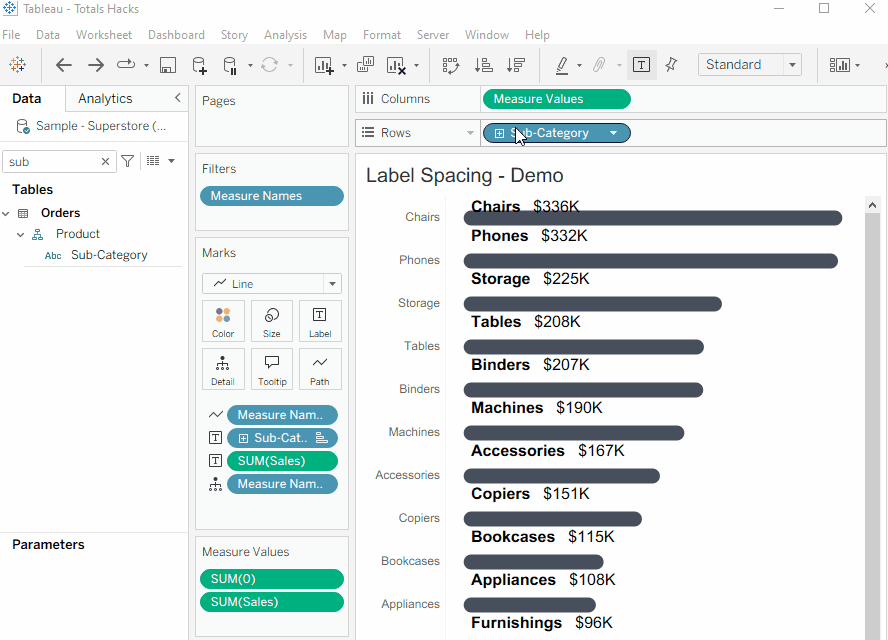
Finally, resize your rows as needed and update the border formatting. At this point, your rounded bar charts should look similar to this:
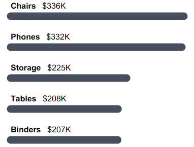
Tableau Formatting Series: How to Use Lines and Borders
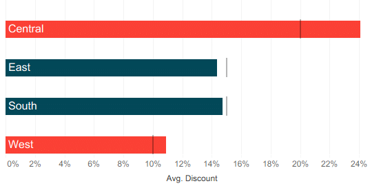
Separate bullet chart reference lines
Adding subtotals to this bullet chart creates separation between the reference lines.
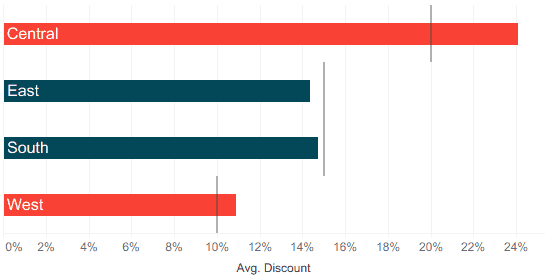
Tableau doesn’t have a way to control the size of a reference line, so the reference lines for each bar fill the entire row height, meeting when they share values. This isn’t necessarily an issue, but sometimes we want the bars to stand out independently.
When we want visual separation between rows, subtotals create space between reference lines.
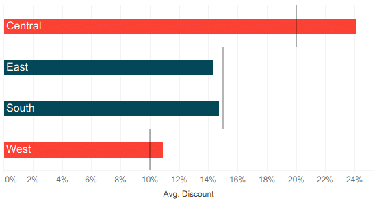
Start the tutorial by creating a horizontal bar chart with a reference line. Set the reference line scope to ‘Per Cell’.
Bring a second copy of your row dimension to the Rows shelf.
Continue reading with a free account, or login.
Unlock this tutorial and hundreds of other free visual analytics resources from our expert team.
Already have an account? Sign In
By continuing, you agree to our Terms of Use and Privacy Policy.
Navigate to Analysis > Totals > Add All Subtotals to turn on subtotals.
In the same Totals menu, select Column Totals to Top to shift the subtotals to the top of each row.
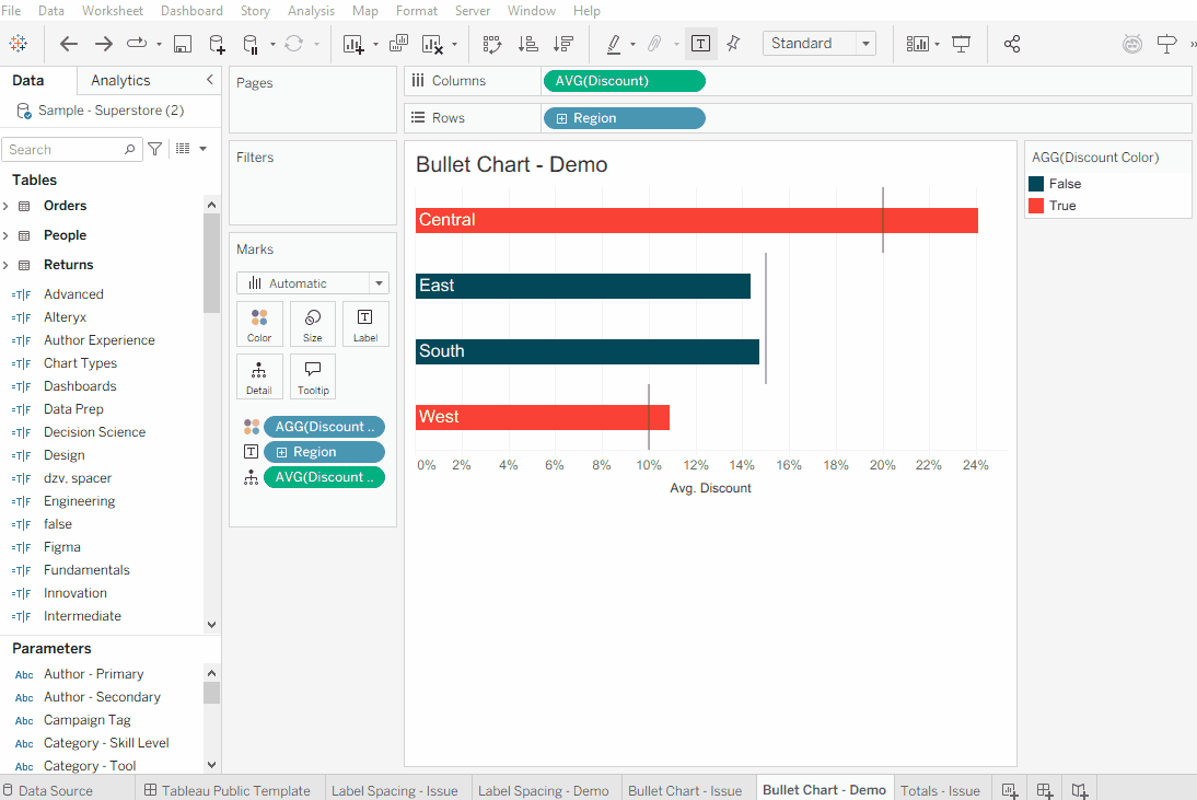
Then adjust row height, mark size, and formatting to finalize the view. Now we have reference lines that don’t extend to the entire height of the cells and we didn’t need to use the dual axis for this formatting trick!
Show totals without overwhelming the axis
There is a way to show the totals label without showing a totals bar!
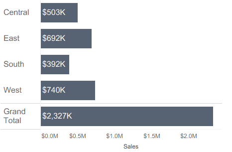
Totals and subtotals add helpful context to bar charts, but the longer bar length for the totals row can overwhelm the axis. The problem with this default behavior is that when the grand total is on a drastically different scale than the dimension members that make up the total, the rest of the chart can be harder to analyze.
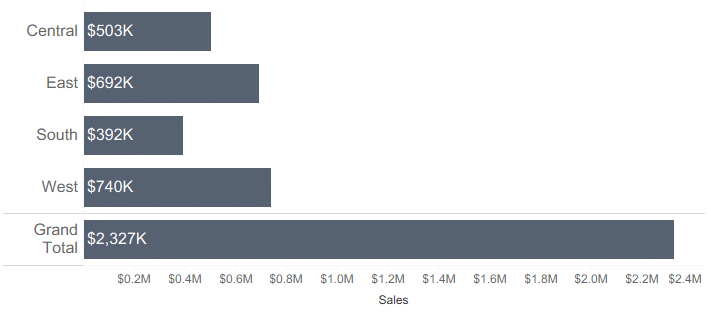
Fortunately, my third and final new hack is a way to show the totals label without showing a totals bar!
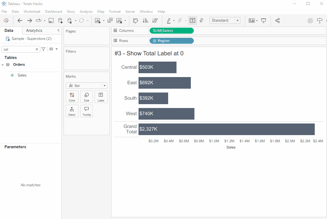
First, create a horizontal bar chart and turn on totals. Click on the measure pill on your Columns shelf and look at the Total Using settings. Change the value to hide; this will make the totals bar disappear.
![]()
Next, move your measure from the Columns shelf to the Size property of the Marks card. This creates a slightly different bar chart, one with no axis and with a mark in the totals row. Bring a new copy of the measure onto the Label property of the Marks card to add a label to the totals mark.
Finally, hide the totals mark. Add the dimension from the Rows shelf to the Color property, and set the color of ‘Total’ to the chart background color.
Now the totals label appears below the bar chart in its row, with no bar. The axis length is set by the longest bar, not the total value.
Even after 10 years of using Tableau, I’m still picking up new tricks! This year has transformed how I use totals and subtotals, and the tricks they enable. I hope this tutorial inspires you to try something new with these features!
Thanks for reading,
Felicia

Written By
Felicia Styer

Peer Review
Matt Snively
Sr. Manager, Analytics Engineering
Related Content
Bringing Tables Together: Working Across Independent Data Sources in Tableau
Welcome to the fourth part of our series on bringing tables together! This article covers working with multiple data sources…

Felicia Styer
Learn about Relationships and Tableau’s Logical Layer Are you struggling to combine data from different data sources? This video demonstrates…
3 Ways to Make Brilliant Bullet Graphs in Tableau

Setting goals and measuring progress is a common activity for many people. Maybe someone wants to read 25 books, travel…