3 Ways to Make Lovely Line Graphs in Tableau

Due to the popularity of 3 Ways to Make Beautiful Bar Charts in Tableau, I’ve decided to follow it up with some ideas for making your line graphs more engaging in Tableau. Line graphs are a close second to bar charts as my favorite fundamental visualization type and are the obvious choice for evaluating trends over time.
Like bar charts, the invention of line graphs is generally credited to William Playfair at the end of the 18th century. Also like bar charts, I blame their age and people’s familiarity with line graphs as the reason some data visualization enthusiasts look for “more engaging” choices. Line graphs have stood the test of time and their effectiveness cannot be denied. I’m hoping that these three approaches help cement line graphs as a top choice for your Tableau data visualizations.
3 More Ways to Make Lovely Line Graphs in Tableau
FAQs answered in this post:
How do I add markers to line graphs in Tableau?
Adding markers to Tableau line graphs is straightforward through the Color property of the Marks card. Click on the Color property of the Marks card, then select the second Markers option to display circles at each data point. Markers serve both a practical purpose—showing where data exists—and a visual purpose by making line graphs more engaging and easier to read at a glance, particularly useful when presenting trends to executives who need quick visual cues.
What is the best way to highlight a specific line in Tableau without using parameters?
The simplest approach is to manually remap colors by clicking on the color legend and changing unimportant dimension members to light gray while keeping your priority line in a bold, saturated color. This creates permanent visual hierarchy that draws stakeholder attention to the metric that matters most—ideal for executive dashboards where you want to control the narrative and ensure decision-makers focus on specific performance indicators without interactive filtering.
How can I reduce visual clutter on Tableau line graph axes?
Right-click on the axis, choose “Edit Axis,” navigate to the “Tick Marks” tab, and manually set fixed intervals that reduce gridline density. For time-series data, showing only the start and end dates often provides sufficient context while maximizing the data-ink ratio. This technique is especially effective in dashboard environments where multiple visualizations compete for attention, allowing your audience to process insights faster with less cognitive load from unnecessary visual elements.
When should I use dual-axis line graphs in Tableau?
Dual-axis line graphs work effectively in two scenarios: creating enhanced markers by placing the same measure twice with different mark types (line and circle), or combining line and area charts inspired by Google Analytics for single-metric storytelling. The dual-axis approach allows you to layer visual elements that would otherwise require separate charts, making complex insights more accessible while maintaining a clean dashboard layout that resonates with data-driven organizations.
Why should I remove the MONTH axis title in Tableau line graphs?
The axis title indicating date granularity is typically redundant—the time period is usually clear from context, the overall title, or the month labels themselves. Remove it by right-clicking the axis, selecting “Edit Axis,” and deleting all text from the title field. This follows Tufte’s data-ink ratio principle by eliminating unnecessary elements, allowing business users to focus on trends and patterns rather than descriptive labels that don’t add analytical value to the visualization.
How can Playfair Data improve our organization’s Tableau implementation?
Playfair Data offers comprehensive Tableau professional services and training that transforms basic visualizations into strategic assets for enterprise decision-making. Our team—including multiple Tableau Visionaries and authors of industry-standard books like Practical Tableau—specializes in visual analytics engineering, design systems, and dashboard governance that accelerate time-to-insight across your organization. Book a complimentary strategy call to learn how our proven methodologies and Flagship Tableau workshops can elevate your analytics capabilities and maximize ROI from your Tableau investment.
1. Use formatting available in Tableau
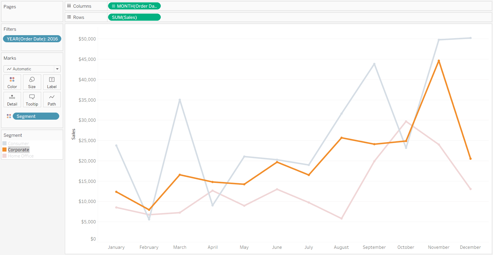
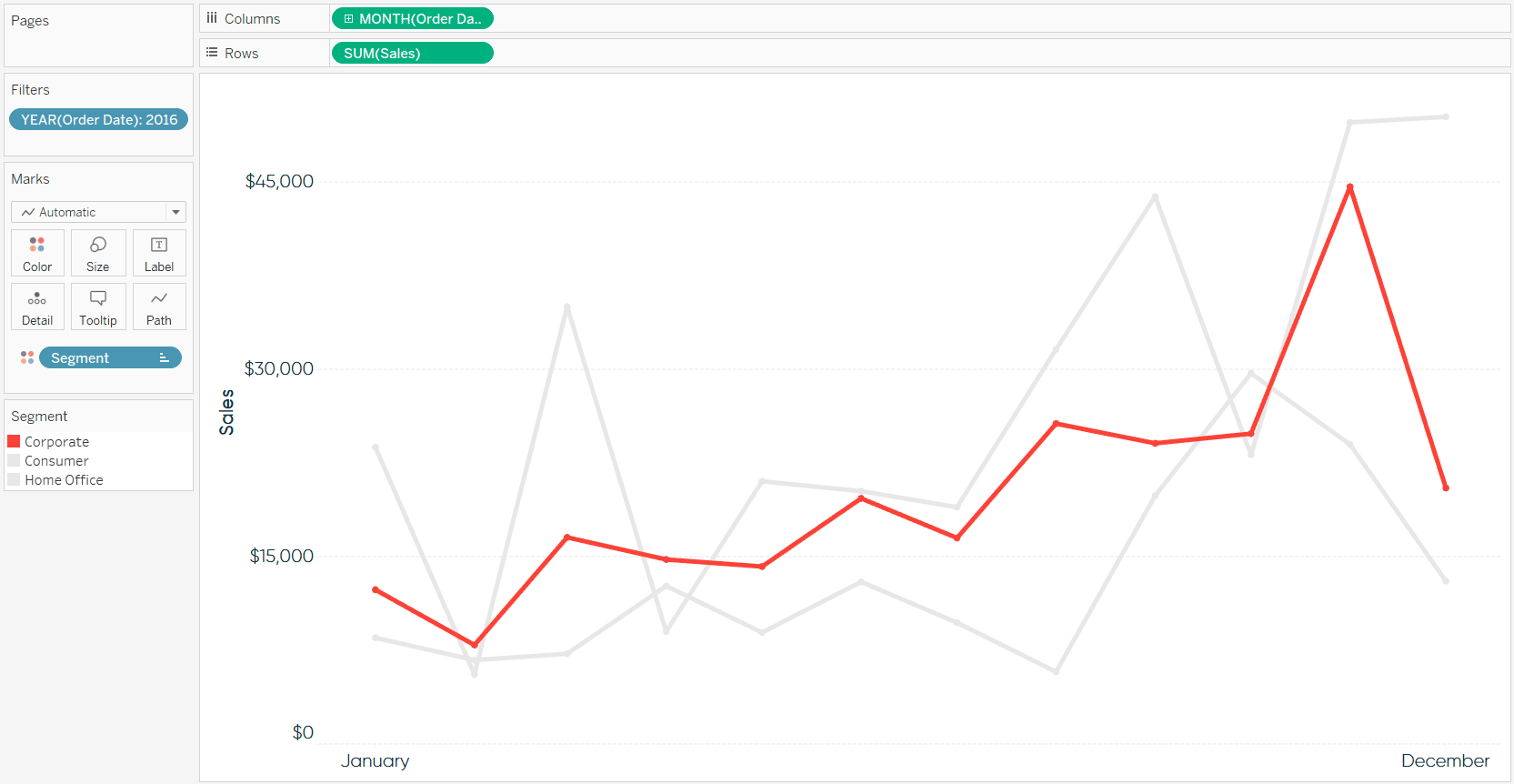
My first tip for making line graphs more engaging is to use the formatting options available to you in Tableau. Consider the following sales by segment line graph with all of the default Tableau format settings. Note that I’ve used the Month([Order Date]) field as continuous and filtered the data to the year 2016.
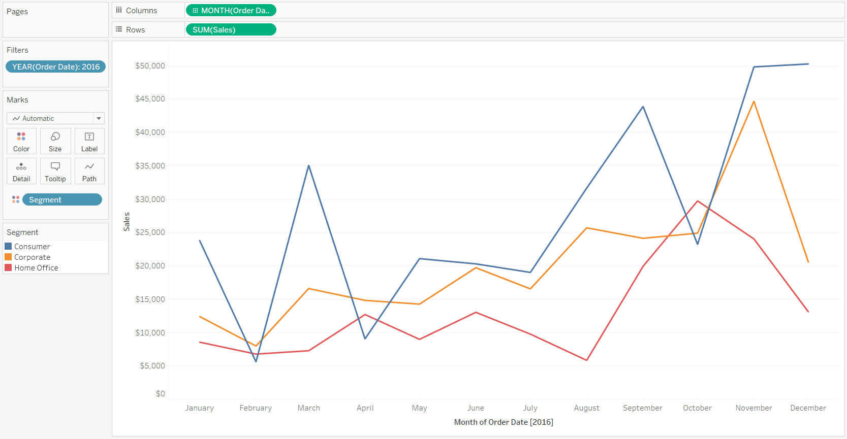
A great deal of thought went into Tableau’s default formatting, including the fonts, colors, and mark sizing. So as can be expected from my data visualization tool of choice, this graph is already getting the job done and providing good insights. That being said, if one of your objectives is to make the graph as engaging as possible, there are several opportunities to add value to this view.
![]()
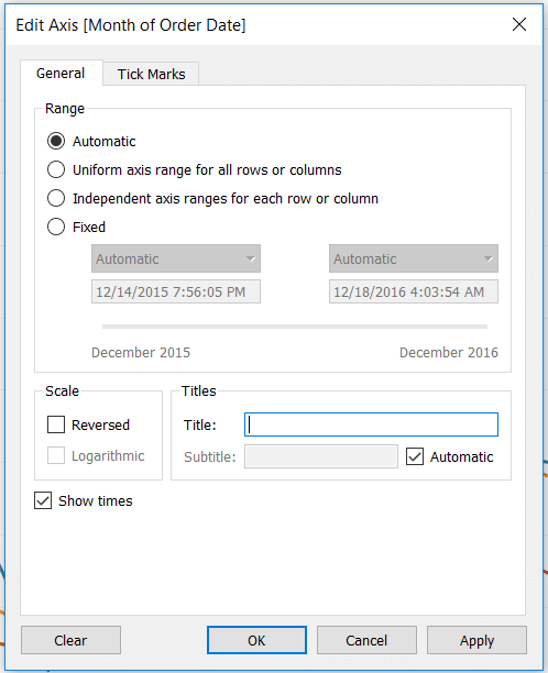
First, I’ve never personally liked the axis title that is used to designate the date granularity when you are using a date field continuously. While I appreciate the clarity the axis title provides, this information is typically already implied in the graph itself and usually stated in surrounding context (i.e. “This is a graph about Sales by Month last year”). I almost always get rid of this axis title. Unfortunately, if you right-click on the axis and deselect “Show Header”, both the axis title and month names disappear. To get rid of only the axis title but keep the month names, right-click on the axis and choose “Edit Axis…”. This will open a dialog box where you can change the axis title. The trick is to simply delete all of the text on this line; then click the OK button.
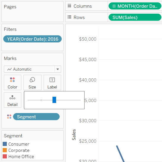
Next, if this is a standalone visualization, the weight of the lines is too light. To change the weight of the lines, click on the Size Marks Card and drag the slider left or right until the lines are weighted as desired. I normally find that the second ‘notch’ on the Size Marks Card is a good option for lines.
Take this on a case-by-case basis because sometimes heavier lines won’t look good when used in a tighter space (such as one of several components on a dashboard).
The next formatting tip addresses one of the most common questions I am asked while speaking about Tableau: Markers. Markers are the small circles that are sometimes seen on data points of a line graph. Markers serve a practical purpose of telling the end user where there is data in a subtle way, and they also are an easy way to enhance a line graph. To add markers, click on the Color Marks Card and select the second Markers option.
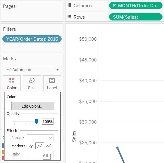
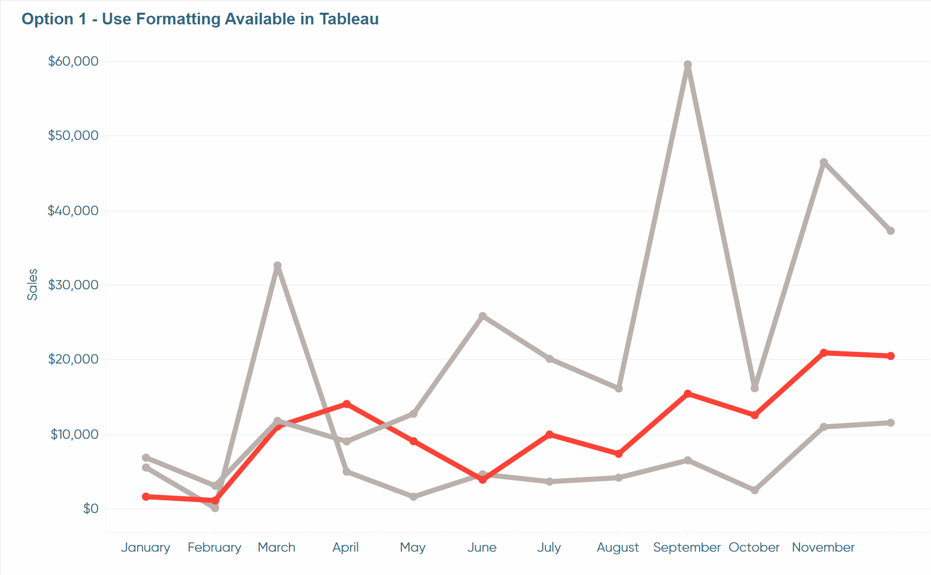
The next tip is optional, but many times I like to make the line or insight that I care about “pop” on the view. This can be accomplished in several ways; the easiest of which is to click a dimension member on the color legend.
This approach also allows the end user to make the selection that they care about. Another way to highlight a dimension member would be to show a highlighter for the Segment dimension. This would be accomplished by right-clicking on the Segment dimension (currently on the Color Marks Card) and choosing “Show Highlighter”.
There are other times that you want to make the highlight more permanent. Maybe I am the manager of the corporate segment, so I always want it highlighted throughout all views. Or maybe I’m not allowed to see the performance of the other dimension members, but my boss wanted me to see my segment’s performance in context of the others. There is a way to do this with parameters which is beyond the scope of this post, but it can also be accomplished easily by changing the colors of the dimension members. Here’s how my line graph looks after “graying out” two out of three dimension members by clicking on the color legend and remapping the colors. To finalize the view, I’ve also put the colors and fonts in brand.
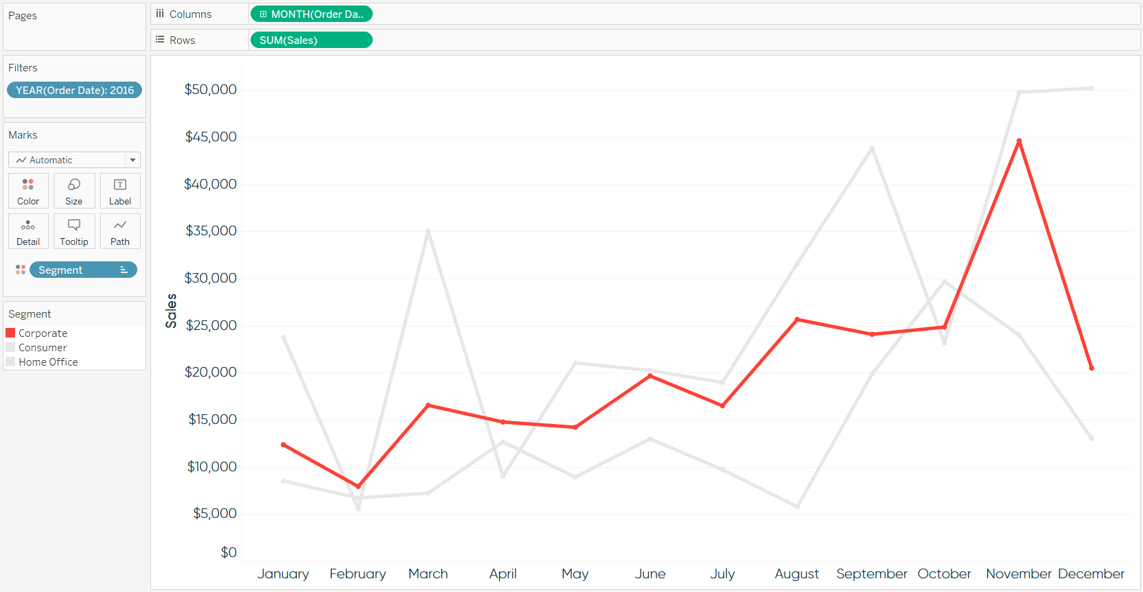
How to Highlight a Dimension Member in Tableau
2. Maximize the data-ink ratio
The next tip should be considered for any visualization you create: Maximize the ‘data-ink ratio’. The data-ink ratio is a concept introduced by Edward Tufte, who says you should dedicate as much ‘ink’ on a view to the data as possible. This means getting rid of unnecessary lines, effects, and anything else that detracts from the data itself.
There are a couple of opportunities to make our line graph even more minimalistic than it already is. First, the axis ticks on the Sales axis can be reduced by at least half. The axis ticks for Sales on this line graph are the multiples of $5,000 going up the Y-axis. By default, these are often too granular for my taste, and cause too many extra lines and too much ink. To fix the axis ticks, right-click on the Y-axis, click “Edit Axis…”, and navigate to the “Tick Marks” tab. You should beware that this option truly does fix the axis tick marks, so if you filter the view later, this setting will stick.
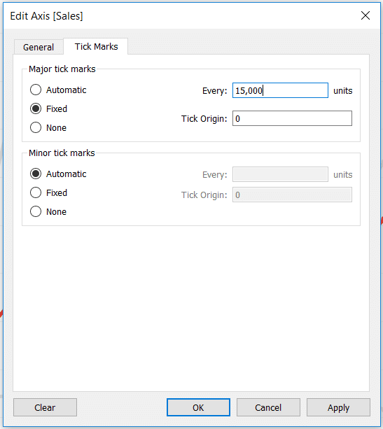
Here’s how my line graph looks after fixing the tick marks at 15,000 units.

This same approach can be taken on the X-axis with months if you are using a continuous axis. This is not always an appropriate choice, but often the range of the axis is enough to communicate what the visualization is about. I often show only the starting point and end point of the X-axis of a line graph, especially when using sparklines. Here’s how my line graph looks after fixing the axis ticks at eleven months with an origin of January 1st.

To finalize the view, I will hide the axis rulers and change the gridlines to dotted. Both of these options are found in the formatting pane, which you can reach by right-clicking on the graph and choosing “Format…”.
Compare this to the default line graph at the beginning of the post!
Data-Ink Ratio Animation and How to Apply it in Tableau
3. Leverage the dual-axis for Tableau line graphs
There are at least two ways the second axis on a line graph can be used to enhance the visualization. Let’s say that we really like the markers from the formatting tip above, but would like to make them more pronounced. To do this, start by putting the Sales measure on the Rows Shelf a second time, right-click on it, and choose “Dual Axis”.
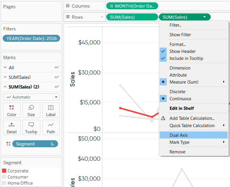
Ensure the axes line up by right-clicking on the right axis and choosing “Synchronize Axis”.
How to Make Dual-Axis Combination Charts in Tableau and Some Creative Applications
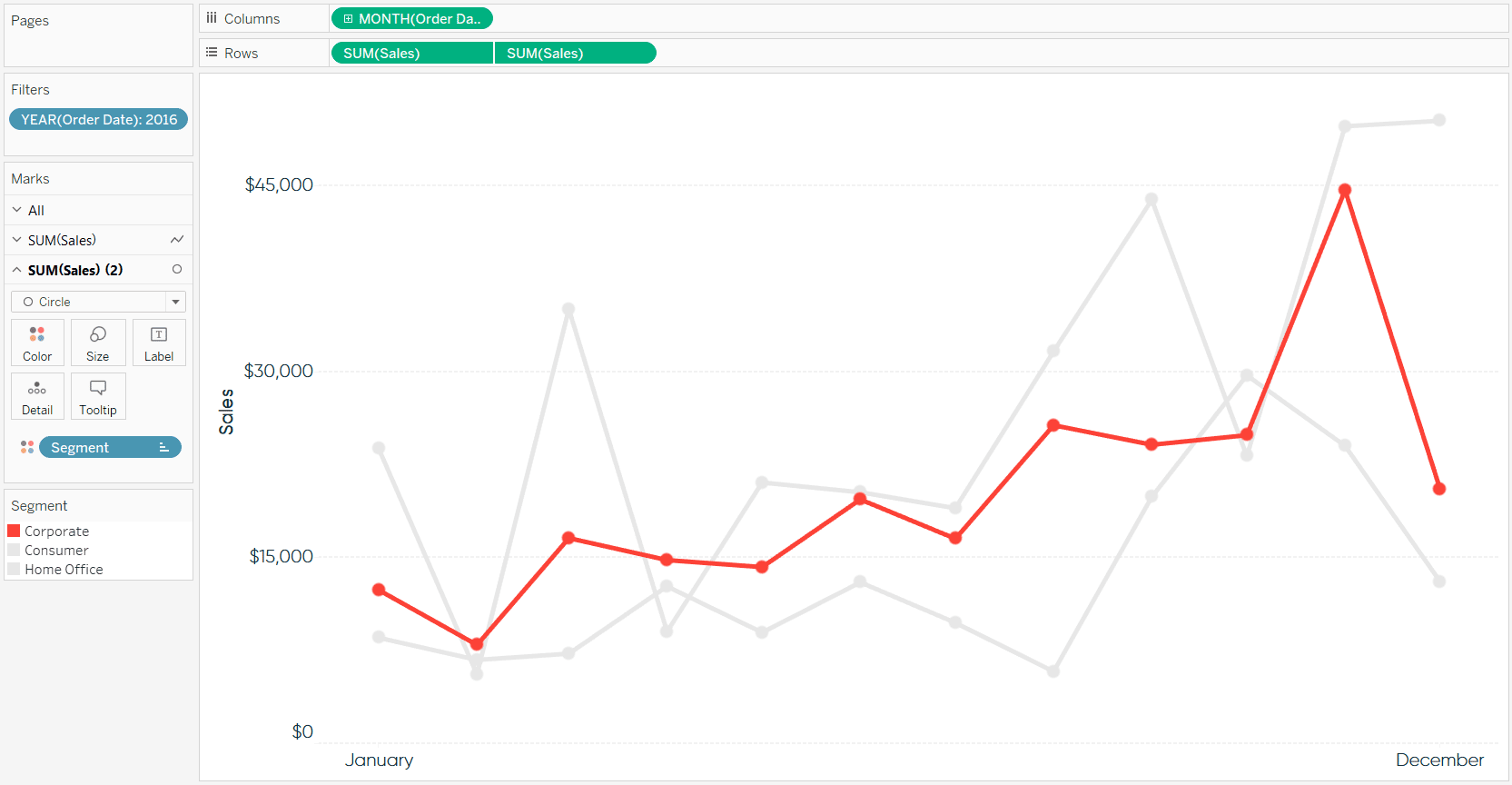
Now that you’ve got two measures on the Rows Shelf, you’ve also got two sets of Marks Cards on the Marks Shelf. These can be edited independently, which means you can keep the mark type for the first occurrence of Sales as Line, but change the mark type for the second occurrence of Sales to Circle.
Continue reading with a free account, or login.
Unlock this tutorial and hundreds of other free visual analytics resources from our expert team.
Already have an account? Sign In
By continuing, you agree to our Terms of Use and Privacy Policy.
After sizing the circles, which are your new markers, hide the right-axis by clicking on it and choosing “Show Header”.
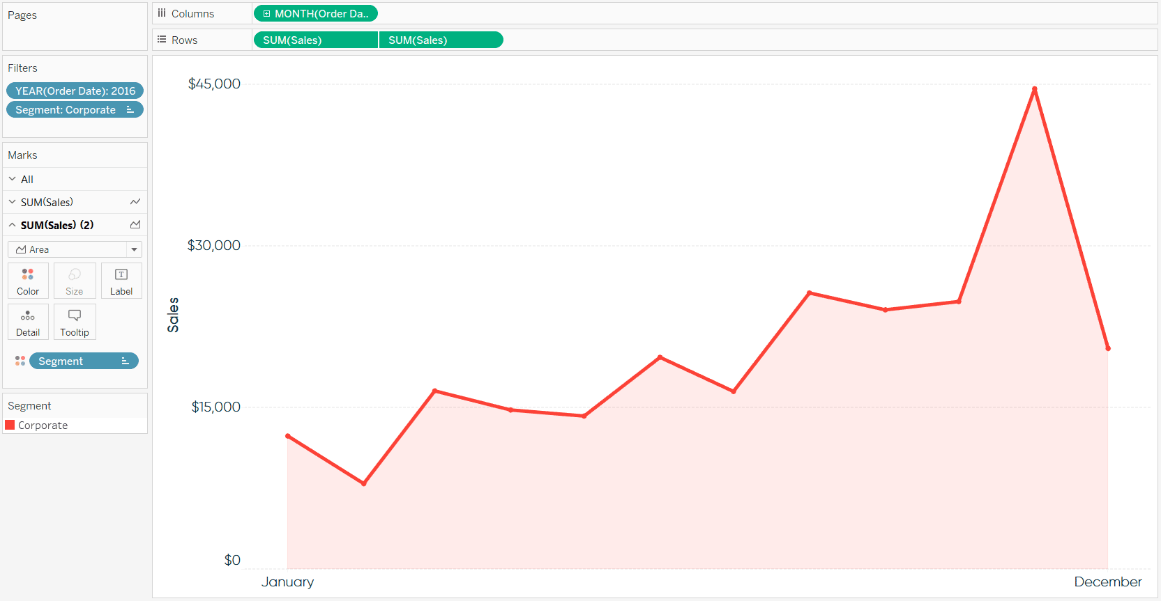
The last tip for using the dual-axis to enhance a line graph is a design inspired by Google Analytics. When showing only one measure and dimension member at a time, Google Analytics shows a dual-axis line graph/area graph combination.
![]()
To show you this approach, I am going to filter the view to only the segment that I care about: Corporate.

Now that we’ve isolated a single dimension member, change the Mark Type on the second occurrence of Sales to Area. Lastly, reduce the opacity of the area to something very light, such as 10%. Here is how my final view looks.
Thanks for reading,
– Ryan
This content is excerpted from my book Practical Tableau: 100 Tips, Tutorials, and Strategies from a Tableau Zen Master published by O’Reilly Media Inc., 2018, ISBN: 978-1491977316. Get the book at Amazon.


Written By
Ryan Sleeper
Related Content
3 Ways to Make Lovely Line Graphs in Oracle Analytics Cloud

As far as I’m concerned, boring chart types are always in style. The problem-solving principle of Occam’s Razor states that,…
3 More Ways to Make Lovely Line Graphs in Tableau

Tableau line graphs are one of the most widely used visualizations on dashboards today – it’s hard to beat a…
3 More Ways to Make Beautiful Bar Charts in Tableau
The humble Tableau bar chart still reigns supreme when it comes to visualizing differences between categorial, or discrete, data –…