3 Ways to Make Beautiful Bar Charts in Oracle Analytics Cloud

When it comes to comparing discrete categorical values, rarely is there a better choice than the bar chart. Invented by our company’s namesake, William Playfair, the bar chart is one of the oldest and most effective chart types that has stood the test of time. Similar to the line graph, building a bar chart in Oracle Analytics is one of the best choices when visualizing data for a wide range of audiences from executives to non-technical users.
By the end of this tutorial, you will be able to engineer a simple bar chart with default formatting, learn how to maximize the data-ink ratio with direct labels, and add caps to your bars for more seamless comparisons.
View / Interact / Download
FAQs answered in this post:
How do I create a basic bar chart in Oracle Analytics Cloud?
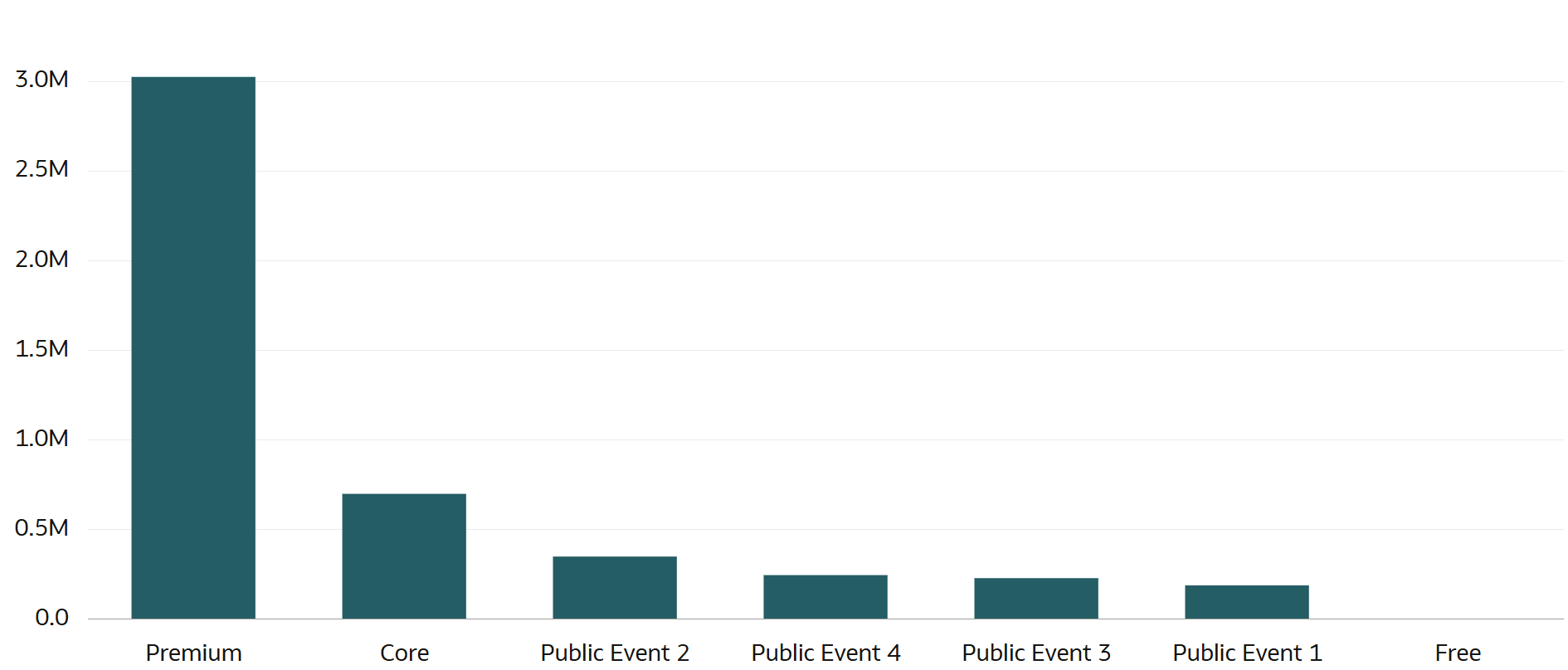
Drag the Bar visualization from the Visualizations pane onto the canvas, then add a dimension to Category and a measure to Values. Sort the bars from high to low using the Sort button to enable comparison by both height and rank order. Improve the data-ink ratio by setting axis titles to None, formatting numbers as Currency with appropriate abbreviations, and removing unnecessary gridlines.
What is double encoding and when should I avoid it in Oracle Analytics bar charts?
Double encoding uses two visual cues to represent the same data point, such as displaying both axis labels and direct labels on bars. While this can provide clarity for accessibility, it often creates chart junk and redundancy in simple visualizations. When adding direct labels to Oracle Analytics bar charts, remove the y-axis and gridlines to avoid double encoding and maximize the data-ink ratio.
How do I add direct labels to bar charts in Oracle Analytics Cloud?
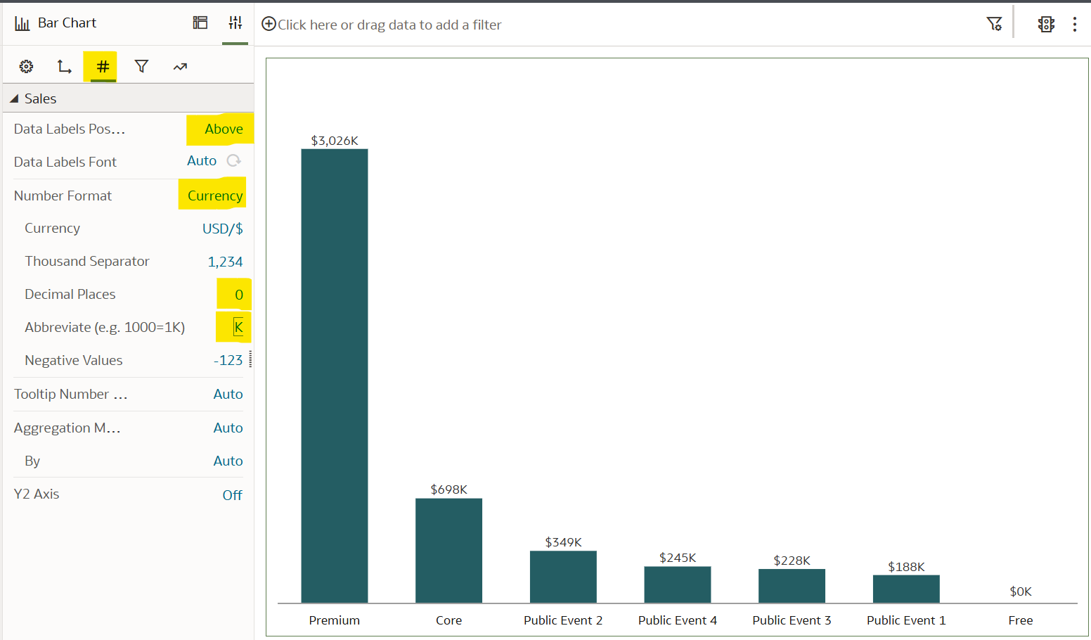
Navigate to the Values tab in the Properties pane and set Data Labels Position to Above or Top. Format the labels with Currency, zero decimal places, and appropriate abbreviations like K for thousands. Direct labeling improves comparison of bars with similar values, enhances design quality, and eliminates the need for viewers to reference axis scales.
What are capped bar charts and how do I build them in Oracle Analytics Cloud?
Capped bar charts add small horizontal segments at the top of bars using stacked bar visualization, creating visual polish and potentially representing secondary metrics like goals. Create a calculated field (SUM(Sales) * .01) for dynamic cap sizing, add it above your measure in Values, then change to Stacked Bar visualization. Use contrasting shades of the same color to differentiate caps from bars and reduce confusion with true stacked bar charts.
Why is sorting important for bar chart effectiveness in Oracle Analytics?
Sorting bar charts from high to low allows stakeholders to compare not only the preattentive attribute of height but also rank order at a glance. This leverages how our brains process categorical comparisons most efficiently, making it easier to identify top performers, outliers, and patterns. Use the Sort button in the visualization toolbar to quickly apply high-to-low or low-to-high ordering based on your measure values.
How can Playfair Data help optimize our Oracle Analytics Cloud bar chart implementations?
Playfair Data is an Oracle Partner specializing in visual analytics that applies design principles like the data-ink ratio to Oracle Analytics Cloud implementations. Our team transforms standard bar charts into strategic decision-making tools through proper formatting, direct labeling, and advanced techniques. Schedule a complimentary strategy call to discover how our Oracle Analytics expertise can elevate your enterprise dashboards and improve stakeholder engagement.
1. Default bar chart formatting in Oracle Analytics
With Oracle Analytics’ “drag and drop” approach to chart building, creating a bar chart with default formatting in Oracle Analytics is quite simple. The steps required include choosing the visualization type, adding the desired dimensions and measures, and formatting it to your liking.
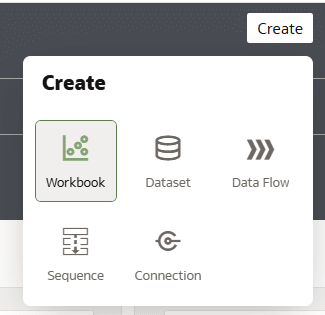
In the Oracle Analytics Home dashboard, start by creating a new workbook by choosing the button at the top right that says “Create”. Then select “Workbook”.
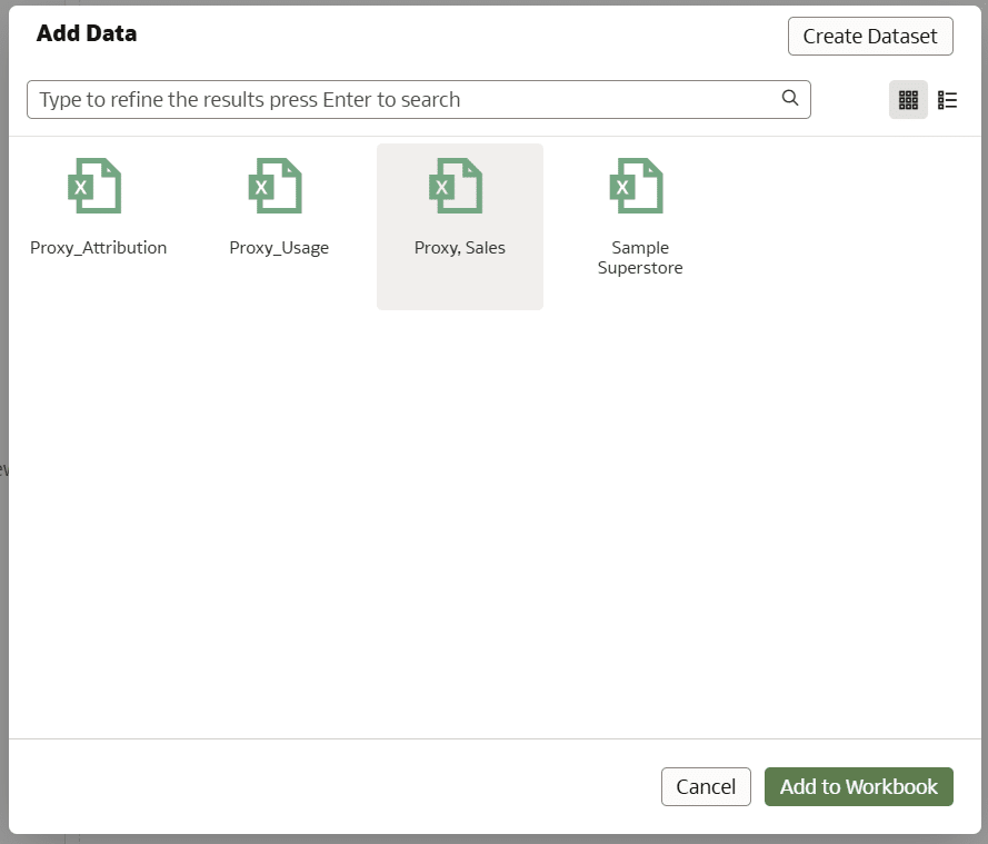
If you want to follow along with the data I’m using, connect to the Sales table from the Proxy dataset by choosing “Proxy, Sales”, then select “Add to Workbook”.
Next, navigate to the Visualizations pane, select, drag, and drop Bar into the canvas.
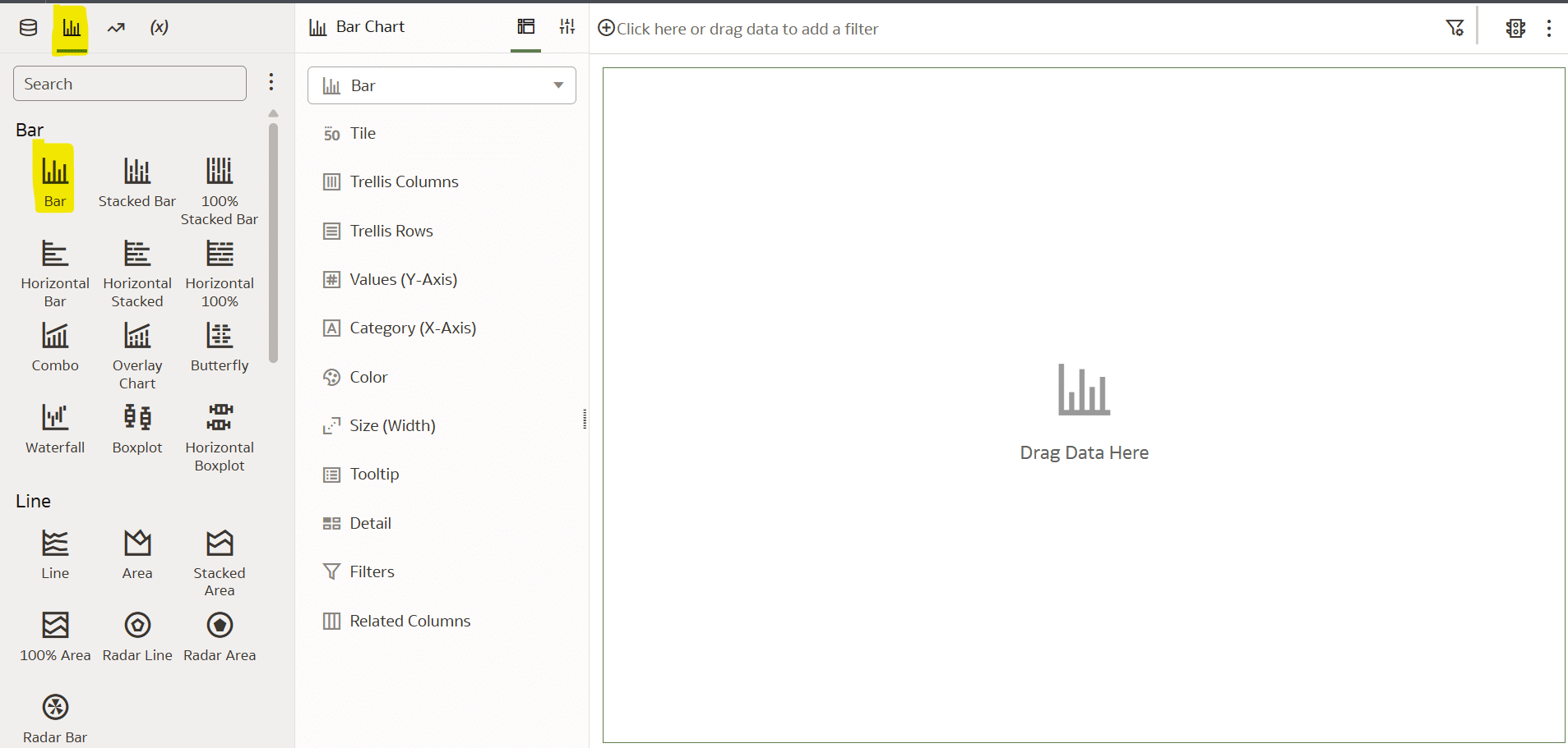
With the Bar chart visualization added to the view, we now need to add at least one dimension to Category and one measure to Values. From the Data pane, drag Sales onto Values and Product onto Category.
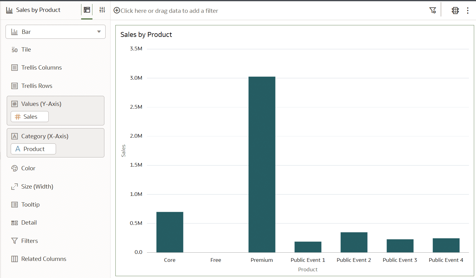
Oracle Analytics’ default formatting options allow users to quickly elevate the basic out-of-the-box bar chart into something more engaging and presentable. The first round of changes will aim to improve the data-ink ratio of this chart. The data-ink ratio is a concept introduced by Edward Tufte, who says you should dedicate as much ‘ink’ on a view to the data as possible. This means getting rid of unnecessary lines, effects, and anything else that detracts from the data itself.
![]()
In the Properties pane, choose the Axis tab. From here, change the Labels and Values Axis Title to None, the Number Format to Currency, Decimal Places to 0, and change the abbreviation to millions by adjusting Abbreviate to M.
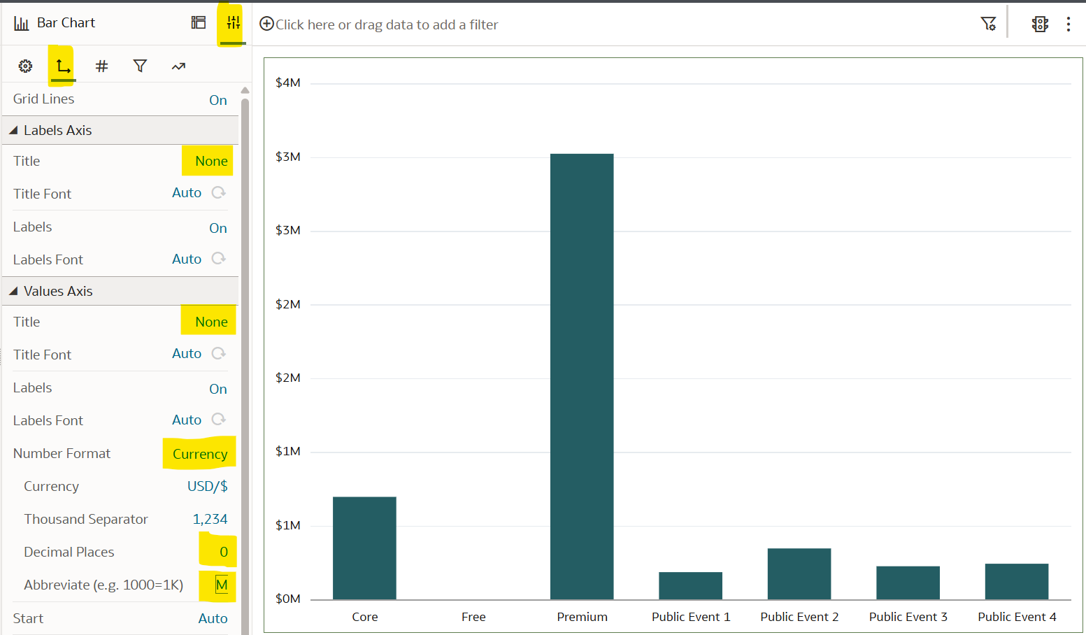
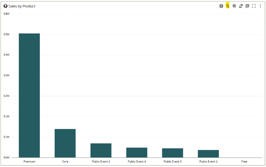
Next, sort the chart from High to Low by choosing the Sort button from the visualization toolbar. This technique allows you to not only compare the preattentive attiribute of height in the bars, but their rank order from left to right.
2. Adding direct labels to bar charts in Oracle Analytics
Direct labeling a bar chart has several benefits including an improved data-ink ratio, easier comparison of bars that are close in value, and elevating the overall design. It is important to note that when you choose to directly label a chart, you must always consider removing the y-Axis to not double-encode the chart.
Double-encoding refers to using two different visual cues, also called preattentive attributes, to represent the same data point. This can either be beneficial or problematic to your data visualization, depending on the use-case.
One way that double-encoding can be beneficial is by providing clarity. For example, if one encoding is hard to interpret (e.g., color-blind users may struggle with color), the second one provides backup. But be aware that if it isn’t used correctly, double-encoding can create chart junk or confusion. It can also be redundant in simple charts, adding no extra value.
Opting to not double-encode this chart, the first step is to remove the grid lines and the y-Axis. Using the bar chart built in the last section, navigate to the Properties pane, choose the Axis tab, change Grid Lines to Off, and Values Axis Labels to Off.
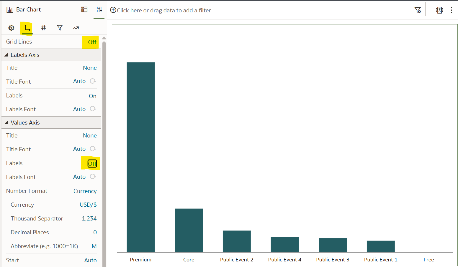
To add direct labels, navigate to the Values tab in the Properties pane, change the Data Labels Position to Above, Number Format to Currency, Decimal Places to 0, and change the abbreviation to thousands by adjusting Abbreviate to K.
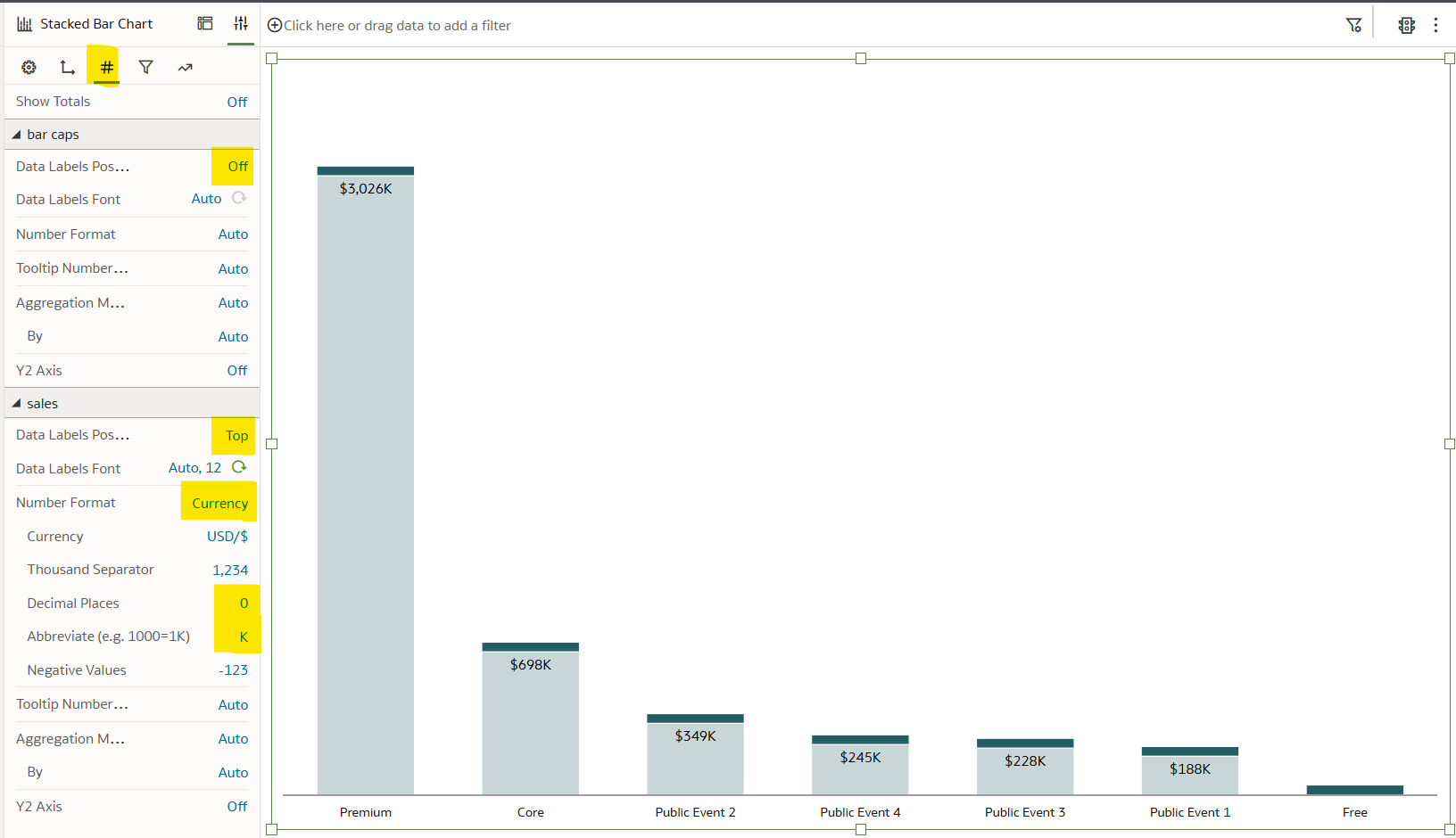
3. Add caps to Oracle Analytics bar charts
Adding caps to bar charts in Oracle Analytics can elevate the design and create an additional comparison point, but there are drawbacks. In the words of Playfair Data’s founder, Ryan Sleeper, “the size of the cap can represent the value of a goal or be colored by a different measure (i.e., length of the bars represent sales; color of caps represent profitability). While I like the style of capped bars and the subtle way they can provide additional information, beware they can easily be confused with stacked bar charts, and should be used with caution.”.
Continue reading with a free account, or login.
Unlock this tutorial and hundreds of other free visual analytics resources from our expert team.
Already have an account? Sign In
By continuing, you agree to our Terms of Use and Privacy Policy.
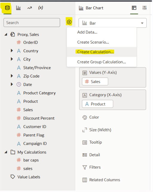
We’ll build off of the bar chart in the last section to create a capped bar chart in Oracle Analytics Cloud. Start by creating a new calculation. To do so, navigate to the Data pane, select the plus icon next to the search bar, and choose “Create Calculation”.
Bar caps in Oracle Analytics are built with a stacked bar chart, where the sales value represents the bottom bar and the bar cap is the top bar. In this example, the bar caps will be sized using a dynamic value based on a percentage of the total Sum of Sales in the view. The purpose of the dynamic sizing value is to ensure that the cap remains the same size relative to the actual bars in the view. If the bar chart changes in value, then the cap will remain the same size. If a static number is used, like 100, then the cap size would fluctuate depending on the values of the bar chart.
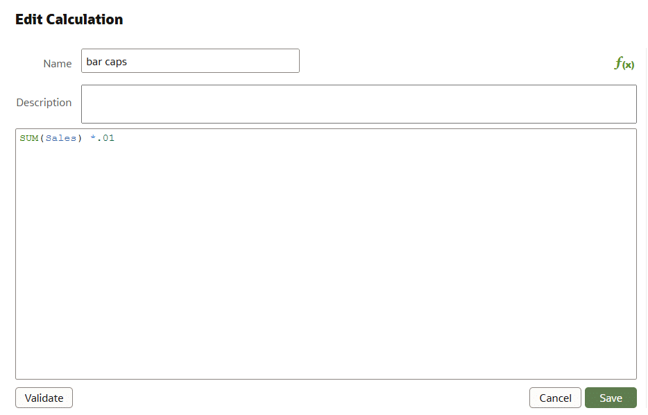
Name the calculation “bar caps”. The syntax is as follows:
SUM(Sales) *.01
Click “Save”. In the Grammar pane, add the ‘bar caps’ calculation to Values, above the Sales measure.
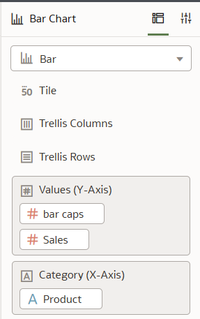
Change the visualization type from Bar to Stacked Bar.
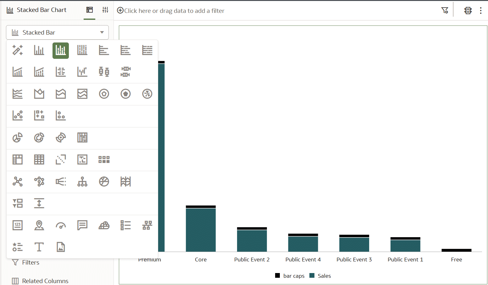
The visualization is starting to take shape, but I will make one design change to make the main bars a lighter shade and the caps a darker shade of the same color blue. This will both decrease the likelihood that the caps are mistaken as a stacked bar chart with separate values (as opposed to bar caps) and improve the branding of the chart.
![]()
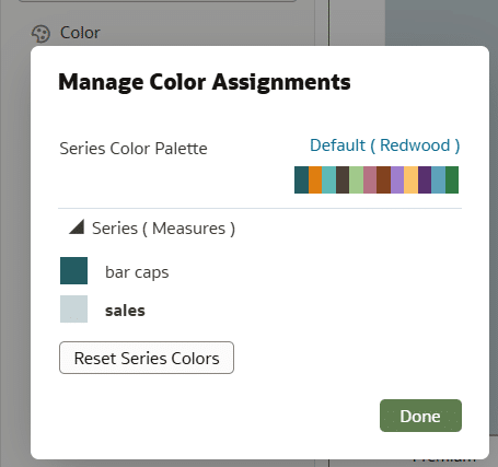
In the Grammar pane, select the dropdown in the Color drop zone and choose Manage Assignments.
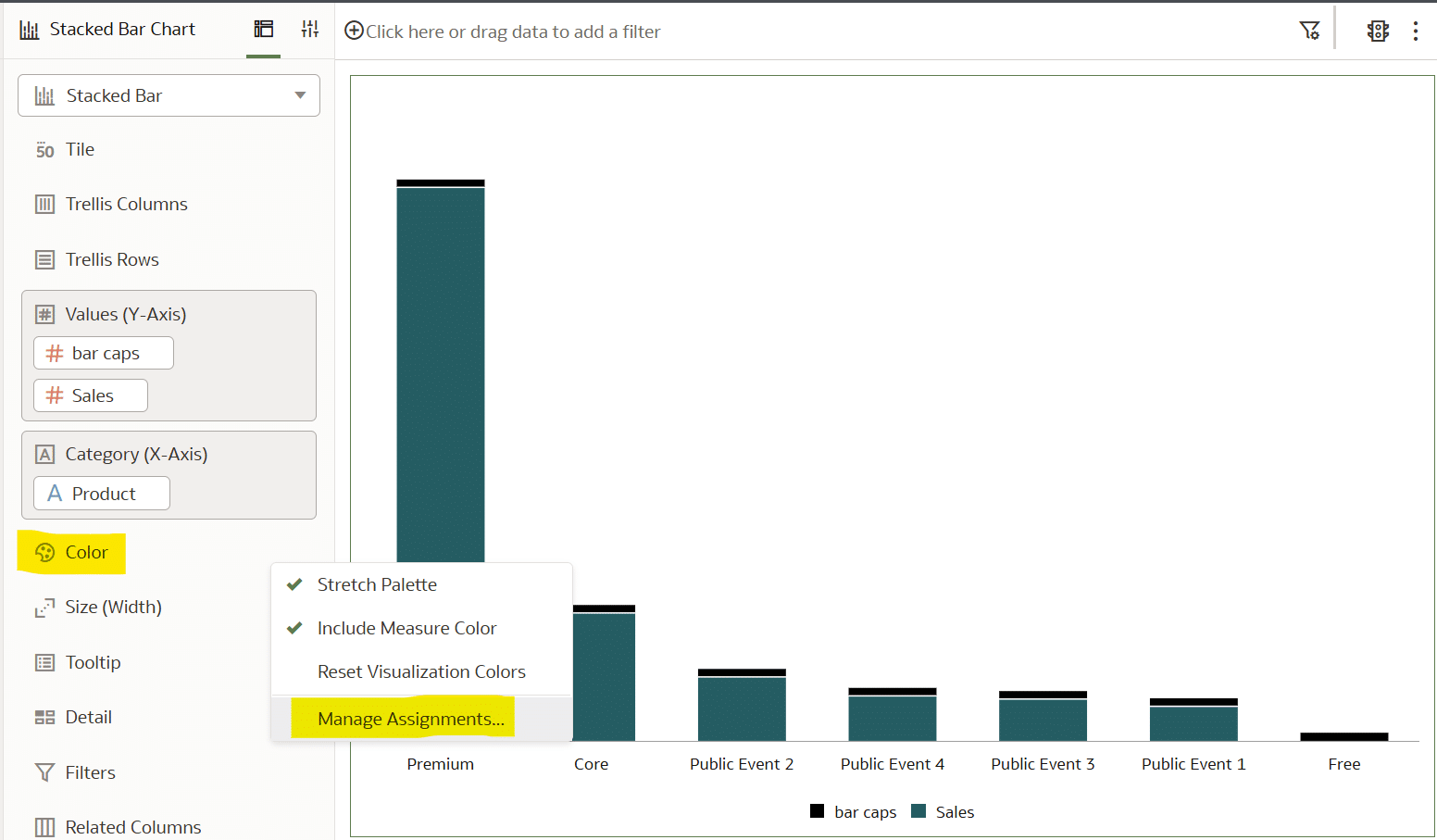
Change the bar caps to a dark shade of blue and the Sales bars to a lighter shade of the same base color.
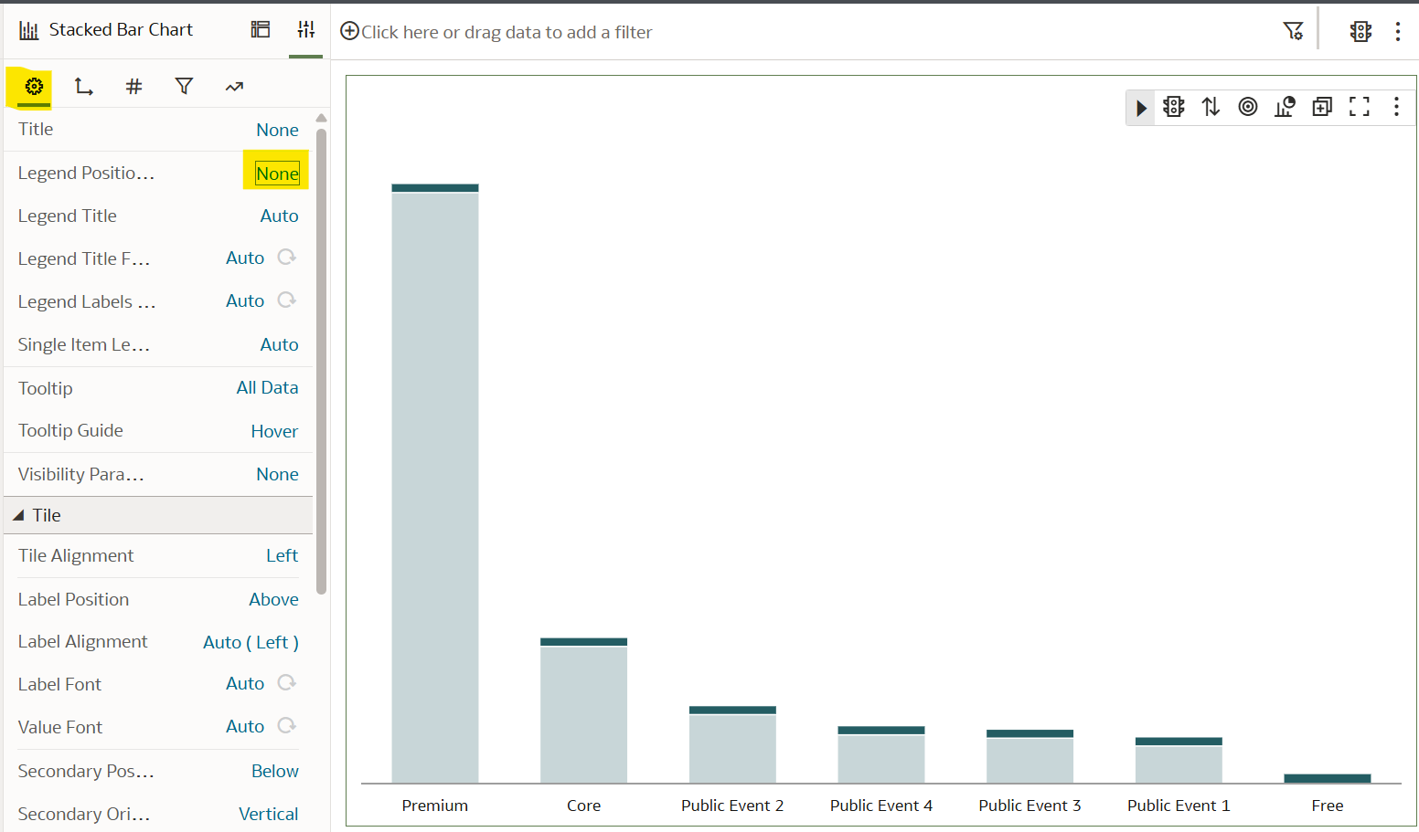
The last step in the process is to clean up the view by removing the legend and adding the direct labels. Remove the legend by navigating to the Properties pane, and choosing the General tab (gear icon). Then, next to Legend Position, choose None.
Navigate to the Sales dropdown in the Values tab. Next to Data Labels Position, deselect Apply to All Measures and select Top. Change the Number Format to Currency, Decimals to 0, and Abbreviation to K. Here is how my final view looks.
While there are other bar chart variations and applications, implementing these three methods to create bar charts in Oracle Analytics will unlock a great deal of value for your data visualizations and stakeholders.
Thanks for reading!
Dan

Written By
Dan Bunker

Peer Review
Juan Carlos Guzman
Visual Analytics Associate

Technical Review
Ethan Lang
Director, Analytics Engineering
Related Content
3 Ways to Make Lovely Line Graphs in Oracle Analytics Cloud
As far as I’m concerned, boring chart types are always in style. The problem-solving principle of Occam’s Razor states that,…
Winning the Oracle Analytics Cloud Data Visualization Challenge

What better way to start the year than for the Playfair Data team to have won yet another award! Our…
How to Setup Oracle Cloud Infrastructure for Oracle Analytics Cloud
Trying to navigate Oracle Cloud Infrastructure (OCI) for the first time can be an overwhelming experience with all the applications,…