3 Ways to Make Beautiful Bar Charts in Tableau

When it comes to data visualization, Tableau bar charts are still king. With all due respect to my other favorite fundamental chart types such as line graphs and scatter plots, nothing has the flexibility, ease of use, and ease of understanding, as the classic bar chart. Used to compare values of categorical data, bar charts work well because they take advantage of a basic preattentive attribute: length. Our ability to process the length of bars with extreme efficiency and accuracy makes the bar chart arguably the most powerful data visualization choice available to us.
The invention of the bar chart is credited to William Playfair, with his Exports and Imports of Scotland to and from different parts for one Year from Christmas 1780 to Christmas 1781 being the first appearance. Extraordinarily long and descriptive titles aside, bar charts have been making an impact for a long time. In fact, I hypothesize that the fact bar charts have been around for so long is one of the reasons some attempt to find a “more engaging” chart type to tell their data story.
![]()
This post attempts to add some love for bar charts by sharing three ways to make them more engaging in Tableau.
FAQs answered in this post:
Why are bar charts considered the most effective visualization type?
Bar charts leverage the preattentive attribute of length, which our brains process with extreme efficiency and accuracy. This makes comparing categorical data faster and more reliable than virtually any other chart type. Invented by William Playfair in 1786, bar charts have remained the gold standard for data comparison because they combine flexibility, ease of understanding, and immediate visual impact.
How should I adjust bar size and spacing in Tableau bar charts?
Widen columns to make category labels readable, then use the Size property of the Marks card to reduce bar weight to the middle notch for balanced proportions. Adjust the overall chart height based on data variance—when differences between bars are minimal, shorter columns with fewer gridlines improve readability. The goal is bars that are substantial enough to compare but not so heavy they dominate the view.
What are best practices for coloring Tableau bar charts?
Avoid double encoding by not adding category to the Color property of the Marks card when bars are already separated by position—unless linking multiple dashboard visuals. Reduce opacity from 100% to 80-90% to make colors easier on the eyes and consider using brand colors for consistency. Adding subtle borders through the Color property of the Marks card options provides definition without overwhelming the design.
How do I create a baseline for bar charts in Tableau?
Right-click the view and select Format, navigate to the Format Lines tab, then modify Axis Rulers to create a solid baseline. Set Row Axis Rulers to None to remove the vertical line, and format Column Axis Rulers as a thick line matching your bar color. This provides a visual foundation that prevents bars from appearing to float while maximizing the data-ink ratio by eliminating unnecessary gridlines.
What are capped bar charts and how do I build them in Tableau?
Capped bar charts add small horizontal bars at the end of each column, enhancing design while potentially providing a secondary comparison point like goal values. Create them by adding a dual-axis with synchronized scales, changing the second measure to Gantt Bar mark type, then adding a calculated field (-MIN([cap size])) to the Size property of the Marks card. Be cautious as caps can be confused with stacked bar charts.
How can Playfair Data help improve our Tableau bar chart design and dashboard strategy?
Playfair Data teaches design principles like the data-ink ratio, preattentive attributes, and strategic color usage that transform basic bar charts into compelling analytical tools. Our Tableau Visionaries and authors of Practical Tableau deliver training from fundamental visualization techniques through advanced dashboard engineering. Book a complimentary strategy call to learn how our Flagship Tableau workshops can elevate your team’s capabilities and improve stakeholder engagement.
1. Use formatting available in Tableau
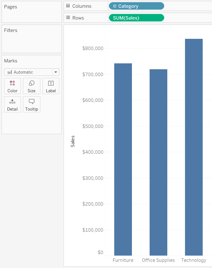
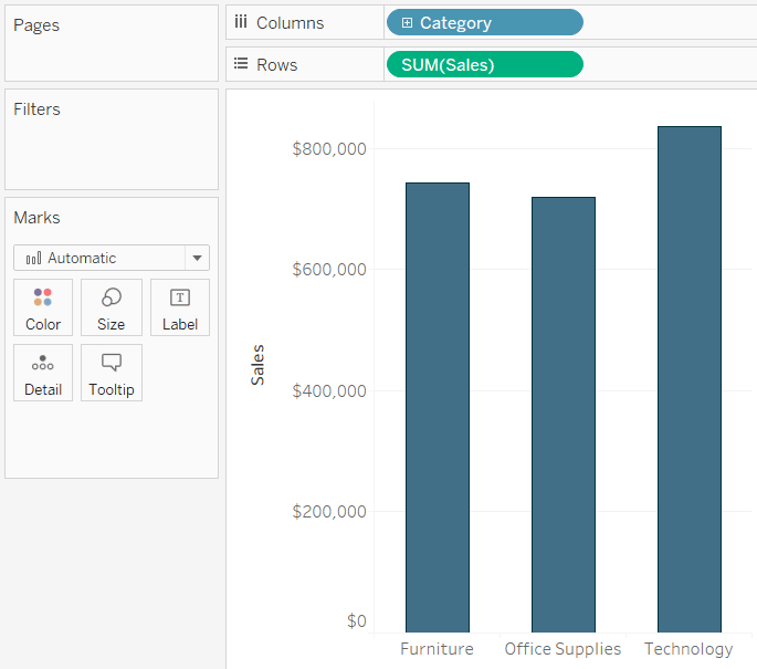
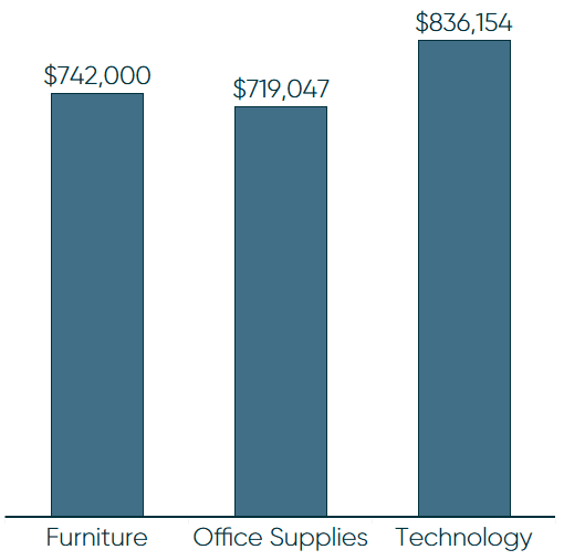
My first tip for making beautiful bar charts in Tableau is to use the formatting options you already have available in Tableau. Consider the following Sales by Category bar chart that shows all of the default Tableau settings:
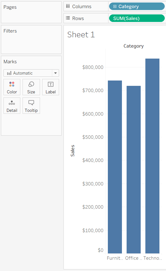
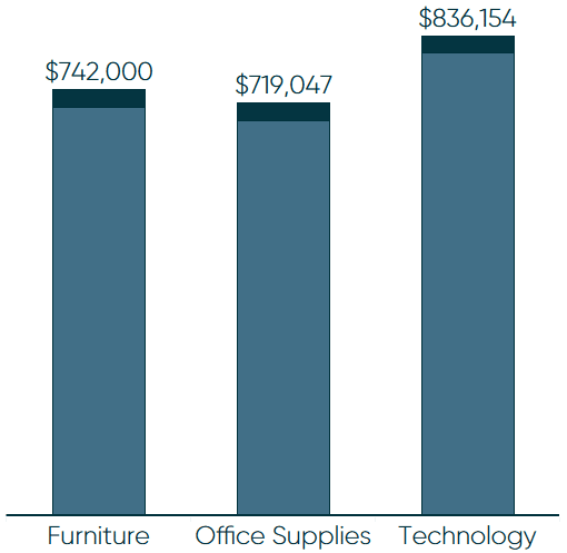
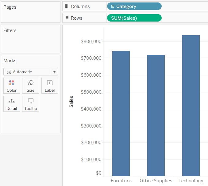
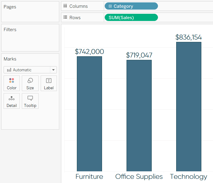
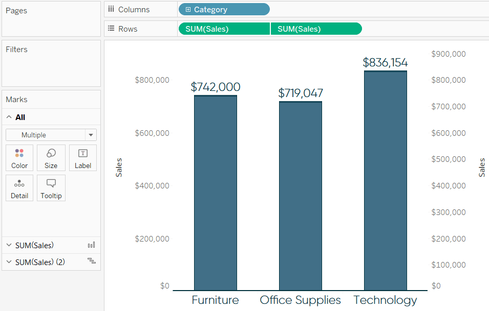
This bar chart gets the job done, as you can immediately decipher that Technology leads the way with over $800,000 in sales, Furniture contributes the second most, and Office Supplies contribute the least. However, there are several opportunities to make this bar chart more engaging and effective. The most obvious of which is to widen the columns so the categories can be read:
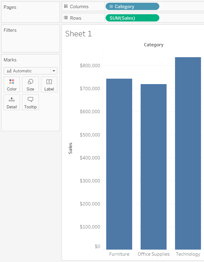
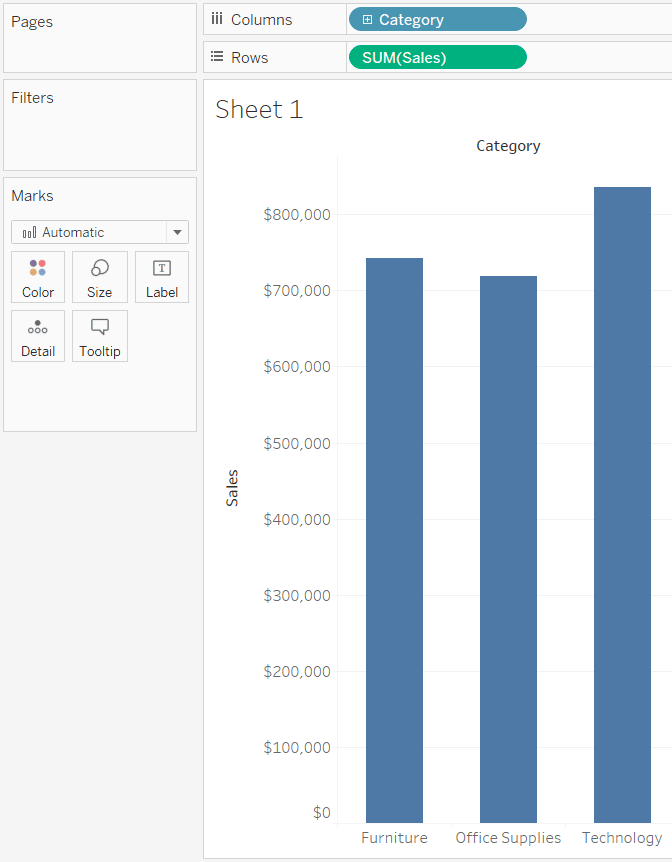
Making the columns wider makes the bars themselves wider. In my opinion, these bars are now too heavy relative to the rest of the visual. The next step I’ll take is to reduce the size of the bars by clicking on the Size Marks Card and dragging the slide to the notch in the middle.
The next tip is arguable, but I’m not as descriptive as William Playfair was above with his 110 character chart name. In my experience, the context of the chart is provided in surrounding text and/or dashboard titles, so I am going to hide the sheet name by right-clicking on the title and choosing “Hide Title”. I am also going to right-click on the bar chart header, “Category”, and click “Hide Field Labels for Columns”. If this is a standalone visualization, I recommend keeping the title.
The bars in this chart are unnecessarily tall because there is not much variance between the categories in this analysis. Here’s how the bar chart looks after I reduce the height by about 40%.
Take this next step on a case-by-case basis, but another side effect of having limited variance between the three bars is that there are too many gridlines and axis marks. This is negatively impacting the data-ink ratio, and can be cleaned up. To reduce the number of axis ticks, right-click on the axis, click “Edit Axis…”, and navigate to the Tick Marks tab.
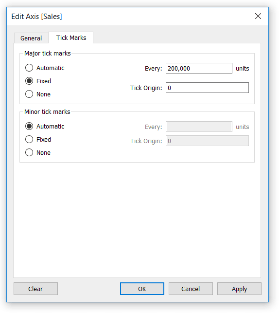
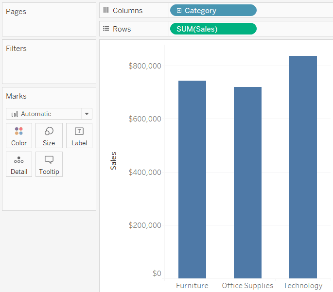
Here’s how the bar chart looks after fixing the tick marks at 200,000 as pictured in the dialog box above.
Last, but not least: color. I have written quite a bit about color, including 3 Storytelling with Color Tips to Improve Your Data Visualization and 3 Ways Psychological Schemas Can Improve Your Data Visualization. There is so much to be said about color, but for the purposes of this post, I will offer just three thoughts on coloring your bar charts:
1. Avoid double encoding. The bars in our chart are already separated by category. Adding category again to the Color Marks Card to color each bar with a unique color is unnecessary and potentially confusing. The one caveat to this is if the colors are being used to provide a link between multiple visuals on a dashboard.
2. Reduce the opacity from 100% to 80% – 90% by clicking on the Color Marks Card and moving the opacity slider to the left. This is a very subtle technique for reducing the saturation of the color and making the visual a little easier on the eyes.
3. Use this as an easy opportunity to brand your data visualization. If you can’t decide on a color, consider using a primary or secondary color from you or your end users’ brand.
Here’s how my final bar chart looks after choosing a secondary color from my personal brand and reducing the opacity of the bars to 90%. Note that I also added a very subtle border to the bars, which can be found in the options on the Color Marks Card.
2. Use axis rulers to add a baseline
In the last tip, I mentioned the data-ink ratio. This a concept introduced by Edward Tufte that essentially says you should dedicate as much “ink” on a data visualization to the data as possible. One way I sometimes achieve this is by hiding the axis altogether and adding labels to the bars.
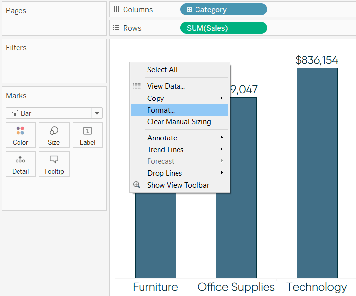
To add to the first tip, formatting, I also made the font larger and in brand. I like this look, but don’t like how the bars appear to be floating. What I would like to do is add a solid foundation for the bars to sit on; this provides a practical purpose and also enhances the design. The easiest way to add a baseline is to modify the formatting of the view’s axis rulers. By default, axis rulers are set to be a very light, thin gray line. To make the line heavier and match the color of the bar chart you are creating, right-click on the view and click “Format…”.
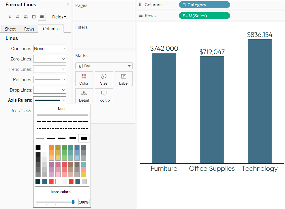
This will open the formatting pane on the left. Navigate to the “Format Lines” tab and modify the formatting for the Axis Rulers for Rows and Columns. To clean up the view, I’m going to set the Axis Rulers for Rows at None, which removes the thin gray vertical line on the left side of the bar chart. I’m then going to format the Axis Rulers for Columns to be a solid, thick line that matches the color of the bars’ borders.
Here’s how my final bar chart looks after removing all of the other lines except for the baseline. Compare this to the default Tableau bar chart in the first image above!
3. Add caps to Tableau bar charts
Capped bar charts have two benefits: (1) they enhance the design of a bar chart and (2) add value by potentially doubling as a secondary comparison point. For example, the size of the cap can represent the value of a goal or be colored by a different measure (i.e. length of the bars represent sales; color of caps represent profitability).
Continue reading with a free account, or login.
Unlock this tutorial and hundreds of other free visual analytics resources from our expert team.
Already have an account? Sign In
By continuing, you agree to our Terms of Use and Privacy Policy.
While I like the style of capped bars and the subtle way they can provide additional information, beware they can easily be confused with stacked bar charts, and should be used with caution. Here’s what a capped bar chart looks like when added to our previous example.
To create a capped bar chart in Tableau, start by adding a dual axis to the original bar chart. This can be accomplished by dragging the measure onto the Rows Shelf a second time, clicking on the second occurrence of the pill, and choosing “Dual Axis”.
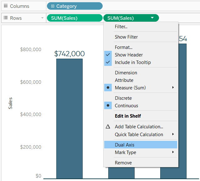
![]()
How to Make Dual-Axis Combination Charts in Tableau and Some Creative Applications
Once you’ve created the dual-axis chart, change the mark type of the first measure back to bar and the mark type for the second measure to Gantt Bar. Also ensure the axes are synchronized by right-clicking on the right axis and choosing “Synchronize Axis”. At this point, my view looks like this:
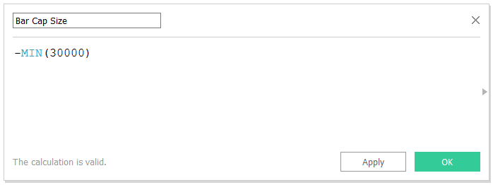
The next step to creating capped bar charts in Tableau is to create a calculated field for the size of the caps. The calculation is simply -MIN([insert size]). It is critical to add the negative sign before the bar size to ensure the caps go the correct direction. Here’s how my calculated field looks when setting the cap size at 30,000:
Lastly, drag this newly created Bar Cap Size calculated field to the Size Marks Card on the Marks Shelf for the measure you set as a Gantt Bar.
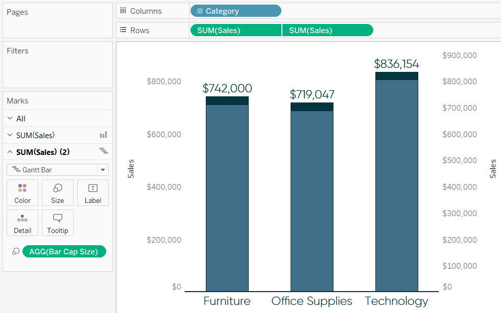
To finalize my capped bar chart, I colored the caps to match the bar borders and hid both axes.
Thanks for reading,
– Ryan
This content is excerpted from my book Practical Tableau: 100 Tips, Tutorials, and Strategies from a Tableau Zen Master published by O’Reilly Media Inc., 2018, ISBN: 978-1491977316. Get the book at Amazon.


Written By
Ryan Sleeper
Related Content
Introducing Balance Scale Charts in Tableau

The “Balance Scale chart” came to life during a team brainstorming session while building the Financial Analysis Swift as we…

Ethan Lang
Understanding a Key Distribution Visualization and Preparing Data for Modeling In this video, Ethan will show you how to create…
3 Ways to Make Beautiful Bar Charts in Power BI

Despite many new challengers over the years in the world of data visualization, bar charts have remained one of the…